Showing posts with label Significant Statistics. Show all posts

Thursday, June 5, 2025

how about let's never leave the fiddy box

A few days before Christmas, my LCS mentioned they are prepping some new $1 and 50¢ boxes. Oooh, that was gonna make for a nice Winter Break at some point over the dreary weeks, I hoped, if I could get back "up home" to my little ole home town. (Narrator: still hasn't happened, sigh).

Until then, I'm still scanning and deliberating on my 2024 finds from those boxes...

Why I selected it: At some point, hopefully in 2025, I will be launching my "Stadium Club Project," which will be to shop each set of Stadium Club, starting in 2015, and selecting 9 favorite horizontals, 9 favorite verticals, and a copy of every card originally printed with a black&white photo (not any of the parallels that changed a color image to b&w).

I'm quite looking forward to it and I expect it to be a lot cheaper than just buying random containers of Stadium Club cards, new or old. It should make for bunches of enjoyable $3 binder pages of Baseball Cards.

Will this 2020 Juan Soto card make it to 2020 SC Nifty Nine status? I'm skeptical, but I do like seeing the "Postseason" uniform patch on a card that doesn't otherwise say anything about the postseason on it. So, maybe. If not by then every stock broker on Wall Street will be wanting every Juan Soto Baseball Card ever made.

Why I selected it: Just, mostly, to scan it. Although this is one of the better recent Team Cards I can ever recall in that it sure makes the viewer want to catch a game at Fenway (bucket list thing, for me), I was hoping it would make a dramatic scan well "lit up" by the scanner, for a small "digital-only" project I plan to follow through on, with all of my otherwise essentially worthless "Rainbow Foil" parallels I have pulled since they began appearing in Topps Baseball sets in about 2015 or so.

There is a pretty good chance that the 2022 Topps Baseball Boston Red Sox® card #519 will become my 1/year best Horizontal Rainbow Foil card from 22 Topps, even if it doesn't become part of a little folder for "screen saver" use, as this scan just didn't light up like I hoped it would.

Why I selected these: I am a Topps addict. I forget what 2010s set these inserts appeared in, but I am "working on" the checklist - that means I want to finish it, someday, but since I can't recall what year these are from, "some" day is probably still a ways off. But that's OK, because I am fairly sure these will never be expensive, unless maybe Topps created a Rookie Card card for itself, which is always possible. They have also essentially already repeated this exercise in a 2020s set I am also 'working" on. Maybe when the 2030s version appears I will have a few more cards in each.

I definitely already had a copy of the Sy Berger card, but that's OK, cuz everyone loves Baseball Cards that show Baseball Cards on them. Don't you?

Why I selected it: A new collection effort, of these "Hobby only" inserts I only discovered courtesy of these cheap single card boxes at my LCS.

A 219 Ft "Avg Distance" seems like it will have some hidden trickery involved, since 219 feet is never a Home Run. So what are we looking at here? Let's find out:

Ok, so Mike Trout still relatively "bombed" the ball in 2022, to the tune of ten feet more than anyone else. Neat.

Why I selected it: Always a lot goin' on on an Acuña card. I just love the miniature "Logoman" the scan revealed, to me anyways. I am now rebuilding a modest collection of these 2021 1986 Topps cards. Maybe I will sync up MVP wins with inclusion in a few pages of these. Or, maybe I will just dive into the pool.
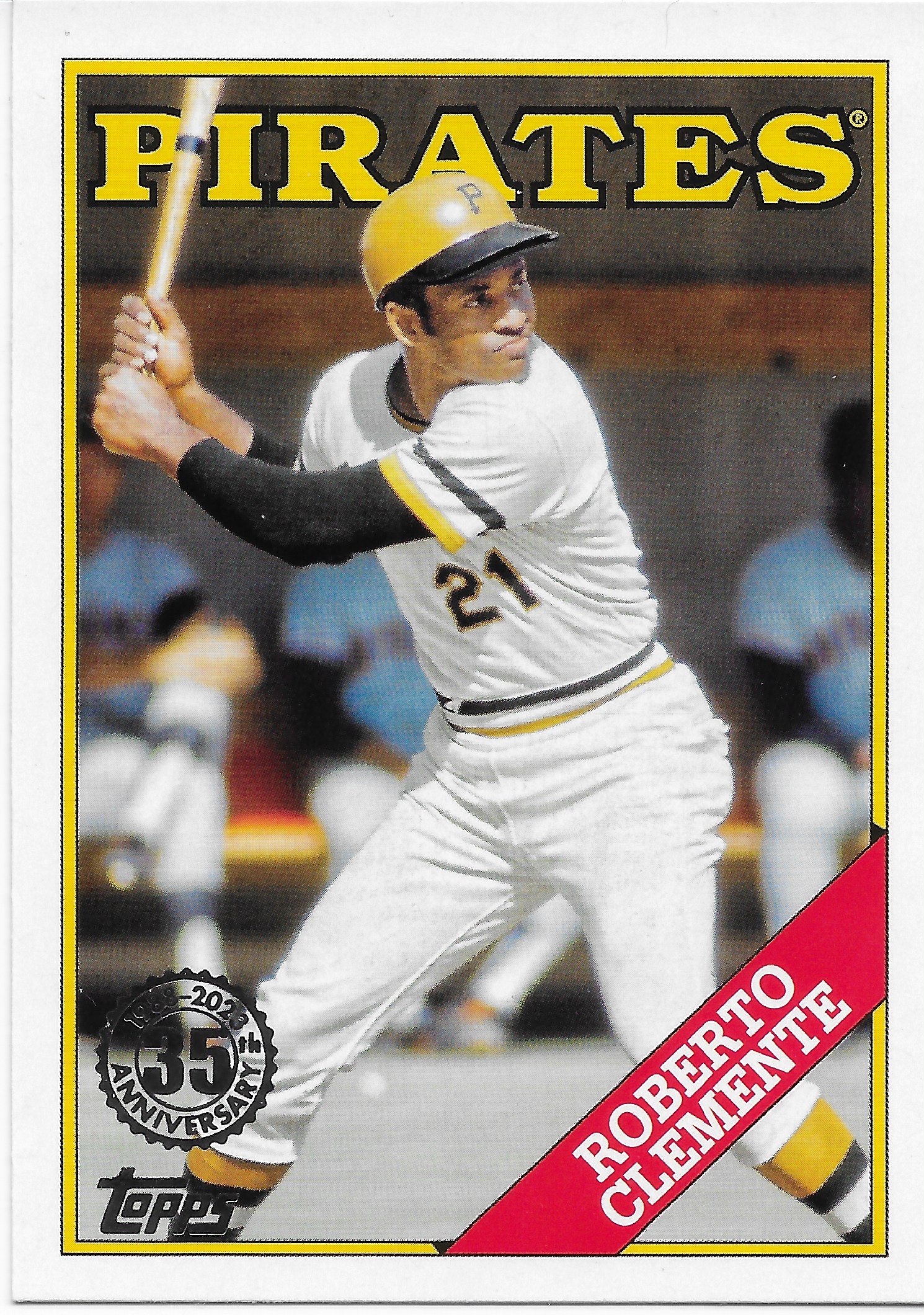
Why I selected it: I think the relatively few "re-dos" of 1988 Topps Baseball are really showing the design in a more positive light, particularly given it's deployment on modern, always-crisp-results printing technology. 

It is -very- functional, and memorable, but lets the image be the memory. In this way it is very reminiscent of 1978 Topps - could that have been deliberate, at the time? The 2 designs may seem a bit of plain-jane, however when the photo is as fresh and illuminative as this one, the design seems to be astutely getting the heck out of the way of viewer enjoyment.

I also liked this card because I can't recall having seen this Clemente photo before. Maybe a Clemente collector will have; I am certainly familiar with repeat images on other Clemente cards. 

So with 2023 1988 Topps I am on the same cusp-of-decision as I am with the 86s.

Why I selected it: More progress on the 2024 Significant Statistics checklist. I think I only have 1 card each from 2 other years of this insert, which has more history than I suspected, though not always in contiguous years. Although there is near zero mystery to the concept of a 100.2 mph average velocity on a Sinker, these cards are ALL about the back, so -
and as it turns out, I learned a few intriguing factoids, including a shout-out to a player who has been hard to collect lately, probably due to a combination of Topps' disdain for Middle Relievers and that he missed a lot of time to injury (I think?) - dat would be da Brooze-Darr. I hope to see him on more cardboard in 2025. Otherwise, I am enjoying these inserts, every time I find one.

Why I selected it: So, let's review. I like Pink Baseball Cards. I like Powder Blue Baseball Cards. I like Racing Stripe Baseball Cards.

3 boxes checked. I also like the Pitcher-Plays-Hard Baseball Cards - show me another Dirty Pitcher card.

I however, do not like 1991 Donruss and I had to laugh when someone succeeded at making the whole thing much worse. They must have been taking notes from 2021 Topps or something. I also don't like no-license = no cap logo, so a couple boxes checked on the other, negatory, side of the ledger.

So this is one of those hideous but ultimately love-hate cards. Here's to hoping that this image can somehow appear on another, better Baseball Card some future year.

Why I selected it: Now here is much improved take on an old Donruss design. It rather begs the question of why, back-in-the-day, they made the regular red version, and the sneaky issue blue version, rather than just super intelligently combining the 2 primary Baseball and American colors, just like this?

Meanwhile, I am launching a small Jackson Chourio collection. So this pretty card will fit in there though I would rather have his Nashville Sounds cards. The back of this card is one of the laziest I have seen lately, with oceans of blank space and a report that Chourio is "From: Venezuela." The super teeny-tiny card back text never even identifies what team name might have been the source of this image, other than "Biloxi." 

I do largely expect this is a totally faked approximation of Milwaukee's Powder Blue Throwback uniform (the new Brew Crew uniforms don't have the colored armbands). But there is an outside chance their MiLB affiliate in Biloxi does use them, so I wanna find out.

I also suspect this is some sort of parallel, not a base, and thus the regular 2023 Donruss probably doesn't use this best-possible approach to this design. But there is a teeny-tiny chance such a checklist holds a few other neato lookin' cards on it. Maybe.

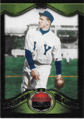
Why I selected it: I keep sayn' I'm gonna quit these 2009 Legends of the Game inserts, but here they keep appearing in my little stacks of purchases. I automatically pick up Christy Mathewson cards because they just aren't commonly seen. Mostly I grabbed this one because of the image, which is probably well on its way to a hey, look at these 9 cards page, some day. This is likely the single most common Mathewson card image.

Why I selected it: This card was supposed to the fated 13th card for one of these posts, but I couldn't leave you with a card this hideous, now could I. 

So why did I buy it? I don't know. Maybe to make sure I don't buy it again? Does that make any sense?

This was an insert in 2022 Topps Chrome but these (the card does say "Diamond Greats" in pointlessly tiny text) first appeared in 2022 Topps as decent enough die-cut cards. That clearly then became an all-too-easily repeated insert in that year's Chrome. And somehow one that got significantly worse once Chromed, but then no amount of design could save a card from this turrible, just turrible pic.

The card back writer went quickly to the standard description of Mathewson in the 1905 World Series and probably clicked this one off the office computer screen as fast as possible. Maybe I bought it just to see how many Christy Mathewson card backs can just float on the one World Series. Blech.

Why I selected it: I have a small collection of Hunter Pence cards that needs to be wrapped up = placed on a binder page. He had a good number of memorable cards in the 2010s, but I can't recall having a choice Astros selection, so I thought a Topps Gold would be a nice add. I heard him call one game in 2024, when the Giants were on ESPN Sunday Night Baseball so he moved over to help out the radio crew. I expect he is otherwise routinely on the TV crew. Maybe that will happen again sometime. I hope so.


Sunday, February 2, 2025

Still just a lil less than 2 Quarters

Sometimes, I wish I still lived about 100 yards from where my LCS is today. That was about 20 years ago now, whoa...one of the toughest things about Baseball Cards is associatin' 'em with a quantity of passed time like that. 

If I still lived 100 yards from a place with big ole boxes of Baseball Cards to purchase, one at a time, as at my LCS these days, I would probably know intimately (read: every few days) the contents of all of their boxes, even the really weird box titled "Graded Cards." That would be awkward.

Fortunately, living a few miles away, I can hardly keep up with what they keep in those boxes, which is a Very Good Thing. Because that means every time I stop by, I can look at fresh stuff in those big ole boxes of Baseball Cards...

Why I selected it: A pert-near-perfect Baseball Card, but just pert. I couldn't remember if I had pulled a Steven Kwan card from my usual purchases of just enough 2022 Topps Update to start seeing double, as in "doubles," routinely. This usually gets me most of the Tigers cards and most of the Rookie Card cards and a good look at all of the inserts and that usually satisfies me with any random new Baseball Card set.

When 2022 Topps Baseball came out I thought I would "collect" it, as in "completely." Because after 2 years of dud designs that followed a great design (2019) with a bunch of weird filters on the photos, my body was ready for a new Complete Set effort. 

I never did pull that trigger because of a slow but very steady (all through Baseball Season that year) disenchantment from the nicely flowing and classical 2022 Topps Baseball design. Which had no demerits, really except one: Topps just FUBAR'd, well, almost-all recognition, that weird little tab with the player's POS on it.

I mean, why include a design element on a card, and then decline to supply it with enough ink to be easily legible? This makes ZERO sense. If it is decided to not put a player's POSition on the front of the Baseball Card, sobeit. I do like seeing the Position - but I have to be able to actually read it. Is that too much to ask of a Baseball Card?

Fortunately, Steven Kwan is so good at Baseball I will be quite happy to have an extra copy of his Rookie Card card, if that proves to be the case when I finish sorting my 2022 Topps Update cards in the year 2029 or so.

Why I selected it: At last, the intrepid adventurer wandering around in the Baseball Card Purgatory known as the "50¢ Box" has found a sign of the Holy Grail:

The Powder Blue Parallel

Maybe, was the conclusion at the time. At least this card does clearly say "Optic" on it; otherwise I have no hope of knowing which card is just a "Donruss" and which card is a "Donruss Optic." To me, they are all "Panini," and those are cards I never usually see, because they are always still inside way too much packaging whenever I might be close to them over at the Big Box store.

But in the 50¢ Box, it can be all-Panini-all-the-time, in some rows. And that's kinda neither here-nor-there in that those rows are very quick to scroll through, in-hand; faster than on a computer screen even, most likely. But every so often...

A month or more later, now here at home and armed with the knowledge that I now owned my very first "Optic" Baseball Card, I kept up the Quest.

The results were, hmmm, a bit "challenging," let's say. The first problem was that 2021 Optic Donruss Baseball (or is it Donruss Optic? I will never, ever, know), well, it contains more different parallels than I can count completely accurately. That's because there are more than 21 of them. A lot more. 34, I believe. But don't quote me on that.

You thought parallels in Topps products were getting out of control? Panini's designers have a Beer they want you to hold.

The second problem is that there are 3 different blue based parallels in the set. Those prove to be "Blue Cracked Ice," "Blue Prizm," & the don't-confuse-this "Blue Velocity Prizm." I don't know how "Velocity" is a Baseball Card parallel pattern, but none of those seem eligible to be the rock solid simple obvious concept I created in my own mind, of the "Powder Blue Parallel" — What's Taking So Long!!!!????

I regrouped a little and tried a different tack - the card clearly says "Optic" on it — maybe that implies that Optic is some sort of deliberate Oooohhhh, Shiny set where every card is some sort of optical illusion (every card is an illusion, actually, which is that any of them will ever actually be worth actual money, the key illusion of 99.x% of all Baseball Cards) and thus this nifty sky blue upper frame just indicates a simple..."base" card.

Nope. Those are white on top, though I still don't know if they are just ordinary sorta cardboard cards, or if they all might be "Optic"al in some sort of weird way probably involving way too much gloss. Not that I really care.

Finally, a bit, or, really, a lot, of Real Life experience came to my aid here. That's because the truncated names of the parallels on the COMC card-disposal-service website named not one, but two, of the 34 parallels as "Carolina B..."

That could only reference one of the prettier sights you could ever hope to see, which is a nice clear sky on a sunny Spring-time day in "Carolina" though I have always thought it is best seen with the appellation "North" on there. "Carolina Blue" is a real thing you can actually see, there, in North Carolina, just like when you are in Montana, the sky really does look "Big."

But everybody knows "Carolina Blue" = Basketball. I mean, like, everybody. Except maybe Baseball Card designers who got transferred over from making Soccer stickers back home in Europe? Is that how Panini Baseball Cards work? I have always suspected that, anyway.

Carolina Blue parallel Baseball Cards. You can't make this stuff up, people, you can't make it up. The Quest, will continue. Meanwhile a melted blue/white candy deal will maybe go nice on a page of Empty Seats, Hitter Edition cards.

Oh and how/what/why are/is/there/was/were TWO Carolina Blue parallels? One is the Carolina Blue Prizm parallel, and the other is the Carolina Blue and White Prizm parallel. Try and keep up.

40some¢ just wasted on that one? Not completely. I learned to never, ever, never open a container of Optic Donruss / Donruss Optic "Baseball" cards. For one.

For two, my basic Pity was triggered by this sad learning experience blogging for you Baseball Card fans tonight. And that is the thought of there being "Super Collectors" who actually do attempt to own all 34 parallels of a Baseball Card of their favorite player even when that card can't even print the name of the player's team on it. 35, actually, including the base card. And that's just from one Baseball Card product. Sometimes, this whole "Hobby" just feels essentially predatory. This is one of those times. Anthony Rizzo has 542 "different" Baseball Cards from the year 2021, as per a COMC search. 542. One player. One year. Gotta catch 'em all.

Let's get back to basically worthless Topps Baseball cards, instead of that depressing topic.

Why I selected it: Just look at that Baseball bat. Just hovering there. How does it do that?

I had to have this card for the "Bat Drop" collection. That one probably won't make as an exciting of binder pages as the "Bat Flip" page, but such cards do seize one's attention.

Why I selected it: So, close. I mean, I do have some purdy darn cool 1986 style cards that print the team name in Powder Blue, but those are for the Rays. OK, granted, the Rays kept the Powder Blue flame alive in 2nd place only to the eternal Powder Blue Champions in Kansas City, and the Blue Jays came to the party a fair bit later. But, still. Couldn't the Topps Baseball Card Miner clicked a few extra clicks on his computer screen for this one? 

Why I selected it: Shoots. .  . .        SCORES!

These "All Aces" inserts are some of the best of the early 2020s in regular ole packs of Topps Baseball Cards. And clearly, the Aces of "Diamonds" are the very best of the four choices. 

And now, I have a Powder Blue Ace of Diamonds.

Why I selected it: OK, I'm not real clear on how purple/pink/fuschia connects to the "GUARDIANS" but I can handle it. Catchers get the most memorable Baseball Cards, quite often. The other day I was babbling about how they shouldn't be photographed with their glove while standing up...but what I meant to say was "with their weird glove but without their cool gear." Then, with the "tools of intelligence," standing up is A-OK.

The back of this card informs me that Bo Naylor stole 20 bases in the Minor Leagues. Nah, that doesn't mean I read the backs while thumbing through the fiddy-box. Not, usually.

I thought my 2023 Topps Baseball 1988 35th Anniversary collection was complete with 9 wonderful Baseball Cards. Looks like I will need a Page 2 for that one.

Why I selected it: I collect Christy Mathewson Baseball Cards. That flows out of picking up a copy of his biography, by Frank Deford. Which in turn flows out of owning a copy of his T206 card, from way-back-in-the-day.

I quite like that I haven't seen this image on my other Mathewson cards. Check out his easy-to-miss glove (prominently featured on the T206 also).

I am also starting to regret not keeping my various "Greatest" inserts from 2019 Topps. I don't always care for how such a checklist theme so quickly and easily summons detracting thoughts about player A being on the checklist, but not player B. Unavoidable, of course, when it comes to issuing retrospective checklists of Baseball players.

So for the 2019 "Greatest Players" and also their "Greatest Seasons" such subjective decisions kinda distracted me a bit much. Fernando Tatis Jr. is not one of the "Greatest Players" on par with his checklist mates, and I believe there are other Rookies included therein.

But for "Greatest Moments" it is a lot easier to just roll with the concept as Moments that don't make the cut aren't as easily summoned to mind. I think there are 150 "Greatest" inserts, split btw Moments/Players/Seasons. So there should be just 50 Greatest Moments. 49 to go.

Why I selected it: I automatically set aside horizontal "Rainbow Foil" cards. I never cared for this seemingly useless parallel until I stumbled across a few horizontals from 2017 Topps and I realized the horizontal format basically increases the amount of Oooohhhh, Shiny real estate. From that point I determined to keep the best horizontal Rainbow Foil I could easily obtain each year.

But then, eventually, I scanned one.

Now I want to scan every Rainbow Foil card I have. 

This one will not win the 2023 Best Horizontal Rainbow Foil contest (doesn't every card blog run that contest?), nor will it even be a keeper scan. I do need to pay more attention on buying spare change Baseball Cards, clearly.

Maybe it was the San Francisco fog that wrecked this one. One handy thing that flowed out of scanning this one is that it revealed to me that S.F.'s "City Connect" uniforms include the Bay Bridge graphic on the side of their caps, which is otherwise not all that clear on this card, or any other of their CC cards I have seen. But that will likely show up better on another future card. So, a win.

Why I selected it: Racing Stripe, 1910 style. I initially quite liked the 2020 Turkey Red inserts, an ancient Baseball Card motif Topps returns to on the regular. Which is nice and all, until you stumble across the first repetitious background, which I don't think was an issue on the original Turkey Reds, though I am a little afraid to look at tho$e much.

When the Repeat Blues hit me on these I deflated a bunch. This weird 1970s/1910s contrast will light up a binder page slot, somehow, somewhere (Powder Blue? Or Racing Stripe?) but otherwise not many of these will ever grace my Baseball Card binders. Maybe the originals have been reprinted...

Why I selected it: I love 1986 Topps. I am never going to complete that set as the non-stop 1980s printing issues endlessly distract me. So these 2021 takes on the design delight me. My first still small collection of them was destroyed in every Baseball Card collector's nightmare scenario: A Pet Incident.

So I didn't think I would return to these cards. Until my LCS started offering them up in their boxes of delights. Probably gonna need more than one page for these, or, maybe, about 9 pages, for all 150 cards. At least now I have one of the 2 most difficult cards in the set, though there are probably multiple Ohtani cards in it, most likely. I have no idea why Aaron Judge would again be in the 50¢ box, however.

Bonus Round
Why I selected it: I had to have this one as a companion card to one of my fun pages, a Nifty Nine of 9 different Jazz Chisholm Rookie Card cards on 9 different Topps Baseball designs. This one could have been included, but is (sorta) his only Chrome Rookie Card card.

So for now this one will just rest comfortably in the "Players" box until, -maybe- I assemble 9 fun Chrome cards for Jazz. 

Double Bonus Round
Why I selected it: This was a pleasing find because just a week or two before thumbing across this one, I had decided to start collecting these inserts from 2023 Topps Series Two.

I have learned a few more things since, namely that Topps has issued these inserts a number of times in the last several years. My ignorance thus likely largely traces to these being inserts only in "Hobby" editions of Topps Baseball packs, and it is not often that I purchase Topps Baseball anywhere but along with my groceries. Just, sometimes @ LCS but not all that many sometimes. And I don't think these inserts are printed in large quantities so not seen all that often in those Hobby packs, either.

So the first thing I did is peruse this checklist on COMC, where naturally there was only one of the Judge card and thus someone wanted $2.75 for it, even though it would only be about $1 on eBay, but another buck for shipping. LCS, to the rescue.

I have figured I should start trying to understand whatever the heck "xwOBA" is for a fair # of years now. So what better way to do that than on the back of a Baseball Card?

Here, let's figure it out together - I haven't flipped this card over to read it, until, now:
"Expected Weighted On-Base Average," huhh. I can't say I will be really concerned about this one, in the future. A problem for me here would start with "on certain types of batted balls" and then who is assessing "quality of contact." Let alone the idea of Yordan Alvarez and his sprint speed keeping up in the upper echelon of the best xwOBA players. Sometimes, in my opinion, the new "compound" stats just get a little too unexpectedly numbers-just-for-the-sake-of-numbers and perhaps also a bit of Baseball "gatekeeping" by the overly obsessed. Though maybe these folks churning #s together in spreadsheets all the time are a little ahead of the peeps collecting all 35 2021 Opruss Dontic Anthony Rizzo Baseball "cards." But don't make me pick which of the two people to drink some Beers with, whatever you do.

Well that was educational. Let's try it again:

"Barrels" - another one on the To Do list:


Well that sure started out more exciting, back on the front of the Baseball Card. "Barrels" - what Baseball fan can't grasp that one? 

But what is the official definition? This Baseball Card ain't tellin' for sure - "those whose comparable hit type traditionally lead to" - which just tells me that the real definition is likely too convoluted to print on the back of a Baseball Card. 

Because again, who, exactly, is it that classifies subjective things like "hit types" and what each does "traditionally" ??? After all, it sounds like a "Barrel" is only good 1/2 the time, as another whiny starting point. Just too much going on here simultaneously for me to worry about who hit how many Barrels. Did Judge hit a Home Run, or not? Home Runs count. Do Barrels?

Topps. Baseball. "Bringing you closer to the game," I think is a phrase straight off some old Topps card somewhere. These Significant Statistics cards do do that, in a round-about way; I will be on the look-out.