Saturday, August 31, 2013

The Wal•Mart Blues

Here's a fun game you can play the next time you are in Wal•Mart. And I know you will be in Wal•Mart, because you buy baseball cards.

Sure, you can try and pretend you never go in there. You can tell me you only and always shop at Target, which would be wise, 'cuz the wimmins in there are way prettier. But I know you would be lying, because you buy baseball cards.

And my little game has nothing to do with the so-called "People of Wal•Mart" that you might be unfortunately picturing in your head right now. I'm not a fan of that website; I can have fun mocking baseball picture cards, but taking pictures of ordinary people to then publicly mock them on the internet is kinda mean really. Karma will find the people who take such pictures, I sincerely believe.

No, my game is one you can simply play in your head the next time you visit Wally World; and it is a simple one that is just simply a question: Is anyone happy in Wal•Mart?

Seriously. Just look around whenever you are in there. The customers? The employees? You?

I am happy at Wal•Mart - I am almost always only there to buy baseball cards. The fact that I can pick up a few groceries or some motor oil or a fishing lure or a pair of work gloves at the same time is kind of a time-saving bonus. No baseball cards, no Wal•Mart for me. Even though I know the other box stores I go to  instead are selling essentially the same junk manufactured by exploited workers in foreign countries.

But hardly anyone besides me ever is happy in there, despite all those smiley faces plastered everywhere. Mi amigos de Mexico y puntas sur, si. If you are in a Wal•Mart near much of an Hispanic immigrant population, you might notice they do seem to enjoy the place and their new American levels of purchasing power. So let me rephrase the question. Are any Americans happy to be in Wal•Mart? Perhaps small children being pacified with a purchase I guess. So one final rephrase - Are any adult Americans happy to be in Wal•Mart?

You be the judge next time. The results ... might surprise you. Or might not.

So I was mentioning that I pulled up to a Wal•Mart a week or so back now in the throes of baseball picture products withdrawal. And then the blog went dark for a few more days.

There is a heat wave gripping the area where I live this week, a rather northerly locale, so we don't really need central air conditioning save for a few miserable weeks a year, like this one, and it isn't built in to my house. And the room with my scanner and baseball cards was more intolerable than my enjoyment of writing this blog for y'all. Especially since the post I had lined up in my mind needs lots of scans. Because you want to see some baseball cards, not just read more wordy words on the internet. Right?

So, finally, let's look at a baseball card:

That's not a Wal•Mart Blue, man. Don't worry, I won't cheat yas, those were in the pack too. Along with my fix of Topps stickers, I picked up a 'fat' pack of Series 2 while I was visiting with Wally. Though this one didn't at first seem quite as 'fat' without Prince Fielder on the cover now.

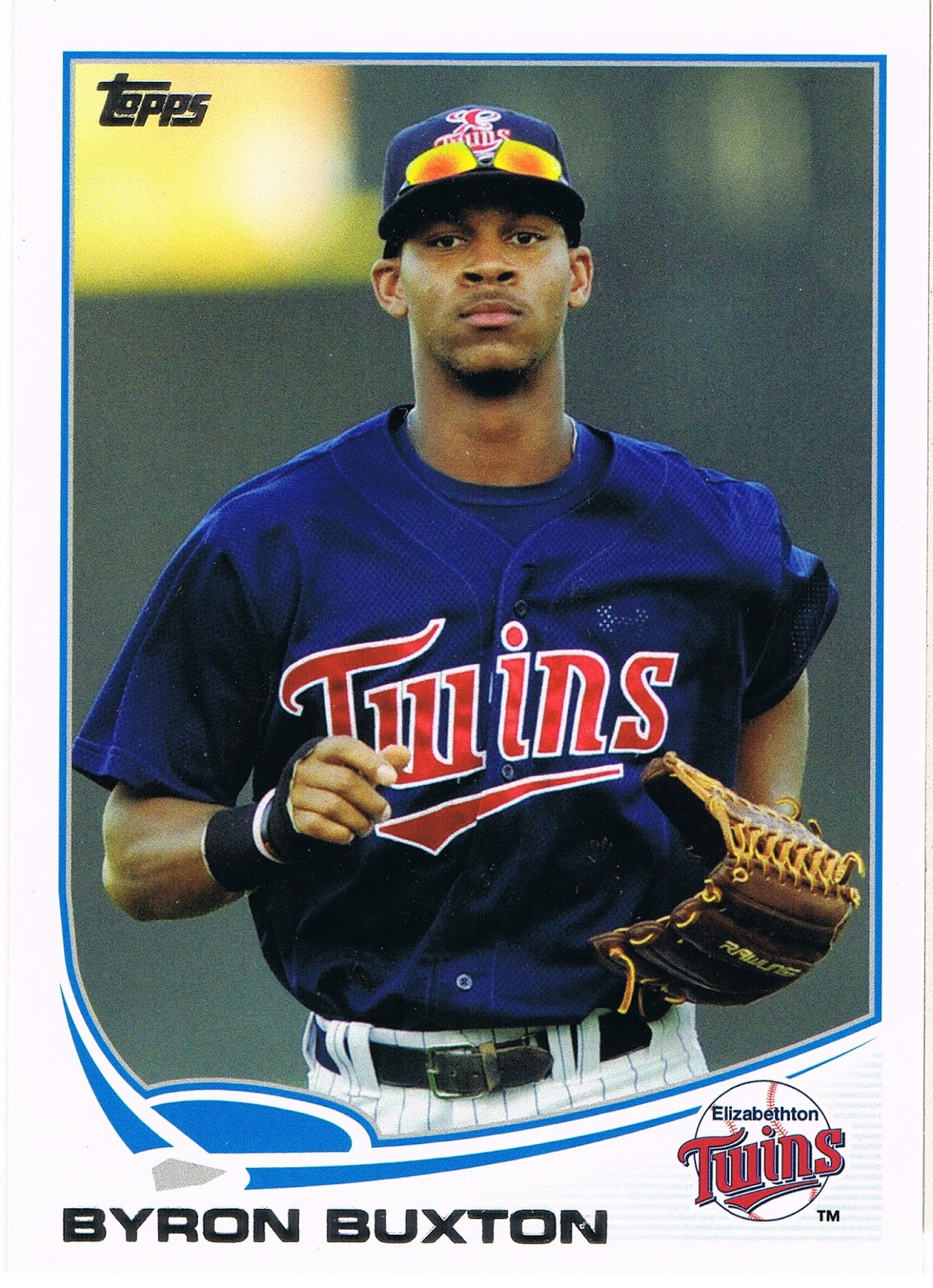
Mr. Diamond here just seems to say America. Baseball. Wal•Mart. There's a diamond on his card and he's named Diamond. Lots of blue on there, like the store's signs. Minnesota. Is there a state more American than Minnesota? Seemed appropriate to get a Twins card when I had watched a Minnesota TV station to get my weather forecast the day before, despite being a couple state lines away from all those lakes.

I am more than a little burnt on the pitcher's torso framing so prevalent in 2013 Topps - this one lost some potential composition points by cropping off most of Scott's leg there, but gained a few back by leaving his uniform's leg stripe on the card.

I like this card anyway, because it is another one shot at Detroit's Comerica Park. That fuzzy white stuff behind him is part of the #5, retired by the Tigers in honor of Hank Greenberg, as noted on the center field wall. Where are all his vintage repros, Topps? Heck, his life story is so amazing there could be a whole set of picture cards about him. Topps, though, seems to think the only old-timey Detroit Tigers worthy of new cardboard are named Kaline and occasionally Cobb.

I also wonder if we have Tatooine cards, what can we call brick-walled cards? Not many of those around, I'm sure. That's all solid brick there behind Mr. Diamond.

And the Topps collating machine didn't let me down on my all-American box-store trip, with more red-white-and-blue, though I just can't scan and blog the whole pack. I thought about it. If I did that, I might as well just launch a whole straight-up Sea Turtle blog, which I have also thought about. But I just don't have that kind of time - you wouldn't see card #990, aka #US330, until sometime in the year 2019 perhaps - and I like to blabber about lots of different baseball cards than just these neat little turtles, like this one:
Who would vote against the idea of more head-first third-base slide cards? This one might appear on some best-of lists; especially since the slightly better card of Everth Cabrera was suspended for the rest of the season. Which coincidentally, seems to have tanked the prices on that Superman-like card, making it rather easy to rainbow if you wanted to. I briefly considered doing just that before launching head-first into my Parallel Project instead.

Usually sliding cards in the digital century feature a little dust going airborne as well, the absence of which makes the Florimon card that much more striking I think. I did quickly find a somewhat analogous card:

I always like the I'm-gonna-catch-that-ball, I'm-gonna-catch-that-ball, I'm-gonna-catch-that-ball baseball cards. The viewer is as entranced with the probability as the baseball player immortalized in time. On this one, Mayberry has run to make this catch so hard that the turf divots are still going airborne behind him. In action, indeed. Topps saluted Mayberry's father with a somewhat unexpected checklist entry in Archives this year.....I think it's time Topps busted out those nice Father/Son cards in a little subset next year. But they probably won't, cuz the 19 year old card dealers dealing cards of 19 year old minor leaguers could care less about major league parents.

I did escape from all-America colors for a few selections in the pack, courtesy of the New York Mets, who generally fare well riding the Sea Turtle:

Especially when the opposing player supplies plenty of their complementary base color, blue. This card did lead me to a bit of extra typing on this 'puter thing in front of me - just who is this mysterious Amarista player in the striking blue uniform? I knew he wasn't among the hallowed 660 in 2013 Topps; which turned out to be because he is a pedestrian infielder for San Diego. No room in the base set for them, unlike near-similar players in major media markets. Though I have to stick up for 1 Whitehall St. here in that no one expected Tejada to disappear from The Game this year after a promising first couple seasons in the bigs.

Though the Mets have that excellent Orange in their color scheme, their cards still scream America! Baseball! as much as the flag-color teams, such as this one:


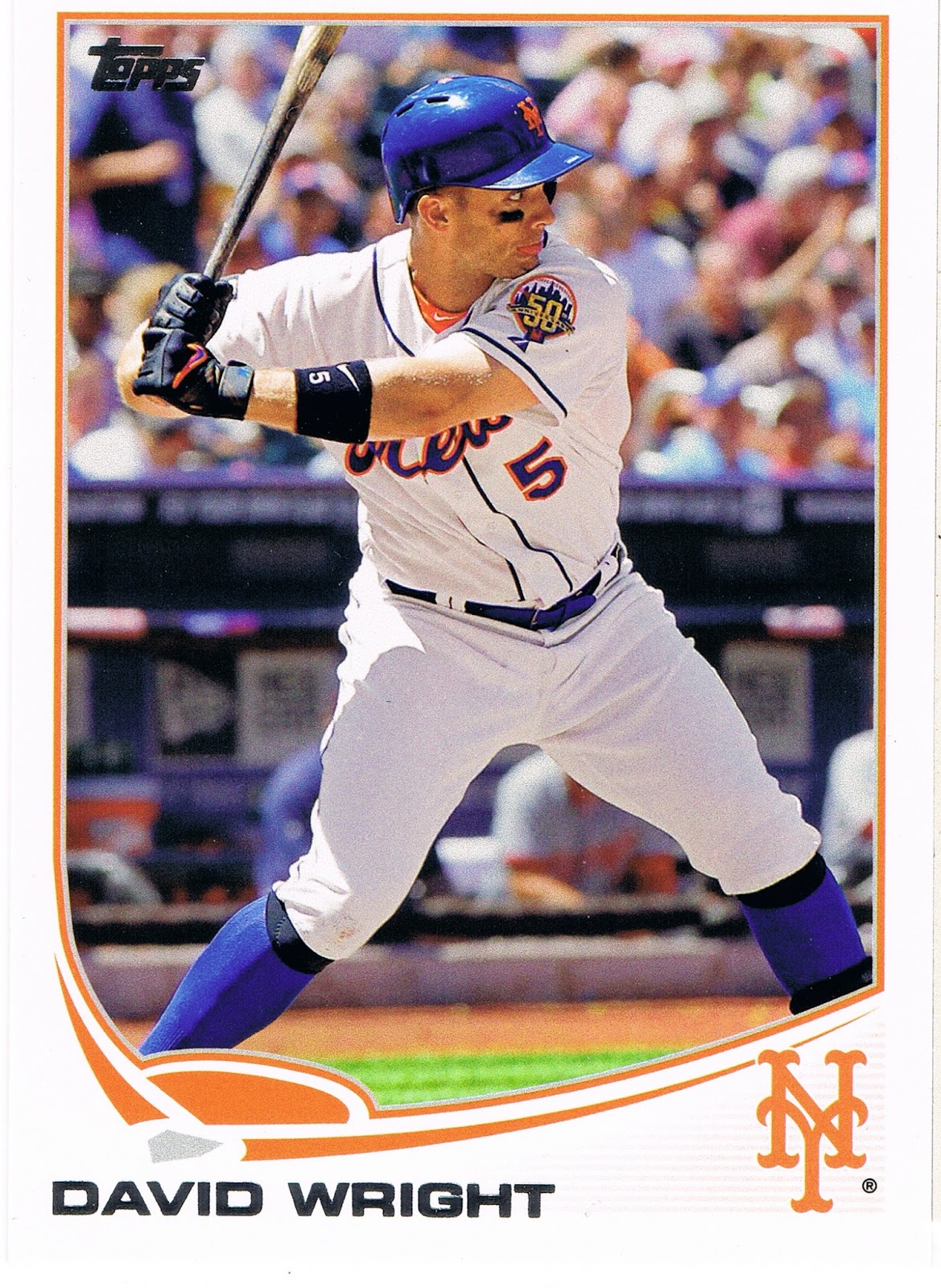
A classic. Great Sox - old school, good supply of Met-blue. Wright has already taken his left foot-step forward - he's committing to swing at the pitch just about to enter the frame. The fully extended left arm further adds to the not-tense but excellent anticipatory tension of the shot. The Met's 50th anniversary shoulder patch is featured nicely. Just an outstanding baseball picture card; even though there have already been, who knows, a million different baseball cards produced (2 million?), and there is nothing new under the beautiful sunny skies at the ballpark that day, I can still enjoy a base set baseball card like this one. It also marks a return to "hero numbers" in Series 2 here, as this is card #400. I liked Topps' experiment with matching card #s to uniform #s in Series 1. I thought it was a nice way to honor more players than the limited amount of "hero" card #s in a set. I hope the tradition can continue right along with the new-fangled-ness next season.

And if you look real close at Wright's face (I won't crop it and blow it up for you - get your own card, it's a good 'un) you will notice that he has his tongue sticking out, like a happy cat or something. I think he is gonna smack that incoming pitch right over the outfield wall.

Of course baseball fans love sluggers, and generally love their baseball cards. But soon enough in this pack I got back to primary baseball colors, and a rather amusing card:


I don't think I've ever seen a slugger with a case of guitar face before -


It must have been a foul ball. Not sure I would hand Jay that card to sign, though he has a few other similar post-contact cards.

Sticking to an also more-common-than-I-totally-wish meme in Series 2 (as in Series 1) - showing a player's "unhappy" face (granted, an inescapable result of 'action' photography) - we find this card:

Normally these are found on the pitcher's cards of course, but Yunel there doesn't appear to be throwing from much of a stretch position, so we have to check the back of the card. Yep, an infielder. A basically unremarkable card really (too, too much blue), until another Tampa Bay Ray wandered into the pack a few cards later:

Another unhappy action shot. Both of these make you think the player is thinking, hey, the runner is already safe, but I have to throw the ball over there anyway. But you can't blame Kelly for being disgruntled at being photoshopped into a Tampa uniform despite being a Series 2 release this year. That's right Topps, a big fat Zero for this one, you graded it yourself there. The overly shiny uni and the too-bright hat are always a dead giveaway for a dead baseball card. I only had to look back a few cards in the pack to confirm I was being manipulated so you could have more time and production budget to put redemption cards in your expensive products.

Fortunately, Series 2 rarely disappoints for long:

My first thought on my first copy of this card a few months back now was that it could be a possible entry in the shoulder patch binder for that intricate Orioles patch. Or maybe an addition to the Shades page. Just today I noticed it's a second card with a touch of slugger face perhaps.

But eventually what really makes this card jump off the stack of baseball cards is the partially flattened baseball jumping off the end of the bat there. Even with the cutting edge camera equipment Topps gets in action these days, such intense motion can't be completely frozen and the ball seems to be departing the bat as if McLouth ignited the rocket fuel in the core. A pity such a great image capture is weakened by the way the ball hides in the white of the uniform. And the unfortunate way the lines of the composition lead the eye away from the baseball to such a degree that it took me 2 months of playing with Series 2 cards to even notice the incredibly rapidly accelerating baseball on it. So close, Topps, so close; much like hitting off the end of the bat like that is not just exactly perfect.

Did I just type 'perfect'? Yep. Like this card:


Yes we have made it to the Wal•Mart Blues at last. Though if you still have the blues after seeing this card, well, baseball cards just won't help. I featured this card before Series 2 even came out, I like it so much, though I did discover what happened to the ball on that card. Hint: don't hit the baseball off the end of the bat. This card is giving me the blues a little though, as I have realized that the best possible parallel edition of it would be the /62 black bordered version, which is basically true of all the Pirate cards. The black-border Alvarez card has been up on eBay twice in the last few weeks and gone for a little more than $25 and $20 w/shipping and I just don't want to spend that much on a single card. But oh how I desire to have it (and the McCutchen card) in that parallel. Donations always accepted. I think, though, that I will probably settle for tracking down a /2013 gold border version, like a few other classy cards this year. The gold always seems to work out nicely with any team colors.

The Wal•Mart parallels also bring me down a little with their pastel washed-out-ness. The basic, nearly-dark blue of the standard Wal•Mart logo would look quite a bit more striking on a baseball card. There was probably no way around that, given the nature of the colored Sea Turtle - i.e., to make a blue parallel either the border or the graphic frame has to be washed out compared to the other.

One of the blues in this pack -
- got me wondering about the colors of the Turtle, vs. the colors of the team logo. The "A's" there is a dark, dark green. It looks great on most cards, matching the tint of the Athletics' unis. And the Turtle is decently dark enough, but still not a match. Ahh, the mysteries of Topps sometimes. And the mystery of Brandon Moss and his little baby blue fore-arm bands, and how he cutely destroys Tiger pitching, and the mystery of how good Billy Beane is at reading the waiver wire all the time.

Which are frequently only matched by the mysteries of the Cubs:


Another probably safe-at-first fielding card, the nearly official meme for light-hitting infielders. You can't hardly put a bat in their hands on the front of their baseball cards when they hit all of .121 last year but are still expected to be part of the starting 9 come Opening Day. Perhaps the card farthest below the Mendoza line this year. And similarly indicative of Topps' luck with printing baseball cards with Cubs logos on them of players that actually end up taking the field for Chicago. There's always next year, when I expect we'll see more Vitters cardboard after an injury-plagued but healthy stat year in the minors. Maybe Topps should just wait and issue all Cubs cards in the Update set until Epstein somehow gets together more of a regular line-up around Castro and Rizzo. Maybe he should call Billy Beane, Epstein's original employer's first choice for the job.

Now of course once the Wal•Mart Blues roll out of the pack, we're due for even more excitement.

What could be more exciting than that Alvarez card up there? Why the generally pretty good crop of inserts this year, usually led off in the 'fat' packs by a '72 mini:

Can't beat a '72 mini of a player who actually played in 1972. I like the '72 design; despite my affinity for harmoniously synchronized team colors on a baseball card, I also like how back in '72 Topps just refused to use the color red on a Redlegs card. Lost in the trippy stars I guess. An added bonus was despite a more than passing familiarity with all the vintage Johnny Bench cards I have or still desire to acquire, and Topps' penchant for ridiculous amounts of photo repeats, this was a new image for me. Now there's an upside to avoiding all those gimmicky "high-end" ego cards. Just don't put this sweet new Johnny Bench card anywhere too close to his entry on the faux-high-end insert set in hobby boxes called "The Greats" or "The Elites" so clearly designed to entice you on to those surely extra-valuable "high-end" sets, or the spell of acquiring a brand new Johnny Bench card might fade a little.

After the minis appear the regular size inserts, such as Chasing History:


Though I have thought there is little more pointless than a card designed to hold autographs or "relics" that then hold neither and just take up space in the packs of the base cards I actually do want, the Chasing History set broke that sad mold this year. The card pictured there is right up there with the excellent Lou Brock edition on the checklist, and a few others. Another great, arm-fully-extended, I'm-ahh-gonna-hit-that-pitch batting card. Great light and shadows interplay and a sweet MLB shoulder patch. I'll need an extra copy of this one for the patch binder. I hope the Jr. Junkie might swing by and enlighten us on what year this great shot is from.

But much like the base cards in this pack, I decided against scanning all the inserts. Normally in a Series 1 or 2 'fat' pack, I like just 1 or 2 of 'em enough to want to comment on them. But this pack just kept on packin':

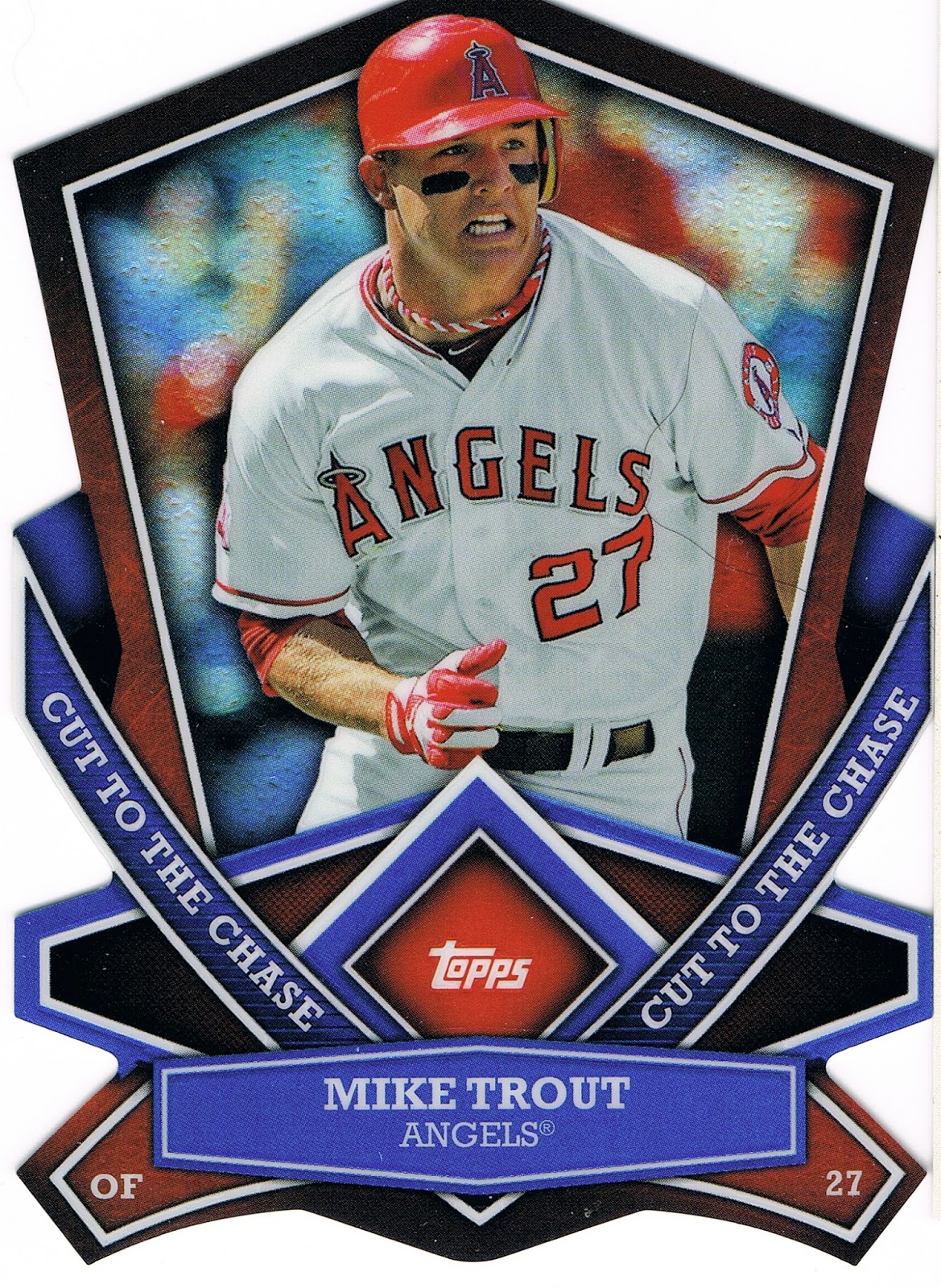
I've never had any die-cut cards before this year, I don't believe. I skipped those crazy 90s cards and most of those other card companies too. But I sure do like these Cut to the Chase cards, and I need to convince you to send me all of yours somehow. And no collector can have too many Mike Trout cards, now can they? I in no way would ever want to start a Player Collection of him, though I have been starting to think Topps just won't issue a card of him with his mouth closed. It's like he is always breathing like a fish or something.

By this point in the pack I was fairly satisfied by Topps' team-up with the Walton clan. But this Wal•Mart was so far off the beaten path I think, that those two corporations had a reward for me for loyally tracking them down at the very end of the distribution chain:

It's a hit. A retail hit. Aww, thanks Wally. Even though the back of the card has to remind me even more explicitly of a Series I'd just as soon forget even more than the 2006 edition. That's a trip to Wal•Mart for ya, always giving everyone the Blues.

Tuesday, August 27, 2013

I just didn't want to see that, Topps.

Help! I lost a card! I pulled it quite a while back, actually.

I set it aside with that blogger thought, ahh, a muse item. It's always nice to have a little stack of those.

I remember even setting it in a stack upside down, so I would remember it was that one card I wanted to babble about.

It wasn't a stack of similar cards, I don't think. But since it was upside down, I would surely remember where it was and why it was in that stack, right? Nope.

Now, I've looked all through the wilds of the card desk. Went on quite a journey through there. That was both rather enjoyable, and rather distressing — when, oh when will I ever have time to sort out those stacks of cards? A very busy season at work is fast approaching. Things are good. But oh so many cards to binder up, type into lists, offer to that one blogger I know will want it, etc., etc., etc. And one of those card stacks is starting to resemble a certain tower in Italy. Maybe if I put some stickers up on top, I too can see gravity experiments in action.

So what card is it? Well, if I knew what card it was, it wouldn't be very lost, would it?

I mean I could always just Google it and share it with you curious readers.

I'm not even sure what set it was from. So that space just above this sentence will have to hold a place on the blog rolls for me tonight.

And the strangest thing about this lost card is, I don't want to look at it any more. Ever again, perhaps. Manifestation is a powerful thing, which can be equally bad, or good. There isn't really a way to connect it to baseball cards, but my seeing-a-Moose story from last year is one helluva illustration of that.

Which is the real reason I put it in that stack upside down. I had to save it for this post, but I didn't want to see it again, and that seems to have worked. The back was safe enough, but though I read the backs, the back had nothing to do with all this.

I did manage to find the other card that somewhat goes along with it. I can show these cards safely enough I think. The original would have had to come with a pretty heavy disclaimer/warning, but you are safe from it now. You can quit squinting from behind your palms now. Well, except maybe if you are a Mets fan, you might want to just click the back button on your browser now.

Very sorry about the news today, though it did trigger my search and a short announcement:

We interrupt your irregularly scheduled blog post about Life, Baseball Cards, and whatever odd thoughts tie them together, for a bit of baseball freak show.

But I think it is safe enough to look at this one:


No, this isn't another tricky What IS That? post. Not all that much to remark about on this card.

When I look at this card, I focus on the background there, which I'm pretty sure is Detroit's Comerica Park. Topps seems to like pictures shot there, which is just fine by me. That yellow line through them all is very soothing.

I mean I want to look at anything but Jake's left elbow there. I use my arm to make money quite often in my occupation, and sports injuries really do scare me a little bit sometimes. Seeing that ligament plain as day there <shudder>. That just doesn't look natural. A pitcher's scowl isn't even worth a passing glance on a baseball card these days, but McGee certainly doesn't look to be enjoying this pitch.

Turns out, McGee already had Tommy John surgery five years ago. I thought this card was maybe foreshadowing it. I can't say I'm glad to be wrong or right on that.

Good thing I lost that one card. It was way, way worse than that one above. So, please, Topps, spare us wear-and-tear shots. Let's leave those under the uniforms. I know, professional football players have it way worse than baseball payers, quite likely losing 1 to 2 decades of their natural life spans.

My arm hurts just looking at that card. Although that could be from what happened at work on Sunday. I was so looking forward to having fun with a scanner and a pack of cards and thoughts on where that pack came from, but as the commercial says, sometimes life moves pretty fast.

Sunday afternoon I got stung by bees about ten times. Many of the stings were just below each cuff of the short-sleeve shirt I was wearing. This morning my elbows hurt. On the inside. Not a whole lot, but noticeable. Probably not as much as an MLB starting pitcher's might.

So I know the ball players' bodies really do go through a whole lot to entertain us. I'm just not sure I want to be reminded of that on my picture cards.

Saturday, August 24, 2013

Withdrawal Symptoms

It was a very long week in a baseball-less black hole. About an hour in any direction from any store that sold baseball cards. Although my phone worked as a phone, data service in total boondocks is mind-blowingly amazing in some places, and non-existent in others, such as where I kept ending up.

Even worse, the hour-to-the-baseball-card-store was also the distance to the same small outposts of humanity that hosted an AM radio station hosting a baseball broadcast. Which is not close enough for low-power AM radio stations any more. Oh how I miss the days of my youth, when I could measure the distance to a baseball broadcast by how many state lines there were between me and the radio station.

Some teams still have games on such stations of course, but not the Tigers. I will never ever forget being in northern Michigan in October, 2006, and having to listen to a Tigers playoff game on a clear-as-day station from New York. With the Yankees announcers. Because where I was sitting in Michigan, none of the Tigers radio network could be pulled in.

But all great jobs come to an end, and along the way home I was ever so happy to find a Wal•Mart. I'll ponder the place tomorrow. For now, let's see what I found inside:

Yep, a sticker I have been chasing. To ease back into the 21st Century and some cheap baseball picture products I went with a few packs of 2013 Topps MLB Stickers. I had a hunch buying them in a different locale might shake up the Topps sorting machine enough to get me several I need, and my managerial instincts were correct. Kaline at last. Still just a few Tigers to go. And logo stickers. I forget just exactly which right now. At least I already have Scherzer, though I hope next year Topps sees fit to celebrate like I do when pitchers get a W _and_ a GWRBI.

A surprising sticker though. Almost every team in the set has a fan-beloved veteran in their short checklist. But all of them I have seen so far included an image from their playing days. Instead we see Kaline acknowledging some sort of tribute right there at Comerica Park, with his old TV broadcast partner's name there next to his left ear. But somehow appropriate for a fan-beloved veteran still very much involved in helping his baseball team win games every day.

And as usual, even in a pack of 16¢ stickers, Topps hooks me up with baseball player pictures I haven't seen before, amidst all the many stickers I already have, and the many I have already seen on their other products.

Why here is a skinny Oakland "A" that somehow seems familiar. Skinny like Billy Beane. Long blonde hair like Brad Pitt. I'm so confused now. With a frame like that, how in the heck did Reddick hit those home runs last year, and for that one week this year? Beware the Topps Voodoo, Josh. Leave it to Topps to reveal the real deal on those baseball players. Topps, always bringing me closer to the game and its leading players, just like they pledged to me on the back of that Fernando Rodney relic they CONGRATULATED me on receiving twice last year.

It seemed to be a bit of an Oakland A hot box of stickers with Reggie Jackson about to swat one all the way, way up there to the southern shore of Lake Superior, a baseball purgatory if there ever was one; yet every little town still with a Little League diamond. One of the stickers had more official MLB news from Topps, as it announced that a Little Leaguer is all grown-up now:

Bye Tommy.

Another sticker shows us what happens in a perfect world after Superman slides into 3rd base:


He simply trots home when the next batter smacks a home run and all the fans ignore him while they stand up to watch the ball fly. A perfect world being the world of baseball stickers for kids that don't need to have anything at all on the back, such as stats for a season with 50 less games played than the year before. But I am a sucker for baseball cards, err, pictures including a standing crowd.

And even after perusing a couple-three thousand baseball picture cards the last couple-three years, Topps also hooked me up with a baseball image archetype I don't think I have seen:

That's binder material there. Though of course, that would be stuck on the outside of the binder. If only we could have got a bit of red in the image so we could have a perfect touch of the irony of a foreign-born player so perfectly honoring our own country. I feel bad for Topps sometimes having to try and make good looking baseball image products with the materials the Brewers give them to work with. I predict many more throwback uni cards in the Brewer's roster's future. They did hook up Gallardo with a great card in Series One though, totally worth the 14 ~ 20some¢ it would cost you to acquire, if you don't count the costs of all those doubles.

Now maybe those of you with a couple-three score thousand baseball cards have seen a great National Anthem deal like that one before. Either way, we all like classic baseball images, like this one:

Red, White, Blue. Can't be beat. Fly your own flag, Anthony. Roll that logo back up the hill, again. Playing in Chicago must surely be one of the more Sisyphean tasks in the Universe. Everything I need to know about baseball, I learn from Topps.

Wednesday, August 14, 2013

Bonus Pack Inside!

I knew this would happen eventually. I carefully saved all these little packs from my Toys-R-Me Opening Day blister packs, like this one:


These are 3 pack blister packs. Not 2 plus a bonus, cheezy Topps blaster ad-blasting style.

Nor are they 4 pack packs with a price seemingly for 3 packs and a 4th pack, Bonus!

No, the Bonus Pack Inside! is just a little pack of 4 cards from Series One. Just regular cards, no inserts or parallels, you know, the average worthless junk from Topps that only children in awe of a whole universe of toys in a toy store would want. Typing that sentence made me realize I should probably report things accurately. What if I was wrong about that and there was a Platinum 1/1 in there? It would be a crime against baseball cards if a 1/1 from a strangely packaged pack of baseball card packs went in the trash wouldn't it? How could Topps not tell me there might be a 1/1 in there? What if it was a Puig, for Mickey Mantle's rookie card's sake? Oh, wait, Puig wasn't in Series One. A forever lost 1/1! A set that will never be completed! Oh the humanity.

In other words, I finally ripped all the packs, just to be sure. Ripping packs packed in clear plastic where you already know 50% of the contents isn't very exciting, which is a part of the reason it took me some four months to rip them. No 1/1 scores to report, sorry. Actually I was a little curious to see if a Short Print could sneak into one. That woulda been hella cool.

Instead the Bonus Packs Inside! had some pretty odd collation. 9 out of 11 of them had official RC Rookie Cards in them, most of them with 2 out of the 4 cards. One instead was a Topps All-Star Rookie Cup hot pack featuring the Cup on 50% of the cards in it. Geoffrey moves in mysterious ways I guess. Maybe he is trying my favorite description of Topps' basic marketing strategy these days - First Hit's Free, Kids - and the big giraffe has to hook those kids on those valuable rookie cards somehow. But then kids don't buy Bowman Draft Fusion Chrome or whatever they call that set with all the little kids in it. Those are for grown-up investors, so Geoffrey generally takes a pass on dealing those.

The Bonus Packs Inside! were not why I actually went to visit Geoffrey to get my toy-like Opening Day cards. Don't forget Opening Day is in April, now! I do like the Opening Day set though this was the first year I collected it. Someday I'll escape from my technicolor parallel daze and finish out typing up the roughly 1/3 of each insert set I need from it, and the roughly 1/3 of each insert set I have to trade from it. Those darn parallels sure got a hold of me this year, and Opening Day has sure helped the Parallel Project as almost every page of Series 1 and Series 2 in the binder includes a player that was part of Opening Day and thus part of the really nice "Blue Foil" /2013 parallels in it. A lot easier to put together with those than 1 pink, 1 camo, and 1 black on every page as I originally dreamed it up. Now I only need 2 of those. Or even just 1 when I can eventually get a hold of some Factory Set Orange. The Update set might even hook me up with another color I forget. I decided the other day to never, ever, look at a "sell sheet" ever again. I'm already bummed about 2014 baseball cards (not Heritage though), and the NFL didn't even start yet.

And the technicolors derailed that paragraph there a little, sorry, though I'm pretty good at that on my own. I purchased my first Opening Day 2013 Toys-R-Us blister pack looking for a card printed on the cardboard packaging. Like the Justin Verlander mini-set last year, about which I still don't know if I have complete at 3 cards.

Instead I found that the Bonus Pack Inside! (hold your horses now children, I'll show you the Bonus Pack when we get outside the store in just a minute) wasn't the only Bonus inside, though Topps did not print a unique card on all that light-blue cardboard field of stars. They just let that possible sweet card border go to waste, actually. And instead, without even blabbing it to the world on the package like one would expect of both Topps and Geoffrey, they slipped in a single parallel per blister pack. Naturally, it was a Toys-R-Us purple. Among the limited amounts of these I have, I did pull this 1 not of 1:

I'm thinking that one will look sharp on the Trade Bait page I haven't built yet. Harper supercollectors can't build the Harper Super Rainbow without the Opening Day Purple very well can they? Topps Super Rainbow chasers this year need 38 cards at last count if their object of rainbow affection (probably sounds a little strange to those strange people outside The Hobby) appears in Opening Day and one of the AL/NL All-Star retail sets. About 15 of those would be 1/1 cards. They might not want to chase those Bonus Packs Inside! too much. Best of luck finding 15 1/1 cards when those dastardly people that don't open their boxes for 38 years stick one on a shelf somewhere. I hope to meet one of those people holding some 1975 wax some day, personally.

I'm trying to limit the Opening Day cards in the Parallel Project to the Blue Foil only unless I'm in a pinch, and though the first page of the Series 1 binder is a little tough to fill with some serious Star Power in cards 1-10, I did pull a gold Bryce Harper to use, so I can trade away his Opening Day Purple. I'm pretty sure I'll be able to track down a Ryan Braun 1/1 of some odd sort to fill the last slot on that page whenever I need to though.

Now when I found my first little Bonus Pack Inside!, (as I opened this post quite awhile ago now) I knew a certain event would happen eventually with these:


Nice Pull! Michael Young in a vintage uni, complete with Eye Black. I think he got a little crazy with the Eye Black on his wrists though. How many genuine Eye Black cards this year? Oh dear, looks like I need another special binder page to keep up with these important details. Hey, didn't I just see some Eye Black on a card somewhere? Oh, yeah, on that purple card up there. Bryce is a helluva ball-player at only 20 years old, but I think he could still use a few Eye Black lessons from the veteran Michael. Children love Eye Black cards, I know that from all those exciting Panini products I see looking lonely on the shelves everywhere I buy Topps cards.

That was the Bonus Pack Inside!? That's it? Wasn't there a magic Bonus event inside? You promised! Oh dear, Topps and promises, there's a difficult toppic. No, the anticipated event appeared in one of the packs inside the blister:


WAIT a minute! The clear-plastic-wrapped Bonus Pack Inside! already told me Michael Young is safely enjoying a solid .301 hitting career all with the Texas Rangers. A clean-cut American ball-player, generally popular I believe, has to be included in the Opening Day set. Now in the space of 2 packs of baseball cards he plays for the Phillies? Daddy, Daddy, I think I pulled an error card! Can you ask those nice Beckett people about this one for me?

Now I am all grown-up now (Really. Yes, really! I swear!), and I know the deal on this card. It is cool that Michael keeps rocking that Eye Black no matter what team he plays for. Not sure how he will do moving back to the infield every day for Philadelphia now that he plays with a claw for a left hand though, looks like that might be a little difficult.

That card is of course a Photoshop card. And I like it. Yesterday I was bitching at Topps for making a Photoshop card, now I am liking them? What gives? Opening Day comes out in late March of course, just-in-time-parts-delivery-guaranteed for Opening Day, which is in April, you can check your pack to be sure. Series One came out in late January, two months previous, and in between there are two whole months of baseball transactions. And more to the point, there are two months of extra production time with the cards scattered all over the Topps factory floor on 220 galleys while the Topps elves tweak them to perfection, right?

And during that time those MLB General Managers might trade a baseball player, or those rarely popular Agents might cut a new deal for their very-not-Free players with a new team. Then what are the Topps elves to do? If they don't fix up a card, a blogger with a whole 30 some readers every day gets real mad at them!

More importantly, kids don't like baseball cards of a player's previous team. They might take out a pen and change the team on the front of the card, O-Pee-Chee style, so their baseball cards are up-to-date and correct for Opening Day.

I did that to my cards when I was young. Then I could file them in the proper team slot in my card case and all was well again. Someday I will be reunited with my 1975 cards and will get a good look at the damage to my Bert Blyleven Dug-Out / Meathook Card that I can still picture pretty well, now that the nightmares have subsided, except for whatever team it was that I wrote on to it over the word TWINS.

Now where is my 1975 Topps font right when I need it? Wouldn't that be handy for blogging? Topps fonts. Yeah, hella cool. Someone needs to get on that and add it to Blogger. Pay attention up there, Google.

So I think it is cool that Topps does this for the Opening Day cards. I think there were a bit less than ten of them this year. I'll link back to this post in the playoffs when I am all giddy playing with new base cards from the Update set. It will be interesting to see if Topps makes yet another Michael Young, Philadelphia Phillies Third Baseman card with a real picture of him in a Phillies uniform, considering how much time they would have to get things right for me....

...if he still plays for the Phillies by then. He cleared waivers the other day. It's more than difficult enough to collect all of the Sea Turtles this year without post-Trade Deadline super super short prints like we had last year.

Those elves had best be working late this summer, tweaking those 330 Update galleys with images fresh from the world wide web of everything ever, right till the Big Box truck backs up to the door for the first pick-up. If they don't, I'm sure I'll get mad at them again.

Tuesday, August 13, 2013

Spring Training Cards

There used to be lots and lots of baseball cards sporting photos obviously taken during Spring Training.

And there still are of course, though they appear in the Archives and Heritage sets these days. That's partly by design I'm sure, to capture the feel of the vintage sets in those two new sets. I'm pretty sure most of the images in those two sets in 2014 have already been captured in Florida and Arizona this past spring. Hopefully the photog Topps uses for them will vary the direction he points his camera some, because the spring training cards are becoming soooo repetitive. Topps doesn't care, because Topps doesn't have to. We buy the cards like good little customers no matter what Topps does.

I would like to see the set I collect the most closely, the Topps set or the flagship if you must, include some Spring Training images. It would help break up that samey-same feeling on so many cards this year, something I will return to on some other angles another night.

I was pleasantly surprised to discover one Spring Training image in Series 2 this year:


Of course since Bourn signed with the Indians in February as a free agent, a collector's first thought on a new Topps card of a player on a new team is of course: Photoshop!

But I really don't think so here. This is a batting cage shot - an occasional baseball card image to be sure, but not seen on regular, all-action Topps cards in many a year. The card also has great light on it; that low winter sun makes for a different character to outdoor light in March. I work outdoors year round and can definitely see this in photographs. And the light is consistent on every part of the card; this isn't a Franken-image of a day backdrop with a night photo of a player, which has happened.

Another reason is a good half-dozen or more of the following type of card in Series 2. When I bindered them a while back, I took note of several of these for a post, but only need to show you one:

The author of the card backs in Series 2 semi-regularly mentions Spring Training 2013 stats, a player making the Opening Day roster, or, as here, even reports a bit of game-day action from Opening Day. Yes, Opening Day 2013.

So Topps has time in the production process to use information from Spring Training, and for a welcome change of pace, used a brand new 2013 photo of Michael Bourn in his new team's uniform via a picture from Spring Training.

Was that so hard Topps? Why can't we have some more of this? I know why, I think. Because Topps puts their production resources (staff hours, photo budget) into other cards. You know which ones. Why work very hard on those lowly base cards that just those "low end" collectors purchase? How I loathe that phrase. I know, the hobby has moved on to new and 'better' things at the "high end." I'm just a disgruntled baseball card veteran being pushed out of The Show by younger talent.

But I can hope to someday see a new Topps set of baseball picture cards made without cutting corners, as was done on this card:


Did the Yankees' uniform manufacturer forget to put the striping on Brennan's left sleeve? I seriously doubt it. The Topps Photoshop wizard was asleep at the big hi-res computer screen again. I wish I could remember which blogger pointed out a much greater classic, new Toronto Blue Jay Melky Cabrera's orange batting gloves. I liked that one so much I decided to use the Factory Set Orange parallel for Melky's card in my parallel project to really put attention on those gloves. I'm still looking for the card on the off chance a reader is picking up a '13 Factory Set.

Boesch was released by the Tigers in March and signed fairly quickly with the Yankees in their desperate scramble to replace so many injured veterans at once. Sure makes you wonder who has been running their minor league system the last few years. I liked Boesch when he was with the Tigers; I saw a slow motion view of his swing one time that was a thing of wonder. When he completed the swing and the tension flowed out of his grip on the bat, it was like seeing a tightly wound spring uncoil. He has tremendous power but of course has to be able to apply that power to a baseball zooming towards him, which has been a mighty struggle for him so far in his career. He might return from a mostly AAA-played, injury stricken 2013 and blossom into a power hitting outfielder perfect for Yankee stadium in 2014. I'm sure the Yankees hope that and will give him a shot, but the odds of it all working out are getting a little long I think.

Anyhow, Boesch climbed on-board the Yankee bus on March 15, 2013. It says so right on the back of the card. Plenty of time for Topps to get a nicely lit shot of Boesch in a Spring Training game. Heck they could probably just buy one from a press agency (I really don't know or care if they hire photographers these days but suspect they usually purchase from agencies).

Instead, we get a botched Photoshop effort. I could say "us low end collectors get a...", but one ironic thing about the Photoshop cards is there are plenty of them in other sets such as the in the world of prospecting, where draft picks are mocked up into a big league uniform. All kinds of goofy montage-like photos (storm clouds? really Topps?) are created for purchasers of "high end" cards who barely care what picture (goodbye floating heads, hello floating torso after floating torso) is on a card, as long as the # and the d in the #/d stroke their ego in that just exactly perfect spot. Oh yeah, good, uhhh-huhhh, oh a little more to the left, oh right there, YES! That relic is so HOT! Ahhhh, check out the curl on that auto! Anyone got a smoke?

I'm not totally anti-Photoshop either. It's not that big a deal, and frequently a card purchaser can not tell. I have even seen cards called out as being Photoshopped when I feel with 99% certainty that they weren't. 

It's more of an affront to the intellect. You know when the player was traded, released, etc., and whether there was any chance at all that Topps could have a real photo of the new uniform.

Photoshop cards could even possibly improve from a technological stand-point, but I doubt it. Perhaps the Topps employees manipulating the images will tighten up some and achieve a higher batting average than they did with Melky and Brennan here in this Series.

Or Topps could put resources into being a realistic, up-to-date chronicler of Major League Baseball, as much as they possibly can. But, they are Topps. They have that monopoly. They don't care, because...

Saturday, August 10, 2013

I pulled a Puig! I pulled a Puig!

That sounds kinda painful. Not sure I would wanna find out where that muscle is.

Or I could have gone with my original snoozer headline - Whaddya Call 219 Rarely Seen Sea Turtles?

Pro Debut.
Everybody's seen that one I'm sure. But there is baseball card fun to be had in this set. Though I have never ever desired to own a minor league baseball card before this year, I found myself drawn to the possibility of simply finding a great baseball card on the great '13 base design.

I also wanted to give myself a bit of a nudge towards going to a minor league game somewhere, by finding a piece of that cool baseball mojo fun that can only be found in the minor leagues. This will be pretty tough though, and there is only one easy possibility an hour north of me....a Northwoods League (college, non-pro) team that I suspect doesn't even have any baseball cards! Ruh-ro! I might find out one of these days, I hope. Work is chasing me lately me, we'll see.

But let's wander through a nice base set of baseball cards and see what we find.

Hero card # devotees will appreciate this set - here's Card #1 -
Ironically not a #1 draft pick in a set full of them. I'm sure he is likely a #1 on one of those prospects lists that baseball fans are so into these days. Sometimes with some card 'collectors' I wonder if they even care about the Major Leagues any more. Nice Cardinals style red belt though, nice work Memphis.

Card #50 - 
Methinks the Las Vegas 51s used to be a Dodgers affiliate. Now they are the AAA team for the New York Mets, which is strange because this set reveals a strong synchronicity amongst the Mets' major league and minor league uniforms. I would have thought the 51s could have some great minor league goofyness to show off, but Zack is the only 51 in this set. But is still card #50. Hero #s played trump.

Card #100 - 
This card features an Indianapolis Indian. Who will soon be (already is?) a Pittsburgh Pirate, go figure.

Card #150 - 
I'll bet you might not know that a baseball card of this player recently sold for $8,000. Yes, Eight Thousand George Washingtons for a player most of you have never heard of, and has yet to play a game in the major leagues. Or even AAA. And won't this September either, most likely, though Minnesota has little to lose by trotting him out there and making the prospectors all get real, real nervous and excited. Maybe they could make some extra money this year by making team-issued limited edition strange baseball cards of their Most Valuable Prospect baseball card.

The $8K card wasn't this one. It showed even less of the player than this blah entry in the 2013 All-Torso-All-The-Time set. I am kind of burning out on the tastes of the current Topps Baseball photo editor. I think Topps in general is catering to the Prospector nuts, and the Autograph nuts, and the Relic Nuts, just far too much. So many collectors today would take a bit to notice that a sick mojo gu-au /5 piece didn't even have a picture of the baseball player on it, and wouldn't even care. There are such cards I believe. We used to call some images on a card the famous/infamous "floating heads". Now we have card after card after card, whole sets of such cards, that is just a floating torso. Nobody cares, because this hobby is all about the ego these days, and Topps knows how to stroke those egos better than I have ever seen. Not the players' egos silly, pay attention.

So why not crop the image all the way down to just the player's upper body. Base cards just get thrown in the trash anyway.

I will say that Byron Buxton has a great baseball name. Alliterative. Always good for players on cards. You know, like that one guy who played in the 1950s in New York and has some pretty expensive baseball cards, considered classics of the genre. That you could buy in very respectable condition for the same price as a certain card of that non-major-leauger up there. I'm not sure I can do anything but laugh at this hobby sometimes.

OK, OK, I'll shut up now and show you some baseball cards. Lots of baseball cards coming atchya tonight; pull up a chair, crack a brew, cuz you might be flipping through all these cards for a little while. Miguel Cabrera just tied the game in the top of the 9th with a 2 run Home Run when he could walk about as well as Kirk Gibson in a certain World Series some years back now. And he did it off Mariano Rivera. That was exciting. But neither of them have cards of any edition that have ever sold for eight large I don't believe. Makes sense to me.

OK, OK, OK, sorry, here is card #200 - 
I stand corrected on the minor Met uniforms. Here we have kind of a reverse Dodger design. A hockey player name, on a team from Buffalo. But soon to be in The Show, this 'net thing tells me.

And closing out this 2 sheet set @ #220 - 
A player I thought would have gotten the call by now, after the Iglesias trade. Soon to be on his way to the Red Sox, everyone expects. I didn't realize they were that deep in the infield positions to keep him in the minors, but perhaps GMs understand the value of minor league playing time better than impatient baseball card collectors. Another #1 type prospect that was not a #1 draft pick. I believe the international draft is coming to the game soon though.

Those were the "studs" of the set. The players that already have dozens and dozens of variants of Bowman cards printed already. But of course that is not what I decided to collect this set for. I wanted to find some minor league fun, and it only took until card #2 to find it - 
Well done Topps. Get me back into the joy of the cards with a nice bunt card. Nothing says minor league baseball like some athletic tape on the equipment. I'm sure that would be simply scandalous in the major leagues. And a just exactly perfect reflection of the sun setting behind the stadium silhouette on the batting helmet there. A stadium sunset card - rare. I declare this card Gem Mint.

Now these cards are the Professional Debut of these players the box tells me. But as I opened the packs, I discovered players here and there who were already playing in the Major Leagues... 
...although Marcell is already back in the minors, perplexingly sent back down after a decent month or more with that most perplexing of organizations, the Miami Marlins. And then unfortunately injured and out for the season. There's always next year, Marcell, when I'm sure we'll see you on cardboard again.

One player I knew was in the big leagues thanks to baseball cards - 
Empty stadium. Batting pose, minus batting helmet. Touch of a Cloud Card. Light tower sprouting out of the bat. That only-on-a-rookie-pure-optimism expression. Screaming Vintage. And great Lines, Lines, everywhere Lines with the bat, the cap logo, the arm, the bleachers, the flags, Eury's gaze, even the light tower. All Eury needs is a meat ball down the heart of the plate and that ball is Gawn! Plus that minor league treasure I was hunting on that classic shoulder patch there — the Monopoly bankster dude becomes a train engineer becomes a screaming baseball head. Awesomeness all around.

But how did this card tell me Eury has seen the tall buildings? It didn't. This card did - 
OH. I think he's about to pick you off there Eury. Snap out of it. Yes, I know, that is another useless base card from a different Base Set. I have no idea why Topps saluted Perez with cards in each set, though it sure worked out great in Pro Debut. Fairly well there in Series One, too. I'm softening up a little, Mr. Topps Photo Editor. (Ms.?)

I look forward to seeing another now-Major Leaguer play on television. Yep, me, Mr. multi-tasking baseball-on-the-radio aficionado. I hope the announcers shut the heck up when this guy strides to the plate - 
- because whenever I hear his name in the baseball news (now with the Angels), I hear such beautiful music in my head...


...and I can only hope he has the taste to use his namesake's music to walk up to the plate with. Probably though I will just have to enjoy that music up there in my head (it's better than the voices) via his baseball cards, of which this is my first one. Thanks Topps.

I knew from listening to Bob Uecker, as I am doing now, about the next player I already knew in this set, had played in the major leagues because I was listening to Bob Uecker. I love it when Bob has to stay up late and work the West Coast and I get two broadcasts in an evening because I am up late listening to the Brewers play on the West Coast. Miller beer is brewed in Milwaukee, did you know that? I would also note that I am looking forward to buying me some Uesinger sausages in a few weeks when I am working within spitting distance of the wonderful world of Wisco.

Blah blah blah, there's not even a baseball card on my screen now, I hear you. Bob doesn't.
I'm about as lost on how Scooter's nascent MLB career has turned out as he is in that batting helmet there, sorry. Do hitters lose their own jacks in the sun too? I only listen for the old-time stories. Brewer doings sink in much more slowly.

But I don't think Topps put Scooter in this set at Bob's suggestion, though I would love to see a Bob Uecker set of baseball cards. Topps just loves great baseball names, so Scooter made the cut. And there was no way Topps could resist feeding that never ending player collector jones, even in a first pro card set -
Is Topps trying to trick us? Mike Piazza doesn't pitch, every baseball fan old enough to remember when Bowman cards were 50 years old knows that. Don't worry, Topps does clear up the baseball family confusion - "a distant relative of the 'other' Mike Piazza" - on the back of the card, something they only sometimes do in their cardboard baseball directories. Topps seems so excited by the idea of selling Piazza cards, having issued this card after a decent enough (but not rocketing up to the Show) four years in the minors, that Piazza is homeless on the back of his card, which just says Home:

Another no-brainer, must-make-baseball-card appears in the set - 
Eagle-eyed blog readers are probably wondering - is that a Stryker type alien spaceship hovering up there in the northeast corner of the card? Nope, that is the official "Pro Debut" logo seen on the box and the very boring pack wrappers. I don't even understand why we have to have so many wrappers on all the cards any more. Why does this logo suddenly appear on a card, but not all the cards? Who knows. Topps doesn't tell. We're just supposed to buy the cards, not ask questions. At least Topps is nice enough to explain what Trahan's parents were up to naming their pride and joy Stryker, "named after a Burt Reynolds character in a 1989-90 TV series," though you'll have to Google exactly which one on your own time, away from the baseball cards.

Topps knows these great baseball names can't all be famous big leaguers. But I doubt you would cut this pitcher card from a baseball card set either...
...even if said pitcher sported a 2-13 record with a 1.56 WHIP last year. We, and Topps, and the Indians, and sports editors everywhere, can hope.

Just as any baseball fan anywhere will hope this guy makes it - 
BOOM. And though I am not and never will be a fan of the ever increasing segment of the baseball card universe these cards dominate, Topps hooked me up with something almost even cooler than a Rock Shoulders baseball card. A Rock Shoulders autograph card!

But alas what could have been — the card to thaw me on the idea of these cards a little bit after a Dwight Gooden auto did some earlier this year. (I traded the ugly '68 style Denny McClain I pulled for an Al Hrabosky, 'cuz the Mad Hungarian appeared on a '75 style card this year, which only exists as an 'auto'; so I still want a nice Tigers on-card auto of somebody, someday). Unfortunately Roderick Shoulders appears to be a little hesitant to fully write out his great baseball name, the way great baseball players always did a long time ago. A shame.

Of course, being the all grown-up purchaser of a whole box of baseball cards, I was guaranteed two of these cards -
Now I have a good amount of friends from south of the border, and I am very familiar with Hispanic family names. But I don't think the Topps certified autograph witness agent person understands them, or explained American naming styles. I do know from this autograph that Alberto's mother's family's name starts with the letter "B". The rest of those lines of ink make no more sense than any other average ball player's or the crazy values people put on these unreadable lines of ink on truncated baseball picture cards.

But to each their own. I chase interesting baseball cards. Psychedelic empty seat cards are always nice -
And baseball card bloggers always note the night cards - 
Home Run trots look better at night, especially for rookies now banging bombs in the Major Leagues. 

This blogger (the one you are reading currently) in particular likes chain link cards...
...but has probably never before found a chain-link night card, even if it likely escaped from 2009 O-Pee-Chee somehow. 

Now I don't have a complete set of these cards yet, as there is no 'Jumbo' box of these available and the regular box leaves a collector short of a set. I'm not complaining - I pulled a Puig after all - so there might be another undiscovered night card in the set, or this could be the last one - 
Whoa. Baseball players have knees, that come in pairs? I almost forgot. If I see one with cleats on I might get scared I guess.

Now a nice thing about taking pictures of baseball players in the great outdoors is the way the great outdoors can insert our dynamic atmosphere into the image. In other words, I like me some Cloud Cards - 
Even, and perhaps especially, Rain-Delay-later-today type Cloud Cards. But then nothing beats a nice sunny baseball card either - 
I mean, these players smile so genuinely. This guy is just sooo happy to have someone taking his picture for a baseball card...even though he had yet to win a game in the minor leagues. Proof that the big league scowl is learned, not instinctual. If someone were to count the smiling cards in this set as a % vs other sets, my money is on the Pro Debut. And is that Gumby there on his shoulder?

You know I like me some Patch Cards, and the Minor Leagues have some great patches - 
Wait, that's a Major League patch. Yeah, I know, but it's a great on-card appearance of it. I had to scan that one for something else - those Shades! To die for. Greenies. But let's get back to the Patches - 
I'm not sure what an Aqua Sock is. Maybe the little aliens in the Pro Debut UFO thingie wear them. Unless they throw that scary pitch, the Clawball - 
Looks nasty. Hey, who is this coming to my baseball cards - 
That's Uncle Sam, that's who that is. Been hiding out, on a baseball player's shoulder, not in a rock and roll band. A pity this one wasn't cropped to waist level for a better view of what looks to be a neat piece of Americana.

But Baseball is no longer a purely American game, and I have a shoulder patch card to prove it - 
Though what that has to do with a "Fightin" I'm not sure. Maybe it's where the UFO comes from. I think Lisalverto is the grown up version of the skeptical little African kid 'Y-all-for-real? meme I'm too tired to track down right now. But I don't think he is real sure just what that thing is either.

Now say the words "patch card" to a baseball card collector and the vast majority of them will ask "but is it sick?", meaning does their valuable collectible trading card have a piece of a cap or shoulder patch showing a minimum of four colors and some stitching to qualify as 'sick'; and a minority will think of that other type of patch card, the "manu-patch." Is there a worse so-called 'word' in the baseball card lexicon of the 21st Century?

Topps of course loves them some Manufactured Patch cards, and we get two different varieties in this set - a traditional cap patch manu-patch (eww) - 

which still has to be connected to a pointless picture of a baseball player, rather than making a bigger, more attractive patch of a great minor league ball-cap logo. I'm sure there are some gems in this insert set, now specially limited to an edition of /75 for your collecting pleasure! And no, I didn't pull # 4/75 for extra value either, knucklehead.

Now, I like mascot cards. Heck I like mascot stickers too. I stick them on things. And I know minor leagues are full of great mascots that would make awesome baseball cards. So I should be all set up with my first purchase of some minor league baseball cards to get some cool new mascot cards. Instead, we get this - 
Stupid Stupid Stupid. Stupid. Topps doesn't even bother to tell me what team Abner fires up the crowd for. Probably some traditionalist old-time old-school club in the eastern-Midwest / upper-western East Coast baseball heartland with a fanbase full of baseball geeks that get excited by an appearance of Abner Doubleday perhaps. But Topps ain't saying where this not even goofy, just kinda dumb lookin', mascot comes from. Maybe they're too embarrassed, but then they did make a full-on patch of this outfit. And #/d it to /120. Stupid. Especially when we could have had /195 ball-cap super cool minor league logo cards for a little cheaper on the ole eBay instead. Stupid.

I need to get back to actual baseball cards now. I went looking for minor league fun, and I kept finding it - 
I think I would be a little bummed too if I were the one that had to wear that uniform, rather than the one who gets to chuckle when I see it.

Any true baseball fan will likely appreciate this next uni; OK, well, maybe not Giants fans - 

Classy. Puig would have looked good in that one too, though who can not like a team called the Rancho Cucamonga Quakes. Their mascot must be intriguing.

Whereas this team would have an obvious mascot costume ready to go - 
One can only hope that the Richmond Flying Squirrels one day make it to the bigs and are reunited with Mariner Moose.

Now sometimes I think the big league club could take uniform tips from their affiliates - 
Would look nice there on the island of Manhattan I think, even if Wilmer isn't too excited about life in the Met world, where it appears fly balls are outs, not home runs. He could take lessons from young Matt here - 
I just felt it was time for a little more of that freshly minted professional baseball player cheer, before I go back to bitching at Topps now. 

I do like the basic design of basic Topps baseball cards this year. A big reason I bought this box of baseball cards. And it is fun to see some new baseball iconography, like the Fort Wayne Tincaps stuff pictured here. Though of course you can hardly see their actually fairly clean and simple logo, because Topps doesn't bother to match many of these to the space available - 
Phoning in the details because, of course, the collectors don't care. All they care about are these cards - 

Oooooh, gold parallel, /50. I think I know a Vogelbach prospector fan-boy somewhere, I bet I can get something for that one! Or, I could wait till the big day of his MLB debut and cash out. Such tough decisions these baseball cards present.

But you know that's not why I bought these cards. But I think it is why Topps can sometimes slap cards together, taking potentially great cards... 
...with a great uniform patch, a great batting helmet logo, Pirate colors for a Pirate affiliate with matching batting gloves, sunlight perfectly captured on the uni # (coulda been a contender)...and carelessly crop it down too far making it just another base card to throw away. Which of course would happen to this card regardless of the over-cropping, because there is only one Yasiel Puig, and only one base card in this set.

So Topps can get away with absurdly bad cards like this one - 
Where I see that major league baseball player style of wearing Only One Sleeve has made it to the minor leagues. As has That Necklace salesman - 
Those necklace guys are as good at selling useless gimcrack as Topps itself. Nice card though. It has a baseball on it. Remember those?

An occasionally striking thing about the players on these cards is their basic youth - 
 Frequently making the viewer wonder when they will finish growing into their batting helmets -
and perhaps if the stars can align for one fresh-faced lad to be on his way to New York City to hang out in a diner with his 3 pals all the time - 
One can hope. One thing one can not hope for in this set, amongst more lost-in-the-helmet kids - 
is much in the way of any kind of playfulness on the card backs. The closest we get to any punny word play is on the back of Mr. Lindor's intriguing patch card:

Quite the whopper there Topps. In general these are some of the most detailed and careful card back texts I can recall, with lots of insights into just why a player is included in this set, from thousands of other minor leaguers that weren't included. You might not know that Topps formerly helped sponsor professional organizations for baseball scouts, including attaching their name to the Topps Scout of the Month and Topps Scout of the Year awards, though Google searches seems to tell me this is a thing of the past. But I suspect some actual professional scouts were involved in the writing of the backs of these cards, which are generally a step or three above the "last July ________ hit 3 home runs in a week" type snoozer text.

But of course as a baseball card critic I can still quibble with what I find on the cards. The stat line and text and player info (height, weight, etc.) are all fine and good. But this is one set that could some of the club information only seen on 60s or earlier cards. Specifically, what league are all these minor league teams in? The South Atlantic? The Pioneer? This would give each card a little more context - which of these cards I just bought played against which other cards last year? It would also help immensely to know what level of pro leagues each club is in - Instructional, A, High-A, AA, or AAA. That has rarely ever been on cards, but on a minor league set it would one of the very first things I would look at when it's time to read the backs.

And yes, I know, the pretty baseball cards have done scrolled on off the screen again. Just when you think you have figured out some of these minor league players and their baby faces, humanity throws you a curve ball - 
Nick Travieso there turns out to be one of the youngest players in the set with a birthdate of 1-31-94, two months younger than the previous card, the baby-faced Lindor.

So I enjoyed my baseball card trip around the country and the Major Leagues courtesy of Pro Debut. I was a little disappointed to only pull 2 Tigers prospects - 220 card set - but I am still a couple-three dozen cards short of a set at this point. And too tired to type in the list of what I need tonight; it will appear soon on the trade page. And ditto for naming favorites, least favorites, etc., if you want to know that, you'll have to scroll back up to the top and read all those wordy words this time.

I did get what I signed up for, though I'm not sure I will chase this one next year. I have a big crop of rookies to prospect with those valuable base cards / bulk weights in the card boxes now as some of these players won't step on to the stage of The Show until 2014. All the squeezed logos were very disappointing as well, though to be fair minor league logos aren't designed for instant recognition on television and from a distance and with that brand awareness, etc., etc., the way MLB logos are. I just wish Topps had treated some of those nifty logos with a touch more respect.

You never know what you might find in baseball's minor leagues ...

Look out Michael! Land Shark!