Thursday, May 29, 2014

Baseball Cards = Art

If I hang it on my wall, that must be true, right?

Last year while working on an ongoing Baseball Card Art project, I picked up an essential item for it direct from the Topps Company, Inc. It will be seen on a future blog post, perhaps when I finish the project.

This year, somewhat out of the blue, Topps sent me a 50% off promo code for up to $100 of merchandise from their website. I knew instantly what I would spend it on, and that wasn't chasing Kris Bryant autos in Bowman Blasters.

Unfortunately, my insta-dream products aren't even here yet, as my purchases have been shipped separately. Topps, always bringing you closer to the mysteries of intelligent product distribution.

Instead the other day I received a brand new product that I didn't know was waiting for me on the current clunky-as-always Topps website, when I finally got it to load all 2000 some images of these things, simultaneously.

A piece of genuine Art. An image I have had permanently seared in my baseball and Baseball Card loving brain since I was 8 years old:


How do I know it is Art? Well I would fight to the Death anyone who would not agree that Art is in the eye of the beholder. If you say something is Art, then it is, simple as that.

But for the more up-tight types in the world who need external validation of their possessions ( /5 RC sparkle-crusted Chrome auto-relic collectors, for example), this piece of 10" x 14" Art comes with genuine Authentication of it's desirability:


Yes Sir, it seems I am only the 12th person smart enough to get in on this Limited Edition action.

Which kind of bums me out actually - as in, I think they should make a lot more than 99 of these babies. Because surely every baseball child of the 70s will want one, won't they?

However that turns out, I am rushing this post into 'print' on the chance that Topps is now shipping copy #89, and I thought all y'all fine folks might be interested in these. There is a whole set of baseball wrapper prints for sale


or were for sale, as I just surfed off to offer you a convenient link to these. eBay is fresh out right now too, for now, though I would imagine they will reappear soon as speculators realize Topps sold out of their stash.

There were also smaller versions (5" x 7") of these that came in 'packs' (irony is so tasty) for each decade, numbered to /49, though I would really scratch my head over anyone who wanted a complete set of art prints of 1980s Topps Baseball Card wrappers on their wall.

So, so sorry to disappoint here. I guess I pulled a hot product from the midst of my work-induced haze…thankfully that 50% off promo code had a strict expiration date or I would have been looking to buy one of these some now sad day in August.

Ahh well, let's return to the Art. This print really surprised me with a new component to one of the primary graphic design images of my life. Dots………….


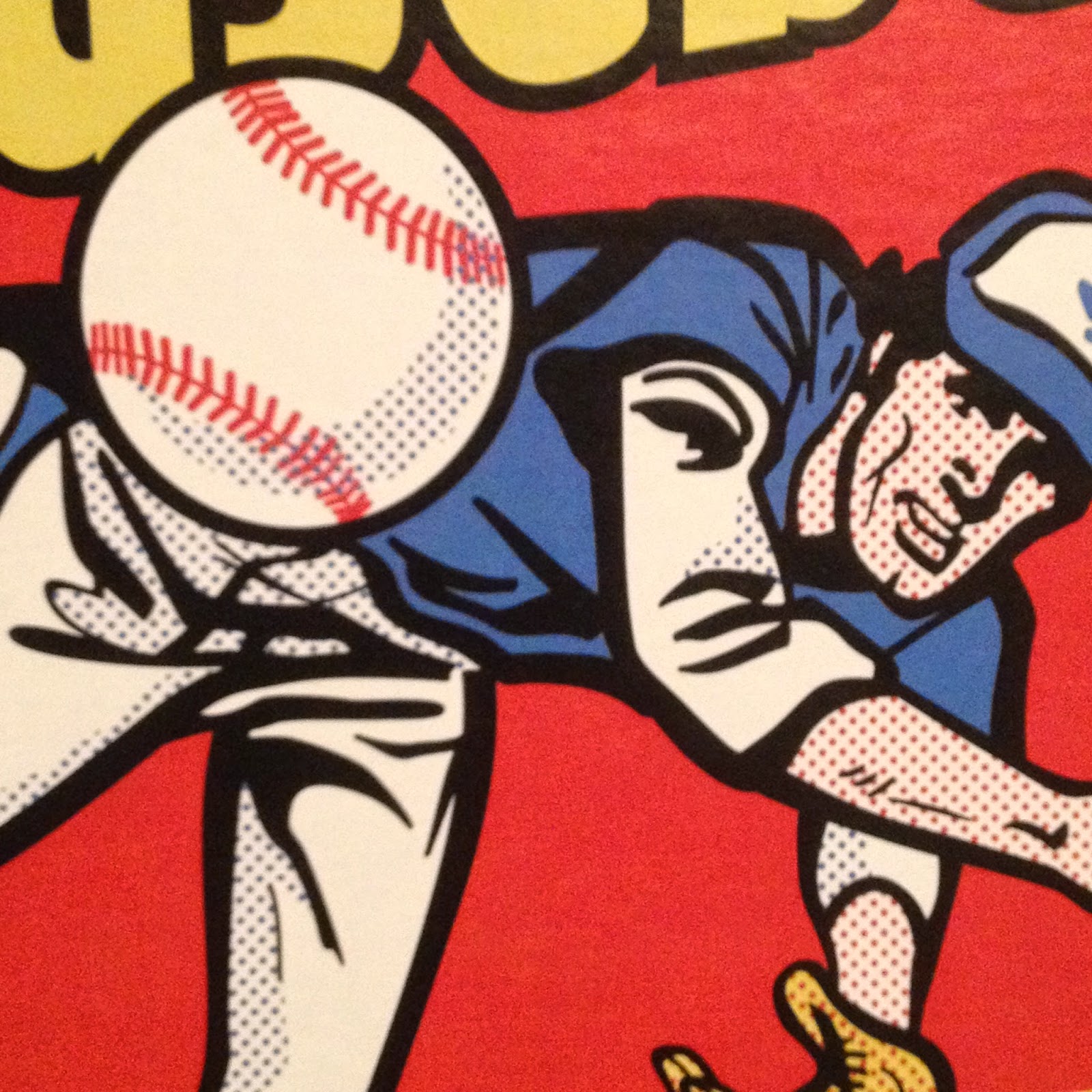
And here I am 39 years later still learning something from this image. The use of dots like that automatically makes anyone with a little grounding in 20th Century American Art immediately think "Liechtenstein!"

And I guess after all these years I have finally realized his influence on this wrapper. Topps had a long history of being attuned to the Art world, not just the sports world. But upon opening this package, I also noticed the dots are probably part of the image to produce a proper shading effect when the image is shrunk to use as part of a consumer product. Thereby realizing an insight into Roy Liechtenstein's work that I had never considered before.

See, I told you baseball cards were Art, and all before you even open the wrapper! The things I learn from these things… I so wish I could compare my new insights on this to the one 1975 wrapper I have in my collection, which is unfortunately still stuck in a storage unit while I can barely fit a card desk in my current living quarters. Arg.

Although I have made little progress on my ongoing goal of learning good photography composition techniques as that is just way, way down the always too long To-Do list (luckily babbling to you dear readers is much higher up the list), I am pretty sure a diagonal line is a strong element of an image. So is a flowing curve. So are primary colors like Red and Yellow. So is an image with motion, and an image that invites the viewer to wonder what is going to happen next. This image has all that, and a pack of cards inside. Come to think of it, all of those exact same compositional elements are part of my other purchase directly from my Topps master, which hasn't arrived yet, or else I would be short one future blog post right now.

I'm sure there are other things to learn and realize about this classic (All-Time?) Baseball Card image. I'll leave the Art Theory alone now and get on with some other great things I can gab about this. I failed  my only Art History class when I wrote up a 'review' of an assigned painting by trashing the ridiculously overwrought frame of the piece, loaded with ceramic grapes and fig leaves and gold gilt, just hideous, instead of writing about the painting inside the frame. I was told to write what I saw?

Now last year I was delighted to open a pack of Baseball Cards and find a sweet brand new Baseball Card inside:

This is one of my favorite Sea Turtles, for what should now be an obvious reason. Though I love card images that bring to mind classic wrappers (I've posted two cards that recall the '77 Topps wrapper), I've never posted this one because I kept thinking I could find a better example if I just kept looking at enough of those worthless base cards nobody wants any more.

Perhaps I will someday. Meanwhile as I have been composing this post in my head for the last 36 hours, Gallardo has won two games in two days - and he is in the starting rotation! Tonight he pitched 6 2/3 innings and got a W. I've always though a Pitcher should get an extra W (at least) when he gets a GWRBI. Yep, last night Gallardo, a former Silver Slugger winner, came into the game as a pinch hitter in the bottom of the 10th and delivered a walk-off Double. Topps had better keep it's act together and deliver me a classic Baseball Card of that next year. Or more than one.

At some point last summer that card led me to finally use this Internet deal to look into that image from the 1975 wrapper. I was hoping maybe someone had sleuthed out who drew it up for Topps. Instead, I found this:

Mets Card of the Week: 1975 Hank Webb box


which is a nice succinct write up of this image:

This is not something I could remember from 1975. When I saw those boxes of cards, ole Hank was likely already ripped off the top of the box, or tucked out of the way to make room for some other box of candy that generally surrounded Baseball Cards back then.

So the wrapper image starting out as a real photo never clicked for me until I stumbled across that blog post.

Of course in the 21st Century, Hank Webb's life story is just a few clicks away, and as it turned out 1975 was a very good year for Hank Webb as he cracked the Mets rotation for 15 starts and went 7-6 in the process.

And like the superstars on the wrappers and boxes today, Webb also has a card in the set he fronted for every single other card:

I'm pretty sure I have this card, as I can recall most of the cards of the Big Red Machine that rolled over my various Pittsburgh Pirate rookies, and I always seemed to pull cursed Reds cards.

This was actually his second appearance on a multi-player Rookie Card, which happened in the 60s and 70s but compared to young players today, well, whatever. The Mets360 blog has more on Hank here.

Also on that blog I learned that my Baseball-Card-wrapper-introduction-to-a-lifelong-fascination-with Art has a son.

Do I mean this one?


No, that is a topic of a future blog post some wonderful rainy day when I can finish ripping that box and starting in on collating that neat set of real cardboard Baseball Cards. But that wrapper definitely owes a little something to 1975 Topps. And some to 1977. And 1976.

It turns out that actual player on the 1975 wrapper that will eventually hang on my wall has a son that is pitching in the Major Leagues today, currently doing fairly well in the bullpen with Baltimore. And sure enough, I have his baseball card:

Whaddyaknow, it's a post release In Action shot of a right hander complete with leg-kick. Nice! This is a pretty good card, though it suffers from the usual practice of the current Topps Baseball Card set editor, who frequently has no concern for slicing off bits and pieces of the ball player with the card margin - that always looks sloppy to me in an age when any image can be manipulated quite easily.

[And really Topps, out of all the subset / inserts ideas you keep reusing for better or worse, bring back the Father & Son cards already. I think a whole lot of collectors would like that.]

Even so, the 2012 Webb card is another nice piece of Art. Art is more enjoyable with Context, and I have sure discovered a lot of that for 2012 Topps Update #US253. The Art elements I like are the banding of the infield grass and dirt, the sense of paused, just-completed motion, but with imminent activity as the ball reaches the plate, and the blurry empty seats in the background. That latter element is not a standard sign of quality Art, just a photo feature I always like on Baseball Cards.

Because as I mentioned above, that is what matters when it comes to Art and Baseball Cards. They are your Baseball Cards. You decide which ones = Art.

Wednesday, May 28, 2014

Beguiling Binder Page #5

So good to be at home - where I can get baseball cards delivered.

A few came the other day, a small lot of 2013 purple parallels. It filled 2 crucial slots in my ongoing Parallel Project as well as one in a small side project, and included a David Price card that will likely pay for the whole lot when ever I finally find the time to assemble a box to send off to COMC.

How is the project coming along, you ask? This is my 7th page completed for a 990 card set. I have reneged on declaring a Series One page completed due to dislike of the Kevin Millwood card I used for reasons illustrated below. I have a whole lot of other pages waiting for either a single keystone card to complete the page, or one difficult card to appear to release a mishmash of possibilities amongst the retail parallels I could use on the page, especially in Series 2. I know doing the Update set this way will be a years long slog, needing a /25 Sapphire on every page just as a starting point, but I'm not too worried about that with the baseball card buyer's resources of ebay and COMC available to help.

One of those slots filled yesterday (the Ryan Dempster) completed a page, card #s 395 ~ 403:


This page has one of my favorite parallels of my whole project so far, the David Wright card. That edition there is the Opening Day 'blue foil' version, which works just exactly perfectly for the Mets' cards. Well, last year it did at least. This year's cards don't have enough orange on them to keep you awake while perusing the Mets cards, which is a comment on the main 2014 design, not the current Mets team. I like colorful baseball cards, obviously.

It took me a while to decide on some rules / preferences for which parallel to use of which player. The Wright card was a bit of a no-brainer, as that was pack pulled. The black and pink on this page, well, that mostly depends on what shows up available cheaply as part of a lot, which is how I ended up with a really nice teal-on-pink card of a great Mariners pitcher who generally mows down hitters in the shadows of a more famous rotation mate in an obscure corner of baseball country.

It also didn't take me long to realize I didn't want red teams on Target cards, or blue teams on Wal•Mart cards. And the basic combination of red-on-blue looks so nice on the 2013 design that I tend to select it for favorite cards, or favorite players, such as for this example of my general like of Aroldis Chapman 'In Action' cards, even though so many of them are basically the same.

For the wrapper redemption 'Blue Sparkle' cards, obviously I nixed the blue teams, though that leaves plenty of options on this page. Generally I like the cards with a mix of tones to the background, as then you end up with green sparkles in the image contrasting nicely with the blue sparkles of the border. Thus, images with infield dirt or vibrant turf work best; I'm sure the Dempster card or the Aviles card would be very nice as a Blue Sparkler. But sometimes I just have to go with what is on hand in the stacks of cards before they head off to a hopefully friendly not local internet re-seller.

All those selections left just a decision on the mysterious Tom Wilhelmsen, card #402, perhaps a sly bit of dyslexia on the part of the Topps set editor, and a footnote for a future blog post.

But really, for the Ricky Williams of MLB, what other parallel could be used but the green one?


Monday, May 19, 2014

How Not To Do It #3

For some cards, the caption writes itself...

Unpacking some cards is always pleasant. You bought them, flipped through them, forgot that one keeper card that you discover the second time you flip through them.

So, from the interior portion of a re-pack impulse purchase somewhere this winter…

Perhaps the obvious mental caption is so obvious, I should just leave it to your brain to fill in for me:


Are we there yet?

"Too much chicken."

Sunday, May 18, 2014

Following a player because of their Baseball Card

I'm sure this happens to all of us. Or at least, the collectors who just like baseball cards because they are baseball cards, not because they are instant financial instruments as soon as a player is drafted (or before) and his baseball cards are printed.

I have a new player on my cuz-of-the-card horizon:


I liked this card a lot last year. I always set aside the Topps All-Star Rookies anyway. But I always like cards with this iconic batting pose, probably because of this:


There are other cards which are a tighter simulacrum of that wrapper, but the Frazier card reminded me of it anyway, and that is a good thing. (I have made no progress on discovering any remnant history or examples of the 'Baseball Card T-Shirt' I always wish I would have ordered way back in '77).

I also like the All-Star Rookies in Heritage:


But a baseball card showing a baseball player with a huge smile on their face is just always a successful baseball card.

Obviously Frazier is liked at Topps HQ as well, being on their All-Star team and all. His 2012 card was enjoyable enough, though I'm not much of a Brandon Phillips fan:

And his Rookie Card was, well better than some and a good example of the wonderful 2011 set style, but not that high on my whatever-happened-to list:


Though I like all of these cards, why would I want to follow the career of an almost completely average  (though with some power) National League infielder?

Shouldn't I be more interested in this marquee player on the Cincinnati Reds?


Yes, sure, I like Joey Votto, he is an amazing player. I felt bad for a friend of mine who is a die-hard Reds fan when Votto headed off to the DL recently.

But when it comes to players on teams playing in leagues I don't have all the time I wish I had to follow, I lean on my baseball cards to pique interest in particular players.


Let's not work too hard on those worthless base cards now, Topps, be sure and save up for those gaudy hits cards everyone wants. But those two cards just aren't getting me very interested in taking the extra 60 seconds to read the Cincinnati box score when I can.

And even all those nifty Todd Frazier cards shown above haven't done that (I'm still on the hunt for his 2013 'Out of Bounds' Series 1 short-print). Nor has his heart-warming connections to honorary Cincinnati Reds ball-boy Teddy Kremmer. No, what tipped the scales for me to keep an extra eye on the middle of that box score was a brand new card I pulled the other day.

Last year I suggested that every set should have one of these cards (though I have no plans to see what ever happens to Kevin Frandsen) i.e., an on-deck circle shot. I like those. I like light-towers. I like clouds on a card. I love seeing the third deck on a card. I like the cool sox. A card that would be right at home in any number of vintage sets, and positively screams BASEBALL:


Wednesday, May 14, 2014

A Lot Going On #2 / What IS That? #9

I've been wanting to post this card for a while. Heck, I've been wanting to just post at all for a while. That job in the Town Without Baseball Cards became a 16-days-straight marathon.

But I made it all the way home finally, for the first time in 5 months. To where the bulk of my baseball cards live.

And my scanner, as in an actual sheet of glass with a cover real-deal scanner. So I scanned a card for you to ponder:

I have loved this card since the day I pulled one from a pack. Because of course, it has A Lot Going On.

At this point though, I have to stop and acknowledge a source I borrowed for the format of my blog; awhile back I noticed one of my other main card blog reads just over to your right there doing this. Repeating a post title with a sequential # is of course borrowed from the card blog that got me blogging, which else but the inimitable Night Owl Cards.

I really liked 2012 Update for some reason. I put it together by simply purchasing pack after pack. I can't remember what I was chasing in it, or why, but looking back on the binder pages now, well that is an enjoyable activity. It is definitely binder worthy. I am starting to have my doubts about that on a few other collecting efforts I have ongoing.

That's Brian Bogusevic there on that card, as even my sorta pro scanner can't handle foil-on-black. Bogusevic had been traded to the Cubs not long after '12 Update was released, though of course he still ended up on an Astros card in 2013 Series One. Which begat him a Cubs card in '13 Update. Perhaps that created the mojo that had him shipped to the Miami Marlins last November, in exchange for the ice-card man Justin Ruggiano. Topps seemed to know the future on his career as he was left out of '14 Series One and he reportedly had a tough go of it in Spring Training this year. He is currently "raking", as they call it, back down in AAA, but Miami is loaded with young outfield talent and I'm not quite sure why they felt the need to trade for Bogusevic to start with.

Be that as it may, this will always be one of my favorite surfboard cards. I always like cards showing the railings in the stands - they set up a great sense of the lines of the image.

And what a menagerie this image contains. Quick, name another baseball card that features two different uniforms of the same team on the same card. Or one that features two player uniforms AND a team executive get-up too.

What is that exec up to anyways? Drinking a beer in the stands? How many baseball cards show an actual container of beer? It looks like a tall-boy of Heineken to me, but let's go to the Zoom and find out:

Hmm, could be one of those energy drink things the kids today are all so addicted to that they can't figure out why they don't have any money to spend on sensible things like baseball cards. I'll just always presume this is a can of beer though. Beer and baseball, mmm-mmm.

But that is just ho-hum compared to what else is happening on this card. Over to the left of the would-be drinkin' exec, it appears a now somewhat frightened fan brought her dog to the game. A dog on a baseball card? I know that happened in those wacky 90s, but in the stands? Let's make this laptop in my lap earn it's keep:


Rover's arm looks a little stiff there, must be … stuffed. ? A stuffed animal on a baseball card? Surely even the 90s couldn't have accomplished that?

And what is going on with that stuffed dog anyway, it appears to be wearing something. It has multiple colors and some sort of number or icon, much like a … baseball uniform. Four uniforms?

And that older gentleman calmly checking out this sweet catch by Bogusevic (the baseball appears on this great card too - it is snagged safely in the glove), he is wearing something that sure looks to have an S-T-R-O on it - A-S-T-R-O-S = another uniform. Five different uniforms on one card? That has to be some sort of record. Four from the same team, even an All-Star Game card couldn't achieve that.

Then we have a final mysterious element:

So What IS That? A coat? A purse? And what's in there? If Bogusevic doesn't make this catch, is this person going to bring the pain down upon him somehow?

And Who IS That? Looks nicely "Chinese-Eyed", an expression from my youth which had nothing to do with ethnicity. Is there a bong in that coat-purse thing? Is Lindsay Lohan a let's-go-to-the-stadium baseball fan? Nice hat.

I like cards with lots of mystery elements; I still like the very first one I found, and I must admit one reason I finally got around to blogging up this 2012 card is that I want to simply show-off a recent acquisition of a special edition of the card I wrote up in the first installment of this series. I didn't make it on time for an apropos anniversary posting a few days ago, but I am just tickled, of course, pink: