Thursday, November 28, 2013

Only one sleeve - What's Up With That?

Well I'll try hard to stick to the visuals - baseball cards, duhh - on tonight's post so that 3rd turkey sandwich you just snagged from the kitchen won't lead you to fall asleep reading my blog. I'll let you wander off to consider some checklist somewhere for that. Maybe some Japanese cards...

And I'll be showing you cards from Series 1, which you might not have seen for a good 9 months or so now, so that should keep you intrigued. And these happen to be the cards I am trying to put away, finally, for the season.

So let's see a card already!
Bats: Left     Extra Sleeve: Right

I love how on this card it looks as if Moose is trying to catch the Turtle. If this card weren't so blue, blue, blue everywhere I would probably have it on a year-end list of some sort. But I promised cards, cards, cards...
Bats: Right     Extra Sleeve: Right

Bats: Right     Extra Sleeve: Left

Bats: Right     Extra Sleeve: Right

Baseball Reference lists a Final Game, so you might think this is a Sunset Card. Except he hit .292 in Japan this year, with 28 Home Runs, and his team won the Japan Series...so now he gets Sega Card Gen cards, a terrible discovery to discover. Topps makes cards of American major leaguers in a foreign country and uses all unique images on them! No repeat photos for their discerning Japanese arcade game customers, no sir. Don't blame me for what happens when you finally see 'em. Here, I'll give you an excuse: An MLB themed bar in Japan even has waitresses in go-go boots parade the cards around. I Kid You Not. It's not my fault.

OK, Ok, I'm sure you expect to see some proof of that bold claim. Here yas go:


Well, if you slept though that part, there's just no helping you. Buy a set of these wonderful baseball cards? Sure thing, uhh, maam, I was just thinking that myself. Anything you want... 

Baseball cards just can't get much more exciting than that ... can they? We'll see.

But now that I've beat back the extra turkey sandwich droopy eyelids, let's get back to some boring old baseball cards. I'd rather look at go-go boots, myself:
Bats: Right     Extra Sleeve: Right

Now this is one of my cards-of-the-year. Torso shots aren't all terrible at all, I just burn out on the quantity of them. I really, really want the black border version of this card, though not nearly as much as I want to hang out with go-go boot wearing baseball card fans. I might have to settle for the /100 Chrome black-border though, rather than the /62 Hobby-Only version all these hobbyists have parked in their collections by now. If only Goldschmidt had hit a half-dozen more home runs...I have his Gold card already, and Cutch cards might be a little more obtainable. All those retired fans out in the desert don't want baseball cards any more. But here I am typing again, what's up with that? Here's another card:
Bats: Right     Extra Sleeve: Right

Bats: Left     Extra Sleeve: Left

Bats: Both     Just One Long Sleeve: Left

Does anyone really like switch-hitters? I dated a switch-hitter once. It didn't end well. I wish she would call me though...
Bats: Left     Extra Sleeve: Right

This card is like a memo. To: Wil Myers baseball card investors.

Bats: Left     Extra Sleeve: Left

Bats: Right     Extra Sleeve: Right

Wheee, I can fly! I've been trying to figure out a way to post that card all year long.

Bats: Right     Extra Sleeve: Left

I still don't know what is in his back pocket.

Bats: Left     Extra Sleeve: Left

I don't remember seeing that last guy playing in October. Oh, yeah, that's because he plays for the Cubs now. Played 70 games this year in Chicago actually. Didn't make the cut for a new card in Update when all those Astros collectors demanded an extra copy of the Chris Carter card I suspect.

I watch baseball on my baseball cards far, far more than I watch it on TV. So when I started seeing all these ball players on their cards with one bare arm, I asked myself: What's Up With That?

I figured maybe that extra high-tech, special athletics-fibers sleeve they are probably wearing might make it sting less when they get hit by a pitch. I mean, for hit-by-pitch questions, all I have to do is turn to my trusty baseball card of Shane Victorino and see what's up, right? His Series 2 card (Sorry, my scanner already dell asleep, and since it runs on an ethernet cable for some stupid reason, it is hard to wake up. Something to do with the 'ether', I guess, you'll have to look up his card in your own collection for 'proof'.) ... anyway, on Victorino's card he is batting left, with his one extra-long sleeve on his right arm, though of course he typically just manages to artfully get his uniform brushed, not actually take a hit on his arm, 'kept when he does, he squirms around like it really does hurt. Aww.

But Victorino is a switch hitter, or was, or will be again next year, or who knows? They can't be trusted. So I knew I would have to just do my homework. Thankfully, I could use my baseball cards for the task. Was this extra sleeving of one arm in any relation to going up to the plate?

You've seen the results above. On 4 of the 12 cards (ignoring the switch-hitter card) - a .333 average, thanks baseball for teaching me math, the extra sleeve would be deployed facing the pitcher. On 8 of the 12 cards, bare skin would face the pitcher.

So despite my baseball cards' best efforts, I am no closer to unraveling the mystery of Only One Sleeve. So, What's Up With That? 

Maybe my baseball card waitress might know. Excuse me, miss...


There are Umpires at the baseball game?

Because I just don't see them on my baseball cards much any more.

I received this card recently; not in trade, but as a bit of packaging protection in a shipment from an eBay seller. The fate of early 1990s baseball cards...
A nice, basic, horizontal baseball card. A Turning Two card, most likely selected out into many collections of such cards.

But what immediately jumped to my attention is the Umpire there. You just don't see many cards like these. We still receive brand new Turning Two cards from Topps, but the Ump is so often edited completely out of the picture.

Now I'm not suggesting Umpires should be on baseball cards. They shouldn't, generally. Baseball picture cards are supposed to feature the players, and oh how well they do now. I just prefer baseball cards that depict the game of baseball, rather than make fetish objects out of the players. Baseball card collectors are always saddened by the size of "The Hobby" today, and wonder why more people aren't interested in it. I'm beginning to think the steady banishment of baseball pictures in favor of the ego-gratifying celebrity-worshipping products that baseball cards generally are today, is one, albeit small, part of the reason.

When I started pondering this toppic the other day I knew I should compare my old-fart complaints about those kids today to cards of years past. But I don't really have the collection for that, with my wonderful 70s/80s cards in a secure remote undisclosed location for the time being, and only large portions of 1991 and 2001 Topps sets to check out. 2001 proved to have a whole lot of live action photos, but no Umps; the images were all sensibly cropped down to a single baseball player, as they should be. You do usually get to see their feet however, which allows in more glimpses of that game context I crave. And again, the cards should be about the players, not the Umpires.

I knew 1991 likely held few of the action shots I seek. That led me to the set that brought me back into everyday collecting, the 2011 set. I fondly recall some Umpires on a 2011 insert set, the Kimball Champion minis:
I like those little cards, where it looks like the Major Leaguers are playing on some small town ball diamond with a forest in the background, but am only saving 2 binder pages of 15 each, rather than collecting all 150 of them. I am down to 8 entries on my want list and have about 50 left over, which I would like to find a good home for. They're not worth sending to COMC.

Now the 2011 set has standard cropping very similar to the 2001 set, but far more horizontal cards, and those are usually dramatic entries in the set. It didn't take long to find one:
A complete slice of baseball action there. I always like cards that capture the press pit there in the background for some reason, though they make me wonder who Topps hires to get such shots, as they obviously aren't over there with the rest of the media.

But let's see what happens when we apply the 2013 zoom style to a similar card I know you all probably remember from Series One this year:
Now the Umpire is just a lurker? No, though even lurking umpires are few and far between on the backs of the Sea Turtles. They can be found on the Ben Zobrist I-just-murdered-the-catcher card, and the spectacular Pedro Alvarez card.

There on the Utley card, the Home Plate Umpire is still present, with just his fingers on Buster Posey's back there, which I found quite touching. Ouch. The Utley card is still a pretty good card, but despite all my bitching about the zooming in to the all torsos, all the cards this year, I have never liked cards that don't show a player's face, no matter how spectacular the game action we receive in exchange. It just seems disrespectful, to me.

But that's about it for Umpire Action in Series 1 & 2. A couple blurry lurkers, and one headless umpire that I was very grateful to have on a card, as I used his uniform # to determine the results of the bunt on the wonderful Erick Aybar card.

Now that Aybar card introduced me to an outstanding baseball card vantage point, seemingly from a point just above and behind the pitcher's shoulders. I'm not sure just how new this is, as I don't have enough baseball cards to ponder. Does anyone ever have enough baseball cards? Topps came through with another fine example of this in Update, on what could become a classic Rookie Card:
Now to me, that is already a great baseball card. Arcia is still a promising young Major Leaguer, but if he hits 30 Home Runs next season collectors these days will be scrambling for all his shiny photo-shopped serial #d relic autograph cards....every card but this one.

I'm not sure how Topps gets these photos. Maybe all that digital / optical zoom technology they overuse now has it's advantages I guess; perhaps these are even stills from the video feed of the standard baseball-on-TV vantage point. I have never fully understood that view; I have always wanted to watch a game from the Umpire's vantage point. I sat 7 rows directly behind Home Plate at Comerica Park once, watching each pitch come right at me, and I've had a bit less desire to go back to a baseball game ever since; unless I could return to that simply awesome vista of baseball, which is how the game should be seen. 

However these photos arrive in my packs of baseball cards, Topps certainly deployed it to good effect on the live-action All-Star cards this year:
There are several of these shots used for the All-Star cards, and I have already featured another great one. Whatever the technology at play, it's only a tad better than the TV cameras at handling Max Scherzer's max out the tint orange shoes there. Is this his hint that he hopes to play in Baltimore in 2015?

Topps does get their photo equipment dialed in to deal with more great orange shoes on an actual Oriole player, Adam Jones:
Though here we are back to an obscured Umpire, I added this tonight because I certainly flubbed not including this one last night ... where else are you going to find two memorial patches for two baseball legends, Stan Musial and Earl Weaver, on the same card but on an All-Star card. (The O's Weaver patch is moved to the left breast to accommodate the All-Star Game shoulder patch). I love the lines on this card created by the MLB logo, the umpire's torso, and the space betweem Molina and Jones. They lead you right to those wonderful shoes. Though lines trending down aren't good for baseball cards, they work out just fine here.

A few more of those cards shot from the same point are used for the All-Star cards in Update, and I am just fine with that, as these make for excellent baseball cards. Overall the Arcia card is probably my favorite Umpire Card this year, at least among the base cards.

But my actual favorite baseball picture cards including an Umpire appeared in an insert set in Opening Day this year:
The game is over, for everyone but the Umpire, lurking there to make sure Willingham steps on the plate after his Walk-Off. I'm not the greatest fan of these cards, or seeing this at a regular season game, though I guess some teams need to celebrate when they can.

Another card in those inserts actually is a home run though, for many reasons. A copy of it will probably make my Airborne binder pages, for one, and even though the card features the vast majority of the Washington Nationals - perhaps these are better than staid team checklist cards - I can't seem to find Bryce Harper anywhere on it, amazingly enough, though I have no plans to look too closely:
Now I had hoped to deploy my own digital technology to figure out which Umpire this is and give him some props here, by zooming in on the scanner results, but that didn't work out. Just not enough pixels available, I think.

Whichever Ump it is, I love this shot of the Umpire, an integral part of every Major League Baseball game, all the way to the end. Whether Topps ever notices them or not.

Wednesday, November 27, 2013

Patching Around #3

Tonight I ignored all the odd little oddities I've discovered on baseball cards the last few days and got back to work on a baseball card collection: Patch Cards. The thin kind, without any swatches on them:
I happily discovered this year that the Update set has the first examples of all the patches seen around Major League Baseball this season. Who would have thought...the Series of baseball cards updating the 2013 sets would use pictures from ... 2013? I could have had a V-8 for a snack this afternoon too I guess, though I would prefer a Doh! nut. I love how the automatic spelling checker doesn't balk at the word 'Doh!' any more.

That "4" there is the memorial patch for Earl Weaver that the O's wore this year. For all of these, I'm sure we'll see more examples late next January when Series 1 arrives, and I will have to make permanent binder selections then, as I only want to keep one example of each patch I find.

I also realized this fall that I should pay a little more attention to the photos on the insert sets sometimes, as I discovered the Update minis include some 2013 images too:
I know I will prefer a permanent keeper copy of that patch on the home white uniform, but mixing minis into a subset collection ... dunno how I feel about that. I'll probably just hope to see this patch again on some 2014 cards.

The '71 minis somewhat surprised me, in terms of image selection. I guess I was somewhat scarred by the Series 1 '72 minis. Even though I love 1972 Topps baseball cards and dutifully collected every little set of them Topps made this year with the design (S1/S2 minis, Archives, Day-Glow Archives, and the Chrome inserts), those first ones I discovered last winter included the Mark Teixeira which was a repeat image of his base card. If I had pulled that base and the mini insert in the same pack I would have probably been so mad I would have skipped baseball cards this year. That card kind of led me to assume the photos on the minis were mainly just a 'photo-dump' on the part of Topps, re-using any old photo they had lying around, such as for some of the vintage stars in the set. Perhaps right now you were just looking at Adam Jones' 2014 base card photo - we'll see.

However checking the '71 minis I do have for patches led to a few nice discoveries. Fans of throwback unis will see a few when I get around to assembling those for their fun binder pages; I haven't got that done for Series 2 yet and here I am already pondering next year's baseball cards. I also got more acquainted with this darn good, but not perfect, baseball card:
I just love that image capture there, showing the physics of hitting a baseball. But what is not perfect about this card, you ask? Well, doing my homework on this card led me to discover that the 'EMK' patch Brett is sporting there is a memorial for former Royals owner Ewing M. Kauffman, yes the namesake of their stadium now. The Royals wore that patch in the 1993 season, which was Brett's last. This led me to thinking about how nice it would be to have a baseball card of George Brett, with an awesome action photo from his final year of play, and his complete career stats. A perfect 'sunset' card, even if issued post-career. But this card just isn't that. The 1971 cards use the abbreviated previous year + Life style stats, so this card just has Brett's career stat line. Impressive as that is, I like looking at them year-by-year. But then that isn't all that feasible on the minis anyway. So this is probably the first baseball card I've ever acquired where I actually hope to see the photo repeated on another card eventually. The photo is that good.

The '71 minis also showed me another new patch, and the whole check-the-patches also revealed Topps using some dated photos on these cards as well. The Miguel Cabrera '71 mini shows a portion of the 'Sparky' patch the Tigers wore in 2011, for example. Anyhow, the Shelby Miller card displays another memorial patch this year, for Stan Musial:
When I first saw this card, I briefly thought it might be a reversed image somehow, which I've never fully understood on baseball cards, because it looks like Miller is sporting a backwards "3" on his sleeve. But the actual red birds are looking correct, so that hunch was obviously wrong.

Fortunately, one of the base cards has a somewhat better view of this patch:
Though I suspect I will be hoping for a better shot of this one in 2014 Heritage.

I discovered one final uni-# memorial on 2013 Topps baseball image products while sorting some stickers for a trade:
I recall that one on the Huston Street card, which I will use in my binder page for these. Another nice find on the Topps stickers; once in a while you can get shown these things in the strangest of places if you look at them right. Researching that #48 there (worn as a tribute to their former Bullpen coach Darrel Akerfelds) led me to a handy website listing uniform memorials maintained by the actual Baseball Hall of Fame, though they admit their list is not complete. Perhaps they should collect more baseball cards.

The base Update cards included one more with a traditional seeming, basic number - 19:
However that one is not for a baseball player; rather it pays tribute to the 19 members of a US Forest Service "Hotshot" crew killed fighting a forest fire in late June in Arizona. My father fought forest fires in his career. Thank you, Arizona Diamondbacks.

Aside from baseball's long tradition of wearing memorial patches, there are a few other varieties:
Going forward, I think I might use my editorial prerogative to just reject anniversary patches that are simply too boring. 

I will have a tougher time considering this patch worn by one team per year:
The 2012 World Series isn't one I'm very excited to memorialize, though I find it a touch ironic to see a Rookie sporting this one. I'll probably just get over it and replace it with a better example next year, should I find one.

I can't always decide what to do with a basic team logo appearing on player's shoulders for this collection. But I do like seeing new patches, and the main (only?) new team shoulder patch in MLB this year was worn by the Houston Astros. The Astros had probably the fewest cards of any team in S1/S2/Update, at 23 or 24 cards not even reaching a full roster. For their Series 2 cards Topps dutifully rolled out their new duds, though generally with that tell-tale satiny sheen their software wizards just can't hide. So this might be one of the first "real" on-card appearances of their new, old, logo (their old, new logo?) -  
That logo is almost saying "there's a new sheriff in town" ... except, of course, there wasn't.

Now there is one team icon - it's not their logo - that I love every time I find it, and I hope to assemble a whole binder page just of variations of this one. I have a real gem example of it I found that I plan to show you next year. But meanwhile, this new Ben Zobrist All-Star card will definitely help move such a Ray page to completion:
My first Blue Ray baseball card.

OK, so all the Ray patches are blue actually. And even though utility reserve Ben Zobrist didn't actually appear in the All-Star game, I think that sweet Ray sailing the American League blue uni seas there scored Zobrist this bonus baseball card appearance. Which is way cooler than the card for your 2013 Houston Astro American League All Star Jason Castro, which doesn't even exist.

Tuesday, November 26, 2013

Beguiling Binder Page #4

We once again interrupt originally scheduled baseball card blogging content to just simply show off some baseball cards.
This is another page with a blogger credit attached to it as I believe the Target Red Billingsley arrived in a trade from the Night Owl, who was kind enough to read all the way through my lists of parallel needs.

This is a nicely bright page thanks to the keystone card right there in the center of the page, the Hunter Safety Paulino. It also feels like a bright page to me as there is no Gold card on it; I really like those, but though they are totally classy, they also look a little staid and dark when hanging out next to foil, sparkles, and wonderfully warring color combos like the pink/green Drew card.

Normally I would not construct a page in S1/S2 with three #/d cards, as generally only two are needed when I can use an Opening Day Blue Foil. But I was picking up a few other Factory Set Orange cards on ebay for 50 cents each; if I added in the Paulino shipping on each card got technically cheaper. Which made finishing the page just as easy with Orange as Gold.

Without all the pretty colors, this page is one of the most blah in the entire Series - no batters! 7 pitchers, a base runner, and a fielder. 9 baseball players all photographed in live game action, but only 2.5 baseball player feet. At least we get to see some spikes on the Seager card. But if it weren't for the Capps horizontal card I would definitely skip over this page very quickly in a binder full of the regular white border cards. 

I have come to realize that even though the standard Topps and Bowman sets are the only product Topps produces with any real baseball game background (and not considering Heritage/Archives, which deliberately mimic other sets' photo composition styles), Topps zooms/crops in on the players for a reason. I think it it could be because Topps thinks this is what collectors want. With the success of "inserts" and "shiny" and the endless combinations of those concepts with autographs and relics, all of which are baseball cards completely devoid of baseball game context, it does appear that is true. In the ego-driven hobby of today, where collecting is done so often for the rather sad "joy" of simple possession (in my opinion), rather than for the enjoyment of the aesthetic qualities of the collected object, this is the natural end result. Prospectors don't care in the slightest that recent draft picks are photo-shopped into major league uniforms and set amidst any goofy background Topps happens to design for them; on high-end cards, simple floating heads are more than sufficient when the real draw is the other other objects on the card. In short, the photograph is nearly an irrelevant portion of the product for many of the purchasers. So why not zoom a live action photo all the way in? All that matters is the status endowing color of the shiny border, and what number follows the slash on the /# part of the card. The lower the #, the greater the "joy;" though all this psycho-babble does short-change the idea of enjoying the aesthetics of shiny inserts, which I do enjoy at times.

The other day I was working out a trade to finish the small set of Update Chrome. My trading partner said the only thing he could offer me was the last MB card I needed, the Puig Rookie Debut, and one Camo parallel from Update, because after that he "didn't have any other numbered cards left." Base cards don't count....who even wants to own them? But there I go again... 

So anyhow, this could be the most pitching on any binder page; I have been meaning to look into that but I think I will just do that as the pages slowly complete, which will probably take long into 2014 as I move acquisitions for this from ebay over to COMC while I am away from home. I look forward to starting out on that site.

This page came together unexpectedly tonight; no cards for it arrived in the mail today. It is one of the more satisfying pages yet as it is my first 100% complete Series One page. I didn't dream up this project until a bit after Series 2 was released, and Series 1 lags far behind. The last card to actually put in a slot was the purple J.A. Happ, even though the last card acquired was the Paulino. The Commissioner saw the empty slot and thought, hmmm, I seem to recall a purple Happ around here somewhere....

Syncing card stacks of 7 main parallels colors with free agent card acquisitions on the 'bay and what can be found on trading blocks is a complicated affair. No wonder this page ended up fielding 7 pitchers and no batters. At least I won't have to keep these 9 players' laundry straight any more.

Monday, November 25, 2013

What IS That? #8

Flipping through the binder tonight, pulling cards for a subset I collect and share with y'all, an entirely different card elbowed those cards out of the way with this post-title's usual burning question.


What IS that, off beyond Jose's left shoulder there? That big ole white space full of nothin'.

A map of Illinois; i.e. Topps suggesting L.A. should trade this young fireballer to Chicago?

The vortex created by a triple digit Dominguez fastball? (I think this card will enter the Dizzy Collection I started recently. It almost looks to be a The Pitcher Isn't Pitching card, but when you realize he did just let one fly, you wonder where the ball is....then the room starts to spin....I think I need to lie down now.)

An attempt by Topps at placing a giant asterisk on a card of player who briefly reached the Major Leagues after two PED busts in the minors, which had to be hurriedly airbrushed away when it was vetoed by MLB at the last minute due to all the impending circus-like "litigation" this off-season?

The baseball gods tapping Dominguez on the shoulder to suggest there should only be one "Little Pedro" in the game at a time? (He was shut down for the season with a quad strain after only 8 innings of work in June).

A really bad photograph?

A hole in the Space-Time Continuum?

All of the above?


Friday, November 22, 2013

I guess you could put it that way


Just a basic rookie card. Lots of visual positives. Junior's gaze seems to be watching something...a Home Run perhaps? The dramatic batting gloves catch your eye...they lead you right off the card - up, up, up & away? Man I've got a Home Run on the brain now.

Let's check the back and see what happened.


Oh. What were we talking about?

Thursday, November 21, 2013

Beguiling Binder Pages #3

A great mail day evening. A binder page is complete!

You can probably guess which was the hardest card on that page, which arrived today from blog reader Jimmy, who is building complete sets of the red-border cards from Target. I tend to select cards of perennial All-Stars from the East Coast, such as Cano, on the cheapest parallels possible to try and stay at least a little fiscally prudent in this completely imprudent project. I won't use a blue turtle on an emerald or a Wal•Mart blue-border, so that left a Bullseye card for Cano there. 

It was also a challenging page due to an early acquisition of Koji Uehara on the hobby-only black border edition, which probably came in a lot of several such cards, well before the postseason. Uehara had such a stealth season until the playoffs, with some incredible stats this year. But then the pre-2013 #s on the back of his card look darn good too. There were probably 3 American League GMs kicking themselves during the games in October this year.

So that was a pretty nice pick-up for the project by this GM typing at you now. But it created a problem...5 more blue Sea Turtles to find pigment for. With Leprechaun and Wally-World-cards ruled out, that meant finding a 3rd low # parallel after the Uehara card, as only 3 cheap parallels were left to use for the blue teams - one from Geoffrey the Giraffe (Toys-R-Me purple), the pretty young things at Target, and a Topps Gold.

That's where the first of what I call the Hunter Safety cards was a handy find - the B.J. Upton /230 Factory Set Orange parallel. Those look sharp if you like bright things....if you are one of those boring people that think the world should be pastel everywhere, this isn't the project for you.

So finally trading with a second person building a parallel set was a big help. A number of Target Reds and a few emeralds from Jimmy came in for some of my Targets and 2012 Gold Foils. Jimmy also sent along enough Octavio Dotel and Miguel Cabrera base cards for me to finally start up some Player Collection lists to avoid duplicates. Thanks, Jimmy!

The haul of parallels also let me improve a page I had initially thought to be finished:
This involved a 3 team swap, something always exciting in Major League Baseball. It seems Drew Pomeranz really had a tough 2013 going on his baseball card. Photo/scanning/printing errors of some type on Topps' part just simply gave him an unattractive card; even a parallel couldn't save it.

But once I initially finished the page, I realized a foil parallel would cover for Topps. So with Jimmie's help Target Red was traded to Ryan Doumit, who then shipped off his camouflaged duds to Jason Hamel, who was glad to escape from the obscured world of Emerald Foil and let his vivid green background shine once again. This also got a blogger's card back on to the page as camo-Hamel had originally arrived from Ryan @ "O" No!!! Another Orioles Blog.

Confused yet? Don't worry, the Hot Stove Parallel League is just getting warmed up.

Meanwhile, out in the Bullpen

We get a baseball card there too. But just one, in S1/S2/Update at least.

It's not all that exciting to get this Bullpen Card, but that's more because Topps likes to zoom in so much and obliterate almost all baseball context from every card now, so I like the cards that bring the set some variety, somehow. (I'm sure you've noticed this by now).

I am fairly intrigued to know what is happening on that back wall of the Bullpen though. 52?

This is likely to be Myers' sunset card, as he made it off the DL for all of 4 games this year, and was released in August. There is one big clue to this on the card - once you see a gray hair on a player's card, well, you do the math. Baseball General Managers certainly will.

I do have a hard time understanding the set this year in regards to the zoom, zoom, zoom. Zoom zoom. Who doesn't like to say the word Zoom? Anyhow, it seems markedly different than the 2011 set in this regard. I have realized I need to do a better job of figuring this out via more homework, and I have a plan. Unfortunately you won't see the results until next summer, because I will have to get my 2011 and 2012 cards nicely tucked away in a binder, and I have been too busy with those durn parallels to do that.

I often wonder what experienced card-collecting kids thought in the early 70s when the first live action shots appeared on baseball cards. I know in my first set (1975), I much preferred the action cards. They were almost more likely to be seen on the playoffs cards, and even the highlights cards, it felt like, but I treasured the ones I did find, and this remained true throughout my youthful collecting days. Playoff cards today are just dumb, usually. If Topps had any smarts about those they will put an image of Justin Verlander, In Action, on the Tigers' ALDS card next year, after 2 straight years of winning a Game 5 in dramatic fashion. But instead we'll get a bunch of Tigers mobbing together in the general vicinity of the pitcher's mound, maybe with Verlander visible, maybe not. And I've wandered a long way from the Bullpen. This is a bull session however...

Now here in the 20-10s, I think Topps probably has access to the best sports action photography of all the decades they've been in business. And we do get to see that on the cards, frequently. In fact, a posed shot in S1/S2/Update is a very rare item these days. The ball player photos on the picture cards are nearly all from a live baseball game, but are then zoomed in so far they effectively look like a posed card anyway. I just don't get it. Probably, a live action photo is cheaper than a portrait shot, as less photographer and ball-player time is involved to a huge degree. But I just wish we could keep a little more of the baseball atmosphere all around the player image. Many of the posed cards in Vintage sets did let you see a Stadium or Spring Training setting behind the player. This is now very rare any more in the baseball card standard known as The Topps Set.

Anyhow, that's my final on that, until next year sometime, when I can compare this across 4 sets at that point.

But, hey, it's past time to see another card. I did discover one other Bullpen Card this year:
Which can only be discerned by the loops of cable up against the wall of the Bullpen, seen at the top of the card.

Most Rookies get a separate card in Chrome, and some collectors even consider the Chrome Rookie to be a player's True Rookie card. Whatever. I've never understood the attraction to Rookie Cards anyway, aside from the fact that I know it's not wise to just leave them piled in with the rest of the base card commons for ever and ever, just in case.

I recently finished binder-izing the '13 Chrome set (I just bought it, cheap), and will have several of those cards to show you, and too many thoughts on Rookie Cards. But this Wheeler card is the only one I can think of right now with any interesting context, and even this one is zoomed in so far that this isn't a very striking card, from a baseball atmosphere regard. I do like the harmony of all the parallel lines, and though they lead the gaze down somewhat, at least they flow off the side of the card, rather than straight to the ground.

I will give this card one bonus point though - you don't often see a Starting Pitcher in the bullpen, except in the Postseason at times. Makes you wonder just what Topps is suggesting here, though only an odd little baseball card blog would ask that question, and probably the Topps photo editor won't be answering it either.

Wednesday, November 20, 2013

Every set needs one of these cards

At least one, please?
A nice On-Deck Circle Card.


This one of course is from Update. I don't think On-Deck images have ever been all that exceptionally numerous in any given set. Baseball cards are generally always posed/portrait cards, or "action" cards which are going to be hitting, pitching, fielding, or base-running. 

And then there are the ones that don't fit in those neat categories, like this new Frandsen card that I really like. The image gives you a feel like you are in the ballpark, in a really good seat. Not in the press pit with an excellent telephoto lens. And we absolutely have to have these "other" card-types somewhere in a set, preferably a lot more than just once.

I have to wonder, though, if Topps picked this image to go with their usual we'll-try-to-make-you-aware-of-the-player's-position-via-which-photo-we-pick approach here. The back of the card talks up Frandsen's role as a pinch-hitter, though in an average card-back, workmanlike way not really worth scanning for you. And indeed when I looked up Frandsen's stats for 2013 (not good) on Baseball Reference, one of his positions played was listed as "Pinch Hitter." So I guess every card does happen for a reason, even if the Phillies might possibly break up with Kevin this winter, though that remains to be seen. 

And where else would you expect to find a Pinch Hitter but in the On-Deck circle, probably signifying an upcoming pitching change in the National League of course...sometimes a pivotal moment in a baseball game, and thus nice to see on baseball card. It's like I'm watching a baseball game or something.

I also like how the Frandsen card shows off a little of the miscellaneous objects that populate the On-Deck Circle. Just the other day I conveniently ran across a much better example of that on this card,
which has some intriguing hardware on display there. I can't recall seeing such items on any other card, though I would imagine such exist.

The rest of the Olivo card is just all wrong though. Every line on the card leads down; even the usually uplifting MLB logo (here nearly monochromatic in chalk, also kinda on-card unique) doesn't seem to help. Hatless cards are not always popular, but a player with his hat in his hands instead of wearing it isn't going to win many popularity contests. Just a downer of a card for a journeyman back-up catcher, with every plus matched by a minus. An interesting glimpse of the game courtesy of Topps however.

The Frandsen card is the only On-Deck card in Update, and Series 2 was not granted one either, although it did have a really nice Batting Cage card, which is every bit as rare as an On-Deck Circle card these days of course.

But I couldn't wander around in the On-Deck circle without posting a certain card from Series 1:
I would imagine this card was the subject of many a post back in the winter, when I hadn't quite fully hatched out of my turtle egg yet and was just discovering all you baseball card bloggers. I seem to partially recall a comment or two disliking the corporate logos on the card, but I am OK with those. I don't think Topps gets money for them or they are conspiring with Fortune 500 companies to make you want a hamburger. You see some logos here and there when you watch baseball, very occasional they then turn up on a baseball card. Big deal. It's not like we're as logo-ed up as NASCAR. Just imagine an unlicensed set of NASCAR cards...that might look weirdly cool, now that I think about it.

But overall just a sweet baseball card, On-Deck. I posted a parallel not to re-pimp my project (again), but just because the White Sox cards all look markedly better on the parallels, except the Camo parallel, my least favorite. There the Sea Turtle is just plain hidden, naturally, which kinda defeats half the purpose of the parallel. The White Sox cards are OK on their base glossy white of course, but much better in full color. I only picked the Target Red because it was the closest copy, on top of the nearest stack. This card looks good in every solid color edition and Gold, but loses everything when it goes off into the parallel Shiny universe.

Now this card does make me wonder if this might be the first appearance of the Golden Arches on a baseball card. I suspect probably not, but at this point of card-gazing tonight I'm a little distracted. Anyone got a hamburger?

Tuesday, November 19, 2013

Let's Trade ... Blue Sparklers?

These are probably the ultimate scanner cards, though I only have a single season of scanning under my belt and I am a long way from making the big $ leagues to scan a "SuperFractor." I'm not sure I would recover from gazing into all those little circles, if I scanned one and checked the results, full-screen, the way I like to look at these cards. One of my next collecting goals is to buy a SuperFractor of some 2000-whenever draft pick who never even made it to AA ball. You can send me yours if you'd like, so you can quit thinking about how much $ you blew on that hot prospecting tip that just couldn't miss.

Fortunately, these cards have a million points of light for the scanner to bounce their laser off, and I just drool over the results like a tourist come morning after being transported to a Colorado ski town over night, i.e. a "gaper."

Here, gape with me now:
This is one of my favorites, though it would be darn near impossible for me to make anything less than a top 50 list of these, all tied for first. I think the aliens are sneaking up on Scott there while he is busy trying to play baseball. Watch out, Scott - The Blob is coming to get ya! You just have to think something bad is going to happen on a Poltergeist card.

I'll tell you right now, the best way to enjoy this post is to click on Mr. Sizemore, and let Blogger take you on a scroll-show of the results of my scanning efforts this evening. If I could find a Complete Set of only the high-quality scans of these cards, I would probably buy one.

Go ahead, mix up a drink, take your tablet over to your extra comfy recliner, and get lost in the stars for a little while. I'll wait.
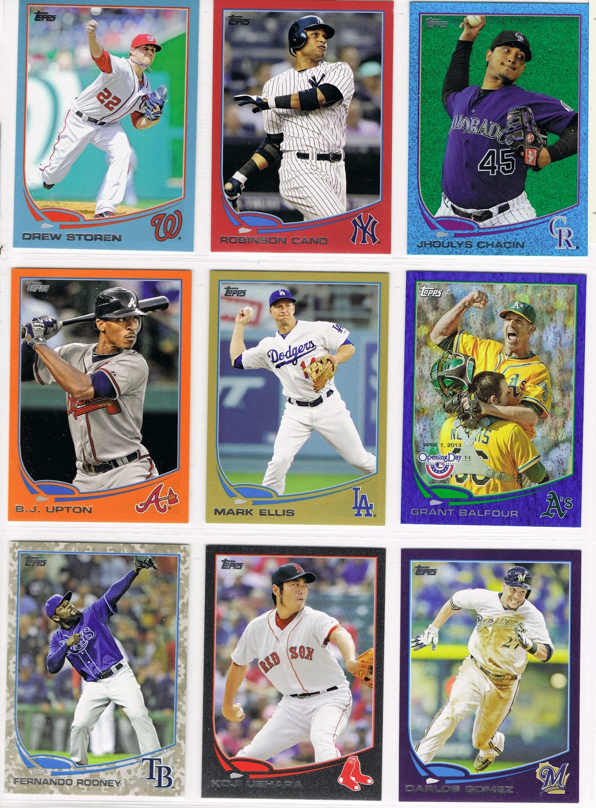
That's the closest I got to a star card, for now though. Now that you have already scrolled through 'em, lazy side-to-side style, you can scroll along down the screen with me while I babble on about these a little bit. Any card that has both dirt and grass on it turns out fantastic on these. So do all of the New York Mets cards. I like the rosin bag picking up a best supporting prop there on this card, and the Mets' logo on the back of the mound too.
These "Reverse Tatooine" cards that have an all-grass background, of which there are plenty in the zoomed-in 2013 set, turn out very well, making me likely to pick them for use in my parallel project. But this card breaks one of the rules of the project - no blue Sea Turtles on a blue border parallel. So my trade stack of these tends to have a lot of the blue teams in it.
A lot depends on the image though...some grass is better than other grass, and we get to see lots more of those little shiny points of light twinkling at us, and who doesn't like that in their grass? This card was actually set up in a permanent home in my project for a little while, until I picked up a Camo border version of this card in a lot purchase, and this Blue Sparkler got bumped. And there is an even better entry in the weird world of parallels on that page anyhows - a Sparkler Error card that is pretty neat. I think someone at Topps was checking out the grass too much perhaps the night those were printed. There is actually a series of those across several different parallels. Naturally, I'm working on a special binder page of those, for future reference after I cut the grass some evening. Don't worry, I like to share.
Of course as the man sang one time back in the 90s, 'what is from the earth is of the greatest worth.' So the actual Tatooine cards in the set this year make the very best sparkler cards this side of, oh, I don't know, Labrador perhaps. Houston Astro cards always pose an existential question for me though. If you didn't have their players on your baseball cards, would they even exist?
I mean, if I had started this post with a "Quick, name a Houston Astro without looking at your baseball cards!", how long would it take you to do it? 

That card is an example of how the various outfield walls around MLB can appear somewhat randomly on these cards, sometimes knocking the buzz out of these. I always wonder whenever I see this card if that is some sort of mark the Astros put on the outfield wall to help all their AA players trying to hit actual Major League pitching, gently telling them "look out there, aim at the crosshairs."

Other times though, the outfield wall becomes the star of the card:
This card was Designated For Permanent Assignment in the Parallel Project, until the Commissioner came along and starting dreaming up Franken-rules, like the second rule I already mentioned - that the back of the Turtle can't match the color of the card it is swimming through. We wouldn't want the players to get confused about which part is their Turtle-shell home and which part is off the edge of their world when things get bumpy. So the Commissioner had to tell this card it was to be Designated For Assignment, back to the trade pile, which happened to the equally cool Jeff Francouer card that didn't show up on time to be scanned for this post, and this one too:
... even though it didn't break the all-important No Matching Colors Rule #2. The Commissioner had to rule out cards that disrespected the other players enjoying their Cameo on someone else's cards (I know from my Base Card of this one that we see Torii Hunter and Albert Pujols here - quite telling how far apart they are in the dug-out on this 2012 shot, pretty sneaky there Topps - can't lose that in the Project). 

It wasn't long before the Commish was summoned from his post-3-martini-lunch siesta, heard to mumble something about not actually wanting to let that cool slice of grass go to waste, to rule on another multi-player mash-up card:
That decision came quickly though: Ope! Which is baseball-ese for "NO." Not enough sparkly action for the high standards of this project, though the scanner revealed another entry in a new, not-yet-revealed-to-the-collecting-public Frankenset - This Card Is Watching Me, since Topps let a TV cameraman sneak onto the card.

No more multi-player cards allowed. "But what about that Todd Helton card you let in, Commish?", asked the Press Corps that is always bothering the Commissioner wherever he goes. The Commissioner again ruled nimbly on his somewhat wobbly martini and sparkly grass feet - Grandfather Clause. Helton is in. He's beaming out of the League this year anyway. "But that one looks like his teammates are beaming up, not Helton," some wag was quick to point out. Err, Reverse Psychology Grandfather Clause. Helton stays in. "But what about that Baltimore Oriole Wild Card Blue Sparkler card you let in? That one isn't very 'wild'." Would these reporters ever leave the poor Commissioner alone to find some more of those sweet organic grass cards? The Commissioner decided to give the Press Corps something to chew on. Baltimore Oriole Sparkler would be replaced. Page entry to the project revoked. Start over....and that was the first one completed from Series One too. This Commissioner is tough; maybe he should be given more time to look for grass cards.
Ahh, now there is a classic of the genre. The wall and that ever sweet shiny grass combine just exactly perfectly. Why, this card should be a #1 draft pick in the Project. And indeed it is. It seems the Commissioner has short-term memory loss at times, and he drafts the same player twice sometimes. No one can convince him to just give up those grass cards. He needs them when conflicts with Rule #1 arise, like when Reimold's set-neighbor, Zack Greinke, had such potentially potent looking grass on his card. But that type of grass is extra-expensive, so the card scouts looking for a Greinke entry for the project were directed down towards Target, which made them happy, because Target has better customer scenery inside than a bunch of baseball cards.

What? You forgot Rule #1 already? It was only 59 posts back now, you should really try and keep up in class better. Don't let that grass up there distract you so much. Rule #1 in the Parallel Project is that only one border color can be found on each page. Rule #1 and Rule #2 don't get along very well as a result, especially when Rule #1 trumps Rule #2 and an extra, more expensive parallel has to be acquired because Topps put 5 or even 6 blue cards on the same page. Maybe Topps lingers too long with the grass cards too. The Commissioner has heard rumors. How else do you explain Topps .998 batting average on the 89,420 different baseball cards they make every year, making a .002 strike-out rate of switched autograph stickers, letters not die-cut correctly, and the various other incessant complaints from their OCD customer base, who obviously aren't into the grass cards enough.

But it was darn nice of Topps to print these just simply beautiful sparkly cards this year. They even gave them away to their loyal customers, in spite of how much they whine about them.
The shadowy cards = nice.


When I first found more than a few of these cards in the same place, I thought they would make an incredible set of cards to own later on down the grassy road. But then my sometimes stupid let's-kick-it-up-a-notch impulse kicked in and I went for the greater glory of the all-Parallel Project. Then these cards could only be 1/9th, or perhaps 10/99ths of the set, as occasionally other from-the-Topps-factory-only parallels take their place, like the basically boring Silver Slate cards, and the outrageous, in a good way, Hunter Safety cards. Or even the also boring but oh-so-wonderfully-ego-stroking Platinum 1/1 cards, of which I scored the one of only one such card the Commissioner would allow in the project (all parallels must be represented by at least one card, even those extra dull printing plates, which is part of Rule 1, subsection b, as in boring), just the other day, finally.
Overall these cards can have a lot going on, and I sure enjoy them. The idea of building a whole set of them has sailed however, as easy pick-up lots on the ole eBay dried up some time ago, and the resellers here and there will only let you have one for a buck or three, plus shipping. So you could still do it if you really wanted, and you could afford the Bryce Trout editions. Luckily, or unluckily, in my case, there wouldn't be a Puig to chase on these. I really wish these had been manufactured for Update, but Topps has bigger customers to worry about than one goofy blogger with an over-fondness for the ultimate twinkly baseball cards.

The good news for you is that every card I scanned here is up for trade. And really, what player or team rainbow is complete without a boat-load of Blue Sparkles at the end of it? That grass is better than gold sometimes. 

The bad news is that I am quickly approaching Last Call on trading season. An actual, no-Super Bowl-eligibility-for-this-card Trading Deadline. So if you are still reading this far down a blog post and you have been thinking you might have some parallels I need, well, it's time. In a few short weeks I will be leaving home and my beloved baseball cards behind for several months. 

In the world of the Blue Sparklers, I need these cards:

(6 R. Howard or 10 A. Jones), 17 (Choo), 24 (Haren), (59 Rauch or 60 Bauer); 79 (Eaton), 89 (J. Santana checklist), (112 Reynolds or 118 Matsuzaka); (120, 122, 125); 157 (C. Capps), (192, 193, 194-197); (211 Parker or 215 Beckham); 235 (Westbrook), 271 (Familia), 277 (B. Ryan), (287 or 288); 312 (S. Hairston), 326 (Andruw Jones)

(368, 371, 372); 412 (E. Cabrera), (476, 478, 481, 483, 484), 490 (C. Ross), (508 Doubront or 510 McLouth or 511 Brantly); 545 (Presley); (548 Lackey or 555 Hanrahan); 597 (M. Scutaro), 646 (Aumont)

And the Commissioner's free agent negotiations resulted in a slight over-supply of these, all up for trade, though you'll have to know your favorite player's card # to see if I have that one you just have to have, somehow. It's November, you should know your favorite player's card # by now, geez:

Series One: 12, 16, 18, 30, 48, 51, 52, 53, 57, 66, 79, 100, 103, 105, 106, 116, 121, 126, 133, 144, 145, 149, 150, 154, 156, 160, 177, 182, 194, 206, 209, 214, 216, 218, 220, 226, 236, 239, 240, 257, 258, 259, 262, 283, 285, 304, 327, 328

Series Two: 341, 347, 348, 354, 363, 364, 367, 377, 381, 384, 400, 404, 408, 429, 432, 436, 438, 444, 450,  451, 471, 479, 482, 485, 492, 496, 497, 516, 518, 520, 524, 525, 534, 539, 542, 550, 557, 558, 560, 567, 574, 590, 601, 619, 623, 630, 632, 659

The other good news on these is that you don't need an actual Blue Sparkle card to pry one of these away from me, before they all get shipped off to COMC when Base Set's base gets way, way smaller come December. Any contribution to my Parallel Project or my other random set needs would probably work.

Now thinking card #s might lead you eagle-eye types to spot a Hero # card in there, and it's been so much boring old alpha-numerics scrolling along your screen for a while now that I figure I should hook you up with one last hit of that sweet shiny grass before the withdrawal symptoms get any worse.

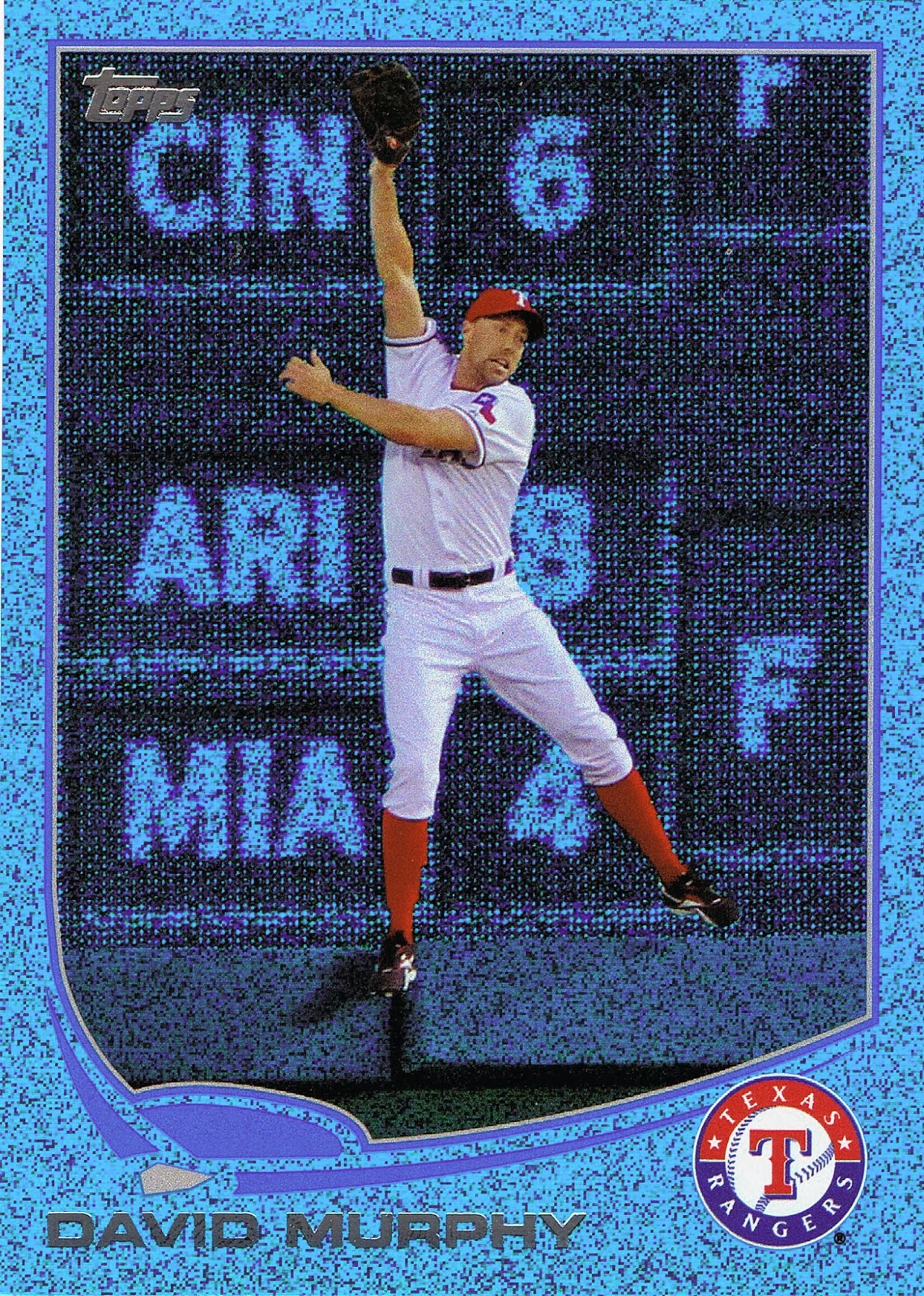
My scanner just loves these cards, so much so that for this one (when it "automagically" detected the borders of the item I was scanning), for the first time ever it reported the dimensions of said item to be exactly 3.5" x 2.5", even though all I ever do with the machine is scan baseball cards that are all exactly that same size.

That's how perfect this card is:
Kinda puts anything in Topps Chrome to shame, if you ask me. Shiny? I call trump on shiny when I get lost looking at these. 

This card already made the Project. And it's duplicate sitting around gathering dust here at Base Set can be yours. Whaddya got?