Well working season finally ended. It took another month in the nearly no-baseball zone of Michigan's Upper Peninsula, but I can finally start fiddling with baseball cards again. Working, camping, camping while working, trout fishing, living without internet service or even baseball broadcasts — none of these things are very helpful for enjoying baseball cards. And I must note it is just rather sad and pitiful how generally useless AM radio stations are these days. I don't expect they will be around much longer.
Things got so far removed from the game of baseball that I bought some baseball cards … and didn't even open them! Horrors!
But I made it back to a civilized locale with an actual working television set on time to see the All-Star Game at least. Though I have to move in a few days and then can finally really get down to the serious business of sorting out stacks of baseball cards (and hopefully being able to blog about the results), I figured it was the right time to rip some packs while watching the game. Let's see what I found:
Yawn. Some nice vivid green and yellow, the necklace is In Action, but it seems like every King Felix card I have is of him in this exact same spot in his delivery. Next.
An All-Star card. On All-Star Game day. I like these cards well enough, but with basically no back they are such empty calories. I might peruse the checklist of these Archives inserts for any Tigers or beloved older players, eventually. I kind of wonder if there might be 9 for each League.
As for this particular card, the Mets always look good on baseball cards, and this one is no exception, I love the orange stripe on the outfield wall - though Topps loves to issue New York Mets cards, they never seem to take as many photos at Citi Field as they used to; perhaps a presumption on my part. Now lots of their cards are shot in Detroit, which I like of course, but I could enjoy Mets colors on the cards, the uniforms, _and_ the outfield wall.
Though I like that Harvey card, I know I have the same image on a sticker and I think one other baseball card. The more I see the same images on multiple cards, the less cards I buy, in packs at least. Are you listening Topps? I am buying less cards this year.
But I like these Archives cards...
…and I like it when Topps puts the contents of their archives to use, as this appears to be a standard posed Shea Stadium shot. They used an In Action shot of Marichal for his '73 card, so they likely had this image filed away from Baseball Card Picture Day that year.
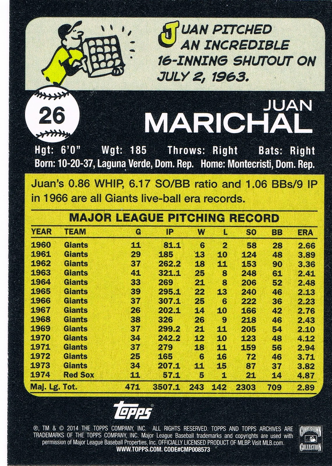
And I like this card. The intense Marichal appears to even be in a good mood. I love cards showing the third deck, and I always like the MLB Logo patch on a card. I don't need 1/1 Logo Man cards, I can enjoy this one just fine. I also like the back of this card:
Or most of the back of this card anyway. I like to imagine some younger fan learning about what has been called "The Greatest Game Ever Pitched" there on the top of the card. Topps perhaps could have mentioned that the losing pitcher (Warren Spahn), also pitched a 16 inning Complete Game.
I also kind of like the card back writer using newer statistics to illustrate how great a pitcher Marichal was in the 1960s. Though an interesting option would have been to tie in the text with the cartoon scrip and note that Marichal finished his career with one more Complete Game than Wins. A pity that Complete Game wasn't added to the pitcher stat line on the card backs until several years after 1973, and now of course has been removed again, because it's a nearly irrelevant stat in today's game. 244 Complete Games. Unreal.
I never watched Marichal pitch, as he retired after two games for the Dodgers in 1975, the first year of my life that I can remember watching baseball. But then Topps doesn't mention that year either, because they didn't want to run out of room for another iteration of their own name there on the back. As if we would forget who supplies with us with our baseball card fix after purchasing thousands upon thousands of these things. And of course only some years of baseball card backs featured complete career stats - but I expect such on an Archives card.
Anyhow I was happy to discover that Archives card backs are worth investigating. I've been looking at too many retro repro cards in the mini format, which I refuse to read on the back. I discovered a few other things on the backs of those Archives cards, but I'll save that for another night. Let's pull another card:
Hey, that's not an All-Star. Though it does have a star on the card. No, not the Mariners logo star. Just one of the more classic true sunset cards I've ever found. Featuring our beloved local star - The Sun. The one and only. Sweet cloud card too, that one will make the cut for an All-Time All-Cloud binder page.
I like the 1980 cards so I am just fine that Topps is repeating their use in Archives. I will go for a set of them, somehow. I started with two rack packs and got hardly any 1980s…in this rack pack I got 4 of them, which is still a half card short, somehow. It might be hard for me to ever do this one the old fashioned way via ripping and trading - have you noticed you can only get these cards at Target? When a Topps product is not available at Wal•Mart, they become quite a bit more difficult for me to acquire. Archives cards are not in the midwest Big Box chain called Meijer's either. I have seen online speculation about big production cuts for Topps this year; I figure Wal•Mart cutting their order was probably the main reason, and that probably hurt Topps. I live far from Target, and far from any card shop. Yeah, yeah, I know, I can just buy them online. That will take me longer. I spend my online time chatting up y'all. And looking at baseball cards:
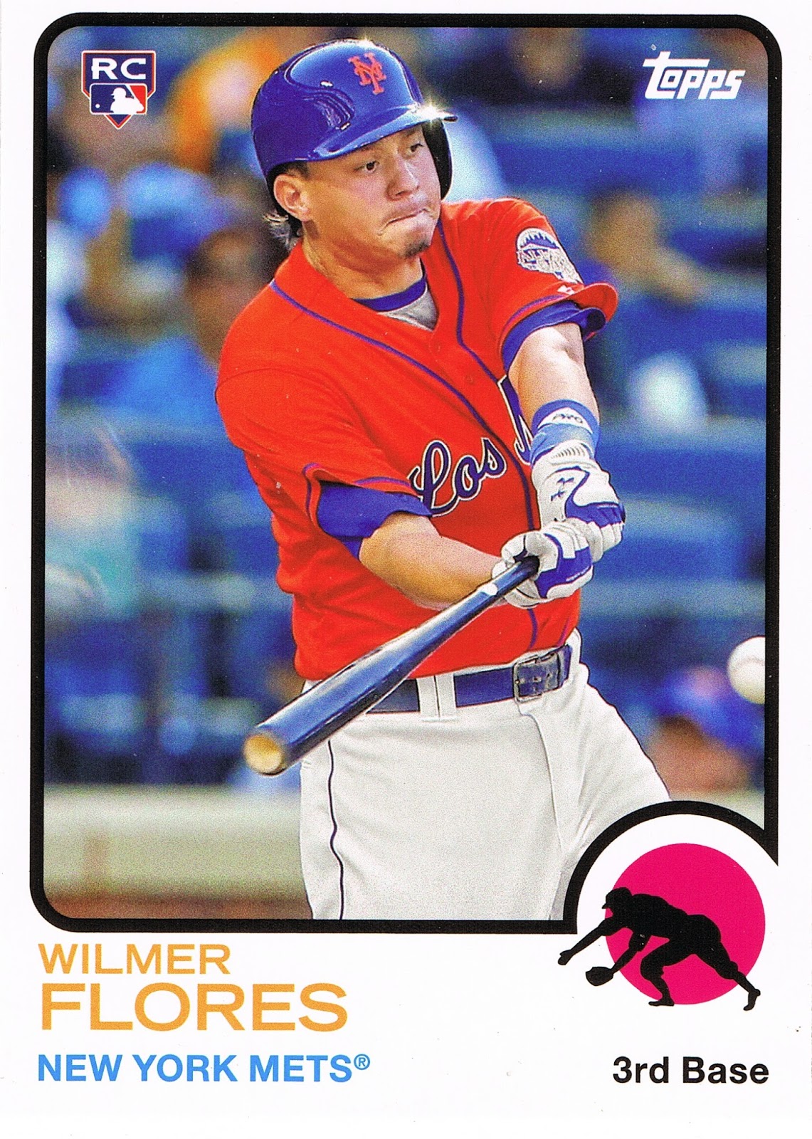
Another non-All-Star, though there is All-Star iconography present on the card if you look hard. I like cards with the special "Los Mets" uniform. Though once again Topps kind of buries the special uni details; I think this is the third such card I have.
And I wouldn't count on Topps to help you figure out the Mets infield situation, not that anyone else can either I think. Why would the Mets bring up a new 3rd Baseman when they have a sometimes All-Star anchoring the position (and every Topps set of course)? The answer is that Flores plays at short for the Mets, when he is in the bigs. He will soon have to stay up there and prove he can hit MLB pitching, or no more baseball cards. But off to the Los Mets binder page this card goes.
Now let's get back to actual All-Stars, like this one:
Who doesn't like a Catfish Hunter card? Especially now that Topps is using the name Catfish right there on the front of the card. Such a cool baseball player…I hope one of his retro cards might already or might someday mention the Bob Dylan song about him.
The reason I like the 1980 design is the hint of a pennant in the design, the curved solid-color border for the image, and especially the setting of some of the text on an angle. All that works great on this card of an All-Star:
I like how Duke signs his real name, which reminds me of another thing I like about the 1980 style Archives cards - the allegiance to the original card style means the players of today have to supply a signature as well. And then the old fart players always come out looking classy.
I also like the advertising on the Snider card. Flying A Deal! On something. Reminds me that advertising has been a part of large scale public sporting events ever since large scale public sporting events began, and shows it is not some conspiracy on the part of Topps to pick up some of their own ad revenue when an advertising image makes it on a card today.
Ahh well, another nice pack of Archives. I hope I get the chance to buy a few more, but that might be a minute. What else did I find at the big Red Bullseye?
My perpetual weakness for the Opening Day cards. I always like cards with a railing in the background, they help set up the lines of the image tremendously, and this card has great lines. A pity the railing isn't a little more in focus. But then I also like Blurry People cards too.
Adam Jones is like the stealth All-Star each year. He puts up tremendously solid numbers but just never seems to get truly famous. Which is slowly becoming less so for this guy:
An OK card, but nearly identical to his card last year. Even the Blurry People are ho-hum on this one.
I actually bought the last 2 packs of Opening Day in the gravity feed box, though I was hoping for one more blaster. Did you notice that Opening Day was also only available at Target this year? It may have had the blister packs in Toys-R-Us, the perfect store for the set, kinda; but it was not at Wal•Mart.
I never did score a 'Between Innings' insert from those packs this year, though I bought more than the requisite 36 packs suggested on the back. I know, I know, I can just go online. I had hoped to find some other fun inserts to share, but that will have to wait for the day I sort the few blasters of it I did pick up earlier this year. There are a couple neat things waiting for you in those stacks.
And I couldn't pass a trip to visit the pretty young things all over a Target store without picking up some special Target cards:
Another guy that just always seems to get good baseball cards. Of course I always like a Smiling Card. But careful there Chris, I hope that devastating slider the card back describes for me isn't creating a claw hand there. That pitch shortens all too many careers….. but let's get back to some more All-Stars while we rip some more Heritage:
Well that's a baseball card. You could put it on Wikipedia to serve as an example definition almost. It's got red, white, and blue, and two different Phillies icons. But it's not all that much to write a blog about. I still enjoy ripping and sorting Heritage. Just the tactile experience is enjoyable. And I like the color of the '65 style. But I don't think I will be putting that one in binder pages for future perusal, just a few special pages of the highlights, like one that you are supposed to write home about, I guess -
Boom! All-Star Game Day retail hit Mojo. Though hits aren't my thing, I kinda like this one more than most. No extra busy design, and the GU part doesn't make the player image superfluous. And it's a different image than any other Chris Sale baseball memorabilia product I own. His cards always look good so I think this one will go in with the rest.
Like Archives, Heritage is a set shot in the spring time. And thus always in the same places:
There's that mountain again. First there is a mountain, then there is no mountain, then there is. It all depends on which player it is, on the Angels or the A's, which is so weird because I wouldn't expect division rivals to share a Spring Training camp. I think I'll probably assemble all my Mountain Cards to see if the players have worn a permanent spot to stand on when Topps poses them for their new baseball card. I've seen this mountain so many times I might have to start seeing if I can figure out the geology of south-central Arizona using baseball cards.
Fortunately for every Mountain Card there are two Cloud Cards, and sunny Florida might have a few clouds once in a while, but never a mountain:
OK, so Zobrist was only technically an All-Star last year, though he did get one All-Star At Bat a few years ago now.
Just another base baseball card that I like. I'm not that into Bat Barrel cards, I just love that Ray patch. This one looks like it has had to show off it's vertical skills getting out of the way of that swing. So off to the binder page it goes, that I will certainly enjoy the next time I flip that binder open. That's why I buy all those Baseball Cards.