Showing posts with label Back in 72. Show all posts

Monday, November 24, 2014

Texting It In #4

I didn't really want to resurrect this particular series of posts, particularly after the cavalcade of research errors I made last time I used this title. But with Topps baseball cards, I know there will be ever more of these posts to come. I switched up the series title a little but I have reasons for that, with this post.

I was (and am) quite contented to have finished assembling this 50 card set from 2013 Archives. I'm not going to bother finishing the 50 cards of the other three retro styles used. I collect only baseball cards I truly want to visually enjoy again in the future. The 82s and 85s appeal to me, but not quite enough. I'll look at the 85s in more detail in my next post.

Let's take a look at what I found when I corralled these new psychedelic tombstones into the cemetery, starting with the first card:
I like this card a lot. I wish I would have pulled some extra copies of it to put in some other binder pages that I haven't even themed up yet. I like the bright colors, I like leading off the set with Babe Ruth. Classy. I suspect this card might have come from a black&white photo colorized with modern technology, though I can't be certain, but I like the idea of doing that. However, -1 point for slicing off two of the Babe's fingers.

Card #2?
More Classy. How can anyone not like a Gary Carter card? Me though, I can like a card and still nit-pick it. Though I like red-white&blue on my baseball cards and I excoriate 1990 Topps for pointlessly adding colors to the design, for some reason I am OK with any color combo Topps wants to swirl in front of me in 1972. At first I thought the cropping could have given us a much cleaner look at the classic Expos logo on Gary's left breast (and it does get credit for keeping his bat intact), but then I found this card:
Which is a card I do not like, all over-done with too much foil, and really is just a card designed to serve as a bed for the "real" card these days, the auto/gu version. But the cropping is much nicer with the blue sleeves and the piping on the jersey making for a nicely balanced image that would have looked really nice on the 1972 card, particularly with Gary's uniform # on the bat barrel there. Ahh, what could have been. Minus half point for slicing off the edge of Gary's elbow for no reason.

Let's see who will reside to Gary's left on this page:
Hey, just like the Gary Carter card, a nice blue sky Spring Training shot, with a classic baseball player pose you don't see too much any more. And really, you don't see completely on this card, with the cropping cutting off most of Carlos' left arm. When I worked in media, I only supplied flippant text to my editors; it was their job to attach photos to my musings, but I don't think they had much control over the contents of those photos the way imagery editors do today with modern software. Be that as it may, I'm pretty sure it would be considered bad form by anyone in the field of photographic endeavors to just randomly leave a thumb sticking out of the side of the frame.

I do like that Topps went with a near-Powder Blue for these Cards (Faux Powder Blue? I'll just call them Powder Blues for my own fun). A pity they couldn't have used images from a 21st Century go at wearing throwback Powder Blues, which the Cardinals did show off for at least one game in 2012. Anyhow, let's check out another one:
Hey, a photo from a real baseball game like the Babe Ruth card. Looks like the outfielder is going to catch that one. And once again the photo editor doesn't worry about arbitrarily slicing ballplayer parts out of the frame. Instead, the key concern is to make the player as big as possible, but not have their head peek over the top of the tombstone and disrupt that groovy lettering. That is the one rule about cropping all 50 of these cards follow precisely.

I had thought to maybe download some images from cutting-edge-as-I-type Topps sets such as the new Dynasty, Tek, or Finest releases, which are basically insert sets blown out to full checklists, but I'll save myself the trouble and you the boredom. Or I could have used any of the hundreds of thousands of autograph cards that have been released this century. On all other baseball cards beyond these lowly "base" cards, which are so base in appeal I guess, there is no room for background context of the live game of baseball. Once a card has to have room for the autograph and the $/x stamping of it's serial number and some graphical design elements, there is no longer room to see the game of baseball on a card. If an auto card included a player's legs, he would like tiny indeed off in the distance behind his looming sharpie scrawl in the foreground.

That's just the way it is, and apparently that is what collectors want. And for collectors that enjoy autograph cards and overloaded graphic design full of pink hearts, yellow moons, orange stars, and green clovers, err, uhhh, hold on, these tombstones are giving me a flashback to a cereal commercial from my youth…. at least we haven't had a baseball card with three wolves, a full moon, diving eagles, and lightning bolts on it yet. Or have we?

Anyhow, for collectors that enjoy context-less idol-worshipping baseball cards, have at it. It just wears me down to see that design philosophy pulled into the cheap baseball cards I want to collect all the time, particularly when the source image was from a live action baseball game, which could have delivered so much more to the card, and the basic frame design is so enjoyable to start with.

But Allen Craig had done scrolled off the screen there, so let's check out something else - the backs of these cards:
A nice, '72 authentic card back, with the correct orange-on-grey tints to what looks and feels like cardboard card stock, minus quite a bit of heft as compared to real 1972 cards. I must note that it is my scanner that gives these backs the greenish, lit-up tint there, sorry. 

I like it when I get the complete career stats from the stars of the past. This card now makes me want to find a card with Babe Ruth's Major League Pitching Record to complement it. That would be cool.

I like that the trivia question is included, though knowing the MVP of the 2002 World Series, is well, trivia, whether I am interested in that one or not. But the next card has a great question that bodes well for the small set:
Another perfectly executed card back from rookie call-up to sunset season back where it all began. And of course, for a long career like Ruth's or Carter's, small type is needed for such completeness. 

So what will happen when I flip over Allen Craig's card, who has had a relatively short contemporary career so far?
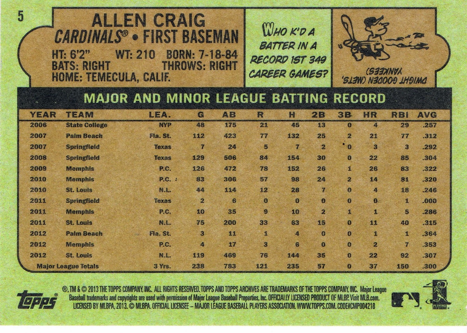
And this is where the Topps card-back writer was probably just texting his or her buddies all day about that new MLB .gif file that was making the rounds on social media that day.

Topps card back writers have long been inconsistent on when to include a player's MLB stats, and when to print their minor league stats along with those. Can't come up with two pithy sentences about another random Major Leaguer for the 59th time that day? Simply print his minor league stats, fill up the card back, and call it done.

And that is perfectly fine. I don't really need those two pithy sentences that are usually totally forgettable. But I might take an interest in a player's minor league stats. Is he just newly a power hitter as he has reached his late 20s, or did he show power on the way up? Speed on the bases? Strikes out too much? (Actually, collectors weren't privy to that particular info in the mid-70s).

But one thing I am not going to do is squint to read tiny type all spaced out on the card for no real reason. I suspect two different card-back writers slaved away in the card-back mines underneath Baseball-Reference.com, which really should make card-back authoring a piece of cake, these days. Why do I think two different individuals were involved here? Some of the other cards:
Now there is much more of an effort. Intelligent observations about the player, and stats you can actually read, in bold font and of a legible size that matches the space available. This card-back writer was doing the job the right way, not texting LOLs back and forth while simultaneously "working."

But wait, what is that trivia question there. Who was the World Series MVP in 2002? Haven't I seen that one somewhere before?

AAAAARRRRRRRRRGGGGGGGGHHHHHHHHH!

I was really looking forward to competing this set and reading all 50 trivia questions. I was going to rank the dumbest and most clever and try and have a little fun with my baseball memorabilia while I lovingly put it on display, sort of, for all eternity. I thought with those cool trivia questions in the 1972 set, these cards would be so binder-worthy each 9 of them would get their own page, so I could read the backs again some day.

Instead I will just double them up like other grade D card-back efforts, like 2011's Lineage. The repeats actually start immediately in the set, with the same exact question on card #2, and card #3, though a different little drawing to go with. Topps puts their laziness on display right away.

This BS also flows from the hit-centric and self-absorbed nature of collecting today. Topps can just copy/paste repeat material on the card backs because they know more people will be glad to have the 709th Gary Carter card in their collection than will actually assemble and peruse a whole set of these. There is no need for craftsmanship any more; baseball cards are just a chase item for grown-up guys with truly disposable income, and the cards aren't moving bubble gum any more either of course. But I really don't think Topps managers in the decades not being copied would ever have cheesed the product out this way, even in the decades when they held a monopolistic license from MLB as they once again do today.

That's one theory, along with the idea of straight laziness by those flunkies down in the cubicles of the card-back department. It all reminds me of how Lily Tomlin explained monolithic monopolies back in the 70s:
Let's hope we don't lose Peoria. But actually, Topps lost Peoria long ago, to video games, Magic, and adults constantly chasing "hits" and telling children their cheap baseball cards were laughably worthless.

So, yeah, you've read all this before probably. I didn't really expect to end up here assembling retro style cards. I wanted to enjoy a trip down memory lane with baseball trivia.

I did assemble all of the trivia questions for you, as I wanted to see just how much effort they did  put into writing for a 50 card set.

The answer is, 12:


Who was World Series MVP when the Angels won it all in 2002?

Troy Glaus.


Which team has had the most Hall of Famers?

Giants, 55


Which pitcher won a record 59 games in 1884?

Old Hoss Radbourn


How many World Series titles did Yogi Berra win?

10, a record


Who's been the only catcher since 1976 drafted #1 overall?

Joe Mauer


Which is the only team that's had 2,000 different players?

St Louis Cardinals


Who threw 8 consecutive complete games in World Series competition?

Bob Gibson


Who K'd a batter in a record first 349 career games?

Dwight Gooden


Who hit the first walk-off homer in a World Series game?

Tommy Henrich, 1949 Yankees


Who was the career pitching strikeouts leader prior to Nolan Ryan?

Steve Carlton, until 1984


Who was the first DH in a World Series game?

Dan Driessen, 1976


At what bases is a runner said to be in scoring position?

2nd and 3rd


That last one is pretty much as bad as the one I discovered on a 1989 Classic card the other day about Umpires, and goes to show just how lackadaisical this effort was, and really holds up poorly next to some great questions.

And do you think they put the Joe Mauer question on the Gary Carter card, or the Giants HoFers question on the Marco Scutaro or Angel Pagan card, or the Troy Glaus question on the Albert Pujols card, or the Yogi Berra question on the Derek Jeter card, or the 2,000 Cardinals in history question or the Bob Gibson question on any of the Cards' cards? Or even the Dwight Gooden question on the actual Dwight Gooden card?

Of course not. That wud b, lk, wrk, dood. 

Sigh. I recently learned what TL;DR means. If you don't know, you'll laugh at me when you Google it. But I am definitely off in that territory once again. I think, though, that Topps can definitely show signs of living in the TL;DR world sometimes.

So let's go back to looking at baseball cards, that's always pleasant. May I present, the 2013 Archives 1972 style Baseball Cards in all their glory:
And the Cardinals win the page with a diagonal FTW, fittingly, after taking the Series the previous October, even after the Powder Blues started off with an errant Ryan Braun there in the corner.

Favorite Card? I have to pick between Gary Carter and The Babe? We'll call it a draw.

And the Powder Blue team goes for the clinching win with a dominating diagonal, and straight-across double victory!

It almost looks like Hanley there is going to punch the photographer and has the bandage to prove his experience with the idea, until you realize it is a game action shot forced to match the Spring Training portraits. And Topps can just never decide if Mr. Morse is Mike, or Michael.

Favorite Card? I'll go thumbs up with Yoenis there in the dug-out.

Finally Sunshine Yellow ends the Powder Blue reign while stopping Neon Green's Go.

That black leather back-drop on all the Orioles cards all the time is just straight horrible. Manny also seems a little upset that he doesn't get a bat too. Tough luck, Rookie.

Favorite Card? The Zobrist is a work of art there. Great lighting and shadows and classical colors against a 51-Bowman-esque sky. Rays drawn with rays…if only we could get the right hand on to the card we'd have another all-time classic Rays card. The Topps photog always sets up that team this way, and it works.


Sunshine Yellow and Neon Green both try to get a win in this Series but just can't quite get there.

I don't know who pissed on Corey Hart's bubble-gum that day, but that card will earn itself another appearance in my binders, also quite near an amusing Wade Boggs card I'll share with you eventually. And is that a night card there in the primetime center slot? I thought Topps was determined to get rid of those cards. Is Adam Dunn trying to compensate for all the frumpiness everywhere else on this page?

Favorite Card? Still the Wade Miley. You can hear the wind in the cemetery on that one.
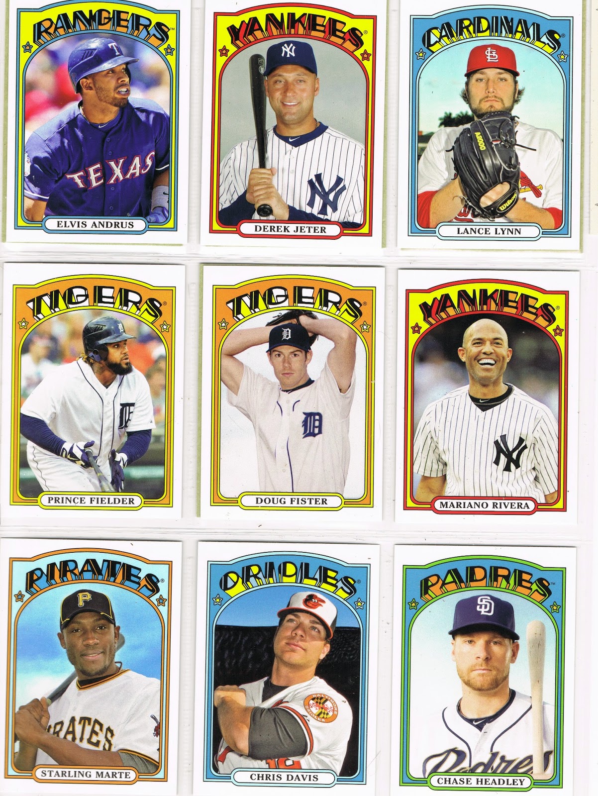
Pastel Orange goes for gold but our second hat-less baseball player shows it how to shine. As a member of the no-hair on middle-aged-men club, I still approve of Mariano's card there. A winning smile still wins over any crowd. And Powder Blue, it just got confused by which part was the design and which part was the image, or it could have taken another page, but it did manage to stop Sunshine Yellow there at the top. Who let the word Pastel into this set anyway? I get it Topps, I get it, especially when you hit me over the head with two cards from the same team sequentially in the checklist. Tigers are orange, yes. Not Tan. 

At this point I have to note that some might think perhaps this is an effort by Topps to match the style of the original set they are re-using, as they generally do with Heritage releases. The very-very-rare-these-days over the head pitcher's delivery pose on the Fister card might indicate that, though too much white on a baseball card is always a little frightening, and the no cap touching the frame rule just did not work out there at all. Especially at the center of this page like a white-bread vortex. Just, no. But I don't really think the editor of this set considered the actual images in the 1972 set, which had a bit more variety than torso, torso, torso.

Favorite Card? Though I think the Chris Davis card might have fallen out of a copy of Teen Beat magazine, the Starling Marte card is far more delightful. It gives me hope that I can still enjoy the game of baseball, and baseball cards, like a kid again.

On this last effort in the top of the 9th, Powder Blue sends it Sky Blue to pinch-hit but with results nowhere near as good as on the Marte card.

Miggy jogging to first base, again, wins this page all day, every day.

Well there you have it. 1972 baseball cards, manufactured in 2013. I still need a half-dozen such cards form the minis in Series 2 last year, as well as 3 of the '72 Chromes in Chrome. I'll share those Complete Sets here with you, someday.

I'm not sure we'll see any more '72 stylee cards for a while; I just hope that when a full set of them appear in 2021 Heritage, Topps puts in quite a bit more effort than they did here.


Saturday, November 22, 2014

The Siren calls, gives up Mojo

So last night I had to stop at my local K-Mart for a new winter hat to help me through the monochromatic white Autumn we are having up here. Yeah, that's the ticket. (I drove through my first snowstorm on Halloween, actually).

Anyhow the original Blue Light store is one of only two outlets for Topps products in my town; Dollar Tree being the other one. Lately the big K has been rather erratic at stocking new baseball cards, but I had that urge to rip just a sample pack of Update. Yeah, just one. No, really.

I also had this odd feeling that maybe their card-distributor-rack-jobber-must-be-a-kinda-sweet-job-to-have person might have brought over some discounted blasters from some other store where neglected baseball cards just sat around not enticing the disinterested customers for too long.

And there it was:

Is there anything that catches the eye of today's baseball card consumer better than that red sticker? Once the blaster gets that cheap … My name is Brian, and I am … all about baseball cards sometimes.

Oh sure, I can get on my high horse and explain my pure wisdom of not ripping new product any more. But old product doesn't count. So why was I hoping to find a little Update? Samples don't count either. 

This was on a blaster of 2013 Archives. I had some pretty good Mojo with those when they were hot off the presses, and I wrote up one of my longest blog stories connecting it to that Mojo. Not coincidentally I had just been pondering 1985 Topps due to selecting a card from it as the lead-off card for a repack purchase. (Just hit Older Post down at the bottom if you missed that one, my previous post). 

Also, I needed just one of the '72 style cards to Complete the Set after some good trades, and there are two Short Prints I desire just because of the base design used - 1975, and a few others just because of the image, like the Tom Brunansky. I had my baseball-cards-on-sale-Mojo working before I even walked in the store thinking "cheap blaster," so, yeah, I pulled the $12 trigger.

Let's rip the first pack:
The last card I needed to Complete That Set! Basically-cheap card Mojo is still Mojo. If I had purchased loose packs, I could have just taken the rest back to the store right then and there. But you can't take back blaster packs, fortunately.

Don't you hate it, though, when at any point in the last 2 years, the last card you needed for a full set or an insert set was the Jeter? I have pulled his memorabilia items from every random baseball memorabilia package I purchase, but can never get his cards in the sets I actually complete. (Anyone want his Qubi stamper? A deckle-edge? Several different blaster manu-patches (eww, I hate that word), a Chip?).

I like Derek Jeter and I usually like his cards. But I suspect this won't be the last time I need a DJ to get it done.

That left 7 & 7/8 packs to go through. There should be some more cards I like in there somewhere:
1985 Mojo! Of course, there was a 25% chance that each card had 1985 Mojo, but that didn't slow me down. I was happy to see this card when I first pulled it and set it aside to share with y'all. But as today has gone by I've grown very disenchanted with this card. I realized I was just reacting to the sharp yellow-on-blue ROYALS design, I like that. But this blaster has me putting 2013 Archives away finally, with cards going into binders and dupes going into the ever-heavier goodbye box that I have to figure out what to do with. Which all means I will have two more blog posts on this set to wrap it all up.

And though I needed few of the cards as I opened the packs, I also enjoy and want doubles of some of the cards:
This is one of my favorite Miggy cards. It's just a plain torso crop-down from a game action shot, but it's a happy card. It will look nice on the Miguel Cabrera binder pages with the other Miggys, and in the 1972 binder pages from this set.

Most of this set used images from the Topps photographer's annual visit to Spring Training, so many of the images can be repeats from Heritage or Series One/Series Two or all the other Topps products. But many of those Spring Training photos bring back fond memories of vintage baseball cards of my youth, because of the ever-photogenic sky in the background. So I was also happy to pull this duplicate for a certain binder page:
The ultimate Sunset Card? Well, a contender at least. I'm not totally convinced that isn't a lurking Eye of Sauron down there in the corner though.

Typing of nice cloud shots and Spring Training, I'll note you'll see a few more nice ones from the '72~2013 set when I take a look at the whole thing in an upcoming blog post, but in the meantime I'll scan a card I pulled previously that I have been waiting to work into a post:
That card pretty much hits all my Spring Training buttons - Clouds, Palm Trees, and a Light-Tower that could even be called a Lurking Light-Tower. 

I did pull a new card here and there:
Ahhh, no, I won't be collecting these. This card is as bad as the David Ortiz card I posted the first time I bought blasters from this product. I do like the 1990 design; I just hate the execution.  And I must admit that for some reason the scanner made this card look much worse than in-hand, but in-hand it is still a mess of pointlessly assembled colors.

I will say this about the 1990 cards - a stack of them is pleasingly colorful on the edge. But my life is a little too cluttered already to keep a stack of baseball cards just because I like how the edge looks.

Topps used the same border for each card from the same team in this 50 card portion of the checklist, and there are a few they did a decent job on:
That just leaves the Hockey Sticks. I pulled a double I did enjoy the first time, but didn't post:
If I were to put together a binder page of Cheshire Cat cards, this would make that page, but I can't think of another card with such a sly grin on it. I don't think it would all fit with baseball. If you like the idea of Cheshire Cat imagery, I can tell you I recently discovered the early 20th century work of Louis Wain; that would make for some fun art cards.

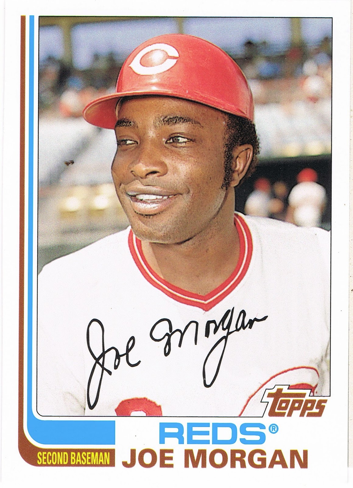
Joe Morgan is about as popular these days as Kirk Gibson, but I do like his baseball cards. Baseball cards don't say anything.

With 1982 Topps, I don't get too concerned about whether the hockey sticks have any relation to the team's colors. And I have my doubts whether Topps would either. Thus, the Mariners get the classic blue-and-orange of the Mets, but the Diamondbacks inexplicably get a nice set of red-and-black sticks. I'll leave those cards for you to ponder from some cheap Archives packs you can find for sale cheap somewhere, some day.

The Hockey Stick cards and the Archives product do make me wish Topps still had a license for Hockey. 'cuz the obvious thing to do now would be to release a set of Hockey cards using the 1982 Topps baseball design.

Well I did mention I am putting the final touches on my collection of this set. Aside from binding up the 72 style set, I decided to keep just 3 examples of the other 3 styles in the binder:

I suspect if any truly modern collectors ever wander into this blog about generally worthless baseball cards, they are starting to get a little itchy by now. They can remind me of some other subculture sometimes, with their fascination with the hits, man, the hits. 'sssst, did you get any hits?

Every blaster of Archives has "hits" in it, though if any word has a flexible definition, it would be that one. And this blaster was no exception:
More the-card-I-was-hoping-for Mojo! 1975!

It's always a treat to pull a 1975 baseball card from a pack. Always. Of course, it will be a good ten years before that glorious day when Topps prints a whole set of 1975 style cards again in Heritage. What a day that will be. Does it really have to be ten years? Of course before then I will get a whole new set of 1972 to enjoy, and a barrel of laughs listening to people complain about black border 1971 style cards, and even a rather enjoyable look at '73 and '74. Do we really have to sit through '67~70 along the way?

Ahh well, if Christmas came every month it would be as boring as all those Bowman sets that come out these days. I sure do love that Lynn card though. Especially since for his fabulous rookie season in 1975, he had the classical Rookie Card shared with other players.

This is actually the second time Topps has made a 1975 style Fred Lynn card all of his own; there is also one in the massively printed K-Mart 20th Anniversary set from 1982, which, come to think of it, I purchased at the very same K-Mart where I picked up this Fred Lynn, though that only cost me a dime - for the whole set! The '82 K-Mart is a neat card in it's own right (I always like Topps' random attempts to make new-old cards before the concept of "retro" sets came along), but that '82 doesn't have a true 1975 style card-back. So I was eagerly anticipating seeing this:
And, FAIL. It's totally white! All wrong. I can get past the thin card-stock of these retro cards. They are just going to be in a binder page for me to enjoy in the long run, though I do much prefer the tactile experience of sorting Heritage cards due to the authentic card stock.

And actually that is a very nice, very faithful card back with a very nice trivia cartoon and a great write-up about Lynn as if it really was 1975 when I pulled this. Quite well done.

The white though - one reason this disappoints so much is that the 1972 cards have accurate grey backs (I'll have some scans of those in a post quite soon, though they have other issues as you'll see); the other 3 retro style card-backs are accurate in that regard as well.

So close, Topps, so close. I made a nice trade last year with Fuji  in which I gave up the Denny McLain on-card autograph I pulled to help Fuji complete that set and I will have to continue my quest for a single Tiger's on-card autograph elsewhere, but then I never did like 1968 cards or Denny McLain. Anyway for that I picked up the Al Hrabosky Fan Favorite Autograph which is also done in the 1975 style, but my own stash of hits seems to be hiding in an undisclosed remote location right now and I can't scan that one for you. Only collectors lose cards. So now I just need the John Mayberry short-print from this set and my 1975 jones will be a little more sated, for a time.

I also hope to find the Tom Brunansky short-print, because it is every bit as great as this awesome Night Card:
Which I have posted before, but it is definitely one of my favorite cards of 2013 that doesn't have a Sea Turtle looking design on the front. So, what the hey, you pull doubles from packs, baseball card blogs can post doubles too.

I did pull one other short-print:
A card I quite like from a set design I quite like. After the debacle of the 1990 style cards, we get an understated design in matching team colors. Well done, Topps. But I can't for the life of me figure out why Keith Miller is a "Fan Favorite." I guess any brief glimmer of hope from a Rookie with a high batting average in a half season's worth of games is enough to get Mets fans excited, and I've always suspected that Topps is chock full of Mets sleeper agents. Which is OK with me, because classic Mets orange-and-blue always makes for nice baseball cards like this one. I think I'll keep it, and keep one less of those goofy 1990 style cards on that page up there.

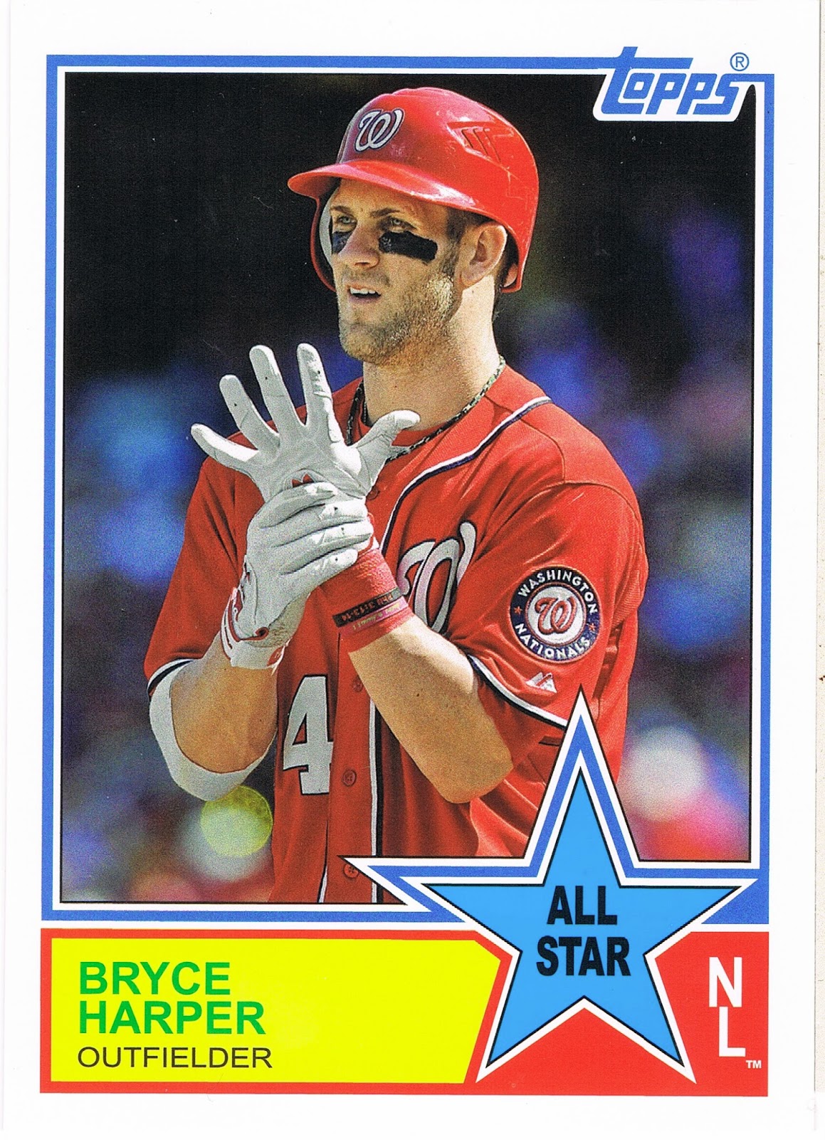
Of course, there are lots of little insert sets in Archives, and if you consider those cards "hits," I certainly squared-up the bat and connected on this one, in the minds of most collectors today:
Bryce Harper cards make me laugh, because if I had enough free time on my hands and computer software skills to do it, I would use my baseball cards to run a contest to see which baseball player puts the most square centimeters of eye-black on their face. I think I know who will be the odds-on favorite.

If I keep this card, it will be because of the back:
Collecting cards in Michigan we always suspected Topps did not like the Tigers for some reason, and the Night Owl figured out one source of our suspicion recently. But though McLain has somewhat earned some kidding about choices in life, I am quite amused to see this printed on the back of a baseball card. Imagine the scandal today if some All-Star starter who makes in the high four figures for each pitch he throws in the regular season were to show up late for the All-Star game!

This quickly led me to scramble to my other pulls from this insert set, which led me to this card:
Imagine that - a starter in the All-Star game still playing in the 8th inning. And a Babe Ruth story on a baseball card. I do like the modern All-Star game quite a bit, with something on the line in the game. I can't agree with all the baseball fans who complain about that and just can't understand the criticism. It is a real game between the game's biggest players. Would they rather go back to the year the game was just called a Draw due to general disinterest? I actually would like to see the starters play most of the game, Babe Ruth style, though he was just playing to entertain the fans, but seemingly playing hard.

I should have saved those two cards to post next summer, but they were just too good to wait that long. I briefly considered starting up a chase of this small insert set to find some more Great All•Star Moments, but the other one I pulled yesterday, Giancarlo Stanton, has a ho-hum game write-up (and is the third copy I have pulled from minimal purchases of this product), as does the Jim Rice I pulled. I still want to see the Fred Lynn edition because I will probably start keeping a small Fred Lynn collection, which will be nice and simple because he doesn't get a flood of new cards all the time in modern sets.

The '33 Comiskey story came from the back of a great card, matched to a player who called Comiskey home for a while:
Nice In Action shot of Fisk that still manages to convey action after being zoomed in like all the other nearly all-torso shots in this set. One of the All-Time leaders in getting great baseball cards from Topps.

I wish I could remember which blog I traded for that nice card for a proper shout-out. I am due for a really good trade post to show you some great cards. It might get posted almost on the anniversary of receiving those cards.

The Archives product generally has all sorts of fun inserts, and I pulled several, such as a Jered Weaver Dual Fan Favorites that is just not a favorite of mine. Weaver never gets good baseball cards from Topps, but I'm OK with that. I also got a Dave Stewart "Tall Boy" - yawn. But I did like this insert last year:

And I found this one binder-worthy. I would find it a little odd to put a four-way sticker "card" on a binder page, but that's not where this is going. Willie McCovey there will be gracing the cover of one of my binders. I've always liked his baseball picture products whenever I find them.

I don't have much of an opinion on those other Giants as I know or care very little about their fortunes in the 80s and 90s (fan in the 70s, a topic to share some day), and Buster Posey is great, but, ahh, if you'd like to stick those stickers on something, you can have them, just drop me a note. I doubt very many collectors will want a sticker "card" ruined by sticking one of the stickers on something.

So it's past nighty-night time, but a nice night it was, putting a set of baseball cards to bed.


Tuesday, October 14, 2014

I can't collect modern archive styles...

…without collecting the original:

Had a very nice visit to my not-that-local card shop (65 mile drive) yesterday. It was the best possible day to visit the LCS.

The day the new cards come in?

Nope. The day the owner of the shop had just purchased a new random collection that no one had looked through yet!

I pulled the above treasure immediately. Two bucks, out the door - though I found some other wonderful treasures to share with you soon, though not the ones I walked in for, as the new Stadium Club was all sold out and the new Update wasn't in yet (in the LCS round of the playoffs….Topps slips more and more on this each passing year). And now as you are reading this, I will be scanning some of the wonderful replacement treasures I found….

As I mentioned the other day, 1972 is one of my favorite designs. Unfortunately, I haven't really collected the originals very seriously and own just a handful of them. I could change that with just a few clicks of a mouse of course, and I might some day. But until that day I'll just pick up 72s when I run across them. I could have just asked my friendly local card shop owner right there on the spot and I'm sure he could have got me started with 100 commons for a carefully calculated price of "ahh, those would book at twenty, so how about eight bucks?" Maybe next time.

The shop I picked this up at hasn't been in my FLCS review series, but it will soon. There is actually a shop ahead of it on my list.

Such a pick-up this card was. When I was young, my first baseball memories are from 1975. Living in the mountains of West Virginia, I pulled for the Pirates in the National League due to their minor league team being the only baseball team in the double-U-V, and the Red Sox because my mom's best-neighbor-lady-friend was from Massachusetts. And she was the only grown-up I knew who had enough of an interest in baseball to comment on the sport, which was good enough for me.

Of course, 1975 is an epic year in Red Sox history, even though it was a bit of an off year for Yaz. I'm sure I'll return to 1975 on this blog plenty. I didn't know or care that Carl didn't produce as normally that year. He was YAZ. Last winner of the Triple Crown, all that.

Right now would be the time to pull out my first Carl Yastrzemski card, but my vintage collection is still locked in it's storage unit prison. (Stupid work).

So I could only show this one. I would have purchased it regardless, and it is definitely now the A #1 1972 baseball card that I own, but it also fits in with another collection I've been occasionally building a little pile of, that I will now add to my blog index: A Tree On My Baseball Card?

This card has a glorious lurking Tree there in the background amidst other miscellaneously dark, threatening shrubbery; a pity that 1971 camera technology didn't dial it into focus the way modern equipment would have. (We are so spoiled these days). I'm thinking a solid specimen of Southern Yellow Pine somewhere there in Winter Haven, though even with a very intimate knowledge of the three Pines that get lumped in to the generic Southern Yellow Pine name, I can't be 100% sure it is actually a Pine.

The one thing I struggle with while making some mini collections is whether a card should go in the set it came from, or only in the mini-collection, or whether I should just set aside an extra copy of it in that little pile.

Hmmmm, looks like I will have to be keeping an eye out for another one of these tell-tale psychedelic green-orange-yellow Sox…...

Thursday, October 9, 2014

Baseball Card Therapy #2

Hello there. Don't be alarmed by the title…the pets here are fine, and life is pretty good. You probably wouldn't believe how good the trout fishing was right there at the end of the season last week, but that's another hobby.

Work though, has been annoying as all get out. My actual jobs are great and I thoroughly enjoy them. The clients though……

Which is of course one reason baseball cards are so great. Just relaxing little picture cards, full of nice calm numbers on the back. Whatever is happening in life, baseball cards won't let you down, well, unless you are desperate to pull a "hit" card by purchasing them retail. But if that is your collecting, err, speculating style, well, I won't be much help.

So when I got home from yet another work excursion (my career is almost as incompatible with baseball card collecting and baseball card blogging as perhaps over-the-road trucking would be), I reached immediately for some baseball cards. 

Aside from working on the ever ongoing Sea Turtle parallel project, I have also been dedicating my available baseball card time to preparing my piles of baseball cards for the long term. Some will hopefully get headed towards sale via COMC (probably still a few weeks out), and some need to be placed in binders….
And yes this means I can finally type….

Minnnnnniiiiiiiiiiiis!

Though I didn't want to use that in the post title and steal just totally everything from the Night Owl. That scan there, definitely owes him something as yes, that is a page of minis in the new binder pages from Ultra•Pro for these cards. And he certainly helped push them into making this obviously needed product in the baseball card world.

I love 1972 style cards. One of my favorite designs after 1975, 1953, and 1956, and, well, maybe I'll rank them all some day, but probably not. But 1972, oh yes. Sadly, at the age of 5 I was not yet buying baseball cards in 1972, and I haven't made any effort to acquire many of my very own original 1972 cards. Until the rise of internet card sales, that was always a scary idea for me. Expensive, not completely simple to do through the mail unless buying a whole set, and there just aren't many card shows (i.e. none) in a county with only 20,000 people living in it.

So when I saw the 1972 style mini in my first pack of 2013 Topps Series One, I knew I would be collecting all of them.

That is a pretty good Mike Trout card there, a nice On-Deck Card it looks like, with plenty of baseball context viewable on-card with the stadium behind him. Quite striking amidst the other 8 seemingly now standard action shots cropped to the torso, which generally blurs the background, on his page.


Now I love the card design, the Psychedelic Tombstone I've read it described as (probably at the Night Owl blog, again), and it turns out these new versions scan really well - probably more vivid in the scans than real life. When the green cards pop this much, I even like the non-harmony of green cards for 'red' teams. Seems fitting for these.

On this page I love the gleam of Adrian Gonzalez's helmet there, and I can still tell Chris Sale was photographed in Detroit, even on a cropped down mini card. Topps prints so many cards shot in Detroit I'm starting to think about looking into who the Detroit based photog for those might be. I also like seeing Rizzo in the Cubs alternate home uniform, complete with National League shoulder patch. Cubs cards next season might be quite varied - they sported 9 different one day alternate / throwback unis this past season.

Page 2 of these cards also shows some downside to the new mini pages. Every time you move the page, the cards go for a ride in the pockets. And doubling them quickly reveals the other card hiding behind the front you are looking at. OCD collectors will struggle with these pages, but for me, they are fine, I just like to look at pretty baseball cards.

This third page makes me wonder if Jose Reyes throws like a girl - professional shortstops in the Women's Fast Pitch Softball league probably do throw better than he does.

That's an interesting dug-out shot of Ryan Braun there, he's sporting a pink armband probably from Stand up to Cancer day in MLB. But his inclusion in this little insert set again makes me wonder why suspended players get baseball cards but we can't have any new Pete Rose cards.

The Dickey card reveals that Topps in no way attempted to use the Heritage approach on these cards, with mimicked poses from the original set. R.A. has two other regular size 13 cards featuring a nearly identically zoomed/cropped photo as this one.
These cards did arrive before A-Rod's eventual suspension of course, and I have to admit I like his card here. Nice shades, and is a nice reminder that the new Yankee stadium tips it's architectural cap to the previous edition.

I like the leg kickin' Cliff Lee card here … it was only with the scanner's help I've noticed it's a card shot in the late afternoon, which I usually like and have a small pile of, waiting for the ever precious free time to be bindered, scanned, and blogged. There are several Night Cards in this set, and though none are all that memorable with this much crop/zoom, they do stand out because there are so few in the base card set these were inserted with.
Here with the sudden change in the checklist from a nearly alphabetic one (by home city name, including 'Anaheim' for those ever mysterious Angels), to a run of Superstars of the past, we reach the end of tonight's blog post.

That is indicated by the Gio Gonzalez card back peeking out at us. The backs of these are authentic to the '72 style, complete with a trivia question on each one. I read some of them; the best one was answered by that card to the right of Gio's back-side - Who was the last ROY to make the HOF? Yes, baseball card prospectors might shudder with the answer - 1982's Rookie-of-the-Year Cal Ripken, Jr.

For the most part though, it is just too hard to squint out from under my glasses (Old Man Need Bi-Focals could easily be inside my next fortune cookie) to read the back of a mini baseball card. Which at least made for an easy decision on whether to keep 9 or 18 cards on each page of these.

But I'm drawing to a close here because this set is not complete, and the Series 2 checklist has even more holes. The missing card there is #44, Nolan Ryan.

My needs list from the Series 2 run of these is:

51 Griffey Jr., 56 Wright, 62 O'Neill, 78 R.A. Dickey (again?), 82 Sheffield, 83 Mattingly, 86 Brett, 89 Middlebrooks, 94 Ortiz, 99 Ozzie Smith

And since I'm typing up lists of cards in hopes you might have one for me, I should note that I am about a similar amount short of the '71 minis from Update. I hadn't thought to collect them at first, and indeed even shipped a few out that I now need. But I bought so much Update chasing the parallels that I had pretty close to a set of those, and they too look pretty good on a binder page. I do need:

2 Ruth, 10 Votto, 12 McCutchen, 15 Kershaw, 21 Kinsler, 26 Rivera, 27 Musial, 28 Bench, 31 Puig, 33 Posey, 36 King Felix, 39 Stanton, 40 Garciaparra, 41 Cespedes, 44 Myers, 47 Mattingly

I do have a nice little stack of these cards to trade, and I look forward to scanning the rest of the pages for you. The blog will likely stay in semi-regular mode as I continue to work on nice permanent binders of cards for the future … but the ever increasing hours of darkness this time of year mean I can only work but so much, hopefully giving me a bit more time to hang out with y'all in the weeks ahead.

Monday, March 3, 2014

This Card Has Gone On Some Trips


I had an outstanding mail day today, courtesy of my temporary home away from home. Although I have been hoping to pull a "buyback" from a pack, I must confess I purchased the sweet one pictured above. I love pondering where all this card has journeyed over the last four decades. A buyback is a well traveled baseball card - perfect, for this one.

It doesn't look good for me to ever pull one from a pack. Because that card came with a hand collated 2014 Series 1. Yes, I bought a set of baseball cards. My resistance to the idea is fading quickly.

The economics are inescapable. Buy cards in packs for 14¢ each and struggle with doubles/dupes of base cards you can hardly give away, perhaps make some trades for $2.07 in postage for a few dozen cards or 66¢ for 3 or 4 cards ... or just buy them all at once for just 6¢ each. Delivered.

I probably found a motivated seller I suppose. I even helped him out as much as I could, by purchasing a partial Series of 315 cards. But then I had already ripped into 150 or so of the cards from First New Baseball Cards Of The Year Day (if you are reading this blog, I know you celebrate that holiday right with me every year), among other recreational ripping the last few weeks. So I will probably need about 7 cards from the Series. I'm not too worried about scrounging up the two bucks that will likely cost me.

Why would I buy a partial hand collated Series? Because of that Ellis card. It was on offer from the seller as well. So, you know, to save on shipping, etc., I picked up my Series 1 for the year simultaneously.

But what a card! I have always loved the "In Action" cards. In fact I will be launching a new collecting project with this card. All of the 1972 In Action cards will be a nice way to ease into collecting the 72 set. I plan to do the same with the Hockey Stick In Action cards too. In other words, the 1982 varieties. I already have most of those, from my real collecting days - when I still rode a bicycle to purchase baseball cards.

I have always preferred Action cards. These 72s aren't the first such cards of course, though I believe they are the first to shout out their Action-ness. The 56 set has plenty of flyin-dirt action too. But though my career is keeping me happy, it isn't keeping me in enough extra happiness to start buying all the 1956 baseball cards I would like.

And again what a card! I did not know Dock had an "In Action" edition. It will also fit another new collecting project - a Dock Ellis PC. Hook me up. I need them all. Except this one.

Oh, that card! Primal red. A pleasing swoop and rounded corners all through the design. An image full of lines. Horizontal lines. One vertical line. Diagonal lines. And so apropos for a Dock Ellis edition, some loop-de-loop lookin' lines. 

And a base. I always like seeing a base on my baseball cards. Keeps me grounded. If you can just reach base, everything will be OK. 

We also get a perfect outfield lurker. Two twinkling little stars. How do I know they are twinkiling? Trust me on that one - they twinkle. Without even being short-printed. And then we have shadows. Dark shadows. Baseball, and contemplative journeys, are not all sweetness and light. Is there a second Dock Ellis lurking here too? The one from dimension #39? And what is happening in those stands above the distant outfieder? Is there a jungle starting to grow? What IS happening? Am I starting to hallucinate?

Could this card be from THAT game? How perfect would that be. Let's ask the back of the card.


Oh yes Topps, I am reliving a 1971 exciting moment, some 42.5 years later. A flashback? No, I missed it the first time around. My love of ... pop culture enlightened me.  But you are such a tease, Topps. I don't think 1972 Series 4 had a card for Dock's No-No that makes lots of Todd Snider fans all say Yes-Yes these days. Who's that you ask? Ask the Google. Type all four names in this post into their magic window. You'll be glad you did.

I wish my forensic baseball card photo skills could align the two twinkling little stars until they told me what game this was from, but it appears this is beyond the capabilities of my tricorder, err, my telephone, not to mention my completely lost memories of the back walls of early 70s baseball parks.

Oh well. The only thing that could make this card better, would be if it was perforated, and then arrived in a mailbox for me. Because I just love Ellis, D In Action.