Monday, May 26, 2025

Repeats? Oh, yes. Nifty Nine #14

Baseball Card collectors often find that they have seen the picture on their brand new Baseball Picture Card somewhere, before — usually on another Baseball Picture product of some sort.

Instead of complaining, I recently decided to just go with a flow on this...

The Card That Started It All

2011 Topps Baseball Wal-Mart Hanger box exclusive insert

This wasn't quite the card that started it all, but was the first card I obtained for this project. I didn't dream this one up until some years later:

2018 Big League

I enjoyed the debut set from the Big League product quite a bit; I almost completed it but the grey border ultimately dissuaded me from that in favor of just some pages of highlights, one of which is a classy page of "All-Time Greats" on this classically understated design. But since I had a duplicate of Hammerin' Hank, I had to decide just what to do with the extra slice of Baseball Card perfection.

So I decided to just start putting Hank Aaron cards into my "Players" box to see what happens on the way to a low key 9 card Player collection page -
2020 Topps A Numbers Game insert

I got off to a bad start with these particular inserts; it took me a few more seasons of laughing at the absurdities of 2020 Update to realize just how much I liked Uni # cards. I will be collecting this one - a simple enough task for a high print-run insert checklist with zero Rookies on it - probably during the next Black Friday week on COMC.

In the mean-time when this great #44 card went into the Players box, that particular alphabetical sort had another 2011 card in the stack with it, waiting for entry...
2011 Topps Baseball Topps 60 insert

...and that's when I finally saw it, and this project was launched.

It all remained in slow motion until I was preparing a shipment of loot from COMC by looking for On Sale notes in the ole watchlist and I decided it was simply time to pull this trigger. After pulling this image from packs four times, I now had to spend actual George Washingtons, both round ones and a few rectangulars, to git r done:
2011 Topps Diamond Anniversary "Home Team Advantage" Hobby Shop promo

Yes, this makes three 2011 cards using this image (so far). Yet that didn't slow Topps down the next year -
2012 Topps Baseball A Cut Above insert

This one has a somewhat atrocious card back / theme that makes me shudder to think what the rest of the cards on the little checklist may have been like. Plus a straight glaring grammatical error. I'm not looking forward to Chat GPT creating my card backs but I fully expect it; this one has about that level of quality. Yech.

Topps then seemed to lay off these easy lay-ups for a few years, until -
2017 High Tek

Never one to discount double check things, nor consider shame in the creation of their products...
2018 High Tek

As I scrolled through the voluminous Hank Aaron listings on COMC, looking just for this image, I found a few surprises. Such as the possibility I could likely, yes, repeat this exercise with another extremely similar image of this famous batting stance, shot from the same vantage point and with a very similar splash of sunshine on Hank's right leg, but a different uniform. And I already had 2 cards using the image. I never have scrolled through all 2,600+ Aaron cards all over again to determine for sure if 9 cards exist with it, though, maybe. A batting cage shot is also creeping upwards on such a list also.

The biggest surprise came 3 decades previous to these 2010s cards however:
1986 Donruss

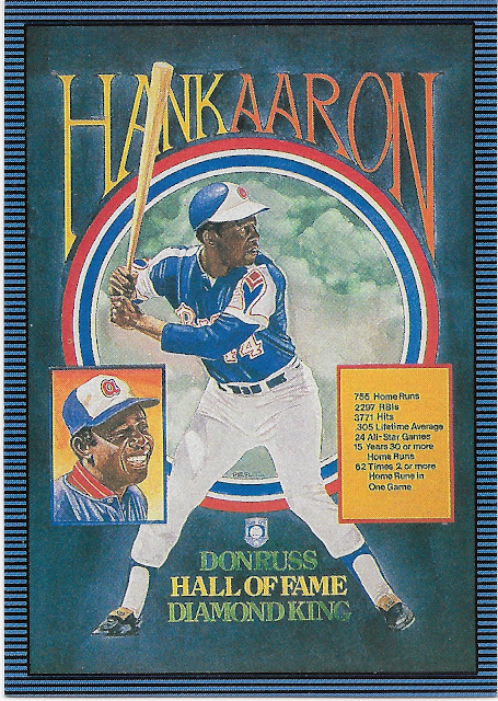
This one's not even a photograph but rather is a Dick Perez painting/illustration of that same photo. It's also not quite a regular "Diamond Kings" card in that this is a card explaining "The 1986 Donruss Hall-of-Fame Puzzle," which can be enjoyed by this regulation 3.5"x2.5" card, or a 15 piece "mini" puzzle also the same size as a regular card, or a full 63 piece 8.5"x11" puzzle one can assemble. Maybe the full deal there would nicely backstop this oddball collection. Could be fun.

I think this might partially explain why Topps became so fond of this picture - perhaps, it is in the public domain. Or, the original Perez-Steele gallery / Donruss rights to the photo had expired by 2011, don't know. From the card offerings, it appears Aaron's licensing went to Donruss for one year in 2008, then no Hank cards appeared in 2009 or 2010, but then in 2011 the Topps floodgates opened.

Regardless, I thought it perfectly anchors this little expedition into the crazy world of minting "new" Baseball Cards of "old" players.

Card Most on the Bubble: despite the general (though small) level of absurdity to this still enjoyable page of Baseball Cards, I am thinking about tweaking it. Which is because there are still more cards using this image, including a 1983 style card, a design I quite like. There is also yet another 2011 card from Triple Threads that would get this thing to four cards from a single year, which has some weird sort of appeal, too. Or maybe, five -
2011 Topps Baseball Kimball Champions insert

So my initial thought was one of the Tek cards would go, because I am not a fan of transparency in cards, particularly once they grace a binder page. And I'm just generally afraid to touch them. Maybe, both will have to go. For now though,

The Result


Sunday, May 25, 2025

A great Baseball day

Baseball has been back in full swing for a while now of course, which is always a wonderful thing. My Baseball Card hobby has not been; after working 6 day weeks from February through April, in May I moved on up - to 7 day weeks. Yay.

Fortunately even working with, around, and in the always dynamic mix of Biology & Weather has periods of slack water eventually, so it's time to blow the dust off the scanner...


1st Card, Best Card

Welcome to 2025! Y'all probably have Series One all bindered up and up on the bookshelf already, but I am still absorbing it. And, enjoying it.

This year I mostly pulled off my annual goal of (somehow) not seeing the new Topps Baseball design until I rip open a pack. A simple plan, which seemingly gets more difficult every year. At this point, "Google News" places all things Baseball Cards into my news feed within minutes of publication, I often think. And one of their little thumbnails with some sort of online/media piece about the new Baseball Cards almost wrecked everything a few days before my target 'opening day' to finally see 2025 Series One at the start of the Tigers' first Spring Training game.

I hit the scroll bar as fast as I could and managed to only know the design would be vertical (again), with a fair amount of graphical action on the left side of the card. Which, once it became "in-hand," I quite like. The foil/metallic ink from 2024's "The Neon" design is back for an encore but on a full white border. Looks like we will have team cap logos this year, which isn't quite the same thing as perhaps "official" team logos. This Phillies card inviting me into the new Topps Baseball set is a perfect contrast candidate for this, as in 2024 their cards used the 'Phillies' + Liberty Bell logo, which does not appear on their uniforms. It will be interesting to see if Topps manages to stay consistent for all 30 teams on this icon choice, something that can vary in some sets. I would like to explore the history of that, but when I can barely find time to read a pack of Baseball Cards, well.

Overall the obvious adjective here is "flowing" and in a way this feels somehow like a reversed ode to 1982's hockey sticks though without being one of those sly 20th or whatever anniversary nods that are more integral to many Topps Baseball designs than is always quickly obvious. An even better adjective which comes to mind is: "elegant." Another wonderful stay-away from those years of aggressive geometry on the card design.

And then there is something altogether NEW: the little graphical diamond indicating the player's position. This, I Like. Bats, balls, and gloves have done duty here but I can't recall anything similar before this, though I can be wrong on such things. It surely can't be easy to introduce a brand new graphical concept to the long history of Baseball Cards. Well done, Topps.

Plus a Powder Blue First Card? Yup, this one's a keeper in that ever growing collection, which won't be of every Powder Blue card, ever, but rather team examples on each design. This card will certainly rep the Powder Blue Phillies for 2025 Topps Baseball.

I particularly liked pulling that Alec Bohm card to open my 2025 season because while I was admiring it, Alec Bohm came up to bat. How handy is that? Let's check the back, because, yeah, I read them:
all in order here
I like the repetition of FIRST LAST name from the front

This is why I prefer to open packages of Baseball Cards while absorbing a live game of Baseball. It was also a bit of an amazement for me in that many Baseball fans in Michigan had spent the off-season wondering if the Tigers might trade for / sign a new 3rd Baseman, a Hot Stove topic which centered largely on the Free Agency of Alex Bregman.

I kinda figured that could go either way; indeed Bregman's decision seems to have ultimately been between Boston and Detroit at the end. Meanwhile I kept thinking about what the Tigers could offer Dave Dombrowski for Bohm, after it was known he had tried to package Bohm and Castellanos in a deal in late 2024. This surely meant Bohm was available, and as I write some 3 months later, Detroit still doesn't quite have an every day guy at Third Base even now that a previous 3B acquisition from Philadelphia, Matt Vierling, is back from an early spring injury. So my off-season armchair GM plan just never went anywhere beyond bouncing around in my own noggin and no one else's - though I will never forget my idea and most especially not when gazing upon this Baseball Card.

By the time I got done flipping First Card over and back over many times, I had lost my place listening to my first live Baseball game of 2025 and it was time to re-check the line-up and also start pondering the rest of the pack -
We all know 2025 will be the year of Chi-Sox RCs

Feels a little odd when the Official RC Logo® is supplying the only real splash of color, but so it goes with MLB's monochromatic team, on lotsa designs. 

Of course Pitchers hardly ever need a positional designator on a card when live game action photography is used, but overall this is a very good image choice very early in Thorpe's motion. As with the Bohm card, the complete player is pictured — perhaps it won't be a year of all-torsos, all-the-time in Topps Baseball. 

As for who Drew Thorpe is, couldn't tell ya. Baseball Cards help tremendously, but I had to look this up: Thorpe hasn't pitched in 2025 and is on the 60 day IL. No surprise for a Pitcher RC. I've had some realizations about RCs and the ultra-modern game of Baseball that I will be exploring in some more posts later this year. Or perhaps later in this post, as that surely won't be the last Rookie Card card in the pack; I think that is an Official Unwritten Rule of Baseball Cards these days...
Nice Mr. Redlegs cameo

From the West Coast, where I never know anything about Baseball players, to a Central division team, where I kinda root for all the teams, so I had better know a few things about their players. Thus, for me, Baseball Cards.

The France card, a fair bit more than the Bohm card, illustrates how the image is going to have to carry the load for some color appeal this year. The Reds uni, naturally, emphasizes the color red which is just kinda barely there in the metallic foil printing. And why do the Reds get a colorful "C," the opposite of their caps, when the Phillies get a regulation white "P," exactly like their caps? I knew Topps would have little chance of going 30-for-30 on this.

a "Sunset" card

More West Coast, in a sense, which I knew from my Baseball Cards, even though Marco Gonzales somewhat struggled to appear on them. He has exactly one Rookie Card - how does that even happen these days? That RC is a 2015 Heritage High Numbers card, without the famous logo; his first Topps Baseball card isn't until 2018 Update. How am I ever going to cover this player in my RC/FTC collection?

This card shows that 2025 Topps Baseball kinda just doesn't want to be scanned - the actual in-hand card in no way gives an indication of the color green in the team color design element.

Series One always has lots of odd checklist choices like this. I could consider this card an "Update" card commemorating Marco's brief (7 games) final career stop in the Steel City, but he did have a Pirates card in 2024 Series Two already. Ultimately considering Gonzales did manage to pitch over 900 innings in MLB, which is an increasingly unusual feat, I guess it's a good thing he got a final, good looking sunlit in-action card like this one. There are always more sunset cards in a set of Topps Baseball than most collectors will ever realize. Which is because this other kind of card -
Colorado Who?


- sucks most of the oxygen out of card collecting any more. We all also know 2025 will also be the year of Rockies Rookie Card cards. Except, Greg Jones is actually a White Sox Rookie in 2025, or, was. After a whole 5 At Bats in Colorado in 2024, he managed 2 At Bats in Chicago in 2025, before continuing on to the Astros minors, as I write. Will he ever exceed "Rookie Limits?" Could go either way, I guess. At least the Topps Baseball Card miner was smart enough to select the colorful Colorado road uniform, which is always a plus...
...and at least the Rockies have color coordinated accessories at home. Otherwise they are almost as monochromatic as that no color team in Chicago.

I at first thought, well, this young player must be on a Home Run trot, given his expression here. But, nobody puts on their oven mitt after banging a dinger. I guess Jordan is just happy to be playing Baseball and appearing on a Baseball Card, and that's good enough for me.

One of the best signs of Spring is the appearance of the Topps Rookie Cup logo on a brand new Baseball Card in my hand. Thanks, Topps. I know the bling has to be spread out some in Series Two, but I would actually be quite content to assemble the Cup collection at the start of the season.

As for this actual card though, I'm not sure mustard, sherbet, and dirt make for an appealing overall image combo. Nor can I discern if those batting gloves are a Mother's Day edition, or how a red belt snuck into assuredly the weirdest of the City Connect unis. I have never noticed the Swinging Friar has to suffer in the sherbet, too. I also have no idea what Baseball event is being depicted here; this card ... just doesn't make any sense. Too much going on.
This guy still plays Baseball?
Is Topps sure about this?


I sometimes like, sometimes don't like a card's zoom/crop choice cutting off a noticeable amount of the Baseball Player. This card, I quite like, as it looks like Blanco just came 'from the stretch' right into the card frame, and he is imminently going to release the ball off the other side of the frame, so you'd best pay attention and follow the action.

A perfect Baseball Card, image wise. even the cheesy advertising is smoothly blurred out for us. The 2025 metallic foil whatever striping for the team color kinda basically fails the Astros though as the primary team color stripe comes off as a weak red, in-hand, not orange, at all. And this is the place to note that 2025 Topps Baseball is probably best enjoyed on a nice sunny day, i.e. during actual daylight hours.

We have a Winn-ah

I don't always collect a set of Leaders cards, though I always kind of want to, every year. I basically prefer a vertical card with the actual League Leader reigning supreme at the top of the card, but for the horizontal style, this is quite The Way. I have to think this might not be the first card to actually print the quantity of the statistic right on the front of the card, but if not, then I will be wanting a little set of previous Leaders card that do this neat trick. I would have dropped the "A." part of the name as everyone knows the full names of MLB's Home Run Leaders anyway, but that's just a nitpick. Looking forward to assembling these.

Frame-Break!

OK, this isn't the first card in the pack that allowed the imagery to overrun the frame design. But this one is certainly a more notable example. I was sure hoping to see a regular horizontal card in my first pack, and this one didn't disappoint. It seems clear Butler is going first-to-third while the defender back at 2nd awaits the throw in from the outfield. Baseball, In Action.

I will soon be assembling all of my 2025 Topps Baseball horizontal player cards to decide if I might just collect 'em all, as Topps always instructs, rather than a 9 card best-of from S1+S2 with another 9 from Update, my usual approach to a partial collection effort. Yes, I already know I am not assembling a 2025 Complete Set, after committing to no less than 3 such efforts in 2024, 2 of which are wonderful big ole sets of Baseball Cards. Though I quite like 2025 Topps, I have to pick my shelf space carefully, going forward. Odds are good though, that '25 will get a bunch of space in the horizontal binder, if it holds more cards like this one. Which I figure it does.
another keeper!
let's zoom in some:

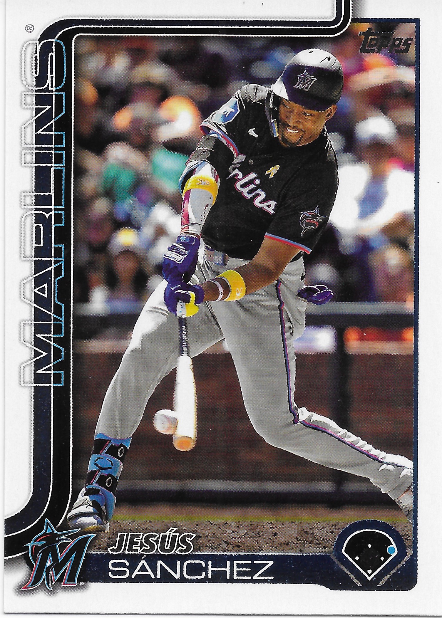
I always enjoy these hey-look-the-Baseball-isn't-round-right-now images. Send me more, Topps.

On the card, the Topps Card Back Writer nicely celebrates Sanchez' ability to hit very impressive Home Runs, perfectly accenting the image on the front. Only problem is, Sanchez just can't do this all that often. Miami's outfield feels as cursed as ever.

That wraps up a look at the 2025 Topps Baseball design. But does any set from Topps arrive without more than one design? I doubt that proposition. It's basically a given that all packages of Baseball Cards must include bonuses of some type - inserts:
Did I just use the word "cursed" appropriately? Nobody knows what's going wrong in Baltimore this year, including Topps probably with their selection of Gunnar Henderson for the 2025 Heritage cover. I was certainly looking forward to some dogfighting in the AL East this year, alas. Did someone kick over a lantern under that destroyed bridge or something?

As for 1990 Topps - is it an homage to Mondrian, or Lichtenstein? A long time ago I wrote about that on this blog, with a well-placed comment from the Night Owl helping things along, but I am too down to link back to that post as it shows off a card I should have never ever never traded away, even for a 1975 style Al Hrabosky autograph, as cool as that is. You can wonder the Archives on your own search bar time if you like.

I like 1990 Topps in very small amounts. I like colorful Baseball Cards in very large amounts. Why does that equation not balance? Just the random-ness of the color choices I guess. Match up some team colors to the here-we-go-round-the-border design and I'm all in. This card nicely serves up Oriole orange&black in the secondary card color element, then just pairs that with - light purple fader bars? I'm not sure either Lichtenstein or Mondrian would approve.

That's the now obligatory 35th Anniversary celebration, rolling since 2018. I have been considering putting together the efforts for 1988 and 1989 Topps, which I think will look quite nice with 21st Century printing quality. One thing I truly look forward to however, is next year: 1991 Topps. Mmmm-mmm.

Lately packs of Topps Baseball cards usually have one other obligatory component: the "Stars of MLB," which might or might not show off a star Baseball player -
the 1990s called, said Illustrator has been updated now

The Twins are hot right now, but this card certainly isn't, as Lee has a perfect 0.0 WAR on the season so far. I actually like 0.0 WAR players, a quite small company every year that supply a face to the "replacement" player concept. But when you tell me a card is depicting a Star of MLB, well I like that Lee rhymes with the theme at least. This insert concept is continuing it's on-year, off-year run, after a fantastic 2024 edition we'll see here sometime soon with a fun little project I just completed.

It's sure nice to get the bloggle on again...now I can wander off to see what y'all think of 2025 Topps, at last. C'ya soon.


Wednesday, March 19, 2025

Livin 4 dimes & a nickel at a time

Looks like I stayed with that fiddy cent box for quite a while, one fine day early last summer. Treasures galore...

Why I selected it: Topps has only issued "Active Leader" cards a handful of times, appearing in the 1984, 2012, and 2020 Update sets. I'm not 100% positive on that being a complete list and would prefer to be wrong and discover some more of these.

I find them to be a fascinating snapshot not of a single year of Baseball activity, but more of a look at, say, 5-10 years of which players are really producing, every season, to climb to the top of a stat category. It is also interesting to see if a leading player can then make the major milestones such as 500 Home Runs or 3,000 Strikeouts. 

I have a long way to go on the 1984 cards, so I was happy to find this one.

Art by Mayumi Seto

Art by Mayumi Seto

Why I selected these: The captions explain it all. More progress on these; whenever I see a 2017 or 2018 Gallery card I generally already know which artist created which card, but that can always be confirmed on the back. 

Why I selected it: I'm a Tigers fan, silly. It must have been Bring-Your-Own-Can-Of-Blue-Spray-Paint Day at some unknown stadium some fine afternoon in 1978.

Why I selected it: Previously in this box of delights I had picked up the 81 Trammel, so for once I was able to keep this famous pair together. Progress.

Why I selected it: Why not? For a year+ now, I have regretted not buying an Aaron Judge KABOOM! card at my LCS, for basically cheap. Those are "case hits" and can go up into the mid 3 digits in price. I could have had Mr. #ALLRISE for just a pair of digits, and enjoyed reading KABOOM! on it whenever I wished.

This card is not a case hit and is thus not worth any money. But, it still goes Boom! Or Roar, or something.

Now I just gotta figure out what kind of cage to keep this thing in.


Why I selected these: I always notice when Topps can't get their Rookie ducks in a row on time to print a player's Rookie Card card before they go out on to the field of play and earn themselves membership on the Topps All-Star Rookie team.

Thus I had solid memories of the regular versions of these cards from 2016 Topps. So - what were these cards? Photo Variation$ ? 

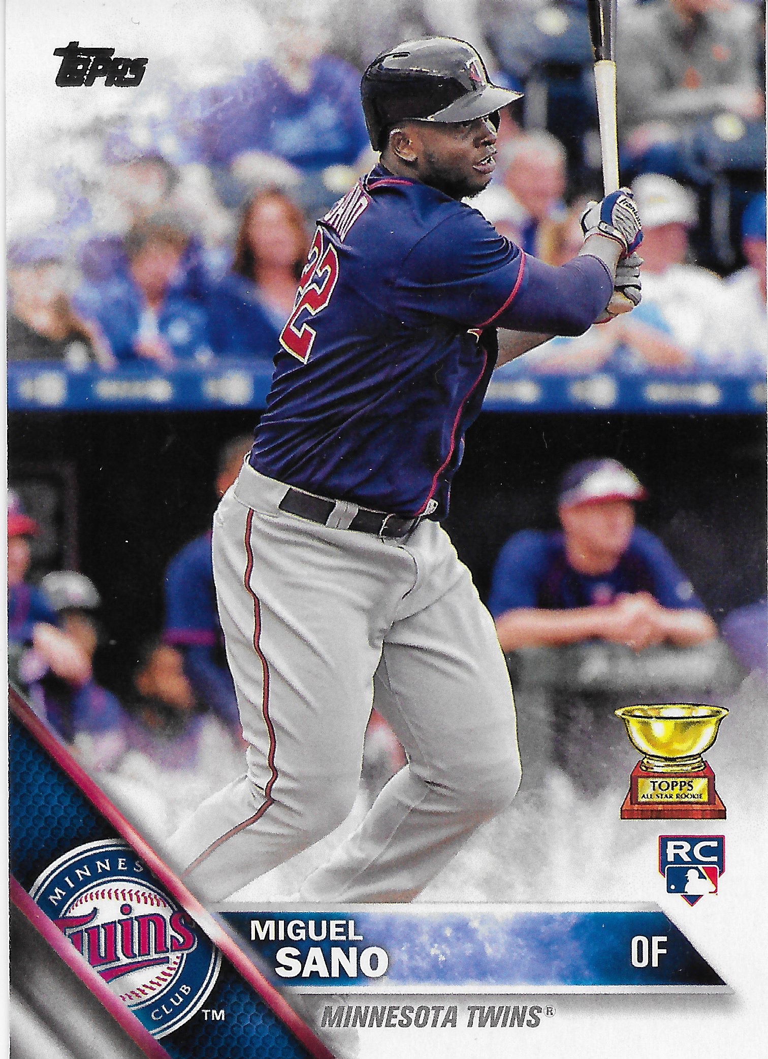
Nope. Just "Factory Set" variations. I would say the Conforto is a definite improvement on his regular 2016 Topps card but the same can't be said about the Sano card.

Why I selected it: Seems to me that a collection of Baseball Cards that sometimes seeks to use them to know Baseball History could use some Tommy John cards.

Why I selected it: What a great menacing look out at the Pitcher. This recent Diamond Kings effort will be a great contrast to the other 8 regular photo-based Baseball Cards on my nifty O'Neil Cruz page. I also like that the artist & card composer managed to well obfuscate the RC logo, which is just not attractive on Panini cards.

Bonus Round
Why I selected it: I sometimes wonder if I know less about Bowman cards, or Panini cards. A moot point if I never buy actual packages of them.

I bought this one because there aren't a lot of cards with Miggy wearing sunglasses, I guess. Also another Miggy-on-the-basepaths card, which are not common.

But I also thought this is one of Bowman's Worst; using a team logo as some sort of under-image backdrop has never made for an attractive card, particularly when the ginormous ® then has to be included. Is Miggy R-rated? Probably.

This card scans up like a gumball machine; the (used to be "atomic") pattern is nowhere near that fascinating, in-hand. Ima stick with Topps, me thinks.


Thursday, March 13, 2025

The last card on the Checklist


Have you ever needed the very last card on a Checklist - to complete that Checklist?

That's the unusual predicament I found myself in 'round about a year ago, when I set out on my way, not to Lodi, but to finally reach the summit of a long-desired collecting goal: completing the 2011 Topps Lineage '75 Minis.

That sweet Koufax card you see there is not the last card on that particular Checklist; rather it is card #1 in Lineage, a Topps product which became "Archives" in 2012. I quite like this particular Koufax card; although this particular image has possibly/probably been re-used somewhere along the 14 years of way since I obtained it, it hasn't been re-used on any Koufax cards that have appeared in any packs for me. That's something that is not true about various other Koufax cards I have randomly obtained over the years.

I also like that the Spring Training backdrop here might indicate a bit of historical accuracy in Topps long-running habit of posing 21st Century Dodgers along or in front of a vegetated area, as seen on many Heritage and Archives cards in the 2010s.

Fortunately I have owned the Koufax card perhaps ever since Lineage first appeared on shelves in front of me; a delightful discovery back in 2011, to see those oh-so-soothing 1975 Topps colors on brand new Baseball Cards, at a time when their re-appearance in Heritage was still 13 years away. As soon as I unexpectedly found one in a pack, I knew I would be collectin' em all, just as Topps has directed me to do, all my life, essentially.

However what I did not expect was just how many Baseball Cards I would discover I quite wanted to collect, from 2011 onwards. Which was a great thing — except for how difficult it then became to complete these purdy '75s. So many cards, so little time.

Thus the Lineage 'minis project sputtered along in fits and starts; eventually no more dusty blasters or hanger packs could be found with a discount sticker in various Big Box stores. I even obtained a fair amount of Lineage cards in a few different K•Marts in my travels. Rain Man would be proud. Sorta.

Once ripping packs was no longer an option I would occasionally pick up a lot of these minis on eBay, and I was able to complete one great trade for about a dozen ticks off the want list. But eventually they rarely appeared on the Bay and most people with an interest in these were far less lazy about completing this than I was being.

That left the great repository of every trading card ever issued, COMC. Or, almost every trading card. On COMC the inventory of these minis, in my memory, has been as high as 160-some cards in the 200 card Checklist. But by early 2024 that # was down to about 140-some, and I still needed a dozen of them. (It is currently down to about 130 available.)

With the imminent major Christmas Eve for 1975 Topps fans at this time last year, I thought interest in the Lineage versions would pick up noticeably during the '24 card/Baseball season, so at long last I "got going," and pulled the trigger on the dozen-ish cards still on my want list there, even paying $10-ish for one of them. Gasp!

And I promptly, missed. COMC didn't have 4 of the cards I needed.

It was time to man-up a little and tackle another long-time, and annoying, entry on the Baseball Card To Do list: navigating the buyer interface on Sportlots. Which has improved some over the years, but is still not quite there yet, particularly if you go many months between shopping expeditions on that site and forget the little tricks you figured out last time you visited.

That left just one card: #200, Tom Seaver - Mets. The very last one. A quirk of the Lineage checklist is that a few players have multiple cards on it, on different teams in Tom Terrific's case.

No problem, it's just one card. ¿Si?

Nope. Problem.

I scoured all the usual electronic exchanges, all the time. One day, I thought I had a "Eureka" moment of not going to a Baseball Card website, first, but rather simply trying a search in the ever ubiquitous Google search box. And, it worked!

Instantly, laziness returned. I simply left open the window offering me a copy for sale and got back to working all day, every day, all over the state of Michigan.

Several weeks later a little free time for Baseball Cards appeared. When I prepared my credit card for the triumphant purchase, I finally noticed the big flaw in that tab I had saved. At the bottom it said "Quantity Available: 0." Yup - Zero. Curses! (There were a lot of those.)

The card could not be found. Even worse, I read an online comment about it: "it took me over a year to track down a copy of that darn Seaver card to complete my set."

Fear - the mind killer - was setting in.

What if ... Lineage card #200 was one of those cards placed on a corner of a sheet, and then the fork lift at the printing plant hit a great big stack of the freshly printed sheets, and the vast bulk of them had to be left out of the product, creating an un-announced, un-planned but very real "Short Print." Noooooooooo!!!!

At least I had card #1 already, so there wouldn't be some ghost of Andy Pafko haunting this simple seeming collecting goal.

I tried increasingly unusual ways to look for this card, such as typing "Tom Seaber" into search windows. Nothing was working.

Finally, finally, you won't be too surprised about what happened. One day back in January after a long day at work I sat down and opened the eBay app. And there 'twas:
What a relief.

Although I like that the 2011 Topps Lineage Checklist editor neatly book-ended the set with 2 of the most famous Pitchers of the 20th Century, this isn't my favorite Tom Seaver card. That would be the 1976 Topps '75 Highlights card, surely the most intense "Look-In" card ever issued.

Now at last I can dive into a quite delightful activity:
A long-awaited sight.

Is there any set that seems more designed to be enjoyed on a 9 pocket page than 1975 Topps? Such things didn't exist, back in 1974, when the concept was created, but it sure works out niiiiiiice.

Seeing this makes me realize, some ten years later, how 2015 Topps is a sly bit of homage to the colorful king of Baseball Card design, some 40 years prior. And how much I am now looking forward to this very same task with those now ten year old cards, something which might hove into view later in 2025, I hope.

An interesting thing about this page of cards involves the two famous Yankees - Jeets, & The Mick - who wore uniforms #2, & #7, respectively. 2013 Topps is the set most known for using a player's uniform # as their card #, but the idea was planted here, two years before. Jackie Robinson is card #42 in this, for example. However there may not be more than those 3 instances of the concept.

And yeah, that page there indicates I have a stash of the 'minis sized pages, carefully held until this wonderful day. "Careful" has been a routine adjective in this too-long project, as these cards chip pretty easily if you even look at them wrong. I am the farthest thing from a condition-sensitive collector, usually. But with these, I wanted them to look as nice as possible when they finally slid into their permanent little plastic bed, forever and ever. So all handling, sorting, etc., has been done in a bit of Baseball Card slo-mo over the years.

That's a mostly respectable group of 9 Baseball players, though today I don't have the same amount of respect for Carlos Beltran as i might have back in 2011. This was the first set of Baseball Cards I had ever seen that mixed current every-day players & Hall-of-Famers with...
Who?

That's one of the "Rookie" cards in the set, although the now classic logo was left off the 'minis despite appearing on the full-sized Lineage cards.

Other notable Rookies in the set include Aroldis Chapman, Chris Sale, 
&, This Guy -

Altogether, Topps somewhat restrained themselves here by only including a dozen Rooks.

I expect there might be some checklists in the '00s decade that tried this now de rigueur mixing of GOATs and RCs, but if so they likely would have been insert checklists at the most.

This is not a practice I am a particular fan of, though it is not all that turrible, just turrible in Lineage as it can be in some more recent Checklist creations. 

So over the years since I have determined on a personal remedy for avoiding things like placing a card for Tsuyoshi Nishioka's 233 career MLB At Bats directly next to a Whitey Ford Baseball Card. Which is to just simply re-arrange the checklist on my binder pages in a certain way:
This is how the regular portion of my Lineage collection will appear, in the binder — the players actually playing in 2011 will be all together, probably with the Rookies just left in the same Checklist sequence. On such a small Checklist I would rather not see teams together when so many teams would have so few representatives, and I do otherwise enjoy the random approach to Checklist construction.

That leaves a decision to make for the retired players - randomly sequenced, or ?

If not using the Checklist order, one could go with date of Debut, or date of Last Game. I chose the latter -
This pleases me.