I'm not sure why I can no longer count to ten correctly. I called a re-do on that pesky page I assembled with a Wal•Mart blue version of Kevin Millwood that was just all wrong, but I think I posted it once already. But that one is not part of the ten finished pages.
I'll probably change the #s again next time I finish a page. Sigh. Meanwhile...
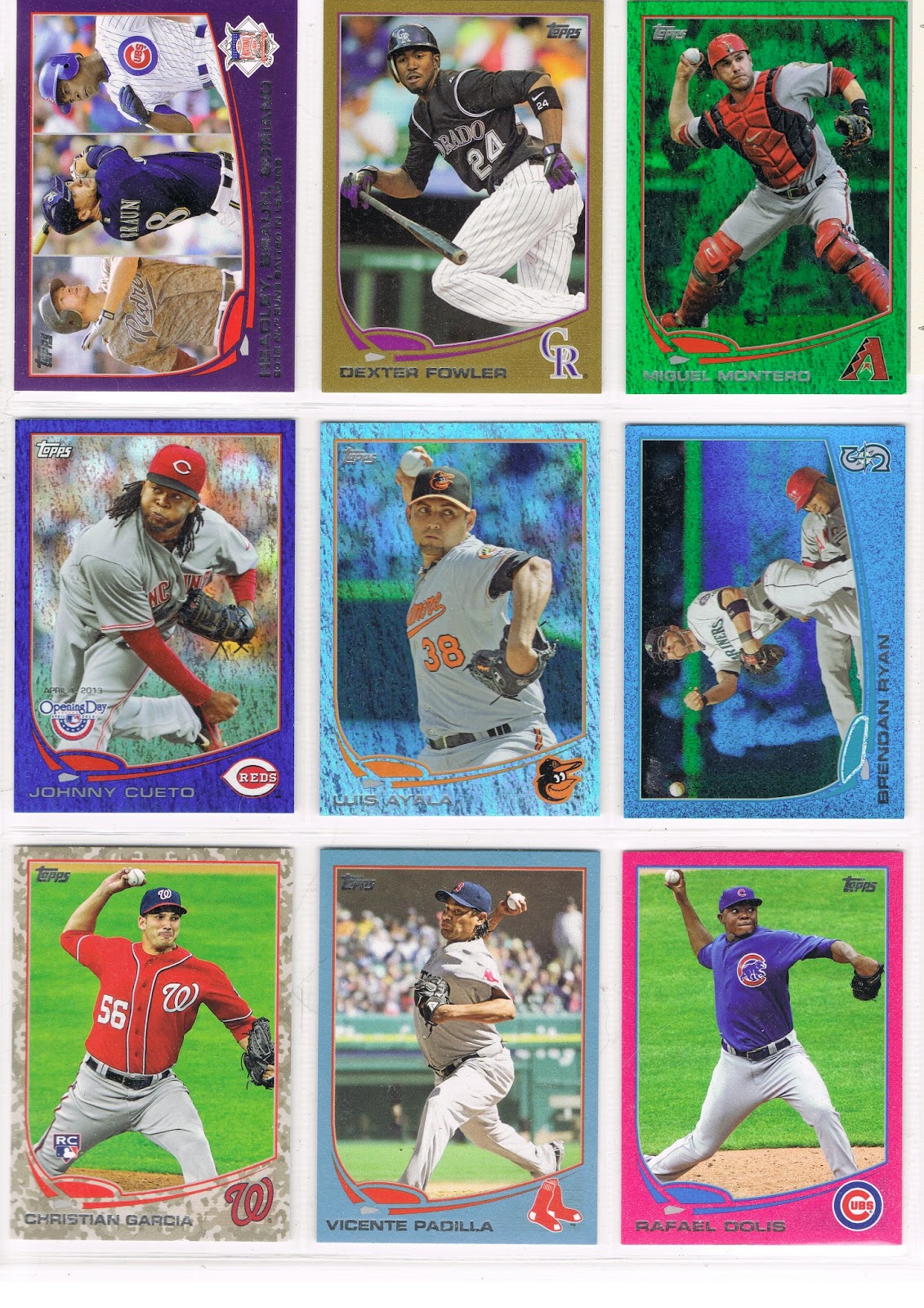
…a couple new items on this page. The center slot is anchored by a Sapphire, that's Luis Ayala there.
I like the Sapphire Foil cards that were released across all 3 Series when Update came out. I don't much care for the fact that they are in an edition of /25. The popular Hope Diamond parallel in 2011 released similarly, was printed /60.
But of course today, collectors and Topps customers prefer expensive cards and yaddayaddayadda, you've read it all before.
I like the Sapphire Foil, except of course I won't use a blue Sea Turtle for one. I discovered the other day that an Athletic Sapphire Sea Turtle doesn't contrast enough to look that great in the project either.
And I'm glad I pulled that Ayala Sapphire myself. His 2012 Update card is probably my Card of the Year for 2012. What, you missed that post? Yeah, well, I'll get around to that one some day. 2015 perhaps.
What was the other new card here on page 9? Not a new parallel, but the first card I've shown that will be part of an interesting side collection developing out of this project.
The Sea Turtle swims aside to reveal a Starship Enterprise Card:

Some of the horizontal cards on certain teams on the Blue Sparkle wrapper redemption cards, and the Emerald Foil cards, have this certain printing error. How could I resist? In the project they go, even though a Mariner Blue Sparkle is a bit less-than-ideal for the project. I'll be putting together a neato nine of these cards for a separate page, if there are 9 of them, though I'm not sure about that yet.
I might need a third copy of this card for another project for which this card includes an example. I found a great, great such card on ebay the other day for fifty cents and I think you'll see it soon. I'm pretty darn sure I can win that auction.
I also like page #9 because it is only the second from Series One that I have finished. I think the lucky Ayala pack pull occurred after acquiring the Pink Dolis and the Camo Garcia, so I didn't need a third low /# parallel with Johnny Cueto conveniently showing up on the Opening Day Blue Foil. And thus probably my first page without a cheap retail Target Red parallel. Such diversity will certainly help the eye appeal when I am flipping through the completed project in the year 2025.
So on to page #10:

Another dramatic page for me, because it's the one that started it all, somewhat. My first purchase of 2013 Series One was a Hobby Jumbo box from which I pulled the black /62 of Izturis there.
What should I do with it, I wondered? And wondered. And wondered. And read card blogs. And put cards in binders. And worked on the still easily available 2012 Update simultaneously. From which parallels poured out of, since I usually shopped for cards at Wal•Mart and Target. As I was haunting those stores all over eastern North Carolina that winter hoping to find left-over 2011 Update with that confounded Mike Trout RC I still needed and refused to buy as a single.
I'm still pretty sure the chance acquisition of many Emerald Foil editions of St. Louis Cardinals cards like the Furcal on this page somehow made the Christmas-in-February lightbulb come on in my head.
Which somehow led to the Eureka! moment for this project, and a way to use that Izturis card in my collection for all eternity.
I lost track of what was the keystone card here. I think it was the Scott Hairston card there in the center slot…I think I was holding out for a Blue Sparkle version of that one, because the Mets cards look fantastic on that parallel, especially when there is great contrast in the background with infield dirt.
But the Orioles also look fantastic with their eye popping orange home uniforms amidst all those sparkles, and Endy Chavez was patiently waiting. So I think I finally relented and pulled Hairston from the Emerald reserves and declared this page done.
I suspect that when I get my COMC account up and selling with all the extra cards I have laying around (and writing this post is delaying that process yet again…), I will pick up a Sparkly Hariston and an Emerald Chaves and rotate them onto public display once in a while.
Because no good Art Gallery can afford to keep all of it's treasures out on the walls at the same time, can it?
No comments:
Post a Comment