I hit the Dollar Tree today, and discovered a new-ish repack product - 30 Baseball Trading Cards for One Dollar. This one is from PressTine, who previously offered a 20 cards / $1 product that I would sample occasionally, though I much preferred the 30 cards / $1 product from CardsOne. I think those guys that were trying to sell a whole 6 cards / $1 are going to lose this war.
But competition for consumers makes the capitalist world go round, and I was jonesing for some Heritage, so as I went one buck window shopping, this top card was an easy choice
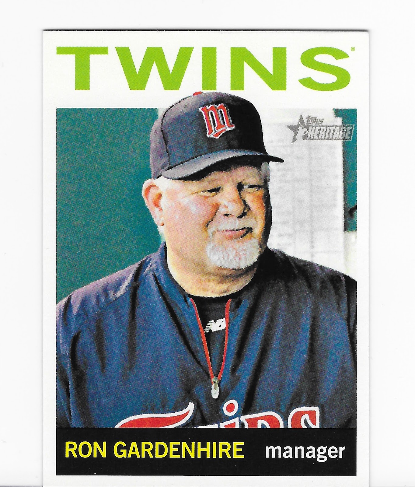
So maybe Old School Crusty Manager is the new nerdy type Manager, we shall see. I could never figure out how a team could hope to be successful "playing the odds" without a strong emphasis on the fundamentals. It's the little things, the itty-bitty things, sings one of my favorite songwriters, that make a play successful and give a +1 on a key counting stat that create those sexy compound SABR stats. It definitely remains to be seen if Gardenhire can successfully merge the new use of analytics (including a deep new analytics department in the Detroit Front Office) with his 20th century ways.
Anyhow, I like Manager cards and I was pretty sure I needed this one from what I call the "Salmon Set" for those just peachy card backs. I never did get around to completing it back in 2013, but that is a beauty of collecting Heritage cards - they are fun to collect later on, too. Do you think anyone will fondly get around to finishing the assembly of 2017 Topps in the year 2029?
Before I dive fully into this 100 cents worth of baseball card enjoyment, I have to note that this will probably be the very first repack advertising card what might well end up on a binder page, though I am having trouble thinking about what other cards to put on a page with this crazy cool card
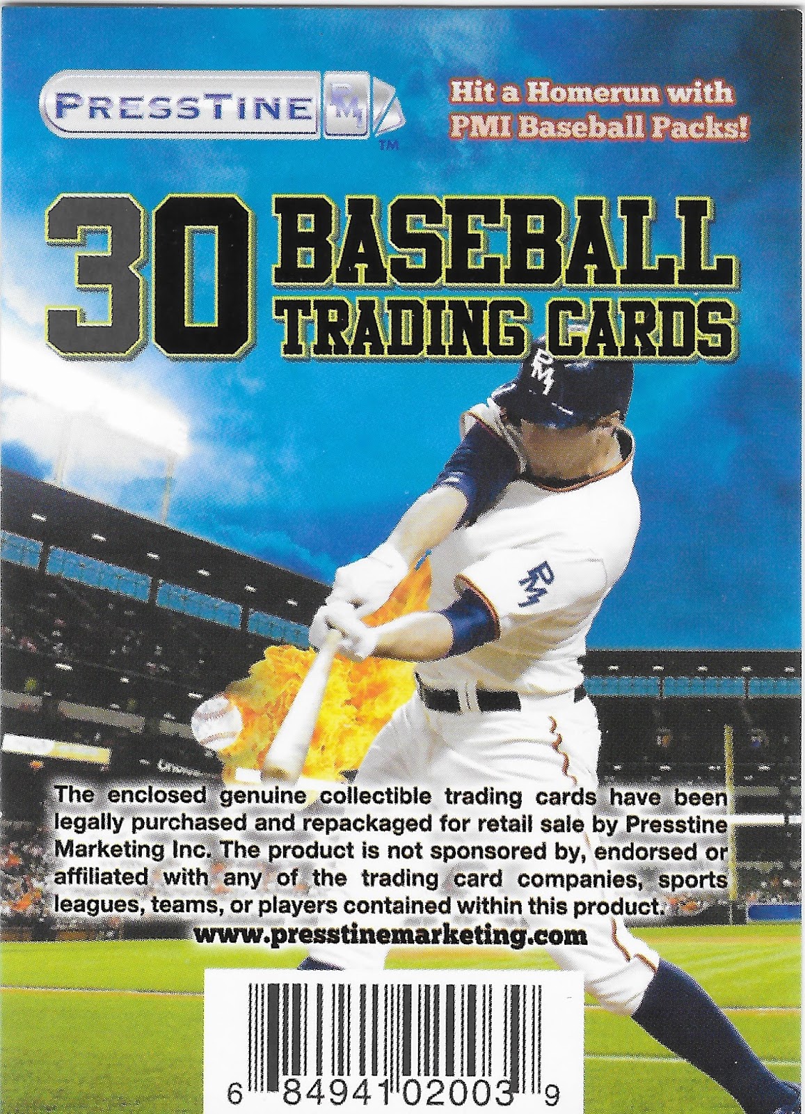
Maybe it would work with some Nolan Ryan cards, surely some of those have some flames on them too, I would imagine. But really, this card has a lot going on.
It is a Stadium Lights card - I collect those, even though I never have gotten around to finishing that cool little insert set in 2011 Opening Day. One of these days.
And you thought only Topps could wield the air brush on to a baseball card these days? Nope, PMI has their own sluggers in this department too; since the pack invites you to "Hit a Homerun with PMI Baseball Packs" it seems only fitting that they supply you a team-mate to play baseball with, in a PMI uniform and everything. PMI = Presstinemarketing, and probably Incorporated, too, I would guess. They even have a website, though sadly, they don't undercut their customer and allow you to buy your own $1 repacks for less than $1 by going direct to the "manufacturer". Truly a pity, as their competition allows you to save money by buying your junk wax by the pound, something I am truly looking forward to doing some day, actually, though I might pass on a full 1,400 pound pallet of junk wax fun.
Bu it is truly a pity sometimes that we live in the land of the Disclaimer. This one really detracts from such a fun baseball card. We are about to hit a Home Run straight into the gathering Night, straight off our awesome baseball bat that is so awesome it is bursting in to flame as we swing!
I just hope this Home Run clears the top of the stadium, because otherwise, as far as I can tell, this probably flaming baseball is about to go zinging straight into the crowd. I sure hope this stadium has plenty of safety netting!
So, each side of the pack has a keeper. How many packs of baseball cards can say that these days?
And, yes, tl;dr reader, it had baseball cards. I have always had a soft spot for In The Dug-Out cards

Recently, the Night Owl explored the mysteries of the creation of the 1988 Topps cards and how the image always lays over the team name. I have been wanting to pull a 1988 Topps ever since. This one doesn't disappoint in that regard, but I doubt it will make my All Time Nine of dug-out cards that will forever lead off with the 1975 Bert Blyleven card that scared me so much as a child. But it might just be the funkiest "O" on the Orioles uniform I have ever seen. What's up with that?
Speaking of scary cards, this one just straight creeps me out

I think it might secretly be an out-take from an un-released Will Ferrel movie, mocking me somehow. Sure, it has acceptable red-&-blue colors, perfect for a baseball card. But grey, ugh. Buh-bye 1998 Upper Deck Collector's Choice, I will be taking a pass.
Which is why I love re-packs. Discovering sets I didn't collect, that I can later discover that I don't want to collect. Sometimes, though, that is a tougher decision

It is a pity the Internet is still stuck in two dimensions, and aside from a lack of depth, it also still has a lack of an ability to impart a tactile sensation. That will make a bunch of people a bunch of money some day, that I can tell you. I mention this because by the year 2001, I am sure baseball card companies were really struggling to come up with anything new, though SkyBox was never shy about giving that a Go. A player stepping out of the design frame? Yeah, so 1988 (and 1964, really). So this card has a portion of it done up with a sand-paper like tactile surface for some reason. Maybe starting pitchers were supposed to hide these in their hats to rough up baseballs with somehow. No, ump, that's not an emery board, that's just my baseball card, I keep it up there to bring me some luck.
But ultimately, the key component of a baseball card is the player on it. If this potential 2001 First Baseman (POS on back) for the Oakland Athletics had such a bright future, how come in the movie Moneyball they were still thinking about the guy who flopped on to first base, and hiring an injured Catcher to convert to First Base? How hard can it be to pick out a Prospect that will make it The Bigs and put him on a baseball card, Washington? Incredibly hard, methinks.
But failed prospects are not why I buy repacks. I am looking for baseball card glory like this one (and cards of my favorite team) -

Another keeper, though I must confess that was automatic based on it being a Tigers card, but how many other cards can make the viewer think - "He throws like a girl" - about a Hall of Famer?

Like that card, which says to me "Pitching Coach", instantly. So at least it led me to look up the idea on Baseball Reference, though I had to actually surf on over to Wikipedia to confirm that yes, indeed, Bruce Hurst was eventually hired as a Pitching Instructor, at least, for 2008 Spring Training with the Red Sox. My baseball card radar is rarely wrong.
And even though I have an eye out for all the players that appeared in Moneyball and I oh-so-slowly work on a collection of them

The repack always rides to the rescue, reminding me to bail on those blah grey bordered sets. I am sure a 90s-lovin' repack will eventually deliver me many more David Justice baseball cards with far more eye appeal. For your sake, I hope so too. My scanner doesn't like them either. Sorry 2000 Topps; I'm sure I bought a pack of you, fell asleep, and waited till my usual baseball card re-birth in any year that ends in "1", which is a Topps Anniversary and they try much harder to make a cool looking baseball card.
Now, wasn't I just wondering how hard could it be for a baseball card company to pick only prospects that make the Major Leagues? Yes, yes, I was, but sometimes failed prospect cards are kinda cool

I mean, how many posed hitter cards are like a good example of Pitcher Face? A scowl must not have been the best way to make it to The Show, you know. But Upper Deck was so frequently thorough, with those basically double-sided baseball cards, even for a Minor Leaguer, so if you collect Bunt Cards, you might could be on the lookout for that scowl -

Well, the scanner got the important part at least. Reading stats of a guy who sadly never made the bigs.... baseball cards are supposed to be fun.

In the 80s, they frequently reminded you of that. Baseball is Exciting! It was only in the 90s that the companies started working a little too hard on the fun.
And ultimately, the funnest thing about opening a pack of baseball cards is finding a card you need for your collection, like this one

Thanks, PressTine! Home Run! My low-end Miguel Cabrera collection just filled an empty slot.
And after a find like that, it is right back to checking out a never-seen or forgotten set

This card gives me a nice warm fuzzy Goudey feeling, though my scanner is again not quite a fan, what with me being all lazy on using the "Auto Detect" feature. Nice primary colors, goes well with an Alternate Uni, and I am a sucker for an On-Deck Circle card, even without the Stadium in the background. I wonder if they put a Canadian flag on the Blue Jays cards? This card is also made out of real cardboard, always a pleasurable part of a repack after one has been fiddling with too many 21st Century baseball cards. I think I will be on the look-out for more 2002 Fleer Tradition efforts.
No repack would be complete with Moar Junk Wax, from the peak years, and this repack didn't disappoint

Even a blurry off-center version of this card is always fun to pull. 24 years before Toys-R-Us parallels, we could ponder Purple, and Dodgers and why, Topps, why? Are there any other cards with a golf cart ? I suspect so, but can't be sure. And I always love this card because my theory is that it is impossible to be in a bad mood when you have your very own golf cart to drive around. Try it some time.
This card, though, just might show the limits of that highly technical 1988 Topps card construction technique. Perhaps that careful work with the scissors might have made it just a teensy bit harder for the printer to align the color plates. At least in that set, the printer has a good excuse for that. I wonder what the excuse was on so many baseball cards the year before this one was printed, and the year after? I told you I would be working on my baseball card heritage chops today.
Eventually though, the best reason to buy a repack will come pawing along. A baseball card of a type that you didn't even know existed. Behold, The Bat That Was Broken!

BAZINGA! And a Rookie Card! Oooooohhhh, I'm rich cuz surely this card foreshadows the Return of King Meyer, though I'm thinking he looks more like a First Baseman. And I am already thinking if there is an official Rookie Card Logo, we must have already reached the Mid-Aughts, though if you can ever tell Mid-Aught Full Bleed Upper Deck cards apart, then you are far more of a baseball card Wizard than I (which is why I need repacks). But by the Mid-Aughts, the Rangers should have had some rookie named Ian Kinsler coming along, so I am off to Baseball Reference ...... which sure enough reveals that this Rookie Card might have just a little too prophetic with that broken bat there, as Drew Meyer played all of 5 games in the Majors, and, yes, in the same year that saw the debut of one Ian Kinsler.
How hard can it be to print baseball cards of prospects that actually stick in The Show, Wash? Incredibly hard. But then you probably shouldn't get your hopes up over a baseball card #'d One Thousand, Two Hundred, and Two. I'm pretty sure I have never pulled a card numbered higher than 1200 before. The things you find in these repacks. Another keeper.
I like collecting baseball cards because of the surprises you can find on them - like Pitchers At The Plate

I will never have enough batting pitchers cards, not even from 1988 Donruss — another set I am no way, no how, ever going to deliberately collect with even a pack or two. So, bring them on, repacks!
And don't forget that mid-90s weirdness

It wasn't until I had this card scanned and was selecting the next one to share with you that I could even notice that it was for another recently minted Hall of Famer. At least it gave me a pleasant flashback to just the other day when a track from Metallica from long ago suddenly appeared on the shuffle on my iPod. Did James Hetfield get stuck with a pack of these cards before he picked up a guitar? Those eyes are just hard to escape from - I'm pretty sure I absolutely do not want a set of 9 pairs of them looking back at me from a binder page.
Sometimes, these repacks are a little too good at teaching the baseball card heritage. As with this card

I want to like 1990 Topps so much, though I find it hard to believe my scanner can't figure out the edges of this colorful card. It's like a cool mash-up of Mondrian and Lichtenstein, as I've written before. Or maybe that should be MondrianXLichtenstein, as in one of my botanical pursuits.
But maybe the repack is finally illuminating baseball card heritage for me. Red, Blue, Texas Rangers, so far so good. Yellow? Ok, Candy Apple Yellow like this card (the color I want to repaint an old van I have), I guess that works to offset so much baseball classicism, and the tint is great and the red dots fading into yellow dots into the pure yellow, yeah, good. But the reason I just can't warm up to 1991 Topps is there in these two corners. What does light blue and teal do here but create a not-psychedelic mess? Is Gary Pettis about to be traded to the Mariners? To a 1970s powder blue club, of which there were several to pick from? Why, Topps, why? I want to like 1990 Topps so much. But now this repack has revealed it to me - it's the superfluous corners, stupid.
So, palming on forward into this little stack of cards, another repack trope is found

A Double! Right in the same pack! Creepy all over again! Is it more or less creepy that this card didn't fall sequentially with it's doppleganger in the repack, the way Bip Roberts cards are supposed to? Dunno, but this card is still creepy. But no cheating on this blog, I scanned both of them.
Repacks are also good for showing off unique unis of the past sometimes -

I generally like brave black bordered sets. A pity this cool alternate uni supplies more color than the totally phoned-it-in design "Bowman" came up with that year - maybe 2011 was just past the peak of the "Foil Era".
I tried to let this repack card entry lead me to some baseball card/uniform education, but all the right webpages were so loaded down with auto-play video advertising and other skip-the-screen-all-over-the-place-advertisements, I gave up on divining the mystery of a white cap for the Boston Red Sox. Thankfully, I have repacks to bring me some baseball uniform/card history.
Sometimes I think I missed my calling in life. I really should be seated in front of an infinite pile of "worthless" baseball cards, purchased by a repack company for mere fractions of a cent, each. I could endlessly amuse myself, and all those unknown people walking into the $ store for a little break from their day via a - randomly? - assembled pack of worthless baseball cards. I would carefully pick a photogenic card from a somewhat recent set to put 'on the cover', make sure to include a Hall-of-Famer or four, not worry about which way each card faced as I maniacally packed the repacks with care, or without care. And at the end of the pack, I could let my hair down, and slyly assemble a couple cards (and meet my one per quota for "vintage"), with some cards created 33 years apart, but still, somehow, related.
Ahh Baseball, the sport of alliteration. Those repacks.
No comments:
Post a Comment