But what I did wasn't all that hard when one lives without internet service, which is usually the case for me this summer here at 4,000 feet of elevation in West Virginia. And I highly recommend trying this simple thing yourself...
Last night, I purchased a pack of 2019 Archives. I carefully pulled a rack pack from the peg, without looking at a blaster box sitting right adjacent. It helped that the brand new display had already been pawed over some. And so, I was able to open a pack of baseball cards without knowing what design style would be on the cards.
The only product you can't really do that with is Heritage. And even though Archives is kinda like Heritage Lite, if you are careful to avoid any web pages that might display the "sell sheet" for a new set of cards months in advance, Archives can surprise you too, though of course you will recognize the designs.
Some years I fail at not "seeing" the cards before they come out - one year I was sunk by the Fritsch card catalog. I was checking in on the price of some sealed 1970s wax they still hold, which makes me drool in anticipation of being able to afford some day, when I stumbled across an ad for a set of the coming year's new cards. Cards not even for sale yet, revealed to me in the Fritsch catalog of all places!
I have been doing this for several years with Series 1 each winter, though I haven't been able to write about that process much on the blog. Even this post finds me parked on that one special spot on the mountain where the cell phone works, up past my bedtime. But I enjoyed this pack of cards so much, I wanted to share it with y'all before I wander around the web a little to see what the rest of you think of this wonderful new set of cards, so - let's rip a pack!
I have no idea who this player is. But that's perfectly OK with me - this is why I buy baseball cards. I am even somewhat in Pittsburgh Pirate country here in eastern WV, where I grew up as a Pirate fan. So I was quite happy to pull this card at the beginning of the pack. I know everyone wants Roooooooookies, send moar Rooooooooooookies, Topps!, but I like Rookies. You have to meet the brand new baseball players, somehow.
And I was surprisingly happy to hold a retro 1958 card in my hand. I was vaguely aware that a 1950s design would be included - I couldn't block out some of the images on the blaster box that perfectly. But I was thinking it would be another go at 1954.
I suddenly like 1958 so much more, holding some of these in my hand. Bright primary colors, a clean white border, efficient clean text, and a team logo.
I apologize that I am many hundreds of miles away from my scanner right now, and also did not take a photo of the back of this card. It notes that Cole Tucker had a big highlight game in April - of this year. Topps is including baseball player news from the current season more and more lately, with their mid-season and onwards releases; it is most noticeable on the card backs in Update and is nice to see now in Archives, too.
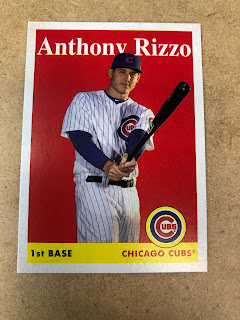
I am a big fan of Anthony Rizzo mostly because - Topps routinely hooks me up with Anthony Rizzo cards. Quite often, really good ones like autographs, relics, and low numbered parallels. And Rizzo is one of the best human beings in the game right now, with his charity work. So although this is just a regular "base" card, I was very happy to get it. 1958 looks even better on this card than the previous card. And one does expect to pull superstar cards from an Archives checklist, like...
This one! You can't beat pulling a Mike Trout card in a pack of baseball cards. I was especially happy to get a Trout in my first pack of Archives - now the inevitable doubles or triples from randomly buying retail packs might give me an extra Trout for my eventual collect 'em, trade 'em endeavors with these. And I really like how the 1958 design meshes with the otherwise ho-hum posed photos taken at Photo Day every year at the beginning of Spring Training. Without any background at all, I actually prefer the clean portrait approach quite a bit more. This card had me wondering who else might be on the checklist this year, hmmm...
Perfect! A player from 1958 on a 1958 style baseball card. I like this card so much it makes me want to randomly buy 9 1958 Topps baseball cards just to enjoy them on a binder page, and hopefully one with that clutch "B" logo, something I have never owned on a baseball card that I can recall with certainty. And it is a good thing I liked that card so much, cuz -
Maybe the "B" stands for Bazinga! Two 1958 Brooklyn baseball cards, in one pack!
I have long thought I could collect Honus Wagner cards until I ended up with the same picture of him on 9 different baseball card designs, but this card made me realize that will probably be easier with this photo of Jackie Robinson, which has adorned many a Topps baseball card over the years. But that's OK - it's Jackie Robinson after all.
Here I did my due baseball card blogger diligence and took a photo of the back for yas:
It might be a little hard to see here in just a photograph, but what I really liked on this well executed card back is that it works in some perspective on Robinson's career using the modern WAR stat - a very nice bit of work put in by a Topps researcher here.
Now it has been a year since I picked up any Archives baseball cards; the 2018 edition just, well, I can't remember much about that one, except a nagging feeling that I really hated something about it that I am suppressing somehow. But I had a feeling that after about 5 cards, it would be time to see a brand new, err, old, baseball card design:
Now here is the real Bazinga! in this pack. 1975!
I had a feeling we were due to see this beloved design return. It has been 8 years since it was used in the original 'Archives' product - 2011's generally under-appreciated release called "Lineage." And maybe that was a part of my careful effort not to discover the 2019 Archives line-up until I was able to carefully rip this first pack. And that certainly paid off - I will be buying a lot more packs of this stuff.
1975! The card backs on these are very well done too, with some pretty good trivia questions. I look forward to reading all 100 of them. (Presuming the checklist is 100 cards/style? Maybe I should figure that out sometime soon, now.)
And a 1975 player on a 1975 card, err, well close enough, since all lovers of 1975 Topps know there was another team's cap on Nolan Ryan's head that year. So using one of his other teams for a new '75 Ryan is a nice way to go here.
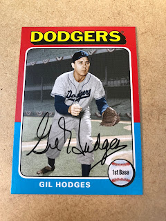
Now there's a baseball card - how about that background. History just oozes out of this card in every way; even though Gil Hodges was not a 1975 Dodger, that is perfectly acceptable on an Archives card, too. And the photo is nice and bright - it seems like Topps skipped using any kind of weird filter to recreate weird old analog photo and printing technology like they have done on some recent retro releases. This card looks very nice, in hand. And I really look forward to absorbing every tidbit on the back - it was a way too long busy day for that. By this point, I was really looking forward to each card...
Finally a card that everyone wants in their pack of baseball cards - a card from their favorite team! I have some pretty serious doubts about whether any member of the 2019 Detroit Tigers might even make it onto this checklist, and it has been a long boring summer with no access to baseball and then a pretty sad summer discovering just how totally bad my favorite team is this year when I do check in with civilization once in a while.
But this card sure helped on that front. It also made me remember why I hated 2018 Archives - that horrible white-on-yellow positional pennant on the 1977 style cards that totally ruined an excellent Hal Newhouser card/photo I had never seen before. Now here is another brand new Newhouser baseball card for me, and that totally makes up for last year's flub. Thanks, Topps! And you can't beat a card of a Pitcher with a bat in his hands — I'm pretty sure this is the first posed Pitcher <> Batting card I have ever pulled. Unique.
Now for me, following Chris Sale's career is a little like following Anthony Rizzo's - I mostly connect it to the many unique Chris Sale cards Topps has sent me over the years. Normally, he gets excellent cards; his 2013 card is one of my faves that year (and will finally make it onto the Sea Turtle blog late this Fall or in early Winter).
On this card, he looks like a dork. But that's OK. It's a Red Sox card, with hardly any color red on the card. That's how 1975 works - glorious. Primal.
And that signature - can't recall seeing a Chris Sale "signature" before this card. No wonder no one can hit his pitches.
Hi there Kids, I'm National League slugger extraordinaire Cody Bellinger. Nice to meetchya. Another perfectly executed baseball card, and I have also never seen a Cody Bellinger signature before either. I actually do like the "facsimile" signature on a card, and I like how Cody signs his name in that - he really signs it, though that is not all that apparent in this picture of a baseball picture card. Baseball cards are meant to be enjoyed in your hand, not on your computer screen.
And I think this pack was supposed to be delivered to upstate New York, rather than to Elkins, WV. I hope Night Owl gets some packs like this one, though it might be time to turn the page to style #3, perhaps?
Nope, a bonus 1975. Nice light tower, too. I am so looking forward to buying my next pack of Archives, that I can tell you. But after 6 trips down favorite baseball card set memory lane, it surely must be time to see what is behind door #3, Monty -
Ahh well, I was so giddy to be wonderfully back in 1975 there (for a good ten minutes or so last night, with just 6 baseball cards), that I forgot - Inserts! There were no inserts in 1975, silly rabbit.
Now my main memory of Topps magazine is something completely different:
Which is from 1991 Wacky Packages. So that Lindor insert card is nice enough I guess, but these will mostly make me just remember to keep an eye on the shelves for brand new Wacky Packages. Oh well, it wouldn't be Archives without some trips through esoteric Topps insert efforts, too, sorta like this one:
Which I don't think was actually an "insert" card back in the day the iconic Jeter card came out with an ordinary checklist number. But since I was starting to go through Rookie Card withdrawal a little bit in this killer pack of baseball cards full of classic designs and classic players (not really), OK, well, if you had to pick a 2019 Rookie to get a cool retro-esque Rookie Card of, well, Pete Alonso is a pretty darn good choice here. As I have never owned one of the '93 Jeters, I was kinda wondering what might be on the back of this card, and how it might compare to the famous DJ card (a future research project I guess). So I took a photo of the back to see how you might remember _the_ card of 1993 -
But who cares about that question, because
Miniiiiiiiiiiis!
I had to take a picture of the next card, with a regular size card, to correctly illustrate the super-Bazinga! I found in this pack. Did I use Bazinga! yet in this post? I forget.
1975 minis. Whoa. I did not see that coming.
Now I am working on the 2011 Lineage 75 minis, but then there weren't 2 versions of the 75 style in that set, just the mini version. And I actually don't expect to collect these new 75 minis, so if you are, yes, I will trade you this Bob Feller one if you need it.
Unless.... the 75 minis in 2019 Archives are actually unique cards, different than the regular size 75s in the product. Then, I would be in trouble. Because at 1:37 packs, I don't expect completing a set of those would be a very cheap proposition. But I would have to have them. So I guess I will find out when I buy a couple blasters and see what falls out of them - unique minis, or simple "parallel" minis. And, ut-oh I guess there might be "parallel" 75s in different colors? I actually hope not. When I get "home" to where the wrapper of this pack is, I guess I need to research a few more things in that list of odds, which is always so complicated.
And surely now, Monty, it is time to see what is behind Door #3 this year:
1993. I have always liked 1993, though I only bought a couple packs of cards that year I have been thinking about collating a set out of it out of a couple vending boxes perhaps, some day. I do enjoy all the 93s I pull in repacks from the dollar store.
And this Xander Bogaerts card is a very good one. I especially like how the distance on the outfield wall is so perfectly included, and the amount of red around the card is just exactly perfect. That old-time faux photo album picture corner thingies probably means nothing to anyone born in 1993 or later, or even 1983 perhaps, but I have just always liked it on the 1993 Topps baseball cards.
I always like a good "empty seat" card, they are kinda trippy, really, and they frequently appear in my little stack of favorites from recent Topps vintages. I doubt there are as many such cards in the 1993 set as there are in those recent sets, which is a sad little clue to the state of Major League Baseball today with it's slowly declining attendance figures.
This card is also a little sad because Hamilton's career with the Royals has ended before this card ever appeared - I do hope he has some success as a pinch runner for Atlanta's run to and into the playoffs this year - maybe someday Topps will make a new Herb Washington card somehow, though I doubt Hamilton will still be accruing MLB service time when 2024 Heritage comes out.
Now there is something I really like about the 1993 design - the horizontal cards. This is not Miguel Andujar's greatest photographic moment though, but I do look forward to pulling more horizontal '93s, like this one:
That's more like it. 9 of these will look quite nice on a binder page, as that is how I binder up horizontal cards nowadays - all horizontals together, rather than strict checklist order mixed with the verticals. Try it, you'll like it.
Now this card actually made me feel a tiny bit sad - only because it was the last card in this most excellent pack of baseball cards. And a little sad that I didn't buy a whole blaster of this stuff, but then my joy at discovering that 1975 Nolan Ryan card up there wouldn't have been quite the same.
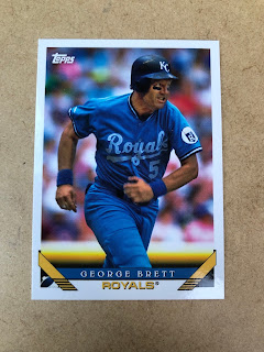
This card is actually the best George Brett card I have pulled in a long long time. A base-running card - a perfect addition to a George Brett collection.
Well there you have it folks, probably what will easily be my "Pack of the Year", which I can't think of ever having designated before. I am really looking forward to my next trip to the big city with the whole four stoplights that are so damn annoying every time I go there...but will be so worth it, next time, when they lead to me more new, err, old, err new — Topps Baseball Cards.


Haha, four stop lights is annoying? Sounds like a dream come true to many of us.
ReplyDeleteThe names in that packs are like a Who's Who list... congrats!
Nice pull. The Trout and Ryan are my favorites. The Topps Magazine insert is a design that I really like. Good post. ,
ReplyDeleteThat's an amazing pack! I bought the whole set, but had I landed that pack, I might have been tempted to collect it myself instead!
ReplyDeleteI have a binder of Brooklyn Dodgers cards issued by Topps in the style of actual Topps base sets, and I added Robinson, Hodges and Reese to it from this set. The binder started with the 2004 or so Brooklyn Dodgers Archives set, but I add onto it each year. I hope Topps continues its love affair with the Brooklyn Dodgers in future Archives sets.
Very entertaining and informative. Great to see Reese and Robinson in a new design.
ReplyDelete