That has worked itself out, for now, so I have been quite enjoying listening to some live baseball, that actually "counts," and ripping some packs.
The other day I lucked into finding Series Two on my local shelf, when it had only been there for a few minutes, I think. The MJ Holdings rep was still there setting out new cards when I walked up to the section. Otherwise, I kind of doubt I would have been able to see this card as my First Card in this year's Series Two:

That's the Meijer's exclusive purple parallel, from the 'Big Box' chain that conveniently built a store in my hometown a few years ago now. I quite like these parallels this year; I guess 1/4 of a colorful frame is better than no frame at all. And I like the tint and pattern to the special 'parallel' section of the card - bright. I like nice bright, colorful baseball cards.
But overall, this continuing 'full bleed' era in the Topps Baseball set is wearing me down and these cards in particular are bleeding into my memories of the 2017 set. Oh how grey life can be sometimes - I don't want grey on my baseball cards, outside of the traditional road grey uniforms on the players. I kind of doubt I want a binder full of a set of these, so I am looking at buying a Complete Set / Factory Set, whenever those actually appear this year, if the ravenous 'retail flippers' happen to leave one on a store shelf for me to buy, complete with my 1-in-ten-thousand-comes-for-the-no-name-cards-inside chance at some special Chromed /13 version of yet another Luis Robert Rookie Card sure to be worth a million dollars, some day. Could become an ongoing dilemma, possibly.
But that's a bit of a cheat for a 'First Card', so let's see what was inside the pack that came inside a blister pack with that purple card.

Sweet! I got that New Guy that hit all those Home Runs for the Mets last year. I mean, that has to be good, even though I already have like 3-4 cards of him from last year and this year that look just like this one.
Oh, wait? Wasn't that guy on the cover of Series One packs? How could he be my First Card in Series Two, too? I guess I will have to read these action image baseball cards a little more closely.
Oh, well, I always manage to find things I like in a brand new series of Topps Baseball cards, like a cool blue glove:

The Topps gaze does seem to like Walker Buehler, regardless of glove. Spiffy gloves do always jump out at me, and perhaps they look even better on a Night Card:

That card supplies a good trivia question to maybe win a bar bet, if we can ever go back in bars. First Elvis to play for an expansion team? Nope. That might depend on how you define 'expansion' perhaps. No, sometimes there is nothing quite like discovering new young baseball players, via baseball cards, to make a baseball fan feel a little old sometimes. Elvis Luciano is the first player to appear in Major League Baseball that was born in the 21st Century - 2-15-00, as Topps kindly informs us on the back of this card. Thanks, Topps, thanks. Nice card though.
I also like special hats:

That's the Cardinals' special Home Sunday cap with the single Redbird on it. I like seeing it on Cards' cards; this isn't even the first Wainwright card to feature it. And those cool socks, yeah, I like those too:

Actually what I like best about that card is not the 2nd example of the snazzy socks, but the way we can see Dexter's eyes focused on the incoming fly ball. That crisp detail, along with being able to see a complete baseball player, In Action, is quite probably made possible by the nameplate being vertical on the side there. That is to this design's credit; now just imagine this card without so much grey space and also with the interlocking STL logo being something other than white-on-grey, like, say, white-on-red, as on their regular everyday caps.
I do like captured motion on baseball cards though, and as with the Luciano card, and also that Fowler card, a player shown with a foot off the ground always supplies a great sense of watching live Baseball:

I have also always liked how a seating rail in the stands can really positively contribute to the overall set of lines in a baseball card image, well, sometimes, at least:

Cards like that one have been amusing me for several years now. By 'like that one' I mean a Dodgers RC issue. Series One had 2 such cards lighting up the $ signs in the eyes of the purchasers of the lottery tickets, err, the packs of baseball cards. Hey, look, here comes another one:

I dunno, not sure 'Garlick' is the best baseball name I have ever come across. I wonder what his Player's Weekend Nickname card will reveal, some day? If he actually appears on such a card some day. The Dodgers line-up has been so stacked for so long now, I sometimes have to wonder what is the point of Topps sending me so many Dodgers rookie cards, series after series.
At least Dodgers cards always have that classic red white & blue baseball look, so those 2 cards will look presentable in the RC binder at least, even if I never hear of these 2 players ever again. I just wish the high draft picks my team makes could hit bushels of Home Runs in the Minors the way obscure Dodgers draft picks can.
Oh well, sometimes I do get a second chance to see anonymous RC players again in a subsequent series, like this player:

Sadly, Isiah is now down to just 2 positions as assigned by Topps there in the really small type, down one from the 3B/2B/C combo on his RC. I know it is wrong to make fun of someone's last name, but I like finding one of Kiner-Falefa's cards in packs, they always make me hungry and since I live so very very far from a working Middle Eastern restaurant, they also are always a tiny bit of motivation to just get un-lazy and make my own darn falafel, some day.
Now that card has a brand new feature down there in the corner, though it is hard to notice amidst all the colorful Catcher gear - an "Inaugural Season" logo for the Rangers' new stadium. I often feel for the Rangers fans, more particularly their baseball card collecting fans, as Brooklyn HQ frequently does an even worse job covering them than they do with my favorite team in Detroit. They both are regular contenders to be card #666 (though given to Colorado this year), and of course Topps completely punted the effort when they issued Series 1 with just one Texas Rangers card. Which, in classic Topps fashion, didn't have this special logo. I just hope they got it right on the blister pack issued Team Set cards, perhaps, the ones they would possibly sell in the spiffy new stadium....oh, wait. 2020 strikes again, sorry Texas. I did hear some interesting talk, now that live baseball analysis has returned, about the dimensions of that new park and how they favor the Pitchers now, rather than the Hitters, which will be quite a change in Arlington. On a team largely guided by Nolan Ryan, hmm, how could that happen?
That somewhat not-out-of-baseball-card-history - logo? stamp? icon? is not so noticeable on that particular card, down there in the right-hand corner. This year's design lifts the eyes up, and away from the bottom corner, as on this card:

With even the Cardinals on the uniform contributing to the great flow of lines in this image, making you ponder what will happen with that baseball your eyes end up on, the now famous RC logo becomes a bit lost all the way down there in the corner. This card is a good example of how captivating the baseball can be on a baseball card - it includes that special Sunday hat and a colorful glove, too, but all I can see when I look at this card is a great example of a Pitcher's grip on the baseball.
Overall that corner logo now is making me wonder what happens on a Rangers' RC, in Series Two at least. I guess I will have to rip some more packs to find out, perhaps.
One long-standing Series Two tradition returns, for players who changed teams but were not included in Series One:

The classic Road Grey PhotoShop job.
Sometimes that is a bit less noticeable somehow -

- but overall I will always wish Topps would spring for a brand new photo taken in Spring Training for this recurring Topps Baseball checklist situation.
With the grey design this year, 'alternate' uniforms really improve a given single baseball card, like this one:

Romo always seems to get good cards, and he does seem excited to be spiffed out in Minnesota's Road Alternate duds. The Twins also have a Home Alternate uni -

I like that yellow bat knob there, will be watching to see one of those again on a card.
Ultimately though what I hope to find when ripping some packs of cards, finally listening to live Major League Baseball, is cards of my favorite team:

That's probably another PhotoShop job; recall the t-shirt sleeves on those last 2 cards. Schoop is well into a journey-ing type career now, but he did get the Tigers first hit of the season the other day and had a pretty good opening series overall.
My next Tigers card was a bit surprising -

- but only in terms of thinking like it was 2018, when Reyes was a Rule 5 pick who made it all the way through his first season in Detroit to 'stick' on the roster permanently. He really blossomed in 2019 and this pick proved to be shrewd indeed, as did this particular 'pull' from a pack of baseball cards, as Reyes just hit a home run while I was gazing upon his nifty horizontal card here.
5 packs, 3 Tigers:

That's the Tigers new closer, who also had a great opening series with 2 Saves already. This card, a bit less than the previous card, illustrates a little of what could have been on this design as you can partially see that the olde English "D" is blue on the uniform, and white on the cap. Topps always seems to favor the cap logo, even when the uni logo would make for a more colorful card.
I also like pulling cards of the opposing team while I am absorbing Major League action, and Topps came through for me with the Reds' Opening Day starter:

That's the "Turkey Red" insert, which appear one / pack, the now 16 card loose single pack, to be specific. Last year each loose pack held a "Superstars of Baseball" insert, which did not appear in other packaging configurations. Given how collation works in Topps products, and this style of unique inserts in the loose packs, they are becoming my preferred format to pick up a few new baseball cards. Especially when I can still get the Meijers blister packs with the purple cards.
I think Sonny Gray looks good in his new uniform; I never thought the pinstripes suited him, in several ways. At 5'10" he is not a typical starting Pitcher, and for whatever reason I always think the shorter players look smaller yet in a pinstripe uniform. The deal that brought him to Cincinnati was convoluted to say the least and prospect results on a couple other teams remain to be seen, but I think overall Cincy pushing some chips in to the center of the table with the Gray deal will make the NL Central that much more interesting the next few years.
These Turkey Red cards are starting to grow on me:

Even though they are a grey border insert in a grey set of baseball cards, the always colorful backgrounds and that crisp faux-inset image border just make these cards:

Classy.
I am fairly sure I have seen this image of Lou Gehrig on a baseball card before, though I don't specifically collect his new issue cards. But I am also quite certain the image has never been melded with an artsy sunset background like that. Thus, I am starting to think a set of these classic cards of classic players might look pretty nice on a binder page:

Oh, wait. All-time Hall of Famers, current stars, & ... Rookies I've never heard of. So much for a desire to complete that set; probably these Turkey Red inserts are destined for Nifty Nine(s) status in my collection. Especially since I have more than enough collecting efforts under way to absorb too much of my scarce extra dollars, anyway.
So though each loose pack I might buy will deliver me another Turkey Red insert card, the packs do also contain examples of the other inserts in Series Two, like this one:

Boo-Yah!
Can't go wrong with a new Willie McCovey card and as a sucker for 70s 'flair', I think I will be looking into these a bit more. And maybe these, too:
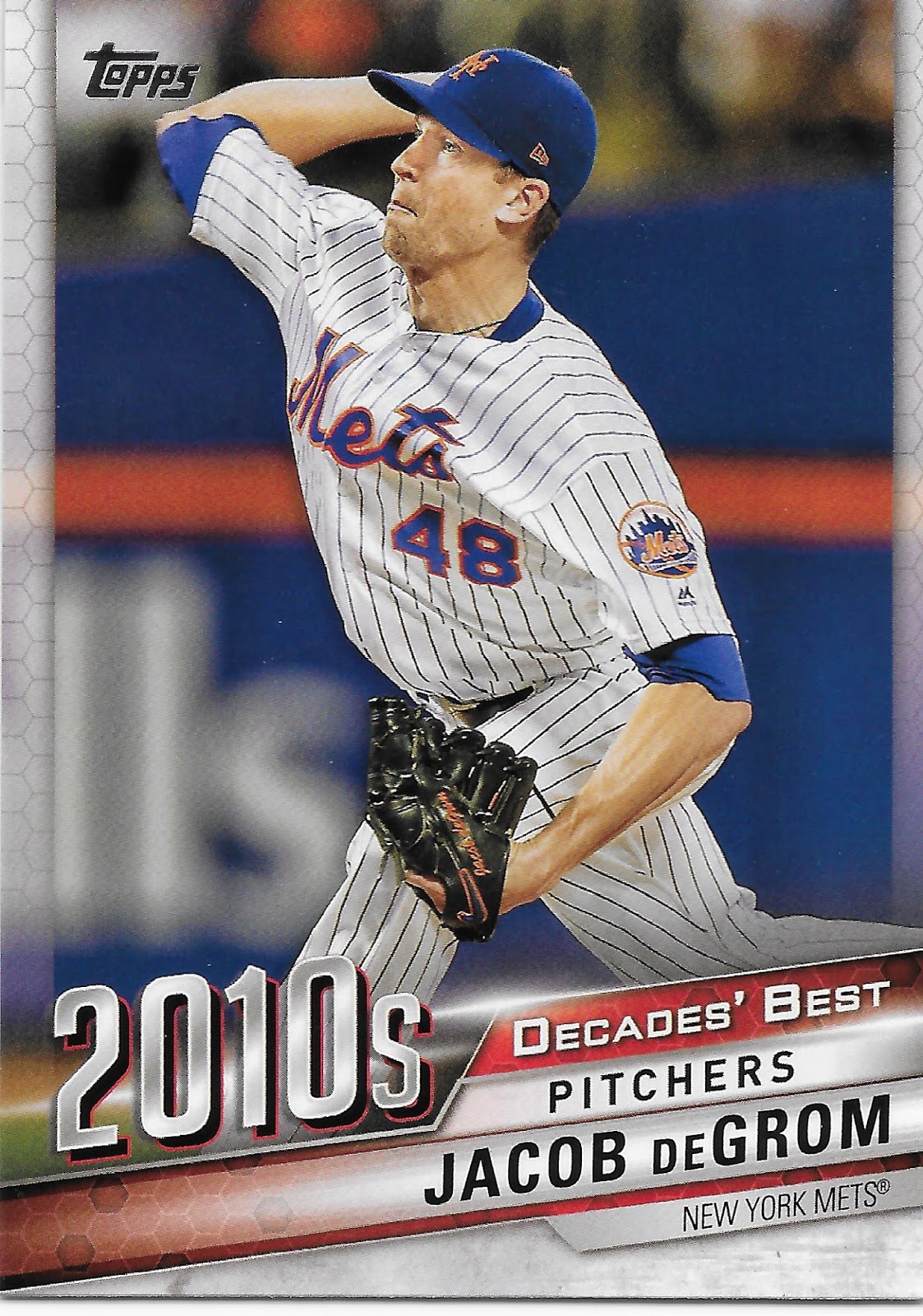
I like/don't like how that particular card recalls the randomly sterile design efforts on Topps baseball cards in the 2010s - hexagons? Really? But I collected a lot of baseball cards in the 2010s and enjoyed following the game of baseball a bit more closely than usual all through that decade, so I look forward to checking out more of this insert checklist.
A Topps Baseball set and summer time often mean: a contest card -

And that is a pretty darn good baseball card in it's own right, right there. I barely have time to blog with y'all so I doubt I will be trying out the Home Run Challenge any time soon, or really, ever. But at least I will enjoy seeing the cards for it this year, as it is starting to look like a few more packs of this stuff will fall in the grocery cart again, presuming I have some luck with the 2020 retail baseball card challenge, which is on a whole 'nother level from previous years and years of collecting baseball cards.
Sometimes I wonder if my decision to like/not like an insert set might depend on the player I first see on one. That certainly didn't hurt with that cool Willie McCovey card I pulled. On this one -

- that's not the issue as I like Pedro Martinez well enough, particularly these days when I am randomly fortunate enough to catch some of his commentary on TV. But overall I am not always that interested in WAR stats, so I doubt I will be keeping any more of these. I prefer straight stats to 'new formula' stats, and with a fair bit of irony, this card did pleasingly tell me that Pedro's season in the year 2000, which generated the 11.7 WAR being celebrated here, also featured a 0.737 WHIP stat, which is the All-Time Record.
& that's why I keep buying baseball cards. I like pondering WHIP on the backs of cards, a regular stat feature of Topps Baseball cards now, but I was unfamiliar with that minor tidbit of baseball info.
I will leave you with a final 'insert' - one that is generally expected to be found when one buys packs of Topps Baseball cards - the Topps Gold. This one doesn't excite me; "Gold" can go a lot of ways on these cards depending on design, and just how the "Gold" is formulated. On this example here, I am having a hard time not thinking of it as a Padres card. The absurdly white edges of the should-be-in-shadow Rays logo 'shopped onto it are quite distracting, and the "Gold" is a bit dark for my tastes:

I picked up 5 packs to open the 2020 season, such as it is; these fall 1:8 packs this year, which is surely a pretty low ratio compared to years past. But that indicates a lot of people are buying Topps Baseball cards these days, and overall, that is a pretty heartening fact to me, in a year when we can use all such heartening things more than ever; most especially these brand new Topps Baseball cards.
Those Decades Best inserts are definitely eye-catching. I would've liked to have seen Topps do a Decades Best-style design for the base cards.
ReplyDeleteI'm with you, I'm kind of done with the full-bleed designs for flagship. I really like the white borders and design they went with in Big League this year.
ReplyDeleteYou mentioned how the Elvis Luciano card back mentioned him as the first 21st century born player, but how did Topps put that kind of effort into the back and forget the RC logo on the front?
This was my first look at the cards from S2. Thanks for sharing. The Romo was my favorite of those you posted.
I had the same thought and did my blogger due diligence on the question - he had an RC in 2019 Update, but it must be on my short list of Needs from that set.
DeleteThe design is definitely "meh" for me. I do like that parallel color though. I might search out some of those. For me the Chipper and Pedro cards make the pack. Great cards. Fun post.
ReplyDelete