...naturally arrived in the next calendar year, from this past year: Topps Gallery. Blasters of such managed to squeeze themselves onto the shelf over at the Big Box, a bit of a feat considering how many cards of every brand, every sport, every box size, and every price are on offer there now.
I have some other nice new baseball cards to share with you from that momentous day back around Pearl Harbor Day when I found 3 new card products on the same day, but I am going to jump the order here a bit to try (& prolly fail) to be at least a little more "current" with our favorite brand new baseball cards.
First card, not best card:

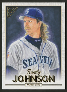


Uggh. Not a player I go looking for in packs of baseball cards. But hey I get to see him in his new uniform that he will be wearing for some time to come. This is a foil parallel. The base design already has sufficient shiny stuff in the gold foil that I'm not sure I really need a more foiled-up version of same. A somewhat odd thing about this card in particular is the way the foil manages to add to the overall blue-ness of the card, like all the blue in the image is somehow reflected in the foil, which is technically a "rainbow foil" effort. A possible contender in a None More Blue battle with some 1998 Donruss, perhaps.
That photography image is particularly crisp, however, a sudden contrast to that weird Randy Johnson card above it. As for the change in the frame design, which differentiates the current players from the retired players, i.e. those 2 thingies on the side of each card, well, I have no clue what those are. Robot needles, my brain conjures/conjects. I definitely like the snow cannons better.
Next up I found a mysterious card:

I think, if I recall correctly, a card like this is supposed to be called an ... "insert" ? After 10 months of pulling every Topps design ever made from my packs of cards, this was a bit striking. I suspect a run of these might look nice together, with that genuine art there on the card. Fascinating, captain.
So far in my first 4 card pack I have one base card, one parallel, and one insert. The regrettable Randy Johnson card is card #160 which in past years would have indicated a short print in the final 25% of the 200 card checklist, but this year there are instead 10 probably very, very short printed image variation cards instead. So an easier, yes, base set to complete this time. But the base cards better start appearing if I'm going to make it to 200 of these -

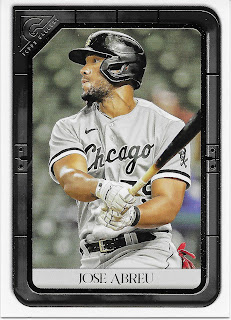
Ahh yes, I almost forgot that Topps can no longer make a set of baseball cards without these weird horizontal torso view creations. Which are absolutely perfect for wasting space or filling empty space with incredibly distracting random things like another player's foot.
So much for pack #1. I really start to wonder, in these moderately more expensive sets than my usual "low end" delights, do I truly need a wrapper around every four cards? Is there anyone who can possibly ration out a set of blaster packs and open just one per day or something? Do the 7 wrappers inside this blaster serve any purpose at all? No, they do not. In my ever so humble opinion.
Then pack #2 crushed my hopes for 2021 Gallery all over again, because this happened


And how did this card manage to make Barry Larkin look grim? Not my memory of the player, at all. And and do I really ever want to remember the era of "baseball vest" uniforms? More, nope. I couldn't paw my way past those 2 cards fast enough; when I did, I landed back in foil-land

This Trevor Rogers card is a Mission Accomplished, in that regard. The foil on this one casts an overall gold effect, in-hand at least, which works well. The one weekend "City Connect" jersey makes for a good Marlins card here, too, simply memorable for a team that just can't seem to settle on a regular uniform for more than a couple-three seasons anyway. I might start to like these horizontal torsos if the card is clean enough, like this next one -

This is my new favorite Jackie Robinson card in a bit. I feel like I have seen this photograph before, but only perhaps. And, if so, not with this degree of crisp focus on Jackie's face, while he is in turn focusing on the coming baseball. The double frame and simple card elements, even the snow cannons, all work together to make you remember _exactly_ what Jackie Robinson looked like. The only question here is - why wasn't this same PhotoShop filter used on that terrible Randy Johnson card?
These horizontal torsos, with the solid framing job implicit in "Gallery" are somehow reminding me of seeing the player on a modern, fourth wall High-Definition TeleVision, which after all are usually a pronounced horizontal rectangle these days. This in turn reminds me of a classic baseball card set I have never collected - 1955 Bowman.
Pack #3 picked right up where pack #2 left off, without changing the channel:

Though unfortunately the robot needles return when I get to watch a current player playing baseball there on my new baseball card. Who will the TV camera pick up next?

More class action from the Saturday afternoon Game of the Week producer here. Don't touch that dial.

Durn, I bumped the remote back to that dumb PRINTER PROOF channel. Ooops. Kinda weird that the printer would want to declare a PROOF of their work on a card that off-centered, don'tcha think? I actually kinda liked all the random off-centering of the cards in this blaster, which came and went on the different parallels, base, etc., though it got to be a little much on that Scherzer card. It was not noticeably severe as on many Archives cards recently, and just reminds me of 20th Century, imperfect baseball cards, which were perfectly fine.
I was glad to see that card in a general sense, however, as I expect there will be very few Dodger cards for Max Scherzer, a player I have always liked. Knowing it exists and that I can probably quite easily obtain a regular ole non-PROOF version is at least a bit of a consolation prize here.
The Scherzer card marked a return to the traditional vertical design, and current players.


Art By Josh Trout
Bazinga, or Bazooka, or something.
Here I find a card image created by the artist that inspired me to buy this blaster in the first place: Josh Trout. Some art cards at last. And with a subtle, just subtle, not garish, nod to the oldest Topps Baseball card design as well with no Anniversary declaration getting all up in your grill.
I had been realizing as I absorbed the first baker's dozen cards in the box that probably a reason Gallery is photo-based this year was quite likely the large amount of coordination work Topps had already put in hiring actual artists for other art card products this year & last - Project 2020 and Project 70. Which are also beautiful sets that I can't afford to collect. I know most collectors just love having a /xyz stamped on their cards, or even just having xyz known to all purchasers as with the 'Project' release, so they can carefully obtain the ones where xyz = a low number, all so they will be worth more later. I can only dream of collecting cards like that, someday, maybe.
So this Josh Trout insert was a very happy discovery, and what Gallery should be all about, in my opinion.
That card marked the half-way point of the blaster; I have been showing the cards sequentially. What did I find in the 2nd half? Card #1 is always an interesting pull in a baseball card product:

I feel like I may have seen this Neon Deion picture before but the clean frame lowlights the basically un-lit image in a decidedly not-neon way -- I have no wish to see a parallel of this one and quite like it the way it is. As with the other retired / HoF players I found


Along the way I saw the Sonny Gray card, again; the 2nd copy was ruint by more of that PRINTER PROOF stupidity, though the hard feelings were instantly alleviated by this pull -

Good thing I already liked this card I guess. It's particularly pleasing, and entirely rare, to find a legible autograph on a baseball card any more. I steer well away from collecting pointless squiggles on my cards, but I totally love this one. I will be checking in on "Trev's" career this coming season, to be sure. That is also a serial numbered ( /50 ) parallel, the 'blue' version subtly indicated by the blue stripe in the frame.
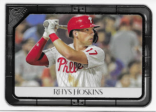
I don't think I have ever purchased a package of Topps baseball cards with this many sort-of duplicate cards as this blaster. The sorta dupe-ing continued with another up-close TV-like zoom, this time in Philly

Quite the little blaster of cards, to cough up a /50 and a /75. I definitely do my level best to give Topps Chewing Gum Corporation as much of my spare change as I possibly can, so it feels nice to pull a few "hits" after a while.
Another find in this intriguing blaster does not trace to perhaps a definitive example of a hot-Rookie-cold-Rookie-bye-Rookie phenom:

This card has one of the more memorable stat line totals on the back of any baseball card I can ever remember as it informs me that Yermin Mercedes played Major League Baseball in the year 2020, and recorded exactly One At Bat. 1 AB. There are also some zeroes involved, in all other categories except G, which also = 1. And then there's a whole bunch of white space surrounding all those zeroes so they are easier to remember.
But the really just, weird, thing about this card is on the front of the card, where the baseball bat, just, well, I dunno what's going on here
 More virus quality control madness I guess.
Overall I couldn't decide if I like the players on the big screen better, or the ones with their portrait hanging on the wall. Some of which were just so endearingly cheerful, a decidedly good thing in year 2 of a pandemic:

Arg, the PROOF stupidity strikes again. I can't leave you with that one and will have to hope for a boring old regular copy in my next blaster of this, which I sure didn't expect to be purchasing based on the 1st & 2nd cards in this one. These cards definitely snuck up on my taste buds as I went along in this blaster even as their centering wandered around all over the place; maybe the Miami Marlins will do that this year, too:

These aren't for me, but really enjoyed your review nevertheless.
ReplyDeletePrinter Proof parallels are so unnecessary. I'm okay with the design this year but the lack of art is disappointing. The Gehrig is a really nice looking card. Good post.
ReplyDeletei like the look of this gallery set - moreso than in previous years. i had to go looking for the original yermin image, and it has the offset bat handle:
ReplyDeletehttps://www.gettyimages.com/detail/news-photo/yermin-mercedes-of-the-chicago-white-sox-bats-during-the-news-photo/1311722060?adppopup=true
not sure what happened there, but surprisingly it wasn't topps' doing!
Thanks so much, didn’t think of going to the source.
DeleteNever been a fan of the Gallery reboot, so going with "blurry photos" is a bit of an improvement for me!
ReplyDeleteThat bat thing is bizarre.
Supposedly 2021 Big League is arriving next month.
ReplyDelete