Happy Opening Day!
I scored a pack of brand new baseball cards the other day - just in time!
This one greeted me to the year two thousand, twenty two:

Alrighty then. A brand new player on a team I am always barely conscious of, since they tend to play baseball while I am falling asleep. But that is quite specifically why I purchase brand new baseball cards. Things seem quite intriguing for the Diamondbacks with this particular player. Spring, hope, eternal, etc., etc.
I quite like this 2022 Topps Baseball design. All those flowing curves — soothing. White border returns after a long absence — classic. Team logo — check. Clearly readable player name — let's just forget all about 2021 Topps Baseball, shall we?
Sadly, try as it might, Topps can just never seem to throw a perfect card no matter how hard (?) it tries. What is up with that little dog ear tab on the bottom right of the image frame? Is it a button you push to reveal a secret about the player? I mean, a baseball was already used, quite nicely, over there on the other side of the card, so it can't be a baseball, I think.
Ahh yes, I forgot, Topps always seems to make this Old Man trying to enjoy a memory of Youth to instead remember that I am, indeed, Old, now, by forcing me to squint a little bit. This time to figure out what is going on in that little tab thing-a-ma-jig there: the player's Position. Why couldn't they have used a nice simple black capital letter there: P - for Pitcher. See how easy that was?
I can tell already that I will enjoy collecting this brand new set of clean, well framed Topps Baseball cards. But that positional goof-up requires that I can only hand out an A- here.
Each year now, I try strenuously to not see the incoming Topps Baseball card design before the simple pleasure of opening a pack of the cards, starting the year before of course. It is always a challenge. This year was only a partial success; I have failed in this goal in several ways and each year brings a new FAIL point. In 2022, it was a nefarious eBay lister, who decided to randomly package up one of these new cards with one my beloved Sea Turtle cards from 2013 in an offering that got included in one of my saved searches on the ole 'Bay. I looked away quickly, but the damage was done. I guess with my annual desire to just experience a pack of Topps Baseball cards just like I did each spring in my youth - with zero foreknowledge - well, there's always next year.
As soon as I finish fully absorbing the front of a brand new card each year, I am also still quite looking forward to seeing the back, too. No one ever bothers ruining that for me:

Here the front image frame nearly repeats completely; perhaps one of the closest such repetitions I can remember. But then it has been more years than I can quickly remember since Topps Baseball cards had a white border, so ... this works, I guess. That white space above the write-up seems kinda wasteful however. The always interesting (to me) write-ups would have looked a bit more Pro there if they had been centered on the vertical in that space, in my cranky opinion.
I'm not sure stats really need an enclosing frame like this, but everything seems to be in order, with no real changes from past efforts. I always hope Topps will pick up an old Donruss card back feature of listing contract status, but that seems increasingly unlikely as MLB players have ever shorter careers with ever quicker pinballing from team to team, it seems.
And even the fronts of the cards frequently remind me of that: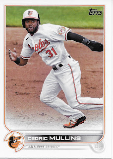

This is a great card. Dynamic. Best player on his team. You are the Pitcher having just completed your follow through; Mullins is looking right at you, you think, initially. No, he is looking towards Home as he is about to zoom out of your visual frame towards 2nd Base.
It's the start of a brand new baseball season. O's fans will have Cedric Mullins, at least. Thanks, Topps.
Now, which team will I see him on in Update, I think, just before I paw past him on to the next card. Oh, wait, Update doesn't show traded players any more. Still, these great cards of great players on bad teams with little chance in the brand new baseball season - yet again, the reason I purchase Topps Baseball cards.
Not just for the Stars of MLB, like this one: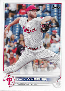

Another great "pull," for me, because although the doings in the NL East are nearly as famous as the AL East given the media concentration around its cities — and I am thus less dependent on Topps for my baseball news — I just happen to enjoy the story of Zack Wheeler's career. Cut loose by the Mets only to sign with a divisional rival and start racking up Cy Young votes, annually now. And Topps comes through for me with no less than 4 League Leader in Italics on the back, though amazingly his solid 1.01 WHIP was not one of them. I guess I will have to flip over more baseball cards to figure out who led that one.
But one thing is almost always for sure in a pack of Topps Baseball cards - you won't hang out in the stars for long -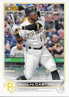

Though being the first player in MLB history to record their first 5 hits as Home Runs should always earn you a Topps Baseball card. As should having 3 sequential letter "O"s in your name too, I guess?
I could only catch a few brief minutes of Bob Walk and Joe Black discussing the Pirates this Spring Training, but I believe I heard them say 2nd Base was one of the probable open spots on the team, so this card is quite mysterious to me. I had a tough Spring Training, myself. I worked 29 days in March, and those 2 "off" days were just a blur of being tired, or one day, sick; after that 2nd day I worked through a strong cold. No, not THE virus - I took my first Covid test of this whole 2 year pandemic, and it was negative. Just, a cold. Like in the old days. That bout of illness was both a PITA, and really cool, too. Just, a cold.
But thoughts of baseball were just hard to cozy up to, particularly before the lock-out finally ended. I knew cards were in some stores, at least - but I didn't go buy any. They weren't in my local grocery store, just a mile away, yet, and I couldn't be bothered to wheel in elsewhere and pursue new cards like I normally would.
Compounding my what, baseball? thoughts was/is the war in Ukraine. Reading military history has been another life-long hobby of mine; now I have the chance to read military history in the daily news, as it happens. I have been far too hooked on that.
And yet I would faithfully check the card section when I scrounged up the time to buy groceries; the new 2022 Topps Baseball cards just would not appear, in my brand of Big Box (Meijers). Then, the weirdest thing happened - Opening Day cards appeared there, -before- Series One. The world gets stranger every day.
I love Opening Day, at least a little bit, and always try to open some on Opening Day. But for me, following the Tigers, that is tomorrow. So the Opening Day cards are still in their Topps shrinkwrap for a little while longer.
When Series One did finally appear at Meijers a few days ago, I snatched up the last 3 single pack blister packs on offer. And then, an even stranger thing happened: I didn't open any of them. For a whole 24 hours. Tired, working, checking the Ukraine headlines while falling asleep. Baseball cards? Ho-hum.
Fortunately, Topps has come through for me, with nice bright baseball cards:

You love to see it. We can beat fearsome diseases and go back to hitting Home Runs. Another Thanks, Topps.
Of course, baseball isn't always played on perfect summer afternoons -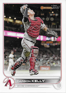

Last year I thought I finally figured out where all the Night Cards come from lately - Arizona. But these are their road grey uniforms, it appears - I am wrong.
That nice baseball card has no demerits on the front. The back though, bummed me right out - it is flipped, compared to all the other vertical cards I just examined. This maddening habit by Topps has been running for a few years now. Make it stop. Please.
Bitch, and ye shall receive, perhaps: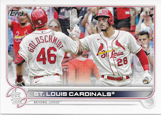
I had to quit crying about flipped backs when the fronts switch to the now annually required horizontal cards. I quite like horizontal baseball cards and am glad to see the design works well here, too. And am pleased to see that Arenado got to keep his #28 in St. Louis. And see some actual baseball fans, not blurs, on a baseball card.
Though I will have to wait for final judgement on this year's horizontals when I see an actual player card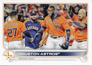

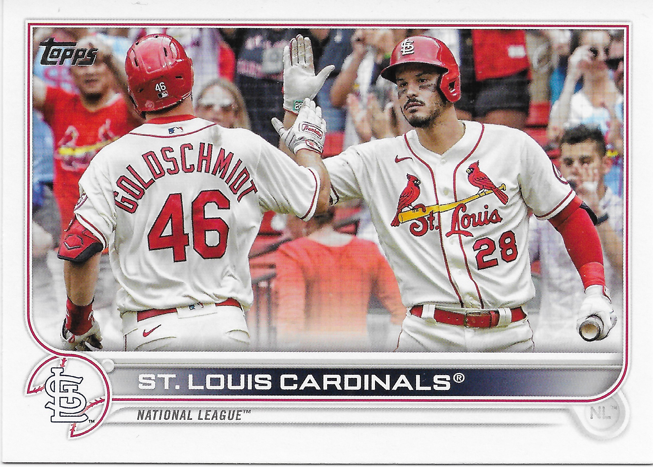
Personally, if I must receive an Astros Team Card annually, I truly wish I could get one with Dusty Baker on it. But I don't see Fanatics coughing up a little money to the Managers to ever make that happen any time soon. There's always next year?
There are still 28 teams to go of course
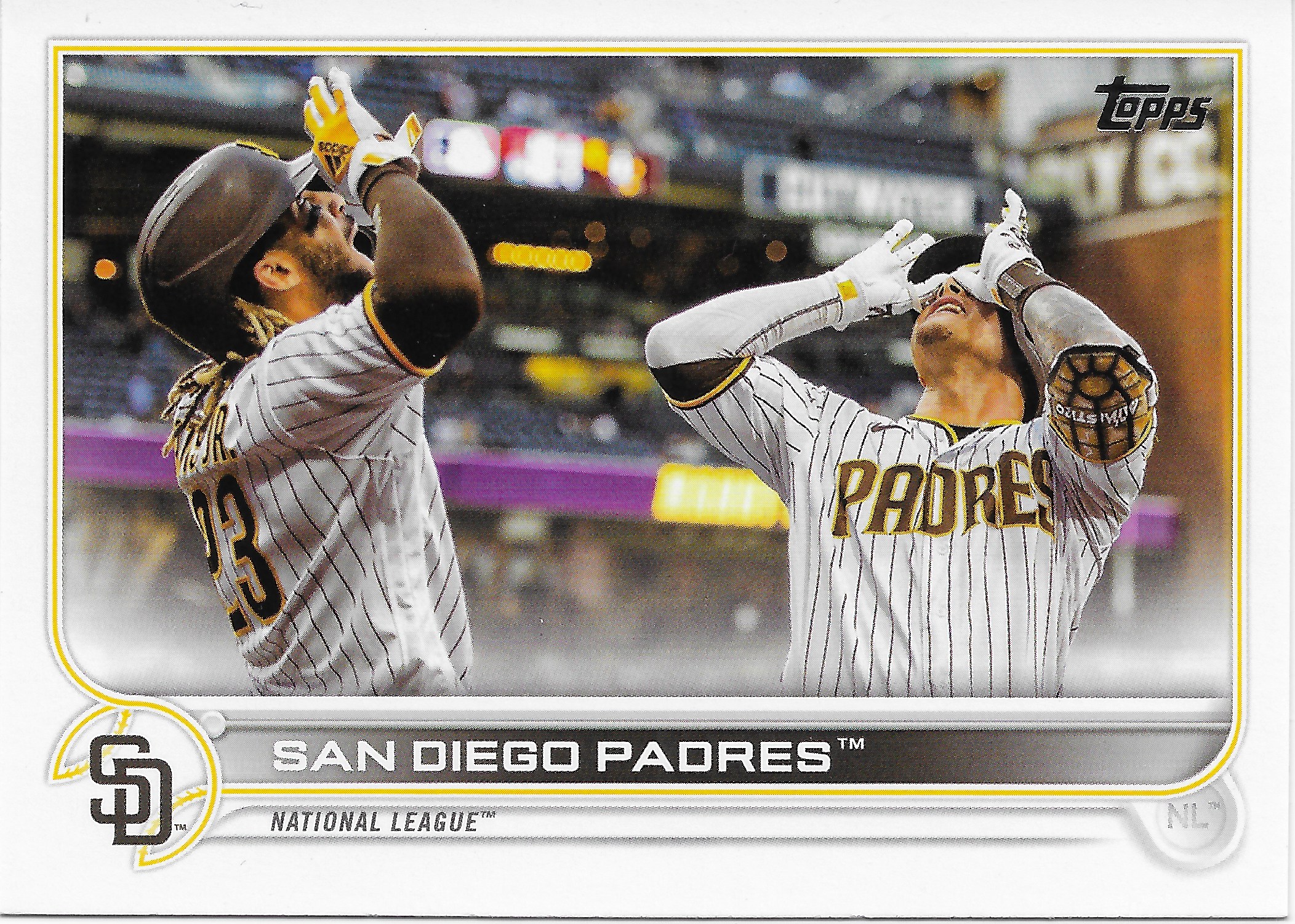
There's that stadium again. The one where all the teams play while I sleep. Although the West teams are mysteries to me, I did know the basics of the Padres season last year. What a battle that Division was. Just don't ask me what the heck is going on with the player on the right's bicep back-side. These team cards do a nice job of summarizing things, though I am starting to suspect all the cellar dweller teams will get cards in Series 2 maybe and I will have to wait a bit to commiserate with Topps Card Back Writer when assigned to say something about, well, you pick which challenging text you will flip over to read.
Still waiting for a horizontal player card though:

Another nice dynamic baseball card here. Your eyes move with Darvish to the glove back to the ball he is about to throw and back off towards Home with Darvish's eyes again. Don't forget your seasick pills.
Anyone else remember when the Padres "team color" was blue for a while? I'm starting to miss that. This pack of cards can't seem to gin up a blue team for me. 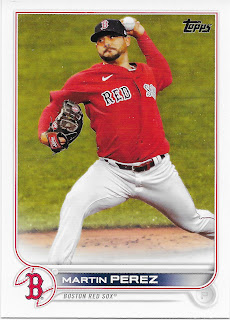

This card has an issue - Martin is sadly a bit blurry, there - I never like that on a baseball card.
But I always hope to pull a Red Sox card in my first pack every year. I want to see if they will once again get a special exception from Topps, as when they use the pair of red socks for the graphic image, which is their shoulder patch, not their cap logo - and thus unlike the other 29 teams in the set, usually. This year, Boston gets the cap logo, like everyone else.
This card, by the way, basically repeats the observations about Perez on the back of the card as delivered just a few months ago in the Update set. This time labeling him "distinctive." I hope to see how his secondary data stats, the ones rarely ever brought up on the backs of baseball cards, might fit in with the rather distinctive ball park he will pitch half of his games in. But I will probably have to depend on Topps to help me with that, in some future set, I hope.
I think I might like these red team cards the best, so far. And I always like seeing a solid color "Alternate" uniform.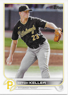
I did mention that my local Big Box store, which perhaps wisely kept Series One off the shelf until I was finally ready for a baseball card pick-me-up, is Meijers - home of the purple parallels.

Which is good, cuz the Road Alternate here saves this card. These yellow team cards (only 2 teams? I forget) aren't getting-r-done in this design. That team color needs to be at least double in width to really work, imo. Although the colors used so far in this pack - Red, Orange, & Yellow - don't suffer from an all too easy fade towards a pastel tint that always drives me nuts, the thin line does evidence a bit of continuing residual fear of bright primary colors by Topps - the ones that make for the most memorable baseball cards. Last seen in 2019 really, and in less than half of the 2010s sets.
One long time Topps Baseball set tradition continues, after seeming to disappear in recent Update sets -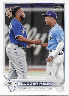
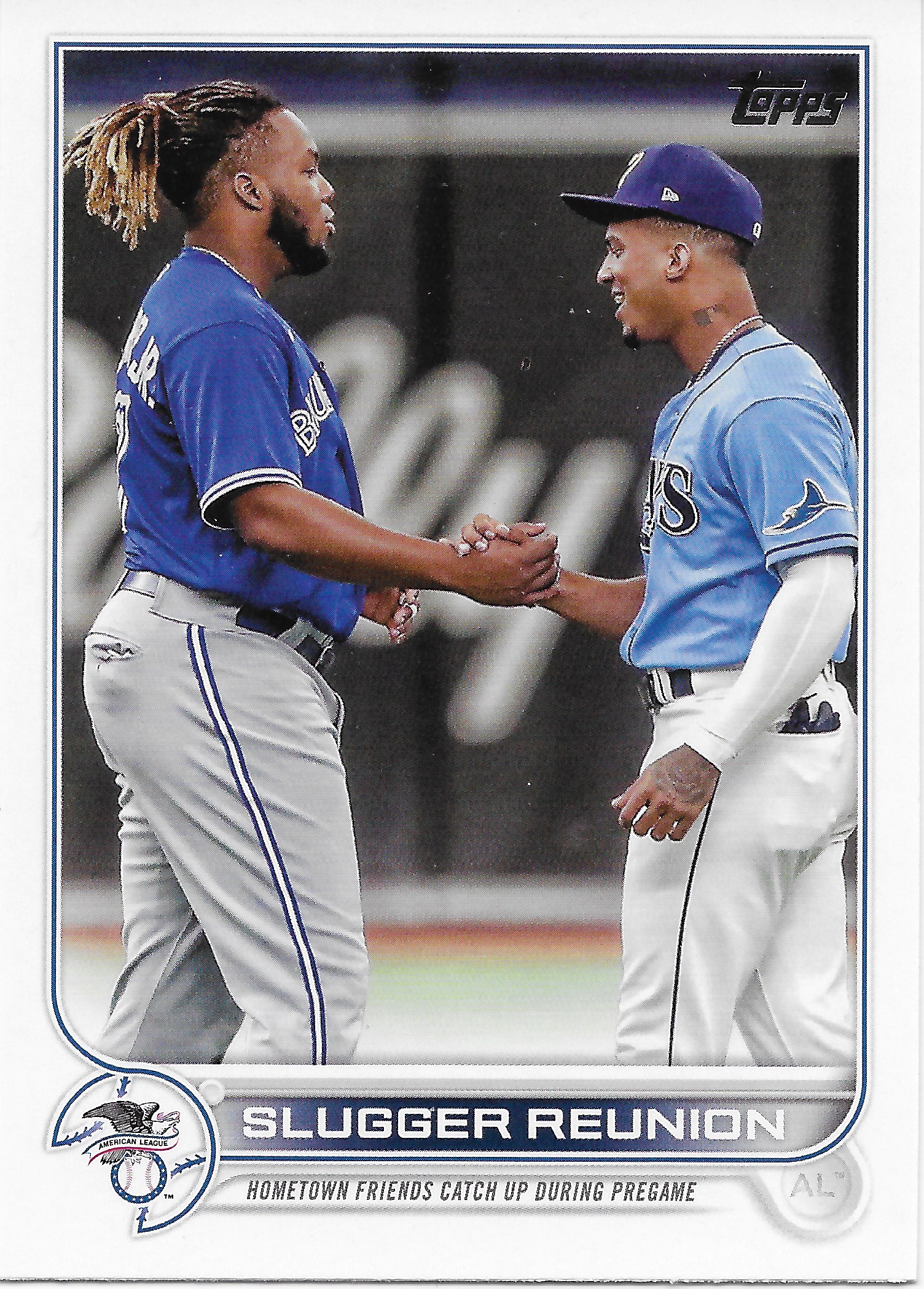
A checklist card.
Though of course not apparent on the front. But I quite like it. I always like seeing the logos for the 2 Leagues in MLB - a touch of 19th century graphic design subtly whispers 'baseball history' to me. And this card has a cool factoid in the subtext: "Hometown friends catch up during pregame" - that I would have never learned otherwise. And a bit surprisingly, the card doesn't hit you over the head to blare the player names at you. An understated thing, from Topps? Nice.
At least I got to see a blue team card, sorta. The back of the card has a few quirks. For one, it is card #329, but covers cards #67 through #99. No, I am not going to be checking the little boxes (still included). But 8 year old me would get mad that I have to check the box for a checklist card on a different checklist card altogether.
This card also revealed something else to me. Card #3 in this pack, for a likely footnote Rookie player for the Pirates, does not feature Rooolfo Castro as the card seems to read. His name is actually Rodolfo Castro, which the font used in the checklist clearly reveals. At first I thought the font used for player names on the front of these cards was a straight use of the font used back in my favorite set, 2013, but now I am not sure. And I will have to go back and see how well "D" vs "O" gets kerned in 2013, too. That will be pleasant, though also a sad reminder of my limited time to work on that special 2013 project, and that set blog - which shall return, some day.
Now I always like 'racing stripe' cards, like this one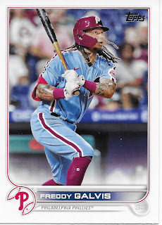

But I also dislike Topps steady habit of just printing Series One cards regardless of contract status. Cut the day after the World Series - here you go. In this case Galvis signed in Japan in early December. So perhaps we will see him again some day, and he probably won't make it in to the 2022 Phillies team set blister pack, at least.
I guess, like baseball, things may change, but things stay the same, too, in packs of Topps Baseball cards. Which must mean it's time for - the inserts: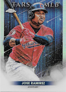


I believe this will be the main insert in Series One this year. By 'main' I mean the one that will appear one per pack in the hard-to-find classical single packs that I prefer (16 cards, this year) as well as in guaranteed quantities in all the other formats, rather than just 1:3 or whatever.
I truly like these. I'm not super excited that there must be a Chrome version and a regular version, though these are nice Chromes. There is 'frame break' going on in all sorts of directions; a bit unfortunately here where Jose Ramirez is just a "Tar of MLB" - it's the little things, Topps. I quite admire Jose Ramirez, who just soldiers on every year for an ownership group that ... does anyone like Cleveland's owners? Or Baltimore's? Or Pittsburgh's? This pack sure seemed to want to keep me on the sad side of MLB, it seemed. Perhaps not pulling any Tigers in my first pack is a good sign, this year.
But that Ramirez insert is only card #15, so -

Now the stars are out, though I don't really like this particular star. I think I will really like pulling more of these inserts though. Pizazz. There is no rule that I have to put this exact card in the binder with the other ones, is there?
This year, only one per blister pack, which means only one scratch off box in the big Wander lottery this Series: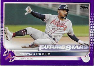

Hey look, a hot RC!
No, wait, that was last year at this time. I think recall listings for actual old time 100 lot Rookie Card cards of Cristian Pache, just about a year ago. I can never decide if it is nice of Topps to continue their Rookie optimism with the Future Stars designation, the next year, or a cruel twist.
A nice enough parallel, I guess. Adding a bit of graphic-y-ness probably helps; can't decide. At least I got to see a horizontal player card. But probably not enough color banging going on here to want to chase these.
Except, of course, for that always tantalizing lottery action in the deal. There's always next pack.
No comments:
Post a Comment