Anyhow the original Blue Light store is one of only two outlets for Topps products in my town; Dollar Tree being the other one. Lately the big K has been rather erratic at stocking new baseball cards, but I had that urge to rip just a sample pack of Update. Yeah, just one. No, really.
I also had this odd feeling that maybe their card-distributor-rack-jobber-must-be-a-kinda-sweet-job-to-have person might have brought over some discounted blasters from some other store where neglected baseball cards just sat around not enticing the disinterested customers for too long.
And there it was:

Is there anything that catches the eye of today's baseball card consumer better than that red sticker? Once the blaster gets that cheap … My name is Brian, and I am … all about baseball cards sometimes.
Oh sure, I can get on my high horse and explain my pure wisdom of not ripping new product any more. But old product doesn't count. So why was I hoping to find a little Update? Samples don't count either.
This was on a blaster of 2013 Archives. I had some pretty good Mojo with those when they were hot off the presses, and I wrote up one of my longest blog stories connecting it to that Mojo. Not coincidentally I had just been pondering 1985 Topps due to selecting a card from it as the lead-off card for a repack purchase. (Just hit Older Post down at the bottom if you missed that one, my previous post).
Also, I needed just one of the '72 style cards to Complete the Set after some good trades, and there are two Short Prints I desire just because of the base design used - 1975, and a few others just because of the image, like the Tom Brunansky. I had my baseball-cards-on-sale-Mojo working before I even walked in the store thinking "cheap blaster," so, yeah, I pulled the $12 trigger.
Let's rip the first pack:

The last card I needed to Complete That Set! Basically-cheap card Mojo is still Mojo. If I had purchased loose packs, I could have just taken the rest back to the store right then and there. But you can't take back blaster packs, fortunately.
Don't you hate it, though, when at any point in the last 2 years, the last card you needed for a full set or an insert set was the Jeter? I have pulled his memorabilia items from every random baseball memorabilia package I purchase, but can never get his cards in the sets I actually complete. (Anyone want his Qubi stamper? A deckle-edge? Several different blaster manu-patches (eww, I hate that word), a Chip?).
I like Derek Jeter and I usually like his cards. But I suspect this won't be the last time I need a DJ to get it done.
That left 7 & 7/8 packs to go through. There should be some more cards I like in there somewhere:

1985 Mojo! Of course, there was a 25% chance that each card had 1985 Mojo, but that didn't slow me down. I was happy to see this card when I first pulled it and set it aside to share with y'all. But as today has gone by I've grown very disenchanted with this card. I realized I was just reacting to the sharp yellow-on-blue ROYALS design, I like that. But this blaster has me putting 2013 Archives away finally, with cards going into binders and dupes going into the ever-heavier goodbye box that I have to figure out what to do with. Which all means I will have two more blog posts on this set to wrap it all up.
And though I needed few of the cards as I opened the packs, I also enjoy and want doubles of some of the cards:

This is one of my favorite Miggy cards. It's just a plain torso crop-down from a game action shot, but it's a happy card. It will look nice on the Miguel Cabrera binder pages with the other Miggys, and in the 1972 binder pages from this set.
Most of this set used images from the Topps photographer's annual visit to Spring Training, so many of the images can be repeats from Heritage or Series One/Series Two or all the other Topps products. But many of those Spring Training photos bring back fond memories of vintage baseball cards of my youth, because of the ever-photogenic sky in the background. So I was also happy to pull this duplicate for a certain binder page:

The ultimate Sunset Card? Well, a contender at least. I'm not totally convinced that isn't a lurking Eye of Sauron down there in the corner though.
Typing of nice cloud shots and Spring Training, I'll note you'll see a few more nice ones from the '72~2013 set when I take a look at the whole thing in an upcoming blog post, but in the meantime I'll scan a card I pulled previously that I have been waiting to work into a post:

That card pretty much hits all my Spring Training buttons - Clouds, Palm Trees, and a Light-Tower that could even be called a Lurking Light-Tower.
I did pull a new card here and there:

Ahhh, no, I won't be collecting these. This card is as bad as the David Ortiz card I posted the first time I bought blasters from this product. I do like the 1990 design; I just hate the execution. And I must admit that for some reason the scanner made this card look much worse than in-hand, but in-hand it is still a mess of pointlessly assembled colors.
I will say this about the 1990 cards - a stack of them is pleasingly colorful on the edge. But my life is a little too cluttered already to keep a stack of baseball cards just because I like how the edge looks.
Topps used the same border for each card from the same team in this 50 card portion of the checklist, and there are a few they did a decent job on:

That just leaves the Hockey Sticks. I pulled a double I did enjoy the first time, but didn't post:
If I were to put together a binder page of Cheshire Cat cards, this would make that page, but I can't think of another card with such a sly grin on it. I don't think it would all fit with baseball. If you like the idea of Cheshire Cat imagery, I can tell you I recently discovered the early 20th century work of Louis Wain; that would make for some fun art cards.
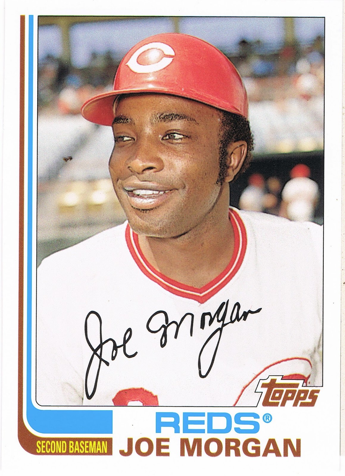
Joe Morgan is about as popular these days as Kirk Gibson, but I do like his baseball cards. Baseball cards don't say anything.
With 1982 Topps, I don't get too concerned about whether the hockey sticks have any relation to the team's colors. And I have my doubts whether Topps would either. Thus, the Mariners get the classic blue-and-orange of the Mets, but the Diamondbacks inexplicably get a nice set of red-and-black sticks. I'll leave those cards for you to ponder from some cheap Archives packs you can find for sale cheap somewhere, some day.
The Hockey Stick cards and the Archives product do make me wish Topps still had a license for Hockey. 'cuz the obvious thing to do now would be to release a set of Hockey cards using the 1982 Topps baseball design.
Well I did mention I am putting the final touches on my collection of this set. Aside from binding up the 72 style set, I decided to keep just 3 examples of the other 3 styles in the binder:

I suspect if any truly modern collectors ever wander into this blog about generally worthless baseball cards, they are starting to get a little itchy by now. They can remind me of some other subculture sometimes, with their fascination with the hits, man, the hits. 'sssst, did you get any hits?
Every blaster of Archives has "hits" in it, though if any word has a flexible definition, it would be that one. And this blaster was no exception:

More the-card-I-was-hoping-for Mojo! 1975!
It's always a treat to pull a 1975 baseball card from a pack. Always. Of course, it will be a good ten years before that glorious day when Topps prints a whole set of 1975 style cards again in Heritage. What a day that will be. Does it really have to be ten years? Of course before then I will get a whole new set of 1972 to enjoy, and a barrel of laughs listening to people complain about black border 1971 style cards, and even a rather enjoyable look at '73 and '74. Do we really have to sit through '67~70 along the way?
Ahh well, if Christmas came every month it would be as boring as all those Bowman sets that come out these days. I sure do love that Lynn card though. Especially since for his fabulous rookie season in 1975, he had the classical Rookie Card shared with other players.
This is actually the second time Topps has made a 1975 style Fred Lynn card all of his own; there is also one in the massively printed K-Mart 20th Anniversary set from 1982, which, come to think of it, I purchased at the very same K-Mart where I picked up this Fred Lynn, though that only cost me a dime - for the whole set! The '82 K-Mart is a neat card in it's own right (I always like Topps' random attempts to make new-old cards before the concept of "retro" sets came along), but that '82 doesn't have a true 1975 style card-back. So I was eagerly anticipating seeing this:

And, FAIL. It's totally white! All wrong. I can get past the thin card-stock of these retro cards. They are just going to be in a binder page for me to enjoy in the long run, though I do much prefer the tactile experience of sorting Heritage cards due to the authentic card stock.
And actually that is a very nice, very faithful card back with a very nice trivia cartoon and a great write-up about Lynn as if it really was 1975 when I pulled this. Quite well done.
The white though - one reason this disappoints so much is that the 1972 cards have accurate grey backs (I'll have some scans of those in a post quite soon, though they have other issues as you'll see); the other 3 retro style card-backs are accurate in that regard as well.
So close, Topps, so close. I made a nice trade last year with Fuji in which I gave up the Denny McLain on-card autograph I pulled to help Fuji complete that set and I will have to continue my quest for a single Tiger's on-card autograph elsewhere, but then I never did like 1968 cards or Denny McLain. Anyway for that I picked up the Al Hrabosky Fan Favorite Autograph which is also done in the 1975 style, but my own stash of hits seems to be hiding in an undisclosed remote location right now and I can't scan that one for you. Only collectors lose cards. So now I just need the John Mayberry short-print from this set and my 1975 jones will be a little more sated, for a time.
I also hope to find the Tom Brunansky short-print, because it is every bit as great as this awesome Night Card:

Which I have posted before, but it is definitely one of my favorite cards of 2013 that doesn't have a Sea Turtle looking design on the front. So, what the hey, you pull doubles from packs, baseball card blogs can post doubles too.
I did pull one other short-print:

A card I quite like from a set design I quite like. After the debacle of the 1990 style cards, we get an understated design in matching team colors. Well done, Topps. But I can't for the life of me figure out why Keith Miller is a "Fan Favorite." I guess any brief glimmer of hope from a Rookie with a high batting average in a half season's worth of games is enough to get Mets fans excited, and I've always suspected that Topps is chock full of Mets sleeper agents. Which is OK with me, because classic Mets orange-and-blue always makes for nice baseball cards like this one. I think I'll keep it, and keep one less of those goofy 1990 style cards on that page up there.
Of course, there are lots of little insert sets in Archives, and if you consider those cards "hits," I certainly squared-up the bat and connected on this one, in the minds of most collectors today:
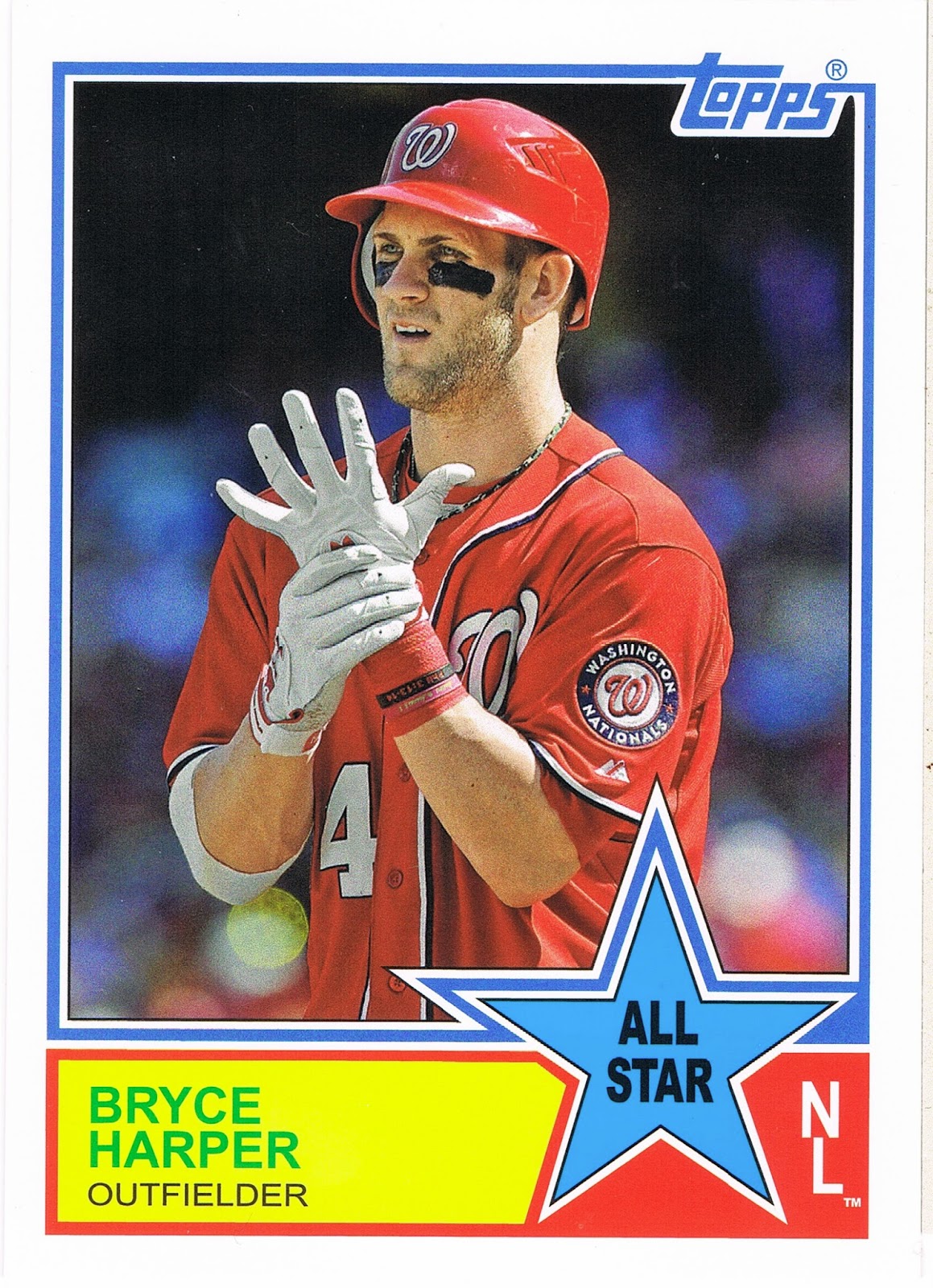
Bryce Harper cards make me laugh, because if I had enough free time on my hands and computer software skills to do it, I would use my baseball cards to run a contest to see which baseball player puts the most square centimeters of eye-black on their face. I think I know who will be the odds-on favorite.
If I keep this card, it will be because of the back:

Collecting cards in Michigan we always suspected Topps did not like the Tigers for some reason, and the Night Owl figured out one source of our suspicion recently. But though McLain has somewhat earned some kidding about choices in life, I am quite amused to see this printed on the back of a baseball card. Imagine the scandal today if some All-Star starter who makes in the high four figures for each pitch he throws in the regular season were to show up late for the All-Star game!
This quickly led me to scramble to my other pulls from this insert set, which led me to this card:

Imagine that - a starter in the All-Star game still playing in the 8th inning. And a Babe Ruth story on a baseball card. I do like the modern All-Star game quite a bit, with something on the line in the game. I can't agree with all the baseball fans who complain about that and just can't understand the criticism. It is a real game between the game's biggest players. Would they rather go back to the year the game was just called a Draw due to general disinterest? I actually would like to see the starters play most of the game, Babe Ruth style, though he was just playing to entertain the fans, but seemingly playing hard.
I should have saved those two cards to post next summer, but they were just too good to wait that long. I briefly considered starting up a chase of this small insert set to find some more Great All•Star Moments, but the other one I pulled yesterday, Giancarlo Stanton, has a ho-hum game write-up (and is the third copy I have pulled from minimal purchases of this product), as does the Jim Rice I pulled. I still want to see the Fred Lynn edition because I will probably start keeping a small Fred Lynn collection, which will be nice and simple because he doesn't get a flood of new cards all the time in modern sets.
The '33 Comiskey story came from the back of a great card, matched to a player who called Comiskey home for a while:

Nice In Action shot of Fisk that still manages to convey action after being zoomed in like all the other nearly all-torso shots in this set. One of the All-Time leaders in getting great baseball cards from Topps.
I wish I could remember which blog I traded for that nice card for a proper shout-out. I am due for a really good trade post to show you some great cards. It might get posted almost on the anniversary of receiving those cards.
The Archives product generally has all sorts of fun inserts, and I pulled several, such as a Jered Weaver Dual Fan Favorites that is just not a favorite of mine. Weaver never gets good baseball cards from Topps, but I'm OK with that. I also got a Dave Stewart "Tall Boy" - yawn. But I did like this insert last year:

And I found this one binder-worthy. I would find it a little odd to put a four-way sticker "card" on a binder page, but that's not where this is going. Willie McCovey there will be gracing the cover of one of my binders. I've always liked his baseball picture products whenever I find them.
I don't have much of an opinion on those other Giants as I know or care very little about their fortunes in the 80s and 90s (fan in the 70s, a topic to share some day), and Buster Posey is great, but, ahh, if you'd like to stick those stickers on something, you can have them, just drop me a note. I doubt very many collectors will want a sticker "card" ruined by sticking one of the stickers on something.
So it's past nighty-night time, but a nice night it was, putting a set of baseball cards to bed.
No comments:
Post a Comment