Last year while working on an ongoing Baseball Card Art project, I picked up an essential item for it direct from the Topps Company, Inc. It will be seen on a future blog post, perhaps when I finish the project.
This year, somewhat out of the blue, Topps sent me a 50% off promo code for up to $100 of merchandise from their website. I knew instantly what I would spend it on, and that wasn't chasing Kris Bryant autos in Bowman Blasters.
Unfortunately, my insta-dream products aren't even here yet, as my purchases have been shipped separately. Topps, always bringing you closer to the mysteries of intelligent product distribution.
Instead the other day I received a brand new product that I didn't know was waiting for me on the current clunky-as-always Topps website, when I finally got it to load all 2000 some images of these things, simultaneously.
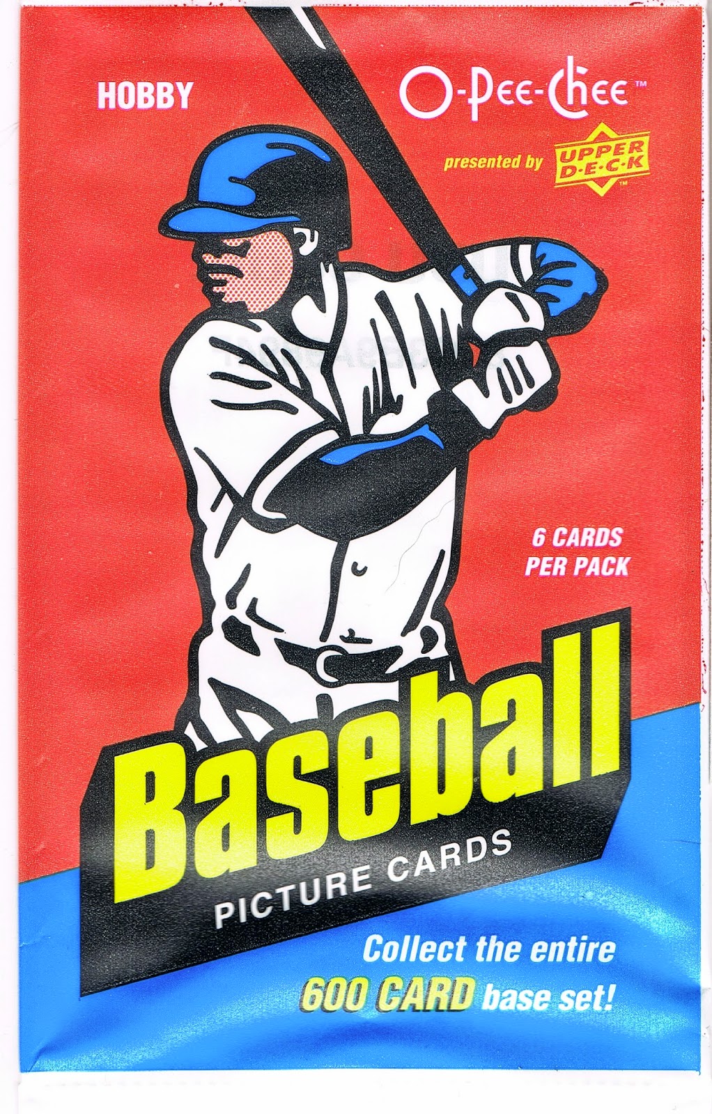
A piece of genuine Art. An image I have had permanently seared in my baseball and Baseball Card loving brain since I was 8 years old:
How do I know it is Art? Well I would fight to the Death anyone who would not agree that Art is in the eye of the beholder. If you say something is Art, then it is, simple as that.
But for the more up-tight types in the world who need external validation of their possessions ( /5 RC sparkle-crusted Chrome auto-relic collectors, for example), this piece of 10" x 14" Art comes with genuine Authentication of it's desirability:
Yes Sir, it seems I am only the 12th person smart enough to get in on this Limited Edition action.
Which kind of bums me out actually - as in, I think they should make a lot more than 99 of these babies. Because surely every baseball child of the 70s will want one, won't they?
However that turns out, I am rushing this post into 'print' on the chance that Topps is now shipping copy #89, and I thought all y'all fine folks might be interested in these. There is a whole set of baseball wrapper prints for sale
or were for sale, as I just surfed off to offer you a convenient link to these. eBay is fresh out right now too, for now, though I would imagine they will reappear soon as speculators realize Topps sold out of their stash.
There were also smaller versions (5" x 7") of these that came in 'packs' (irony is so tasty) for each decade, numbered to /49, though I would really scratch my head over anyone who wanted a complete set of art prints of 1980s Topps Baseball Card wrappers on their wall.
So, so sorry to disappoint here. I guess I pulled a hot product from the midst of my work-induced haze…thankfully that 50% off promo code had a strict expiration date or I would have been looking to buy one of these some now sad day in August.
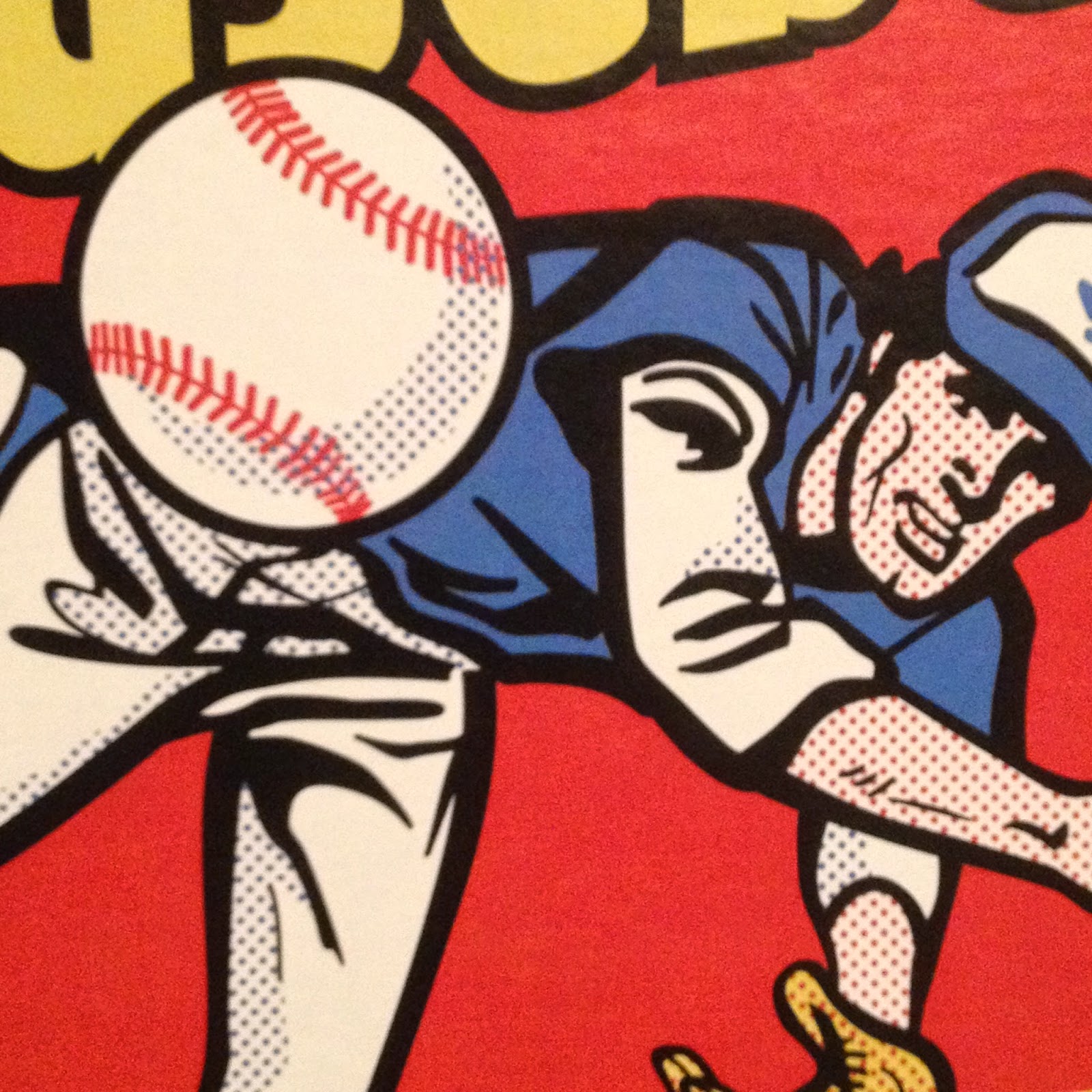
Ahh well, let's return to the Art. This print really surprised me with a new component to one of the primary graphic design images of my life. Dots………….
And here I am 39 years later still learning something from this image. The use of dots like that automatically makes anyone with a little grounding in 20th Century American Art immediately think "Liechtenstein!"
And I guess after all these years I have finally realized his influence on this wrapper. Topps had a long history of being attuned to the Art world, not just the sports world. But upon opening this package, I also noticed the dots are probably part of the image to produce a proper shading effect when the image is shrunk to use as part of a consumer product. Thereby realizing an insight into Roy Liechtenstein's work that I had never considered before.
See, I told you baseball cards were Art, and all before you even open the wrapper! The things I learn from these things… I so wish I could compare my new insights on this to the one 1975 wrapper I have in my collection, which is unfortunately still stuck in a storage unit while I can barely fit a card desk in my current living quarters. Arg.
Although I have made little progress on my ongoing goal of learning good photography composition techniques as that is just way, way down the always too long To-Do list (luckily babbling to you dear readers is much higher up the list), I am pretty sure a diagonal line is a strong element of an image. So is a flowing curve. So are primary colors like Red and Yellow. So is an image with motion, and an image that invites the viewer to wonder what is going to happen next. This image has all that, and a pack of cards inside. Come to think of it, all of those exact same compositional elements are part of my other purchase directly from my Topps master, which hasn't arrived yet, or else I would be short one future blog post right now.
I'm sure there are other things to learn and realize about this classic (All-Time?) Baseball Card image. I'll leave the Art Theory alone now and get on with some other great things I can gab about this. I failed my only Art History class when I wrote up a 'review' of an assigned painting by trashing the ridiculously overwrought frame of the piece, loaded with ceramic grapes and fig leaves and gold gilt, just hideous, instead of writing about the painting inside the frame. I was told to write what I saw?
Now last year I was delighted to open a pack of Baseball Cards and find a sweet brand new Baseball Card inside:
This is one of my favorite Sea Turtles, for what should now be an obvious reason. Though I love card images that bring to mind classic wrappers (I've posted two cards that recall the '77 Topps wrapper), I've never posted this one because I kept thinking I could find a better example if I just kept looking at enough of those worthless base cards nobody wants any more.
Perhaps I will someday. Meanwhile as I have been composing this post in my head for the last 36 hours, Gallardo has won two games in two days - and he is in the starting rotation! Tonight he pitched 6 2/3 innings and got a W. I've always though a Pitcher should get an extra W (at least) when he gets a GWRBI. Yep, last night Gallardo, a former Silver Slugger winner, came into the game as a pinch hitter in the bottom of the 10th and delivered a walk-off Double. Topps had better keep it's act together and deliver me a classic Baseball Card of that next year. Or more than one.
At some point last summer that card led me to finally use this Internet deal to look into that image from the 1975 wrapper. I was hoping maybe someone had sleuthed out who drew it up for Topps. Instead, I found this:
Mets Card of the Week: 1975 Hank Webb box
which is a nice succinct write up of this image:
This is not something I could remember from 1975. When I saw those boxes of cards, ole Hank was likely already ripped off the top of the box, or tucked out of the way to make room for some other box of candy that generally surrounded Baseball Cards back then.
So the wrapper image starting out as a real photo never clicked for me until I stumbled across that blog post.
Of course in the 21st Century, Hank Webb's life story is just a few clicks away, and as it turned out 1975 was a very good year for Hank Webb as he cracked the Mets rotation for 15 starts and went 7-6 in the process.
And like the superstars on the wrappers and boxes today, Webb also has a card in the set he fronted for every single other card:
I'm pretty sure I have this card, as I can recall most of the cards of the Big Red Machine that rolled over my various Pittsburgh Pirate rookies, and I always seemed to pull cursed Reds cards.
This was actually his second appearance on a multi-player Rookie Card, which happened in the 60s and 70s but compared to young players today, well, whatever. The Mets360 blog has more on Hank here.
Also on that blog I learned that my Baseball-Card-wrapper-introduction-to-a-lifelong-fascination-with Art has a son.
Do I mean this one?
No, that is a topic of a future blog post some wonderful rainy day when I can finish ripping that box and starting in on collating that neat set of real cardboard Baseball Cards. But that wrapper definitely owes a little something to 1975 Topps. And some to 1977. And 1976.
It turns out that actual player on the 1975 wrapper that will eventually hang on my wall has a son that is pitching in the Major Leagues today, currently doing fairly well in the bullpen with Baltimore. And sure enough, I have his baseball card:
Whaddyaknow, it's a post release In Action shot of a right hander complete with leg-kick. Nice! This is a pretty good card, though it suffers from the usual practice of the current Topps Baseball Card set editor, who frequently has no concern for slicing off bits and pieces of the ball player with the card margin - that always looks sloppy to me in an age when any image can be manipulated quite easily.
[And really Topps, out of all the subset / inserts ideas you keep reusing for better or worse, bring back the Father & Son cards already. I think a whole lot of collectors would like that.]
Even so, the 2012 Webb card is another nice piece of Art. Art is more enjoyable with Context, and I have sure discovered a lot of that for 2012 Topps Update #US253. The Art elements I like are the banding of the infield grass and dirt, the sense of paused, just-completed motion, but with imminent activity as the ball reaches the plate, and the blurry empty seats in the background. That latter element is not a standard sign of quality Art, just a photo feature I always like on Baseball Cards.
Because as I mentioned above, that is what matters when it comes to Art and Baseball Cards. They are your Baseball Cards. You decide which ones = Art.


The '75 baseball card wrapper is the wallpaper on my phone. I think I'll limit that image to that. I can't see myself throwing down that kind of cash for a framed picture.
ReplyDeleteSigh. I should have let you know this right away a few weeks ago … Topps changed the pricing structure on their card prints. There are now 3 sizes, and you can buy them framed or unframed. The large ones with their frame approach 2 bills. The unframed 10x14, such as this wrapper, are only $30 now.
ReplyDeleteI poked around a little on that new Social Media thing I keep hearing about, and Topps has reported there that all of the 70s wrappers are sold out.
I really don't get along with Limited Edition anything usually; I'll write that up some other time.