
This past year, I thought it hit a sophomore slump a fair bit. I am trying hard to quit writing about 2019 as "this year." Maybe the start of some live baseball games in a few more days will help that along.
Actually, I liked most things about 2019 Big League. The Nickname / Player's Weekend cards returned, but I am working on that set and will throw those up on a brag blog post, someday.
The design was basically nice too. I like diagonals on cards; 2020 will be a good year for me re-living all those 1985 Topps cards. I don't quite get the need for that extra little triangle of photograph, or the fairly superfluous section/row/seat ticket stub conceit. We use barcodes on our 'phones' to get in the big league game these days, Topps.
I liked the wood grain framing quite a bit - really, I wished there was a little bit more space to show it off on the front. On the back, it made for one of the purdiest card backs I have seen in quite a while:
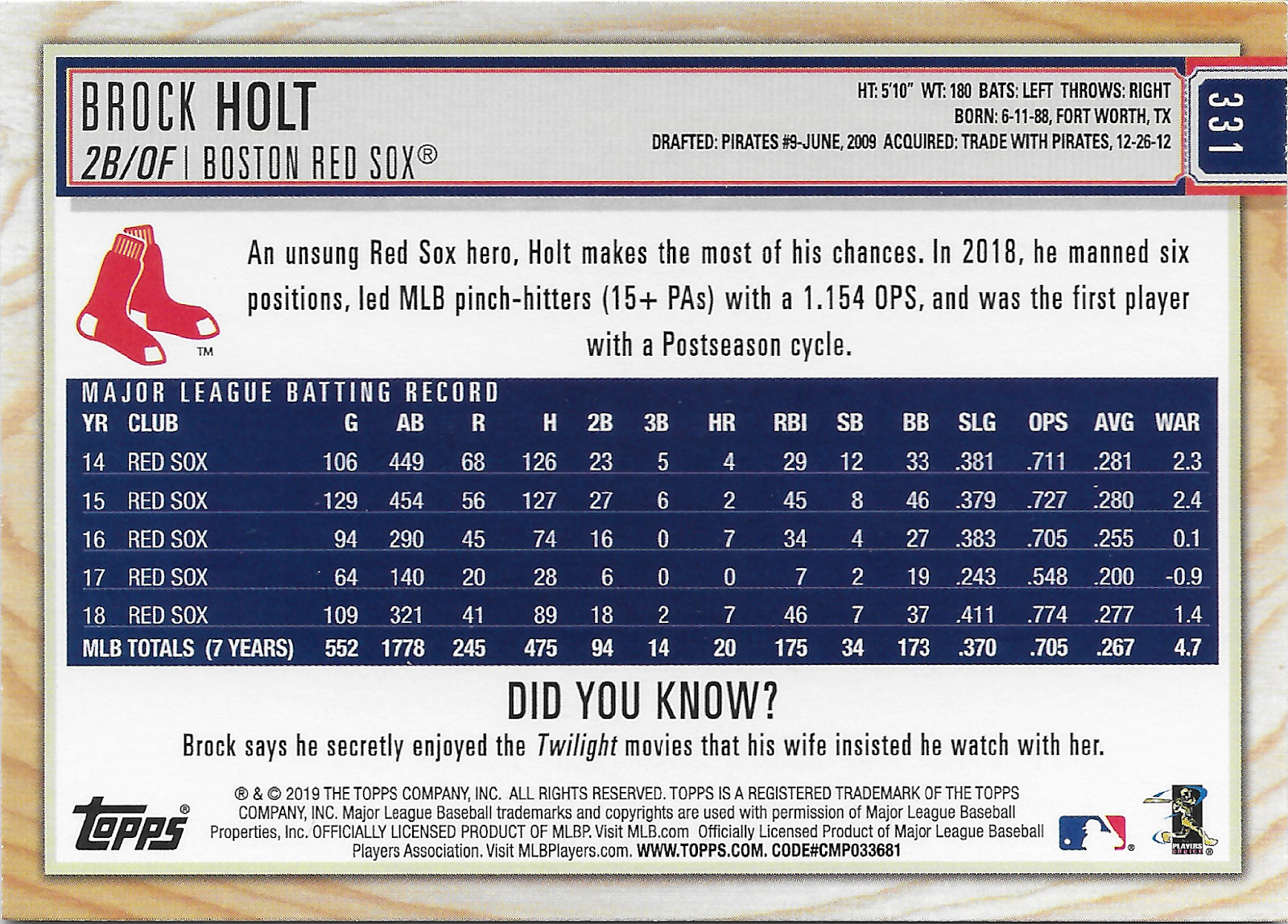
Here the lumber really looks just exactly perfect, and the random Did You Know? feature returned. Those mostly useless random little factoids appear at the price of Full Stats, but how many people just collect one small set of baseball cards these days? Full Stats appear on plenty of other cards, and though if I were in charge, the regulation Topps Baseball set would have them every year, as they do re-appear in 2020 Series One. But how else could Bo Diddley, Aristotle, and Twilight movies make it on to the back of a baseball card?
Another nice feature on the back is the nifty team logo/graphic you just kind of expect to see on a baseball card. But seeing it all nice and crisp on the back informs probably the biggest reason I'm not collecting this release hardly at all:

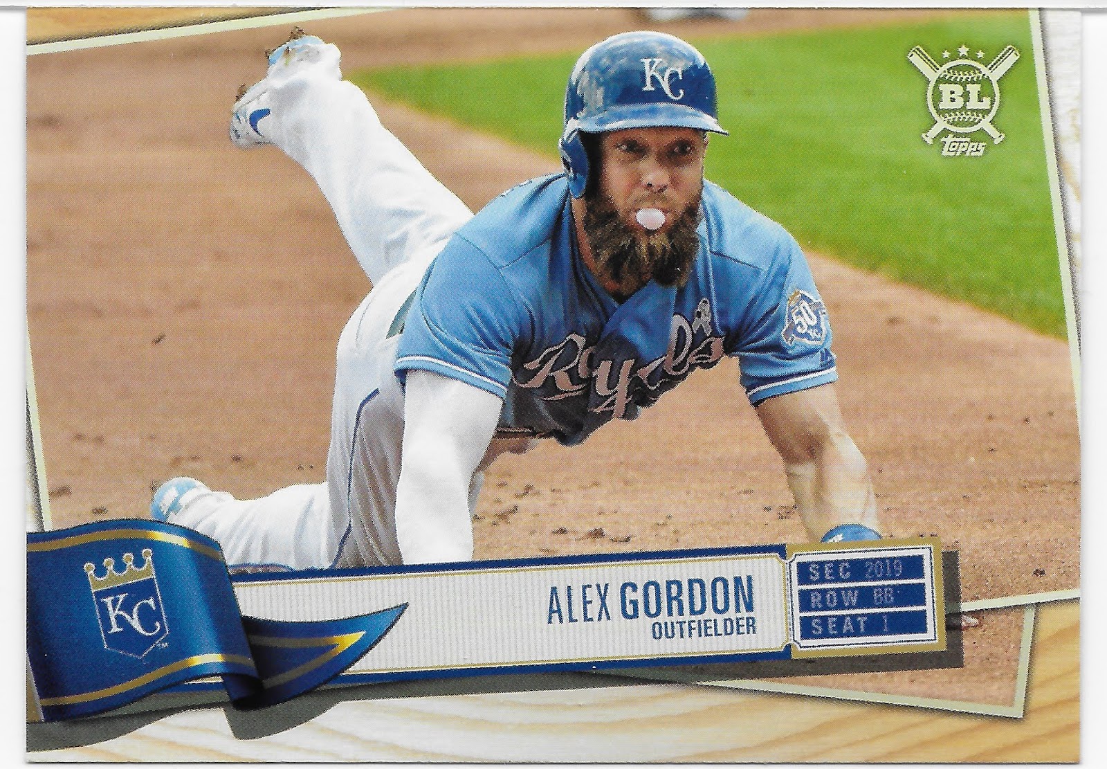
After who knows how many years, we finally get a pennant on a baseball card again, but I don't like it. Too dark. That simple. Ironically, as I move now into a stack of cards from this set I do like, the pennant on that one is too 'royal' blue - dark; the portion of the pennant around the logo has to be purposely lightened to make the logo more visible, a process which fails for many other teams. And the just exactly perfect light and shading, as if the sun was shining on the pennant and then casting a shadow on the baseball player photo below - overkill. Just ditch all that dark on baseball card design; leave that to the cards shot on a twi-night double header, or at night - and then they look real, real, nice with some nice bright baseball card graphics, like this card could have, without that odd area of dark graphics down in the low left corner dragging everything else into it's darkness.
Salvy's batting helmet there isn't that dark. Big league teams don't use dark shaded colors all that much in uniform and logo choices; Milwaukee just ditched their dark navy blue uniforms for this year for example. I think only Minnesota and San Diego persist with the navy these days, and maybe road alternates for the Yankees.
Ahh, well, I will try to stick to what I did like for the most part. I like bubble gum cards:

Those last 2 cards were the 'Gold' parallel. I like them well enough, though I wish I could pull only the Golds for the cards I like, or only the base version. Having to mix them together later will make me crabby.
I especially like "In Action" bubble gum cards.
Now if only this pack of baseball cards had bubble gum in it, too — considering the price point, and some of the design themes of the inserts, and even some of the photo choices, like these bubble gum cards (2018 had several as well, but I can't recall any in S1/S2 for a couple years now), well in theory this set is aimed at kids. So it would seem to be the perfect place for Topps to return to issuing bubble gum with their baseball cards. Instead in the 2020 set, some packaging format will come with an MLB toy of some sort. I have been avoiding looking at the details - so ripping that first pack this summer will be so much more enjoyable.
One checklist feature Big League has that has been missing from Topps Baseball for many years now are Leaders cards:

After lo these many years, Joey Votto finally got his due in the 2018 set, though I wasn't able to pull that card this year. Big League really likes the Leader, err, Stat Kings, cards, and issues many for categories never seen in the history of baseball cards, like that one.
But I like some of the throwback Stat Kings cards, for categories that have existed on Leader cards in previous decades, but not consistently:

Of course, only us old-timers would even know what trying to use the word "Fireman" about this card would mean; let's not confuse the 21st Century kids too much now. But when I was a kid, I always looked forward to pulling this card -

Though any more in MLB 'action', the idea of a Stolen Base might start to confuse the kids. And how does Trea Turner steal a base with a bat in his hand? Is the game turning violent now?
Leader cards are a subset of course, and a traditional one.
I mentioned the inserts - me likey, mostly, this year:

These somehow again make me want to chew some bubble gum, perhaps because I'm just barely smart enough to stay away from the cotton candy level of sugary stuff these days. But I like the simplistic stuff, sometimes; on that Trout card I like the Catcher's mitt now captured in a graphic bubble. I don't need 25x copies of simple, so when this little pile of cards reaches 9, that will be nifty.

I will finish that one out, however. Perhaps more for the photo effect laying over the outfield wall advertising? I like these kinds of cards mixed into my base sets, but I like them here, all gathered together in one place, too.
In general, the photo selection in Big League is not all that different from the Topps Baseball set each year, and that's OK. Pictures of baseball players playing baseball are why I buy baseball cards. Big League does have one big advantage in that approach, seen on this card:

What I mean here is something that flows from Big League's mid-summer release date - the players who changed teams since the previous season now appear in their new duds, no Photoshopping required. Though of course fancy software was needed to first make a grey pennant so that it could then be artsy-fartsied into making it look like a fluttering pennant and have differing levels of shade and sunshine on it. And then somehow the team with the darkest secondary team color - black - now has the lightest of all the pennants in the set; go figure. A straight black pennant with the Sox logo would look far more striking, especially with the nice colorful Sox Throwback uniform on this card.
And I always like a nice Throwback card, like this one:

Which does make me look forward to seeing some video from Maryville here in a week or so. Let's hope 2020 Big League realizes how just exactly perfect the logo there on Chacin's cap really is and skips the busybody approach to it taken by 2020 Series One.
The Chacin photograph there was probably created at home in Miller Park; the bright powder blue & yellow popping out all over the card probably save it from my other more-than-just-nagging problem with this set - washed out photos:

That one has a good chance to have originated in a photo in Miller Park too (Yadi is wearing his road greys under the catcher gear), on a day when the roof was closed perhaps.

(another Miller Park card)
I'm not sure what got into the baseball card creation system at Topps in 2019, but it sure seemed to churn out too high a % of these odd washed out baseball cards, sometimes even on the nice sunny baseball day cards.

Once more, another oh well - too many of those as you paw through a pack of baseball cards and you will look at all the other options on the baseball card shelf the next time you are standing in front of it. I do look forward to seeing Big League on the shelf again 4-5 months from now; I think it has a higher chance than most sets of including a playful card, like this one:

Which unfortunately is not my card, but considering the talk of MLB as Spring Training begins, I thought you might enjoy knowing it is in the set. I got a kick out of seeing in in some listings the other day, but am not that invested in the whole affair generating all the buzz. But if I had pulled that card, I would be keeping one.
I did keep this card, nearly 45 years after I first pulled a card featuring this All-Time Great from a pack -

Perhaps Hammerin' Hank has appeared on other cards that honor the recipient of the award named after him; I'm not sure. But to see him just on a base card rather than some fancy insert, etc., is just a nice touch in this set.
I just never know, opening a pack of baseball cards, what random live action baseball photo will translate into a keeper card for me, like this base-running card:

A more well known baseball card trope is becoming a pretty rare thing in MLB these days, but Big League almost seems to sometimes have a theme of keeping tradition alive -

Or even purposely trying to illustrate technique for it's (theoretical) young audience:

Here at the end of my little off-season resolution of what to do with a stack of cards from 2 blasters of 2019 Big League, I had less cards I really wanted to keep than I did with 2018 Big League. Probably, I will just make a final cut of 9 from the cards seen in this post, 9 'Blast Off' cards, and fill out the Wall Climbers set and probably just the nine niftiest Nicknames cards.
One card though, will stay with me well into my twilight years, probably, as it is probably the greatest 'cooler dump' card I have ever picked up, though that little trope/sub-genre needs a much better name than that. I haven't found a 'Stadium Lights' card in quite a while now. It also somehow gives me nice warm fuzzy memories of Flaming Lips concerts, too, and some boring day late in the 2020s when blogs filled with all those wordy words are just another what-were-those-geezers-thinking idea like stealing a base or bunting the baseball, I think I will show off this card once again as my
2019 Psychedelic Card of the Year

There's definitely a lot of fun photos and facts in Big League, but I preferred the 2018 design to this one. I'd like to see what Topps comes up with for 2020 Big League.
ReplyDelete2018 Topps base has two bubble cards, Machado and Rupp. 2019 base had Avisail Garcia and Acuna in the Update. If you're interested I have over 1500 duplicates of bubble cards and can send you a sampling.
ReplyDeleteThat Brock Holt card is easily one of my favorite cards from this past year. I'm sad he'll be playing elsewhere.
ReplyDeleteI actually know what fireman points were from looking at my dad's baseball cards from the 70's- it's wins+ saves.
ReplyDelete