
A while back this year I read an online report that the 2021 Opening Day set wouldn't actually reach retail stores. This turned out to be false - it was simply delayed. A few days ago it arrived in my little ole home town and some 5 hours after the officially designated trading card distribution time of 3pm at my local Big Box© store, some Opening Day was even still for sale on the shelves.
This was quite a relief to me. The idea that the cheapest Topps baseball picture card product was so desired that it couldn't even be sold in stores was basically disturbing. Trading Card Mania couldn't reach all the way into a set full of cards not even worth money, could it?
Instead what is happening is Topps and Panini have to produce far more trading cards than any other year in the 21st Century so far, but with the same amount of production capacity, is my conclusion. And do so amidst this pandemic problem you may have heard about. The result seems simple: trading card products are arriving later than expected.
So a few nights ago I was able to relax and rip some packs while listening to a baseball game. Which included pulling the Colin Moran card shown above while he was At Bat, and once again tearing up the opposition in this young season.
Of course the design of these cards was already known. But one can always hope for a bit of drama in Opening Day, as with the year of the black cards in the Topps Baseball set that became white cards in the Opening Day release. However that is generally very unlikely in this product, and instead we have just a tiny difference this year:

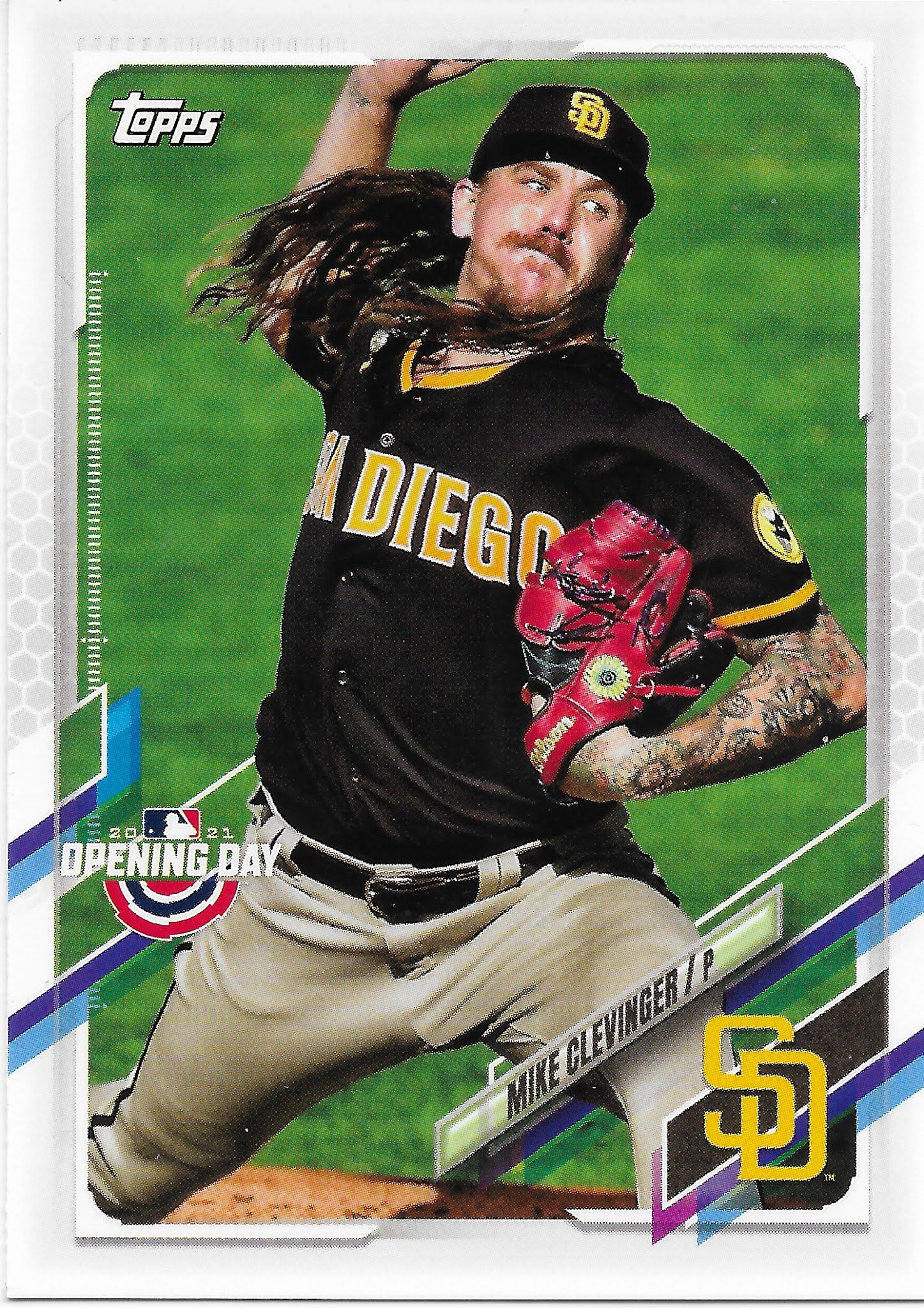

As in most Opening Day sets, any foil is replaced by normal printing. And this year, one tiny part of the parallelogram is accented to a darker shade. Bold, Topps, bold. I do like how the Opening Day logo helps tame that pointlessly excessively long parallelogram on the left side of the card at least.
The design this year has so many busy elements all over the place that I have a hard time thinking of how to refer to it. I like my thought of calling it the Parallelogram Set, but I hate typing that word out. And really, how long has it been since you have heard a nickname for a Topps Baseball set actually pronounced out loud by someone else? I thought so. Even so, I don't really want to pronounce the Parallelogram Set out loud, either.
Maybe I will just call it the Busy Set. Topps certainly stays busy making sure every Topps Baseball set now includes horizontal cards, too:

One thing that often leaps out at a viewer of Topps Baseball cards is the way textual graphic elements on the cards become fixed in place on every card, regardless of how they work in the image. The Opening Day logo could fit in a plethora of locations on this card, but instead it's automatic placement here basically wrecks the best thing this photo has going for it when used for a baseball picture card.
I usually don't care for any baseball picture card that doesn't help me picture a player's face. Some such cards can certainly be quite dramatic and enjoyable, well worth overruling that rule of mine. But other times, well, sometimes I'm glad I don't have to look at certain players' faces.
Now I was on the lookout for this next card, as I knew it wasn't in Series One this year:


Topps is finally ending it's curious treatment of Castellanos with his first Topps Baseball card not drawing attention to his fielding, on it's 8th try. For a Tigers fan this is a rather unfortunate card though, showing off two potential Top Ten Home Runs leaders in the NL that are both ex-Tigers, with (so far) little to show on the roster back in Detroit.
And ironically it was squinting at this card that revealed to me that Topps slipped back to ignoring Castellanos' official request to be referred to as "Nicholas," which Topps remembered for a couple years before backsliding to "Nick" last year.
However 2021 Topps Baseball remains a set where I don't recommend attempting to learn how to spell complex multi-syllable last names, like this one:

Though the FUTURE STARS logo certainly does help light up those teeny-tiny names at least a little bit.
And I do like that Karinchak card quite a bit. Perhaps mostly for the Powder Blue lurker back there who looks a bit distraught at probably just having lost that day's game, detectable even in his blurry background status. This card is definitely going in my nascent Powder Blue Collection, coming in more and more packs to you, should you be able to find any 2021 packs of baseball cards. But I can't quite figure out what team that lurker plays for. I want to think it is a rarely seen Powder Blue effort by the Chicago White Sox, but Google isn't backing me up here. Maybe by the time I pull this card in Series Two I will have figured it out.
I did have to turn to other resources than my brand new Topps Baseball card to figure out how to spell Karinchak's last name correctly. Which kind of defeats the purpose of acquiring this brand new baseball card, really. But along the way I just learned on Baseball Reference that as I write this post, Karinchak has a 0.6 WAR for the 2021 season already - after having pitched in only 6 innings so far. He has yet to allow a run in those 6 innings, so does that reveal one of the mysteries of WAR - each inning without a run allowed is worth 0.1 WAR, maybe? I don't know. Does anyone?
This time of year, finding "new" cards in Opening Day means finding cards not yet already seen in Series One, so let's see some more:
But I like that Albies card, and somehow the player image disappearing into that design tangle is still OK on it. Which is not always the case:
The scan really nails this one, showing off the gleam on the batting helmet even better than this basically nice baseball card does. I'm beginning to quite like finding "leading off" type base-running cards like this one.
This card shows off something else all too well - did you know each card in the 2021 Topps Baseball design includes a "team color" element? You probably figured that out with Cincinnati Reds cards, like I did - but it certainly took me a while, in the Busy Set. But it's there, underneath the team's cap logo, or whichever team logo Topps decides to anoint each team with on their baseball cards. This card reveals that the set design got so busy, and the Topps baseball picture card composers got so busy, that they couldn't always quite get that team color design element quite right amidst so much busy-ness all over the card. And why is the one rounded corner under the design mess colored-in with brown, anyway? This design just simply can't answer that question, on any card/team color/photo combination, really.

Other times, the player's body parts simultaneously overlaying and underlaying the design elements just draw the eye into the Busy a bit too much.
The Soler card image at least doesn't make you ponder the design poking into the top of the image overly much. Other times, it's up, up in the air, it's a parallelogram, it's an alien spaceship, it's a 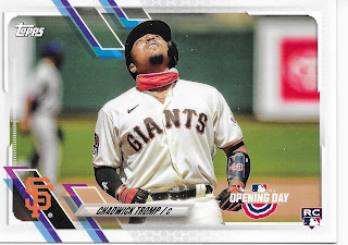

I don't know either, Chadwick.
And I don't know who this player is, either, though at least I don't have to squint quite so hard when the team color is black, which also controls the ink color of the teeny tiny names. Which would be pretty cool, if it weren't so nearly un-noticeable.
Now I know Topps has to introduce us to the Catchers of the 2020s who will eventually replace Buster Posey in San Francisco. And this card includes a heartwarming tidbit about this player's call-up on the back. But is Opening Day really the set for this type of card? In the 2013 Opening Day set that I like so much, there were only 8 RC logo cards. In 2021, that has multiplied by a factor of 6 - 48 Rookie Card cards on the 220 card checklist. Will Chadwick Tromp play in the Majors this year? Maybe. Should all Topps Baseball sets just be Bowman sets full of Rookie Card cards only? Would anyone even notice? Maybe not.
And the weird thing about loading up this product, too, with Rookie Card cards is - Opening Day RC cards are almost always the cheapest Rookie Card card of a player one can purchase - i.e. the least valuable/desirable.
Oh well, let's get back to those normal baseball picture cards, the vertical ones:

Always nice to see the Twins' red alternate uniform on a card as it always livens them up regardless of design. I think this might be the first Night Card I have noticed this year. A good card, no demerits as the stadium light-up ads supply the non-photo fascination instead of the Busy.
And the Maeda card has a great photo selection, as did the Karinchak card, and as does this card:

These are all rare sights in a Topps Baseball set any more - a Pitcher not actually in the act of pitching the baseball. They are even more noticeable in Opening Day, which includes very few Pitchers at all, though it does manage to now include several Rookie pitchers I have never heard of.
Normally, though, we get the regular Pitcher pitching cards -

More Nationals Moob. What's up with these? Another Bad is Good? No, I don't think I will include these. Not good.
And the Pitcher pitching cards can still work just fine, on any given card:

I should know by now how the Cubs refer to this uniform - a Home Alternate, perhaps? - but I always enjoy seeing it, on-card.
Except Yu Darvish won't be pitching for the Cubs any more of course. He was traded to San Diego on 12-29-20. Is that past the editorial cut-off for the creation of Opening Day? I don't know. But Darvish does not have a regular Series One player card, just a League Leader card naturally quite similar to this card, given how busy Topps is these days - same uniform, nearly the same image. Mostly this card makes me wonder if this card will also be issued in Series 2.
In years past, players changing teams in December would sometimes find themselves photoshopped into a new uniform on an Opening Day card. It appears Topps dropped that practice, this year. I also found new cards of players on old teams for:
David Dahl, Rockies - signed w/Texas 12-15-20
George Springer, Astros - signed w/Blue Jays 1-23-21
Joc Pederson, Dodgers - signed w/Cubs 2-5-21
Andrew Benintendi, Red Sox - traded to Royals 2-10-21
Just some baseball card trivia for you there, I guess. Overall I don't expect that 2021 Opening Day will include any cards with an image different than a player's S1/S2 card, though one can't be positive of that until Series 2 releases later this year. 2018 increasingly looks like the exception that proves the rule on such possibilities. Perhaps the Darvish, Dahl, and Springer cards will not be included in Series 2, though few but careful team collectors will ever notice, either way.
A few players changing into those casual road grey photoshops is one thing I watch for in Opening Day, along with any card image different than the card in the Topps Baseball set. But there is always much more to the cheap little set, like it's standard blue parallel:

This is one is perhaps a perfect "pull" from this product. A Rookie Card parallel! Oooohh! But is actually a quite nice combo of a blue parallel with a blue Road Alternate uniform. The full blue frame does, however, serve to really accent all the idiosyncratic Busy going on all the way around the design 'frame' of the card as your eyes keep going round and round it, all Busy-like. No two edges the same, or it wouldn't be "Busy" enough, I guess.
Though I can't recall this Pitcher making any "Hot" lists, or even ever having heard of him before - which is a main reason I buy baseball cards.
In total from my purchase of one blaster (77 cards) and one hanger box (35 cards), I pulled 2 of these blue parallels, both from the blaster. My memory of past years is finding about triple that, earlier in the 2010s, but 2/blaster seems about the same as the last couple years.
I also buy these cards in hopes of finding an enjoyable insert set. What would 2021 Opening Day supply on that front?

This is a bit of a standard insert theme in the Opening Day set, naturally. Though I like this card's use of standard MLB colors (but why does Topps rarely use this normal blue color on any baseball card?), these don't do much for me, this year. The Reds have the longest running Opening Day tradition in Major League Baseball, or did in the past, of being the first game in the National League each year, even if by only an hour or so.
These cards have a nice synopsis of the events of Opening Day, 2020, for each team, but the fronts of these cards do nothing for me aside from the classy bottom frame. I pulled 3, and they each are no different than any other "team card" showing a few players celebrating. One for the Padres shows 2 players not even mentioned in the text on the back, which is also true of the Indians card. For a true Opening Day card, I want to see the classic bunting, and at least feature a player who featured in that OD game the previous season. Eventually though I realized images of 2020 Opening Day probably just weren't worth using, given that no fans could attend.
The Opening Day theme does continue on another insert:

Now we are getting into baseball card insert action. I would want one of these cards if I was a dedicated 'Player Collector' but I am just a lazy player collector - if I find a card I like of a player I really like, it might make it into a binder page for that player. Though I have a basically positive reaction to these, they don't move my needle towards needing all of them. Would the rest of the inserts?
I was glad to find this one to get some OG action in my brand new Powder Blue Collection, but otherwise this feels like a Zoomed-it-in effort here. Other cards pulled from this checklist include Griffey Jr. and Ripken - really going out on a limb there, Topps. I can live without the rest of these, too.
There are a few more inserts in this, technically, though they are deliberately short printed to be rare cards to supply the "value" that entices the customers to buy more. I didn't "hit" any of them, this year, so will likely never see what they look like and thus won't need to collect them, either. Opening Day Stars seems to have been retired, finally; I generally liked that effort in years past.
A final component of an Opening Day set is referred to as an insert, but is also basically a base card - the Mascots: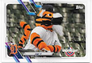

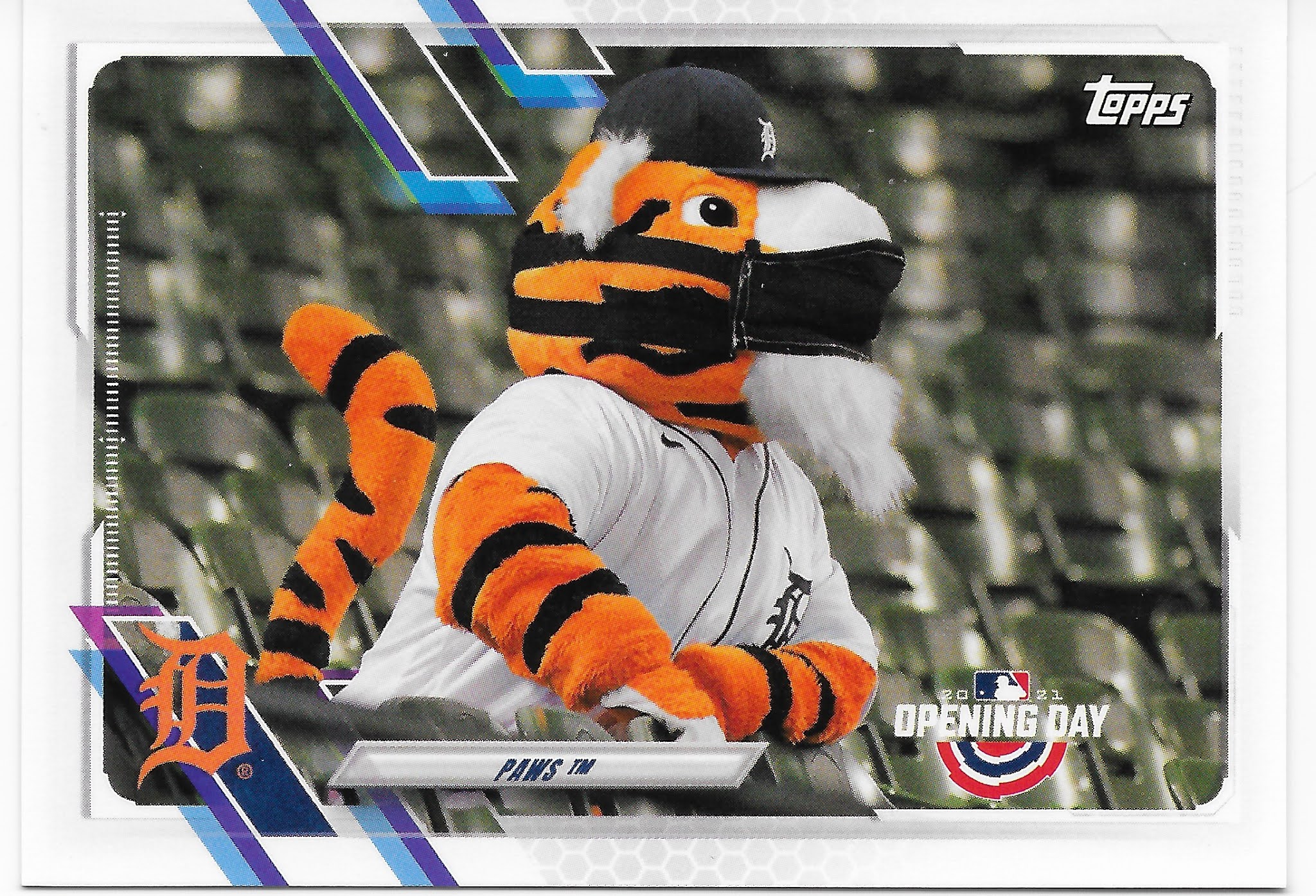
2020 Represent!

Those are the 2 mascots I most look forward to finding, and Topps came through for me with their packs carefully sent to my little ole home town. These cats are nearing full binder pages now and will probably get double-sided pages soon enough, though the Parrot's card has some amusing stats on the back as Topps did manage to include at least a little baseball card fun on these despite all the grim news going on off of our baseball cards over the last year.
That leaves only wanting to see a new Bernie Brewer card, which I did not pull, however unless he manages to actually be photographed still landing in actual beer in an actual beer barrel, which seems unlikely in his new stadium now named after an insurance company, I doubt there is much Topps can do for me with his image at this point. Which was the general case for 2021 Opening Day; I could not find evidence of the base checklist offering up any variety from Series One, and there were no memorable insert designs like Stadium Lights (2011), Play Hard (2013), or Bubble Trouble (2016), to name a few faves over the years.
I was happy with my pleasant hour of absorbing brand new baseball cards while listening to live baseball. Though I don't feel any need to purchase more packages of this, that will likely soon become a moot point during ongoing Trading Card Mania, anyway. And I was also quite pleased to find one final mascot card to share, a mascot that only sometimes makes it into this set (but has their own binder page, too), who seems to be summing up my feelings on this one:

Powder Blue uniform mystery. Yep it looks to me like the White Sox. Judging by cap logo.
ReplyDelete