
A nice On-Deck Circle Card.
This one of course is from Update. I don't think On-Deck images have ever been all that exceptionally numerous in any given set. Baseball cards are generally always posed/portrait cards, or "action" cards which are going to be hitting, pitching, fielding, or base-running.
And then there are the ones that don't fit in those neat categories, like this new Frandsen card that I really like. The image gives you a feel like you are in the ballpark, in a really good seat. Not in the press pit with an excellent telephoto lens. And we absolutely have to have these "other" card-types somewhere in a set, preferably a lot more than just once.
I have to wonder, though, if Topps picked this image to go with their usual we'll-try-to-make-you-aware-of-the-player's-position-via-which-photo-we-pick approach here. The back of the card talks up Frandsen's role as a pinch-hitter, though in an average card-back, workmanlike way not really worth scanning for you. And indeed when I looked up Frandsen's stats for 2013 (not good) on Baseball Reference, one of his positions played was listed as "Pinch Hitter." So I guess every card does happen for a reason, even if the Phillies might possibly break up with Kevin this winter, though that remains to be seen.
And where else would you expect to find a Pinch Hitter but in the On-Deck circle, probably signifying an upcoming pitching change in the National League of course...sometimes a pivotal moment in a baseball game, and thus nice to see on baseball card. It's like I'm watching a baseball game or something.
I also like how the Frandsen card shows off a little of the miscellaneous objects that populate the On-Deck Circle. Just the other day I conveniently ran across a much better example of that on this card,
which has some intriguing hardware on display there. I can't recall seeing such items on any other card, though I would imagine such exist.
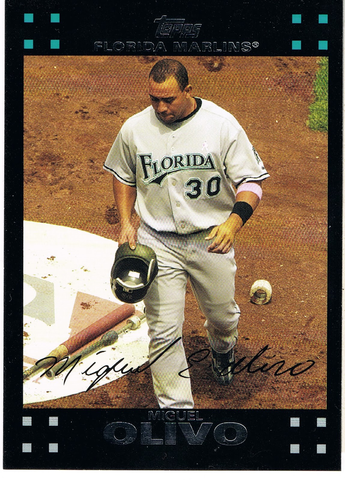
The rest of the Olivo card is just all wrong though. Every line on the card leads down; even the usually uplifting MLB logo (here nearly monochromatic in chalk, also kinda on-card unique) doesn't seem to help. Hatless cards are not always popular, but a player with his hat in his hands instead of wearing it isn't going to win many popularity contests. Just a downer of a card for a journeyman back-up catcher, with every plus matched by a minus. An interesting glimpse of the game courtesy of Topps however.
The Frandsen card is the only On-Deck card in Update, and Series 2 was not granted one either, although it did have a really nice Batting Cage card, which is every bit as rare as an On-Deck Circle card these days of course.
But I couldn't wander around in the On-Deck circle without posting a certain card from Series 1:

I would imagine this card was the subject of many a post back in the winter, when I hadn't quite fully hatched out of my turtle egg yet and was just discovering all you baseball card bloggers. I seem to partially recall a comment or two disliking the corporate logos on the card, but I am OK with those. I don't think Topps gets money for them or they are conspiring with Fortune 500 companies to make you want a hamburger. You see some logos here and there when you watch baseball, very occasional they then turn up on a baseball card. Big deal. It's not like we're as logo-ed up as NASCAR. Just imagine an unlicensed set of NASCAR cards...that might look weirdly cool, now that I think about it.
But overall just a sweet baseball card, On-Deck. I posted a parallel not to re-pimp my project (again), but just because the White Sox cards all look markedly better on the parallels, except the Camo parallel, my least favorite. There the Sea Turtle is just plain hidden, naturally, which kinda defeats half the purpose of the parallel. The White Sox cards are OK on their base glossy white of course, but much better in full color. I only picked the Target Red because it was the closest copy, on top of the nearest stack. This card looks good in every solid color edition and Gold, but loses everything when it goes off into the parallel Shiny universe.
Now this card does make me wonder if this might be the first appearance of the Golden Arches on a baseball card. I suspect probably not, but at this point of card-gazing tonight I'm a little distracted. Anyone got a hamburger?
I've been working on a custom set using on deck photos of younger "future stars". So it has a literal photo of the player on deck to bat and a double meaning of hey, these guys are on deck to be the future stars of baseball. Haven't worked out all the kinks yet to show them off though.
ReplyDeleteI also thought "On Deck" might make a good SP theme like Topps used the "Out of Bounds" theme this year.
Topps nailed it with the photo they used on the A.J. Pierzynski card. It's so perfect... it's almost like a painting.
Delete