I have always liked 1985 Topps Baseball. I didn't collect it much at the time, and in fact it was probably a low point in collecting for me until I skipped most of the 90s. I have a whole lot of 1986 Topps probably due to meeting new friends in college, including a baseball card collector.
But I basically like diagonal design elements on a baseball card. They get things moving on the card. And unless you are sitting right in line with 2 bases, you will always see the game of baseball on some sort of diagonal. A diamond is four diagonals after all.
In the first three decades of Topps baseball card designs, a diagonal element is quite rare, only seen in 1966 and partially in 1977.
Then came 1980, which is one of my favorite designs to this day. I completed that set but sold it in my early 20s; I am just starting on a re-do of that.
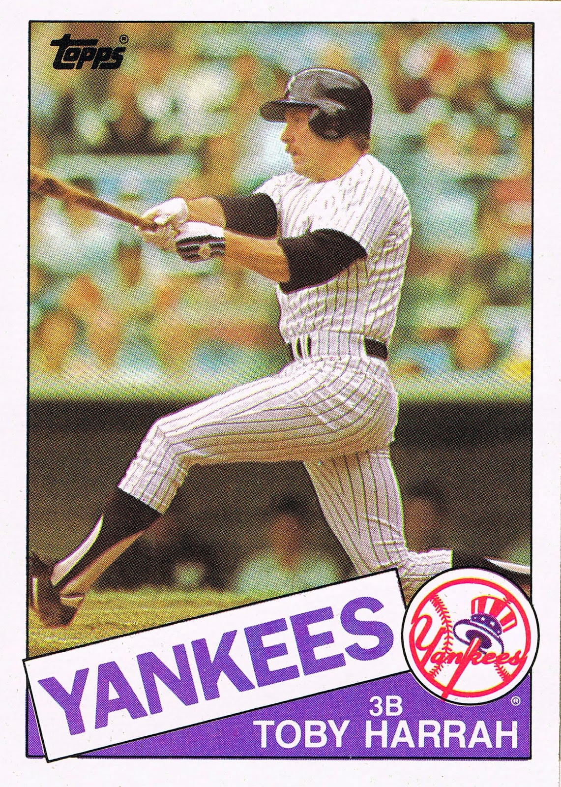
1985 brought back the diagonal in a big way:

Aside from the diagonal, I also like the use of color in the design as the bed under the player's name; it's just kind of a bonus how colorful the blurry crowd is on this particular card. I just pulled this card the other day from a repack; these have brought me all the way back to four 85s I have on hand to consider, though I have a loose pack of them around here somewhere, and another little stash of them hiding in their Undisclosed Location with Dick Cheney, in the event of a terrorist attack, or not having enough storage space in my current living quarters. Anyhow, let's see a bit more of the real deal, from back in the day:


Hey, look, it's Night Owl's favorite hat! He writes a great blog about the 1985 set, but I have been purposely not reading it that much, because I still might put the 1985 set together, and I'd rather see the cards for the first (or second) time in my life one at a time, as the stack of cards reveals them. I might pick up a vending box full of the things, an idea I was in awe of as a child reading baseball card catalogs. 500 cards, in one box? Incredible.
Then in 2012, when I was still busy casually putting together the 2011 Topps set and hadn't discovered baseball card blogs yet, Topps released their Archives set. I kind of got into that one in a retro way, picking up more of it in 2013 than when it was new. And that was probably traced to purchasing some of the 2nd Archives release, and finding this card:

A favorite player of my youth, and just simply a guy that generally photographs well, all with those strong diagonals and harmonious team colors in the design. A for Effort Topps, and P for Perfect, or so I thought. And despite a fondness for Stargell cards all my life, I had never noticed his unique batting-helmet-over-the-cap style on display here (and a theme of an ongoing collecting effort I'll share with you some day - you'll be surprised who else I discovered capping it like that).
I also pulled this card:

This is one of my favorite cards of 2013, and is probably definitely my favorite from outside of my standard love, Topps Series 1 and Series 2. A memorial patch, a night card, I could go on with all the things I like here, and have. This single baseball card gave me a better appreciation for Salvador Perez than any other connection I have to the game of baseball, which says a lot to me considering he plays for my favorite team's most dangerous rival the last few years. I hope KC wises up next year and plays his back-up a little more often so he doesn't tail off so bad late in the season, though I also simultaneously hope they don't figure that out and/or have such a thin team that they can't actually do that, like this year.
I started to think maybe I should track all these down, though I was far more interested in that with the 1972 cards, and proceeded to work on those when I could. But I kept liking the 1985 style cards I pulled, and started to wonder - could this set satisfy my desire to gaze upon 1985 Topps Baseball? This card probably could:

I knew instantly this was most likely an alternate take shot at the same time as the photo used on his second card in the 1976 set. But it was still basically a new photograph for me. I also liked how Topps worked on the authenticity, by putting a 1976 style Royals logo on this card - scroll back up a little to the Perez card to see what I mean (and check out the Cardinals icon on the Porter card way back at the top.)
Though on the Brett card, the key design decision of printing the name of the team next to their logo works out just fine, and with only one "KC" on the card on George's hat, on other cards things didn't work out so nicely minimalist:

Ugg. Here he have the word Royals three times, and the the letters KC three more times. Baseball cards are much better without so much busyness all over them.
Now with some teams like the Royals, they just don't have much of a graphic icon that can be used to get around this problem, as compared to classic baseball iconography that some teams give Topps an easy out with:

I'm not sure how Topps selected the red socks for the Red Sox, rather than the script "B", or a block capital "P" for the Pirates, rather than their iconic Pirate. The Red Sox wear those on their left shoulder, perhaps that's how they did it?

No, that can't be it - the Rays have a left shoulder patch every bit as iconic as the red socks for the Red Sox, that would look fantastic next to the word Rays on the card. And I have no idea why the Ray isn't on the alternate powder-blue Rays uni there. And since the Rays weren't around in 1985, Topps could do whatever it wanted here.
Now with the team name on the card, players in their road uniforms present some interesting opportunities:

I kind of like how that turned out. But if they had zoomed that digital image out just 5% more, the "Los Angeles" would look just exactly perfect over the "Dodgers," even with the repeat of the word Dodgers in the logo.
Topps did pull off a nice card in that vein:

Cool. Says it all right there, gets both of their main logos, repetition is discreet and no big deal, unlike this card:

And this card:

Has there ever been a card with four Chief Wahoos but only a single player? That might be a tough find. I didn't think I would ever find a card with the team name repeated four times, but there it was:

Now, this is a standard potential problem (or not a problem at all, except for nuts like me) for cards of players of many teams, whenever the designer goes with team logos on the baseball card, seen often in logo'd sets:

A triple logo card. This even happens in the original 1985 Topps:

And this isn't a totally terrible thing. I really look forward to owning that particular card; I had to download that scan from the Night Owl. (Blogger tip: don't hotlink baseball card images; download them to your own computer first, then re-upload them to your blog post. Otherwise someday you might just have a little blue ? icon where your hot linked image was, though I truly hope the 1985 Topps.blogspot never goes away).
I love red, white, & blue cards and ironically the Expos have the best examples of these all the time, though the Dodgers should have good ones as well if Topps would ever use red on their cards a little more often. On that card I probably like the image due to the way the two diagonals interact, even on a zoomed in card; it helps that the diagonal lines lead you to Carter's eyes looking out of the frame rather than at the photographer.
So you could say now that I am just nitpicking Topps for using team names in the design and the photographs, and that is a bit true. But contrast this effort:

With this one:
And here I am purposely leading you astray with an image that doesn't even show an NY anywhere, from one of the most non-iconic teams, on their uniforms at least.
Because ultimately what turned me off from the the 2013 use of the 1985 Topps baseball style wasn't the repeats of the team icon or team name, but the reason that it is so glaring on so many cards. Which I can't quite show you without scanning a lot of them all together, say in a binder page, but I'm just not up for that.
Instead I'll just lazy out and use a link to all 50 of these cards in the COMC sales listings, where you can peruse them all easily enough.
When I put together all 50 of the 1972 cards, I discovered that only 7 of them even showed a player's belt. When I considered doing the same for the 1985s (though I need another half-dozen or so), I discovered that of those 50 cards, on exactly zero of them could I see even the player's belt.
I get the certain "theme" of Archives - shooting pictures of players at Spring Training, with palm trees and batting cages and tiny empty exhibition stadiums in the backgrounds, just like the old days on Topps baseball cards, even in 1985. You would be hard pressed to see a player's belt in the 1965 set, for example, but it avoids the problems of busily repeating the team's name 3 or 4 times by zooming in all the way past the text on the uniforms.
But ultimately I just didn't want to look at 5 1/2 more pages of baseball player torsos, generally carelessly cropped, though I do have to give Topps credit for not repeating all the trivia questions like they did on the 1972 cards. I already had a nice colorful 5 1/2 pages of such cards in the 1972 design.
And I still like the idea of Topps re-using their designs and will probably always take an interest in such, on a design-by-design basis. (Bring on 1976!) I had hoped maybe this nice convenient 50 card set would give me a nice look at 1985, with current players and without a lot of additional expense. Archives does hold that promise to an extent, but this particular effort just fails for me, and I finally made my decision, probably with the help of those cards from the repacks.
I would much more enjoy tracking down the actual 1985 Topps Baseball cards. And then I could read another great baseball card blog...
No comments:
Post a Comment