But I had to gaze around the card desk and look at something else besides my new Update cards, and discovered a small stack of cards patiently waiting in line to enter my halls of baseball card immortality - a card binder. They were starting to get a little worried they might end up in one of those boxes of commons that might not have the dust blown off them for a few years at a time.
Let's see if they escape from that fate:

I know this one will. Topps doesn't seem fond of the Athletics' green uniform, which isn't all that surprising considering how good their yellow uniform looks on baseball cards. So to get a green elephant for a change - from a posed set which frequently yields the best Patch Cards - well, that's a keeper. Plus I'm a sucker for that mountain in Arizona that shows up on it's share of baseball cards. I'd like to discover the name of that little peak. Bonus half-point for a lurking cloud too.
I have no idea why Topps chose the color purple for Athletics cards, but that is a choice they made in 1964. That was 3 years before the creation of the reason I like Purple A's cards.
I did like plenty of cards from Heritage this year. Not enough to build the whole set as that many heads looking back at me from a binder page would freak me out too much. I like the '65 design quite a bit more and I see a new set building exercise on my collecting horizon.
But the '64 / '13 cards will make for good entries on my strange sets of binder pages, like this one:

There is an OK example of the Gary Carter memorial patch in '13 Series 1, but I expect I'll use this one for my patch collection, for the variety. And the possibility that Kirk's far away eyes here have something to do with seeing a famous old veteran catcher there in Port St. Lucie.
Another gazing away card probably won't make the cut:
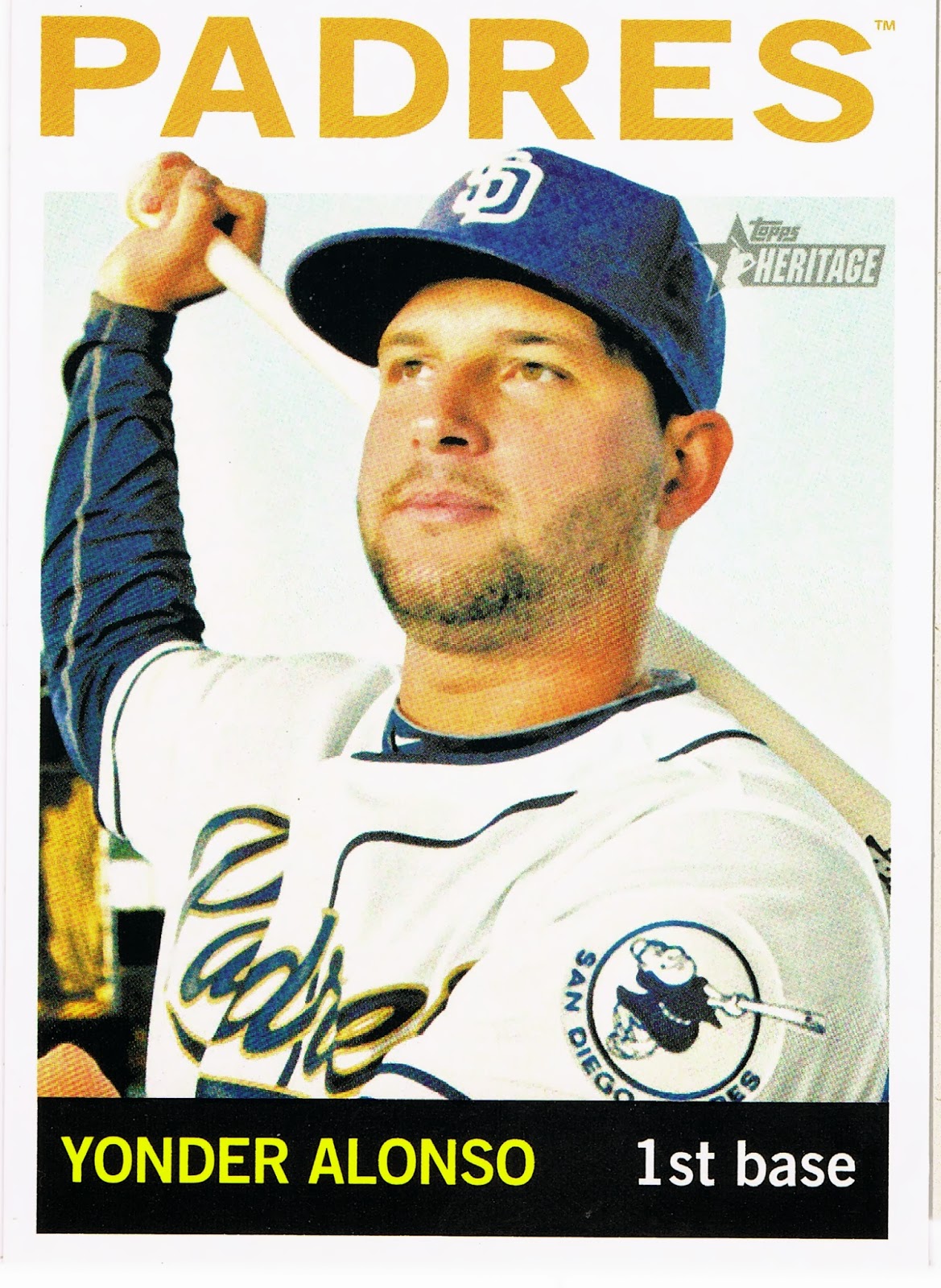
I can't recall seeing this patch on a card before, but then I haven't built sets every year of my baseball life. I get a kick out of the fake swing, no batting helmet pose, but a patch has to be complete to compete with all the other patch cards it will be neighbors with. So Yonder here will probably see just a little binder time, until I find a better example of the Friar Patch.
Which will not be the fate for this card:

I actually just deleted the adjective 'fantastic' before the word card up there. I love this card, but entirely for the Ray sailing on in from the border there. Otherwise putting a white uniform up against a white sky on a white border baseball card just makes the whole result a bit too much floating head for my taste. I like the careful signature though.
So a card of pluses and minuses. But ooooh that Ray patch.....soo smooooooooth......
No comments:
Post a Comment