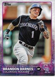
But that's OK; I enjoy baseball on the radio, and when I wonder what the players look like, I turn to my baseball cards. So it does seem like the perfect product to open on Opening Day is --- Opening Day. Let's take a look.
In my very first pack this year, I got a Hit!
Woot! Woot! I'm rich! The new Babe Ruth's Rookie Card! Woot! And it is a clutch Press Conference variation! Woot!
Oh, wait. Press Conference photo variations in Opening Day were like so four years ago or so. Opening Day variations remain incredibly tough pulls - in years of collecting this product for some reason, I have never pulled one. I have 2 from 2018 Series One, but those are actually more common than the /2018 gold cards, running at about 3,000 copies each (something I read on one of the baseball card forums). So I did a discount double check and checked out all the Opening Day variants in the ever handy Cardboard Connection gallery, the only place I ever see such cards. This Ohtani card is just his regular base card in this set, which will be a unique card for him; I highly doubt Topps would repeat this rather boring image in Series Two.
But a nice reason to collect Opening Day is the possibility of other random variants amongst those dreary low end base cards no one cares about, like this one:
I knew this one was coming, sort of, as it was used by Topps on the "sell sheet" several months ago. That vaguely kinda promised something unique as an image of a Kershaw card was labelled "Base Card Veteran" - but that was a picture of an entirely different Kershaw card, featuring Clayton @ idle in a night game, looking contented. Which well now remain just a mock-up image that never gets produced.Would there be more Base Card Veterans? The only way to find such baseball cards is to open more baseball cards ...
Which is a unique card, as compared to his Series One card. This might be become more difficult for Topps, in terms of finding new action shots of Tulo, as he is once again on the DL as I type. But this card may have been produced because of a promo I read about for blister packs of Opening Day at a retailer in Canada, which promise a Blue Jays card in every blister. The outside-the-wrapper-cards proved to be the same base cards as found inside the wrapper, but at least this one is something new for a Jays collector. I wish I could remember which blog I read those details on, sorry about that.
Opening Day is where to find "new" cards of players changing teams in a certain post-season window, like this one:
Which overall is a well-done such effort with the 21st Century airbrush. Normally, Topps selects the classic 'road grey' uniform for this work -
Though that one called for the tricky use of the Redbirds there, as St. Louis only rarely sports a vintage road uni that actually says "St. Louis" on it. A mostly fine effort by the Topps airbrusher on Photoshop detail, but these cards always invite close examination, and this one doesn't disappoint in that department - dat shoe, doe.
Something rarely seen in Opening Day is a card like this one:
A more typical road grey effort, with no shoes untied for a Yankees player visiting the O.co - last year? What makes this card interesting is it's predecessor in Series One:
I think I have only ever seen Topps do this once before, and that was on an obscure /50 Silk parallel in 2013 Update. Makes for a unique pair of cards illustrating the construction of brand new 21st century baseball cards.
So, are there more unique "Veteran" Base Cards? I'm not that sure yet. 75 of the 200 cards on the checklist "will be featured in Series 2," as the Sell Sheet notes, and I found plenty of those. I was looking for Tigers cards in particular, as I sweetly absorbed the first inning of a new MLB season, but I would settle for Pirates cards as well since they were my team's first opponent. And a team I have basically cheered for since following the Charleston Charlies, their AAA affiliate in the mid-70s, which supplied many of the cogs in the "We Are Family" 1979 World Series winners. So I was only sorta happy to pull these 2 cards, nestled quite apropos sequentially in a pack -
Not every player that changes cities does so on time for the Topps airbrusher. A couple bittersweet pulls and a cruel irony of that ever-so-crappy Topps collation machine they use for retail products - I have pulled this pair of cards three times now. Fortunately I did finally pull a card of a player playing in the game I was listening to -
I am thinking this is another forthcoming Series Two card, as with the previously pulled pair of Pirates, though I am sorting Series One in a unique way this year and haven't toted up exactly how many cards I still need after plenty of duplicative retail purchases. But that is part of the enjoyment of opening Opening Day - brand new baseball cards, like this one:
Another un-remarkable card in a release full of Hitters Hitting and Pitchers Pitching, somewhat inevitable with an Action Image driven themed set. I just like finding a Wieters card after all those years he refused to sign a contract with Topps; I think this is about his third year back with (ALL?) the rest of his compatriots. At least they didn't issue another frowning Matt Wieters card.
Though all the Hitters Hitting cards start to wear me down sometimes, at least for a DH that has to be the go-to option. And I do like a possible trend in the photo selections, as exampled here -
It does seem like the photo buyer likes those colorful alternate uniforms, too; the 'Road Alternate' is especially nice to see on a card. I would love to have enough free time some day to count up how many Alternate/White/Grey unis Topps uses for the images in a given set... but I don't see that blog post happening any time soon.
Not every card reveals which solid color Alternate is in use:
But that's OK, some cards are just a great capture of a baseball player playing baseball, even the Pitchers Pitching cards. But I still take the most notice of the more unique cards
Which is neither a hitting card, nor even a fielding card, but the much more rare Base-Running card. And this new classic Kris Bryant card (I always like his cards, even with no plans to chase all the expensive ones) is a yet more rare subset of Base-Running cards - a Home Run Trot card, it looks like. I pulled another great example of this only very occasional baseball card genre from the other part of the "Bryzzo", featuring Anthony rounding the bases on the 1983 inserts in Series One. I will certainly be on the look-out for more of these types of cards.
And hey, look, a Fielding Card!
They do still exist, if you open enough baseball cards. I like a card featuring a live action baseball - Thames is still concentrating on the incoming ball which just popped in to his glove, and the base runner is nowhere to be seen, yet - Out! - you can almost hear the Ump say from just off the edge of the card. I am not always a fan of a torso-only shot on a horizontal card, but this one works.
As I type tonight the Brewers are busy dismantling the Padres for a sweep of their opening series. Uecker mused that "I don't know how you can get much hotter than this" as the Brew Crew sprayed hits all over PetCo throughout the game. The Brewers even appear on my radio without Internet assistance, so they have always been my #2 go-to team to root for, which will be a big help in this year when the Tigers main upside is drafting very first in June and will then at least have the team logo on one of the most expensive baseball cards around, come next fall. So I am happy to pull Brewers cards, and cards like this
Which could well be JV's first Astros card featuring a true image if that is Correa playing a strong shift in September or October game action last year. It was a little odd seeing Verlander in his new duds while listening to Opening Day in Detroit, where normally Justin would have been on the mound over most of the last decade. But it is a nice colorful card and I like those; it connects me to this next card and maybe shows off how special-green the Astro Turf is in the new Astro Dome:
This is a repeat image from Series One, but pulling it again in Opening Day gave me a better appreciation for this uniquely colorful card, which has plenty of strong lines and could be becoming a favorite of 2018 so far.
Overall though, I expect most of the "75" Series 2 players in Opening Day to have repeat images. I won't know for sure until late June, or maybe next winter sometime if I run out of spare card baseball time, all too common in my self-employed life.
But I like opening Opening Day for a chance to pull cards like this -
And although I used to love parallels back in the days of proper baseball cards with proper image borders, I generally have a strong dislike for just bad ego-stroke gimmicks, which is all that can be said of the truly bad Full Bleed parallels this year. Yuck.
The "Opening Day Blue" cards are once again not numbered this year, so you just have to take Topps word for it that there are 2,018 of them. They only fall one per 77 card blaster now, as compared to 2 or 3 per blaster in previous years, so we are probably looking at another set with a bountiful print run - thanks Aaron Judge! And I mean that; I am happy to know print runs are going up, and more people are buying baseball cards. Always a good thing.
Of course, most of those purchasers are looking for cards like that blue Calhoun up there. Because if Willie Calhoun becomes the next Aaron Judge, that blue parallel dere will be quite the card to have, though that seems unlikely for a Rookie who failed to make the Opening Day line-up of the Texas Rangers, or even the 25 man roster. But that card was an interesting pull because of this card
Which is of course not an Opening Day card, but a Series One card - and a different card. The bread-and-butter of the baseball card business now is that special logo about to be chipped in to the stands as a foul ball by Calhoun's bat there, and a product with unique Rookie Cards is a product that will be opened in large quantities by gamblers looking for that special version of the hottest RC in town.
Topps works hard to never disappoint those types of customers:
These are all new Rookie Cards, and this is not completely new this year; the inimitable Aaron Judge had his own special Rookie Card in Opening Day last year (2 of them, actually, with a photo variation). But I don't think Opening Day '17 had anywhere near this many. Not all the RC cards in Opening Day this year are unique as compared to the Series One version, but there is no shortage of them either. I think I will keep this little Noob 9 collection together on this binder page - maybe next year this near complete team of players will all have the Rookie Cup logo on their cards.
Though I enjoy the cheap thrill of opening the cheap lottery tickets which Opening Day offers, I also purchase a fair bit of it for the inserts. It seems to me like I have an innate better chance of liking an insert set in Opening Day, when Topps is deliberately trying for a more light-hearted touch, you know, for the children. Like me.
One standard component of Opening Day are the Mascots; I am always pleased to pull this character:
Almost a pity I wasn't listening to Opening Day at Three Rivers or the Ketchup Place or whatever they call Pittsburgh's Park these days. I could have gone for a little less cropping and a little more Pirate flag, but for Topps, too, there is always next year. I'm still looking forward to this year's version of Mr. Met and Paws and Bernie Brewer; there is usually one other or two other Mascot cards I really like - even the Swingin' Friar made my permanent collection of these one year just recently.
The other long-running theme of Opening Day inserts is "Opening Day Stars"
Though I have to question how a player can be an Opening Day Star already when he hasn't actually ever played on an Opening Day - first time the ever multiplying horde of RC logo cards has been included in Opening Day inserts. This one should perhaps only feature Opening Day Stars from teams that play outdoors, in the northern half of the country (an ever dwindling list), as this card is almost perfect for Opening Day in some cities - it looks like it is snowing big wet juicy snowflakes, but that doesn't bother a Rookie so hot, he can wear short sleeves on Opening Day, or something.
Overall I liked last years Opening Day Stars quite a bit better:
Which was a good news / bad news discovery for me last year - for once I liked a Topps effort at just adding random cutesy graphics to a baseball card. The bad news was these have become very tough pulls as well, falling about one per three blaster boxes now. But I hope to complete last year's set of these despite having quite a ways to go, so if you have a few laying around the card desk, hit me up.
Last year this set used the Opening Day set/product theme to feature cards featuring Opening Day activity at the ballpark. The cards were rather hit or miss, and inexplicably featured only 15 of the 30 stadiums. This year the insert set is back, but Topps could only be bothered to create cards for 20 of the teams. How did they do? More Hit or Miss, in my opinion -
So although I hope to visit the home of my 2nd favorite, newly hot team, this card certainly doesn't, well, it just doesn't do anything at all. Some crunchy old-timers gathered around the batting cage during batting practice could well make for an interesting baseball card. But this card is not that. It is still slightly better than this one though -
Which doesn't feature anything at all except the duhh-huhh obviousness that Reds fans like to wear red when they go see the Reds, something baseball card collectors know very, very well all Reddy. What really makes me hate that card is what it says on the back, some nice text about Cincinnati's long tradition (the like, really, really, really long tradition of always playing in Cincinnati on the first day of activity in the National League) and mentions the pre-game Parade, which warms up for this card:
Only Topps could create a baseball card about a baseball tradition and then not bother to actually depict that tradition. And do it on two separate cards in the same product. FAIL.
The Team Traditions & Celebrations insert set will probably eventually yield a couple cards I like, though none made it into the 'scanner pile' to show off to you, Dear Reader. And let's just forget about all those Hot Dog cards last year, which always just made me pointlessly hungry before I threw them in the trash.
But there is almost always an insert set in Opening Day that I like, and didn't see coming. This year it is proving to be the "Before Opening Day" cards, which finally yielded a Tigers card on the Tigers' Opening Day -
- and which both revealed a piece of Tigers apparel I have never seen on a baseball card before, and featured a nice player, maturing into being an everyday starter in his late 20s, thus considered worthless by most of the baseball card world these days. But not by me. And to find a journeyman player on a Topps insert set in the year 2018 was quite a surprise; one I didn't see coming at all - and he even plays Left Field, naturally. Thanks Topps!
I'm not sure why, but I always like seeing Spring Training on a baseball card. Probably 'cuz of all those cards from my youth in the mid-70s. But even though plenty of Heritage and Archives cards feature plenty of Spring Training poses and even real palm trees at times, they are not actually Spring Training "Action" cards, like this
Sigh. Thumbs up for authentic Spring Training photo, thumbs down for being essentially a picture of Buster Posey's butt. Try again, Topps
An authentic Grapefruit League patch card, and I didn't even have to pay top dollar for a sliver of a patch glued onto a non-descript card of some All-Star. And probably the last Marlins Ichiro card I will pull - I am looking forward to Ichiro's triumphant Mariners card in Update. It had better be triumphant, Topps. Just as this player really needs to finally triumph this year...
That is certainly a positive sign for Buxton. And kind of a rare sight on a baseball card, unfortunately - a nice big, unforced smile. I think this will be the year that will finally show whether paying $8,000 for Buxton's "Superfractor Auto" was a worthwhile investment, for someone, somewhere. I hope so, after pulling this happy baseball card.
Another happy card was the following, for both the photographed player, and me, the low-end baseball card collector:
Topps likes to make sure I pull all the best Anthony Rizzo cards. Or at least the best ones I can get via buying some cheap baseball cards with my groceries all the time. That started in 2011, when I pulled his /60 'Hope Diamond' parallel RC, which will sell for a whole lot of pretty pennies sometime soon I expect. And it continued on into 2013, when I pulled his autograph from a pack of retail cards not once but twice - and not dupes/doubles, either. The $ swag factor has been declining some in subsequent years though Opening Day relics have been historically been a tough pull, I did get one of Rizzo.
Now this year just a generic insert might not fetch a whole dollar once COMC has 29 of them for sale all at once here in another couple months, I am still quite pleased with this card - a St. Patrick's Day card. I doubt I will ever assemble 9 such cards together because I doubt 9 exist. One that I know does was for Miguel Cabrera, but was a "case hit" photo variation in 2013 Topps Chrome, a card I am very unlikely to ever own. So I will just be happy to place this with my 9 best Rizzo cards eventually.
That Rizzo is certainly one of my favorites from this nascent collecting season so far. A final "Before Opening Day" card amused me however
as it seems Topps will never pass on buying a photo that subtly, or not so subtly, shows off some epic manicurial action
This also happens for any player sporting some nice, not-natty dreads, but I didn't pull any in Opening Day so far, though I do have a couple more Series Two previews for ya:
I kind of like a picture of Justin Turner possibly turning a Double Play, but I don't know how Topps managed to make someone with a debatably epic beard somehow look a little girl-ish at the same time. This card will not make my Nifty Nine binder page for Justin, that I can tell you.
The final S2 preview card continues a theme Topps leaned on heavily in S1 this year: What Are They Pointing At?
A player probably far from any favorites list outside of New York, but one that will likely make a hand-made subset collection in my collection as I think all these finger pointing cards will make a pointedly unique binder page later on this fall sometime.
And although I had to settle for just the one Tigers player card while listening to the first Tigers game of 2018 the other day, Topps did come through for me with the one just exactly perfect baseball card for my Opening Day ripping tradition:
This card notes proudly on the back that "The Tigers won their ninth straight home opener in 2017" and will definitely be the last time Brad Ausmus is seen on a baseball card for quite some time. But, alas, all Topps and I could do was give it the old Topps try, one more year. One of the greatest things about baseball, and baseball cards, is the well-worn, not-a-cliche-but-a-comforting-truism about next year, when I will most likely be opening Opening Day on Opening Day, to open the season, again.


