Showing posts with label Beguiling Binder Page. Show all posts

Tuesday, November 11, 2014

Beguiling Binder Pages #12 and 13

Finished a page today … I'll change the numbering system again next time. I finally got it figured out. I think. Here 'tis:
Yes, I was glad to see this one. The first page from the Update part of the set.

It was a tough decision to attempt extending this project to the Update cards. Without two key decisions by Topps, it wouldn't really be possible.

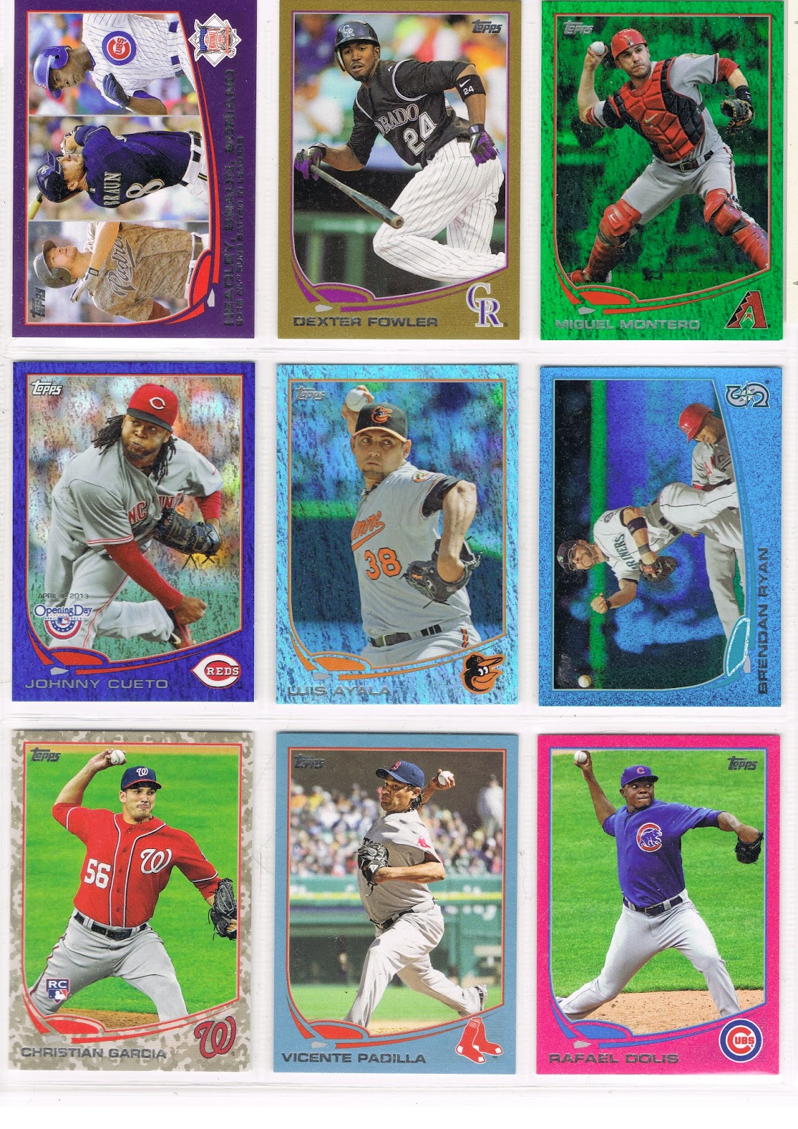
What's that Dan Haren card there in the center … what does that logo say? Chrome? Yep. I am using Chrome cards for the all-parallel Update collection.

It really wouldn't be possible without them. Last year, Topps issued a small set of 55 cards from Update done up in the Chrome style, though, surprisingly, without quite the hoopla they put in a regular Chrome set - just two parallels (Gold and Black), and one quite lame insert set. These were the "Mega-Boxes." 

I enjoy my project as it moves along, but for the Update cards, several possible parallels don't exist - Toys R Us purple, Factory Set Orange, Wrapper Redemption Blue Sparkle, and Wrapper Redemption Silver Slate. and Opening Day Blue Foil. Wait. Opening Day is a different set. So is Topps Chrome. That helped me rationalize a little, since I do use Opening Day Blue Foil in the Series 1 and 2 pages where I can. The only thing different are the card #s and a logo on the front; the photo and the Turtle remain the same on the vast majority of cards. Shin-Soo Choo, though, got the most different Sea Turtles last year, with 4 different photos.

But this begs a certain question - why don't I use all sorts of the various Chrome parallels for this project? I considered it. With these Update cards though, the only two parallels, Gold and Black, were the same as two of the base parallels. This is also basically true of the standard 220 card Chrome set, excepting at least the Sepia and Atomic parallels I still hope to obtain an example of one day, perhaps a few others.

And overall, I'm not a big fan of Chrome cards at all. For fun and to complete my full look at the Sea Turtle design, I have a set of the 2013 Topps Chrome base, mostly to look for image variations from Series 1 and 2. And in the long run, I am going for a collection of the Xfractor versions of those cards as you can see there on your right or through this link.

The use of the Update Chrome cards led to a different problem - there are a few pages that don't have a card from Update Chrome. A pickle. I can complete such a page, but it's not easy. I'll show you one day, I hope. I do have a couple that are over the difficult part….

Of course another Topps decision aside from the Update Chrome set also made that page possible - the introduction of a new parallel - the Sapphire. I quite like them, a pretty baseball card. The first thing I have to do completing an Update page is find the Sapphire, before I can worry about the Pink, Black, or Camo (I also need one of each on each Update page - ugggh. Tough project.)

These come in an edition of /25, which is quite unfortunate. In 2011, the Update release also included a new parallel that was extended back to the Series 1 and 2 cards already released - the Hope Diamond, which came in an edition of /60. Much easier to get a hold of.

Incidentally, I have been trading some with a collector who is not only putting together a complete set of this year's Sapphires, but is only 3 cards away from a set of the 2011 Hope Diamonds - 280 Andrew Bailey, 497 Alex Avila, and US207 Frank Robinson. If you might know where any of those three cards are, I can get you in touch with him.

OK, OK, the cards have done scrolled off the screen again. Let's see some more baseball cards….here's page 13:
This was indeed a lucky 13 page. For the first time, I have run into a page of 9 cards with 7 blue teams.

And out the window go my color-choice goals for this project. Where? What? There on the Chris Johnson card. A blue Sea Turtle on a blue parallel. I picked him because at least his team logo has the most red of the possibilities here.

There is no escape. A blue Emerald looks terrible. A blue Sapphire would be the very problem I am describing - blue-on-blue. Yet this page almost holds one example of each possible parallel I can use for the Update cards, save two: printing plates, Silks, and Platinum 1/1.

So now I have finally been pulled all the way into the bizarre world of 21st Century baseball card collecting, which for so many is no longer about completing a simple set of baseball cards, or obtaining a desirable Rookie Card of their favorite baseball player. I've questioned it before, but what, ultimately, is really the point of owning a 1/1 baseball card? Particularly when the 1/1 cards are just a color variation from an otherwise identical edition of that same baseball card? Yes, it makes people happy to own one. I shouldn't criticize that. But I just can't wrap my mind around such a pleasure I find so strange - I own this, and you can't.

And now I want one. It would give me my own strange pleasure to replace that Chris Johnson card with the Platinum 1/1 version. Or any of the other 6 blue cards on this page. I could settle for a Printing Plate I guess, though that is not my first choice. I have one on another page, though at least I pulled that one from a pack myself - my first 1/1. You never forget your first one. And I have purchased one other Printing Plate, for one of those pages with no Update Chrome available.

Silks, ahh, another topic for another night. I should probably wrap this up and click over to eBay. There might be some new 2013 Topps parallels listed...
Friday, September 19, 2014

Beguiling Binder Pages #9 and #10

I think. The last time I tried to count them I got 7. Now I'm adding two pages but I count ten in the snazzy permanent binder I have for them. You'll have to wait for the end of the project to see it though.

I'm not sure why I can no longer count to ten correctly. I called a re-do on that pesky page I assembled with a Wal•Mart blue version of Kevin Millwood that was just all wrong, but I think I posted it once already. But that one is not part of the ten finished pages.

I'll probably change the #s again next time I finish a page. Sigh. Meanwhile...
…a couple new items on this page. The center slot is anchored by a Sapphire, that's Luis Ayala there. 

I like the Sapphire Foil cards that were released across all 3 Series when Update came out. I don't much care for the fact that they are in an edition of /25. The popular Hope Diamond parallel in 2011 released similarly, was printed /60.

But of course today, collectors and Topps customers prefer expensive cards and yaddayaddayadda, you've read it all before.

I like the Sapphire Foil, except of course I won't use a blue Sea Turtle for one. I discovered the other day that an Athletic Sapphire Sea Turtle doesn't contrast enough to look that great in the project either.

And I'm glad I pulled that Ayala Sapphire myself. His 2012 Update card is probably my Card of the Year for 2012. What, you missed that post? Yeah, well, I'll get around to that one some day. 2015 perhaps.

What was the other new card here on page 9? Not a new parallel, but the first card I've shown that will be part of an interesting side collection developing out of this project.

The Sea Turtle swims aside to reveal a Starship Enterprise Card:
Some of the horizontal cards on certain teams on the Blue Sparkle wrapper redemption cards, and the Emerald Foil cards, have this certain printing error. How could I resist? In the project they go, even though a Mariner Blue Sparkle is a bit less-than-ideal for the project. I'll be putting together a neato nine of these cards for a separate page, if there are 9 of them, though I'm not sure about that yet.

I might need a third copy of this card for another project for which this card includes an example. I found a great, great such card on ebay the other day for fifty cents and I think you'll see it soon. I'm pretty darn sure I can win that auction.

I also like page #9 because it is only the second from Series One that I have finished. I think the lucky Ayala pack pull occurred after acquiring the Pink Dolis and the Camo Garcia, so I didn't need a third low /# parallel with Johnny Cueto conveniently showing up on the Opening Day Blue Foil. And thus probably my first page without a cheap retail Target Red parallel. Such diversity will certainly help the eye appeal when I am flipping through the completed project in the year 2025.

So on to page #10:
Another dramatic page for me, because it's the one that started it all, somewhat. My first purchase of 2013 Series One was a Hobby Jumbo box from which I pulled the black /62 of Izturis there.

What should I do with it, I wondered? And wondered. And wondered. And read card blogs. And put cards in binders. And worked on the still easily available 2012 Update simultaneously. From which parallels poured out of, since I usually shopped for cards at Wal•Mart and Target. As I was haunting those stores all over eastern North Carolina that winter hoping to find left-over 2011 Update with that confounded Mike Trout RC I still needed and refused to buy as a single.

I'm still pretty sure the chance acquisition of many Emerald Foil editions of St. Louis Cardinals cards like the Furcal on this page somehow made the Christmas-in-February lightbulb come on in my head.
Which somehow led to the Eureka! moment for this project, and a way to use that Izturis card in my collection for all eternity.

I lost track of what was the keystone card here. I think it was the Scott Hairston card there in the center slot…I think I was holding out for a Blue Sparkle version of that one, because the Mets cards look fantastic on that parallel, especially when there is great contrast in the background with infield dirt.

But the Orioles also look fantastic with their eye popping orange home uniforms amidst all those sparkles, and Endy Chavez was patiently waiting. So I think I finally relented and pulled Hairston from the Emerald reserves and declared this page done.

I suspect that when I get my COMC account up and selling with all the extra cards I have laying around (and writing this post is delaying that process yet again…), I will pick up a Sparkly Hariston and an Emerald Chaves and rotate them onto public display once in a while.

Because no good Art Gallery can afford to keep all of it's treasures out on the walls at the same time, can it?

Wednesday, July 23, 2014

Beguiling Binder Page #7

Collecting baseball cards is always idiosyncratic. That is, it's uniquely personal. This page of my 2013 All-Parallel collecting project illustrated that to me well, as this was a key page that led me to decide on the color 'rules' for this project as I discussed in the last post in this series, #5.

Why is this post #7? Because of idiosyncrasies. It was time to match up the post # with the page #s I have completed, as the stars and moon weren't aligned on those any more; i.e. the #s didn't match.

May I present Beguiling Binder Page #7:


As always, don't forget you can click on an image on a Blogger blog page for a bigger view of the pretty colors.

I had to re-acquire two cards on this page to conform to those color rules - the David Murphy, and the Torii Hunter, which became the 'keystone' card on this page. When I first started picking up the wonderful "Blue Sparkle" parallels Topps produced last year, I knew I would want Murhpy's edition in that style to see how the scoreboard backdrop looked. And it was (and is) a cool card for the potential Legend of Cardboard. But it was a blue Sea Turtle on a blue parallel - broken color rule. Start over.

I had a worse problem with the Torii Hunter card - it was the only one on this page included in the Opening Day set and available as a "Blue Foil" parallel. Even worse, there were 6 blue Sea Turtles on this page. Really start over.

Fortunately, the Jason Marquis card decided itself as I automatically went for the Camo-Camo combo on any Padres card I could. (I still need the Ian Kennedy Camo from Update). It is also fortunate that I really like the Cubs on Purple even though that is a little similar to their blue Turtle diamond. And I like Pink for the Blue Jays as they are both easy to acquire from Americans who have a hard time shipping singles to Canada, and it works out well with their solid-blue alternate home uniforms as on the Adam Lind card there. I'm also happy to assign Nate Eovaldi to Sparkly world as I generally like his cards. Finally a month or so ago on a rare, short visit home I was able to surf eBay a little and pick up a hobby-only Black border copy of Hunter and the page was complete.

My project is a long way from complete in terms of pages, though many pages are at 8 cards. But it will still be a long project, I know, especially as I am about to enter another baseball card slowdown. I am moving tomorrow and some family is coming to visit my town for a week. I'll be playing with some cards, but they will be Magic:The Gathering cards as my nephews are little wizards at that game. Not my thing, but they were pretty stoked when I showed them binder pages last summer, so I know they are bringing their decks this summer. So the blog will go back to it's now usual slow pace for a bit, sigh. I have a lot of fun things lined up to bloggle about, as soon as I can.

In other blog news, I had to correct an error in my last post about the Junichi Tazawa cards, so I just used the Update function to sort all that out. I spent 20~30 minutes with Google and various websites researching that one, but that didn't quite get-er-done, as I discovered while wandering card blogs the next day.

Ahh well, you win some, you blog some, you lose some. See y'all again soon.

Wednesday, May 28, 2014

Beguiling Binder Page #5

So good to be at home - where I can get baseball cards delivered.

A few came the other day, a small lot of 2013 purple parallels. It filled 2 crucial slots in my ongoing Parallel Project as well as one in a small side project, and included a David Price card that will likely pay for the whole lot when ever I finally find the time to assemble a box to send off to COMC.

How is the project coming along, you ask? This is my 7th page completed for a 990 card set. I have reneged on declaring a Series One page completed due to dislike of the Kevin Millwood card I used for reasons illustrated below. I have a whole lot of other pages waiting for either a single keystone card to complete the page, or one difficult card to appear to release a mishmash of possibilities amongst the retail parallels I could use on the page, especially in Series 2. I know doing the Update set this way will be a years long slog, needing a /25 Sapphire on every page just as a starting point, but I'm not too worried about that with the baseball card buyer's resources of ebay and COMC available to help.

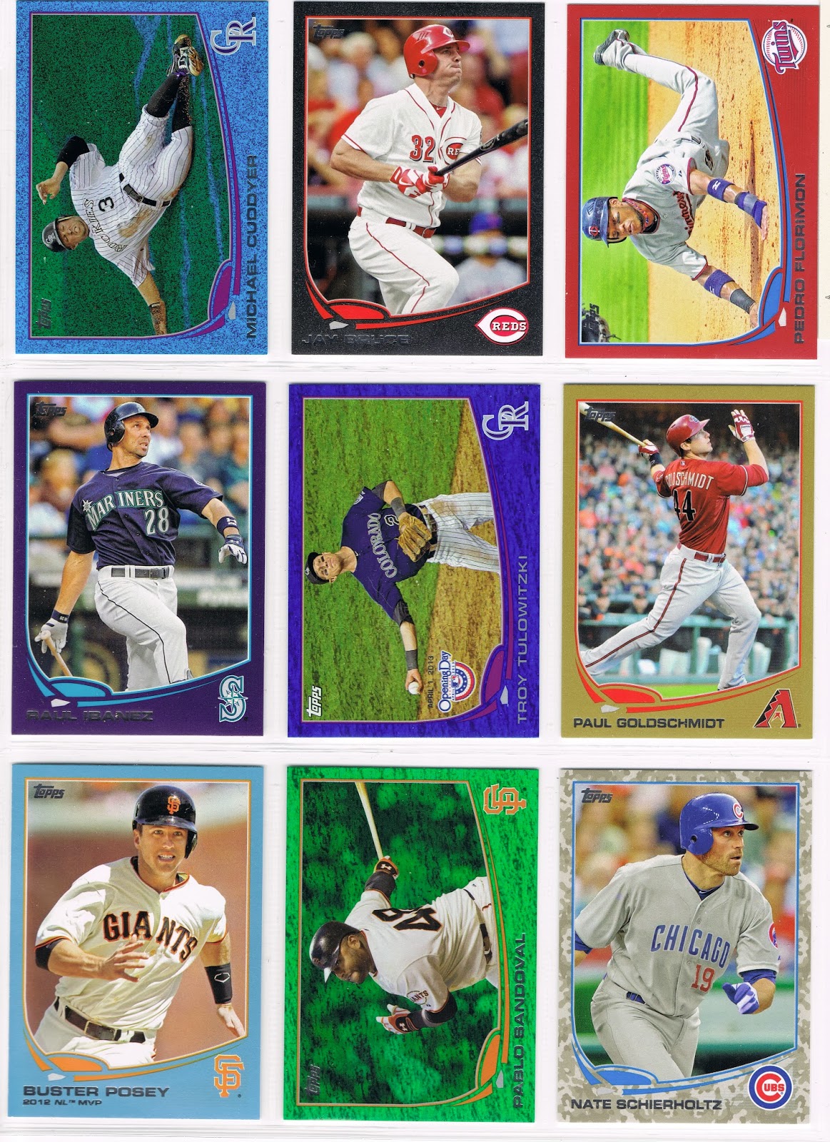
One of those slots filled yesterday (the Ryan Dempster) completed a page, card #s 395 ~ 403:


This page has one of my favorite parallels of my whole project so far, the David Wright card. That edition there is the Opening Day 'blue foil' version, which works just exactly perfectly for the Mets' cards. Well, last year it did at least. This year's cards don't have enough orange on them to keep you awake while perusing the Mets cards, which is a comment on the main 2014 design, not the current Mets team. I like colorful baseball cards, obviously.

It took me a while to decide on some rules / preferences for which parallel to use of which player. The Wright card was a bit of a no-brainer, as that was pack pulled. The black and pink on this page, well, that mostly depends on what shows up available cheaply as part of a lot, which is how I ended up with a really nice teal-on-pink card of a great Mariners pitcher who generally mows down hitters in the shadows of a more famous rotation mate in an obscure corner of baseball country.

It also didn't take me long to realize I didn't want red teams on Target cards, or blue teams on Wal•Mart cards. And the basic combination of red-on-blue looks so nice on the 2013 design that I tend to select it for favorite cards, or favorite players, such as for this example of my general like of Aroldis Chapman 'In Action' cards, even though so many of them are basically the same.

For the wrapper redemption 'Blue Sparkle' cards, obviously I nixed the blue teams, though that leaves plenty of options on this page. Generally I like the cards with a mix of tones to the background, as then you end up with green sparkles in the image contrasting nicely with the blue sparkles of the border. Thus, images with infield dirt or vibrant turf work best; I'm sure the Dempster card or the Aviles card would be very nice as a Blue Sparkler. But sometimes I just have to go with what is on hand in the stacks of cards before they head off to a hopefully friendly not local internet re-seller.

All those selections left just a decision on the mysterious Tom Wilhelmsen, card #402, perhaps a sly bit of dyslexia on the part of the Topps set editor, and a footnote for a future blog post.

But really, for the Ricky Williams of MLB, what other parallel could be used but the green one?


Tuesday, December 3, 2013

Christmas Cards


While I know there are a few scattered examples of baseball card / christmas card mash-ups, and Topps' occasional fun with the subject, I'm not headed off that way tonight. I did like the result of asking Google Images for a 'baseball christmas card' though.

The cards I have for you tonight are my first parallel collecting effort. I somewhat fell into it last winter, when I was ripping packs and setting aside the parallels into their little piles. I had no idea what I would ever do with them.

Then I noticed the leading team in the pile of Emeralds was the St. Louis Cardinals. A red team on a green card. Looks like something left over from Christmas, I thought. When I made my first trade of the 2013 collecting season with a friendly collector working on a set of the Emeralds (William @ Foul Bunt, just to your right as you read this), I carefully held out the Cards cards from what I would offer, and selected Cards from his available cards.

A collection was born. May I present ... my 2013 Christmas Cards:
I just slowly worked on this one as the year went along, mostly by simply setting aside the Emerald Cardinals from the too many packs of baseball cards I ripped. I think not more than one or two arrived from a trading block after my trade with William (which already had me over ten cards if I recall...).

But of course, ripping packs is the hardest way to get the cards you want, and here at the end, I had to resort to picking up the last singles on eBay. The Molina was the toughest, as it probably should be. A great card of a tough player.

I've never built a purely team set before; not even for my favorite team, the Tigers. It is kind of nice to see an all-parallel team collection. Here is the second half of the set:
Yes, I stopped this effort at 18 Cards. Although I have 7 more Emerald Cards, I am sending these off to my Uncle, who I haven't communicated with in too many years. He is a life-long Cards fan, having grown up 100 miles south of St. Louis. He is not a baseball card collector and I'm not sure what he will do with these. I will suggest he consider giving them to anyone in his church who might want them, if he doesn't. But all that being the case, I decided to leave out the players traded away, and all of the Update Cards. I regret there is no Matt Adams on one hand, but I wasn't really up for tracking down a Michael Wacha on the other hand. And 18 cards perfectly fit in a single binder page for shipping and displaying.

It was fun though. I can picture my uncle's face when he connects the dots on why he received a set of green Cardinals baseball cards at Christmas time. I am working on one other such set, to keep for myself, of the Oakland A's, though of a different color.

Along with purchasing the final few Christmas Cards from a you-pick auction on eBay (why do I frequently capitalize the B in that?), I added a few Emeralds needed for my parallel project, a direct descendant of the Christmas Cards.

The incoming Emeralds completed one page, perhaps my favorite of 2013. An action-packed page of baseball cards:
No Pitchers!

I think there is only one other page of cards like this one in 2013 Series 1 / Series 2 / Update, and that is an extremely memorable one, though I still need 3 parallels on it, and they are tough.

I haven't gotten around to figuring out how many other No-Pitcher binder pages there might be; I'm pretty sure there are no No-Hitter pages. I wish Topps would have a little more fun with all that; though they have started putting the card #s to use a little in that 2 players from the same team follow each other many times in the sets this year.

But I haven't gotten around to much with my baseball cards since my last post, because I have the baseball card blahs. Don't worry, I still enjoy my baseball cards as much as anyone who enjoys baseball cards enough to be reading this blog. But I have to leave home for the winter very soon, and that means I have to basically put all my baseball cards away. The trading deadline has past. Bids can not be placed on eBay. No packs to rip.

I sometimes wonder this time of year if this is how players feel in early February, particularly veteran players, and coaches and managers. Leaving home for the road for another season. I know those seasons add up. I am about to start my 22nd season of crossing a half-dozen state lines for up to a half-dozen months.

I know once I reach Spring Training camp (Charleston, SC - first stop this winter), I will be in my element. It's not baseball, but I will feel like a baseball player.

So I won't see y'all quite as much as I'd like, though I will post when I can. I actually started this blog while on the road last winter. I hope to scan up a stash of card images to blabber about some nights.

One of the great things about going On The Road, something oddly missing from the great, great novel of that title, is of course returning Home. When I get home next spring, I will immediately start opening boxes of baseball cards and setting them around the card desk. That will be ... like Christmas.

Tuesday, November 26, 2013

Beguiling Binder Page #4

We once again interrupt originally scheduled baseball card blogging content to just simply show off some baseball cards.
This is another page with a blogger credit attached to it as I believe the Target Red Billingsley arrived in a trade from the Night Owl, who was kind enough to read all the way through my lists of parallel needs.

This is a nicely bright page thanks to the keystone card right there in the center of the page, the Hunter Safety Paulino. It also feels like a bright page to me as there is no Gold card on it; I really like those, but though they are totally classy, they also look a little staid and dark when hanging out next to foil, sparkles, and wonderfully warring color combos like the pink/green Drew card.

Normally I would not construct a page in S1/S2 with three #/d cards, as generally only two are needed when I can use an Opening Day Blue Foil. But I was picking up a few other Factory Set Orange cards on ebay for 50 cents each; if I added in the Paulino shipping on each card got technically cheaper. Which made finishing the page just as easy with Orange as Gold.

Without all the pretty colors, this page is one of the most blah in the entire Series - no batters! 7 pitchers, a base runner, and a fielder. 9 baseball players all photographed in live game action, but only 2.5 baseball player feet. At least we get to see some spikes on the Seager card. But if it weren't for the Capps horizontal card I would definitely skip over this page very quickly in a binder full of the regular white border cards. 

I have come to realize that even though the standard Topps and Bowman sets are the only product Topps produces with any real baseball game background (and not considering Heritage/Archives, which deliberately mimic other sets' photo composition styles), Topps zooms/crops in on the players for a reason. I think it it could be because Topps thinks this is what collectors want. With the success of "inserts" and "shiny" and the endless combinations of those concepts with autographs and relics, all of which are baseball cards completely devoid of baseball game context, it does appear that is true. In the ego-driven hobby of today, where collecting is done so often for the rather sad "joy" of simple possession (in my opinion), rather than for the enjoyment of the aesthetic qualities of the collected object, this is the natural end result. Prospectors don't care in the slightest that recent draft picks are photo-shopped into major league uniforms and set amidst any goofy background Topps happens to design for them; on high-end cards, simple floating heads are more than sufficient when the real draw is the other other objects on the card. In short, the photograph is nearly an irrelevant portion of the product for many of the purchasers. So why not zoom a live action photo all the way in? All that matters is the status endowing color of the shiny border, and what number follows the slash on the /# part of the card. The lower the #, the greater the "joy;" though all this psycho-babble does short-change the idea of enjoying the aesthetics of shiny inserts, which I do enjoy at times.

The other day I was working out a trade to finish the small set of Update Chrome. My trading partner said the only thing he could offer me was the last MB card I needed, the Puig Rookie Debut, and one Camo parallel from Update, because after that he "didn't have any other numbered cards left." Base cards don't count....who even wants to own them? But there I go again... 

So anyhow, this could be the most pitching on any binder page; I have been meaning to look into that but I think I will just do that as the pages slowly complete, which will probably take long into 2014 as I move acquisitions for this from ebay over to COMC while I am away from home. I look forward to starting out on that site.

This page came together unexpectedly tonight; no cards for it arrived in the mail today. It is one of the more satisfying pages yet as it is my first 100% complete Series One page. I didn't dream up this project until a bit after Series 2 was released, and Series 1 lags far behind. The last card to actually put in a slot was the purple J.A. Happ, even though the last card acquired was the Paulino. The Commissioner saw the empty slot and thought, hmmm, I seem to recall a purple Happ around here somewhere....

Syncing card stacks of 7 main parallels colors with free agent card acquisitions on the 'bay and what can be found on trading blocks is a complicated affair. No wonder this page ended up fielding 7 pitchers and no batters. At least I won't have to keep these 9 players' laundry straight any more.

Thursday, November 21, 2013

Beguiling Binder Pages #3

A great mail day evening. A binder page is complete!

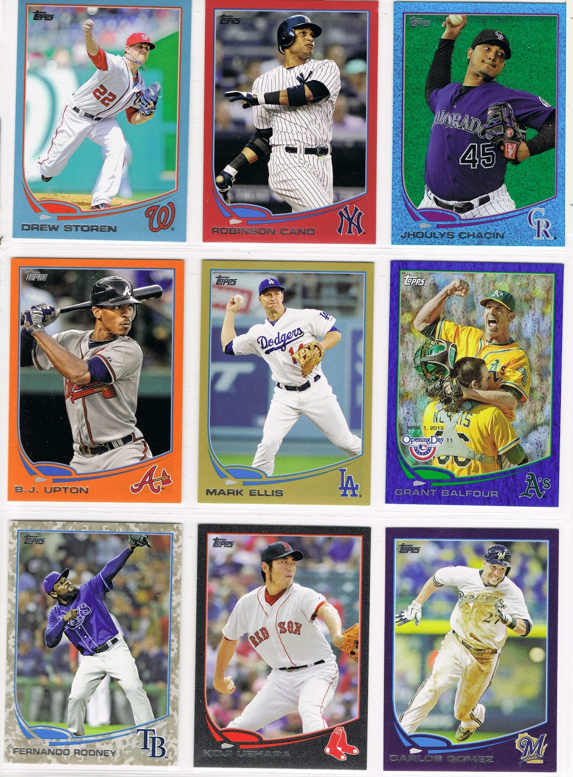
You can probably guess which was the hardest card on that page, which arrived today from blog reader Jimmy, who is building complete sets of the red-border cards from Target. I tend to select cards of perennial All-Stars from the East Coast, such as Cano, on the cheapest parallels possible to try and stay at least a little fiscally prudent in this completely imprudent project. I won't use a blue turtle on an emerald or a Wal•Mart blue-border, so that left a Bullseye card for Cano there. 

It was also a challenging page due to an early acquisition of Koji Uehara on the hobby-only black border edition, which probably came in a lot of several such cards, well before the postseason. Uehara had such a stealth season until the playoffs, with some incredible stats this year. But then the pre-2013 #s on the back of his card look darn good too. There were probably 3 American League GMs kicking themselves during the games in October this year.

So that was a pretty nice pick-up for the project by this GM typing at you now. But it created a problem...5 more blue Sea Turtles to find pigment for. With Leprechaun and Wally-World-cards ruled out, that meant finding a 3rd low # parallel after the Uehara card, as only 3 cheap parallels were left to use for the blue teams - one from Geoffrey the Giraffe (Toys-R-Me purple), the pretty young things at Target, and a Topps Gold.

That's where the first of what I call the Hunter Safety cards was a handy find - the B.J. Upton /230 Factory Set Orange parallel. Those look sharp if you like bright things....if you are one of those boring people that think the world should be pastel everywhere, this isn't the project for you.

So finally trading with a second person building a parallel set was a big help. A number of Target Reds and a few emeralds from Jimmy came in for some of my Targets and 2012 Gold Foils. Jimmy also sent along enough Octavio Dotel and Miguel Cabrera base cards for me to finally start up some Player Collection lists to avoid duplicates. Thanks, Jimmy!

The haul of parallels also let me improve a page I had initially thought to be finished:
This involved a 3 team swap, something always exciting in Major League Baseball. It seems Drew Pomeranz really had a tough 2013 going on his baseball card. Photo/scanning/printing errors of some type on Topps' part just simply gave him an unattractive card; even a parallel couldn't save it.

But once I initially finished the page, I realized a foil parallel would cover for Topps. So with Jimmie's help Target Red was traded to Ryan Doumit, who then shipped off his camouflaged duds to Jason Hamel, who was glad to escape from the obscured world of Emerald Foil and let his vivid green background shine once again. This also got a blogger's card back on to the page as camo-Hamel had originally arrived from Ryan @ "O" No!!! Another Orioles Blog.

Confused yet? Don't worry, the Hot Stove Parallel League is just getting warmed up.

Tuesday, October 29, 2013

Beguiling Binder Page #2

A little 'set maintenance' and card shipping this morning. Picked up a small lot of the /10 Silver Slate cards. The Greinke included in the lot will more than pay for the whole lot.

I figured this series will need a new title, and even a permanent collection on here somewhere. Starting in on the Update pages now too - these will be very tough, requiring Silk or Printing Plate or Platinum on some of them. Ouch! And I'm not even really a fan of the Silk Collection. Keep me in mind for non-blue-team Sapphires from the Update set itself, I will need at least 30 more yet.

Nor am I much of a fan of the basically colorless Silver Slate cards despite the raised border, but decided to use a few when they are very cheap, just for variety on the pages. So finally caved on putting the Neil Walker card in the set, instead of the Target Red version. I might look at a Target Red for the Helton card, though I kinda-sorta like the sparkly teammates that must have just beamed up or something. It looks much 'neater' un-bindered, in-hand — Todd is like "whoa, which way did they go?"


Tuesday, October 22, 2013

Joy of a Completed Binder Page

Well I've been wanting to type that post title for a long time now. A title I borrowed from the always entertaining Card Junk blog.

I have been buying packs, single cards, lots of cards and have sorted them and typed out their numbers and re-sorted them and have finally completed the first page of my Parallel Project.

May I present 2013 Topps Series 2 Cards 350 ~ 358:


I have had several pages stuck at 8 cards for quite a while now. Henderson Alvarez no-Hit the Tigers on the last game of the regular season, and now he was no-hitting this project....until a lot of Series 2 Gold cards came in, and I decided to re-check each page in the binder. I had a /62 Black border card of Alvarez, but I also had one of Juan Francisco, and I was giving preference to the horizontal card on a slot for a Black card — my favorite of the parallels this year. Probably it was the Greg Dobbs card that became the keystone of completing the page. I had him in several colors ... I sorted the stacks .... I discovered a new /2013 Gold of Francisco ... but I already had Dobbs on the page for Gold ... I found a Target Red of Dobbs ... Get Down! Page Complete!

I especially like this page because it doesn't use any Emerald (my least favorite), thanks mostly to the /10 "Silver Slate" parallel I picked up on eBay. It also helps that I could use a card from the /2013 Blue Foil parallels from Opening Day, which is true on most pages in Series 1 & 2, but not quite all of them.

Along the way I discovered how tough it can be make a nice-looking page with these cards. As the difficult cards (Pink, Black, or Camo) on a page arrive, I can start placing the more easily acquired parallels. I realized I would have to buy the low /x parallels of common players and use the most printed parallels (Emerald, Wal•Mart Blue, Target Red) for the stars. I got lucky and pulled the Pujols card from a blister pack at Toys•R•Us. (Thanks Geoffrey!)

However when I can place the Red & Blue parallels I was surprised to learn I couldn't bring myself to just use any parallel I had laying around. I couldn't use a Target Red parallel of Asdrubal Cabrera up there....red-on-red does not a good parallel make. I also realized that the team colors and card border parallels are a bit like being able to make your own baseball cards, at least in terms of the color scheme.

I managed to finish 2 other pages shortly after that one; a second from Series 2 and my first in Series 1 as well. I'll shut up now....here are cards 458 to 466:


I might re-do parts of that page as I'm not sold on the Purple-on-Red of the Pomeranz card, which is actually one of the worst in either Series with print lines in the background. The Emerald would hide that perfectly; I like Orange-on-Emerald for the Orioles but I might order Hammel and Pomeranz to switch, we'll see.

Don't forget you can click on an embedded picture in a blog for a better view of it. I scanned these in their brand new binder pages where they will live for all eternity, but the upload process shrinks everything considerably.


That is cards 317 ~ 325 from Series 1. I'm not totally into Teal-on-Wal•Mart 'Blue' either, but it will do for now.

I still can't believe I finally have some pages done. Only 71 pages to go ... then 37 more for Update, and for that one I won't have access to 4 possible colors: Silver Slate, Blue Sparkle, Toys•R•Us Purple, and Topps Factory Set Orange. I'll probably have to cave in a little and use one white Base Card per page for that one.

So blow the dust off that PC Rainbow, Team Rainbow, Master Team Rainbow, whatever partially completed collecting project you lost interest in with these cards, and let's trade some parallels!