Showing posts with label Comerica. Show all posts

Saturday, August 31, 2013

The Wal•Mart Blues

Here's a fun game you can play the next time you are in Wal•Mart. And I know you will be in Wal•Mart, because you buy baseball cards.

Sure, you can try and pretend you never go in there. You can tell me you only and always shop at Target, which would be wise, 'cuz the wimmins in there are way prettier. But I know you would be lying, because you buy baseball cards.

And my little game has nothing to do with the so-called "People of Wal•Mart" that you might be unfortunately picturing in your head right now. I'm not a fan of that website; I can have fun mocking baseball picture cards, but taking pictures of ordinary people to then publicly mock them on the internet is kinda mean really. Karma will find the people who take such pictures, I sincerely believe.

No, my game is one you can simply play in your head the next time you visit Wally World; and it is a simple one that is just simply a question: Is anyone happy in Wal•Mart?

Seriously. Just look around whenever you are in there. The customers? The employees? You?

I am happy at Wal•Mart - I am almost always only there to buy baseball cards. The fact that I can pick up a few groceries or some motor oil or a fishing lure or a pair of work gloves at the same time is kind of a time-saving bonus. No baseball cards, no Wal•Mart for me. Even though I know the other box stores I go to  instead are selling essentially the same junk manufactured by exploited workers in foreign countries.

But hardly anyone besides me ever is happy in there, despite all those smiley faces plastered everywhere. Mi amigos de Mexico y puntas sur, si. If you are in a Wal•Mart near much of an Hispanic immigrant population, you might notice they do seem to enjoy the place and their new American levels of purchasing power. So let me rephrase the question. Are any Americans happy to be in Wal•Mart? Perhaps small children being pacified with a purchase I guess. So one final rephrase - Are any adult Americans happy to be in Wal•Mart?

You be the judge next time. The results ... might surprise you. Or might not.

So I was mentioning that I pulled up to a Wal•Mart a week or so back now in the throes of baseball picture products withdrawal. And then the blog went dark for a few more days.

There is a heat wave gripping the area where I live this week, a rather northerly locale, so we don't really need central air conditioning save for a few miserable weeks a year, like this one, and it isn't built in to my house. And the room with my scanner and baseball cards was more intolerable than my enjoyment of writing this blog for y'all. Especially since the post I had lined up in my mind needs lots of scans. Because you want to see some baseball cards, not just read more wordy words on the internet. Right?

So, finally, let's look at a baseball card:

That's not a Wal•Mart Blue, man. Don't worry, I won't cheat yas, those were in the pack too. Along with my fix of Topps stickers, I picked up a 'fat' pack of Series 2 while I was visiting with Wally. Though this one didn't at first seem quite as 'fat' without Prince Fielder on the cover now.

Mr. Diamond here just seems to say America. Baseball. Wal•Mart. There's a diamond on his card and he's named Diamond. Lots of blue on there, like the store's signs. Minnesota. Is there a state more American than Minnesota? Seemed appropriate to get a Twins card when I had watched a Minnesota TV station to get my weather forecast the day before, despite being a couple state lines away from all those lakes.

I am more than a little burnt on the pitcher's torso framing so prevalent in 2013 Topps - this one lost some potential composition points by cropping off most of Scott's leg there, but gained a few back by leaving his uniform's leg stripe on the card.

I like this card anyway, because it is another one shot at Detroit's Comerica Park. That fuzzy white stuff behind him is part of the #5, retired by the Tigers in honor of Hank Greenberg, as noted on the center field wall. Where are all his vintage repros, Topps? Heck, his life story is so amazing there could be a whole set of picture cards about him. Topps, though, seems to think the only old-timey Detroit Tigers worthy of new cardboard are named Kaline and occasionally Cobb.

I also wonder if we have Tatooine cards, what can we call brick-walled cards? Not many of those around, I'm sure. That's all solid brick there behind Mr. Diamond.

And the Topps collating machine didn't let me down on my all-American box-store trip, with more red-white-and-blue, though I just can't scan and blog the whole pack. I thought about it. If I did that, I might as well just launch a whole straight-up Sea Turtle blog, which I have also thought about. But I just don't have that kind of time - you wouldn't see card #990, aka #US330, until sometime in the year 2019 perhaps - and I like to blabber about lots of different baseball cards than just these neat little turtles, like this one:
Who would vote against the idea of more head-first third-base slide cards? This one might appear on some best-of lists; especially since the slightly better card of Everth Cabrera was suspended for the rest of the season. Which coincidentally, seems to have tanked the prices on that Superman-like card, making it rather easy to rainbow if you wanted to. I briefly considered doing just that before launching head-first into my Parallel Project instead.

Usually sliding cards in the digital century feature a little dust going airborne as well, the absence of which makes the Florimon card that much more striking I think. I did quickly find a somewhat analogous card:

I always like the I'm-gonna-catch-that-ball, I'm-gonna-catch-that-ball, I'm-gonna-catch-that-ball baseball cards. The viewer is as entranced with the probability as the baseball player immortalized in time. On this one, Mayberry has run to make this catch so hard that the turf divots are still going airborne behind him. In action, indeed. Topps saluted Mayberry's father with a somewhat unexpected checklist entry in Archives this year.....I think it's time Topps busted out those nice Father/Son cards in a little subset next year. But they probably won't, cuz the 19 year old card dealers dealing cards of 19 year old minor leaguers could care less about major league parents.

I did escape from all-America colors for a few selections in the pack, courtesy of the New York Mets, who generally fare well riding the Sea Turtle:

Especially when the opposing player supplies plenty of their complementary base color, blue. This card did lead me to a bit of extra typing on this 'puter thing in front of me - just who is this mysterious Amarista player in the striking blue uniform? I knew he wasn't among the hallowed 660 in 2013 Topps; which turned out to be because he is a pedestrian infielder for San Diego. No room in the base set for them, unlike near-similar players in major media markets. Though I have to stick up for 1 Whitehall St. here in that no one expected Tejada to disappear from The Game this year after a promising first couple seasons in the bigs.

Though the Mets have that excellent Orange in their color scheme, their cards still scream America! Baseball! as much as the flag-color teams, such as this one:
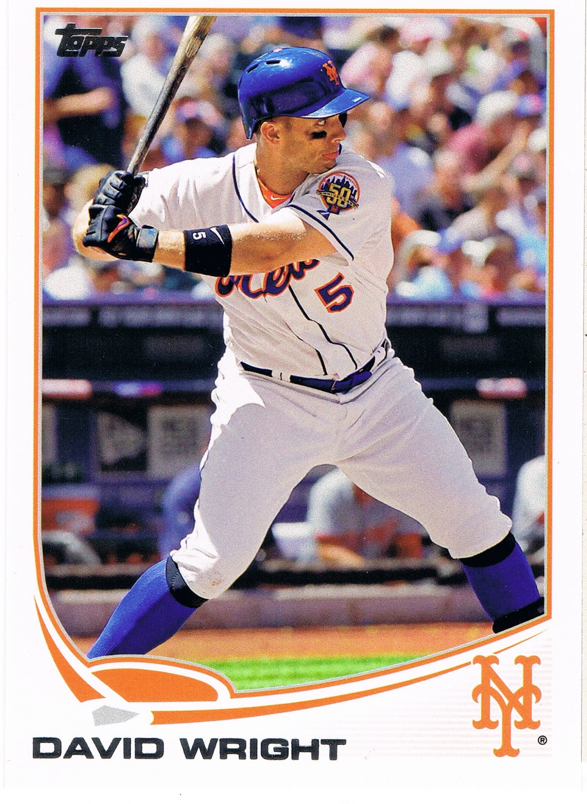

A classic. Great Sox - old school, good supply of Met-blue. Wright has already taken his left foot-step forward - he's committing to swing at the pitch just about to enter the frame. The fully extended left arm further adds to the not-tense but excellent anticipatory tension of the shot. The Met's 50th anniversary shoulder patch is featured nicely. Just an outstanding baseball picture card; even though there have already been, who knows, a million different baseball cards produced (2 million?), and there is nothing new under the beautiful sunny skies at the ballpark that day, I can still enjoy a base set baseball card like this one. It also marks a return to "hero numbers" in Series 2 here, as this is card #400. I liked Topps' experiment with matching card #s to uniform #s in Series 1. I thought it was a nice way to honor more players than the limited amount of "hero" card #s in a set. I hope the tradition can continue right along with the new-fangled-ness next season.

And if you look real close at Wright's face (I won't crop it and blow it up for you - get your own card, it's a good 'un) you will notice that he has his tongue sticking out, like a happy cat or something. I think he is gonna smack that incoming pitch right over the outfield wall.

Of course baseball fans love sluggers, and generally love their baseball cards. But soon enough in this pack I got back to primary baseball colors, and a rather amusing card:


I don't think I've ever seen a slugger with a case of guitar face before -


It must have been a foul ball. Not sure I would hand Jay that card to sign, though he has a few other similar post-contact cards.

Sticking to an also more-common-than-I-totally-wish meme in Series 2 (as in Series 1) - showing a player's "unhappy" face (granted, an inescapable result of 'action' photography) - we find this card:

Normally these are found on the pitcher's cards of course, but Yunel there doesn't appear to be throwing from much of a stretch position, so we have to check the back of the card. Yep, an infielder. A basically unremarkable card really (too, too much blue), until another Tampa Bay Ray wandered into the pack a few cards later:

Another unhappy action shot. Both of these make you think the player is thinking, hey, the runner is already safe, but I have to throw the ball over there anyway. But you can't blame Kelly for being disgruntled at being photoshopped into a Tampa uniform despite being a Series 2 release this year. That's right Topps, a big fat Zero for this one, you graded it yourself there. The overly shiny uni and the too-bright hat are always a dead giveaway for a dead baseball card. I only had to look back a few cards in the pack to confirm I was being manipulated so you could have more time and production budget to put redemption cards in your expensive products.

Fortunately, Series 2 rarely disappoints for long:

My first thought on my first copy of this card a few months back now was that it could be a possible entry in the shoulder patch binder for that intricate Orioles patch. Or maybe an addition to the Shades page. Just today I noticed it's a second card with a touch of slugger face perhaps.

But eventually what really makes this card jump off the stack of baseball cards is the partially flattened baseball jumping off the end of the bat there. Even with the cutting edge camera equipment Topps gets in action these days, such intense motion can't be completely frozen and the ball seems to be departing the bat as if McLouth ignited the rocket fuel in the core. A pity such a great image capture is weakened by the way the ball hides in the white of the uniform. And the unfortunate way the lines of the composition lead the eye away from the baseball to such a degree that it took me 2 months of playing with Series 2 cards to even notice the incredibly rapidly accelerating baseball on it. So close, Topps, so close; much like hitting off the end of the bat like that is not just exactly perfect.

Did I just type 'perfect'? Yep. Like this card:


Yes we have made it to the Wal•Mart Blues at last. Though if you still have the blues after seeing this card, well, baseball cards just won't help. I featured this card before Series 2 even came out, I like it so much, though I did discover what happened to the ball on that card. Hint: don't hit the baseball off the end of the bat. This card is giving me the blues a little though, as I have realized that the best possible parallel edition of it would be the /62 black bordered version, which is basically true of all the Pirate cards. The black-border Alvarez card has been up on eBay twice in the last few weeks and gone for a little more than $25 and $20 w/shipping and I just don't want to spend that much on a single card. But oh how I desire to have it (and the McCutchen card) in that parallel. Donations always accepted. I think, though, that I will probably settle for tracking down a /2013 gold border version, like a few other classy cards this year. The gold always seems to work out nicely with any team colors.

The Wal•Mart parallels also bring me down a little with their pastel washed-out-ness. The basic, nearly-dark blue of the standard Wal•Mart logo would look quite a bit more striking on a baseball card. There was probably no way around that, given the nature of the colored Sea Turtle - i.e., to make a blue parallel either the border or the graphic frame has to be washed out compared to the other.

One of the blues in this pack -
- got me wondering about the colors of the Turtle, vs. the colors of the team logo. The "A's" there is a dark, dark green. It looks great on most cards, matching the tint of the Athletics' unis. And the Turtle is decently dark enough, but still not a match. Ahh, the mysteries of Topps sometimes. And the mystery of Brandon Moss and his little baby blue fore-arm bands, and how he cutely destroys Tiger pitching, and the mystery of how good Billy Beane is at reading the waiver wire all the time.

Which are frequently only matched by the mysteries of the Cubs:


Another probably safe-at-first fielding card, the nearly official meme for light-hitting infielders. You can't hardly put a bat in their hands on the front of their baseball cards when they hit all of .121 last year but are still expected to be part of the starting 9 come Opening Day. Perhaps the card farthest below the Mendoza line this year. And similarly indicative of Topps' luck with printing baseball cards with Cubs logos on them of players that actually end up taking the field for Chicago. There's always next year, when I expect we'll see more Vitters cardboard after an injury-plagued but healthy stat year in the minors. Maybe Topps should just wait and issue all Cubs cards in the Update set until Epstein somehow gets together more of a regular line-up around Castro and Rizzo. Maybe he should call Billy Beane, Epstein's original employer's first choice for the job.

Now of course once the Wal•Mart Blues roll out of the pack, we're due for even more excitement.

What could be more exciting than that Alvarez card up there? Why the generally pretty good crop of inserts this year, usually led off in the 'fat' packs by a '72 mini:

Can't beat a '72 mini of a player who actually played in 1972. I like the '72 design; despite my affinity for harmoniously synchronized team colors on a baseball card, I also like how back in '72 Topps just refused to use the color red on a Redlegs card. Lost in the trippy stars I guess. An added bonus was despite a more than passing familiarity with all the vintage Johnny Bench cards I have or still desire to acquire, and Topps' penchant for ridiculous amounts of photo repeats, this was a new image for me. Now there's an upside to avoiding all those gimmicky "high-end" ego cards. Just don't put this sweet new Johnny Bench card anywhere too close to his entry on the faux-high-end insert set in hobby boxes called "The Greats" or "The Elites" so clearly designed to entice you on to those surely extra-valuable "high-end" sets, or the spell of acquiring a brand new Johnny Bench card might fade a little.

After the minis appear the regular size inserts, such as Chasing History:


Though I have thought there is little more pointless than a card designed to hold autographs or "relics" that then hold neither and just take up space in the packs of the base cards I actually do want, the Chasing History set broke that sad mold this year. The card pictured there is right up there with the excellent Lou Brock edition on the checklist, and a few others. Another great, arm-fully-extended, I'm-ahh-gonna-hit-that-pitch batting card. Great light and shadows interplay and a sweet MLB shoulder patch. I'll need an extra copy of this one for the patch binder. I hope the Jr. Junkie might swing by and enlighten us on what year this great shot is from.

But much like the base cards in this pack, I decided against scanning all the inserts. Normally in a Series 1 or 2 'fat' pack, I like just 1 or 2 of 'em enough to want to comment on them. But this pack just kept on packin':
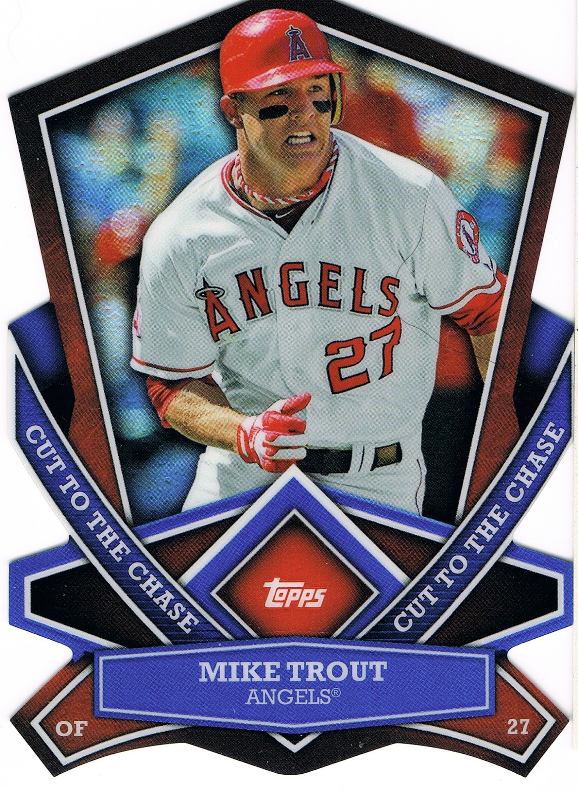
I've never had any die-cut cards before this year, I don't believe. I skipped those crazy 90s cards and most of those other card companies too. But I sure do like these Cut to the Chase cards, and I need to convince you to send me all of yours somehow. And no collector can have too many Mike Trout cards, now can they? I in no way would ever want to start a Player Collection of him, though I have been starting to think Topps just won't issue a card of him with his mouth closed. It's like he is always breathing like a fish or something.

By this point in the pack I was fairly satisfied by Topps' team-up with the Walton clan. But this Wal•Mart was so far off the beaten path I think, that those two corporations had a reward for me for loyally tracking them down at the very end of the distribution chain:

It's a hit. A retail hit. Aww, thanks Wally. Even though the back of the card has to remind me even more explicitly of a Series I'd just as soon forget even more than the 2006 edition. That's a trip to Wal•Mart for ya, always giving everyone the Blues.

Tuesday, August 27, 2013

I just didn't want to see that, Topps.

Help! I lost a card! I pulled it quite a while back, actually.

I set it aside with that blogger thought, ahh, a muse item. It's always nice to have a little stack of those.

I remember even setting it in a stack upside down, so I would remember it was that one card I wanted to babble about.

It wasn't a stack of similar cards, I don't think. But since it was upside down, I would surely remember where it was and why it was in that stack, right? Nope.

Now, I've looked all through the wilds of the card desk. Went on quite a journey through there. That was both rather enjoyable, and rather distressing — when, oh when will I ever have time to sort out those stacks of cards? A very busy season at work is fast approaching. Things are good. But oh so many cards to binder up, type into lists, offer to that one blogger I know will want it, etc., etc., etc. And one of those card stacks is starting to resemble a certain tower in Italy. Maybe if I put some stickers up on top, I too can see gravity experiments in action.

So what card is it? Well, if I knew what card it was, it wouldn't be very lost, would it?

I mean I could always just Google it and share it with you curious readers.

I'm not even sure what set it was from. So that space just above this sentence will have to hold a place on the blog rolls for me tonight.

And the strangest thing about this lost card is, I don't want to look at it any more. Ever again, perhaps. Manifestation is a powerful thing, which can be equally bad, or good. There isn't really a way to connect it to baseball cards, but my seeing-a-Moose story from last year is one helluva illustration of that.

Which is the real reason I put it in that stack upside down. I had to save it for this post, but I didn't want to see it again, and that seems to have worked. The back was safe enough, but though I read the backs, the back had nothing to do with all this.

I did manage to find the other card that somewhat goes along with it. I can show these cards safely enough I think. The original would have had to come with a pretty heavy disclaimer/warning, but you are safe from it now. You can quit squinting from behind your palms now. Well, except maybe if you are a Mets fan, you might want to just click the back button on your browser now.

Very sorry about the news today, though it did trigger my search and a short announcement:

We interrupt your irregularly scheduled blog post about Life, Baseball Cards, and whatever odd thoughts tie them together, for a bit of baseball freak show.

But I think it is safe enough to look at this one:


No, this isn't another tricky What IS That? post. Not all that much to remark about on this card.

When I look at this card, I focus on the background there, which I'm pretty sure is Detroit's Comerica Park. Topps seems to like pictures shot there, which is just fine by me. That yellow line through them all is very soothing.

I mean I want to look at anything but Jake's left elbow there. I use my arm to make money quite often in my occupation, and sports injuries really do scare me a little bit sometimes. Seeing that ligament plain as day there <shudder>. That just doesn't look natural. A pitcher's scowl isn't even worth a passing glance on a baseball card these days, but McGee certainly doesn't look to be enjoying this pitch.

Turns out, McGee already had Tommy John surgery five years ago. I thought this card was maybe foreshadowing it. I can't say I'm glad to be wrong or right on that.

Good thing I lost that one card. It was way, way worse than that one above. So, please, Topps, spare us wear-and-tear shots. Let's leave those under the uniforms. I know, professional football players have it way worse than baseball payers, quite likely losing 1 to 2 decades of their natural life spans.

My arm hurts just looking at that card. Although that could be from what happened at work on Sunday. I was so looking forward to having fun with a scanner and a pack of cards and thoughts on where that pack came from, but as the commercial says, sometimes life moves pretty fast.

Sunday afternoon I got stung by bees about ten times. Many of the stings were just below each cuff of the short-sleeve shirt I was wearing. This morning my elbows hurt. On the inside. Not a whole lot, but noticeable. Probably not as much as an MLB starting pitcher's might.

So I know the ball players' bodies really do go through a whole lot to entertain us. I'm just not sure I want to be reminded of that on my picture cards.

Tuesday, June 4, 2013

Ladies & Gentlemen, YOURrr Two Thousand Thirteen Detroit Tigers


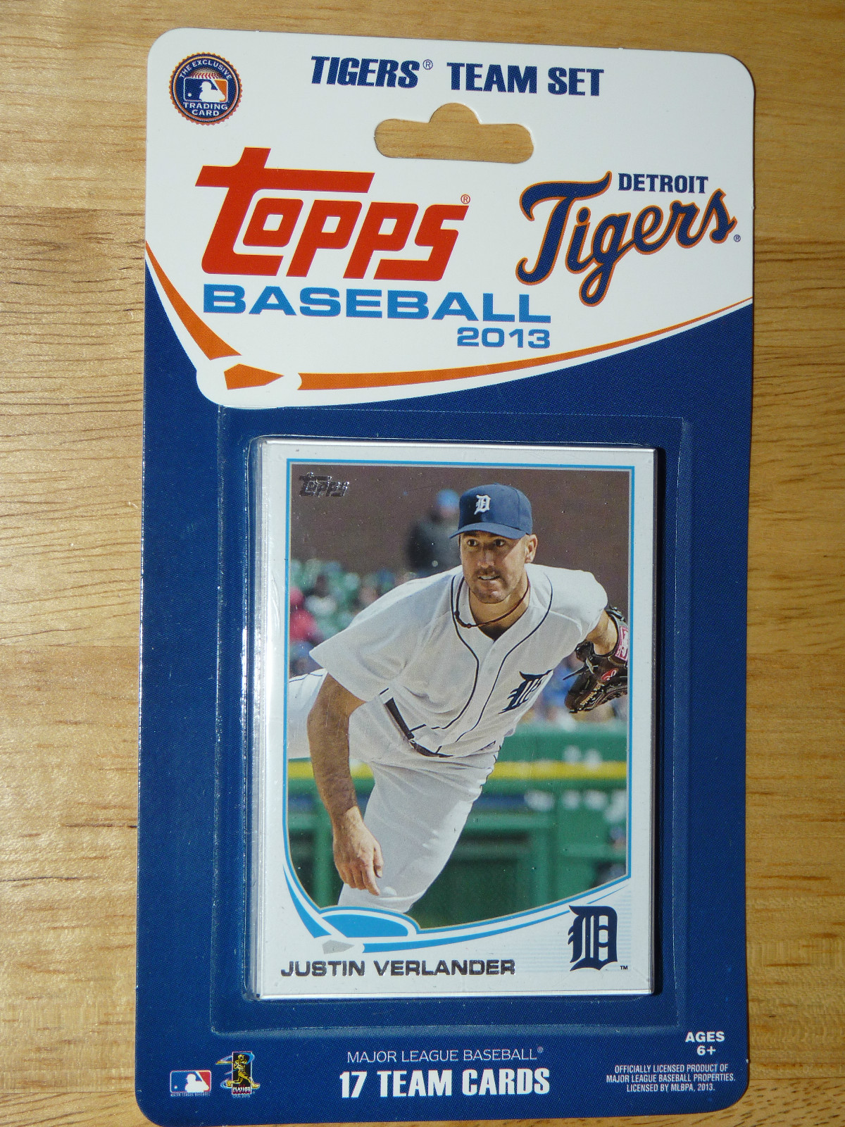
Yep, that's correct, I picked up the 2013 Topps Factory Sealed Detroit Tigers Team Set.

OK, I've actually had this one for a while, courtesy of a not quite 'local' FLCS, that actually barely had any cards for sale any more, like several I have been to this year. Not their fault, I know; and they did have this nifty product. The real news here is that I finally have a working scanner hooked up to my laptop. So now I can hook you up with my favorite cards without using a cell-phone camera. Hooray!

'cept of course I will probably still frequently just crib images from the web, cuz I'm lazy, and the whole scanning thing is a little bit of a PITA. You can look it up.

Why, here's one now -

I wasn't completely clear on the concept when I read a few blog posts about these items, back when they hit the streets a month or so ago. One of the Cubs bloggers and one for the Nationals typed up the details for us - I'd love to read more about these sets. I was glad to learn these team sets could contain image variations (such as the Verlander shown here) from the Base Set, and exclusive cards, such as the Comerica card I did scan in (such great Lines on it). Doesn't the Sea Turtle look nice, swimming away from it's mama diamond?

You might find Stadium Cards boring. I don't. Send them to me....

So who is in the Tigers Team Set this year? I'll just borrow an image once more:


So only 5 of the 8 current Tigers in Series One make the Team Set. (2 Series One Tigers, Raburn & Young, were released last fall and are now with the Indians and Phillies). Ramon Santiago, Avisail Garcia, and Octavio Dotel are scratched.

Minus those 5 and the Comerica card and we could see 11 more Tigers in Series Two....or will one of those 11 be elusively exclusive in this special blister pack? This is the first Team Set I have ever purchased, so I am intrigued. Cabrera, Jackson, Martinez and Hunter (along with a Press Conference short-print = zzzz) are in Opening Day, and all of them should definitely be in Series Two and will most likely remain the same images. Austin Jackson sports a sweet uni variation for the Motowners, and Cabrera's great sliding-into-Home card is on the sell sheet for Series Two. We could see a variation out of the other two I guess, but I doubt it. Also intriguing is some pre-release checklist info that has a member of the Tigers' 40 man roster on a Series Two card that is not one of the 11 listed above. I will only share one more scan from these 17 cards; I wouldn't want to take away your fun ripping packs looking for new Tigers cards, now would I?

But I had to get this last one out to the blogosphere:


It makes me wonder if there is a bit of controversy on the horizon with this one. No, not over the Tigers fairly solid left fielder there, casually climbing up the wall and robbing someone of a Home Run with his eyes closed. He had a rough April, but he's had two minor injuries this year, one limiting his playing time in Spring Training. While Austin Jackson has been on the DL he has been batting lead-off a fair amount and has been slowly raising his batting average through May, which was a much better month for him. I'm sure callers to sports nutz radio shows and online post-article commenters probably say he should be killed because he's not hitting .300, but I can only laugh at all the armchair quarterbacks of the world (takes one to know one, I know). I can never remember his well-known negative - his drastic splits vs left or right handed pitching, but that's why I buy baseball cards. He bats left, this card tells me.

But what confuses me about this card is whether it qualifies as part of the Out Of Bounds series of Short Prints. Of course, that very name is a bit goofy - one would think only catching a Foul Ball would be a true out-of-bounds fielding chance, but several of the cards clearly feature fielders chasing fly balls in the field of play. Not that Topps would ever let nitpicky details like that get in the way of a marketing gimmick. Anyhow, I like the cards quite a bit, though I only have four of them so far. And yeah, I would be glad to take the goofy things off your hands, by the way.

Will this great Andy Dirks card then be a part of that short-printed batch of cards in Series Two, with a more ordinary batting or fielding shot as his Base card? I pretty much doubt that, but one never knows what Topps is up to (and I prefer it that way). Several cards in Series One were labeled as Out Of Bounds cards very early in it's release, such as the wonderful Jon Jay card and the also outstanding Ryan Raburn card.

I think this card will give others that same thought....or maybe I have found a great way to pick up those tricky Out Of Bounds cards....as if Topps would have such mercy on us. We'll see.

What's in your favorite Team Set this year?

Sunday, March 24, 2013

No one likes cutting their own cards...


...but it can be worth it. Fortunately, I don't have access to my random amounts of old Hostess cards to scan some severely sad seventies scissors selections.

So just where did this 2012 Justin Verlander card that you've never seen before come from?

Here is the source material:


Courtesy of Geoffrey once again. Who's Geoffrey? Which blog is his? No, no, Geoffrey is the name of the giraffe that is the mascot for Toys R Us. This is a blister pack that held 3 packs of '12 Opening Day, with the usual T-R-U mark-up, so it cost $3.99 for 3 packs. I guess the cut-your-own bonus card is supposed to help make up for that. It has been nice buying cards from Geoffrey this month at least, when the big ole cuddly giraffe is offering them up at 20% off.

And there are random surprises about the 2013 Opening Day blister packs at Toys R Us too. I'll cover that here very soon.

Although it clearly states "Cut Out Your BONUS TRADING CARD Under This Pack" at the top of the blister there, I didn't quite understand that part. I'm slow sometimes. I thought there would be a bonus card in there loose, so I wasn't all that careful peeling open the blister and I put a crease in this 2012 Topps Opening Day Justin Verlander image-variation card. Short Print? Well, in this hobby there are no hard and fast definitions of that term, that's for sure. So I'll leave that alone for a second.

It is interesting that Topps put the April 5, 2012 date on that particular piece of cardboard, just as they do with the Opening Day parallels of late, and only on the parallels now. Does that imply that some of these variant cards might have a color parallel? Don't ask me. Were any printed and cut in the normal process? Again, dunno.

I have put off this post for a few weeks of owning this "card", because I seriously didn't look forward to the required scissors work. Overall it came out pretty good I think. Two slight creases, one wavy edge. The word "mint" will certainly never be attached to the effort though.

Which was OK, but it made for good practice to get this card:

YES! I wasn't looking forward to the effort required to ever get this one. I didn't buy many cards in 2012 (a story I keep promising to tell here) and I'm going to just buy a factory set of them. (Horrors! Yes, I know.) But that means little chance to ever pull one from a pack, or any of the other short-prints from that set to trade for it. And I will have enough of a climb to get the '13 SPs that I want.

I hope maybe to discover the story of this card somewhere. Did they really put that on the scoreboard at Comerica for this shot, or was it done later with digital wizardry? Lots of questions on this one.

For the first week I owned these I thought I might have some fun with saying I scored a 2012 Justin Verlander Short Print Blank Back 1/1!!!!! But then I looked at the actual back:


Pretty boring. And I would just add that I will still use this platform to wonder about the high value of the 1/1 blank back cards. Who wants a baseball card with nothing on the back? Yeah, yeah, there is only one of them. In the Whole World! And I own it! That's what makes it valuable Dude! OK, you get your kicks your way, I'll get mine a different way.

So, of course, I still don't own the 2012 Topps Justin Verlander Short-Print Image Variation baseball card. Technically. And though it is a little hard to see in the small picture above, there is just a trace of the residual gray cardboard this wonderful slab of a cardboard hero was cut from. A Printing Error card. This makes it totally unlike any other version of this card, anywhere. A true 1/1. And I own it.

Sunday, March 17, 2013

Bring me the Arm of Octavio Dotel


Or at least his baseball cards. Hurry, before that Arm realizes It's Alive! and simply clonks poor Octavio on his noggin and begins a reign of terror.

I love the digital photography era. There is frequently such great separation of subject and background. (Comerica Park on the above card....I'll be starting a Frankenset for it I think).

But sometimes the separation of the elements in the photo can get a little nutty. And then Dotel has a funky motion that makes me think his Arm is actually a separate creature. Just try and name another player with a larger fore-arm than bi-cep. And it surely ain't natural to have one's arm going on it's own special journey back there:


I have those two cards by the way. And his '11 Topps Blue Jays card, and most likely his '12 Topps Tigers card.

I really doubt the following image is on a card, because except on the sad subset of All-Star cards these days, 99% of baseball cards show the player's face. And here his fore-arm seems as one from a normal human, but this shot makes my shoulder hurt:


I swear that Arm is a quasi-independent creature Dotel has cut a deal with to throw baseballs for him.

Whoa. Did you just hear that sound in the closet? I think it's Dotel's Arm, recently escaped from an old Rat Fink card of some sort, and it wants out. It's got a baseball in it's grip, and it's gonna throw it. At you.

Surprisingly, I have resisted all temptation to post images of Dotel making a Funny Pitching Expression Face. His is a good one — he sticks his tongue out at the batter it appears. But the vast majority of pitchers on baseball cards make a Funny Pitching Expression Face. That idea just gets too old and overwhelmed too quickly when you have a pile of baseball cards to paw through.

So I didn't expect to ever do this, but I am launching a Player Collection. My very first one.

I doubt I will have much competition for all those rare short-printed Octavio Dotel auto-relic refractor cards, will I? Too bad the serial #/d cards for him won't have enough demand to merit a press run to ever match his uni #. That sucks.

I am only partially intrigued by the Arm. I have also always been interested in the players who play for the most teams. I think at 13 teams, Octavio holds the current record, which is good because he has absolutely zero League Leader in Italics on the backs of his cards. And the All-Time Record, I believe. So yeah, a PC for a player holding an All-Time Record. Makes sense I think. What about baseball card collecting makes sense?

Plus, 'ole Dotel is currently a Tiger, and probably likely to retire as a Tiger, though his Arm looks eternal to me. Not very rubbery, but not ready to quit yet either.

Another former Tiger also intrigues me as a frequent club-house hopper, starting pitcher Edwin Jackson. What is the deal with him?

Why do some players end up on so many teams? For Dotel, it's probably the nature of being a situational reliever. Surprisingly, he is not a lefty; I would think they would bounce around the leagues the most. But probably southpaws stay put more often than righties 'cuz there's never enough lefties to go around.

Other times though, you have to wonder. Does the player just simply fart in the clubhouse too much? Baseball does a pretty good job of keeping what happens in the clubhouse, in the clubhouse. All pro sports teams try to do that, with varying degrees of success. I think MLB does it the best. So I will probably never know why Edwin Jackson gets traded so much.

So in the months to come when you all finally get to see my wants/needs/desires and the pile of bait I am accumulating to obtain them, you can always offer in any Octavio Dotel card you might have. Any manufacturer, any team, any year. It will be neat to see who got his team right the most times, and whether he gets a card for all 13 teams, which I kinda doubt, or for all 15 seasons he has played on an MLB team. And who simply banished him to the Relievers Set, or the Update Set as it's described on the packs.

But I am still a month out from being reunited with my main collection of baseball cards, and 6~7 weeks out from enough time to type up lists of them, etc. I just came off a job without access to baseball cards......err, I mean the Internet, and all you fine folks. The other day, a Reaper flew over me. I thought maybe I should try to take a picture of it, but then it might lock on to me. Such is life working next door to a bombing range. Thankfully, they weren't practicing sorting their night cards.