Showing posts with label 2013. Show all posts

Friday, January 2, 2026

I never thought this would happen to Me


I am collecting Super Short Prints now. I have mixed feelings about this, although I quite enjoy owning that there newest edition to the collection.

Collecting expensive Baseball Cards has generally been off limits to me. Not just due to financial limitations, but personal ones, on the decision making between spending money on Entertainment, vs. other life choices.

I finally admitted this to myself a little over a year ago, when I deliberately purchased some SSPs, which is somewhat different than stumbling across an exceptionally good deal for one, which is always tremulous, when collecting Baseball Cards — all the marketing phrases hit you simultaneously: "limited time offer," "act fast," etc. You know they are true because - other people collect the exact same Baseball Cards you desire.

Along the way recently I have had some successes with this always-sure-to-be-very-difficult collecting goal, and some setbacks, too. So I thought I would pass along a few experiences that could possibly help someone else ooohhhhhing and ahhhhing those partially wonderful /25 Baseball Cards.

One of those has happened 3 years/times now - December seems like a key month to have a good amount of bummin'-around-money set aside, absolutely ready for that rare card to suddenly ping your ebay search that has never pinged before. It seems logical that the Christmas season is a likely time for a card owner to decide it's time to generate a little extra cash. It also seems like there will be fewer buyers to compete with, this time of year.

That Aaron card there is from 2013 Update, and specifically the SSP checklist; I think Update may have been the product that first introduced the concept of 2 levels of short printed image variations. It was my introduction to the infernal concept anyway.

I truly lusted after that card in particular because of the workings of a card back text feature, "The Chase," about a player's chances of becoming one of Baseball's "All Time" leaders in a given statistic. And it did not disappoint on that regard, something that will make it onto the Sea Turtle Cards blog oh maybe by the year 2036 or so. (I do expect to become much more 'off the road' in another year or two and should have way more time to spend on Baseball Cards).

The reason I recently "pulled the trigger" on it was the creeping horror of understanding that the rare RCs from that checklist are only a small portion of the battle. The dozen+ Hall of Famers included amongst the 25 entries are probably now more difficult to obtain than the Rookies, as the Rookies end up in the hands of people hoping for a large appreciation gain on the card, whereas HoF players all have dedicated Player Collectors who always want Moar cards of their "PC Guy", Moar, Moar, Moar. And a good portion of the 13 Update SSPs actually feature 2 HoF players on the same card - so Willie Mays collectors want the above card, too. Arrrrrgggggghhhhhhh.

I'm not like that. 9 cards of one player is enough for me.

So now that the card in question has scrolled off your screen, can you recall anything about it that might have resulted in me obtaining it for a "reasonable" price (less than $100, in this case) ? 

The card has a severe crease across the whole top of the card, about 1/5th of the way down from the top edge. And that is fairly easily viewable, in-hand, and there is actually a slight loss of "eye appeal." In the scan above, it is most visible via the small white lines around Willie's eye brows. 

But for me, the appeal deficit is quite slight, and one quite worth saving .... $150 ? Who knows. I felt it was fairly unlikely I would ever see a copy of this For Sale, ever again, in any condition. Which is the even more frustrating part of attempting to collect a checklist like this one. Demand potentially very high, supply so very, very low.

Such concepts of eye appeal vs. likely official grade culminate in the expression "buy the card, not the grade" and can very much work in a collector's favor. Which is what happened for me finally obtaining this long-desired Baseball Card:

This copy has a short, barely perceptible surface wrinkle, well hidden in one of the black ink portions of the card. If you hold it up to a bright light and angle it just right, you can see it. Would a card grader find that? Some times, probably, maybe most of the time, or not. If they did see it, then the card would be an 8 or less, whereas the Aaron card is probably, I don't know, a 4 perhaps. I don't and will never have a lot of experience with those nutty concepts. Recently I read someone complaining about older PSA "slabs" being "often very over-graded." I truly pity such people.

That Cole card became an unfortunate keystone in this whole collecting concept, as I expected it to be one of the most expensive cards on the 25 card SSP checklist, forever and ever. Which is no longer the case, as all those Hall-of-Fame cards will likely retain their now high prices, forever and ever, and I could have purchased many of them for a fraction of their current values while I was hung-up deciding on whether to ever purchase this card for a far higher price than the HoF cards, years ago now.

I still have a love-hate relationship with the card. It is such a great card, the super anticipated 1-1 player (not the same as a 1/1 Baseball Card; 1-1 refers to a player selected as the very first in an MLB draft, like Henry Davis and Paul Skenes were, to name 2 pertinent examples) making his dramatic entrance to a game, with the big outfield wall team logo behind him while he wears a rarely-seen-on-cardboard Pirates black warmup jacket. And of course I fully expect the Cole-Pirates situation to repeat possibly quite soon on my favorite team, with Tarik Skubal, and all over again for the Pirates in a few years with Skenes. Sometimes I thoroughly dislike this ever more coast-tilted Sport. That particular Baseball Card is a horrible reminder of MLB's current structure.

And — why couldn't that be his regular Rookie Card card? It would be just exactly perfect. Some other random image, like say the one on his regular RC, could be on the /25 SSP version, inserted mainly to help create re-sale value in the box of lottery tickets. Such a card would still have plenty of dollar value, because a solid majority buy the serial number, not the Baseball Card. For soooooooo many purchasers / "collectors," card image and design are basically irrelevant. So ..... let me have the good photos, cheap, dammit!!!! Sometimes I thoroughly dislike this Hobby.

I did have some basically tangential Good Luck with finally landing the Cole as he spent 2025 off the field, for the inevitable Tommy John surgery rehab - a point where "investors" (how I loathe needing to use that word in relation to Baseball Cards) can often begin to "cut their losses," potentially. 

That likely helped move multiple copies of the Cole card into For Sale activity over the last few months, which becomes a huge help to the collector wanting a rare card. We of course all exist in the tension between sellers wanting as high a price as possible and buyers wanting as low a price as possible. But when 2 sellers attempt a sale of the same card simultaneously, the buyers have leverage that is absent when only one copy is For Sale.

Not having a lot of experience with purchasing expensive Baseball Cards, that now seemingly simple concept was a bit of an "I coulda had a V8" moment, or maybe a "I didn't sleep at a Holiday Inn last night," or probably plenty more cute social aphorisms. Also recently, that basic concept well assisted purchasing this card via Best Offer -
That one has no defects aside from my scanner's usual struggle to discern the white boundary correctly. However the card still cost about double the last price I could remember for it, only 2-3 years ago. So it goes when you have to pick your Baseball Card battles oh so carefully.

The Gehrig card is also now a card in the lower tier of (potential, because few of the entries are ever actually For Sale) prices on that 25 card SSP checklist. Best illustrated by me purchasing it for just about half of what the John Kruk card on the checklist sold for a week or two later. Players from the 30s will never be as collected as players from the 50s regardless of overall fame; not even the presence of Jimmie Foxx on this card will change that as a huge amount of Baseball fans don't even know who Jimmie Foxx was. The Stars of those days just didn't have enough Baseball Cards depicting them, unlike the Post-War era players.

I am mostly enjoying this collecting by design goal - all of the 2013 Topps design cards. Even though it hasn't yet been used for a full design re-use checklist (only 36 years to go for its use in Heritage), a semi-regular scattering of such cards do exist. And one of them is a /87 Aaron Judge Rookie, which hasn't appeared for sale in several years now, and will almost certainly never be in my price range.

That is also true of a whole number of 2013 design cards issued in 2013, despite my halting step onto the Update SSP checklist. 2013 Topps Chrome has short printed image variations too - and most of those are now 4 figure cards. Yes, as in > $1,000, each. That's because they are probably printed in an edition of /10, and there are people just like me who want to complete that checklist, too. So I also know I will never own the really cool Miguel Cabrera Chrome SSSP, which shows off the Detroit Tigers special green uniform worn on St. Patrick's Day down in Florida.

And then 2013 also included a set of autographed cards on the Sea Turtle design, most well-known as part of the Wrapper Redemption program which supplied us the /150 "Blue Sparkle" cards which are a darn purdy parallel. The small 'packs' of those included randomly inserted autos, including things like a Manny Machado RC, and Hall of Famers like Gwynn and Ripken, amongst a few others, with copies limited to just 10. I also just recently learned that 2013 Series One & Two also included similar cards of some of the same HoF players, inserted into packs though not noted on official checklists. These cards had an edition of only /5, and I will almost certainly never see one even for sale, and even if then the price will be in the mid four figures.

Me, I still shudder at the idea of the numeral "2" fronting the price of a three digit card. Pulling the trigger on the numeral "1" a few times now is still creating Doubt in my mind, which is not an enjoyable concept to attach to collecting, at all. I saw a fork in the road, and I took it. The question is .... how far to the next exit on this ever more lonely road? I think I have about 12 more exits to reach the end of this road, which is now likely to head deep into unknown parts of Nevada, although there's always .... next December.


Thursday, November 28, 2024

That guy


I just scanned a Sea Turtle card! I feel like I just climbed into the WayBack Machine. I do miss writing about the Sea Turtle cards and still think I Shall Return, often, but, Life, happens. Work on my parallel collection of the 2013 Topps Baseball set does always continue; I picked up a key "Factory Orange" card just yesterday & Black Friday Week COMC sales are rolling right now.

Meanwhile I have been also slowly chipping away at another Sea Turtle project, collecting ALL Baseball Cards with the 2013 design. That is a much tougher assignment than collecting 990 parallels, because some of them were printed in editions of only /25, it is thought, and depict some _very_ famous people.

The card shown above is from the 2013 Pro Debut set, which I quite enjoyed completing. I still like that Puig card, too, a nice simple (and, authentic, not 'shopped) Minor League Baseball Card and somehow without that weird Pro Debut stamp Topps seems so proud of for some reason. We'll see some 2024 Pro Debut here on the blog sometime this winter, I expect.

Back in that previous decade, Yasiel Puig cards were a big deal, for a few years at least. We all know how that turned out. But in the short run, back then, the To The Moon! prices of Yasiel Puig cards definitely kept me from thinking I could ever hope to complete a certain set of the 2013 design cards, even though I very much Desired to. That would be a somewhat dreaded term to hear in the universe of Baseball Cards, when you discover one of these exists for a player or team (or in my case, a design) you Desire to collect, completely. That would be the horror, the horror of the "Super" Short Prints.

Although issuing "photo variations" had been a thing for several years already before 2013, I believe it was the year that Topps added the "Super" innovation to the concept, resulting in the acronym "SSP." This was after the 2013 Baseball Card year had started simply enough, with these "Great Catch" photo variations in Series One:
These were neither all that difficult to actually see at least one example from a pack, nor were most of them that expensive to purchase, if you wished. I have a memory of reading somewhere, many years ago now, that it was thought a print run on these might be around 3,000 copies each and thus nearly 1000 more copies than a Topps Gold parallel.

But naturally a checklist of only 25 cards is going to have a high degree of variability around that word "expense" as there would be some All-Stars / obvious future Hall of Famers included, which brings set collectors additional competition from player collectors.

So I steeled myself to shop carefully for the bigger names on that checklist, which included a > $100 card for this guy named Mike Trout. 3,000 copies, & > $100 prices. Bummer. These SP photo variations are (were) probably my most expensive Baseball Card Desire, outside of finally finding a specific 1/1 from 2013 Series One.

Several years ago now I bit the bullet and handed over a Benjamin for the Mike Trout Great Catch SP. And concluded that the worst was over, as the Bryce Harper card was only a $30 card. It is becoming perhaps an Irony that in the long run, the Harper card could easily become more valuable than the Trout card, as their career arcs steadily diverge now.

At this point I still need a few more of the Great Catch cards, including David Wright and Alex Rodriguez, which each have a New York collector base value above their Hall of Very Good career pedigrees would suggest. And I still need one of the two Mike Trout SPs issued in Series Two; I have the 'autographs' card but still need the 'sunglasses' card which was also a > $100 card for many years but has now probably halved in value. A pity I didn't wait longer on the 'autographs' SP. 

Most of those struggles between Desire and Life Goals were not even yet on my radar screen when 2013 Topps Update was released. I didn't even conceive of the all-parallel 2013 project until a year later, either. So the Update Short Prints, which seemed to consist of just multi-player poses from the 2013 All-Star Game, first didn't interest me and then didn't appear difficult to acquire for a couple-3 dollars each, some day. A few of them sell for < $1 today.

And the concepts and scarcity of the "Super" Short Prints were even more fuzzy to me. All I knew was, Flaming Hot Rookie Yasiel Puig had some photo variant cards that were far more difficult to obtain than all of his other Rookie Card cards and since the last thing I wanted to collect specifically were Rookie Card cards, I basically ignored the concept quite contentedly.

Except for one card, which I can't scan for you as I don't yet own a copy. That was the Gerritt Cole SSP, a card with an RC logo, so.....

That card is often referred to as the "Black Jacket" card as it shows him leaving the bullpen still wearing a black jacket. Given the hopes for the Andrew McCutchen led Pirates right then, the arrival of their recent 1-1 pick was a big deal in Pittsburgh and that image perfectly encapsulated those feelings, giving the card great cachet not just some of the time, but, instantly. As soon as I saw an image of it, the inner-Gollum that I expect every Baseball Card collector is familiar with piped up instantly: "I wants it."

I began watching the price of that card at some point in 2014. It has only ever climbed in price and I passed on several chances to buy it at around $75. That small fact is a reason for my dislike of Gerrit Cole, which is in no way his fault. I would still like to go fishing with him, if he enjoys that hobby, something I would say about almost every human being on the planet. What I really don't like is actually the structure of the game of professional Baseball today, which is perfectly illustrated in Cole's career and is now only getting worse as TV revenues decline but player salaries can only go up, up, up, up, up — to the point that Gerrit Cole now receives $15,000, give or take, for every single Pitch he throws. And the real loser is the fans of the "have-not" teams that comprise a whole lot of Major League Baseball today.

Shelby Miller has a Super Short Print photo variation card in 2013 Topps Update as well, probably with the same print run as the Gerrit Cole card. It is an incredibly lazy effort by Topps in that it features him just wearing the Cardinals' special "Sunday Home Only" cap instead of their regular cap, in a pose that makes it look incredibly similar to his Rookie Debut card, his "Factory Set" Rookie Variation card, and also a little bit like his regular Series One Rookie Card card. That same-same -ness has probably made a few of the "Blue Cap" SSPs be lost, right from the get-go, amidst stacks of totally worthless "base" cards that not every box opener actually wants any more. A possible fate for many photo variation cards of course.

And yet despite that basic rarity being probably a touch more acute than the Gerrit Cole SSP, Cole's card now sells for $250-ish while the Shelby Miller would go for half or less of that, I would guesstimate, if one were to appear for sale, which is because only oddball set collectors such as myself would seek it as it is very unlikely Shelby Miller has any dedicated player collectors at this point. I would further wager that if every single Shelby Miller Baseball Card ever made were somehow auctioned off simultaneously, individually, the 13 Update SSP would now be his single most valuable card.

All of that is the basics of Baseball, and Baseball Cards today. Between the Puig Rookie Card card mania and the permanently rising Cole card, I tried the best I could to blot out the knowledge of those 2013 Topps Update Super Short Print photo variation$ from entering my mind at all.

But that's never going to happen in our always dynamically scrolling "feed" of Baseball Card images, particularly when routinely shopping for the things online. 

One day early last winter, this next card appeared on eBay -
This is a card I had no real desire to ever own, starting with the simple fact of it not actually being a "Baseball" card at all. But that nagging Desire to own every 2013 Topps designed card will never leave me. Whatever you do, don't ever mention the Chrome SPs in my presence.

And as you can see, I pulled the trigger. The price, was right. That made the decision rather simple as I believe it was offered for only about 20% of what it would have fetched at auction. I could barely mash the "Buy It Now" button fast enough.

#Profit ? No, I am keeping the card. This of course has now set me on a problematic course as my inner-Gollum is louder than ever about that Gerrit Cole card. And of course the rest of his checklist mates, such as the famous Teddy Kremer card, which is viewed as a great "feel good" effort by Topps, unless, that is, you are someone who wants to complete the 2013 Update SSP checklist. I, and I believe many other collectors, would be much much happier if every photo variation card came out in far more reasonable print runs. Instead, every single player card in the Topps Baseball set, and many duals, now have "Golden Mirror" SP variants in limited edition. Act Fast! Buy Now! I do my best to never see what any of those look like.

Just a short week or so before the opportunity to own the ludicrous card just shown fell on me, I had shushed Gollum on the idea of owning a copy of the Kremer card for just $200. Like oh so many decisions, I began regretting that the instant the card sold anyway. Now, another one (graded & everything!) is on-sale for a cool $1000, or 50% off, if you act fast.

Sigh. Baseball Cards are always such a great hammer driving the nail of Buddhism's 2nd "Noble Truth," the one about Attachment & Desire. There is no escape.

For now though, I will continue row, row, rowing my Baseball Card boat somewhat happily down the stream. Now that I have one of the top 3 most difficult cards on the checklist, that makes the ho-hum double digit cost cards into very easy purchase decisions, which started with this one:
That is a nice nod to amusing Baseball Card history on the part of Topps, though I have never been clear on why these gloves actually exist beyond supplying a fun image to use on a Baseball Card. I had never paid it any mind in particular beyond that basic disdain for superfluous Rookie Card cards so I don't know how expensive it might have ever become. It now sells for maybe ten bucks, probably mostly to people like me, and that is still over-priced compared to most other regular SPs on that checklist, a phenomena known as "bag holding," which is now mostly, but not completely, abating for Yasiel Puig cards. That card was not one of the "Super" Short Prints but rather was just a boring regular SP.

My next two pick-ups were originally on the 'tough' list -


For the longest time, I thought the "arms raised" image was from the SSP list, but the "sliding" card was potentially from an even-fewer-printed Super Super Short Print list. Uggh. It is a fun card though from a famous incident where Puig un-necessarily slid into the completion of a Walk-Off Home Run. He was a fun player, and I did like that, so this card is a fun "get." 

I mostly thought there may actually be 3 levels of Short Prints in 2013 Update because that Puig "sliding" card was priced higher than the "arms raised" card, when I occasionally saw a listing for them. That, and the Teddy Kremer and Prince George cards were/are rarely ever seen actually for sale. 

Now, I am doubtful of that, as I can't find any online speculation, anywhere, on that concept. I also managed to stumble across the "population report" for some of the SSP cards graded at PSA, a concept I care about not-at-all and had thought was locked away behind an "account required" rule on the PSA website. (Wrong). There, some of what I thought might be the even more limited cards just mentioned have actually been graded more times than some of the just 'super' short printed cards. So there is likely just the SPs @ > Topps Gold level, and the SSPs @ maybe /25. A conundrum on the SSP quantity calculation, something never disclosed by Topps, is the 110 card structure of the printing sheets used in 2013, as 25 checklist entries is not divisible by 110 in any way. The mysteries.

It is nice to see all 3 of the Puig variants together finally. And those were a nice lesson on the folly of paying "peak" prices for Baseball Cards, before the latest can't-miss Hot Rookie gets promoted straight to Cooperstown, as were the Trout variants in Series One & Two.

Still waiting for me up ahead are that darn Cole card, and the even tougher every-Reds-fan-wants-one Kremer card. But also, many more 2013 variants featuring genuine Hall of Famers, sometimes 2 at once. A Baseball Card depicting Willie Mays standing next to Hank Aaron is never going to be as cheap as the other cards on the same checklist, which is far more understandable than the usually temporary peak prices of limited edition Hot Rookie Card cards.

At least Hall of Fame Baseball Cards are more fun to obtain than so many of the gimcrackery, dance-junkie-dance 2.5"x3.5" creations emanating from 1 Whitehall St. these days. Even when the card isn't particularly rare, or is of a famous player who just isn't quite to Finger Lakes New York standards, like the inimitable John Kruk, or This Guy, as we know:


Friday, June 21, 2013

The Sea Turtle makes it to near-cardboard


On the blister pack there. Kind of more of a stiff paper than cardboard. Not brown. Keep swimming Mr. Sea Turtle. Topps is bound to reprint you some day on actual brown cardboard if we keep whining enough. Maybe in Archives 2031. You'll simply have to download the code from Topps and send it over to the 3D printer. It will look and feel just like cardboard, and you can pick how thick to make it.

Ho-Hum. Gambled on finding an image variation in this retail set and lost.

I like the team sets Topps puts together for that reason. In fact, I first picked up the NL set with that one player from Washington on the cover, thinking the big box store thought we had all moved to the D.C. area. I had to think, hey, perhaps I'll find a bonus card not in the regular Series. I'll be buying some more of the actual team sets, but probably not until 2015 when they are just a couple bucks apiece. I have a sinking feeling that I'll be going for a Master Set of all the Sea Turtle cards. Not all the inserts they get packaged with, just all of the cards with Sea Turtles on them. At least the Short Prints in Series 2 look to be not-so-shortly printed.

But all you get in this set is a foil stamp of the American League logo. I'm sure these will bedevil card shop employees in the 2030s with non-collectors bringing one in from this storage locker they purchased, hoping for cash money from that special stamp. Best of luck there. Here is an example:

Based on all other parallel prices, that one is the one most likely to be wanted by anyone, for their double rainbow of every variant possible.

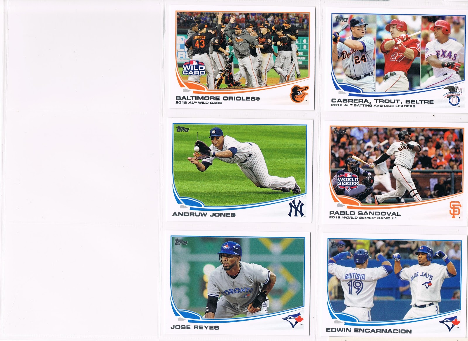
The Checklist runs like this

Fielder
Jeter
Cano
Price
Beltre
Bautista
Verlander
Hamilton
Darvish
Pujols
Trout
Hernandez
Reyes      ... hey, he wasn't in the American League last year. This is not an All-Star set.
Sale
Cabrera
Longoria
Pedroia

A little heavy on the infielders there Topps, the American League better hope none of their outfielders get injured this year. I won't be picking up the National League blister pack to make head-to-head match ups.

The five cards that are from Series 2 are all the same as their previous editions in Opening Day, just to supply some reporting here.

So if you need a foil eagle stamp for a PC entry, by all means offer me up anything you like. I like baseball cards, those will work.

Don't forget all these great features:

American League™ embossed Eagle logo Silver Foil Stamping

Unique AL-# card number on the back

Unique Topps production code number on the back

Not available in packs

Pack-fresh Gem Mint condition

Order today and receive Bonus! regular Series edition of each card. That's right, TWO cards!

Boredom sold separately in this year's Panini packs.

Wednesday, June 19, 2013

Baseball Card TV

You really can't beat a horizontal baseball card.


Though you can scan them running downhill a little. Oops.


And you could have put them in binder pages so the #s run from top left to bottom right. Second oops.


'course, a sub-set builder could also rule out sub-sub-sets, like the leader cards. Third oops.


and those team celebration shots, do we really need those? Fourth oops.


For the most part though, horizontal cards speak for themselves. Even with the sound off.


uhh-ohh, fault-conflict in sub-sub-set rule at location 282. Should we leave Russell Martin on the TV here? What then to do with the 2 cards with lurking TV cameras on them? Subset problems. Problematic subsets. An Artificial Intelligence computer will never be able to sort baseball cards very well.


But people make mistakes, like not bothering to crop a scan when they are tired. 5th oops. Maybe you do need a baseball card robot to take care of these things for you. Little details like counting the cards.

60 of these in Series One, of 330 = 18.1818181818181818%

That's about 18%, or almost but not quite 1 card in 5. This seems like a high ratio. I can only wonder if it is as high as in the 1973 set, or the 1991. Or set years missing from my memory collection up there in the ole noggin. This will give me something to keep investigating with the little rectangular pieces of card-stock.

However only 44 of these feature a named player. And not even all 44 are a standard issued single player baseball card, as some of the playoff cards put a hero-player name on the front, some put a team name on the front. Pursuing that line leaves us with 38 horizontal baseball players. The 22 League Leader and Playoffs cards, along with 5 checklist cards, makes for a Series One of 303 baseball picture cards.

And thus we actually have 38 horizontal players, of 303 = 12.5%, or 'zactly 1 out of 8 player cards.

A favorite? On which page? I don't pick favorites when I watch TV. I like all baseball players on TV, usually. It's reading about them later that makes me not like some of them.

But I like too many of these cards to pick a favorite, or run a final count-down. How do those bloggers do that? Drawing cards out of a hat? That's how I would have to do it.

I can't even organize my cards right sometimes. I know I could make these pages look even better. But that's the great thing about baseball cards. There's always next Series.

Tuesday, June 18, 2013

Patching Around

Patches are an integral part of uniforms. I know this from my baseball cards. There are lots of different kinds of patches....here are those I found in 2013 Series One:


Generally the right shoulder is for a 'limited edition' patch which is only to be worn for one season. Tributes generally show up here, though not always. In 2012, the Mets wore this patch at home games as a memorial for Gary Carter.


Yes, the patch repeats right there on the corner of the card. I skip over some like that in this collection, especially all the ones that are simply the team logo, and especially the ones that are identical to the patch on the cap. But I like the Red Sox, and I like this patch.


A common right shoulder patch is an anniversary patch. The Rangers celebrated their 40th anniversary in 2012.

Right at this point I would note that I am skipping over the Anthony Rizzo card, which has a good depiction of the great Chicago Cubs left shoulder patch. I like that patch, but I want a perfect example of it.


Another anniversary patch, for Fenway's 100th season. Great patch, great card. I would like to get a photo with a bigger example of the patch, but it would be hard to replace this card.


Patches aren't always on the shoulder; this one is another memorial patch. I'll quote Wikipedia here: "In 2011, the Phillies added a black circular patch with a 'B' in honor of minority owners Alexander and John Buck, who died in late 2010." OK. But, Topps, this is a 2013 set of baseball cards. I also just learned that my set of alternate uniform cards I posted yesterday will have to be increased, as this is the Phillies' alternate home jersey (missed a Throwback jersey too). The pinstripe uniform is their everyday home uniform.


In the long run, this will probably not be the all-time greatest example of the famous A's elephant patch, as the patch's portion of the photo is a bit small. Sure enough, the Uni-Watch website has an FAQ question on this patch. I'd hook you up with a link that explains it, but that link is broken today. Which is a drag, because I want to read that story.

I should have rambled about this card yesterday, but I was sticking to generalities, posting 61 cards at once. How many baseball cards feature 2 different team uniforms, and a warm-up jacket? Where I live, a lot of people still like Brandon Inge, because he clearly played hard all the way through the Tigers' terrible 2003 season when they racked up 119 losses. He is at that point in his career now where his bat speed is decreasing, and he has always struck out too much. Haters are gonna hate, and he experienced plenty of that by the end of his time with the Tigers. But he is still in the game, serving as a pinch-hitter and super-utility man for the Pirates, as Inge can play any position. I would expect to see a card of him in the '13 Update set with the Pirates, and I expect that will be his final card. I hope it's a good one. But then I thought his card last year was his final card...


Another well-known patch, the Texas state flag. There are lots of examples of it on baseball cards. This was the first one I encountered sequentially in this set that is a good shot of it, and I will probably stay with it for a long-term collection. Especially if Olt lives up to expectations.


Also a well-known patch. I expect I'll find a better (bigger) example before too long. But I like cards showing a player that went for it earlier in the game, either fielding in the infield or a head-first slide. So I picked this one for now.


This patch is just ... sad, somehow? I wish I had more time to follow the Marlins this year. Total rebuilding projects always fascinate me. But those Marlins fans.....the taxpayers of Florida help pay for a new ballpark, and the owner guts the team (again), and can't keep professional front office help around — but hey we'll wear a neat patch to celebrate our empty ballpark! I'm looking for a certain card to use in conjunction with another post on this topic.


Hey, we play in Texas too. Last time you'll see this one on a baseball card, as they pushed the reset button on their uniforms for the move to the American League. Unless of course Topps were to use a 2012 photo on a 2014 card...would that ever happen?


Another great patch, great card combo. I expect to find a better replacement for this eventually, patch-wise.


Good ole Mr. Redlegs. Can't have a set of patch cards without him, could we?


Indeed, he is so iconic I picked out an example on their home white uniform too. I will probably do that for some other patches as well. The 20 cards posted here will be the nucleus for a permanent set of pages across all teams, sets, manufacturers, and years, as I find great patch cards.


The "Bend-It" card. I'm always tempted to just start bending this card when I have it in my hands. Again from Wikipedia: "The double diamond patches pay tribute to Bill “Moose” Skowron, with the initials “BMS”, and Kevin Hickey with his nickname “HIC MAN”. They were both former White Sox players who went on to work for the club for a long time. I expect there could be a better example of these out there, but this is another card I would be loath to replace. There are slight variants of these patches on their other uniforms, but I won't be Chasing picture cards of those. I'm not a White Sox fan at all, and one is enough. I do admire their new manager though.


This one says "Oriole Park at Camden Yards" I believe, and I believe I will find a sharper focused example of it eventually. Not sure if the Orioles will always wear this patch now, but I guess so.


The patches sure do tend to show up on some good cards, eh? I love the Rays patch, but I have already found a better example on a card released after this one. Sorry Ben, though you will always get a lot of glory from this card, even if it seems there are almost as many umpires watching the game as paid customers.


Another anniversary patch. Teal on a white-edged card. Classy.


And the patch doesn't even have to be on the player named on the card. Dodger Stadium anniversary patch.


You win the World Series, you get to wear a patch to remind everybody. Seems fair enough. The Cardinals pick the left shoulder, where they don't normally have a patch.


Yeah, I typed that I wouldn't use patches that just repeat what is on the player's head. I lied. I will definitely never get too concerned about it if that logo on the card ever appears on a patch, however.

So there ya go. Your next new patch fix arrives in just a few more days. Hang in there.

In other news, I've made a little progress on typing in all these numbers from the backs of all these baseball cards just inches from this keyboard. I have a long way to go, but don't forget those parallels. I wants them. Also, I will soon be putting up a trade report. So some of you'll get to see your old cards you sent me, one last time. Unless, of course, you sent me your double cards. I am perhaps more likely to only send out only triple or > triple cards. That way I get to make binder pages like this one.

Monday, June 17, 2013

My Baseball Uniform Watch

Yes, I know ... there's a website for that. That's a little deeper than I want to go. That site's header uses the word "obsessive." I'm not obsessive. I collect baseball cards. I'm not obsessive.

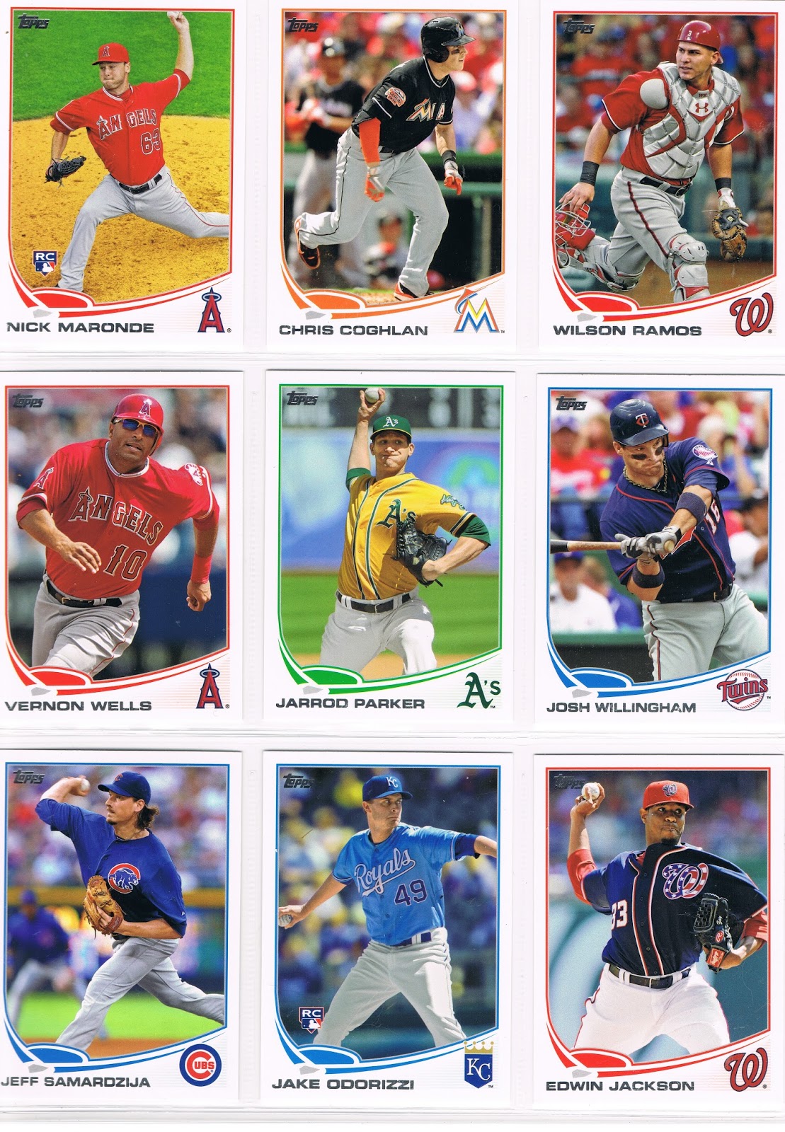
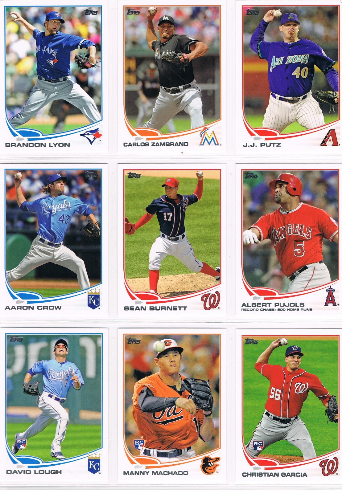
These baseball cards all feature the player wearing their team's "alternate" uniform...


A majority of teams have these, but not all. 20 of the 30, on these cards.


Washington leads this stat, at 7 this year. I think Topps has a thing for that team. There's that one player I heard about.


They are worn on a certain day of the week generally, though I don't obsess over which day.


Rookies certainly get to show off their team pride via colorful uniforms. 14 of 32 RC-designated cards feature alternate unis, or 43.8%, a bit more than double the rate of veterans. But I wouldn't want to look at this stuff too obsessively.


I do like the idea of the alternate road uniform the best. What I like thinking about that is ... who picks when those are worn? Only on the last game of the series, AKA the 'get-away-day'? Only when the home team is wearing theirs? Or can a team just pull their alternate road unis out for a surprise, like to break a team slump or something? From the cards here, we see only 11 or so in road uniforms, of 61 cards, or 18%. It's hard to be sure about the San Diego uniform, and I counted the blue Washington uni as their alternate on the road; just guessing. Nobody knows where the Angels play, on baseball cards at least, where they are always just the Angels®. I don't think they play in Heaven, given their franchise history and how things are going for them this year. And it's hard to be sure about Home/Away on some other cards too, like the suave Manny Machado down there. I'm not obsessed about it.


There are 61 cards here, featuring 60 players. Out of 310 single player cards in Series One, or 19.3%. I included the Baltimore Wild Card Card because they are wearing an alternate road uniform, their black one. Maybe they pulled that out for luck. That worked out well for them.


A favorite? Uniform, or card? I like the Orioles. Vibrant. Intense. You tell me that uniform didn't get them one of their one run "Buckyball" victories last year. At some point in some inning in some game, an opposing player caught that orange in his eye unexpectedly, and it slowed down his reaction time to do something important, and he screwed that up, cuz his eye was still catching trails off all that orange. Maybe it was giving him a flashback to hunting season, when he missed a nice buck.

Team runner-up? Probably the Seattle road uni on the Carter Capps card, though we don't get to see much of it. Not sure why, it just strikes me. I like their teal home uniforms and how they fit with the turtle's back - perhaps the best of all the Sea Turtles. Classy. And their road uni screws that up, so I like it.

Favorite single card of these 61? L.J. Hoes. I think that one will be in the running for Psychedelic Card of the Year, but I won't pick one of those till Update comes out. 2012 had a definite heavyweight champion card in that department. L.J.'s card looks like a night card, but was shot in the daytime. Matching shades too. Bad-ass. We'll need more imagery to tide you over as we go along, so here it is all by itself:


Card runner-up? I'll go with the Sean Burnett. You'll see that one again too; I'll liberate it from it's bindings for that post. Maybe scan at 1200 dpi too, instead of 600. What the hey.

Card second runner-up? All of the rest of them. I like all of these better than the other 269 cards in the Series. So I gave them their own binder pages. What else am I going to do with all the doubles I get? And I actually need a card pictured above, way back at the beginning. I need another copy of Ryan Braun's card #8. Oh joy. I told you it was tempting to leave him out of a binder page somewhere. But I wouldn't want to show you less than a Complete Set here.

I'm not sure if I will do this for each Series going forward. I do have a set of these from '12 Update. Haven't put one together for '12 Series 1 & 2 nor any from 2011, and I'm not going to collect Topps base cards before 2011, except for a very few partials sets I already have. In the long run I will probably build a set of cards of each alternate uniform for each team, though it will be hard to pick just one for that. Like the Sean Burnett card is a great card, but it doesn't show off the uniform as good as the Edwin Jackson card. Such hard decisions in collecting baseball cards.

I like color in baseball, and Topps got the colors in the design just right, imo, this year, so it's the perfect year to enjoy the alternate uniforms.

The whole exercise, which I have been fooling with since early February, has lead me to a key baseball question. It hadn't really solidified in my thinking until a post on Night Owl's blog happened to mention that many teams used a black uniform for a while, probably mostly when I was strictly enjoying baseball on the radio, without baseball cards. (Don't ask me why no cards, I don't know. I'll try and weasel around that question some other night). Now, there seems to be only Pittsburgh and Miami still using a black uniform.

OK, now I am going to veer off into a story from real / "3D" life. I don't have any pictures to sprinkle through here, so if you're getting sleepy you might just want to close this browser window now.

My work is very athletic, though it has nothing to do with sports. I am a tree-planting contractor, and by that I mean I plant tree seedlings on a bulk scale. Not landscaping, where you do this, then do that, half in the shade at times, moving around a yard with that tool, then this tool. My work involves planting a seedling, then planting another one. Anywhere from 2 to 8 per minute. Yes, per minute. It is very, very physical, and it is almost always done in full sunlight. If there was any shade, we wouldn't need to plant any trees, would we?

I have long understood that wearing dark colors during physical exertion will make you warmer. This is fine on a cold day. But on a sunny day above 55º, that is a mistake. Dark colors absorb heat, and that is the last thing you need when your body is trying to shed heat via sweat.

But I can rarely convince people working for me that this is true. Some of them just don't care, they aren't going to work as hard as they can anyway. So a little extra heat won't bother them, they will just work slower. They probably won't be around working for me very long anyway.

Others do care about giving their employer a solid effort, but are just pig-headead about some things, such as wearing black. One day this spring, we were working on a reclamation project, planting on bare sand. No soil type feels hotter than bare white-ish sand. It was already about 65º when we arrived early at the jobsite, on it's way up into the 80s that day (tough day). One of the guys with me that day had shown up wearing a black long-sleeve thermal shirt, black overalls, and a big puffy black hat with no venting. I kidded him that I had my black hoodie sweatshirt available if he was a little cold. He assured me that he would be fine, as my knock on his outfit sailed clear over his big puffy hat. I was sensibly wearing shorts, a wide straw hat, and a white T-shirt.

I let it all slide, but I knew what would happen, and I wanted him to learn something, as well as knowing this was the only way he ever would learn this. We set off across the sand, working steadily. It took about 20 minutes. "Can I go back to the truck?" He was completely drenched, huffing-and-puffing, and possibly about to fall out from heat exhaustion (smokers get hit by this even worse, and he is a smoker). Luckily, he had alternate clothes on hand as we work on the road, far away from home usually. "I don't know what I was thinking." Yeah, me neither. I gently explain the virtues of wearing white, but so it goes. When I return to hiring a large crew someday, I will make a very few mandatory "uniform" rules.

Perhaps this is what ended the black uniform craze in Major League Baseball. Baseball is played under some extra-warm conditions at times. And this is what I am wondering now about the Alternate uniforms pictured so far above now. Do the players like them? I know I wouldn't want to wear a black uniform in July & August. Even at night; I'm pretty sure the physics of heat absorption are the same regardless of light conditions actually.

And given all of the advanced sabremetric math results calculated about baseball these days, I have to wonder if anyone has ever looked into won-loss records with Alternate Uniforms on, and how that compares to that team's Home Whites and Road Greys. And even how the different colors match up. Powder-blue on the Royals must work better than dark purple on the Rockies.

Perhaps the folks at Uni-Watch already know (High Heat Stats, are you reading this?), but I just don't have time to wander around Googling things like this. I'm not someone that obsesses over things.

Sunday, June 16, 2013

Series One Throwbacks

Everybody knows there is more than one way to organize baseball cards. You can do it by card #, or team..........or you can put them in a binder page any way you want. My binder pages might be a little different. But I like to look at my baseball cards and ponder what I see.

So I'm going to start a series of posts mostly of binder pages. I'll probably just keep on posting them till I get home from my delayed trip to my Friendly somewhat Local Card Shop for my first Series 2 fix on Wednesday, though I probably have a couple more Series One single cards to discuss as well.

One thing I really like on baseball cards is the not-everyday uniforms found on just some cards. I rarely get a chance to watch TV with baseball on it. Worked straight through yet another Saturday afternoon of MLB on Fox again today; don't have Fox Sports Detroit, nor ESPN either. I do hope to someday be lucky enough to watch some of a game featuring throwback uniforms, or even just a game with a team in their solid color "alternate" units, which I'll examine here tomorrow, without calling the waaaaaambulance. I don't miss deluxe cable TV in the slightest....baseball is great on the radio, and when I wonder what the game looks like, I crack open a binder:


And the final 3:


On those last 3, I have to wonder if Topps plays Tic-Tac-Toe with their binders up at Topps HQ, something I alluded to yesterday in my I-need-your-parallels post. If you were to leave a blank spot at #7 this year, those three cards would make a diagonal on a binder page.

Now on any of these posts, if you think I missed a card or added a wrong card, please pipe up. I especially struggle with some of the white uniforms - without watching baseball players on TV all the time, I don't always know for sure when a white uni is some variant of the team's every day home uniform. Particularly when they used to sport pinstripes, but now they don't, or vice-versa (Astros?). But then I've never been a big fan of the pinstripes anyhow.

A favorite? Probably Altuve, easy choice. All the bonus details on his card certainly don't hurt — the casual toss to first, great lines, the blurred lurking orange-man...the best leg stripe ever makes the whole thing work even with his glove covering lotsa the glory on his torso. Topps gets it right for a change too with the orange framing of the card.

I also like the straight-up 70s-ness of the Worley card (even if I'm wrong on that), Adam Wainwright's single Cardinal black hat, and pretty much everything about the Maybin card. It's great to see the old Brewers logo, though I would always be up for seeing it done more prominently. Their block-M-grain-Wisco on every card just makes me think the Brewers deserve the year they're having with that boring, risk-free logo they use now. I mean, would you want to wear that? "Hi, I'm a boring Brewers baseball guy." And of course it is cool to see some powder blue action; Rickie Weeks has that all to himself in Series 1. Rickie could use anything of singular distinction the way his career has been turning lately.

A case could be made that Wainwright is just sporting an alternate uni look, as the web informs me that the Cardinals wear that hat every Sunday at Home. But it is a throwback hat. I'll probably put him on my Alternate Hat page too, which otherwise has too many Rangers to post for Series 1 only. Similarly, I'm not sure if I want to count a card as a Throwback Uni card if the main "old time" element is just special striped socks as on the Sergio Romo, Daniel Descalso, and Wade Davis cards. And I can't really say the Rays are eligible to even have a throwback uniform yet, unless perhaps the word Devil appears.

The Michael Young card makes me giggle. If I were to ever buy a mini bobble-head or a little plastic baseball player figurine or were to watch MLB anime, if such a thing ever exists, I am positive that is how the Texas Ranger uniforms would look. And then I would giggle even harder. I just wish some Rangers players would go the extra few yards and sport red-white-and-blue wristbands just like my favorite bass player, but that would probably only ever happen in San Francisco, a team which has nothing whatsoever to do with red-white-and-blue.

And finally, the Chris Sale card is just simply a great card. You can rarely go wrong with a horizontal card; it doesn't matter what uniform he would be wearing. Same for Worley, though Sale would probably win a matchup every time. Especially with Worley being probably the only 2013 Opening Day starter currently at AAA.

The not-so-good? It's unfortunate that we can barely see the old school halo on the the Scott Downs card. Otherwise, this question is a no-brainer with a one word answer - "vest". Black, no less. Sad on an otherwise pretty good card that will be part of another post soon. I'll ponder the black uniform in general tonight....tune in then for more baseball television, via baseball cards.

Saturday, June 15, 2013

I Need Your Blacks, The Camos And The Pinks


You love these
But he loves those
And they all love the sparkles
You just can't win

And so it goes
Till your set is complete
This thing they call parallels
It's gonna make you cry

I need more blacks
The camos and the pinks
One thing for sure

Parallels Rock!


You'll have to play the air guitar part on your own. It's a pretty easy one, at a slow tempo.

I had thought to put this post up on the night Series 2 hit the streets, which I thought was today, though my new FLCS kindly, gently, broke it to me that Series 2 actually goes public next Wednesday. So I won't have any new cards to sigh over until then. At least I have a little more time to share my goofy notes on Series 1 in a timely manner.

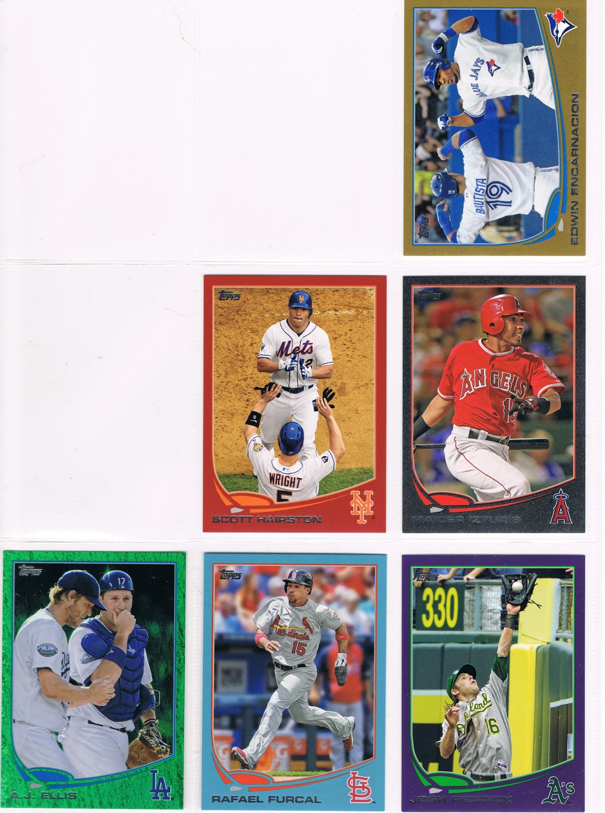
This is my goal for the Base Set this year:


What is it? Playing tic-tac-toe with the Cameo Cards? No, I'm not that into the Cameo Cards actually.

Building geometric shapes on my binder pages? Nope. Here are the proud genetic donor cards:


For those of you scoring at home, that's card #s 308 through 316. I didn't bother leaving a blank slot way back at #7, though it was tempting to do that at #8.


Still a little puzzled? I want to put together a set of 2013 Topps with a different color parallel in each slot on the binder page. I like the set this year. I like the design, I like the colors. I especially like the way the colors combine on the parallel versions. There are a few teams I want to build a set of in a certain color — for the purple, who else but the Pirates? Purple Pirates. Arrrrrr! But how could I enjoy all the random parallel cards that one ends up with while building a simple Base Set? This is my answer.


I got this idea quite a while back now, but it took a lot longer to commit to this project. But gosh darn it, I'm good enough, I'm smart enough, and doggone it, people like me, I hope.

Success has many fathers, but failure is an orphan, as they say. This project has several fathers, starting with William@Foul Bunt. He is putting together a set of this year's Emerald parallels. I had randomly daydreamed about doing a parallel set, but moreso dreamed about someone else doing it. I never thought I could put together a parallel set. William supplied the germ. Then the rest of the blogosphere out there, always reporting their trades and showing how smooth trading baseball cards can be in the 21st Century, got this thing to sprout. The rest will be up to YOU.

This is simple enough for the Wal•Mart, Target, Toys-R-Us, Emerald, and somewhat too the Gold parallels. After that, things get tough. I am going to use any of the Blue Foil cards from Opening Day that match the card image in Series 1 or 2. I will also use the Blue Sparkle / Silver Slate cards, though I only have one right now.

The hard part will be the pink, camo, and black cards. I pulled one black border parallel from a hobby jumbo box back in February (shown above), and haven't found any of those 3 since.

So I need yours. Any of them. Since those three colors will be the most difficult to acquire, I will work with what I can of those, and then build the rest of the page around them. I have stacks of extras of the red, blue, purple (lots of purples), emerald, gold, and blue-foil parallels. I don't quite want to put up lists of which of those are available yet, in case I need to switch some out as blacks, camos, or pinks come in. If you really need a certain parallel, just ask. I have bought a lot of cards this year, once I decided to go for it.

I do have about 50 purples from 2012 that will all be available. Also 9 gold from last year. There will be a healthy list of 2011 parallels available too. I will get lists up as fast as I can, though I am still very busy with work as I type.

So on any of my trade pages or future posts, if I have something available from any year, I will take 2013 parallels for it. I have a good amount of late 70s Topps Football to work with, as well as Topps baseball from the late 70s to mid 80s if you are looking for anything from that era.

I will probably bump this post by repeating it some as the summer goes along and the blog might have new readers. I will start out slow though; I have one trade to mail tomorrow, and two more to finalize after that, over the weekend. Hopefully at the end of next week I can get off the every-day-till-dark treadmill at work, and then I can really dive into this.

So now that random pink, camo, or black card you scored at random but don't know what to with can find a home. If you'd like to trade one, send along an offer with a want list, or a link to your want list.

I've got to get going now, I think I figured out how to put a link to my nascent lists. Watch this space.