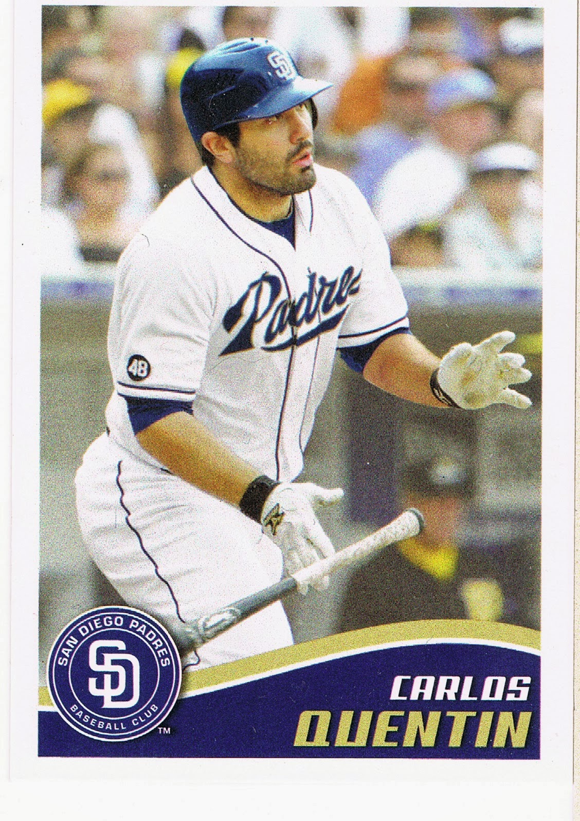
Showing posts with label 13 Update. Show all posts

Friday, January 2, 2026

I never thought this would happen to Me


I am collecting Super Short Prints now. I have mixed feelings about this, although I quite enjoy owning that there newest edition to the collection.

Collecting expensive Baseball Cards has generally been off limits to me. Not just due to financial limitations, but personal ones, on the decision making between spending money on Entertainment, vs. other life choices.

I finally admitted this to myself a little over a year ago, when I deliberately purchased some SSPs, which is somewhat different than stumbling across an exceptionally good deal for one, which is always tremulous, when collecting Baseball Cards — all the marketing phrases hit you simultaneously: "limited time offer," "act fast," etc. You know they are true because - other people collect the exact same Baseball Cards you desire.

Along the way recently I have had some successes with this always-sure-to-be-very-difficult collecting goal, and some setbacks, too. So I thought I would pass along a few experiences that could possibly help someone else ooohhhhhing and ahhhhing those partially wonderful /25 Baseball Cards.

One of those has happened 3 years/times now - December seems like a key month to have a good amount of bummin'-around-money set aside, absolutely ready for that rare card to suddenly ping your ebay search that has never pinged before. It seems logical that the Christmas season is a likely time for a card owner to decide it's time to generate a little extra cash. It also seems like there will be fewer buyers to compete with, this time of year.

That Aaron card there is from 2013 Update, and specifically the SSP checklist; I think Update may have been the product that first introduced the concept of 2 levels of short printed image variations. It was my introduction to the infernal concept anyway.

I truly lusted after that card in particular because of the workings of a card back text feature, "The Chase," about a player's chances of becoming one of Baseball's "All Time" leaders in a given statistic. And it did not disappoint on that regard, something that will make it onto the Sea Turtle Cards blog oh maybe by the year 2036 or so. (I do expect to become much more 'off the road' in another year or two and should have way more time to spend on Baseball Cards).

The reason I recently "pulled the trigger" on it was the creeping horror of understanding that the rare RCs from that checklist are only a small portion of the battle. The dozen+ Hall of Famers included amongst the 25 entries are probably now more difficult to obtain than the Rookies, as the Rookies end up in the hands of people hoping for a large appreciation gain on the card, whereas HoF players all have dedicated Player Collectors who always want Moar cards of their "PC Guy", Moar, Moar, Moar. And a good portion of the 13 Update SSPs actually feature 2 HoF players on the same card - so Willie Mays collectors want the above card, too. Arrrrrgggggghhhhhhh.

I'm not like that. 9 cards of one player is enough for me.

So now that the card in question has scrolled off your screen, can you recall anything about it that might have resulted in me obtaining it for a "reasonable" price (less than $100, in this case) ? 

The card has a severe crease across the whole top of the card, about 1/5th of the way down from the top edge. And that is fairly easily viewable, in-hand, and there is actually a slight loss of "eye appeal." In the scan above, it is most visible via the small white lines around Willie's eye brows. 

But for me, the appeal deficit is quite slight, and one quite worth saving .... $150 ? Who knows. I felt it was fairly unlikely I would ever see a copy of this For Sale, ever again, in any condition. Which is the even more frustrating part of attempting to collect a checklist like this one. Demand potentially very high, supply so very, very low.

Such concepts of eye appeal vs. likely official grade culminate in the expression "buy the card, not the grade" and can very much work in a collector's favor. Which is what happened for me finally obtaining this long-desired Baseball Card:

This copy has a short, barely perceptible surface wrinkle, well hidden in one of the black ink portions of the card. If you hold it up to a bright light and angle it just right, you can see it. Would a card grader find that? Some times, probably, maybe most of the time, or not. If they did see it, then the card would be an 8 or less, whereas the Aaron card is probably, I don't know, a 4 perhaps. I don't and will never have a lot of experience with those nutty concepts. Recently I read someone complaining about older PSA "slabs" being "often very over-graded." I truly pity such people.

That Cole card became an unfortunate keystone in this whole collecting concept, as I expected it to be one of the most expensive cards on the 25 card SSP checklist, forever and ever. Which is no longer the case, as all those Hall-of-Fame cards will likely retain their now high prices, forever and ever, and I could have purchased many of them for a fraction of their current values while I was hung-up deciding on whether to ever purchase this card for a far higher price than the HoF cards, years ago now.

I still have a love-hate relationship with the card. It is such a great card, the super anticipated 1-1 player (not the same as a 1/1 Baseball Card; 1-1 refers to a player selected as the very first in an MLB draft, like Henry Davis and Paul Skenes were, to name 2 pertinent examples) making his dramatic entrance to a game, with the big outfield wall team logo behind him while he wears a rarely-seen-on-cardboard Pirates black warmup jacket. And of course I fully expect the Cole-Pirates situation to repeat possibly quite soon on my favorite team, with Tarik Skubal, and all over again for the Pirates in a few years with Skenes. Sometimes I thoroughly dislike this ever more coast-tilted Sport. That particular Baseball Card is a horrible reminder of MLB's current structure.

And — why couldn't that be his regular Rookie Card card? It would be just exactly perfect. Some other random image, like say the one on his regular RC, could be on the /25 SSP version, inserted mainly to help create re-sale value in the box of lottery tickets. Such a card would still have plenty of dollar value, because a solid majority buy the serial number, not the Baseball Card. For soooooooo many purchasers / "collectors," card image and design are basically irrelevant. So ..... let me have the good photos, cheap, dammit!!!! Sometimes I thoroughly dislike this Hobby.

I did have some basically tangential Good Luck with finally landing the Cole as he spent 2025 off the field, for the inevitable Tommy John surgery rehab - a point where "investors" (how I loathe needing to use that word in relation to Baseball Cards) can often begin to "cut their losses," potentially. 

That likely helped move multiple copies of the Cole card into For Sale activity over the last few months, which becomes a huge help to the collector wanting a rare card. We of course all exist in the tension between sellers wanting as high a price as possible and buyers wanting as low a price as possible. But when 2 sellers attempt a sale of the same card simultaneously, the buyers have leverage that is absent when only one copy is For Sale.

Not having a lot of experience with purchasing expensive Baseball Cards, that now seemingly simple concept was a bit of an "I coulda had a V8" moment, or maybe a "I didn't sleep at a Holiday Inn last night," or probably plenty more cute social aphorisms. Also recently, that basic concept well assisted purchasing this card via Best Offer -
That one has no defects aside from my scanner's usual struggle to discern the white boundary correctly. However the card still cost about double the last price I could remember for it, only 2-3 years ago. So it goes when you have to pick your Baseball Card battles oh so carefully.

The Gehrig card is also now a card in the lower tier of (potential, because few of the entries are ever actually For Sale) prices on that 25 card SSP checklist. Best illustrated by me purchasing it for just about half of what the John Kruk card on the checklist sold for a week or two later. Players from the 30s will never be as collected as players from the 50s regardless of overall fame; not even the presence of Jimmie Foxx on this card will change that as a huge amount of Baseball fans don't even know who Jimmie Foxx was. The Stars of those days just didn't have enough Baseball Cards depicting them, unlike the Post-War era players.

I am mostly enjoying this collecting by design goal - all of the 2013 Topps design cards. Even though it hasn't yet been used for a full design re-use checklist (only 36 years to go for its use in Heritage), a semi-regular scattering of such cards do exist. And one of them is a /87 Aaron Judge Rookie, which hasn't appeared for sale in several years now, and will almost certainly never be in my price range.

That is also true of a whole number of 2013 design cards issued in 2013, despite my halting step onto the Update SSP checklist. 2013 Topps Chrome has short printed image variations too - and most of those are now 4 figure cards. Yes, as in > $1,000, each. That's because they are probably printed in an edition of /10, and there are people just like me who want to complete that checklist, too. So I also know I will never own the really cool Miguel Cabrera Chrome SSSP, which shows off the Detroit Tigers special green uniform worn on St. Patrick's Day down in Florida.

And then 2013 also included a set of autographed cards on the Sea Turtle design, most well-known as part of the Wrapper Redemption program which supplied us the /150 "Blue Sparkle" cards which are a darn purdy parallel. The small 'packs' of those included randomly inserted autos, including things like a Manny Machado RC, and Hall of Famers like Gwynn and Ripken, amongst a few others, with copies limited to just 10. I also just recently learned that 2013 Series One & Two also included similar cards of some of the same HoF players, inserted into packs though not noted on official checklists. These cards had an edition of only /5, and I will almost certainly never see one even for sale, and even if then the price will be in the mid four figures.

Me, I still shudder at the idea of the numeral "2" fronting the price of a three digit card. Pulling the trigger on the numeral "1" a few times now is still creating Doubt in my mind, which is not an enjoyable concept to attach to collecting, at all. I saw a fork in the road, and I took it. The question is .... how far to the next exit on this ever more lonely road? I think I have about 12 more exits to reach the end of this road, which is now likely to head deep into unknown parts of Nevada, although there's always .... next December.


Thursday, November 28, 2024

That guy


I just scanned a Sea Turtle card! I feel like I just climbed into the WayBack Machine. I do miss writing about the Sea Turtle cards and still think I Shall Return, often, but, Life, happens. Work on my parallel collection of the 2013 Topps Baseball set does always continue; I picked up a key "Factory Orange" card just yesterday & Black Friday Week COMC sales are rolling right now.

Meanwhile I have been also slowly chipping away at another Sea Turtle project, collecting ALL Baseball Cards with the 2013 design. That is a much tougher assignment than collecting 990 parallels, because some of them were printed in editions of only /25, it is thought, and depict some _very_ famous people.

The card shown above is from the 2013 Pro Debut set, which I quite enjoyed completing. I still like that Puig card, too, a nice simple (and, authentic, not 'shopped) Minor League Baseball Card and somehow without that weird Pro Debut stamp Topps seems so proud of for some reason. We'll see some 2024 Pro Debut here on the blog sometime this winter, I expect.

Back in that previous decade, Yasiel Puig cards were a big deal, for a few years at least. We all know how that turned out. But in the short run, back then, the To The Moon! prices of Yasiel Puig cards definitely kept me from thinking I could ever hope to complete a certain set of the 2013 design cards, even though I very much Desired to. That would be a somewhat dreaded term to hear in the universe of Baseball Cards, when you discover one of these exists for a player or team (or in my case, a design) you Desire to collect, completely. That would be the horror, the horror of the "Super" Short Prints.

Although issuing "photo variations" had been a thing for several years already before 2013, I believe it was the year that Topps added the "Super" innovation to the concept, resulting in the acronym "SSP." This was after the 2013 Baseball Card year had started simply enough, with these "Great Catch" photo variations in Series One:
These were neither all that difficult to actually see at least one example from a pack, nor were most of them that expensive to purchase, if you wished. I have a memory of reading somewhere, many years ago now, that it was thought a print run on these might be around 3,000 copies each and thus nearly 1000 more copies than a Topps Gold parallel.

But naturally a checklist of only 25 cards is going to have a high degree of variability around that word "expense" as there would be some All-Stars / obvious future Hall of Famers included, which brings set collectors additional competition from player collectors.

So I steeled myself to shop carefully for the bigger names on that checklist, which included a > $100 card for this guy named Mike Trout. 3,000 copies, & > $100 prices. Bummer. These SP photo variations are (were) probably my most expensive Baseball Card Desire, outside of finally finding a specific 1/1 from 2013 Series One.

Several years ago now I bit the bullet and handed over a Benjamin for the Mike Trout Great Catch SP. And concluded that the worst was over, as the Bryce Harper card was only a $30 card. It is becoming perhaps an Irony that in the long run, the Harper card could easily become more valuable than the Trout card, as their career arcs steadily diverge now.

At this point I still need a few more of the Great Catch cards, including David Wright and Alex Rodriguez, which each have a New York collector base value above their Hall of Very Good career pedigrees would suggest. And I still need one of the two Mike Trout SPs issued in Series Two; I have the 'autographs' card but still need the 'sunglasses' card which was also a > $100 card for many years but has now probably halved in value. A pity I didn't wait longer on the 'autographs' SP. 

Most of those struggles between Desire and Life Goals were not even yet on my radar screen when 2013 Topps Update was released. I didn't even conceive of the all-parallel 2013 project until a year later, either. So the Update Short Prints, which seemed to consist of just multi-player poses from the 2013 All-Star Game, first didn't interest me and then didn't appear difficult to acquire for a couple-3 dollars each, some day. A few of them sell for < $1 today.

And the concepts and scarcity of the "Super" Short Prints were even more fuzzy to me. All I knew was, Flaming Hot Rookie Yasiel Puig had some photo variant cards that were far more difficult to obtain than all of his other Rookie Card cards and since the last thing I wanted to collect specifically were Rookie Card cards, I basically ignored the concept quite contentedly.

Except for one card, which I can't scan for you as I don't yet own a copy. That was the Gerritt Cole SSP, a card with an RC logo, so.....

That card is often referred to as the "Black Jacket" card as it shows him leaving the bullpen still wearing a black jacket. Given the hopes for the Andrew McCutchen led Pirates right then, the arrival of their recent 1-1 pick was a big deal in Pittsburgh and that image perfectly encapsulated those feelings, giving the card great cachet not just some of the time, but, instantly. As soon as I saw an image of it, the inner-Gollum that I expect every Baseball Card collector is familiar with piped up instantly: "I wants it."

I began watching the price of that card at some point in 2014. It has only ever climbed in price and I passed on several chances to buy it at around $75. That small fact is a reason for my dislike of Gerrit Cole, which is in no way his fault. I would still like to go fishing with him, if he enjoys that hobby, something I would say about almost every human being on the planet. What I really don't like is actually the structure of the game of professional Baseball today, which is perfectly illustrated in Cole's career and is now only getting worse as TV revenues decline but player salaries can only go up, up, up, up, up — to the point that Gerrit Cole now receives $15,000, give or take, for every single Pitch he throws. And the real loser is the fans of the "have-not" teams that comprise a whole lot of Major League Baseball today.

Shelby Miller has a Super Short Print photo variation card in 2013 Topps Update as well, probably with the same print run as the Gerrit Cole card. It is an incredibly lazy effort by Topps in that it features him just wearing the Cardinals' special "Sunday Home Only" cap instead of their regular cap, in a pose that makes it look incredibly similar to his Rookie Debut card, his "Factory Set" Rookie Variation card, and also a little bit like his regular Series One Rookie Card card. That same-same -ness has probably made a few of the "Blue Cap" SSPs be lost, right from the get-go, amidst stacks of totally worthless "base" cards that not every box opener actually wants any more. A possible fate for many photo variation cards of course.

And yet despite that basic rarity being probably a touch more acute than the Gerrit Cole SSP, Cole's card now sells for $250-ish while the Shelby Miller would go for half or less of that, I would guesstimate, if one were to appear for sale, which is because only oddball set collectors such as myself would seek it as it is very unlikely Shelby Miller has any dedicated player collectors at this point. I would further wager that if every single Shelby Miller Baseball Card ever made were somehow auctioned off simultaneously, individually, the 13 Update SSP would now be his single most valuable card.

All of that is the basics of Baseball, and Baseball Cards today. Between the Puig Rookie Card card mania and the permanently rising Cole card, I tried the best I could to blot out the knowledge of those 2013 Topps Update Super Short Print photo variation$ from entering my mind at all.

But that's never going to happen in our always dynamically scrolling "feed" of Baseball Card images, particularly when routinely shopping for the things online. 

One day early last winter, this next card appeared on eBay -
This is a card I had no real desire to ever own, starting with the simple fact of it not actually being a "Baseball" card at all. But that nagging Desire to own every 2013 Topps designed card will never leave me. Whatever you do, don't ever mention the Chrome SPs in my presence.

And as you can see, I pulled the trigger. The price, was right. That made the decision rather simple as I believe it was offered for only about 20% of what it would have fetched at auction. I could barely mash the "Buy It Now" button fast enough.

#Profit ? No, I am keeping the card. This of course has now set me on a problematic course as my inner-Gollum is louder than ever about that Gerrit Cole card. And of course the rest of his checklist mates, such as the famous Teddy Kremer card, which is viewed as a great "feel good" effort by Topps, unless, that is, you are someone who wants to complete the 2013 Update SSP checklist. I, and I believe many other collectors, would be much much happier if every photo variation card came out in far more reasonable print runs. Instead, every single player card in the Topps Baseball set, and many duals, now have "Golden Mirror" SP variants in limited edition. Act Fast! Buy Now! I do my best to never see what any of those look like.

Just a short week or so before the opportunity to own the ludicrous card just shown fell on me, I had shushed Gollum on the idea of owning a copy of the Kremer card for just $200. Like oh so many decisions, I began regretting that the instant the card sold anyway. Now, another one (graded & everything!) is on-sale for a cool $1000, or 50% off, if you act fast.

Sigh. Baseball Cards are always such a great hammer driving the nail of Buddhism's 2nd "Noble Truth," the one about Attachment & Desire. There is no escape.

For now though, I will continue row, row, rowing my Baseball Card boat somewhat happily down the stream. Now that I have one of the top 3 most difficult cards on the checklist, that makes the ho-hum double digit cost cards into very easy purchase decisions, which started with this one:
That is a nice nod to amusing Baseball Card history on the part of Topps, though I have never been clear on why these gloves actually exist beyond supplying a fun image to use on a Baseball Card. I had never paid it any mind in particular beyond that basic disdain for superfluous Rookie Card cards so I don't know how expensive it might have ever become. It now sells for maybe ten bucks, probably mostly to people like me, and that is still over-priced compared to most other regular SPs on that checklist, a phenomena known as "bag holding," which is now mostly, but not completely, abating for Yasiel Puig cards. That card was not one of the "Super" Short Prints but rather was just a boring regular SP.

My next two pick-ups were originally on the 'tough' list -


For the longest time, I thought the "arms raised" image was from the SSP list, but the "sliding" card was potentially from an even-fewer-printed Super Super Short Print list. Uggh. It is a fun card though from a famous incident where Puig un-necessarily slid into the completion of a Walk-Off Home Run. He was a fun player, and I did like that, so this card is a fun "get." 

I mostly thought there may actually be 3 levels of Short Prints in 2013 Update because that Puig "sliding" card was priced higher than the "arms raised" card, when I occasionally saw a listing for them. That, and the Teddy Kremer and Prince George cards were/are rarely ever seen actually for sale. 

Now, I am doubtful of that, as I can't find any online speculation, anywhere, on that concept. I also managed to stumble across the "population report" for some of the SSP cards graded at PSA, a concept I care about not-at-all and had thought was locked away behind an "account required" rule on the PSA website. (Wrong). There, some of what I thought might be the even more limited cards just mentioned have actually been graded more times than some of the just 'super' short printed cards. So there is likely just the SPs @ > Topps Gold level, and the SSPs @ maybe /25. A conundrum on the SSP quantity calculation, something never disclosed by Topps, is the 110 card structure of the printing sheets used in 2013, as 25 checklist entries is not divisible by 110 in any way. The mysteries.

It is nice to see all 3 of the Puig variants together finally. And those were a nice lesson on the folly of paying "peak" prices for Baseball Cards, before the latest can't-miss Hot Rookie gets promoted straight to Cooperstown, as were the Trout variants in Series One & Two.

Still waiting for me up ahead are that darn Cole card, and the even tougher every-Reds-fan-wants-one Kremer card. But also, many more 2013 variants featuring genuine Hall of Famers, sometimes 2 at once. A Baseball Card depicting Willie Mays standing next to Hank Aaron is never going to be as cheap as the other cards on the same checklist, which is far more understandable than the usually temporary peak prices of limited edition Hot Rookie Card cards.

At least Hall of Fame Baseball Cards are more fun to obtain than so many of the gimcrackery, dance-junkie-dance 2.5"x3.5" creations emanating from 1 Whitehall St. these days. Even when the card isn't particularly rare, or is of a famous player who just isn't quite to Finger Lakes New York standards, like the inimitable John Kruk, or This Guy, as we know:


Monday, July 21, 2014

Phoning It In #3

…and we're back. So nice to have a full slate of games to listen to once again. I've been cleaning up my mess of baseball cards and trying to refrain from babbling about them, so I can figure out which ones I can babble about.

Mostly that has been slogging through putting Series One in a binder, though I have too many other projects going on simultaneously. I hadn't planned to post for a few more days yet, but I just found these:


I like the '13 Update card quite a bit, it seems to be a night game in a dome perhaps. I like cards with the outfield grass all lit up like that. And I like the live action necklace on both cards. The '14 edition is an example of how as the zoom/crop moves in, the viewer is left with little but facial expression to remember the card by.

The black armband must be part of the memorial for the victims of the Boston Marathon bombing … except it isn't. The black armband was worn late in the 2012 season as a memorial for Johnny Pesky.

Which means Topps couldn't be bothered to pick up a 2013 picture of Tazawa for the 2014 set. Not all that surprising, even though Tazawa was one of the best set-up men in the game last year, though still basically lame on the part of Topps. But really the only reason an 8th inning specialist is in Series One was the Red Sox' World Series run, during which Tazawa was outstanding.

Update: I received a FAIL when I turned in my homework assignment on this post. I did not check this key resource:


or this one:


The Red Sox _did_ wear a black armband on the road all of last season as a memorial to the victims of the Boston Marathon bombing, and the 2014 Tazawa card is probably a 2013 photo.

Be careful how you word your Google searches, I guess...

But even though I could post near identical baseball card pictures of baseball picture cards from lots of players this year (and might, just to see), the front of these two cards did not generate this post. The backs did:


I know writing the card backs is a chore. Reading the "Rookie Fact" on each file folder this year is one helluva chore. I have found a couple 'neat' ones so far, but nothing all that entertaining nor illuminating at all. Fairly pointless overall, and that is the hardest kind of work there is.

Thursday, November 28, 2013

There are Umpires at the baseball game?

Because I just don't see them on my baseball cards much any more.

I received this card recently; not in trade, but as a bit of packaging protection in a shipment from an eBay seller. The fate of early 1990s baseball cards...
A nice, basic, horizontal baseball card. A Turning Two card, most likely selected out into many collections of such cards.

But what immediately jumped to my attention is the Umpire there. You just don't see many cards like these. We still receive brand new Turning Two cards from Topps, but the Ump is so often edited completely out of the picture.

Now I'm not suggesting Umpires should be on baseball cards. They shouldn't, generally. Baseball picture cards are supposed to feature the players, and oh how well they do now. I just prefer baseball cards that depict the game of baseball, rather than make fetish objects out of the players. Baseball card collectors are always saddened by the size of "The Hobby" today, and wonder why more people aren't interested in it. I'm beginning to think the steady banishment of baseball pictures in favor of the ego-gratifying celebrity-worshipping products that baseball cards generally are today, is one, albeit small, part of the reason.

When I started pondering this toppic the other day I knew I should compare my old-fart complaints about those kids today to cards of years past. But I don't really have the collection for that, with my wonderful 70s/80s cards in a secure remote undisclosed location for the time being, and only large portions of 1991 and 2001 Topps sets to check out. 2001 proved to have a whole lot of live action photos, but no Umps; the images were all sensibly cropped down to a single baseball player, as they should be. You do usually get to see their feet however, which allows in more glimpses of that game context I crave. And again, the cards should be about the players, not the Umpires.

I knew 1991 likely held few of the action shots I seek. That led me to the set that brought me back into everyday collecting, the 2011 set. I fondly recall some Umpires on a 2011 insert set, the Kimball Champion minis:
I like those little cards, where it looks like the Major Leaguers are playing on some small town ball diamond with a forest in the background, but am only saving 2 binder pages of 15 each, rather than collecting all 150 of them. I am down to 8 entries on my want list and have about 50 left over, which I would like to find a good home for. They're not worth sending to COMC.

Now the 2011 set has standard cropping very similar to the 2001 set, but far more horizontal cards, and those are usually dramatic entries in the set. It didn't take long to find one:
A complete slice of baseball action there. I always like cards that capture the press pit there in the background for some reason, though they make me wonder who Topps hires to get such shots, as they obviously aren't over there with the rest of the media.

But let's see what happens when we apply the 2013 zoom style to a similar card I know you all probably remember from Series One this year:
Now the Umpire is just a lurker? No, though even lurking umpires are few and far between on the backs of the Sea Turtles. They can be found on the Ben Zobrist I-just-murdered-the-catcher card, and the spectacular Pedro Alvarez card.

There on the Utley card, the Home Plate Umpire is still present, with just his fingers on Buster Posey's back there, which I found quite touching. Ouch. The Utley card is still a pretty good card, but despite all my bitching about the zooming in to the all torsos, all the cards this year, I have never liked cards that don't show a player's face, no matter how spectacular the game action we receive in exchange. It just seems disrespectful, to me.

But that's about it for Umpire Action in Series 1 & 2. A couple blurry lurkers, and one headless umpire that I was very grateful to have on a card, as I used his uniform # to determine the results of the bunt on the wonderful Erick Aybar card.

Now that Aybar card introduced me to an outstanding baseball card vantage point, seemingly from a point just above and behind the pitcher's shoulders. I'm not sure just how new this is, as I don't have enough baseball cards to ponder. Does anyone ever have enough baseball cards? Topps came through with another fine example of this in Update, on what could become a classic Rookie Card:
Now to me, that is already a great baseball card. Arcia is still a promising young Major Leaguer, but if he hits 30 Home Runs next season collectors these days will be scrambling for all his shiny photo-shopped serial #d relic autograph cards....every card but this one.

I'm not sure how Topps gets these photos. Maybe all that digital / optical zoom technology they overuse now has it's advantages I guess; perhaps these are even stills from the video feed of the standard baseball-on-TV vantage point. I have never fully understood that view; I have always wanted to watch a game from the Umpire's vantage point. I sat 7 rows directly behind Home Plate at Comerica Park once, watching each pitch come right at me, and I've had a bit less desire to go back to a baseball game ever since; unless I could return to that simply awesome vista of baseball, which is how the game should be seen. 

However these photos arrive in my packs of baseball cards, Topps certainly deployed it to good effect on the live-action All-Star cards this year:
There are several of these shots used for the All-Star cards, and I have already featured another great one. Whatever the technology at play, it's only a tad better than the TV cameras at handling Max Scherzer's max out the tint orange shoes there. Is this his hint that he hopes to play in Baltimore in 2015?

Topps does get their photo equipment dialed in to deal with more great orange shoes on an actual Oriole player, Adam Jones:
Though here we are back to an obscured Umpire, I added this tonight because I certainly flubbed not including this one last night ... where else are you going to find two memorial patches for two baseball legends, Stan Musial and Earl Weaver, on the same card but on an All-Star card. (The O's Weaver patch is moved to the left breast to accommodate the All-Star Game shoulder patch). I love the lines on this card created by the MLB logo, the umpire's torso, and the space betweem Molina and Jones. They lead you right to those wonderful shoes. Though lines trending down aren't good for baseball cards, they work out just fine here.

A few more of those cards shot from the same point are used for the All-Star cards in Update, and I am just fine with that, as these make for excellent baseball cards. Overall the Arcia card is probably my favorite Umpire Card this year, at least among the base cards.

But my actual favorite baseball picture cards including an Umpire appeared in an insert set in Opening Day this year:
The game is over, for everyone but the Umpire, lurking there to make sure Willingham steps on the plate after his Walk-Off. I'm not the greatest fan of these cards, or seeing this at a regular season game, though I guess some teams need to celebrate when they can.

Another card in those inserts actually is a home run though, for many reasons. A copy of it will probably make my Airborne binder pages, for one, and even though the card features the vast majority of the Washington Nationals - perhaps these are better than staid team checklist cards - I can't seem to find Bryce Harper anywhere on it, amazingly enough, though I have no plans to look too closely:
Now I had hoped to deploy my own digital technology to figure out which Umpire this is and give him some props here, by zooming in on the scanner results, but that didn't work out. Just not enough pixels available, I think.

Whichever Ump it is, I love this shot of the Umpire, an integral part of every Major League Baseball game, all the way to the end. Whether Topps ever notices them or not.

Wednesday, November 27, 2013

Patching Around #3

Tonight I ignored all the odd little oddities I've discovered on baseball cards the last few days and got back to work on a baseball card collection: Patch Cards. The thin kind, without any swatches on them:
I happily discovered this year that the Update set has the first examples of all the patches seen around Major League Baseball this season. Who would have thought...the Series of baseball cards updating the 2013 sets would use pictures from ... 2013? I could have had a V-8 for a snack this afternoon too I guess, though I would prefer a Doh! nut. I love how the automatic spelling checker doesn't balk at the word 'Doh!' any more.

That "4" there is the memorial patch for Earl Weaver that the O's wore this year. For all of these, I'm sure we'll see more examples late next January when Series 1 arrives, and I will have to make permanent binder selections then, as I only want to keep one example of each patch I find.

I also realized this fall that I should pay a little more attention to the photos on the insert sets sometimes, as I discovered the Update minis include some 2013 images too:
I know I will prefer a permanent keeper copy of that patch on the home white uniform, but mixing minis into a subset collection ... dunno how I feel about that. I'll probably just hope to see this patch again on some 2014 cards.

The '71 minis somewhat surprised me, in terms of image selection. I guess I was somewhat scarred by the Series 1 '72 minis. Even though I love 1972 Topps baseball cards and dutifully collected every little set of them Topps made this year with the design (S1/S2 minis, Archives, Day-Glow Archives, and the Chrome inserts), those first ones I discovered last winter included the Mark Teixeira which was a repeat image of his base card. If I had pulled that base and the mini insert in the same pack I would have probably been so mad I would have skipped baseball cards this year. That card kind of led me to assume the photos on the minis were mainly just a 'photo-dump' on the part of Topps, re-using any old photo they had lying around, such as for some of the vintage stars in the set. Perhaps right now you were just looking at Adam Jones' 2014 base card photo - we'll see.

However checking the '71 minis I do have for patches led to a few nice discoveries. Fans of throwback unis will see a few when I get around to assembling those for their fun binder pages; I haven't got that done for Series 2 yet and here I am already pondering next year's baseball cards. I also got more acquainted with this darn good, but not perfect, baseball card:
I just love that image capture there, showing the physics of hitting a baseball. But what is not perfect about this card, you ask? Well, doing my homework on this card led me to discover that the 'EMK' patch Brett is sporting there is a memorial for former Royals owner Ewing M. Kauffman, yes the namesake of their stadium now. The Royals wore that patch in the 1993 season, which was Brett's last. This led me to thinking about how nice it would be to have a baseball card of George Brett, with an awesome action photo from his final year of play, and his complete career stats. A perfect 'sunset' card, even if issued post-career. But this card just isn't that. The 1971 cards use the abbreviated previous year + Life style stats, so this card just has Brett's career stat line. Impressive as that is, I like looking at them year-by-year. But then that isn't all that feasible on the minis anyway. So this is probably the first baseball card I've ever acquired where I actually hope to see the photo repeated on another card eventually. The photo is that good.

The '71 minis also showed me another new patch, and the whole check-the-patches also revealed Topps using some dated photos on these cards as well. The Miguel Cabrera '71 mini shows a portion of the 'Sparky' patch the Tigers wore in 2011, for example. Anyhow, the Shelby Miller card displays another memorial patch this year, for Stan Musial:
When I first saw this card, I briefly thought it might be a reversed image somehow, which I've never fully understood on baseball cards, because it looks like Miller is sporting a backwards "3" on his sleeve. But the actual red birds are looking correct, so that hunch was obviously wrong.

Fortunately, one of the base cards has a somewhat better view of this patch:
Though I suspect I will be hoping for a better shot of this one in 2014 Heritage.

I discovered one final uni-# memorial on 2013 Topps baseball image products while sorting some stickers for a trade:
I recall that one on the Huston Street card, which I will use in my binder page for these. Another nice find on the Topps stickers; once in a while you can get shown these things in the strangest of places if you look at them right. Researching that #48 there (worn as a tribute to their former Bullpen coach Darrel Akerfelds) led me to a handy website listing uniform memorials maintained by the actual Baseball Hall of Fame, though they admit their list is not complete. Perhaps they should collect more baseball cards.

The base Update cards included one more with a traditional seeming, basic number - 19:
However that one is not for a baseball player; rather it pays tribute to the 19 members of a US Forest Service "Hotshot" crew killed fighting a forest fire in late June in Arizona. My father fought forest fires in his career. Thank you, Arizona Diamondbacks.

Aside from baseball's long tradition of wearing memorial patches, there are a few other varieties:
Going forward, I think I might use my editorial prerogative to just reject anniversary patches that are simply too boring. 

I will have a tougher time considering this patch worn by one team per year:
The 2012 World Series isn't one I'm very excited to memorialize, though I find it a touch ironic to see a Rookie sporting this one. I'll probably just get over it and replace it with a better example next year, should I find one.

I can't always decide what to do with a basic team logo appearing on player's shoulders for this collection. But I do like seeing new patches, and the main (only?) new team shoulder patch in MLB this year was worn by the Houston Astros. The Astros had probably the fewest cards of any team in S1/S2/Update, at 23 or 24 cards not even reaching a full roster. For their Series 2 cards Topps dutifully rolled out their new duds, though generally with that tell-tale satiny sheen their software wizards just can't hide. So this might be one of the first "real" on-card appearances of their new, old, logo (their old, new logo?) -  
That logo is almost saying "there's a new sheriff in town" ... except, of course, there wasn't.

Now there is one team icon - it's not their logo - that I love every time I find it, and I hope to assemble a whole binder page just of variations of this one. I have a real gem example of it I found that I plan to show you next year. But meanwhile, this new Ben Zobrist All-Star card will definitely help move such a Ray page to completion:
My first Blue Ray baseball card.

OK, so all the Ray patches are blue actually. And even though utility reserve Ben Zobrist didn't actually appear in the All-Star game, I think that sweet Ray sailing the American League blue uni seas there scored Zobrist this bonus baseball card appearance. Which is way cooler than the card for your 2013 Houston Astro American League All Star Jason Castro, which doesn't even exist.

Monday, November 25, 2013

What IS That? #8

Flipping through the binder tonight, pulling cards for a subset I collect and share with y'all, an entirely different card elbowed those cards out of the way with this post-title's usual burning question.


What IS that, off beyond Jose's left shoulder there? That big ole white space full of nothin'.

A map of Illinois; i.e. Topps suggesting L.A. should trade this young fireballer to Chicago?

The vortex created by a triple digit Dominguez fastball? (I think this card will enter the Dizzy Collection I started recently. It almost looks to be a The Pitcher Isn't Pitching card, but when you realize he did just let one fly, you wonder where the ball is....then the room starts to spin....I think I need to lie down now.)

An attempt by Topps at placing a giant asterisk on a card of player who briefly reached the Major Leagues after two PED busts in the minors, which had to be hurriedly airbrushed away when it was vetoed by MLB at the last minute due to all the impending circus-like "litigation" this off-season?

The baseball gods tapping Dominguez on the shoulder to suggest there should only be one "Little Pedro" in the game at a time? (He was shut down for the season with a quad strain after only 8 innings of work in June).

A really bad photograph?

A hole in the Space-Time Continuum?

All of the above?


Friday, November 22, 2013

I guess you could put it that way


Just a basic rookie card. Lots of visual positives. Junior's gaze seems to be watching something...a Home Run perhaps? The dramatic batting gloves catch your eye...they lead you right off the card - up, up, up & away? Man I've got a Home Run on the brain now.

Let's check the back and see what happened.


Oh. What were we talking about?

Wednesday, November 20, 2013

Every set needs one of these cards

At least one, please?
A nice On-Deck Circle Card.


This one of course is from Update. I don't think On-Deck images have ever been all that exceptionally numerous in any given set. Baseball cards are generally always posed/portrait cards, or "action" cards which are going to be hitting, pitching, fielding, or base-running. 

And then there are the ones that don't fit in those neat categories, like this new Frandsen card that I really like. The image gives you a feel like you are in the ballpark, in a really good seat. Not in the press pit with an excellent telephoto lens. And we absolutely have to have these "other" card-types somewhere in a set, preferably a lot more than just once.

I have to wonder, though, if Topps picked this image to go with their usual we'll-try-to-make-you-aware-of-the-player's-position-via-which-photo-we-pick approach here. The back of the card talks up Frandsen's role as a pinch-hitter, though in an average card-back, workmanlike way not really worth scanning for you. And indeed when I looked up Frandsen's stats for 2013 (not good) on Baseball Reference, one of his positions played was listed as "Pinch Hitter." So I guess every card does happen for a reason, even if the Phillies might possibly break up with Kevin this winter, though that remains to be seen. 

And where else would you expect to find a Pinch Hitter but in the On-Deck circle, probably signifying an upcoming pitching change in the National League of course...sometimes a pivotal moment in a baseball game, and thus nice to see on baseball card. It's like I'm watching a baseball game or something.

I also like how the Frandsen card shows off a little of the miscellaneous objects that populate the On-Deck Circle. Just the other day I conveniently ran across a much better example of that on this card,
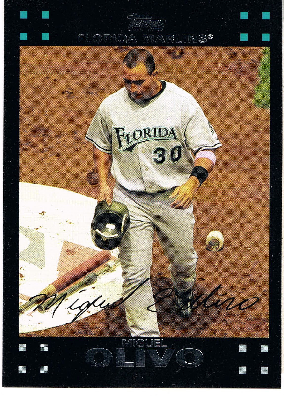
which has some intriguing hardware on display there. I can't recall seeing such items on any other card, though I would imagine such exist.

The rest of the Olivo card is just all wrong though. Every line on the card leads down; even the usually uplifting MLB logo (here nearly monochromatic in chalk, also kinda on-card unique) doesn't seem to help. Hatless cards are not always popular, but a player with his hat in his hands instead of wearing it isn't going to win many popularity contests. Just a downer of a card for a journeyman back-up catcher, with every plus matched by a minus. An interesting glimpse of the game courtesy of Topps however.

The Frandsen card is the only On-Deck card in Update, and Series 2 was not granted one either, although it did have a really nice Batting Cage card, which is every bit as rare as an On-Deck Circle card these days of course.

But I couldn't wander around in the On-Deck circle without posting a certain card from Series 1:
I would imagine this card was the subject of many a post back in the winter, when I hadn't quite fully hatched out of my turtle egg yet and was just discovering all you baseball card bloggers. I seem to partially recall a comment or two disliking the corporate logos on the card, but I am OK with those. I don't think Topps gets money for them or they are conspiring with Fortune 500 companies to make you want a hamburger. You see some logos here and there when you watch baseball, very occasional they then turn up on a baseball card. Big deal. It's not like we're as logo-ed up as NASCAR. Just imagine an unlicensed set of NASCAR cards...that might look weirdly cool, now that I think about it.

But overall just a sweet baseball card, On-Deck. I posted a parallel not to re-pimp my project (again), but just because the White Sox cards all look markedly better on the parallels, except the Camo parallel, my least favorite. There the Sea Turtle is just plain hidden, naturally, which kinda defeats half the purpose of the parallel. The White Sox cards are OK on their base glossy white of course, but much better in full color. I only picked the Target Red because it was the closest copy, on top of the nearest stack. This card looks good in every solid color edition and Gold, but loses everything when it goes off into the parallel Shiny universe.

Now this card does make me wonder if this might be the first appearance of the Golden Arches on a baseball card. I suspect probably not, but at this point of card-gazing tonight I'm a little distracted. Anyone got a hamburger?

Sunday, November 17, 2013

...and another thing...

you be Out!

Hey, wait a minute. What happened to my finger? What is that stuff there Topps? Hey, leggo already! That guy is Out! That's the last Out! I'm closing a game here, can't you tell? He's OUT! Now let go of my finger. No, I didn't say Pull My Finger you knucklehead. Let go already! OWww!

Friday, November 15, 2013

These cards make me dizzy

This side-set is starting out slowly. The second entry is really a doozy:

I don't want to go too fast finding these, or, well, you know, I might get...

Striking out at Petco

So I've made two posts in a row now where I have mis-underestimated what I was looking at on a baseball card.

And I'm glad to discover what I was really looking at. But I don't want to go for the complete K here, so I want to get this card figured out:
Is this Petco park in the background?

I ask this today because last week, before another short work delay in the blogging, I posted this card:
and was kindly informed by a reader that the Franklin image is from Petco.

And not from a Spring Training facility, which is only part of why I like the Franklin card, but is all of why I pulled the O'Flaherty card aside last winter when I was corralling the 2012 Update Surfboards onto binder pages. I like Spring Training shots on modern cards for that nice tingly Vintage flashback, though these are few and very far between lately, 'cept of course in the Archives sets.

That could become O'Flaherty's sunset card as he was released after the season by the Braves after not receiving any cards from Topps at all in 2013. Atlanta used him a lot less this year and though his WHIP remained decently steady, his ERA crept back up. I didn't bother considering all the ERA+ FIP .BABIP # deals to think about his career. I leave those concerns to the overpaid professionals.

Just another middle reliever who can't even make the Middle Reliever set of baseball cards, so we can all have those Home-Run Derby cards everyone lusts after, but I'm just on repeat here. I would think a 28 year old lefty middle reliever would likely find more MLB employment somewhere however.

Anyhow it appears Petco has a nifty outfield grass seating feature. If I'm ever in San Diego, which is extremely doubtful even though my career involves too much travel, I'd probably try catching a game from those likely cheap seats.

Otherwise, the only place I'll ever see Petco Park is on my baseball cards. The National League West just isn't going to appear on TV screens in Michigan all that very often.

On a related note, I thought I had yesterday's card figured out as well. At least I can be sure it was shot at Petco, since the Padres are wearing their home whites on the card.

But this is what the aftermath of Chris Denorfia's Walk-Off Home Run on July 29, 2013 actually looked like:

Which is what we have come to expect after a Walk Off Game Winning Home Run, particularly if you pick up a lot of recent baseball cards. I'm not sure when this tradition crept into the game, but I can't say it impresses me during a regular season game. There are only 161 other games to play. But then hitting a Walk-Off off Aroldis Chapman does call for a little celebrating I guess.

At least Topps is on top of things, showing me the state of the game of baseball, even if they didn't actually hook me up with the actual post-GWRBI photo I was leaping to conclusions about after reading the back of Denorfia's new Update picture card.

Here is the real photo from Getty Images that Topps used on the card:
And by finding the photo first, I then finally found the actual date of this shot, which turns out to be from June 26, 2013 against the Phillies, when Denorfia hit a 2-run Homer in the bottom of the 5th, also scoring Logan Forsythe (another boo-boo, let's call it a foul-tip, no Strike Out, yet, I hope) who is there behind him. And Chase Headley is correctly placed there in the on-deck circle as he was batting 2 spots after Denorfia that day, unlike the day of the Walk-Off...I should have caught that.

Still a more tasteful card than another mobbed-at-the-plate card, which are actually kind of boring, for me at least. The build-up on the back of the card just lead me down a different hoped for path a bit too quickly.

Also yesterday I was imagining what might have been with an alternative 2013 MLB photo that wasn't used on a card. The after-aftermath of Denorfia's Walk-Off included another image we have seen on a few cards this year (Opening Day inserts mostly and one Series 2 card) — a gatorade shower, including a lovely TV 'journalist' conducting an interview. If only Topps had given me a card of this action, perhaps taken 30 seconds later. I could see some things really standing out on such a card: