Showing posts with label 12 Update. Show all posts

Thursday, May 29, 2014

Baseball Cards = Art

If I hang it on my wall, that must be true, right?

Last year while working on an ongoing Baseball Card Art project, I picked up an essential item for it direct from the Topps Company, Inc. It will be seen on a future blog post, perhaps when I finish the project.

This year, somewhat out of the blue, Topps sent me a 50% off promo code for up to $100 of merchandise from their website. I knew instantly what I would spend it on, and that wasn't chasing Kris Bryant autos in Bowman Blasters.

Unfortunately, my insta-dream products aren't even here yet, as my purchases have been shipped separately. Topps, always bringing you closer to the mysteries of intelligent product distribution.

Instead the other day I received a brand new product that I didn't know was waiting for me on the current clunky-as-always Topps website, when I finally got it to load all 2000 some images of these things, simultaneously.

A piece of genuine Art. An image I have had permanently seared in my baseball and Baseball Card loving brain since I was 8 years old:


How do I know it is Art? Well I would fight to the Death anyone who would not agree that Art is in the eye of the beholder. If you say something is Art, then it is, simple as that.

But for the more up-tight types in the world who need external validation of their possessions ( /5 RC sparkle-crusted Chrome auto-relic collectors, for example), this piece of 10" x 14" Art comes with genuine Authentication of it's desirability:


Yes Sir, it seems I am only the 12th person smart enough to get in on this Limited Edition action.

Which kind of bums me out actually - as in, I think they should make a lot more than 99 of these babies. Because surely every baseball child of the 70s will want one, won't they?

However that turns out, I am rushing this post into 'print' on the chance that Topps is now shipping copy #89, and I thought all y'all fine folks might be interested in these. There is a whole set of baseball wrapper prints for sale


or were for sale, as I just surfed off to offer you a convenient link to these. eBay is fresh out right now too, for now, though I would imagine they will reappear soon as speculators realize Topps sold out of their stash.

There were also smaller versions (5" x 7") of these that came in 'packs' (irony is so tasty) for each decade, numbered to /49, though I would really scratch my head over anyone who wanted a complete set of art prints of 1980s Topps Baseball Card wrappers on their wall.

So, so sorry to disappoint here. I guess I pulled a hot product from the midst of my work-induced haze…thankfully that 50% off promo code had a strict expiration date or I would have been looking to buy one of these some now sad day in August.

Ahh well, let's return to the Art. This print really surprised me with a new component to one of the primary graphic design images of my life. Dots………….
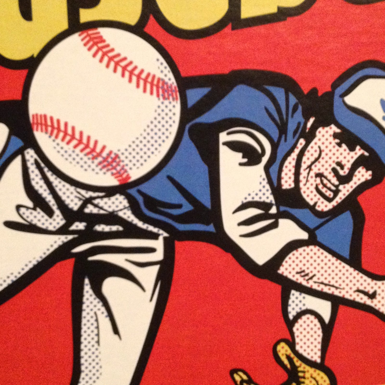

And here I am 39 years later still learning something from this image. The use of dots like that automatically makes anyone with a little grounding in 20th Century American Art immediately think "Liechtenstein!"

And I guess after all these years I have finally realized his influence on this wrapper. Topps had a long history of being attuned to the Art world, not just the sports world. But upon opening this package, I also noticed the dots are probably part of the image to produce a proper shading effect when the image is shrunk to use as part of a consumer product. Thereby realizing an insight into Roy Liechtenstein's work that I had never considered before.

See, I told you baseball cards were Art, and all before you even open the wrapper! The things I learn from these things… I so wish I could compare my new insights on this to the one 1975 wrapper I have in my collection, which is unfortunately still stuck in a storage unit while I can barely fit a card desk in my current living quarters. Arg.

Although I have made little progress on my ongoing goal of learning good photography composition techniques as that is just way, way down the always too long To-Do list (luckily babbling to you dear readers is much higher up the list), I am pretty sure a diagonal line is a strong element of an image. So is a flowing curve. So are primary colors like Red and Yellow. So is an image with motion, and an image that invites the viewer to wonder what is going to happen next. This image has all that, and a pack of cards inside. Come to think of it, all of those exact same compositional elements are part of my other purchase directly from my Topps master, which hasn't arrived yet, or else I would be short one future blog post right now.

I'm sure there are other things to learn and realize about this classic (All-Time?) Baseball Card image. I'll leave the Art Theory alone now and get on with some other great things I can gab about this. I failed  my only Art History class when I wrote up a 'review' of an assigned painting by trashing the ridiculously overwrought frame of the piece, loaded with ceramic grapes and fig leaves and gold gilt, just hideous, instead of writing about the painting inside the frame. I was told to write what I saw?

Now last year I was delighted to open a pack of Baseball Cards and find a sweet brand new Baseball Card inside:

This is one of my favorite Sea Turtles, for what should now be an obvious reason. Though I love card images that bring to mind classic wrappers (I've posted two cards that recall the '77 Topps wrapper), I've never posted this one because I kept thinking I could find a better example if I just kept looking at enough of those worthless base cards nobody wants any more.

Perhaps I will someday. Meanwhile as I have been composing this post in my head for the last 36 hours, Gallardo has won two games in two days - and he is in the starting rotation! Tonight he pitched 6 2/3 innings and got a W. I've always though a Pitcher should get an extra W (at least) when he gets a GWRBI. Yep, last night Gallardo, a former Silver Slugger winner, came into the game as a pinch hitter in the bottom of the 10th and delivered a walk-off Double. Topps had better keep it's act together and deliver me a classic Baseball Card of that next year. Or more than one.

At some point last summer that card led me to finally use this Internet deal to look into that image from the 1975 wrapper. I was hoping maybe someone had sleuthed out who drew it up for Topps. Instead, I found this:

Mets Card of the Week: 1975 Hank Webb box


which is a nice succinct write up of this image:

This is not something I could remember from 1975. When I saw those boxes of cards, ole Hank was likely already ripped off the top of the box, or tucked out of the way to make room for some other box of candy that generally surrounded Baseball Cards back then.

So the wrapper image starting out as a real photo never clicked for me until I stumbled across that blog post.

Of course in the 21st Century, Hank Webb's life story is just a few clicks away, and as it turned out 1975 was a very good year for Hank Webb as he cracked the Mets rotation for 15 starts and went 7-6 in the process.

And like the superstars on the wrappers and boxes today, Webb also has a card in the set he fronted for every single other card:

I'm pretty sure I have this card, as I can recall most of the cards of the Big Red Machine that rolled over my various Pittsburgh Pirate rookies, and I always seemed to pull cursed Reds cards.

This was actually his second appearance on a multi-player Rookie Card, which happened in the 60s and 70s but compared to young players today, well, whatever. The Mets360 blog has more on Hank here.

Also on that blog I learned that my Baseball-Card-wrapper-introduction-to-a-lifelong-fascination-with Art has a son.

Do I mean this one?
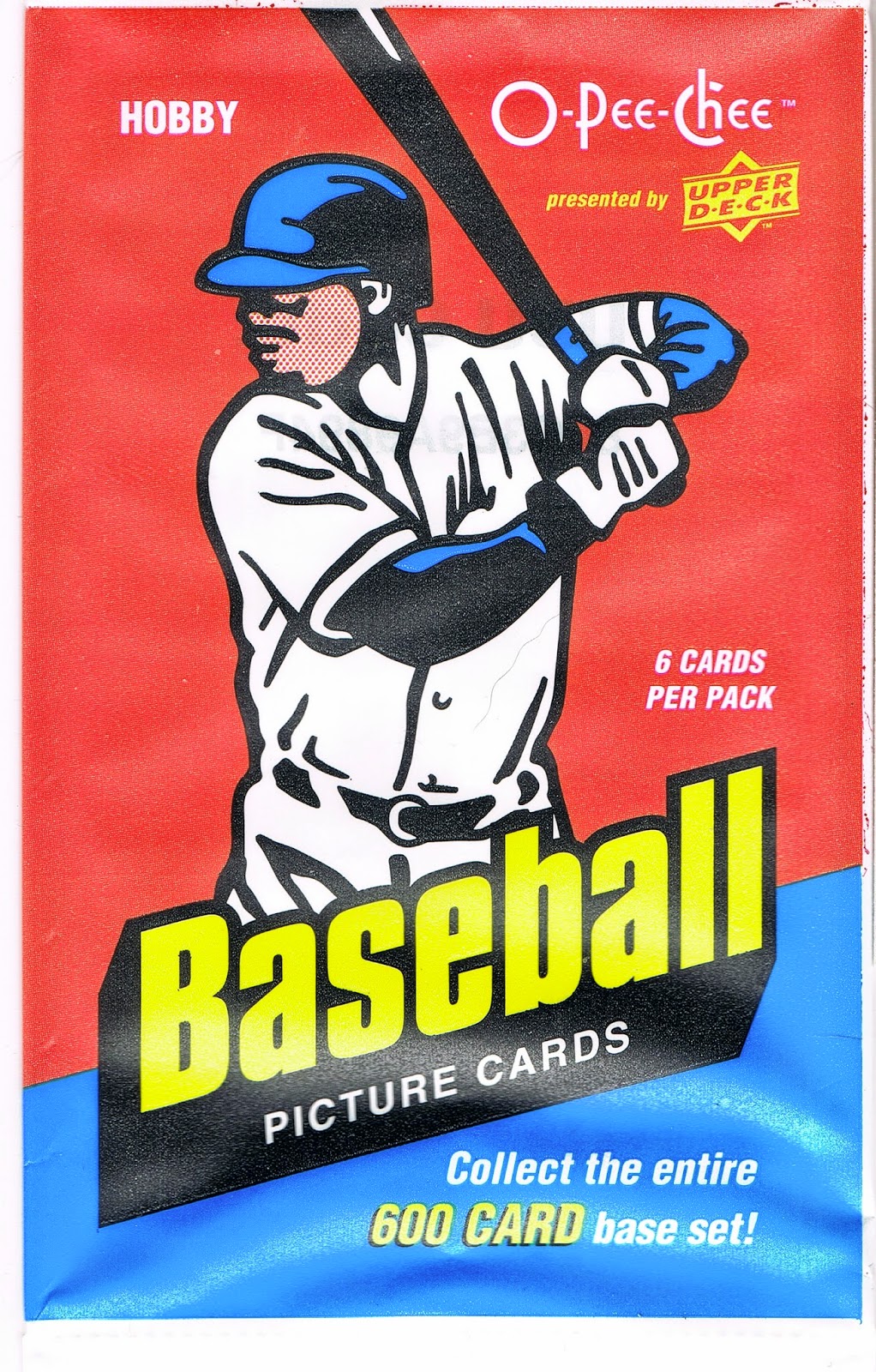


No, that is a topic of a future blog post some wonderful rainy day when I can finish ripping that box and starting in on collating that neat set of real cardboard Baseball Cards. But that wrapper definitely owes a little something to 1975 Topps. And some to 1977. And 1976.

It turns out that actual player on the 1975 wrapper that will eventually hang on my wall has a son that is pitching in the Major Leagues today, currently doing fairly well in the bullpen with Baltimore. And sure enough, I have his baseball card:

Whaddyaknow, it's a post release In Action shot of a right hander complete with leg-kick. Nice! This is a pretty good card, though it suffers from the usual practice of the current Topps Baseball Card set editor, who frequently has no concern for slicing off bits and pieces of the ball player with the card margin - that always looks sloppy to me in an age when any image can be manipulated quite easily.

[And really Topps, out of all the subset / inserts ideas you keep reusing for better or worse, bring back the Father & Son cards already. I think a whole lot of collectors would like that.]

Even so, the 2012 Webb card is another nice piece of Art. Art is more enjoyable with Context, and I have sure discovered a lot of that for 2012 Topps Update #US253. The Art elements I like are the banding of the infield grass and dirt, the sense of paused, just-completed motion, but with imminent activity as the ball reaches the plate, and the blurry empty seats in the background. That latter element is not a standard sign of quality Art, just a photo feature I always like on Baseball Cards.

Because as I mentioned above, that is what matters when it comes to Art and Baseball Cards. They are your Baseball Cards. You decide which ones = Art.

Wednesday, May 14, 2014

A Lot Going On #2 / What IS That? #9

I've been wanting to post this card for a while. Heck, I've been wanting to just post at all for a while. That job in the Town Without Baseball Cards became a 16-days-straight marathon.

But I made it all the way home finally, for the first time in 5 months. To where the bulk of my baseball cards live.

And my scanner, as in an actual sheet of glass with a cover real-deal scanner. So I scanned a card for you to ponder:

I have loved this card since the day I pulled one from a pack. Because of course, it has A Lot Going On.

At this point though, I have to stop and acknowledge a source I borrowed for the format of my blog; awhile back I noticed one of my other main card blog reads just over to your right there doing this. Repeating a post title with a sequential # is of course borrowed from the card blog that got me blogging, which else but the inimitable Night Owl Cards.

I really liked 2012 Update for some reason. I put it together by simply purchasing pack after pack. I can't remember what I was chasing in it, or why, but looking back on the binder pages now, well that is an enjoyable activity. It is definitely binder worthy. I am starting to have my doubts about that on a few other collecting efforts I have ongoing.

That's Brian Bogusevic there on that card, as even my sorta pro scanner can't handle foil-on-black. Bogusevic had been traded to the Cubs not long after '12 Update was released, though of course he still ended up on an Astros card in 2013 Series One. Which begat him a Cubs card in '13 Update. Perhaps that created the mojo that had him shipped to the Miami Marlins last November, in exchange for the ice-card man Justin Ruggiano. Topps seemed to know the future on his career as he was left out of '14 Series One and he reportedly had a tough go of it in Spring Training this year. He is currently "raking", as they call it, back down in AAA, but Miami is loaded with young outfield talent and I'm not quite sure why they felt the need to trade for Bogusevic to start with.

Be that as it may, this will always be one of my favorite surfboard cards. I always like cards showing the railings in the stands - they set up a great sense of the lines of the image.

And what a menagerie this image contains. Quick, name another baseball card that features two different uniforms of the same team on the same card. Or one that features two player uniforms AND a team executive get-up too.

What is that exec up to anyways? Drinking a beer in the stands? How many baseball cards show an actual container of beer? It looks like a tall-boy of Heineken to me, but let's go to the Zoom and find out:

Hmm, could be one of those energy drink things the kids today are all so addicted to that they can't figure out why they don't have any money to spend on sensible things like baseball cards. I'll just always presume this is a can of beer though. Beer and baseball, mmm-mmm.

But that is just ho-hum compared to what else is happening on this card. Over to the left of the would-be drinkin' exec, it appears a now somewhat frightened fan brought her dog to the game. A dog on a baseball card? I know that happened in those wacky 90s, but in the stands? Let's make this laptop in my lap earn it's keep:


Rover's arm looks a little stiff there, must be … stuffed. ? A stuffed animal on a baseball card? Surely even the 90s couldn't have accomplished that?

And what is going on with that stuffed dog anyway, it appears to be wearing something. It has multiple colors and some sort of number or icon, much like a … baseball uniform. Four uniforms?

And that older gentleman calmly checking out this sweet catch by Bogusevic (the baseball appears on this great card too - it is snagged safely in the glove), he is wearing something that sure looks to have an S-T-R-O on it - A-S-T-R-O-S = another uniform. Five different uniforms on one card? That has to be some sort of record. Four from the same team, even an All-Star Game card couldn't achieve that.

Then we have a final mysterious element:

So What IS That? A coat? A purse? And what's in there? If Bogusevic doesn't make this catch, is this person going to bring the pain down upon him somehow?

And Who IS That? Looks nicely "Chinese-Eyed", an expression from my youth which had nothing to do with ethnicity. Is there a bong in that coat-purse thing? Is Lindsay Lohan a let's-go-to-the-stadium baseball fan? Nice hat.

I like cards with lots of mystery elements; I still like the very first one I found, and I must admit one reason I finally got around to blogging up this 2012 card is that I want to simply show-off a recent acquisition of a special edition of the card I wrote up in the first installment of this series. I didn't make it on time for an apropos anniversary posting a few days ago, but I am just tickled, of course, pink:


Friday, November 15, 2013

Striking out at Petco

So I've made two posts in a row now where I have mis-underestimated what I was looking at on a baseball card.

And I'm glad to discover what I was really looking at. But I don't want to go for the complete K here, so I want to get this card figured out:
Is this Petco park in the background?

I ask this today because last week, before another short work delay in the blogging, I posted this card:
and was kindly informed by a reader that the Franklin image is from Petco.

And not from a Spring Training facility, which is only part of why I like the Franklin card, but is all of why I pulled the O'Flaherty card aside last winter when I was corralling the 2012 Update Surfboards onto binder pages. I like Spring Training shots on modern cards for that nice tingly Vintage flashback, though these are few and very far between lately, 'cept of course in the Archives sets.

That could become O'Flaherty's sunset card as he was released after the season by the Braves after not receiving any cards from Topps at all in 2013. Atlanta used him a lot less this year and though his WHIP remained decently steady, his ERA crept back up. I didn't bother considering all the ERA+ FIP .BABIP # deals to think about his career. I leave those concerns to the overpaid professionals.

Just another middle reliever who can't even make the Middle Reliever set of baseball cards, so we can all have those Home-Run Derby cards everyone lusts after, but I'm just on repeat here. I would think a 28 year old lefty middle reliever would likely find more MLB employment somewhere however.

Anyhow it appears Petco has a nifty outfield grass seating feature. If I'm ever in San Diego, which is extremely doubtful even though my career involves too much travel, I'd probably try catching a game from those likely cheap seats.

Otherwise, the only place I'll ever see Petco Park is on my baseball cards. The National League West just isn't going to appear on TV screens in Michigan all that very often.

On a related note, I thought I had yesterday's card figured out as well. At least I can be sure it was shot at Petco, since the Padres are wearing their home whites on the card.

But this is what the aftermath of Chris Denorfia's Walk-Off Home Run on July 29, 2013 actually looked like:

Which is what we have come to expect after a Walk Off Game Winning Home Run, particularly if you pick up a lot of recent baseball cards. I'm not sure when this tradition crept into the game, but I can't say it impresses me during a regular season game. There are only 161 other games to play. But then hitting a Walk-Off off Aroldis Chapman does call for a little celebrating I guess.

At least Topps is on top of things, showing me the state of the game of baseball, even if they didn't actually hook me up with the actual post-GWRBI photo I was leaping to conclusions about after reading the back of Denorfia's new Update picture card.

Here is the real photo from Getty Images that Topps used on the card:
And by finding the photo first, I then finally found the actual date of this shot, which turns out to be from June 26, 2013 against the Phillies, when Denorfia hit a 2-run Homer in the bottom of the 5th, also scoring Logan Forsythe (another boo-boo, let's call it a foul-tip, no Strike Out, yet, I hope) who is there behind him. And Chase Headley is correctly placed there in the on-deck circle as he was batting 2 spots after Denorfia that day, unlike the day of the Walk-Off...I should have caught that.

Still a more tasteful card than another mobbed-at-the-plate card, which are actually kind of boring, for me at least. The build-up on the back of the card just lead me down a different hoped for path a bit too quickly.

Also yesterday I was imagining what might have been with an alternative 2013 MLB photo that wasn't used on a card. The after-aftermath of Denorfia's Walk-Off included another image we have seen on a few cards this year (Opening Day inserts mostly and one Series 2 card) — a gatorade shower, including a lovely TV 'journalist' conducting an interview. If only Topps had given me a card of this action, perhaps taken 30 seconds later. I could see some things really standing out on such a card:

Sunday, July 7, 2013

I Don't Know, It Must Have Been The Roses

All I know I could not leave this card behind:


Pretty sure I've never seen roses on a baseball card before. I'm positive they have been on some college football cards, even though I have never seen a college football card and don't really ever want to.

I'm sure they are on some non-sports cards I have, and some I don't have.

I spent some time poking around the internet for some details on this photo, but couldn't find any. The Twins don't seem to have a solid color road alternate uniform, so this has to be from Target Field. I have seen some identical white grating in some photos of the ballpark. It figures that one of the friendliest, classiest states in the country, Minnesota, would decorate their ball-park so tastefully.

It would be great to know who hit what appears to be a Home Run here. Or maybe it is a new special subset of cards, the "Fan Interference" set. Can't say I've ever seen that on a baseball card either. Such a mystery here...what did the Umps have to say about this one? Let's just hope no roses were harmed.

That picture is of course from the short-prints distributed with 2013 Series One. The subset even had it's own name, and unifying theme - the "Out of Bounds" cards. The short-prints in Series Two have at least two different themes, and no name for the collection. The Out of Bounds image theme itself was not applied that consistently across the Series. Buster Posey's short-print image variation is the same exact action shot as Geovany Soto's regular base card, for example. But then when is Topps ever completely consistent?

I like the Series One cards, and am working on a set of them. I currently hold 5, with 2 more on the way. I bought my first one a few days ago - Andre Ethier, for only $3.50. I am hoping prices on them continue to drop. It will be a long time before I ever purchase the Bryce Harper card on this checklist, although I have his '12 Update short-print to miraculously find a trade partner for.

I got the Willingham card in a trade with the Chipp 'n' Dale blog; I'm pretty sure I approached James with an offer to trade for the Willingham. I can't recall if he posted having the Willingham available, or I just asked for any short-print he might have. I'll post a trade bait post of all the other non-'13 short prints I have up for trade eventually.


I would like to collect a complete set of the 'Sea Turtle' cards this year, across all the sets they appear in. But I know I never will, because I don't like non-baseball Baseball Cards. Press conference cards, San Francisco trolley cards, etc. If they were regular commons worth a nickel, sure, fine. Even a quarter, OK. After that there is just no way I am that collectorly of a collector to pay real money for a picture card that doesn't show someone wearing a baseball uniform.

The card I traded away to get the Willingham is probably worth more than the Willingham on both the supply & demand sides of the "what's it worth?" equation. It was from the 2012 Update set which theoretically would have a smaller print run than Series 1, though us lowly customers are never privy to the true production statistics of the overly expensive glossy picture cards we buy over and over again.

And I am sure the player I traded for will always have far higher demand for his cards than an OK outfielder who probably peaked in run production last year (which probably earned him a spot in Out of Bounds more than fielding prowess). Even though the card I traded away has great lurking clouds and is actually a nice card you can't help but like, I am very happy to have a baseball card with roses on it instead, and also have been thinking well how it will live happily ever after in all good company.


Monday, June 10, 2013

So if this is a Tatooine card


What should I call these?


I wish I could recall which blog I first saw the phrase "Tatooine Card" on; I have run across it several more times. I did my homework and I understand it was probably first applied to the 1971 card from the 1970 World Series.

But I think the 2013 Jones and Choo cards are a new type of baseball player image, for me at least. I had seen one previously, and there are probably earlier examples I will discover eventually. There are lots of pitcher cards that come close to being 100% green in the frame, but I won't count those. I'm a purist — I collect baseball cards.


I liked the Abreu card ('12 Update) when I first found it not long before '13 Series One came out. I thought it was a nice touch by Topps, a nice action shot for his "sunset card" (another name I struggle with, another topic for another night). I even put it on a page of night cards, but ixnayed that in the long run on the outside chance the photo was shot in Arizona. Dome cards don't count.

I will be collecting each; i.e. Tatooine, and .... but I just can't settle on a name for the 'Turf Cards' - what if it is real grass? 'Grass Cards' - what if it artificial turf? Should I put a piece of artificial turf on the binder for 'em? It comes in rolls and is for sale down at the Big Box hardware store, cut a piece any size you like. You know, the Big Box stores that don't have any baseball cards. This is starting to give me a flashback......to a party in Amsterdam almost ten years ago now. A buddy of mine was squatting in a closed elementary school. He was sorta working for the anti-squatter organization, which places people to live in buildings, you know, to keep the squatters out. Europe has it together like that. His neighbors down the hall were setting up for a late-late-night soiree while I visited, which included the usual lights, DJ equipment, and rolls of sod. Yep. These urbanest of urban kids covered every flat surface with live grass. Attendees would invariably step in and run their fingers through it and plop down on it, absolutely delighted. On that same trip I scored the absolutely coolest card I own. Truly cool, not nerd cool. But that one hasn't emerged from storage yet, and that might be a while. Don't worry, you'll get to see it. Cuz I for sure want more of those cool cards. It was from L.A. actually, to reconnect this to ole Bobby up there.

Meanwhile, back in 2013, I'm still drawing a blank. "Don't Take Your Eyes Off The Ball" - what if the  outfielder already caught it? Same problem with "I Got It!"

I don't got it. I don't know what to call these cards.


Tuesday, March 19, 2013

Yeah, I read the backs


And the bon mot above is one of the better ones I have ever read on the back.

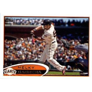
Melky was suspended on August 15th, 2012, so I'm thinking the Topps Update editor must have finished his (c'mon, don't you daydream that Erin Andrews actually does this?) work and had the cards off to the presses before that date. I'm sure they would have preferred a Do-Over on this card.

Personally, I wish Update would come out a fair amount earlier. I think it would sell better if it arrived with more time left in the regular season. I'm no expert on such matters. A release date of October 1st means many fans who's team isn't in the playoffs are probably buying football cards instead, methinks. I know Update is tied up with the All-Star game now, and the trading deadline of course.

But last year's Update set creates a question on this. The blockbuster Red Sox <> Dodgers trade was announced August 25, 2012. And Topps had time to create a few super-duper-short printed cards of the major stars in that trade. Perhaps those versions were created and printed during production and the special cards then hit the market a bit later in October; I don't know.

Probably an accidentally goofy statement on the back of the Melky Cabrera card wasn't high on the list of details to cover for the release of the set. I'm sure it is much more important to Topps to keep the amounts and distribution of their manufactured rarities just exactly perfect. But with the All-Star game on July 10, and the so-called trading "deadline" (don't ask me) on July 31st, and then a blockbuster trade on August 25th still kinda-sorta being able to make it into the Update set.....is Topps run by Europeans who just take the summer off?

It seems like when I was a kid, those wacky Traded cards came out in late summer, so you still had time to play with them, while baseball was still being played. Then you could take that card where you had crossed out one team's name and written in the player's new team and stick it in your bicycle spokes to give an already mangled card a properly mangled burial. The new Traded card set the record straight, and that was the one to keep. Who needs a card with the wrong team on it?

But there is one other remote possibility about that sentence - Topps has total faith in Melky. And some people do say that about PED's - they don't help you make contact with the ball. Maybe the greenies do though. More upper-body strength should get you more hits though, as your drives rip past the infielders faster than they used to. So perhaps Topps is declaring that Mr. Cabrera will spray the ball all over the Sky-Dome just as he did at the new Candlestick or whatever the heck they call the Giant's ball-field, and like he did at Kauffman Stadium too. But I doubt it. On both counts, if you are following closely here.

I'll be watching to see what they put on his 2013 cards, that's for sure. I'd wager that they avoid the whole thing by adding his minor league stats to his Series Two card, so there is no room for comment.

Whew. Oh where a sentence on the back of a baseball card can take me. To keep from getting too wordy yet again (I thought this would be a short post. That first sentence on the back of the card kinda just says it all, not that that stopped Me), let's look at the front of this card:

I actually love this card as a baseball card. It would make several of my Frankensets I like to look at - it's a Horizontal Card, There's A Baseball On My Baseball Card (with such good stop-motion photog action these days you can see the seams on a live pitch), and it's a Bunt Card. 

I think it might be the first Bunt Card I can recall actually — I will soon post another one to launch a quest for all the Bunt Cards I can find. 

And then Melky has a red bat. I can't recall where else I've seen a red bat. One other Giants card in the last 2 years I think, but I forget which. And since baseball cards are my main visual reference for the game, I really noticed this one. Now of course I discovered this card, like everyone else, with full knowledge of the partially comical Cabrera saga. But looking at the red bat on there, it makes you wonder a little.....is it a sign? Melky with red, trouble ahead? Dunno. And I haven't figured out what goofy name to use for a Frankenset full of colorful baseball gear - Hey, Look: My Bat Is RED won't work for the blue glove and pink bat I have discovered elsewhere in the world of Topps recently. Frankenset meme under construction here.

As for cards in the steroid era, I wonder if today's news on Topps remaining exclusive until 2020 will have any other details in the fine print. Not that we card collectors will ever be able to read those details, at least not until 2040 or so when Topps sells off it's copy of the contract perhaps.

But given the flap over even printing the name "Pete Rose" in tiny type on the back of a baseball card this year, it leads me to an obvious thought. If Topps is MLB and MLB is represented on Topps baseball cards, perhaps part of any PED suspension could include Topps. So a busted player would be dropped from certain sets via some mechanism.

I mean, PED's, and even non-performance enhancing drugs, are banned in part because of the poor & dangerous example they set for kids. Sometimes I think too many things in our country are set up that way in my opinion, but this is one I can agree with easily. What about the children? But I'm here to write about baseball cards, not Society.

So when the hypothetical young baseball card collector is building a set and there is no Melky Cabrera in it, even though the kid remembers him winning the All-Star Game MVP last year and he just saw him go 1-for-5 leading off for Toronto on the Saturday Game of the Week, the no-baseball-card-for-cheaters lesson hits home a little bit. If, in fact, kids still buy baseball cards, rather than just Comic Book Guys who like to hang out down at the Android's Dungeon and bitch bitch bitch about their cardboard master all day.

Just a random tangent my mind was led to by the back of a Topps baseball card. Where will these things lead me next?

Friday, March 1, 2013

So how do you trade these things?


Yeah, I know the basics. First you trade emails, then cards go out in the "snail mail." I did it in the 70s without the email step; I hope I might have some of the little flipbooks left that you mailed around with the trades. That would make quite a blog post.

I hope to stick to the blog standard of one post / day. I had a great post all dreamed up yesterday about Cardinals manager Mike Matheny and his new public call for a rules change regarding Plays at the Plate, and a discussion about it on the Tigers broadcast yesterday. Jim Price, a former catcher, weighed in, and they reported Jim Leyland's take on it. Leyland is also a former catcher and sits on the MLB Rules Committee of some sort.

I also went looking for cards of Jamey Wright, a classic "failed 5th starter, converted to well traveled reliever" trying to make the Tampa Bay team this year, and the Ray's skill at cobbling together a bullpen from the 'scrap heap', an idea straight from my favorite broadcasters. Jamey is probably not regarded fondly in many a baseball town.

Then my internet service went down. I was at a loss. When you live off the ubiquitous "Free Wi-Fi!", sometimes you get what you pay for.

I figured a reliever had to be in the Update Set, and I have the 2012 Update with me right now as I built it over the last several weeks. I couldn't find his card and finally nodded off reading card backs and flipping binder pages. I was right that Wright was in the set, I just didn't make it to his page - his card in 2012 was #US324. It's a nice-ish one; not much to write home about. A blurry Cub is lurking on 1st base, kinda leading-off a little casually, no crouch. Jamey must not have much of a pick-off move. Or he is in the game on 'mop-up' duty and it doesn't matter what the baserunners do anymore. I love 'mop-up', but that's a term from another world. Could be a night card. Heck, it could be Brad Pitt impersonating him, hard to tell:


I had spent all day composing the piece in my head while I listened to the broadcast while working. But the fine points are all gone now. And I sure have figured out how to post pics of baseball cards without a scanner.

But I have lots of questions about trading, and I want this post near the top (or the bottom, as the case may be on a computer screen). I'm wondering what the standards are. I wouldn't want to disappoint someone - particularly a card collector. Was the word 'finicky' brought into our language to describe cats, or to describe people who love their......stuff?

a) The Envelope - does it have to be a padded mailer? Or would plain manilla work? Plain white 'bidness'? Would that depend on the # of cards perhaps?

(When I went shopping for mailers how could I resist the brand with 'superior edge protection'? Plus I preferred using recycled stuff whenever I can).

b) Protecting the cards - what is the standard? Toploaders for every card? Or are simple Card Sleeves good enough? Or can you just put commons in the envelope? I think I would probably be fine with that last option.

I just want to know the standards in the trading blogosphere. I like that 'toploader' is considered a misspelled word but 'blogosphere' is not. Anyhow, don't be shy, speak up.

But I have more questions. Let's say I do use that mailer - how much would postage be? I have a very hard time making it into a Post Office when it is open. I work back in the woods you see (now with link). So I will want to buy up stamps in advance so I can drop envelopes in the mail when the Post Office isn't open.

What happens if I use 'media mail', or whatever it is that isn't "First Class" and thus cheaper?

So what's the deal? Maybe this post can get things going. Go ahead, vent a little about That One Guy that sent you cards that showed up all screwed-up now, and how will you ever track down another copy of That One Card? Or shovel compliments on some favorite blogger who does it just exactly perfectly.

OK, OK, kind reader, you came all the way through this boring blog post thinking - that's a Bryce Harper short-print up there! - What are you going to do with it? Why is it there? Why does Bryce wear purple to a parade? Is that the very first cell-phone card? I bet that fan feels a little goofy, if he knows he is now on a somewhat-hard-to-acquire baseball card, engrossed in his phone (with 2 hands no less, must be a gamer, not a baseball fan) for all eternity.

Well a picture of a pack of mailers and a stack of toploaders wouldn't be very exciting, would it?

Yes, Bryce Harper is on the trading block. I hope the Google web crawler extracts that neat little sentence for some internet hi-jinks. I could be as famous as that anonymous fan in the blue shirt.

But there is only one card I would really trade it for:


No, I am not a Bryce Harper fan (or foe, I just don't follow the NL East much). I am simply chasing the 2013 short-prints, as I prefer action-shot baseball cards, and Topps is all about that these days. Which is a big reason I have returned to collecting baseball cards.

Normally I'm not into attempting to acquire rare cards. In fact, I have been participating in the hobby in an exclusively non-on-line way the last couple years, as you'll discern in blog posts to come, and this is the first I have heard of short-prints actually. So I figured Update series cards should be printed a little less than The Topps Set, and a good supply of extra '12 Updates will make for good trade material. Yet another future post for you to anticipate.

So I would like to have all the new SPs (only 2 pulls so far for me - Kemp and Youkilis), and it looks like Mr. Harper will be the hardest one to acquire. Unless of course he hits a severe sophomore slump from Opening Day till the All-Star Break. Maybe I should just wait and see on that. But if that were to happen, his 2012 Update set Short Print will be equally worthless, so I figure it's best to just try for a simple fair trade on it now. It might take that long for my blog to have enough readers to get this done..... ???