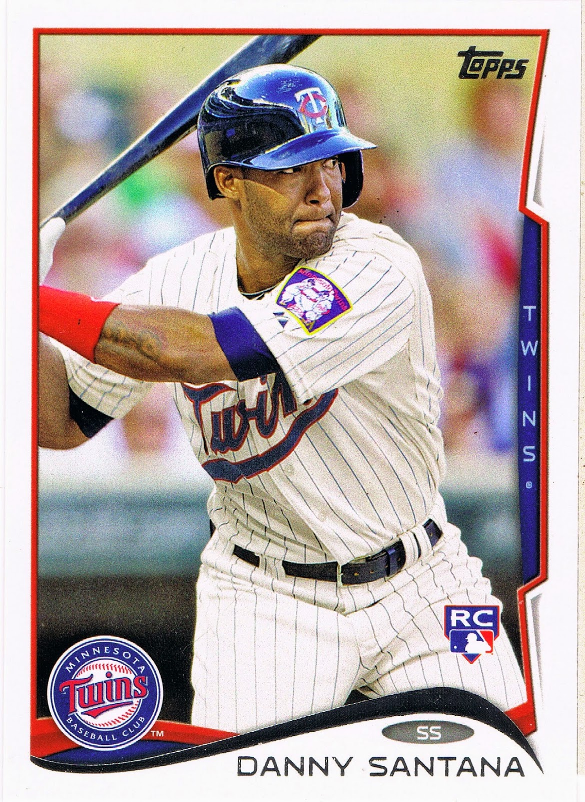
The tire store was across the parking lot from a K-Mart. A K-Mart I hadn't previously pillaged for any possible remaining Mike Trout rookies. And the tire clerk had forgotten my truck has a diesel engine = I needed a higher load range tire than they had in the shop.
So off to K-Mart for a little Trout fishing. Early to bed / early to rise / fish all day / make up lies. I'll be honest here though - there were no 2011 Update packs to be had, which wasn't too surprising.
But the baseball card jones had to be sated. I selected this:

I have been skeptical of these. I like repacks. But a big reason I like them is I at least get to know one of the cards I am buying. Yes, I am a box searcher. I look through all of the packs to figure out which one has some goofy card I like, before you get a chance to pick one blindly, without even looking.
But I can't do that with these obviously. Here is the rest of what this pack promises, hidden behind the ugly green plastic:

Well that's good, of course I want to collect my Favorite Stars from a Championship Collection of Trading Cards. Who wouldn't?
And though I keep wanting to work on another post unrelated to repacks, well, this repack might have a card that I can use in that post, so, just to be sure, I'll open this repack first.
But first, let's inquire a little more skeptically. Where did this repack come from? As always on this blog, let's check the back:

Hmmm, I thought you could get in big, big trouble for being an MJ Holding Company. And I'm pretty sure Michael Jordan might enjoy a few recreational sports cards in his spare time, but I'm also pretty sure he's got bigger companies to run than a used sports cards repacking company. I have seen this name before somewhere, I will have to look into this mystery company sometime. This was part of my goal of buying this pack. Journalism. Serious, heavy-hitting, data-driven, well-researched Journalism. Yeah, that's the ticket. I was going to get real with these repacks, and count the cards inside. But there's 100 cheap-ass baseball cards inside, we already know that, silly!
No, I was going to help educate just what my loyal blog readers should expect for their hard-earned five spot from those 100 baseball cards. How much junk wax? How many cards from last year? Which manufacturers paid off this repacker the most? How many "hits"? Would I break even buying this pack, or could I turn a profit flipping repacks? (You'll be surprised….)
But then, this happened:

WHAT! Repackers can't do this! Sure, they can cruelly Bip you with multiple copies of the same card, but they are not supposed to just put stacks of cards all from the same junk set in there like they didn't even care about the product they so lovingly distribute to baseball card addicts like me. I mean, if I wanted cards all from the same set, I'd buy one of those repacks full of actual junk packs of baseball cards.
So much for my serious research. Ruined by bad data before I even start. There is only one solution — I'll have to buy another one of these repacks to see if MJ Holding Company has formed a habit with this practice. Darn.
OK, OK, let's look at some baseball cards already. Here is that crucial tone-setting first card:




Hey, a Manager card. I like Manager cards. In fact, that will be the title of an upcoming post. I knew this repack would help me be a good blogger. And if you love baseball cards, you have to have lots of Alou cards. We'll save this one for further consideration some day in 2017, at this rate. But 2003 Topps? There are reasons I drift away from baseball cards once in a while. I like colorful cards. I like strong primary colors. But I think this set puts me to sleep, and it's already late.
What's the next card?
Hmmm, that MJ Holding Company repacker person is more sly than I thought. The second card is the famous baseball player replaced by the first card! Maybe MJ can help you understand the game of baseball after all.
I'll have to blame these poor scans on the beer though. I ran a chainsaw a bunch today, and to try and get the taste of gasoline off the tip of my tongue, I went with a heavily hopped beverage - 2014 Sierra Nevada Celebration Ale - and forgot to check how the scanner was registering the cards before I scanned them all for you. Sorry about cutting off the tops of the cards there. Bad blogger, bad. This will be a problem for the whole post, oops.
That's sure a lot of blue on that card though. I like it though. Nicknames make for better baseball cards. I'll read the back later, let's keep flipping through these blue cards:
It's a Manger Hot Pack! Yippee! This is a very rare "In Action" Manager card, though you can't really expect a 72 year old baseball lifer to challenge the photographer to stay in focus.
But this was my first clue these cards came from an actual baseball card collection. Luckily for me, that collector who sold their collection to MJ Holdings Corporation - hmmm, I wonder what you could get back in trade for baseball cards from them? - well, they picked up the Traded set from Topps in 2003, which is where Topps put all the Manager cards that year. Which is a pretty good idea Topps could use when they have a hard time filling out all 330 cards in the Update set these days. BRING BACK THE MANAGER CARDS! please.
But I couldn't be that lucky to purchase 100 Manager cards at once. I also found this card:
Nice palm trees! I think this card might hold down the Twins shoulder patch binder page slot for a while. Me likey.
So much blue though, isn't there some other set of cards in this repack?
A blue bat! Blue empty seats! Blue alternate uniform! There is no escape from the blues, every grown-up knows that. I'm pretty sure I've never seen a blue bat on a baseball card before though. I'm also pretty sure 1989 Donruss is going to have a tough time convincing me to keep any of their other 659 cards with a design that boring. But of course, with baseball cards, there's always the next pack…
This pack was pretty loaded with those cheap flimsy cards though. That portion of it did have one other surprise:
So for you lazy types that couldn't be bothered to figure out how to put the challenging jigsaw puzzle together even though you already owned hundreds and hundreds of the baseball cards that came out of the same packs, they gave you a cheater card showing you what the puzzle looked like? I did not know that. I'll use this to my advantage. Clearly, the one cool piece of this puzzle would be the one with the Brave on it. Sorry, Warren, this puzzle just doesn't do it for me, and nether does this set of baseball cards.
But that's the beauty of a repack - there are always other sets to check out:
Back to the blues. Does this pack have a theme or what? And What IS That in Tony's uniform there? A Saturday Night Special to really put the fear in base runners thinking about stealing one? Never trust a Pirate. And those fore-arm bands? What's up with that?
Even beer can't help you escape from the blues, trust me:
Something doesn't seem right about that card. Those pesky red Empty Seats? You thought I liked these cards. I do, I do, that's not it. That Espy card is a classic. No, no, it's something else...
There, that's better. Whatever possessed the Mariners to switch to teal anyway? Teal is pretty classy, sure, but the ocean is blue, everybody knows that.
And what about collecting my Favorite Stars like I was promised?
Everybody likes an Eddie Murray card. But wasn't there some of those chippy black border cards everyone hates in here somewhere?
And wasn't I complaining just yesterday about lackadaisical baseball card editors carelessly dropping graphical elements on the cards? Yes, yes I was. But I dig that Win! Twins! logo. Looks like I'll have more Twins patch cards to be looking for.
I'm not sure what to make of 1987 Donruss. I mean, it's like every card got run over by one of those old-time bullpen buggies I discovered while wasting time on the Internet, like you are right now:
Which are pretty cool. I hope that idea has been factored into a nickname for this set. I mean, I do like black border baseball cards, they make the colors in the image just pop oh so well. I wonder what else I can find in 1987 Donruss?
Shazam! Now there is a puzzle I would like to complete! And they call this stuff junk. At least that means it will be cheap!
There was quite a stack of these cards in the pack, but sadly no puzzle pieces. Were there any more good cards?
All-right all-right, another cool Mark Langston card. His binder page will be filling up before I know it. That star sure does look pointy, Mark, good thing you usually have a great leg kick going on your cards.
I think there were a lot of famous baseball players in 1987 sets. I sure hope so, because they sure printed a lot of their cards, which is good for me, so I can find sweet Hall of Famer cards like this one:
Nice. Though again I wish I could re-assemble the card and put that old school Sox logo over in the left corner, a little more outta the way.
Yes, 1987 Donruss seems like it could be enjoyable to assemble, particularly since I won't let 1987 Topps grow into very big piles. And I'll need some 1987 cards to keep up with my baseball history:
Why there's Johnny Football of his day. Quarterback of the Michigan Wolverines but made Pro in Major League Baseball instead. I doubt you'll ever see his like again. He was pretty famous in Michigan when I was growing up, but I never knew he was also born right there in Ann Arbor - what a storybook baseball card, thanks Donruss. I'll have to keep an eye out for more of his cards and see how his total career turned out, I forget these things. Here he is in 1987 already a DH though, hmmmm…
Well, so much for my repack with a very low score on the variety index. Let's hope the repacker tried a little harder putting the second stack of cards together:
Sweet. A baseball player from the very first set of baseball cards I ever collected, still going strong on cardboard in 1991. This would be Frank's final of 3 Upper Deck cards, but is better than his 91 Topps. This pack is off to a good start!
Though this is a rather routine action in game - the runner is already safe on a pick-off attempt - I always like a card where the fielder hasn't closed his glove on the ball yet. Hey man, nice shot. Upper Deck was also known for intriguing photos on the back of course:
I think this might have been one of Bryce Harper's favorite cards when he was a little boy.
It was nice to see a short run of 1991 Upper Deck to start the next portion of 50 cards, because that set is full of these types of cards:
Now there's a Pitcher In Action card. Repacks usually have a generous helping of early Upper Deck issues, quite probably because the print runs of those cards are pretty high I imagine. This will work out well for me, because I think I will just keep an occasional UD '91 until I have 9 really good ones. They are not all fabulous action shots though, Upper Deck also liked to have fun posing the players:
Another great Empty Seats card, naturally in this pack with blue seats. Yes, all four of those cards are keepers. That card has some potential for use in the post I try to keep working on, if I didn't keep buying new repacks lately. Once the card designer puts a team logo on the card, you can quickly get triple logo cards. Unlike this set:
Perhaps Leaf was just practicing here for their unlicensed future. With no logo or even team name, the photo selection doesn't come through to support that design decision. And I have never liked the main element here, recalling the little sticky-back thingies you would use on each corner of a photo to affix it to a page in an album, you know, when people kept their photographs without using electronics, back when we had to walk 3 miles through the snow, each way, to get to the one room school house, sonny. 1991 Leaf will be a one-and-done set in my binders - I will probably just keep one card from it, when and ever I find a really, really good one.
Perhaps someday Leaf will hook me up with a card from my oddball personal baseball card memes like this Stadium Club does:
This card could read Louisville Slugger for the name and I would be happy to accept it as a Lurking Catcher card. That bat looks like it's up to something…I'm always on the look-out for Floating Bat cards now.
With a hit of Stadium Club, this repack is finally starting to behave like a repack. And nothing says repack like a shiny 90s insert:
I might scan that one again to see how it turns out a second time. Or, I might have a Shiny 90s scan-off contest - wait till you see a 95 or 96 Pacific Oooooh, Shiny I pulled from my extra repack the other night; just ridiculous. I'll give you a heads-up in advance so you can have shades handy that night.
Did I just type the word night here in the middle of the night? Did I find a night card? Yep.
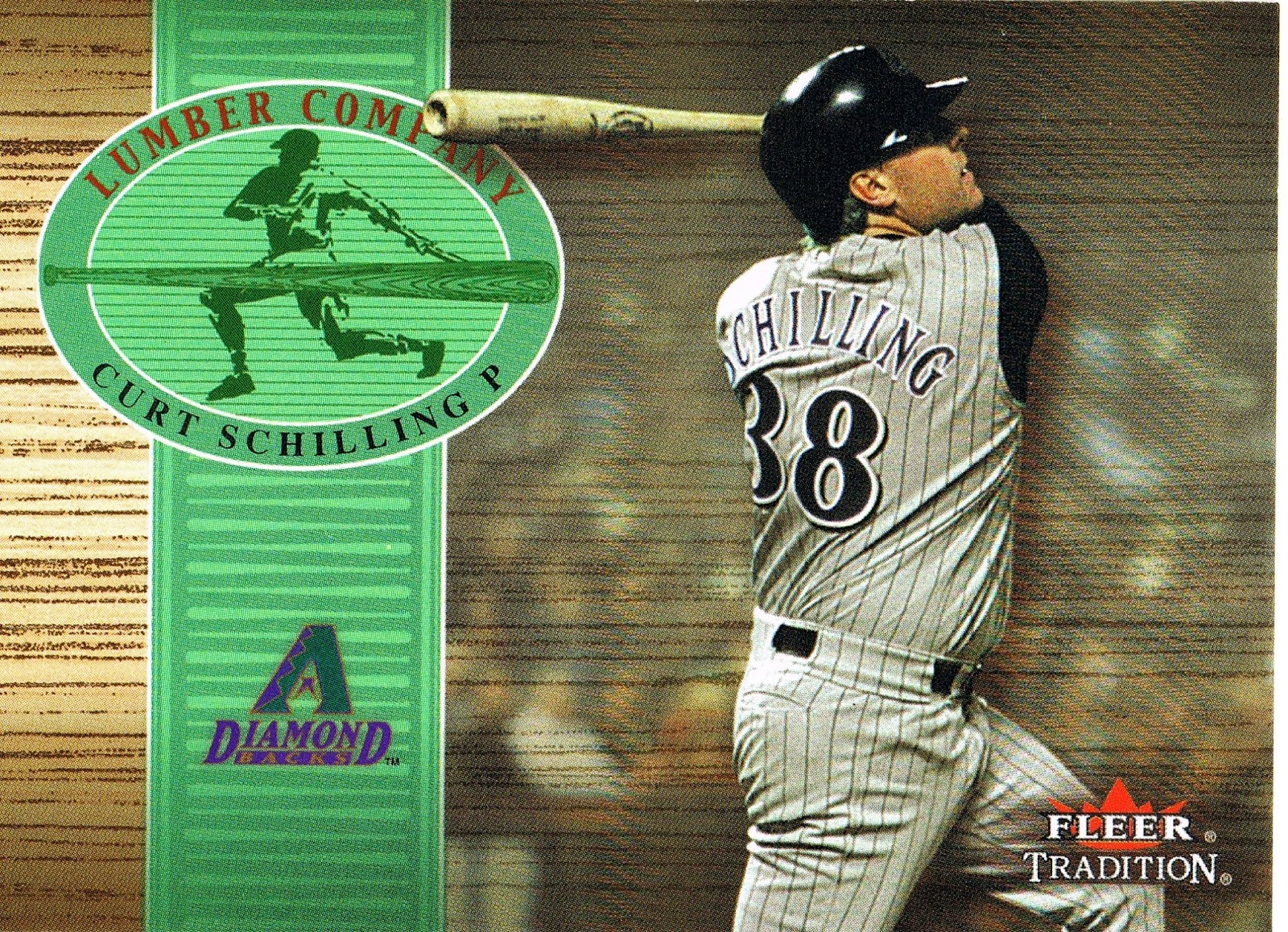
A pitcher-at-the-plate insert night card no less, probably; you can't always tell if any Diamaondbacks card is actually from a night game. Like most inserts in the 21st century this one too, from 2002, is mostly designed for a relic version. I think bat relic cards for pitchers are about the only such cards I would enjoy owning.
Once you start pulling inserts in a repack, the cards from sets you've never seen before won't be far behind:
This is actually a 3-D card, in that you would need a 3-D scanner to capture the embossed faux-baseball stitches on the top right of the card; also the surface of the card is also a nice faux-leather, though you'll not often see leather that glossy. Still a fun go at something a little different from Upper Deck in the 2001 Ovation set. There were a couple more of these in the repack, gave it a little heft. I think I will enjoy owing some of these for the tactile experience. Much better than 1995's Topps Embossed. You missed Topps Embossed? Don't worry, they're easy to find, and real, real cheap too.
You never know what those non-Topps baseball card companies would try next:
Here Fleer tries a hand at a retro issue in 2001 for it's 20th Anniversary. I hadn't seen one of these before; I'll be keeping an eye out for more. The back of it is pretty interesting:
This is actually a nod to sets in the later 80s, rather than 1981 Fleer, which wasn't all that adventurous on the back. I like this kind of baseball data a lot better than new composite statistics I haven't had time to figure out yet. My usual radio announcer, Dan Dickerson for the Tigers, uses some of these #s occasionally. For several minutes I had to wonder how Wilson's 1st Pitch On-Base Percentage could be higher than his Batting Average — he must have been hit by a 1st Pitch in an At Bat or two.
This is another card I can use in a future post, and in future collecting, but it came near the end of the pack, which closed with another several 1991 Upper Deck. This repacker also thinks I should have a certain wonderful baseball card, that I didn't have to scan for you tonight:
…because I scanned it for you the other day; this is the third copy of this card I have pulled lately.
I thought I had probably seen another of my newly repacked 91 UD cards online before, but it turned out that had only been the back of the card. So this was another fun find in my retro repack of bewitching baseball cards: