I can't say I ever recall purchasing 3 brand new Topps Baseball Card products simultaneously, but that is something that happened to me not long ago. All these new cards arrive at a handy time of the year - indoor time. But overall it remains decidedly strange to be absorbing brand new cards when Baseball itself is as 100% frozen as everything outside my house is right now.
Perhaps that is a bit more magnified in my lifetime of living with the cycles of weather when my new cards are yet more old cards, as is naturally the case when 2021 Archives finally made it through the pandemic and all the way to my little town. Let's rip a pack:

Well this first card is about as flat line average/OK/predictable as one could expect in Archives. One of the game's leading stars, featured on a Topps wrapper elsewhere, in a classic baseball card portrait. I quite like this one; though I find diagonals in an image to be more dynamic, there is something to be said for lots of contrasting horizontal and vertical compositional elements as seen here.
The big mystery however, is why 1973? Aren't I due to purchase whole bunches of 1973 style cards in just 3 short months, also while the world is still largely frozen? We here in the blogosphere routinely expect a lot from Topps in some occasionally quite minute details. But using next year's Heritage style in this year's Archives release is a little higher up the scale of Topps-gonna-Topps-whatever than usual, particularly when 1978 is still completely ignored, and of course the entire idea of further Heritage releases are way, way 'on the bubble' right now. But setting up the 1973 templates for Archives will probably save someone some time for their upcoming Heritage tasks, so I guess whoever picked 1973 has that going for 'em.
I quite expect there will be a few near identical cards between '21 Archives and '22 Heritage. For me, I will probably simply just mix them together in a binder page when the time comes, as there doesn't seem to be much chance '22 Heritage will entice me to collect all of it.
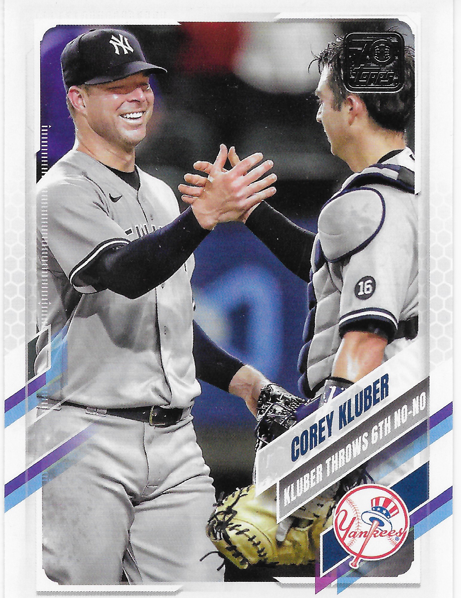
The next card in the pack had a decidedly familiar feel to it as well

which was OK, since I love 1983 Topps.
The familiarity flowed from 3 things; some other Archives release using 1983, absorbing lots of 1983 cards while purchasing lots of 2018 Topps, and from pulling this card on the same day:

At least I like racing stripes. The lighting on the 2 cards doesn't match or I would have to wonder if I had just pulled 2 images of nearly the same moment from 2 different photographers. And yeah, I'm pretty sure I know what role Hendriks occupies in the White Sox bullpen.
After those bits of future and current repetition, Archives then did manage to return me to the past -

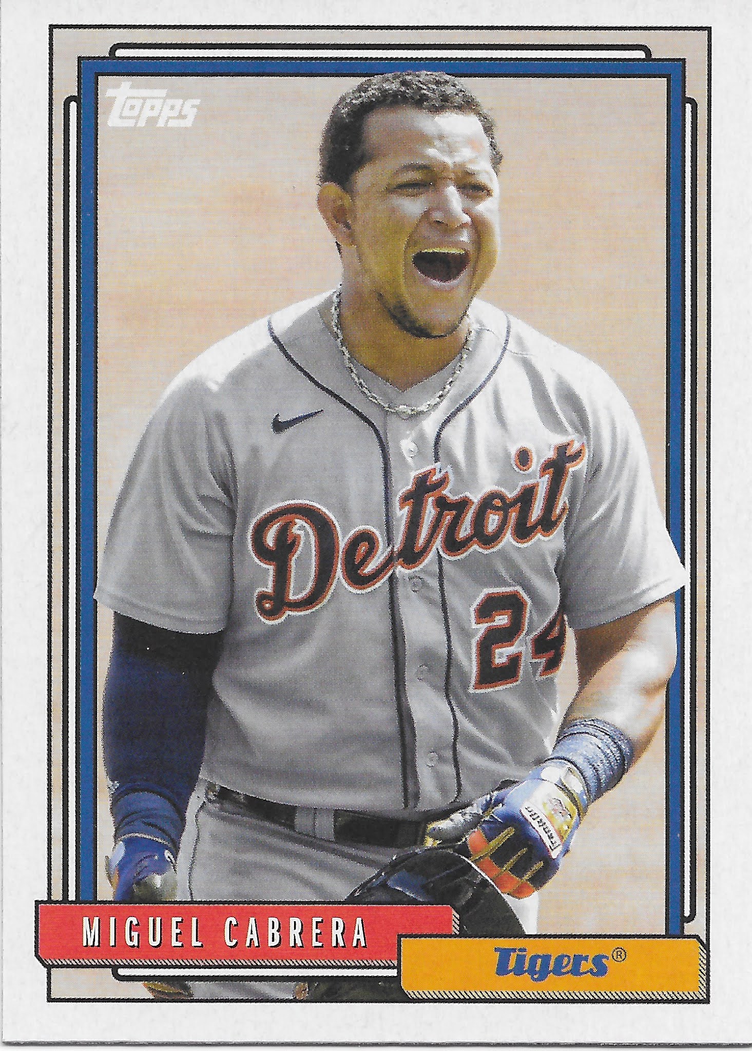
This card was nice to see; a basic acknowledgement of probably the best Tiger on their current roster. And surprisingly, given how much Topps seems to love to re-use their 1987-homage-to-1962, it seems like 1962 style cards have only appeared in their one Heritage run. But I think at this point I have seen so many new-old Topps cards this year I'm not sure I can keep track of the old-new card styles that well any more. Candelario's near checklist mate appeared next:

The 2 '62s illustrate a clear choice made often in this release - using contemporary action photos cropped in/down to become classic baseball card portrait style cards. Like this one:

The difference is most true portrait cards feature the player looking at the photographer, as on this 1957 style card. (Why the plain ole, plain ole 1957 style during a big anniversary re-use fiesta? Feels like yet more Topps-gonna-Topps-whatever, to me.) The whole actions-now-portraits cards come in bunches in this release; maybe Topps has done this before and I just haven't noticed it so much. When you pull a card that isn't looking at you followed by a card that is looking at you, the difference can be striking.
One of the fun things in Archives is its ability to use random Topps picture card products of the past, though Topps also has trouble keeping track of that idea that well at this point. My first example of such this year was this card: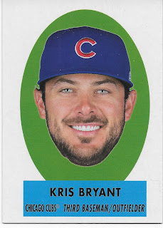

That's card #69-PO14, though all the promo material for this product identifies these as from another year, and there also seems to be some confusion over whether this is a look back at Topps "Peel Offs" or Topps "Pop Ups" - while this card does neither.
The inserts-in-the-middle continued in my first pack with a 2nd example of Topps lexicon confusion - "Big Mini" -

This is another card I was quite looking forward to scanning, as it has a "foil" treatment. Though I can in no way understand why. The scan here only slightly reveals how the foil-ing impacts the card. In regular daytime daylight in a room with big windows, these look quite nice. At night via artificial light only, the foil effect darkens the subsidiary/background picture so much that the card becomes pointless.
I quite liked the Topps Big products when they were new, even though I was no longer a kid by that point. They were a nice bit of homage to 1956 Topps baseball cards that I will never be able to collect, for one. And the backs had lovely full color cartoons. In 2021, the card back is just more we-ain't-got-time-for-authenticity


One can easily imagine the image themes of the cartoon from the text this card delivers at least, had the cartoon been created.
The card back also includes a curious detail - the player's nickname (omitted on any Rookie's cards):

Although the rest of the back is authentic to the originals, those did not include player nicknames. I quite like Topps' occasional dabbling in sharing the inside-the-game nicknames with us on various cards the last several years, but this random bonus detail that I do like can't overcome the pointless use of the foil on the front of the card, nor the inevitable disappointment I feel each time I flip over one of these "Big Minis."
After the 2 inserts, the pack returned to the just straight-up base cards -
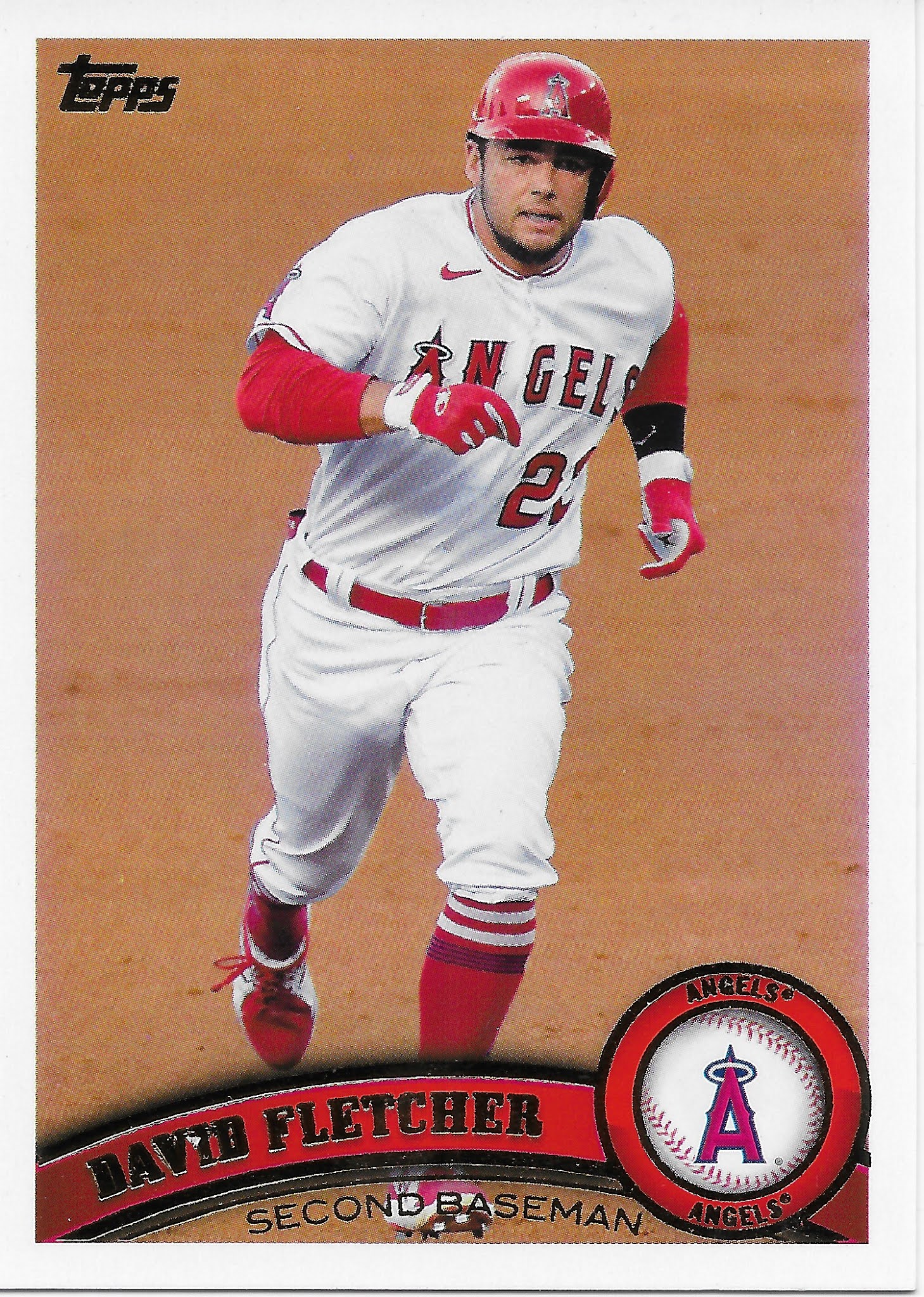
Hooray! 2011 Topps is here. I liked 2011 quite a bit. Clean, but still colorful. A baseball on my baseball cards is a can't miss. 2011 tended to show complete players, as on this card; it is also nice to get a good ole 'Tatooine' card.
Why 2011, from only ten years ago? How could you forget that it's an anniversary year for Topps? I know, I know, every year is an anniversary in Topps world. In 2021 Archives, 7 designs are included, for each of the 7 decades in the 70 years of Topps baseball card making. Here comes another one now:
This colorful card makes me wonder how many teams wore solid color 'alternate' uniforms in the 2000 season for Topps to use on the 50th anniversary set in 2001, a set which can be rather dark given the border and the basically small team logo's inability to speak up very well.
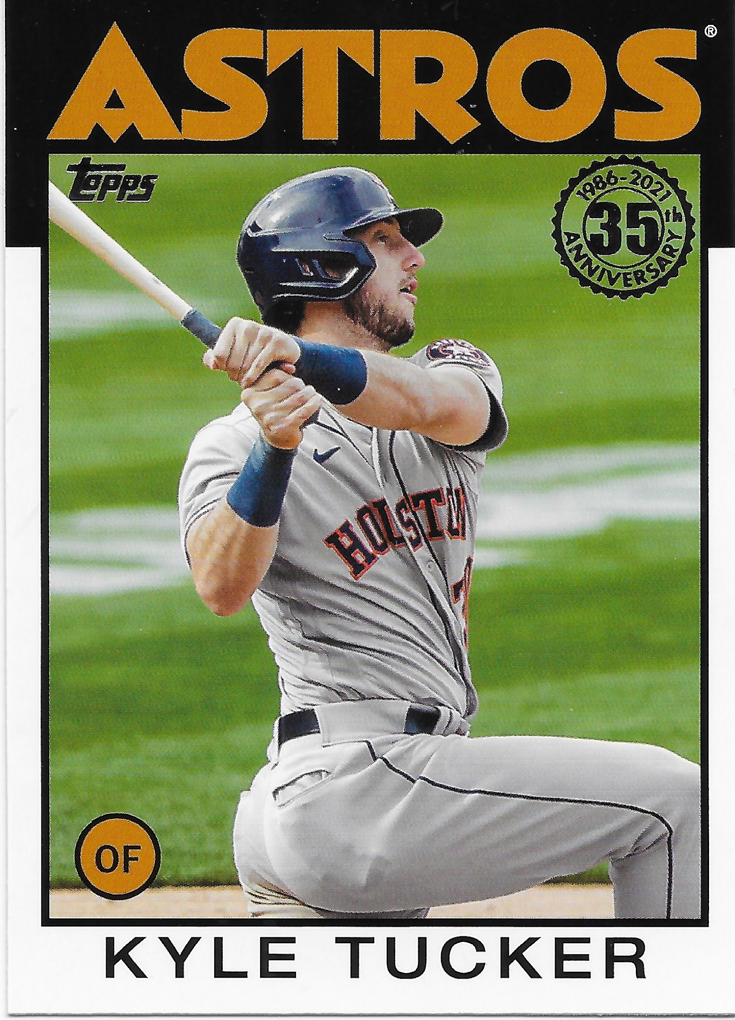
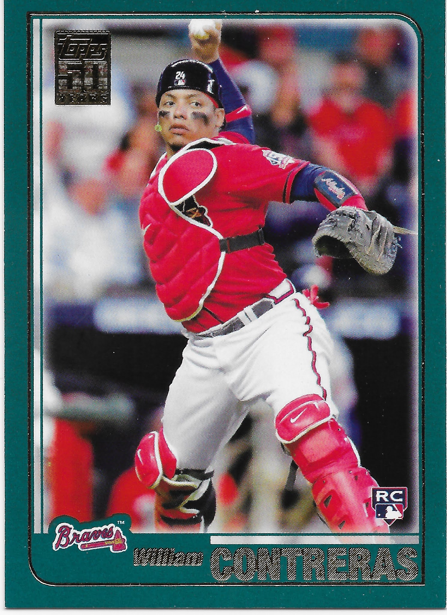
Baseball cards are improved tremendously when the players are sporting their colorful 'alternate' duds. The Contreras RC rounded out my first pack, leaving just one base card design to find in subsequent packs — 1991

Perfection.
Alternate uniform + team color card - these just make one wonder why more baseball cards can't get these simply pleasing elements just exactly perfect. I have pleasant memories of my very-near-complete set of 1991 Topps but this brand new Starling Marte card made me realize I had never played with the set in a key way that I often do with many sets: sorting it by team. So all the harmonious team color cards for the A's never registered in my deep baseball card memory well until this card came along some 30 years later.
The Marte card shows off another angle to an Archives set lately - being produced during the season (most card backs give the writers a fantastic easy theme to fill in by simply noting a key accomplishment in April or May) allows Archives a solid chance to out-update Update:


(they always forget the belt)

I can't really recall a Padres team-color-card victory like that one. Perhaps Frazier already had a seemingly perfect glove to add to the win-win here, from his previous team, which was on my mind as I pulled another brand new baseball card of his on the very same day as that one:

Which was from a package of Topps "Update" baseball cards. I was particularly confused by that brand new Adam Frazier card because I knew he was one of the Pirates' best players, which of course always makes it near-certain that he would have to be traded. So why didn't he appear in the marquee Topps Baseball set until Update? Ummm, actually he did as eventually I recalled this card:

That card didn't really 'stick' with me that well, though when one is absorbing Update cards in December, Series One cards from the previous winter now feel like ancient history and that first Frazier card with the obscured road uniform and the green sunglasses don't quite say "Pirates" as loudly as possible, either.
The bonus Frazier card there in Update just doesn't make me feel all that Updated, compared to what I can find in Archives now. Like this neat new Brewers card -


That's a nice shot of the Hank Aaron memorial patch; I guess I will have to watch for that on Braves cards I pull from packs going forward too. Since the Braves built a starting Outfield from scratch back at the 2021 trade deadline, there should be a chance to see some of their 2021 action shots in a 2021 baseball card set. But should I look in Update, or Archives?
The Archives blaster I picked up (probably the only retail format this year) I am sure guarantees an appearance from all the potential card designs in the product, both old:


and surprisingly for an 'Archives' release, new:

This insert is a card version of a set of posters included as box toppers with hobby boxes, a trend that seems to be on the upswing in various products. This continues a poster&insert design concept used last year in Archives as well. The odd thing is that 2021 Update has no new insert designs at all, but the retro/vintage product does. More Topps-gonna-Topps-whatever I guess. And on that note, if Topps can summon the energy to put brand new inserts in an old product but only re-used designs in a new product, why not double down:

That's a Topps guess on what baseball cards will look like 70 years in the future. I will give it to the White Sox, that uniform probably is classic enough to keep around for the next 70 years.
One thing I particularly don't care for in Archives is cards like this one:

because

Not to mention the blizzard of other Nationals cards this year all shot with this same Topps-gonna-Topps-whatever zero-baseball background. Yes, technically they did not re-use the exact same photograph. No points.
Now it wouldn't be 2021 Topps without an appearance by this card -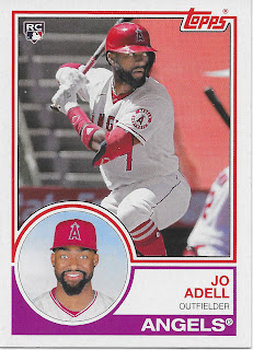

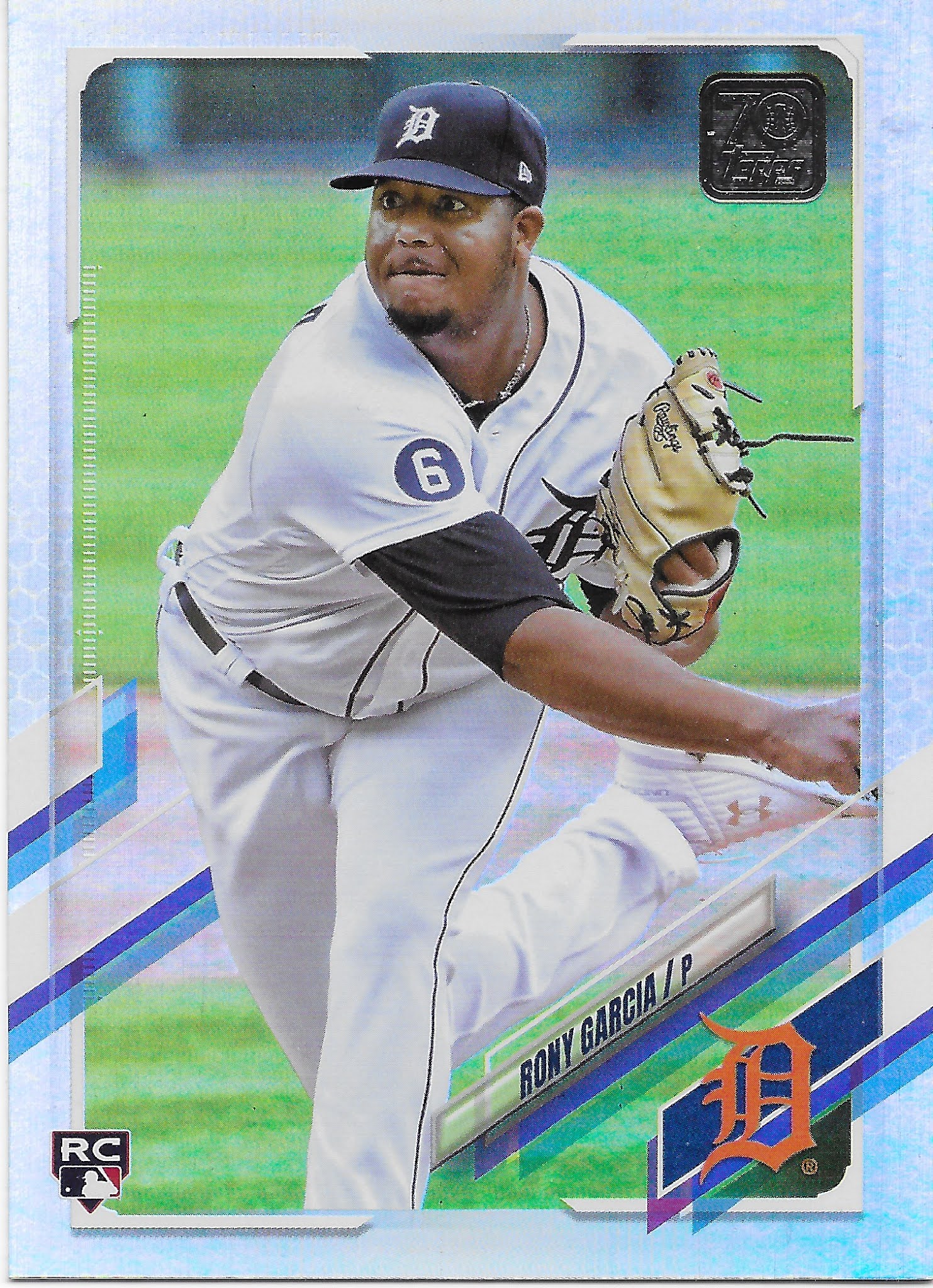
That is probably my favorite of the more-than-I-can-actually-recall Jo Adell Rookie Card cards I have pulled this year. It will dovetail nicely with a variety of those fabulous 2018-1983 Rookie Card card class cards I have. And I would bet 2021 Archives will probably deliver a few more of these nice 1983 RCs, because I will probably look for them in another blaster or 2.
Which is because Archives always does come through with cards that I can't complain about, and decidedly look forward to keeping, like these:


I particularly like those last two as they are true examples of classic Topps baseball card style. They pose a player at a perfect place: a Major League Baseball stadium, something which worked just fine all the way back in the 1950s even, but seems forgotten today.
Although I will pick up a bit more of these cards, as discovered randomly from inside packs, I will close with a further mystery of this release. One odd thing about it is a bit of the nostalgia I always like in Archives is seemingly skipped this year, I think. Perhaps I missed this probably quick got-r-did design somewhere in those sad years I didn't reliably purchase way more Topps Baseball cards than I ever really need, but I don't think so. If this is perhaps a wrapper from those forgettable grey and brown sets in the late 90s, please let me know. Otherwise I can't help but think all the skips past the fine details in this product is summed-up all too well before the cards are even actually seen — by the wrapper:
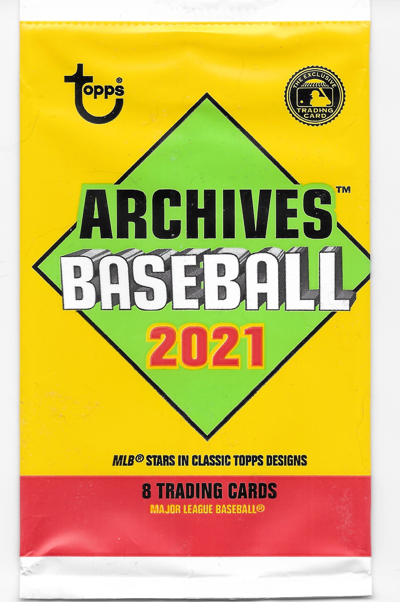
Topps-gonna-Topps-whatever