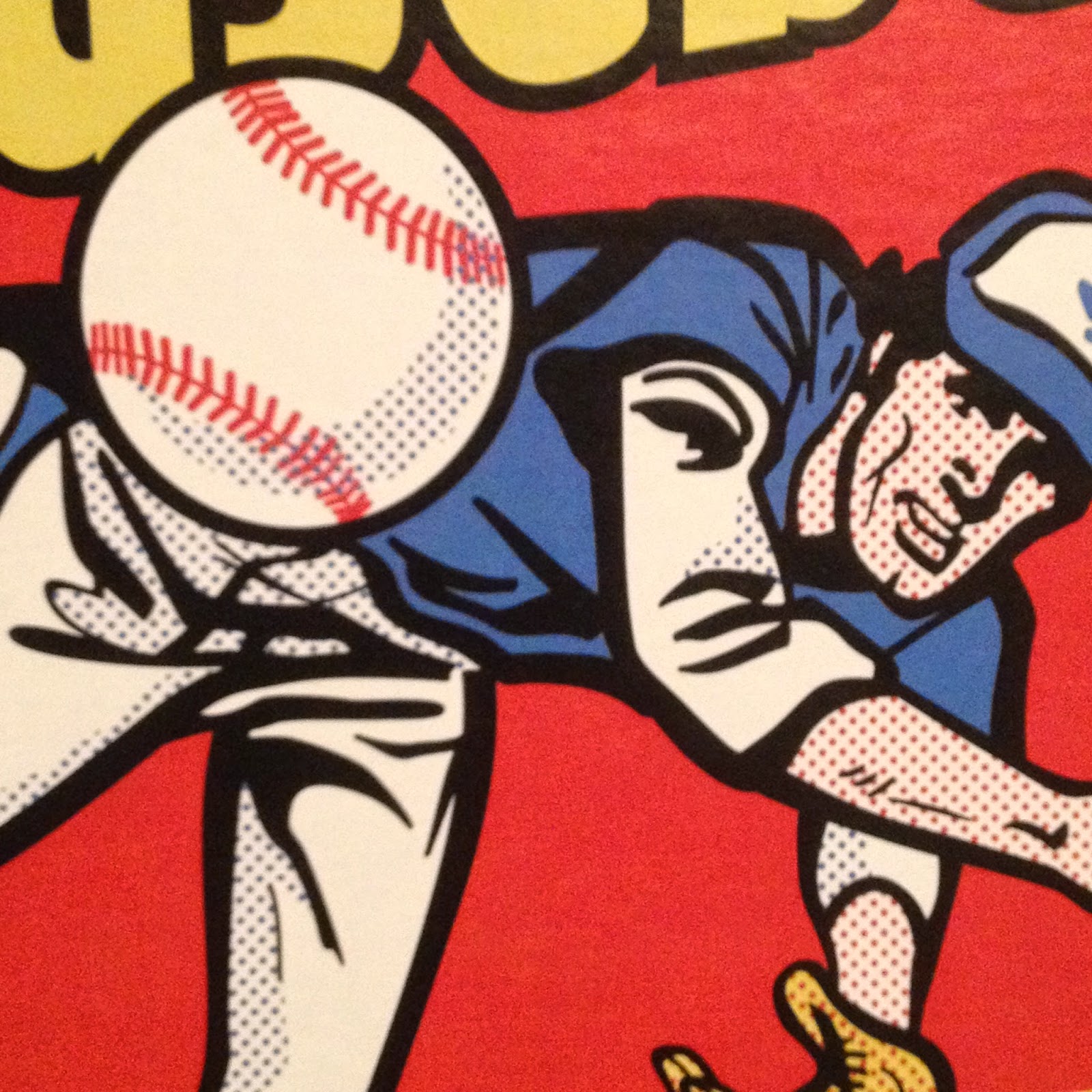
Art by Josh Trout
Recently, I started in to collecting a totally new, for me, set of baseball cards: Gallery.
This is the 3rd time-around for the "re-booted" product. In 2018, I tried just one pack; in 2017 I think I basically missed it's existence entirely as a devouring horde of locusts desperate for more Aaron Judge Rookie Cards kept my local baseball card shelves picked to the bone, routinely.
As you can probably tell from my Google Photo Profile, I take an interest in "Art," not just baseball cards. But what you can't tell is that I have only a passing interest in Art, really. I don't spend money on it or follow it all that closely; I just like what I like. I spend my money on baseball cards and follow those closely instead.
When Art and baseball cards intersect though, I generally check things out. I am still kinda surprised I never did try a sample pack of '17 Gallery; a regret, now, that I will return to later in this post. In 2018, I did check out a pack amidst an adventuresome White Halloween fall working season up near Lake Superior. I thumbed through the cards and put them in a little box and sometime later that winter, I sent off the "hits" - a Mookie Betts 'Heritage' insert and a couple Wood Canvas parallels, whatever those are/were. I think I received about 43¢ a card or some such figure for each of them, I forget. The rest of the base cards I just stuck in one of those to-be-?-later stacks of cards we all end up with.
This year, I tried another sample pack.
And I liked it much better. I quickly realized that when it comes to the intersection of Art and baseball cards, results are going to be extremely variable, based on one collector's response to the work of one artist. I also realized that I am not going to like every artist who creates baseball card Art, and probably not even every last creation they hand to Topps, and Topps hands to me.
But I definitely found enough things I like that I will be collecting most of this set. The 2019 cards featured artists I liked better than some who submitted for the 2018 set. I also liked the new card design quite a bit. The complete gold frame works much better than the 3-sided frame in the '18 set. The card edge is a more stately set of slightly raised parallel lines all around the outside of the gold frame, classier than the circular pattern on the '18 cards, though those gave a nice baseball bat-esque pattern one would see in tree rings. The classy gold script of the player's first and last names is a nice touch; I like the way it gives equal heft to the first and last name, rather than just the last name dominating the card as in '18. The whole design just cleanly emphasizes the artwork in the center of the card, with zero distractions, though some might be a touch distracted by a certain little red, white, & blue logo on many cards, as on the beautiful card you have already gazed upon at the top of this post.
The card stock is also quite nice. The clean white-ness of it and the whole design is just elegant. So elegant that my collecting effort took a little time to get going, as I wanted to treat these like Chrome cards - taking them straight from a pack, and into a penny sleeve, before sorting, etc. I wanted to touch them strictly as little as possible. But lately, my local baseball card distributor rep hasn't deigned to offer to sell me packs of penny sleeves for some several years running now. I'm not the type to just solve that problem by "just order some." Far too much PITA for a $1 product.
But penny sleeves finally returned and I have been able to assemble the results of buying a couple blasters and a few more hanger packs. Before we dive into checking out some cards from this new set I really like, I want to return to the '18 set for a moment. Last fall, I felt something felt a bit too familiar about this card:

Art by Kris Penix
But I couldn't place that feeling on it until I got home from the Superior country and get back to my completely buried baseball card desk, which helped me realize that 2018 Gallery card seemed familiar because -

Baseball: Los Angeles Angels of Anaheim Ian Kinsler (3) in action, fielding vs San Francisco Giants during spring training game at Tempe Diablo Stadium. Tempe, AZ 3/10/2018 CREDIT: Robert Beck (Photo by Robert Beck /Sports Illustrated via Getty Images) (Set Number: X161783 TK1 )
Which at first feels kind of cheap. But ultimately as I thought about this a little bit more - exactly how is an artist going to draw/sketch/paint a representation of a Major League Baseball player? The player isn't going to appear at their studio and patiently pose for the artist, after all; for that to happen, well, we wouldn't be able to afford the resulting cards.
So while pondering that question some I turned to Google. Which led me to this photo:

That's Mayumi Seto working on a new piece; the photo is from a brief interview with her in Becket Baseball, with far more details on the whole process, which can be found by clicking on this unfortunately pale looking text that means "link" in this iteration of Blogger.
I really like her work and will return to that once again yet later in this post.
Once I somewhat 'got over' knowing how Gallery cards are created (something a bit nicer than the famous Bismarck quote about laws & sausages), I began to be more drawn into my new Gallery cards.
After scrounging around for those pack left-overs from the '18 set, I noticed this card, and immediately loved it:

Art by John Giancaspro
First, it formed this image in my mind:

Clipped from still from movie "Swingers"
Which is Jon Favreau some 20-ish years ago now, in a great comedy I have always enjoyed. And that makes me chuckle; others may not see it, but now I want to see the movie again, and probably the movie "Made" once again as well.
That Soto 'art card' also did an amazing job of making the viewer think about real life in that Juan Soto has the same "how old is, he, really" questions swirling around him as Albert Pujols did when he was a rookie, as have a few other Latin American born players over the years.
So, good job 2018 Gallery, Topps, and artist John Giancaspro; that particular Juan Soto RC will be my go-to Soto card for many years to come and will probably lead me to create a 9 card player page for him over time. Though I must confess most other collectors don't care for the card and the way it ages him a little. Also I can note that one little $6 pack of 2018 Gallery also held a Rookie Card of some kid named Ronald Acuña - how many packs did you buy last year that held both Soto _and_ Acuña RCs?
Now with all that background out of the way, I can show off some of the many cards I like from 2019 Gallery, which quite quickly hooked me up with another entry for my nascent Juan Soto collection:

Art by Kevin Graham
I mean if ever there was a card that arrives with an automatic soundtrack, it would be this one, which clearly says: "I'll be back." I'm starting to like this Soto 'kid' more and more all the time. Thanks, Topps.
But I am jumping the story just a touch. I also became intrigued by 2019 Gallery via a blog post @ the Mint Condition blog; just a basic box break post, though of one of the large $80 boxes I am still only dreaming about purchasing. I can't thank Jordan enough for posting that, as it piqued my interest in this set because of the "1965 Heritage" inserts shown in the post. 1965?, I thought. I like those cards. I could see quite enjoying some hand-drawn versions. I never did finish the 2014 Heritage set after all, as no matter how much I enjoy the graphic design of the set, the endlessly repetitive photos Topps dumps into a Heritage product always end up boring me out of completing it. Although I have never made a serious attempt at collecting any original set re-created in Heritage, my memories of the originals are that the variety factor was several times higher in them than in the Heritage versions.
Now, I finally have 4 of these cards to judge, in-hand:

Art by Louise Draper
The Votto is my favorite; another 2 (McCutchen, Benintendi) are a little 'on the bubble' for me and the Altuve needs to go somewhere else, pronto. Which reminds me of another key point - these cards don't necessarily come off well in scans. To really judge them, one should consider them in 3D real life, not via what you might see on any computer screen. Ultimately with these "65s" I think they will be a little hit or miss with me and I will likely just stick to whichever 9 I like best that I can manage to acquire the easiest.
That '65 Votto has a perfectly authentic 1965 card back too, quite well done. As I start to get into the meat of any baseball card set, the base cards, I should demonstrate a sample card back:

composition by unknown Topps baseball card miner
Not much to write home about here, but functional enough. Month-by-month stats aren't unknown on the backs of baseball cards, but aren't that common any more. Only sometimes are those very illustrative of just what happened the previous season.
As I have been collecting these I have been liking that Alonso RC more and more all the time. I don't think it will lead to an Alonso PC page for me; so many of his cards so far are way too same-same. But that gaze up, up, and away following the Home Run ball and off into the future up there at the top of the post - that's a Rookie Card to remember, in my opinion.
That's probably because I have realized I am drawn to the work of that artist - Josh Trout - more than the other contributors. I received the following card in an early pack:

Art by Josh Trout
It proceeded to spend a fair bit of time as a display card keeping me company looking back at me from the card desk, which probably explains some of the chipping now present in the gold frame, as I didn't yet have those penny sleeves I always run out of. But I'm not worried about pulling a duplicate eventually, another I'll-get-back-to-that.
That card spent some time in this little doo-hickey, which I can definitely recommend as a handy card desk accessory:
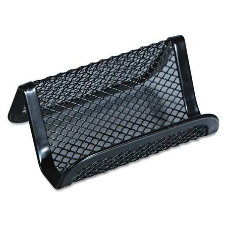
I like the little not-gizmo so much for use with baseball cards that I want to buy a couple more (business card holders, a buck or two at any office supply store).
Here is another fine horizontal card in the set:

Art by Josh Trout
and another -

Art by Josh Trout
I was particularly pleased to pull this one:

Art by Josh Trout
Seeing as how Willie is the 'cover player' for this set, though this image is not the one used on the wrappers and boxes. Still I think it illustrates how much Topps likes Josh Trout's work, to give him this checklist assignment; he is new to the roster of Gallery artists this year.
Those last 2 cards, with the 'Masters' & 'Apprentices' tagline, are an unfortunate part of this set: Short Prints. I'm not sure I will ever finish this set, and that is disappointing. I have obtained 5 so far in-hand, but the SP checklist is 50 cards long.
They fall 1 per blaster, or 1:3 hanger packs. So either way, a collector is going to spend about $20 just to get one Short Print. If one were to attempt to build this set via regular old collect 'em, trade 'em strategies that Topps has been advising me to pursue for my whole life, the base set (150 cards) would be completed many times over as one chased these Short Prints, and the total cost to obtain 50 of them would be about $1,000! & some would be dups :(
That is just not going to happen, for this collector. Of course in the 21st century we don't have to buy our cards only straight off the shelf at full retail; other options are easier than ever. I do have a few of these already waiting for me at COMC, but I'm still not sure I will end up completing the Short Prints. I definitely will pick up all of the Josh Trout SPs, and a few select others; that is probably realistically affordable for me. Though I often accept this economic limitation on collecting dreams, it is not one I am ever happy about, & here, there is no particularly good reason I can afford 150 of these somewhat premium baseball cards, but not a different 50 of them.
Of course, that is how baseball cards work now. Everyone really wants $20 bills in their packs of cards as much as they want new baseball cards. So this product is as loaded with random gimcrack as every other Topps product, though with a notable exception of no "relics."
Fortunately, I have been able to get in to the gimcrack, too, and one such piece was another from the artist I am chasing the most:

Art by Josh Trout
The autograph checklist in this product is long and diverse, though features the dreaded 'sticker autos' that I am not so particular about. Still, I think changing this set to on-card autos would really start to make for some hot little single baseball cards - imagine that Alonso card way up there now, as an RC on-card auto. However I think the premium card stock wouldn't really support shipping the cards back and forth to the players as easily as some other sets might. And then if you really want that Alonso card signed by Pete Alonso, Topps will probably soon oblige you by issuing a copy in the Archives Signature Series.
I was happy to pull this one in particular as it will fit in with collecting this by artist as much as checklist, it has a uni # inscription, and now I have a random Rookie Cardinal Pitcher to follow a little more closely; Hudson could well be yet another gem uncovered in "The Cardinal Way" minor league system that just keeps churning out relieable MLB starters, so unlike my favorite team's system, which mostly seems to churn out DFA candidates.
My other only real "hit" so far is this card -

Art by John Giancaspro
This is the orange parallel #/'d to /25. These cards work perfectly on their own; parallels add very little to them and I expect on some a colored frame would actually detract from the experience. But everyone wants "value" in their packs, so "value" has to be created.
I did like getting my share of the "value" for similar reasons as with the Dakota Hudson autograph - I learned about an interesting new Rookie. Reynolds is still under the radar for most, perhaps largely because he fell just a few At Bats short of being 'qualified' to appear on MLB leader boards for hitting stats. A 3.9 WAR rookie campaign is pretty darn good; I always remember with young outfielders now that Christian Yelich had just a league average-ish OPS for his first 3 years in the majors. Yet another card it would be silly to sell for just a couple bucks now vs. selling for just a couple bucks five years from now if Reynolds turns out to be merely Very Good.
As you start collecting these cards, sometimes each artist's work becomes quickly recognizable; other times the name on the back surprises when you flip the card over:

Art by Dan Bergren
I thought that would be another Josh Trout card, based on the similar background as the Alonso card. I have yet to see an online resource grouping the cards by artist name rather than player name.
Bergren has supplied artwork to all 3 years of the new Gallery; in the 2019 set he also does the artwork for the Hall of Fame inserts:

Art by Dan Bergren
That card will be a nice addition to my still small Christy Mathewson collection; I might finish out this insert set as well but am still undecided until I see a few more of them, but probably so. I will not be completing the Masterpiece inserts or the Master & Apprentice duals. I have yet to pull one of the 'Impressionists' inserts but look forward to seeing one.
I also know that none of the artists will bat 1.000 with my personal appreciation of these cards, just as every set has photos that just fall flat no matter how much you might like the set design.

Art by Josh Trout
One card that particularly didn't connect with me was one for a player for whom I hope to assemble 9 nifty baseball cards, who is by all accounts one of the happier young players in MLB:

Art by John Giancaspro
Now if Astudillo goes on to become a long-tenured star in MLB (seems a little improbable), perhaps a Rookie Card showing this much gravitas will become a nice piece of his baseball card oeuvre, as it were. But from what I hear about Willians on broadcasts, this card just doesn't match up though otherwise it is an excellent piece of realistic artwork and my expectations here probably have more to do with the source photo selection. A little more unfortunate is that this is card #1 in the set.
Another unfortunate result is the following card

Art by Todd Aaron Smith
This card just doesn't say "Nicholas Castellanos" to me even though that is what the text on it says; I have been looking at Castellanos cards for a pretty long time. What is a bit of a downer in particular for Cubs and/or Castellanos fans is that this looks to be the only Topps card featuring Nick on the Cubs as they declined to put one in Series One with all the other players on expired contracts now wearing new uniforms in real life, but not in Series One. Fortunately, they did come through with a Cubs issue in the Bowman Heritage set, as discovered on the Wrigley Field Roster Jenga blog.
Now we only sometimes will know which photograph a particular artist is re-creating. Perhaps, they are using photos from the future, as it were:

Art by Carlos Cabaleiro
Amaze your friends by predicting the appearance of the semi-regular baseball card trope of Scherzer casually flipping a baseball in the air on his soon-to-be-released 2020 Heritage baseball card:
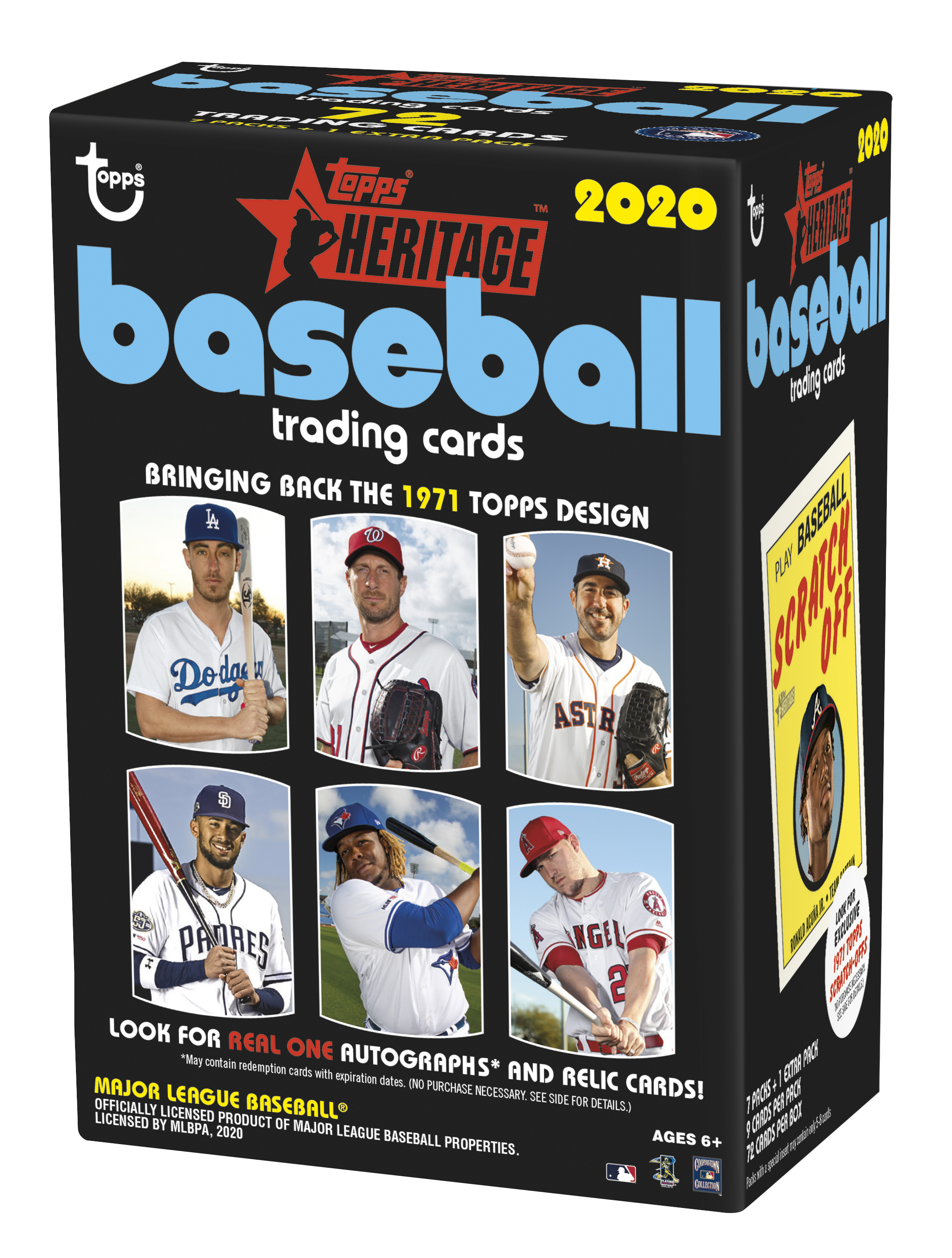
A little taste, for ya.
Which reminds me of a definite dream of mine as the 1970s, err, the 2020s start to roll along — more MLB stadiums on my MLB baseball cards, like this one:

Art by John Giancaspro
I mean if an artist hired by Topps can go the extra mile to put a real MLB Stadium in the background of a hand constructed card, surely one of their photogs can shoot a few players inside an MLB stadium, too? A kid can dream, right?
A bit of bad news around this one for fans of amusing baseball cards, however - Hammer was DFA'd recently and will now have to, yes, hammer his way back into MLB as an NRI player just like all the other couple dozen NRIs in every Spring Training camp as I type this one. Good luck, J.D.
One thing that surprised me about these cards was how much the background might make the card:

Art by Carlos Cabaleiro
That one is probably an example of the it's-better-in-3D-reality. It will 'make the team' as I binder these cards up, somehow, some day.
Now perhaps that artist reads the Night Owl Cards blog:

Art by Carlos Cabaleiro
Or at least, maybe his Topps assignment editor does.
One of the pleasant discoveries for me in my discovery of how pleased these cards make me is that back in the 2017 Gallery set, a primary artist featured was Mayumi Seto, as seen in this blog post many hours of your life ago now. I really like her work that I have seen in the Topps Living Set, but I also know I will be lucky to assemble just a single binder page of 9 cards from it, eventually. Collecting a large set of baseball cards at $5 per, or more, is just not a viable deal for me, as with the Short Prints in this set. I so hoped for such a solid take on doing up a new version of the 1953 set that once upon a time I sent a letter to 1 Whitehall St. New York, NY, politely requesting that Topps do up the 1953 set once again, and do it right, with warm analog, artwork, rather than the cold digital crap they have placed on the 1953 design several times now in the 21st Century. Be careful what you wish for.
So I was quite pleased to discover that I can collect a nice portion of Seto's work by traveling back in time and picking up some 2017 Gallery, which is slowly rising to the top of my baseball card To Do list. I was also quite pleased to discover this card in a pack this year:

Art by Mayumi Seto
It was especially nice that this one isn't a Short Print, as seems to be the case with her few contributions to the 2018 Gallery set. (Still hoping to discover an artist based checklist for all 3 years of this re-boot). I love the reflections illustrated into the batting helmet here, but I am not really a Gary Sanchez fan. I do hope that one of the 50 cards made into 'box toppers' in this release might be a Seto card, but I have only seen about half of those online so far, so I have yet to pick one of those to chase. I definitely don't particularly want to put a sweet drawing of The Kraken sticking his tongue out at me, up on my bookshelf with another great box topper from 2011 Lineage.
Nevertheless I have about 40% of this set still to discover; there is lots and lots of it still on the shelves where I live and I am hoping at good chances to pick up more of it at 40% off. So there yet could be some more Art by one of my favorite new artists appearing on my card desk, like this last example of half-pointless gimcrack in the set, the blaster-only (fake) 'Artist Proof' stamped cards:

Art by Mayumi Seto