Showing posts with label Archives. Show all posts

Thursday, January 8, 2026

Stumbling around in the Past

 Well it is once again Old Guy season in Baseball Cards, as 2025 Archives is somewhat fresh on the shelves, as is 2025 Heritage High Numbers, kinda sorta. HHN is not on actual shelves any more, just, virtual ones, as Topps has finally listened to all the complaints from shops about keeping those Old Guys away from the Middle-Aged dudes who just want to shop for their Pokemon cards in peace, without stories about walking both ways up a hill in a snowstorm just to buy some Bubble Gum Cards.

I always look forward to Archives, though some years I immediately wonder - why? Will this be one of -those- years? Let's rip a pack.


International Bonus Baby (see how Old Guy I am?) Jasson Domínguez greeted me this year as First Card, representing 2013 Heritage, errr, uhhh, 1964 Topps. I could mainly only summon memories of 2013 Heritage as I am not quite Old Guy enough to have experienced 1964 Topps, ever.

I immediately noticed that this 100 card take on the '64s would be different than 2013's was. Back in '13, a photograph from a live game of Baseball would mostly only be used as a coveted "Action" parallel printed in tiny quantities, so all the Old Guys buying up Heritage could feel more secure in owning a tangible asset rather than just a bunch of worthless Bubble Gum Cards. Me, I was still pissed about the lack of bubble gum, going on almost 5 years at that point.

Everything else feels solid about that particular Bubble Gum Card, complete with the authentic card stock. My main experience of late with a 64 Topps style card has been a reprint of Bob Gibson's 1964 Topps card, which looks OK enough in a binder page, though it has a too-brilliant white gloss shine to it, and is on craptastic modern Baseball Card printing stock that feels more like a piece of plastic. I vowed to replace that card someday if I could.

That Jasson Dominguez card there certainly looks legit with a nice night-time photograph, but it also has some odd faux analog-ness that kind of jumps at me a little, though not as much as a card from another pack we'll see later. Next!
ahh, now there's the cold unfiltered digital photography I remember so well from Heritage. Perfect for a Twins card? 
...and is that the perfect smug-ness for a Yankee? I am still quite pleased that the Yankees finally let their peeps be photographed while we look towards the outfield, rather than the prison that Steinbrenner Stadium's pressbox always appeared to be on so, so many years of Heritage cards.

So, 1964 Topps, give it a blue check-mark. As usual with an Archives release, and just as I carefully do with each year's Series One big Baseball Card day, I managed to get a box of this in my grocery cart without knowing what styles would be included in it. Just this week I had to enter a partial online-Baseball-Carding bubble of avoiding any and all Baseball Card websites with pictures (including your fine blog), as 2026 Topps Baseball images are likely circulating now. Anticipation, anticipayayshun, is making me wait... (Old Guy enough for ya?)
1996 Topps.
Tatis.

I feel, kinda, kinda, about each concept here. Somewhere I might still have the pack of cards I purchased from Topps in 1996, might not. I just know I didn't purchase a 2nd one, that year. Ditto for Fernando Tatis, Jr. I know I have some of his cards, because, but I do know I don't have any extras, deliberately. "I didn't know what 'the clear' was," uhh-huhh, sure. Between this guy and another Manny character, it is kinda, kinda way too easy to root against the Padres lately, even though they have been spending money like the drunken sailors I always figure supply them with a good amount of tickets sold. I do respect the owners that spend.

As for 1996 Topps I'm not sure I will ever warm up to it fully. Has any other "inset" set ever simply repeated the inset image from the main photo? I expect so, but I would be equally, hmmm, non-plussed as I am about 1996 Topps. I mean I can clearly see Fernando Jr.'s face perfectly clearly in the main photo - why does the card need a smaller version of the same thing? Ifffff I recall correctly, an ever less certain concept, for Old Guys, 1963 Topps set the original standard here, and one that didn't need somebody else to mistake it all up.

I will say the near Stadium Club clean-ness to the 1996 design is an overall strength however.

And, foil. Did 1996 Topps introduce this bad idea? I think 1995 did, but those were dark times. Foil sure won't usually illuminate things, unless the sun is shining.
Pitcher Face inset. Uhhh, ok. This card is a little weird in the way the outfield wall went purple just in time to match the 1996 card designer's thoughts back in the fall of 1995. At least the Giants' alternate black uniform always makes for a nice Baseball Card. I thought their lettering was orange though - that fog in S.F. is powerful stuff, sometimes; Webb's 2023 Topps card is a bit red as orange, too.

2005 TOPPS
IN THE HOUSE

I should have seen this set choice coming from 2 aisles away back at the grocery store, but Old Guys aren't known for having the best memory. I think this is now a basic tradition in Archives, to select that year's 20th anniversary set for use, or is it 30 years? And if that is a tradition, why did Topps just blow up next year's 30th anniversary in the previously seen set? Old Guys are easily confused by this stuff. But, then, so is Topps.

One thing I am no longer confused about, is what to do with my shoebox (yes, really) full of several hundred 2005 Topps cards. For a long time, I have been thinking - should I go for it? Complete it? This ices the decision. The big bold beautiful set you can never forget when you see it, is cleared for collecting launch. If you have a similar box of hundreds-plus-ish 2005 Topps commons, I'm your huckleberry.

That decision was helped by a recent serendipitous find of an incredible 2005 Topps style card hidden away in the "online only" Throwback Thursday Baseball Cards, which are always a pain-in-the-gimp for Old Guys to ever discover. I soooo look forward to the day that card can be bragged about right here on this very Baseball Card blog. i.e., when it actually arrives.

Yes, I like 2005 Topps. Looks like I'll be 'clectin it right here in 2025 Topps Archives, too. Those PLAYER LAST NAMES are just so perfect there centered on top of the Baseball Card. Plus, strong team color use, and for once Topps even defeats the color yellow correctly, too. 

What? Those PLAYER NAMES are printed in foil, too, you say? Don't remind me of the perfection that could have been with some simple black ink, like Old Guys prefer. At least it's gold foil, a big improvement over silver foil, always. Plus I couldn't hear whatever it was you were just sayn', and I already forgot, anyways.
Speaking of Old Guys, they sure do seem to get long contracts, don't they? This guy has been playing for 14 years already, is signed for 6 more to go, and is now routinely busy passively aggressively trying to get another 4-5 years added on, maybe cuz he already knows he is lucked out of becoming Baseball's first Billion Dollar Player, coming soon, and he's now jelly, as those young whippersnappers like to say. 

I do have a way extremely casual Bryce Harper collection going; it's got like, four cards in it so far, out of my 5,000+ options. But when the day comes that I have to pick from 20 (or 25?) Topps designs to memorialize this one-helluva-Baseball-player, how could I skip his HARPER card for such a collection? 'specially a sweet red-white-&-blue one.

So, a calm steady-as-she-goes traditional 3 styles in this year's Archives, just like Old Guys expect. But we also know that every pack of Baseball Cards in the 21st Century will also have a big "Hit" in it, of some kind, cuz even Old Guys don't like those super boring "base packs" any more. Let's see what's under the scratch-off box, in this pack -
tight

It's a Hit!
Topps sank my Battleship! 

Sooo many boxes checked, here:

• black Baseball Card

• weird cap possibly never seen on cardboard before, just, wrappers

• 'home' alternate solid color uni

• 'rainbow' foil, sometimes-a-fun-time, not to be confused with foil "ink"
    (hard impossible to see in this scan)

• (in?) famous Baseball Player

• I've seen this guy on TV already, unlike 96% of Rookie Cards

• I know his name even without the useless foil "ink"

• I'll probably see this guy on TV again, unlike 82% of Rookie Cards

• Rookie Card card - & worth actual money

OK, well that last double point isn't quite accurate. Rookie Card cards don't check my boxes, usually. And this one has a touch of white showing on one corner the scanner hid from ya, so it is not worth $2, it's worth $0.00 now. I should probably blow up this defective Baseball Card rip-off on TwitterX repeatedly until Topps is shamed into sending me another one, plus a couple old packs of Big League or something.

So, yeah, I likes those black bordered Baseball Cards. If I'm gonna keep it, like this one, I might just touch the white spot with the tip of a sharpie. Don't tell nobody.

I am always wistful that the black cards are often only produced in /x limited quantities, or special retail only packages in a store I am a long long ways away from, or in one of so many other ways to make them complex obtainments. Like, here in Archives being the "retail parallel," arriving at 4/blaster, probably the only retail format for this, or kinda-sorta $7.89, each, depending on if you actually want any of the other 52 cards in the box, which most people won't, unless one of the other 4 special needs cards have an RC logo on it, for one of the top 5 rooks of 2025.

That was quite a pack. But there's gotta be more Old Guy stuff bubbling up from the dusty past, right? Inserts? Archives will never let you down there:
2007 Topps All-Stars

I think this card might answer a question I hadn't been wondering, until I saw this card: where did Topps get the idea for so many phoned-it-in inserts featuring slapdash design even a child would laugh _at_ (not, _with_, which is perfectly fine), in the Opening Day and then Big League product?

Turns out, 2007 led those phone calls. With yet more foil, no yay. I guess I missed those in 2007. Stars on Baseball Card, generally good. But, sometimes...whatev. Next?
1995 Topps CyberStats

Flags on Baseball Cards always instantly make me suspicious. They say to me "we ran out of ideas, so here comes a repeat." Which is actually understandable, considering how many Baseball Card sets are created every year, each needing a half-dozen or so actual card designs. It ain't easy bein' cheezy. What flags have to do with "cyber" stats I doubt anyone anywhere could explain.

And what is a "cyber" stat, anyway? Let's flip the card over and find out -
That's actually quite enjoyable to me, Mr. Wordy-word. A nice simple paragraph detailing out an impressive statistical achievement by a Baseball player.

I think, however, I am starting to be suspicious of the word "cyber" which doesn't feel at all Baseball-y, and is somewhat as randomly incongruous as the flag on the front of the card. 

Meanwhile, the correct appellation for these cards is not 1995 Topps Cyberstats, but rather 1995 Topps Cyberstats Season in Review.

Let's review: in 1995 Topps, there appear to be a set of parallels of the base checklist which are known as the Cyberstats version. Those have a different back simply highlighting the 1994 stats while obliterating / not including any stats more than a few years old, to what mysterious purpose I can't at all divine, today. 

Also included was another small insert checklist with the text paragraphs as seen above, the Cyberstats Season in Review cards. 

Why? It sometimes seems to me that Topps often struggled out of the gate with the concept of inserts/parallels in the ever growing 1990s Baseball Card market, despite the early Home Run known as "Finest." Those cards in ... 1994 Topps? ... with the "Gold Winner" version, but also the version with a star on it, are similarly just ... confusing. I didn't Baseball Card much in the mid-1990s, and I don't think I ever will.

Though I am still decidedly dubious about cards with flags on the front, I do expect to be collecting more of 2025 Archives, the dumb way - i.e. buying it still in packs, and this will result in me owning more of these flag cards. But since what I really like about them is the backs, I can always put them on a binder page, backwards, just as I can collect just 9 of them, because looking at a page of 9 paragraphs of stat nerd stuff is probably the solid realistic limit for such a goofy concept. It's time for the magic word ... next
1987 Topps Boardwalk & Baseball

Now here is a now somewhat rare thing in the Archives product: a Topps concept I had never heard of, after so many of them have been rolled out in either Heritage or the now 15 year history of Archives (counting 2011 Lineage as year 1). Apparently this is based on a small boxed set produced for a theme park in New Jersey around 1987, or some such story you will have to research on your own time. I can't get past this:
2021 Gallery

That's a design I quite liked, and will be filling out some pages of, one of these days. These new "Boardwalk" cards are not a complete copy by the Gallery set, but I can't look at one without seeing those Gallery cards. 

Meanwhile, on the back...
...these cards introduce some new (to me) Baseball stats.

That would be the and RP and RPA* columns there on the right, which if you are squinting too hard at this card back (like me), stand for Runs Produced, and Runs Produced Average (RP divided by G).

Completely absent from this wondrous (?) development is just how "Runs Produced" is calculated, as Old Guy stat "RBI" is included here too. We are left to our own devices on that one and I have to wonder if Bill James was called about this. I suspect, not. I mean otherwise, wouldn't we all know about it in the age of endless cyber, err, SABR-metric stats all over all Baseball discussions? So confusing.

Meanwhile, the 25 card checklist includes some Rookie Card cards (surprise!), which one would think might struggle to have much MLB relevance in this way outta left field "new" stat, unless MiLB is all about the leader board for "RP," which I also basically doubt. Also on the checklist are some Pitchers, so they will have to have different stats - I suppose, though we all have a keen interest in quantities of Runs, connected to a single Pitcher. I will certainly be kinda bored-ly looking forward to seeing a Pitcher on this effort, but I definitely have zero desire to assemble these and I expect they will also have zero value to anyone except those hungry for card #2,329 in their PC of of some Baseball SuperStar. Howz about we use the magic word again -

1964 Topps Stand-Up

It's another Hit! Home Run! With me, at least. I collect 1964 Topps Stand-Ups, or at least that style of card, not having the courage to look at prices of actual 1964 Topps Stand-Ups. I got into the habit with Archives, volume 1, aka 2011's Lineage, which has a nice set of these also. Sometimes, repeats are just the ticket I like in my old-new Baseball Cards.

A few other manufacturers have dabbled in this card concept and I have a carefully stashed collection of any such cards I can find. The project that results will be epic, I promise you. The reinforcements to the idea I will be pulling from 2025 Topps Archives will be a big ole help to that long-simmering idea.

That Kyle Tucker Stand-Up there appeared in the last pack of my first blaster of this stuff; I have now opened 2 more of those. I found lots of great cards, but stumbling around my scanner can be tiring work sometimes, and I scanned a whole bunch of fun new Baseball Cards from the growing pile of 25 Archives. But to see those, check back here, soon. Us Old Guys can't always babble on about Baseball Cards quite as late as we used to...




Thursday, August 27, 2020

Old people cards

As the magnitude of the incredible shrinking supply of baseball cards slowly sank in this summer, I knew there would be one product I expected no problems finding: Archives.

This was because some 2019 Archives, which I enjoyed very much, was still on my local shelves well into July 2020. However even those blasters would tend to disappear, one by one, week by week.

So last Friday I was going to take no chances and hit up the baseball card stores once I got clear of all possible work tasks for the day, in the early evening, as at least one somewhat local Big Box store gets stocked on that day.

Fortunately, I instead lucked into some Topps Chrome at last, on my 4th Friday attempt. And also fortunately, finding some fresh 2020 Archives was not a problem either and I picked up a blaster to try it out for this year. I 'collected' parts of the set last year, as I have done some years, but haven't really thought about for this year. I never really make that call with Archives until I get some packs to rip.

Let's take a look:
First out of the pack is the oldest set featured, 1955. I only know the originals from images in beloved baseball card books, and in the digital era of course via seeing them on-screen. I haven't had anywhere close to a desire to own some originals because I would much rather acquire my very first 1956 &/or 1953 Topps card, followed by many many more from those sets. If I could, I would.

This card if well executed and the research department here at Base Set Calling has a hunch this is actually the very same primary photo as used on Irvin's original 1955 card, though appearing on-card now with much improved printing technology. The back of the card is nice and colorfully authentic, too, and perhaps a bit more easily readable than a '55 original, which is a plus to modern efforts at these, though something Topps only sometimes gets right.

I am going to guess that most online commentary on this latest take on the '55 set will note that the original didn't use the cap logo up there in the upper left. I am fine with that because after lo these many years of collecting baseball cards and absorbing baseball history in various ways — I had never noticed the historical connection of the interlocking NY logo the Mets use to the cap logo used by the NY Giants. Until this baseball card reached my hands. Thanks, Topps.

Naturally for a release like this, Topps instantly ditches any kind of consistency on what to do with the required graphic up there in the upper left corner in my very next card in the pack:
Here we see two logo decisions on Reds caps and Topps goes with a different logo altogether on their part of the card. Though repeating the basic "C" a third time in that image would look a little odd, it definitely doesn't match the decision made on the previous card; nor the decision Topps made back in late 1954.

But I do always like pulling Neon Deion cards, and I am 2-for-2 on pulling cheerful baseball cards of cheerful baseball players with a nice smile on their face. Could I maintain this hot streak?
Nope. This makes me wonder - how many 21st Century rookies end up flashing a smile on their Rookie Card cards? Not many, I expect, but thanks to Deion and Monte, I think I will start watching for those.

Here we do see triple logo action, thought not all that dramatically given the smaller size of the action image. For the Blue Jays though, there is no other real choice anyway.

This card does remind me of my usual reaction to 21st century takes on 1950s (and 1960s) baseball cards: too sterile. I think this might flow from the digital photography used today, even though this particular card is not the worst example of the dry, but glossy, cold I see on many Heritage and Archives cards. Topps &/or the digital photographer can change that if they try, and it does look like an effort was made here in that regard, though this is still the least warm of my first three 1955 2020 cards. 

I guess it is cool to pull a Rookie Card card so desirable that it is even featured on the box of cards I just bought. Archives Rookie Card cards are somewhere in the double digits on any average list of desirable Rookie Card cards from everything I have seen over the life of the product. That's not why I buy these cards of course, but that desirability factor (read: $$) is probably why I expect no problem finding this product on my shelves this year.

Personally I do like the Archives Rookie Card cards I have pulled over the years, like this one:
So I occasionally look through my Rookie Card box and check in on what is happening with such cards; this basic 2018 Archives Acuña card is currently selling in the random teens on the ole eBay.

Why are Archives Rookie Card cards so far down the list of preferred cards to own? I suspect several reasons. One is a lack of an autographed version in Archives, a distinct difference from essentially the same idea in Heritage sets. Another is where Archives sits on the release calendar: middle-towards-end of baseball card "season." If somehow Archives was released earlier in the year, the Rookie Card cards therein would be much "hotter" in the marketplace. Also, exactly zero Chrome in Archives, though a future change to that would surprise exactly no one. And now I need to walk outside, forget why, and start yelling at a cloud. Because I also suspect that the vast majority of people following Bo Bichette on an At-Bat-by-At-Bat basis along with a refresh on the current price of his 2020 Series One PSA 10 Rookie Card card, well, few of them care about what he might look like on a 1955 style baseball card. And that's just the way she goes.

Ahh well, let's see what else Topps has for me this year:
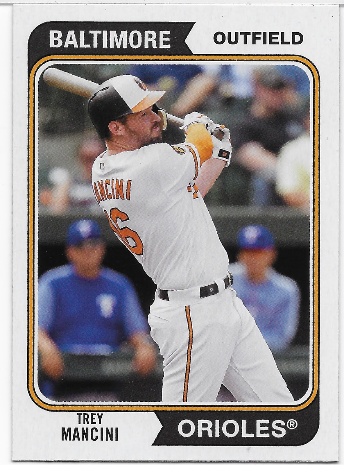
1974! Woot! I like 1974 Topps.

I began collecting baseball cards the very next year, so 1974 Topps holds a fair bit of mystery for me to this day. I have never delved into picking up a small stack of such cards just to absorb and probably launch even a small set collecting effort, like I have with 1973. But I do like a certain 1974 Topps Baseball card enough to have purchased the "Wall Art" version to some day hang on a wall - the '74 Garvey.

On this Trey Mancini card, I at first like the harmonious use of orange for the image border, and black for those flowing city and team name pennants I have always admired. But....why can't those be printed in orange, too? I don't get it.

There is something I do like about this basically routine Mancini card very much however - it is an action shot. Early on in the Archives product, Topps would routinely create the cards of the current players using their Photo Day mug-shot from early in Spring Training. On card after card after card year after year after year. The historical players mixed in to the checklists would often have photos taken from a live action game, which made the repetitive Photo Day cards that much more noticeably boring. Now, a current player is shown playing baseball on these historical designs. A definite improvement here.

Though the back of the card helpfully fills me in that Mancini was the 2019 team MVP for the O's, we all know that isn't a whole lot to write a card back about. It is a bit of an ironic card to pull here in the summer of Covid-19, as Mancini is both unable to play as he recovers from colon cancer treatment, and has a compromised immune system requiring him to be extra careful around other people right now. Colon cancer - here I am pondering a baseball card and remembering I need to check in with a doctor somehow, somewhere, just in case, as I am almost old enough to have purchased a 1974 baseball card whereas Trey Mancini was born 8 years after those were for sale. Not the thoughts I expected to have when I ripped open this pack of baseball cards featuring the Boys of Summer. This still earns a Thanks, Topps, though not a happiest of such. Maybe I will get one of those eternally happy Rookie Card cards next -
More 2020 irony as Buster Posey elected to opt out of the season this year, and a small bit of charity here from Topps as I strongly doubt Posey would have played anywhere close to the amount of games wearing that nifty orange&black catcher gear this year as he would have at First Base. It's time, Topps. Sooner or later, we all get told. 

And on this card - why do the Giants get nice harmonious team color orange ink in the black pennant, but the Orioles don't? Solidly inconsistent on my first two cards, again.

Now in every 8 card pack from inside a blaster, 2 of the 3 sets featured has to lose a card to the insert in each pack; in my first pack '74 had to volunteer, bummer. That yielded this card:
Alright, a nice smiling Rookie. Almost. The one thing people like the most after Rookie Card cards is Topps Rookie Cup cards the next year (sometimes; sometimes the Cup appears on the actual Rookie Card card).

Topps has re-run this idea before, on the 50th Anniversary of the 1959 season for the players really selected by the youth of America to make the inaugural edition of this checklist. The backs of these cards feature an authentic take on the original 1960 card back.

Two sets, one insert so far, that leaves our final set to re-issue:
Ahh a set I never collected after the annual sample pack. I like the flowing pennants, again, and the again harmonious choice of team colors for them, which go perfectly with a Braves alternate uniform here. And a team color bat, too?

But, Brown? Sure, baseball gloves are brown (usually). But every kid knows brown is the color of a whole 'nother sport, not baseball.

Just never could get into that set and never tried. The top of this card reveals instantly why it was selected in the year 2020, for perhaps the only Topps Baseball set to list the year of production right on the front of the card, though I might have fallen asleep on noticing that in the mid-90s somewhere.

Now it might take me a minute or 29 to find my few original 2002 Topps cards, but I doubt they had a traditional card stock like these 2020 Archives versions do. 2001 Topps used a modern thin stock; I collected that one. However all of the cards in the blaster, from the 3 sets and all the insert sets, use the same cardboard card stock - another change from last year, and a good one. Part of the allure of Heritage and Archives is that old-timey card stock us old-timers like as we paw through a stock of old-timey baseball cards, even if we are looking at a design from the 21st century.

So now we can get a brand new baseball card of an old baseball player on old-time cardboard. Like this one:
This is just one of the most unfortunate baseball cards I have ever pulled. It surely has to be from Morgan's 2nd stint with the Astros to help explain the definite lack of youth here, but is just a terrible picture to choose for a baseball card. Let's flip it over.
Whew, that's better. But I can't think of another set where I like the color of the back more than the color of the front, that's for sure. At least these 2020 2002 cards I own now will have complete career stats for the old guys on them. I like that.

What a weird first pack that was. One Rookie Card card, one smiling Rookie Cup winner, and a whole lot of old. Let's see what else I can find in this blaster -
Ahh, one of those Rookies that will be following me around this year. When Topps like a Rookie, they make a lot of checklists. My first knowledge of Sean Murphy was tuning in a west coast game to hear him come to the plate in the top of the 9th with the A's down a half-dozen or so runs, in one of their recent late inning demolitions of their cross bay rivals. Murphy calmly hit a Home Run and the rally was on. John Miller could hardly believe what he was seeing.

A nice cheerful-ish, ain't-no-sunshine-in-the-winter Rookie Card card but it again asks - cap logo, or team logo? I will never understand how Topps makes those calls.

But I do like Oakland A's cards:
A nice candid, just like on old timey Topps Baseball card sets, of a player watching some baseball action from the bat rack area. This Archives set is getting some things together, it appears.
Though now we head back to Spring Training Photo Day.

But that's, OK. I don't mind Spring Training baseball cards at all. I just don't like such images to appear on card after card after card as I paw through my cardboard.

One thing I have noticed about Photo Day images is no team ever seems to wear any of their Alternate uniforms that day. Some probably actually wear their Spring Training uniforms, which are a bit of an alternate to the home whites. Or, their newest-of-new uniform issue, as we see here.

But overall, I am really starting to like baseball cards with those Alternate uniforms:
Blue & red uniform and accoutrements, blue & red team logo, blue & red baseball card pennants. But, Brown?

I also like the slowly-sneaking-up-on-us return of the Powder Blues, complete with 'racing stripe' -
But, Brown?

Time to paw our way to another insert:
Looks like 1960 is a bit of a 4th set to be re-issued here. That would be a neat trick in this product - re-run every insert from a certain set, all at once. Perhaps, though, 1960 Topps had only 2 subsets, so...just don't ask me what happened to Mike & Shohei's faces here. Stayed too long at the Wax Museum?

I like the sky background, but this card makes me a bit depressed. I really wanted to see Ohtani become a potent weapon in the late innings for Joe Maddon, as a shut-down reliever that also wouldn't waste a crucial plate appearance when the Pitcher was due up. Now he is finally playing for Maddon, but in the wrong League for my dream, and the all powerful bad news that is the year 2020 might also finally make an NL DH a permanent thing, anyway. Meanwhile, Mike Trout seems farther away from playing some October baseball than he ever has been, and I am thus farther away from seeing the player of a generation playing baseball on a TV, particularly since the regional divisions won't play each other at all this year. 

That card will have to go, somewhere. And I will have to go back to 1955
Solemn. Now there is a word you don't connect to a baseball card very often.

Maybe the key to a good Photo Day baseball card in the digital era is a good base tan. Because Photo Day, the 3rd week of February or so, features a spring-time bright Florida sun, a bit different than regular season sunshine, right Anthony?
You can't get more Spring Training than that and I doubt Rizzo would smile bigly if you asked him to sign this entry in his baseball card oeuvre.

But I like that card anyway because I never thought about the idea of 1974 Topps Baseball including some pink baseball cards, or close enough, and I like pink baseball cards, though I have no idea how pink became selected in this set, or the original. Or, for that matter, the color red:
Now we're cooking with gas. Promise me a new Willie Stargell baseball card and I will buy a pack, every time.

I guess I will have to hope to see a lot of 1974 Topps on a blog somewhere to divine the mysteries of the colors selected then & now, but that odd choice can't take me away from enjoying this card, which also taught me a fun bit of Stargell/Pirates trivia on the back:
And unlike many a quick-draw Topps cartoon, I am not instantly thinking "seen it" with that one, though I wouldn't wager that basic idea hasn't been used on another card or three.


This card back does illustrate a point where Topps had to display a bit of finesse to create a 2020 version of the 1974 card backs. The originals featured the player's 'facsimile' signature on the top right. These days, signatures are just some version of a scrawl for the vast majority of players, and those just wouldn't work here, at all. So Topps just picked an elegant-ish font and re-printed the player name with it. Which looks kinda, weird. Whaddayagonnado?

Why continue on backwards in time, of course, to 1955 again:
Though Topps sometimes creates "Bowman Heritage" sets, it hasn't yet done "Bowman Archives" unless I missed some online-only-on-3rd-Tuesday version of such, which I frequently do. (I recently discovered that there was an online only repro of 1975 Topps World Series cards that I now absolutely have to have. Thanks, Topps. Kinda.)

Though I have strong doubts the 1955 originals of these had anything to do with purposely showcasing "Rookies" (such players could barely make a baseball card checklist back then), this go-round of '55 Bowman is a 30 card checklist, each with the classic Rookie Logo Man there in the bottom right. Because, Rookies. That's what we all need in our packs of baseball cards - moar Rookie Card cards.

The player on that card is another Topps-beloved Rookie this year, that is also following me around in my 2020 limited baseball card purchases - but only on insert cards, not base cards. Each time I pull one of his cards I giggle at the weird spot the White Sox are in this year, as Collins is trying to break in for them at Catcher. Topps probably green-lighted his appearance on so many checklists before the Sox signed Yasmani Grandal to a four year deal. Meanwhile, the career of James McCann is really blossoming both behind the plate and standing at the plate; it is whispered that the Sox pitching staff greatly prefers throwing to him over Grandal and McCann caught Lucas Giolito's almost perfect first-of-2020 No Hitter the other night. Also meanwhile, the Sox have Edwin Encarnacion on the roster to slug Designated Home Runs and a number of hot hitting positional players (and so-so fielders) that can always use a one day break from fielding so the Utility guy to get his butt off the pine for a day, while the Sox would want their bat to stay in the line-up. Such are the problems of a heavily loaded line-up, something my team hasn't had to worry about for such a very long time now. I can already tell I will be pulling a Zack Collins insert in 2020 Stadium Club.

That almost does it for my first-blaster inserts in 2020 Archives; I did not pull a 1980s Glossy Rookie (maybe Hobby Box only?), nor another take on '76 Tradeds, nor a super duper rare 1989 Cornfield parallel (?) that I don't understand. Must be some sort of anniversary of that weird Build It And They Will Come movie I have never wanted to watch, &/or Topps must have just straight ran out of baseball movies to somehow integrate on to some Archives cards this year. But Topps always keeps you hanging on with their steady supply of "Hits," like this one:
A /175 parallel, ooooooh. Looking at this uniform makes me think the Rays 'secondary team color' might be yellow. Might. Back in 2002, it probably wasn't; at one point their team colors were actually two shades of green. 

Now I always like a Rays card with the actual Ray sailing in to the frame there on the left sleeve patch, but here with my one chance to escape from but, brown, I get but, purple on a "blue" card. I also do like the faux Turkey Red background the Topps photographer managed to discover back there last February at least, but this one is just not a keeper.

There is one final type of card-from-the-past in this product - a 1964 'Giant'. I quite liked those ten years ago in the Lineage release, though I have only acquired 2 of those as they were 'box topper' cards and I can't run around buying boxes and boxes of baseball cards, just packs and sometimes a blaster. One of the Lineage versions sits on my bookshelf to this day:
(Complete with 1964 like centering - well done, Topps).

This year a new take on the cards are included one per blaster, and those I can run around buying every so often, just as long as 2020 doesn't intervene I guess. I was quite looking forward to this portion of the brand new baseball card ripping experience:
And here my weirdly incredible 2020 baseball card mojo came through for me again as I held this 'pack' in my hand it felt kind of, too thick, somehow:
Bank error in your favor, collect $200!

Or, at least, a simple extra '64 Giant baseball card. Thanks, faulty Topps packaging robot!

These cards are so nice:
The backs are re-executed perfectly, as well:

And I am always down for a bonus pull -


If you are a Team or Player collector for a card in this checklist, I can highly recommend owning one of these.

The only bad news for me on them is - no Tigers this time. Not surprising when you live in a cellar, but this blaster of Archives marks my second sequential baseball card purchase with no Tigers cards of any kind in the packs. Maybe if I want some exciting new Tigers cards, I should collect Bowman cards.

Instead, I stick with Topps. At least I get Mike Trout cards that way:
Photo Day scruff? Pass. Least favorite Trout card ever? Yup. Maybe back in February, Mike already knew how things would go this year, though at least he is having a good year off the field with a new baby at home.

I also know I will get plenty of cards of all the other exciting Center Fielders in the game -
More nice baseball red & blue and I am now positive: I want all future Atlanta Braves cards to be delivered to me with photos using their Alternate uni.

But what else can Topps do for an exciting player now on his 3rd year cards, so far removed from those exciting Rookie Card cards that no one but old people like me even notice they pulled one? How about a re-run of the next best thing to a Rookie Card card, a Rookie Cup card:
This card kind of turned me off from the idea of collecting this run of inserts - Acuña was on the All-Star Rookie team in 2019, not 2020. Turns out, this little insert checklist is 18 cards long, all of players from 2019 & 2020. Though I suspect the checklist is not a complete set of either year's run of Rookie Cup players, I don't have the psychic energy to figure it out, given this weird break in how such things should go, here.

As for the way all the game's Center Fielders (except Tigers CFs) appear in my packs of Topps baseball cards, not all of them are welcome sights:
One of the 2020 losses to the game of Baseball is no chance for the fans to express their thoughts when the Astros come to town.

Eventually as I pondered this part of the checklist and whether I will find it 'binder worthy', I had a handy realization. It is of course a pain-in-the-neck to put a 100 card checklist into binder pages, which work in units of 9 cards each. 11 pages of 9 cards leaves one problem. But I think if I binder up these cards - problem solved.

I do like Astros cards just enough I guess, from the pre-cheating era at least:
Oh, wait. Rumors. Still, not a player I see in packs very often, and another nifty example of those pennants flowing their way around the card.

The nice thing about a checklist of old people is the way the cards in the pack will quickly return you to a better memory of whatever era of baseball you might be pondering, as with another player I haven't seen on-card in a while:
Is the official team logo selected by Topps here actually a premonition of future cards for the Cleveland Ball Club? It might be, it might. Will this be the last on-card appearance of Chief Wahoo? It might, but I think that might prove far too difficult for Topps to achieve in coming sets and years.

It is nice to pull a post-career Jim Thome card; though I know he has made some checklists since retirement I just haven't found any of those in a pack.

These Archives checklists do have an odd way of making one think about the passage of time. Before we know it, this guy's cards will be sitting in "vintage" boxes:
Which might be fitting, as even a 1990s photograph still has more basic humanity to it than so many of our current century's digital takes on life. I'm starting to warm up to these cards, too...
BOOM

Show me a baseball card collector who says they don't totally enjoy pulling a brand new Hank Aaron card from a pack and I'll show you a liar.

And in another Doh! I could've had a V-8 moment, I finally realized with this card that ALL of them are horizontal, which makes for a much nicer looking binder page. I suspect 9 of these 100 cards could make for a Nifty Nine page, 'specially since 99 of the '74 style cards would probably result in using 4.5 pages of double inserted cards. Sometimes it's not the amount of binder pages one can use that becomes important, but the amount of binders one can keep around, nomsayn?

There is one final baseball card archetype in this product to share with you - some Short Prints, I guess. Home-made by Topps, I think?
These are Topps Nickname Poster Cards and perhaps have no antecedent within the Topps baseball card multi-verse and rather are inspired by other baseball posters made a few decades ago.

Somewhat like last year, this run of cards includes card #s tacked on above 300 in the checklist of base cards but the pack odds (1:5) list these, somewhat making them an insert, but not. Or something. These also exist in true poster sizes, as 'box toppers' in the Hobby edition.

Another small set of cards I don't need to chase, particularly as no Tigers make the 15 card checklist (unsurprising), and probably something largely of interest for a dedicated player collection only.

Now a small thing I like in the latest editions of Archives is the late street date allows it to function as a bit of an 'Update' set on some cards:
No complaints about UPS trucks from me here - this could be the only possible baseball photo that actually calls for a brown border to sync up well with the image.

What I like about that card is that it absolutely does not look PhotoShopped. On all other such cards I have pulled this year, or seen on-line, I noticed Topps never adds the Nike Swoosh to the uniform. Which is actually accurate for a 2020 baseball card, as they weren't on the uniforms last year. So for better or worse (I choose the latter), this might well could be the first baseball card to feature the Swoosh just over the right lung. Though of course the Swoosh has been seen elsewhere on baseball cards for many many years.

Overall though, my little pile of set-asides from this one blaster of Archives largely featured the '74 cards...
...with their familiar players and even familiar images, though somehow Tom Seaver's delivery seems to make all of his cards look similar even when they are unique.
Soon, I think, even the greats of the 1990s will be set apart in a little more hallowed little piles of baseball cards that come along in mixed checklists like this one.

As I absorbed these cards I started thinking about filing them in a totally new way for me, in yet another sign we all get told about, by age. Might give a display of these an interesting flow.
We have a Winner.