Showing posts with label Shades. Show all posts

Wednesday, March 17, 2021

Kicking off card season with a Blast(er)

I wouldn't normally make my first baseball card purchase of the year via the Blaster format. I rarely buy the things at all, though I do have a weakness for the "box cards" in the Big League product. It just feels like I am paying a premium for the so-called "Patch" card in each one, that I very rarely ever wish to own at all, for one.

The other problem with blasters is the way collation works in baseball card packaging. The sheet-cutting and partially random assemblage of the cards is designed to do one thing: there will not be a repeat card, inside a given package. 

However, when one buys two such packages, you will "hit" identical sequences of cards - and then you don't get just a duplicate card, you receive multiple duplicates. Many multiples. This is probably magnified even more in the "hanger box" format, although that has usually offered the lowest price per card. So far, I haven't seen any hanger boxes or "rack"/"fat" packs, either, this year and I have to wonder if I ever will.

This year however, anyone wishing to just buy a few brand new baseball cards while grocery shopping can't take any chances on hoping to find some desired pack format. It is a minor miracle to find new baseball cards on a shelf at all, so if any are seen they must be purchased on the spot. Which is how I found my first blaster of the 2021 baseball card season - a single solitary blaster, half hidden behind some Magic The Gathering boxes of some sort.

A little later on I did find just a few examples of my preferred format but that will make for a nice future post, with some interesting, non-blaster cards to look at. Today I want to check out the rest of the blaster as a way to ponder 2021 Series One a little more. Fully absorbing the "first pack" is nice and all, but there are 84 other cards in each blaster - now a $25 blaster, where I shop. What did I find?


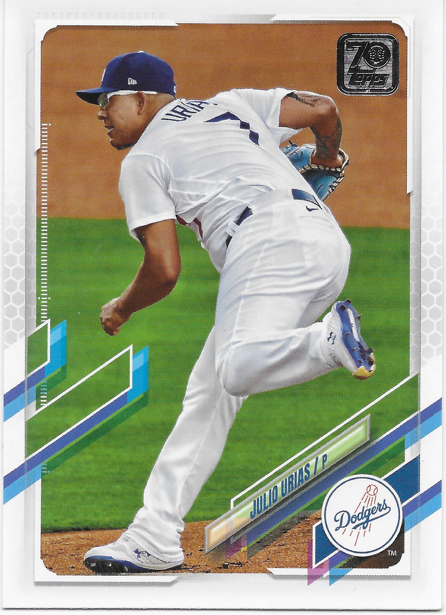
This is a perfect example of why I grade this design a "so close" - everything works here, except those almost vertical design elements, and outside of the ridiculous player name size. Many have commented on how they make the cards "line up" in a stack and would even in a binder page, but I don't think that is why they exist like this. Rather, aligned elements like this make it easier to print and most importantly, cut the cards accurately. Something ever more important in the collecting era of "10 Snobs" who insist that every single baseball card Topps makes MUST arrive to their greed focused hands in 100.0% flawless condition, including "centering," or it is off to Social Media they go. Not just some of the time, but instantly.

I still quite like this Alex Verdugo card, with his cool glove, harmoniously color balancing the Green Monster and the team colors, and the way the wall even makes it looks like he has a green wristband on. Perhaps the perfect card to post today - St. Patrick's Day.

Meanwhile I think this card will kick off another random little side collection for me - cards featuring these - "full wrap?" - sunglasses that I am seeing on more and more cards lately. How long will baseball players favor these? I fully expect my Topps Baseball cards to document this.

But I'm just not sure I will ever quite get used to looking at 2021 Topps Baseball cards in the horizontal format.

An S1 card I always anticipate is some World Series cards from the previous Fall Classic, like this one:
I didn't have much invested in the Series last year, with 2 teams from the coasts featured, and was unable to watch it at all while out on a remote job at the time, and no ability to head into a pleasant little drinking establishment with a television, either. So I was depending on Topps to show me at least a little of what I missed. This card does that wonderfully, with a great image break taking primacy over the design elements. Overall, this is probably my favorite Kershaw card in some time.

Another routine part of Topps Baseball is the Rookie Cup -
Floating player, floating Cup.

And it's always nice to pull card #1 in a new set:
And card #27, too:
Mike Trout is routinely card #27 on many Topps checklists these days, a tiny holdover from the then firm break with tradition in 2013, which I could now write as "way back in...2013" - when I started this blog. Time flies, when brand new baseball cards appear for me to purchase on a relentless, basically year-round schedule these days.

That card makes me think State Farm has certainly got it's money worth from that bit of advertising placement at Angel Stadium of Anaheim. And also makes me wonder if they have ever considered hiring Mike Trout as a promo guy of some sort. Seems like it would be a good fit - the perfect wholesome baseball player, who would surely make a good neighbor, and one with basically perfect statistical production, year in & year out - a sure bet almost like - insurance.

I did find a bit of a surprise in terms of a year in, year out tradition in Topps Baseball for about 25 years now - a special handling of card #7.
That long run of Topps Baseball sets going back to 1996, of either a Mickey Mantle card, no card, or a carefully selected Yankees card at card #7 is over now. The Mantle family moved on to do business with Panini rather than Topps back in about 2017, iirc, but Topps kept some minor tip o' the cap to The Mick in the Topps Baseball set even afterwards.

2021 #7 is such an odd card. The center of the card is basically empty space while a touch more care in overall composition might have nicely accented the basic card design. And I certainly never expected to find the word "dab" on a baseball card of all places, given it's 21st century association with something else altogether.

Meanwhile, I also pulled the Yankees team card from this blaster (why not make it #7?), which is also odd -
On some of the horizontal team cards, the white line around the "design element" (what else can you call those weird parallelogram like 'things') just inexplicably disappears. 2020 strikes again I guess, with more baseball cards being produced than ever before, all done via Zoom meetings, perhaps. Meanwhile on this card at least, the design element has a clear antithesis in a whole 'nother professionally played sport, which at least gives you a mental name for the design elements on these graphic error cards.

Another card I always watch for in particular, this time of year, is one featuring a previous equal to the #27 card, Miggy:
And Miggy is looking good here - this bodes well for the 2021 Tigers.

Speaking of which, for the first time in a long time the Tigers have highly anticipated Rookie Cards in a new Topps Baseball release, and I pulled one in my first purchase -
What I particularly like about Tarik Skubal is that he is not some high-rated first round prospect who already has Bowman cards selling for 4 or even 5 figures. Rather, he is a normal product of baseball scouting, drafting, and development. It's way past time that my team gets some fresh young talent this way, rather than whatever they could get via their timid trades of two month rentals, which is how they picked up another Series One Tigers card I was looking forward to:
Though I am a little less optimistic about Paredes than Skubal, I do quite like the prominent view of the Al Kaline patch the Tigers wore last year, when I had the lowest chances to see them on TV of any year of my life. Those 3 cards pretty much satisfied me completely on the Favorite Team portion of the beginning of my 2021 baseball card season. I guess there are upsides to starting with a blaster after all.

2020 was of course a completely unique year in basically every way, and along that way, we all knew this card was coming -
and this one:
which was my first card to show me a fan cut-out in the stands. I know there will be more, and better, such cards in my future S1 purchases, but this is a card image I was expecting (and oddly looking forward to) from the first rip of the first pack.

A great thing about the Topps Baseball genre is the occasional repeat of a classic -
This new entry in the Wrigley Ivy checklist perfectly shows off the possibilities of this design + image and I can almost forgive that too long left side design element. Almost. I will return to that shortly. This year's Topps Baseball features an even more classic Wrigley Ivy card I quite enjoy:
It's like Topps has brought the Social Media concept of "trolling" into the set with this one, which perfectly cardboard-encapsulates the probable rise of the South Side of this year, while the North Side likely treads water.

As for images that perfectly match this design, I found several -


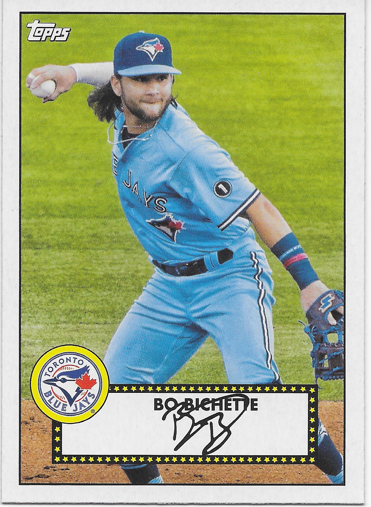
Now this Spencer Howard RC has me wondering - does this set feature the most Powder Blue uniforms since, oh, maybe 1982 or so?
I would say - Yes, yes it does. Probably later this year I will attempt to tally up how many Powder Blue baseball cards I find this year. I think it will be - a lot.

That is another of those 1952 "Redux" cards though I can't for the life of me figure out the need to use the weird psuedo-word "Redux" for these, nor why an insert clearly included to mark the 70th anniversary of Topps Baseball sets doesn't include the special Topps 70 (or is it 70 Topps?) logo - but for once I am glad to see Topps basically miss an obvious chance to thematically tie a few things together, as these "Action 52s" that I quite like are much better without any superfluous graphical notations.

Especially since such sure, why not appellations will likely be found on all the other inserts in the release:
I have always been a fan of 1986 Topps so I quite look forward to obtaining some "new" 1986 cards. But I don't know anyone who celebrates the 35th anniversary of anything and that notation on these reprint inserts is pretty much played out - but you know it will be a huge deal all over the Topps Baseball set, next year. A prediction so easy, it's like falling off a log.

Meanwhile I might need a duplicate of this Ortiz card to help fill out some binder pages of a half-baked Opening Day insert checklist from a few years ago called "Heavy Hitters" which well illustrates the comical challenge of maintaining upper torso muscle mass as you get older.

Inserts have changed over the last several years; I believe Topps dialed down the insertion ratios of most of them to give collectors more of a chase challenge and possibly to up the re-sale value of their products; something I can only partially agree with. When I like an insert, I don't want it to be rare. When I don't like an insert, I am more happy to not find them in my packs. Particularly all those insert checklists that mix certified Hall of Famers with maybe-maybe Rookies which then makes for big holes in the checklist years later after most of the Rookies inevitably fail to reach Cooperstown immediately after their first At Bat.

This year there are a couple ridiculously low input low hanging fruit type inserts given the "Anniversary" theme of the Topps Baseball set, and one upside is that the design of these inserts locks out brand new Rookies completely, as with this one:

These are nifty little reprints I would quite like to assemble - but they are also basically low insertion rate reprints that I am unlikely to find more than a couple three of over my coming S1 purchases. But since they are just reprints without hot Rookie Card cards included, I'm thinking they will be very cheap to acquire in the "aftermarket."

Speaking of which, the point of most box break recaps for most readers is the hits, man, the hits - did I "hit" anything in this blaster? Anything worth more than 0¢, the basic value of all of the cards I have just scanned in for you, (possibly temporarily) outside of the 2 RCs shown? Why yes, yes I did:

This is technically a "super" short print, though it took me quite a while to realize that. Usually the photo variations have some sort of theme to the image selections. Other times, Topps simply phones it in, as with this card. Nonetheless if I can get around to ever selling this it would probably pay for the price of the blaster. Which is both good, and bad. 

'Bad?' Yes, this "hit" card I found is the reason it is so hard to find baseball cards for sale, and I don't care to encounter problems when I just want the simple pleasure of ripping a few packs of brand new baseball cards. Of course I enjoy the faint chance of "hitting" a card worth more than 0¢ in my packs (the 'good'), but if I had to choose between buying packs that might hold a $20 bill and a guaranteed chance to simply buy a few packs of baseball cards, I would take the the guaranteed availability. Meanwhile that intoxicating chance to find a $20 bill in a pack of cards, or $200, or, even - $2,000 - leads people to purchase so many of these baseball cards that this all now makes it difficult for people who just want to buy the cards, a few packs at a time. Like me.

Ultimately, a Topps Baseball set is remembered for the basic design of the basic baseball card and how that works out for any random player your mind selects when thinking about the set. Over the years I have started to notice the way I think a few teams put uniform #s in odd spots, though I can't recall another specific team example right now, when I need one to share. I have noticed the Reds uni style including the uniform # on the player's belt before this card. 

But it took until I found this card to even notice the player name is written in a team color match, normally a basic, and good, part of a baseball card design. In 2021 Topps Baseball, however, the uniforms have to do the talking:


Thursday, October 9, 2014

Baseball Card Therapy #2

Hello there. Don't be alarmed by the title…the pets here are fine, and life is pretty good. You probably wouldn't believe how good the trout fishing was right there at the end of the season last week, but that's another hobby.

Work though, has been annoying as all get out. My actual jobs are great and I thoroughly enjoy them. The clients though……

Which is of course one reason baseball cards are so great. Just relaxing little picture cards, full of nice calm numbers on the back. Whatever is happening in life, baseball cards won't let you down, well, unless you are desperate to pull a "hit" card by purchasing them retail. But if that is your collecting, err, speculating style, well, I won't be much help.

So when I got home from yet another work excursion (my career is almost as incompatible with baseball card collecting and baseball card blogging as perhaps over-the-road trucking would be), I reached immediately for some baseball cards. 

Aside from working on the ever ongoing Sea Turtle parallel project, I have also been dedicating my available baseball card time to preparing my piles of baseball cards for the long term. Some will hopefully get headed towards sale via COMC (probably still a few weeks out), and some need to be placed in binders….
And yes this means I can finally type….

Minnnnnniiiiiiiiiiiis!

Though I didn't want to use that in the post title and steal just totally everything from the Night Owl. That scan there, definitely owes him something as yes, that is a page of minis in the new binder pages from Ultra•Pro for these cards. And he certainly helped push them into making this obviously needed product in the baseball card world.

I love 1972 style cards. One of my favorite designs after 1975, 1953, and 1956, and, well, maybe I'll rank them all some day, but probably not. But 1972, oh yes. Sadly, at the age of 5 I was not yet buying baseball cards in 1972, and I haven't made any effort to acquire many of my very own original 1972 cards. Until the rise of internet card sales, that was always a scary idea for me. Expensive, not completely simple to do through the mail unless buying a whole set, and there just aren't many card shows (i.e. none) in a county with only 20,000 people living in it.

So when I saw the 1972 style mini in my first pack of 2013 Topps Series One, I knew I would be collecting all of them.

That is a pretty good Mike Trout card there, a nice On-Deck Card it looks like, with plenty of baseball context viewable on-card with the stadium behind him. Quite striking amidst the other 8 seemingly now standard action shots cropped to the torso, which generally blurs the background, on his page.


Now I love the card design, the Psychedelic Tombstone I've read it described as (probably at the Night Owl blog, again), and it turns out these new versions scan really well - probably more vivid in the scans than real life. When the green cards pop this much, I even like the non-harmony of green cards for 'red' teams. Seems fitting for these.

On this page I love the gleam of Adrian Gonzalez's helmet there, and I can still tell Chris Sale was photographed in Detroit, even on a cropped down mini card. Topps prints so many cards shot in Detroit I'm starting to think about looking into who the Detroit based photog for those might be. I also like seeing Rizzo in the Cubs alternate home uniform, complete with National League shoulder patch. Cubs cards next season might be quite varied - they sported 9 different one day alternate / throwback unis this past season.

Page 2 of these cards also shows some downside to the new mini pages. Every time you move the page, the cards go for a ride in the pockets. And doubling them quickly reveals the other card hiding behind the front you are looking at. OCD collectors will struggle with these pages, but for me, they are fine, I just like to look at pretty baseball cards.

This third page makes me wonder if Jose Reyes throws like a girl - professional shortstops in the Women's Fast Pitch Softball league probably do throw better than he does.

That's an interesting dug-out shot of Ryan Braun there, he's sporting a pink armband probably from Stand up to Cancer day in MLB. But his inclusion in this little insert set again makes me wonder why suspended players get baseball cards but we can't have any new Pete Rose cards.

The Dickey card reveals that Topps in no way attempted to use the Heritage approach on these cards, with mimicked poses from the original set. R.A. has two other regular size 13 cards featuring a nearly identically zoomed/cropped photo as this one.
These cards did arrive before A-Rod's eventual suspension of course, and I have to admit I like his card here. Nice shades, and is a nice reminder that the new Yankee stadium tips it's architectural cap to the previous edition.

I like the leg kickin' Cliff Lee card here … it was only with the scanner's help I've noticed it's a card shot in the late afternoon, which I usually like and have a small pile of, waiting for the ever precious free time to be bindered, scanned, and blogged. There are several Night Cards in this set, and though none are all that memorable with this much crop/zoom, they do stand out because there are so few in the base card set these were inserted with.
Here with the sudden change in the checklist from a nearly alphabetic one (by home city name, including 'Anaheim' for those ever mysterious Angels), to a run of Superstars of the past, we reach the end of tonight's blog post.

That is indicated by the Gio Gonzalez card back peeking out at us. The backs of these are authentic to the '72 style, complete with a trivia question on each one. I read some of them; the best one was answered by that card to the right of Gio's back-side - Who was the last ROY to make the HOF? Yes, baseball card prospectors might shudder with the answer - 1982's Rookie-of-the-Year Cal Ripken, Jr.

For the most part though, it is just too hard to squint out from under my glasses (Old Man Need Bi-Focals could easily be inside my next fortune cookie) to read the back of a mini baseball card. Which at least made for an easy decision on whether to keep 9 or 18 cards on each page of these.

But I'm drawing to a close here because this set is not complete, and the Series 2 checklist has even more holes. The missing card there is #44, Nolan Ryan.

My needs list from the Series 2 run of these is:

51 Griffey Jr., 56 Wright, 62 O'Neill, 78 R.A. Dickey (again?), 82 Sheffield, 83 Mattingly, 86 Brett, 89 Middlebrooks, 94 Ortiz, 99 Ozzie Smith

And since I'm typing up lists of cards in hopes you might have one for me, I should note that I am about a similar amount short of the '71 minis from Update. I hadn't thought to collect them at first, and indeed even shipped a few out that I now need. But I bought so much Update chasing the parallels that I had pretty close to a set of those, and they too look pretty good on a binder page. I do need:

2 Ruth, 10 Votto, 12 McCutchen, 15 Kershaw, 21 Kinsler, 26 Rivera, 27 Musial, 28 Bench, 31 Puig, 33 Posey, 36 King Felix, 39 Stanton, 40 Garciaparra, 41 Cespedes, 44 Myers, 47 Mattingly

I do have a nice little stack of these cards to trade, and I look forward to scanning the rest of the pages for you. The blog will likely stay in semi-regular mode as I continue to work on nice permanent binders of cards for the future … but the ever increasing hours of darkness this time of year mean I can only work but so much, hopefully giving me a bit more time to hang out with y'all in the weeks ahead.

Sunday, November 17, 2013

Let's Trade ... Short-Prints?

The cards everyone loves to hate....until one appears of their favorite player. Gimmicks. Set-breakers. You have to have them. You didn't even know you pulled one. You could care less. They make you rip packs like that mayor in Blue Jay town seeing what he can find down on the corner after work.

You gaze at them wistfully on eBay. You just can't decide what to think about Short Prints. Or what to do with them when you get one. Sure, you could send them to your favorite trading partner who collects That One Guy you pulled. But what does he send back? What is equal in trading value for a Short Print? We don't even get to know how "Short" the Print is.

So they sit there. They're a Short Print. You can't just put them in the binder with your other cards. They don't fit on the page right. You don't collect that team. You don't know what to think about them, or what to do with them. So they sit there, over in the corner of your card desk in their lonely little stack, on that box of base cards from 3 years ago that you don't know what to do with either, where you hope nothing will bother those weird little Short Prints.

And sit there. You don't want to open an eBay account. You can't throw one out. You're not really up for just adding it to the pile you're shipping off to that one trader. It's a Short Print. That's gotta be worth something, isn't it? I mean, you think you saw one on TV once, or maybe just on a non-baseball-card webpage. How often does that ever happen? People must love and desire these things somewhere.

But where? What do you do with the darn things when you pull one? You don't even understand how they play baseball in That League. And now you have a Short Print from it.

I have the answer you've been looking for. Trade it to ME!

But what can I give you back? What else but a Short Print. Check 'em out:
Cutch! MVP! Lovin' It there all googly-eyed with Pedro! If this card wasn't a short-print, there would be vandalized meme quotes drawn on this one everywhere you look.
Cutch again! A Cell-Phone Card! I bet you don't have one of those yet! And a Bow-Tie Card. Now there's a Two-Fer for ya. Good luck ever finding this combo on a baseball card ever again. And ... an Earring! It's a Trifecta!
These silly dress-up cards just don't do it for me. Does that guy even play baseball? I never see him in the MVP voting everyone is always arguing about. He must be a League Official or something, the fan in the back there is more into his cellphone. Hey, it's a 2nd Cell-Phone card! Trade for these cards and you're on your way to a whole binder page! I can even hook you up with more sartorial baseball wonderment, check it out:
Good Lord. I'm thinking all the smart baseball players told the League they weren't feeling too good before "warm-ups" at the 2000 All-Star game. They'd be OK by game time in their regular uniform, but for now it would be ahh-ite if the the 2nd place vote-getter went out there and represented for them. Yeah, that's the ticket. Nomar forgot this option. He is not impressed.
Now that's impressive. You have to be pretty frickin' cool to wear pink. I bet you don't ever wear pink. Robinson Cano though, he can Man-Up and wear pink whenever he wants. Even on a baseball card. Maybe he put on shades so no one could see him rolling his eyes all the time during the Fan Parade. I'm not sure just what is going on with all these fans who refuse to even watch the thing though. But Shades Cards are certainly cool.
Topps certainly thinks so. They made a bunch of them this year. If you look closely enough, I think you can see my scanner in there, cuz this year's batch sure scans up nice. Go ahead, click on it for a better view. Careful though, you might need your shades first.  His necklace is even glowing a little bit, just extra coolness dripping off there.
You know what else is cool? Signing autographs for kids. That really is cool. Maybe wearing cool Shades explains an autograph that looks like this:
That's not a Short-Print! Nope. Wrong blog for that kind of thing, sorry. Let's get back to the baseball cards:
Now we're talking. Classic lines, classic player, classic socks. The spare, popular 2011 design, classic "topps" up there in the corner. What's not to like? Not sure what happened to the classic "A" logo on the baseball there though. Maybe it got rubbed off in all that great infield dirt on this card. Or maybe it's an uncorrected error card. A UER SP. Boom! Now that would be a card to chase.

Vintage players on current designs. Kinda cooler than current players on vintage designs sometimes. Your Topps Master has to keep you ripping packs somehow. Let's see some more:
Hmmm. That picture sure looks familiar. Where did I see that one before? Was it here?
No, no, that's not quite it. That one is a print too though; it's hanging on walls these days in the Topps Wall Art Set that is to die for. That is one hell of a stretch Seaver had. I just know I've seen that same picture, hmmmmm....
I knew I had seen it somewhere — it was right there in the same box of cards with the _short_ print. Some Short Prints are shorter than others I guess. I don't know what to do with all those Topps 60 cards I have either. Can't see 'em too well in a room with those new light bulbs these days, can't burn 'em. Hmmmmm. Let's see some more Short Prints.
Everywhere I wander on the baseball related Internet, I see quotes from old Vintage pitchers about how they hated the batter when they pitched. Looks like The Hawk can give it right back to 'em. That poor little Cubbie there on his shoulder seems like he wants to keep his distance from that bi-cep. Damn. Keep your distance, I think it might explode.

There's more cutting-edge Vintage classic retro-ness, or something. Hard to get more "baseball" than Pinstripes at the plate.

We all love to pull Short-Prints. They take you back to that first time Topps told you softly "first hit's free, kid" and you believed them, because scrounging up some loose change for a pack of baseball cards is about the same as free isn't it? Just like swiping your debit card these days ... you don't even have to take cash out of your wallet to get you some more baseball cards. That's kinda like free too, isn't it? Cuz when you get that Short Print Hit, yeah,
Smoltz knows.

So how can you get one of these sweet Short Prints for yourself? Well that will cost you a Short Print. But which ones? You can't even read a Checklist without tripping over the Short Prints and the Super Short Prints these days, and why can't I just call them Variations like a professional baseball card critic? People slap "short print" on every other card on eBay these days.

In particular, I want some more of these Short Prints:
They are from a set of 25 I believe. The 2013 Topps Series 1 'Out of Bounds' series. Looks like I have 16 to go....those are the ones I have so far. Some of them, thanks to cool bloggers like you.

There's some others I'm interested in. I have a few more I didn't scan, like last year's Update SPs of the last 2 AL MVP winners, Miguel Cabrera and Justin Verlander. Yep, more MVP SP cards up on the block.

Cuz I love those Short Prints. I need new ones. Like the Cabrera autograph signing one from Series 2, and the Scherzer one where he's posed along with his awesome power slugging third baseman you may have heard of. Oh, and of course, your choicest Parallels can pry one of these away from me too. So as always, hook me up with your Camos, your Blacks, and your Pinks. Those new Sapphires are crazy-cool looking too. Trust me, you don't want them laying around near all your spare Short Prints for too long. You don't want to end up like that Mayor up there in Ontario, eh?

Sooo, Let's Trade! Short Prints.

Thursday, September 12, 2013

5 Cards challenge

Well hello there, I sure have missed y'all. I'll just say that self-employment and blogging can be very mutually exclusive at times. I love to write, which you may have noticed, but I would write quite a bit more if I had a nice regularly scheduled work week.

I do have quite a number of posts figured out, but I also have a long stretch in nearly-no-baseball-access land coming up too. I am hoping Bob Uecker's broadcasts will come in at least, I think they might, and there is a cheap casino just down the road a piece. But I won't be around all that much until Update comes out, then I should be at home some, I hope.

In other blog news, I wish to note that I love it when I find out I am wrong about a baseball card. A part of the reasons I write about any card is an attempt to find out if I am really seeing what I think I am seeing on that card, or if the goofiness is taking over again. So you might want to check out how my previous blog post over a week ago actually turned out.

For tonight though I have plenty on the to-do list (such as packaging one trade and typing out details on another, hang in there), so I'm going with a trick I will probably try more often going forward. The first time I tried this it eventually led to a very long post on photo composition. Oops.

The idea is to pick the smallest possible pack of cards, and blog about one of the contents. How small do packs of the Topps Base Set get? This small:

Yep, that really says "5" there in the crinkle. Where does a 5 card pack come from? The Dollar Store, it turns out. So the cherished image of little Johnny saving his nickels dimes and quarters for taking old Mrs. Smith's garbage cans out to the curb and back and saving up for a pack of baseball cards is still alive, I guess.

I'm actually somewhat seriously considering buying my set this way next year. I was stupid enough to look at the sell sheet for 2014 Topps, a set I already know I will call the "Half Bowman," and I'm just not that excited about it. The inserts just don't appeal to me that much, and I don't see enough color synergy possibilities in the design to get very excited about the parallels. There is some sort of big Rookie theme across the whole set...as if we don't have enough baseball cards of kids not old enough to legally drink yet. That's not a clown comment, bro, that's an all too sober reality. So it might likely be pretty much a Heritage year for me next year.

But I can't really pass on a Base Set of Topps cards. Heritage will never have enough random baseball photos of random utility players to feed my jones. So the question becomes ... how to get those base cards? I like ripping packs, so perhaps a whole bunch of these 5-cards-for-a-buck packs are in my future. But the actual wholesale price of your Topps base showcase, contestant, is actually just 4¢ a card. That's right. If you go out to purchase base cards on the secondary market they run just about 4 shiny Lincolns each when purchased in bulk. That ripping jones is actually pretty expensive.

But all that's next year. It's just silly to know what next year's baseball cards will look like before the playoffs even start, fer-cryin'-out-loud. I'm going to try much harder to never peek at future sell sheets.

I do hope the 2014 wrapper is at least as good as this year's wrapper. I like that the Sea Turtle appears on most of the packaging this year. And I am a sucker for that classic MLB logo on anything. I do sometimes wonder which came first, MLB or the similar one for the NBA? Dunno.

And I have to wonder what is the deal with the Eye Black on the young stars; they sure seem to lay it on a bit thick. But now I'm wandering off into a future topic, and I've already blown the time budget for tonight. And aren't baseball card blogs supposed to be about looking at baseball cards?

So the winner of tonight's 5 card challenge is....Alexei Ramirez:

Tell Alexei what he wins there, Bob. Well Base Set, Alexei didn't manage to escape his fate at either the the traditional no-waiver Trade Deadline or the clear-waivers Playoff Roster deadline, so he seems doomed to be a solid middle infielder on a rebuilding team with a young manager for however long it takes for his contract to run out with hopes the eventual post-Jeter circus might still be in swing, so he wins absolutely nothing. He can have a big pile of duplicate Topps base cards if he would like I guess.

At least Topps handed him a good card this year. Though he is a very good top-of-the-order batter, Topps shows him fielding, in line with their themes for each position. As if they are saying, nope, we don't need to put the player's position on the front of the card, we'll demonstrate it for you in the picture and show slugger Clint Barmes batting instead.

And a good picture it is. I almost always like a horizontal card. There is one in Series 2 that is just stupid, but I didn't pull it in this pack so you'll have to find that one on your own time.

It seems the 5 card challenge does lead to a card with great lines. I'm already looking forward to ripping my next pack. I think I'll take it on the road with me and do a little mobile blogging. The idea of way over-paying for base cards with these dollar packs might be growing on me....

Here we have several examples of lines going from bottom right to top left, from the pinstripes on Ramirez' uniform to Joe Mauer's fingers. They are nicely complemented by just a small amount of not-quite-opposite, more-vertical lines. But the predominant flow of the lines lead straight to a baseball. On a baseball card. I always like seeing a baseball on my baseball card. Nice pick, Topps.

I also like Alexei's 21st century shades, and that little smirk on his face as if he is sayin' yep, All-American pretty-boy perfect baseball player Joe Mauer, you be Out! Not gloating, just a sly little smirk.  And now I'm gonna throw out that slow Willingham dude too! Ha!

The only downfall to this card is the same problem the White Sox always have, save when they bust out some special colorful uniform on special uniform day: monochrome. The Sox are the one team that just don't fare too well in the base Sea Turtle design. (They do pop very, very well in any parallel you wish however). You probably can't see it in the scan, but this card suffers even more as the Topps printer shorted the turtle of the right amount of ink and the Turtle's racing stripes are kinda washed out. Like how most Chicago fans are probably feeling by now.

What else did I pull? Not much to write out to the blogosphere about. 3 more torso cards (zzzzz), one of them Photoshopped (Torii Hunter - that certain shinyness to the cut/pasted uni from some night dome game they use every time always gives it away). Yet more proof that however much I admire the various set blogs and the 2013 Sea Turtle set, I just don't think I could ever pull off writing about all 990 of them with 600 torso shots along the way. Colorful turtles and logos can only get me so far.

Also another turning-two card, of Brandon Phillips and a camouflaged Padre. A nice enough card with Phillips' hat looking like it is a beer can that needs to be opened. I would be too tempted to crack that head open in a blog post, so I'll leave that one be.

So there you have it, another baseball card for another night in the 2013 baseball season. The teams keep on setting lines like a heartbeat on one of those heart machines at the hospital as they win and lose and race towards playoff eligibility. While they do it, I just hope to find the time to follow the lines on their baseball cards.

Saturday, August 31, 2013

The Wal•Mart Blues

Here's a fun game you can play the next time you are in Wal•Mart. And I know you will be in Wal•Mart, because you buy baseball cards.

Sure, you can try and pretend you never go in there. You can tell me you only and always shop at Target, which would be wise, 'cuz the wimmins in there are way prettier. But I know you would be lying, because you buy baseball cards.

And my little game has nothing to do with the so-called "People of Wal•Mart" that you might be unfortunately picturing in your head right now. I'm not a fan of that website; I can have fun mocking baseball picture cards, but taking pictures of ordinary people to then publicly mock them on the internet is kinda mean really. Karma will find the people who take such pictures, I sincerely believe.

No, my game is one you can simply play in your head the next time you visit Wally World; and it is a simple one that is just simply a question: Is anyone happy in Wal•Mart?

Seriously. Just look around whenever you are in there. The customers? The employees? You?

I am happy at Wal•Mart - I am almost always only there to buy baseball cards. The fact that I can pick up a few groceries or some motor oil or a fishing lure or a pair of work gloves at the same time is kind of a time-saving bonus. No baseball cards, no Wal•Mart for me. Even though I know the other box stores I go to  instead are selling essentially the same junk manufactured by exploited workers in foreign countries.

But hardly anyone besides me ever is happy in there, despite all those smiley faces plastered everywhere. Mi amigos de Mexico y puntas sur, si. If you are in a Wal•Mart near much of an Hispanic immigrant population, you might notice they do seem to enjoy the place and their new American levels of purchasing power. So let me rephrase the question. Are any Americans happy to be in Wal•Mart? Perhaps small children being pacified with a purchase I guess. So one final rephrase - Are any adult Americans happy to be in Wal•Mart?

You be the judge next time. The results ... might surprise you. Or might not.

So I was mentioning that I pulled up to a Wal•Mart a week or so back now in the throes of baseball picture products withdrawal. And then the blog went dark for a few more days.

There is a heat wave gripping the area where I live this week, a rather northerly locale, so we don't really need central air conditioning save for a few miserable weeks a year, like this one, and it isn't built in to my house. And the room with my scanner and baseball cards was more intolerable than my enjoyment of writing this blog for y'all. Especially since the post I had lined up in my mind needs lots of scans. Because you want to see some baseball cards, not just read more wordy words on the internet. Right?

So, finally, let's look at a baseball card:

That's not a Wal•Mart Blue, man. Don't worry, I won't cheat yas, those were in the pack too. Along with my fix of Topps stickers, I picked up a 'fat' pack of Series 2 while I was visiting with Wally. Though this one didn't at first seem quite as 'fat' without Prince Fielder on the cover now.

Mr. Diamond here just seems to say America. Baseball. Wal•Mart. There's a diamond on his card and he's named Diamond. Lots of blue on there, like the store's signs. Minnesota. Is there a state more American than Minnesota? Seemed appropriate to get a Twins card when I had watched a Minnesota TV station to get my weather forecast the day before, despite being a couple state lines away from all those lakes.

I am more than a little burnt on the pitcher's torso framing so prevalent in 2013 Topps - this one lost some potential composition points by cropping off most of Scott's leg there, but gained a few back by leaving his uniform's leg stripe on the card.

I like this card anyway, because it is another one shot at Detroit's Comerica Park. That fuzzy white stuff behind him is part of the #5, retired by the Tigers in honor of Hank Greenberg, as noted on the center field wall. Where are all his vintage repros, Topps? Heck, his life story is so amazing there could be a whole set of picture cards about him. Topps, though, seems to think the only old-timey Detroit Tigers worthy of new cardboard are named Kaline and occasionally Cobb.

I also wonder if we have Tatooine cards, what can we call brick-walled cards? Not many of those around, I'm sure. That's all solid brick there behind Mr. Diamond.

And the Topps collating machine didn't let me down on my all-American box-store trip, with more red-white-and-blue, though I just can't scan and blog the whole pack. I thought about it. If I did that, I might as well just launch a whole straight-up Sea Turtle blog, which I have also thought about. But I just don't have that kind of time - you wouldn't see card #990, aka #US330, until sometime in the year 2019 perhaps - and I like to blabber about lots of different baseball cards than just these neat little turtles, like this one:
Who would vote against the idea of more head-first third-base slide cards? This one might appear on some best-of lists; especially since the slightly better card of Everth Cabrera was suspended for the rest of the season. Which coincidentally, seems to have tanked the prices on that Superman-like card, making it rather easy to rainbow if you wanted to. I briefly considered doing just that before launching head-first into my Parallel Project instead.

Usually sliding cards in the digital century feature a little dust going airborne as well, the absence of which makes the Florimon card that much more striking I think. I did quickly find a somewhat analogous card:

I always like the I'm-gonna-catch-that-ball, I'm-gonna-catch-that-ball, I'm-gonna-catch-that-ball baseball cards. The viewer is as entranced with the probability as the baseball player immortalized in time. On this one, Mayberry has run to make this catch so hard that the turf divots are still going airborne behind him. In action, indeed. Topps saluted Mayberry's father with a somewhat unexpected checklist entry in Archives this year.....I think it's time Topps busted out those nice Father/Son cards in a little subset next year. But they probably won't, cuz the 19 year old card dealers dealing cards of 19 year old minor leaguers could care less about major league parents.

I did escape from all-America colors for a few selections in the pack, courtesy of the New York Mets, who generally fare well riding the Sea Turtle:

Especially when the opposing player supplies plenty of their complementary base color, blue. This card did lead me to a bit of extra typing on this 'puter thing in front of me - just who is this mysterious Amarista player in the striking blue uniform? I knew he wasn't among the hallowed 660 in 2013 Topps; which turned out to be because he is a pedestrian infielder for San Diego. No room in the base set for them, unlike near-similar players in major media markets. Though I have to stick up for 1 Whitehall St. here in that no one expected Tejada to disappear from The Game this year after a promising first couple seasons in the bigs.

Though the Mets have that excellent Orange in their color scheme, their cards still scream America! Baseball! as much as the flag-color teams, such as this one:


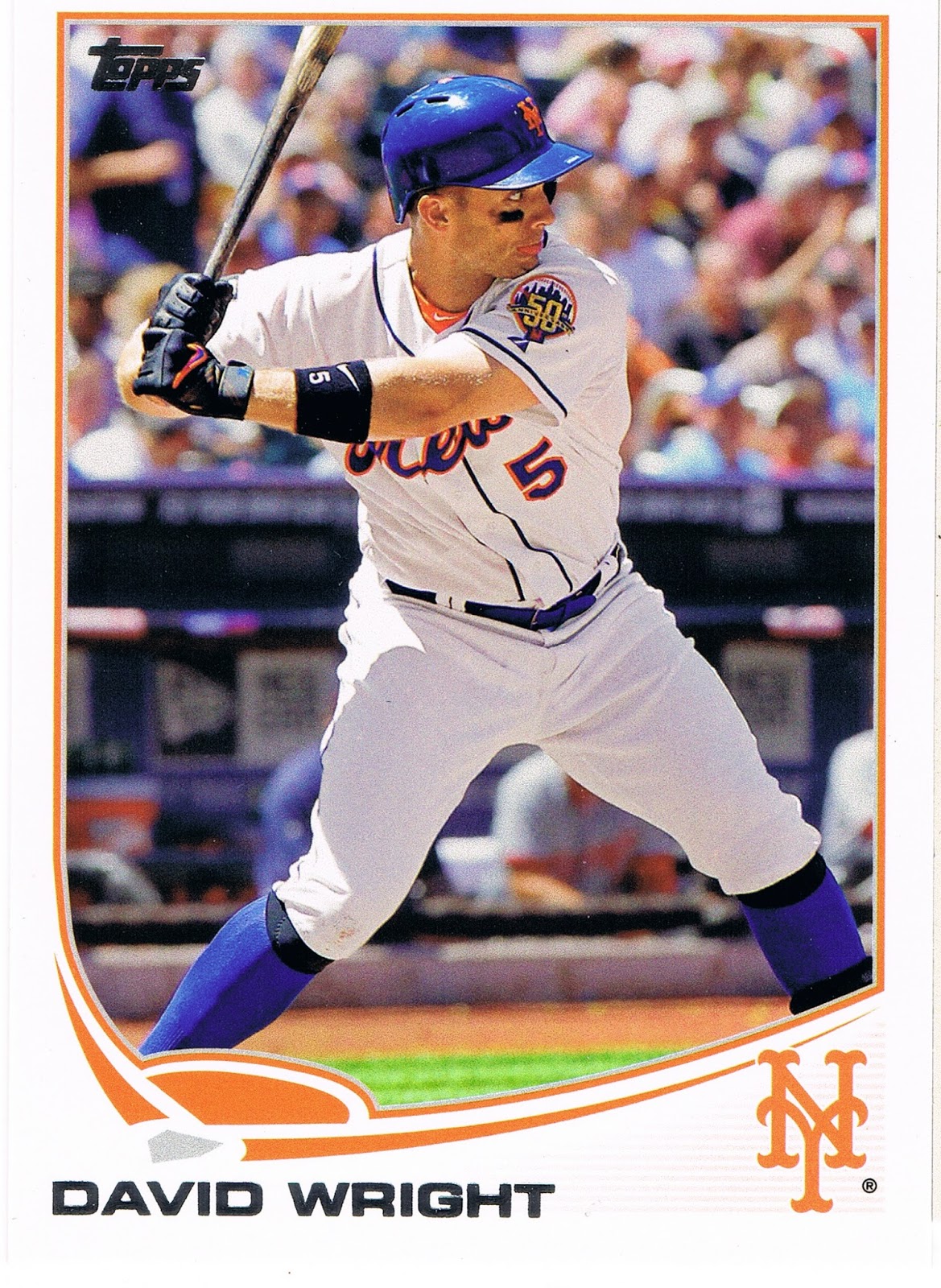
A classic. Great Sox - old school, good supply of Met-blue. Wright has already taken his left foot-step forward - he's committing to swing at the pitch just about to enter the frame. The fully extended left arm further adds to the not-tense but excellent anticipatory tension of the shot. The Met's 50th anniversary shoulder patch is featured nicely. Just an outstanding baseball picture card; even though there have already been, who knows, a million different baseball cards produced (2 million?), and there is nothing new under the beautiful sunny skies at the ballpark that day, I can still enjoy a base set baseball card like this one. It also marks a return to "hero numbers" in Series 2 here, as this is card #400. I liked Topps' experiment with matching card #s to uniform #s in Series 1. I thought it was a nice way to honor more players than the limited amount of "hero" card #s in a set. I hope the tradition can continue right along with the new-fangled-ness next season.

And if you look real close at Wright's face (I won't crop it and blow it up for you - get your own card, it's a good 'un) you will notice that he has his tongue sticking out, like a happy cat or something. I think he is gonna smack that incoming pitch right over the outfield wall.

Of course baseball fans love sluggers, and generally love their baseball cards. But soon enough in this pack I got back to primary baseball colors, and a rather amusing card:


I don't think I've ever seen a slugger with a case of guitar face before -


It must have been a foul ball. Not sure I would hand Jay that card to sign, though he has a few other similar post-contact cards.

Sticking to an also more-common-than-I-totally-wish meme in Series 2 (as in Series 1) - showing a player's "unhappy" face (granted, an inescapable result of 'action' photography) - we find this card:

Normally these are found on the pitcher's cards of course, but Yunel there doesn't appear to be throwing from much of a stretch position, so we have to check the back of the card. Yep, an infielder. A basically unremarkable card really (too, too much blue), until another Tampa Bay Ray wandered into the pack a few cards later:

Another unhappy action shot. Both of these make you think the player is thinking, hey, the runner is already safe, but I have to throw the ball over there anyway. But you can't blame Kelly for being disgruntled at being photoshopped into a Tampa uniform despite being a Series 2 release this year. That's right Topps, a big fat Zero for this one, you graded it yourself there. The overly shiny uni and the too-bright hat are always a dead giveaway for a dead baseball card. I only had to look back a few cards in the pack to confirm I was being manipulated so you could have more time and production budget to put redemption cards in your expensive products.

Fortunately, Series 2 rarely disappoints for long:

My first thought on my first copy of this card a few months back now was that it could be a possible entry in the shoulder patch binder for that intricate Orioles patch. Or maybe an addition to the Shades page. Just today I noticed it's a second card with a touch of slugger face perhaps.

But eventually what really makes this card jump off the stack of baseball cards is the partially flattened baseball jumping off the end of the bat there. Even with the cutting edge camera equipment Topps gets in action these days, such intense motion can't be completely frozen and the ball seems to be departing the bat as if McLouth ignited the rocket fuel in the core. A pity such a great image capture is weakened by the way the ball hides in the white of the uniform. And the unfortunate way the lines of the composition lead the eye away from the baseball to such a degree that it took me 2 months of playing with Series 2 cards to even notice the incredibly rapidly accelerating baseball on it. So close, Topps, so close; much like hitting off the end of the bat like that is not just exactly perfect.

Did I just type 'perfect'? Yep. Like this card:


Yes we have made it to the Wal•Mart Blues at last. Though if you still have the blues after seeing this card, well, baseball cards just won't help. I featured this card before Series 2 even came out, I like it so much, though I did discover what happened to the ball on that card. Hint: don't hit the baseball off the end of the bat. This card is giving me the blues a little though, as I have realized that the best possible parallel edition of it would be the /62 black bordered version, which is basically true of all the Pirate cards. The black-border Alvarez card has been up on eBay twice in the last few weeks and gone for a little more than $25 and $20 w/shipping and I just don't want to spend that much on a single card. But oh how I desire to have it (and the McCutchen card) in that parallel. Donations always accepted. I think, though, that I will probably settle for tracking down a /2013 gold border version, like a few other classy cards this year. The gold always seems to work out nicely with any team colors.

The Wal•Mart parallels also bring me down a little with their pastel washed-out-ness. The basic, nearly-dark blue of the standard Wal•Mart logo would look quite a bit more striking on a baseball card. There was probably no way around that, given the nature of the colored Sea Turtle - i.e., to make a blue parallel either the border or the graphic frame has to be washed out compared to the other.

One of the blues in this pack -
- got me wondering about the colors of the Turtle, vs. the colors of the team logo. The "A's" there is a dark, dark green. It looks great on most cards, matching the tint of the Athletics' unis. And the Turtle is decently dark enough, but still not a match. Ahh, the mysteries of Topps sometimes. And the mystery of Brandon Moss and his little baby blue fore-arm bands, and how he cutely destroys Tiger pitching, and the mystery of how good Billy Beane is at reading the waiver wire all the time.

Which are frequently only matched by the mysteries of the Cubs:


Another probably safe-at-first fielding card, the nearly official meme for light-hitting infielders. You can't hardly put a bat in their hands on the front of their baseball cards when they hit all of .121 last year but are still expected to be part of the starting 9 come Opening Day. Perhaps the card farthest below the Mendoza line this year. And similarly indicative of Topps' luck with printing baseball cards with Cubs logos on them of players that actually end up taking the field for Chicago. There's always next year, when I expect we'll see more Vitters cardboard after an injury-plagued but healthy stat year in the minors. Maybe Topps should just wait and issue all Cubs cards in the Update set until Epstein somehow gets together more of a regular line-up around Castro and Rizzo. Maybe he should call Billy Beane, Epstein's original employer's first choice for the job.

Now of course once the Wal•Mart Blues roll out of the pack, we're due for even more excitement.

What could be more exciting than that Alvarez card up there? Why the generally pretty good crop of inserts this year, usually led off in the 'fat' packs by a '72 mini:

Can't beat a '72 mini of a player who actually played in 1972. I like the '72 design; despite my affinity for harmoniously synchronized team colors on a baseball card, I also like how back in '72 Topps just refused to use the color red on a Redlegs card. Lost in the trippy stars I guess. An added bonus was despite a more than passing familiarity with all the vintage Johnny Bench cards I have or still desire to acquire, and Topps' penchant for ridiculous amounts of photo repeats, this was a new image for me. Now there's an upside to avoiding all those gimmicky "high-end" ego cards. Just don't put this sweet new Johnny Bench card anywhere too close to his entry on the faux-high-end insert set in hobby boxes called "The Greats" or "The Elites" so clearly designed to entice you on to those surely extra-valuable "high-end" sets, or the spell of acquiring a brand new Johnny Bench card might fade a little.

After the minis appear the regular size inserts, such as Chasing History:


Though I have thought there is little more pointless than a card designed to hold autographs or "relics" that then hold neither and just take up space in the packs of the base cards I actually do want, the Chasing History set broke that sad mold this year. The card pictured there is right up there with the excellent Lou Brock edition on the checklist, and a few others. Another great, arm-fully-extended, I'm-ahh-gonna-hit-that-pitch batting card. Great light and shadows interplay and a sweet MLB shoulder patch. I'll need an extra copy of this one for the patch binder. I hope the Jr. Junkie might swing by and enlighten us on what year this great shot is from.

But much like the base cards in this pack, I decided against scanning all the inserts. Normally in a Series 1 or 2 'fat' pack, I like just 1 or 2 of 'em enough to want to comment on them. But this pack just kept on packin':

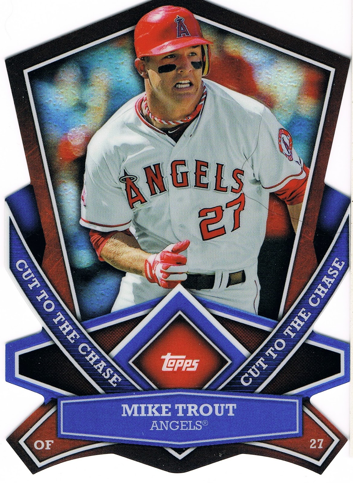
I've never had any die-cut cards before this year, I don't believe. I skipped those crazy 90s cards and most of those other card companies too. But I sure do like these Cut to the Chase cards, and I need to convince you to send me all of yours somehow. And no collector can have too many Mike Trout cards, now can they? I in no way would ever want to start a Player Collection of him, though I have been starting to think Topps just won't issue a card of him with his mouth closed. It's like he is always breathing like a fish or something.

By this point in the pack I was fairly satisfied by Topps' team-up with the Walton clan. But this Wal•Mart was so far off the beaten path I think, that those two corporations had a reward for me for loyally tracking them down at the very end of the distribution chain:

It's a hit. A retail hit. Aww, thanks Wally. Even though the back of the card has to remind me even more explicitly of a Series I'd just as soon forget even more than the 2006 edition. That's a trip to Wal•Mart for ya, always giving everyone the Blues.