Wednesday, March 17, 2021

Kicking off card season with a Blast(er)

I wouldn't normally make my first baseball card purchase of the year via the Blaster format. I rarely buy the things at all, though I do have a weakness for the "box cards" in the Big League product. It just feels like I am paying a premium for the so-called "Patch" card in each one, that I very rarely ever wish to own at all, for one.

The other problem with blasters is the way collation works in baseball card packaging. The sheet-cutting and partially random assemblage of the cards is designed to do one thing: there will not be a repeat card, inside a given package. 

However, when one buys two such packages, you will "hit" identical sequences of cards - and then you don't get just a duplicate card, you receive multiple duplicates. Many multiples. This is probably magnified even more in the "hanger box" format, although that has usually offered the lowest price per card. So far, I haven't seen any hanger boxes or "rack"/"fat" packs, either, this year and I have to wonder if I ever will.

This year however, anyone wishing to just buy a few brand new baseball cards while grocery shopping can't take any chances on hoping to find some desired pack format. It is a minor miracle to find new baseball cards on a shelf at all, so if any are seen they must be purchased on the spot. Which is how I found my first blaster of the 2021 baseball card season - a single solitary blaster, half hidden behind some Magic The Gathering boxes of some sort.

A little later on I did find just a few examples of my preferred format but that will make for a nice future post, with some interesting, non-blaster cards to look at. Today I want to check out the rest of the blaster as a way to ponder 2021 Series One a little more. Fully absorbing the "first pack" is nice and all, but there are 84 other cards in each blaster - now a $25 blaster, where I shop. What did I find?


This is a perfect example of why I grade this design a "so close" - everything works here, except those almost vertical design elements, and outside of the ridiculous player name size. Many have commented on how they make the cards "line up" in a stack and would even in a binder page, but I don't think that is why they exist like this. Rather, aligned elements like this make it easier to print and most importantly, cut the cards accurately. Something ever more important in the collecting era of "10 Snobs" who insist that every single baseball card Topps makes MUST arrive to their greed focused hands in 100.0% flawless condition, including "centering," or it is off to Social Media they go. Not just some of the time, but instantly.

I still quite like this Alex Verdugo card, with his cool glove, harmoniously color balancing the Green Monster and the team colors, and the way the wall even makes it looks like he has a green wristband on. Perhaps the perfect card to post today - St. Patrick's Day.

Meanwhile I think this card will kick off another random little side collection for me - cards featuring these - "full wrap?" - sunglasses that I am seeing on more and more cards lately. How long will baseball players favor these? I fully expect my Topps Baseball cards to document this.

But I'm just not sure I will ever quite get used to looking at 2021 Topps Baseball cards in the horizontal format.

An S1 card I always anticipate is some World Series cards from the previous Fall Classic, like this one:
I didn't have much invested in the Series last year, with 2 teams from the coasts featured, and was unable to watch it at all while out on a remote job at the time, and no ability to head into a pleasant little drinking establishment with a television, either. So I was depending on Topps to show me at least a little of what I missed. This card does that wonderfully, with a great image break taking primacy over the design elements. Overall, this is probably my favorite Kershaw card in some time.

Another routine part of Topps Baseball is the Rookie Cup -
Floating player, floating Cup.

And it's always nice to pull card #1 in a new set:
And card #27, too:
Mike Trout is routinely card #27 on many Topps checklists these days, a tiny holdover from the then firm break with tradition in 2013, which I could now write as "way back in...2013" - when I started this blog. Time flies, when brand new baseball cards appear for me to purchase on a relentless, basically year-round schedule these days.

That card makes me think State Farm has certainly got it's money worth from that bit of advertising placement at Angel Stadium of Anaheim. And also makes me wonder if they have ever considered hiring Mike Trout as a promo guy of some sort. Seems like it would be a good fit - the perfect wholesome baseball player, who would surely make a good neighbor, and one with basically perfect statistical production, year in & year out - a sure bet almost like - insurance.

I did find a bit of a surprise in terms of a year in, year out tradition in Topps Baseball for about 25 years now - a special handling of card #7.
That long run of Topps Baseball sets going back to 1996, of either a Mickey Mantle card, no card, or a carefully selected Yankees card at card #7 is over now. The Mantle family moved on to do business with Panini rather than Topps back in about 2017, iirc, but Topps kept some minor tip o' the cap to The Mick in the Topps Baseball set even afterwards.

2021 #7 is such an odd card. The center of the card is basically empty space while a touch more care in overall composition might have nicely accented the basic card design. And I certainly never expected to find the word "dab" on a baseball card of all places, given it's 21st century association with something else altogether.

Meanwhile, I also pulled the Yankees team card from this blaster (why not make it #7?), which is also odd -
On some of the horizontal team cards, the white line around the "design element" (what else can you call those weird parallelogram like 'things') just inexplicably disappears. 2020 strikes again I guess, with more baseball cards being produced than ever before, all done via Zoom meetings, perhaps. Meanwhile on this card at least, the design element has a clear antithesis in a whole 'nother professionally played sport, which at least gives you a mental name for the design elements on these graphic error cards.

Another card I always watch for in particular, this time of year, is one featuring a previous equal to the #27 card, Miggy:
And Miggy is looking good here - this bodes well for the 2021 Tigers.

Speaking of which, for the first time in a long time the Tigers have highly anticipated Rookie Cards in a new Topps Baseball release, and I pulled one in my first purchase -
What I particularly like about Tarik Skubal is that he is not some high-rated first round prospect who already has Bowman cards selling for 4 or even 5 figures. Rather, he is a normal product of baseball scouting, drafting, and development. It's way past time that my team gets some fresh young talent this way, rather than whatever they could get via their timid trades of two month rentals, which is how they picked up another Series One Tigers card I was looking forward to:
Though I am a little less optimistic about Paredes than Skubal, I do quite like the prominent view of the Al Kaline patch the Tigers wore last year, when I had the lowest chances to see them on TV of any year of my life. Those 3 cards pretty much satisfied me completely on the Favorite Team portion of the beginning of my 2021 baseball card season. I guess there are upsides to starting with a blaster after all.

2020 was of course a completely unique year in basically every way, and along that way, we all knew this card was coming -
and this one:
which was my first card to show me a fan cut-out in the stands. I know there will be more, and better, such cards in my future S1 purchases, but this is a card image I was expecting (and oddly looking forward to) from the first rip of the first pack.

A great thing about the Topps Baseball genre is the occasional repeat of a classic -
This new entry in the Wrigley Ivy checklist perfectly shows off the possibilities of this design + image and I can almost forgive that too long left side design element. Almost. I will return to that shortly. This year's Topps Baseball features an even more classic Wrigley Ivy card I quite enjoy:
It's like Topps has brought the Social Media concept of "trolling" into the set with this one, which perfectly cardboard-encapsulates the probable rise of the South Side of this year, while the North Side likely treads water.

As for images that perfectly match this design, I found several -


Now this Spencer Howard RC has me wondering - does this set feature the most Powder Blue uniforms since, oh, maybe 1982 or so?
I would say - Yes, yes it does. Probably later this year I will attempt to tally up how many Powder Blue baseball cards I find this year. I think it will be - a lot.

That is another of those 1952 "Redux" cards though I can't for the life of me figure out the need to use the weird psuedo-word "Redux" for these, nor why an insert clearly included to mark the 70th anniversary of Topps Baseball sets doesn't include the special Topps 70 (or is it 70 Topps?) logo - but for once I am glad to see Topps basically miss an obvious chance to thematically tie a few things together, as these "Action 52s" that I quite like are much better without any superfluous graphical notations.

Especially since such sure, why not appellations will likely be found on all the other inserts in the release:
I have always been a fan of 1986 Topps so I quite look forward to obtaining some "new" 1986 cards. But I don't know anyone who celebrates the 35th anniversary of anything and that notation on these reprint inserts is pretty much played out - but you know it will be a huge deal all over the Topps Baseball set, next year. A prediction so easy, it's like falling off a log.

Meanwhile I might need a duplicate of this Ortiz card to help fill out some binder pages of a half-baked Opening Day insert checklist from a few years ago called "Heavy Hitters" which well illustrates the comical challenge of maintaining upper torso muscle mass as you get older.

Inserts have changed over the last several years; I believe Topps dialed down the insertion ratios of most of them to give collectors more of a chase challenge and possibly to up the re-sale value of their products; something I can only partially agree with. When I like an insert, I don't want it to be rare. When I don't like an insert, I am more happy to not find them in my packs. Particularly all those insert checklists that mix certified Hall of Famers with maybe-maybe Rookies which then makes for big holes in the checklist years later after most of the Rookies inevitably fail to reach Cooperstown immediately after their first At Bat.

This year there are a couple ridiculously low input low hanging fruit type inserts given the "Anniversary" theme of the Topps Baseball set, and one upside is that the design of these inserts locks out brand new Rookies completely, as with this one:

These are nifty little reprints I would quite like to assemble - but they are also basically low insertion rate reprints that I am unlikely to find more than a couple three of over my coming S1 purchases. But since they are just reprints without hot Rookie Card cards included, I'm thinking they will be very cheap to acquire in the "aftermarket."

Speaking of which, the point of most box break recaps for most readers is the hits, man, the hits - did I "hit" anything in this blaster? Anything worth more than 0¢, the basic value of all of the cards I have just scanned in for you, (possibly temporarily) outside of the 2 RCs shown? Why yes, yes I did:

This is technically a "super" short print, though it took me quite a while to realize that. Usually the photo variations have some sort of theme to the image selections. Other times, Topps simply phones it in, as with this card. Nonetheless if I can get around to ever selling this it would probably pay for the price of the blaster. Which is both good, and bad. 

'Bad?' Yes, this "hit" card I found is the reason it is so hard to find baseball cards for sale, and I don't care to encounter problems when I just want the simple pleasure of ripping a few packs of brand new baseball cards. Of course I enjoy the faint chance of "hitting" a card worth more than 0¢ in my packs (the 'good'), but if I had to choose between buying packs that might hold a $20 bill and a guaranteed chance to simply buy a few packs of baseball cards, I would take the the guaranteed availability. Meanwhile that intoxicating chance to find a $20 bill in a pack of cards, or $200, or, even - $2,000 - leads people to purchase so many of these baseball cards that this all now makes it difficult for people who just want to buy the cards, a few packs at a time. Like me.

Ultimately, a Topps Baseball set is remembered for the basic design of the basic baseball card and how that works out for any random player your mind selects when thinking about the set. Over the years I have started to notice the way I think a few teams put uniform #s in odd spots, though I can't recall another specific team example right now, when I need one to share. I have noticed the Reds uni style including the uniform # on the player's belt before this card. 

But it took until I found this card to even notice the player name is written in a team color match, normally a basic, and good, part of a baseball card design. In 2021 Topps Baseball, however, the uniforms have to do the talking:


Monday, March 15, 2021

Is that 2021 Baseball Cards there on that shelf?

It was, it was!

Hello again everybody, I have sure missed you. Each year from around the time that Topps reveals the design of the next year's main Topps Baseball baseball card, I pretty much stop reading the baseball card blogs, and begin being very careful about everything "baseball card" I do elsewhere online. As each year I still want to enjoy one of my life's simplest pleasures: opening a pack of brand new baseball cards without knowing what they will look like in advance. Which is becoming a fairly not so simple pleasure any more as our lives become increasingly digital.

Nevertheless I persist in my old-timey ways where I can, and mostly avoided seeing the new Topps Baseball design until I was finally able to pick up some cards recently. I would prefer to buy a single loose pack, but that is not always simple and was basically impossible during our ongoing baseball card mania. So I considered myself lucky to find one blaster of 2021 Series One just laying on a shelf in my local Big Box store, with nary a price sticker in sight (weird). Of course that gave me a delightful 100-ish brand new baseball cards to absorb, but I will just post the whole of the first "pack" from inside the blaster. Let's go to the tape:

Whoop there it is! The big 7-0 I guess.

And this is why I buy Topps Baseball cards basically most every chance I get. Here I find a card of a player for a division rival to my favorite team, that I have never heard of before ripping this pack. Which probably traces to the absurdly extreme difficulties I had last summer in procuring any 2020 Series Two, where Danny Mendick's Rookie Card appeared, unbeknownst to me after procuring only maybe 100 of the 2020 S2 cards.

Another year, another brand new Topps Baseball design. I think I will rate this one "so close," Topps, so close. I quite like diagonal design elements to a baseball card; they frequently contribute to the flow of captured motion in the photograph. This will vary considerably from card to card with this design, as we shall see.

The obvious glaring problem here though is the teeny tiny player name, which is a rather large (small) mistake, in my opinion. That is then compounded by the font choice, which doesn't work well in the ALL CAPS version, and I suspect it is also ITALICS but I just don't have the energy, or the eyesight, to really figure that out. The player's name is just too darn hard to read, period.

I am also not a fan of the way life in 2021 America is so Pastel. I use that word in reference to the tint or brightness of a color. Most bright colors are frowned upon in our society any more; our country is supposedly the land of the free, where individuality reigns supreme. Of course we can all choose a bright color for a piece of clothing or any object we own, but few people do. One place you don't see toned down pastel colors is in Major League Baseball, where bright primary colors seem to largely hold on, somehow. But here on this brand new Topps Baseball card, we have that odd bit of pale pink appended on to the main graphic element, but in such a small amount that it does almost nothing.

Ahh well, there are good things about this design too, like the return of a full border to the Topps Baseball set after many years in the full bleed jungle. Though here again I like the concept, but not the execution. Whoever OK'd the full border refused to just stop there though. This border has so many different little things going on I'm not sure I could count them all. I'm not a professionally trained Graphic Designer, I just play one on my little baseball card blog. But I do know the design probably violates the Prime Directive of Design: Keep it simple, stupid. I did not pull any color border parallels in this first blaster purchase, but I have seen some, and that is where all the random things going on all around every edge of the image really start popping out at you and cluttering everything up. Why, Topps why?

The final piece of most Topps Baseball designs is the bit where Topps let's you know who made this baseball card: Topps. I do quite like the foil 70 Topps logo with more diagonal goodness and also it's tactile feel from being embossed on each card.

Overall, I know this design will grow on me over time, as all Topps Baseball designs do. But I also suspect I won't really want to look at 74 binder pages of nothing but this design, either. It coulda been a contender for being full set binder worthy with just a few small tweaks to the basic concepts, but 1 Whitehall St. never rings me up for approval in advance with these things.

OK then, let's check the back:
More grey again this year, but most importantly - full stats. Many, but not all, of the random things happening around the border of the image on the front of the card return for a still somewhat overly busy look. The player name is again hard to read and the team name is even more illegible, though that isn't all that needed since we will always have a nice professionally designed team logo with standard primary colors to tell us the team name quickly and easily anyway. The player position though - it's on the back of the card, but so tiny as to be an after-thought, really. 

Now I did cheat on y'all just a little bit and bought a few more of these brand new Topps Baseball cards, where I pulled another Blue Jays card:

I scanned this card back for a couple reasons - check out the pink design element on this Santiago Espinal card vs the purple look to the same element on the Shoemaker card. This tells me that production will vary on these cards quite a bit; not a surprise in a year with a big production increase and probably an extra layer of challenge for the printers, in this year of the virus.

The back of the Espinal card is notable for something else, as it has that coveted Rookie Card logo on the front. The stats on the back, though, are finally the stats from Espinal's first games in the Majors last year. Though most people know that Mike Trout only hit .220 during his first appearances in MLB in 2011 and well understand that "cup of coffee" type stats don't really mean all that much (unless, perhaps, they are very, very good), I would still rather read these MLB stats than a useless compilation of an RC logo card player's stats in the minor league's the previous year. Since there were no minor league games last year, Topps had little choice in this. But I hope this trend of using MLB stats even on an RC logo card, when MLB stats do exist for a player, will continue in future sets.

OK, ok, you there in the back, wake UP! Here are some more of them baseball cards you clicked over here to look at:
I pulled a Mike Clevenger card (or is it Mike Clevinger? if only my baseball card could show me) in my first pack last year, and the year before that, too. This one is much better than the 2020 all-grey-all-the-time card, but not as good as the definitively informational 2019 card.
One of the tangential losses to the virus in the 2020 season was fans never had their chance to boo the Astros. On this card, it looks like that might have been a hazardous choice by the fans in the stands, though they would have all that new netting to protect them. Is that a chip there on Bregman's shoulder? I dunno, but if so, it was well earned.
The "Future Stars" designation will continue, a not all that long running Topps tradition which is a bit of a sophomore selection for promising young players akin to the even longer Topps tradition of the Rookie Cup team logo. I always like these, mostly so I can set them aside and snicker at the selections five years later. And of course other times, this Topps anointment arrives for players like Bo Jackson, so - I likes it.
Has anyone ever tried to rank which MLB team is the most sartorially challenged across their years of existence? Is there any doubt that San Diego would "win" such a contest?
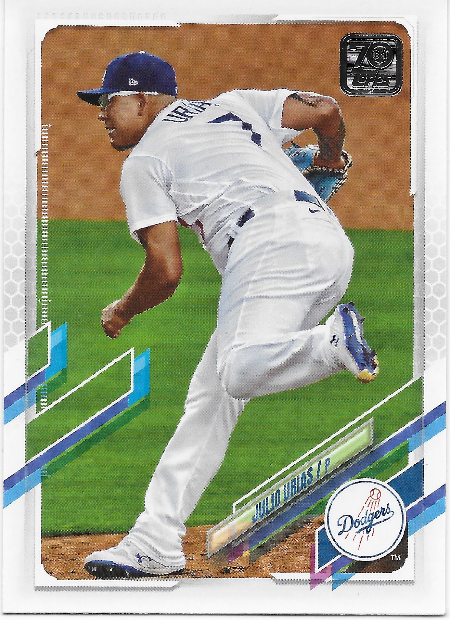
It appears we have a bit of a Pitcher Hot Pack going here on opening day of my 2021 baseball card season. Could be a long season. This card though, begins to illustrate a bit more of the what will probably be an infinite amount of nuance in the way the player photo is allowed to "frame break" the design elements. Thought since the design elements instead break out of the frame and into the image, I'm not sure that is the best term for this.
A bit of a relief, a classic positional player baseball card stance. I won't forget that I have a 2021 Topps Baseball card of Oakland Athletics player #20, though I'm not totally sure just exactly who that is. My mind now connects Oakland, and #20, and a batter, named "Mark" it appears. Maybe it's "Mike" though. And there is a C involved in his name too. I think.
Ahh, now I have another card that I was looking for without even knowing it before I ripped open this pack. I can more easily read Willie Calhoun's name here than the name on the previous card. I remember pulling various examples of Willie's Rookie Cards in 2018 but that is my last memory of him. So this new card allows me to figure out: what happened to Willie Calhoun? As it turns out, not much.

But this is something I will write about a little more in my next post sometime soon. It's not going to be a good year for my long running habit of Yeah, I Read the Backs.
Now we are into the most important part of a "pack" of baseball cards, for most collectors these days - the inserts, or in this case, a simple foil parallel. They look quite nice this year. However I have my doubts that I will ever accumulate even 9 of them for a nice binder page of shiny goodness. We'll see.
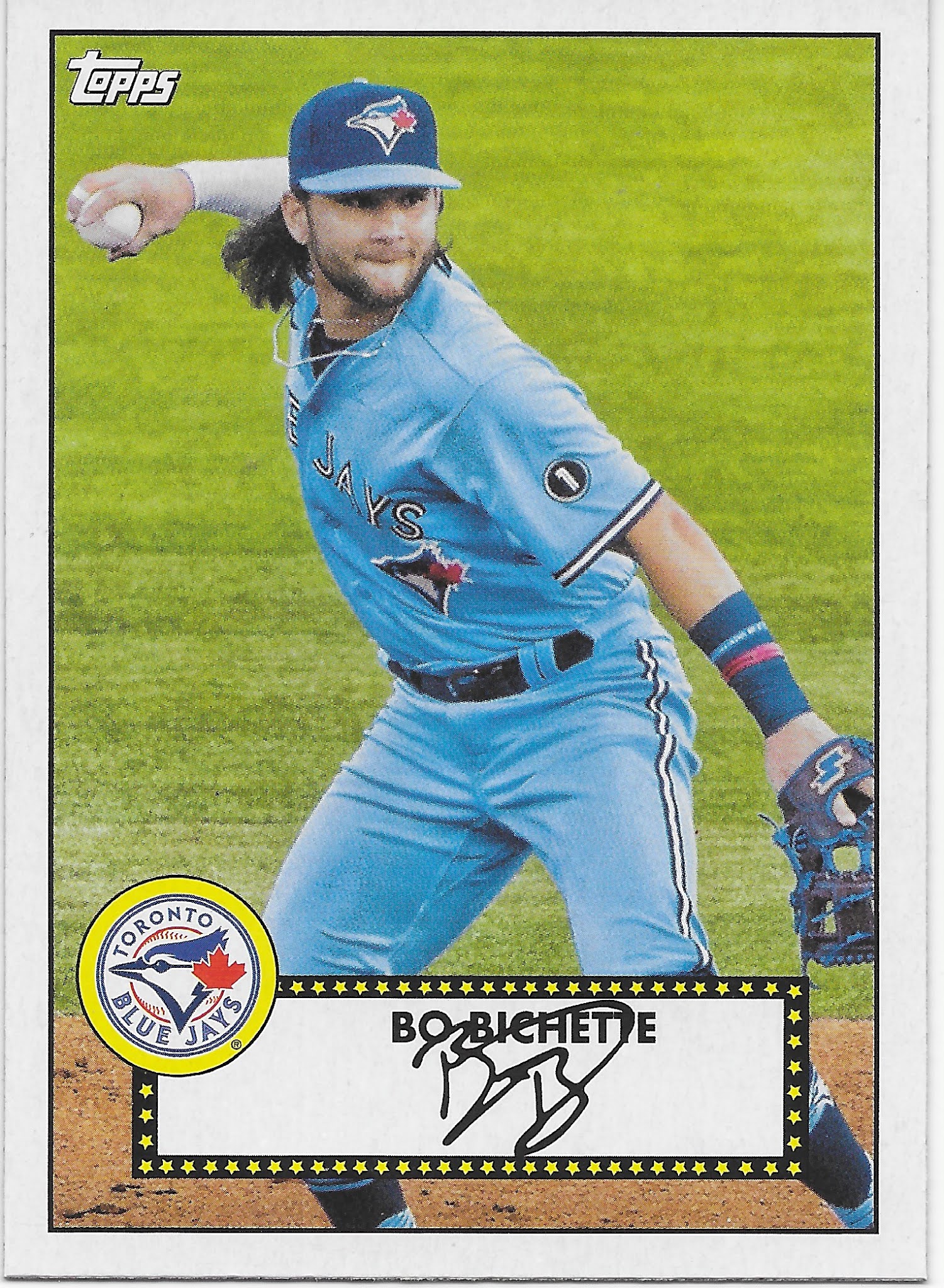
Now this 2nd insert I like very much. A nod to the very first Topps Baseball set on it's 70th Anniversary, it appears these will appear in each and every pack of 2021 Topps Baseball cards. These are printed on what is usually now called "vintage" stock with that nice cardboardy heft to them that always makes for a pleasing stack of cards to paw through to check on checklist completion status. 

This small checklist of 50 cards has two things going for it that somewhat differentiate it from other re-print/retro takes on previous Topps designs: there is no gloss on the front of the card, which gives them much more of a warm, analog feel to them, and the images used are live action baseball photos. The result is something quite different than actual 1952 Topps Baseball cards. Although I both like facsimile signatures on baseball cards and dislike the amount of white space used up to hold what are sometimes a decidedly tiny signature like this one, the sum total of live action + that kept simple 1952 design quite appeals to me. Binder worthy. I basically wish I could buy whole packs of these things, but alas, we must now return to 2021 Series One:
Sometimes, the image overruling the graphic and the whole diagonal flow of the whole thing just works. On this card, even the new Swoosh™ on the uniform, that I wish was not there at all, contributes.
More Diamondbacks. More pitching. More leaning. More flow. Where'd that weird oblong blue thing go? Oh, yeah, the image is more important. See how these cards start to sneak up on you?
I spy a Powder Blue uni....and even a wristband. Though I still don't care for superfluous purple pink whatever pastels, I give Powder Blue a pass on probably technically belonging to the snoozy world of pastels. That 2nd, long angled rectangle on the left side of the card though - Why, Topps, Why?

And I have yet to hear a good baseball card nickname for this opposite of a 'Tatooine' card.

The pitcher drives to the plate...I like this baseball card. It's the Seattle #7 card in my mind though.

So there you have it, my first pack of 2021 Topps Baseball cards. I figure I will mostly enjoy ripping open more packs of these things; the promise of a +1 for my nascent 1952 Topps collection in each pack will definitely be a nice thing about that.

I did buy a whole blaster full of these cards, and found some more goodies along the way, but we'll take a look at those here soon.