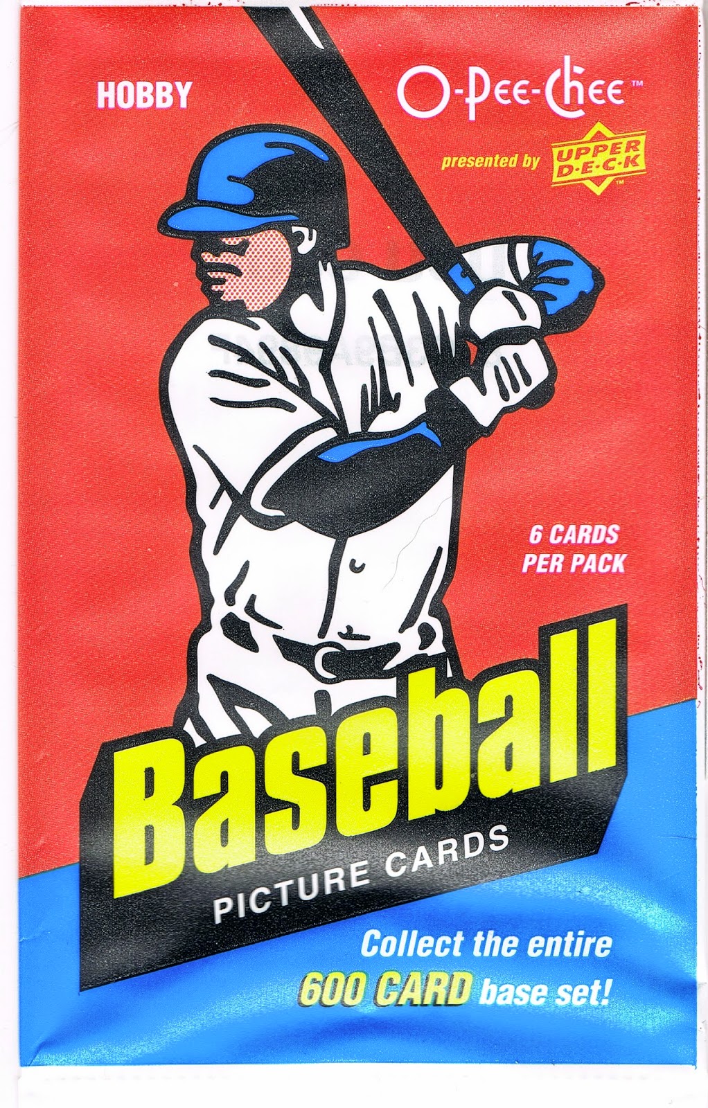
Showing posts with label yeah I save the wrappers. Show all posts

Wednesday, October 15, 2014

Stuck

There is of course a wide variety of baseball player picture memorabilia products out there. One of my favorites is probably the most overlooked in this oh-so-grown-up now "hobby" -

Stickers

Yes, Dave, stickers make me pretty happy too.

These stickers I picked up the other day do that especially well. These are the 1990 edition from Topps, perhaps their most unique sticker set.

I haven't assembled a collection with representatives of every year that Topps made these, though I can see my baseball player picture collecting tastes will lead me to that point.

So I'm not positive that these are the only dual image stickers issued (they are perforated in the middle and that is two stickers there, on a single backing piece we'll get too shortly). 

I have a stronger suspicion that this might be the only set of stickers that recall the design of the Topps baseball cards that year. Normally with Topps stickers, you get either a white border for all of them, or a combo of Red for the AL players and Blue for the NL players. With special exceptions for the All-Stars, most years. 

But in this case, I find this design much superior to the usual choices from 1 Whitehall Street. And by that I mean also superior to the base card design that year. One day last season I buried my thoughts on 1990 Topps in a long wordy word post about 2013 Archives, and then added to those thoughts in the comments after a smart comment from the Night Owl. He thought 1990 = Lichtenstein, I think 1990 = Mondrian. These stickers definitely support the latter, though you can't argue against connecting the dots to Lichtenstein (no, not the country, click around and learn something), either. I prefer these stickers to the baseball cards because Topps exercises restraint on how many colors they add to the frame, rather than just seemingly randomly rainbow-ing up the entire frame the way they did on so many 1990 cards. And they are still color-coded by League, even with this touch of Art on a 5¢ sticker.

I have always liked the variety of baseball picture card tropes in most Topps products, and this sticker set is no exception. Up there on the first one on to the scanner, we've got a sweet shot of Ozzie Smith, In Action, probably about to smack a pitch left up too high in the zone, it looks like. And I always like a Smiling Card. Or sticker.

Let's see what other baseball card archetypes I can find on these tiny (2" x 1.5") baseball player picture products:
Here we get a nice Batting Cage shot of Andres Thomas, while Melido Perez gets a nice Leg Kick pic as he pitches in some extra-empty weekday game somewhere. Who? Yeah, me neither, though when I cheated via today's online checklists, I did discover that Thomas was a former Topps All-Star Rookie (on those terrible wood-grain cards in 1987, which is why I probably forgot him), and I think Topps always kept those players on their checklists ever after. 

You may wonder why there would be a Topps baseball memorabilia product that doesn't identify the player in the picture (not even on the back of the sticker), which is pretty rare in the world of Topps, though I have always liked their occasional such efforts. Keep in mind that these are designed to be put in the official Topps album each year, where the player's name would probably be printed clearly underneath the empty frame where we are supposed to stick the sticker.

And there are plenty of other classic baseball photo styles:
That's Ivan Calderon hanging out in the dug-out showing off his snazzy red batting gloves. A young John Smoltz is not impressed. Dug-Out cards catch everyone's eye, but I have an eye for certain other things on my baseball picture deals:
Light-towers! Clouds! Storm clouds, at that. Nice stuff. What's up with Kent Hrbek growing a beard and Denny Martinez shaving off his mustache though? No silly, that is Jeff Reardon there on the left, and Craig Worthington on the right, the last sticker # in this set, as it turns out.

Did I finally pull an All-Star sticker there with the special blue star (for an AL guy? actually, all the little stars are blue, even for the AL), while Topps has fun using every part of the color wheel their printing machine had that year.

No, the All-Star players are on their usual special Foil stickers:
Though I appreciate the rare fielding shot for an All-Star baseball player picture thingie, I find the 1990 All-Star sticker effort a little …. meh …. even with all those stars, in part because the foil washes out the wonderful color present in the rest of the set. (Shades of the mmm, shiny baseball card products to come in the rest of the decade, and decades ever after, I guess.) The AL All-Stars get the same exact colors and stars, except theirs are on the left of the frame. Though the All-Stars do get their own complete 3" x 2" sticker.

So what is going on back there with Craig Worthington's special blue star? The answer is another possibly unique feature of this set - the presence of the Topps All-Star Rookies, though without the Rookie Cup, or the statue. Worthington made the team at Third Base, after belting 15 Home Runs in 1989, easily his peak year in the majors. Perhaps the sticker album noted his Topps AS Rookie selection, I don't know.

I like how the All-Star Rookie all-the-colors border somehow leads to his neighbor's frame getting an extra boost as well, as on this likely example of the ultimate Star Power sticker in this set:

Boom!

Imagine pulling that combo the year after Griffey Jr. rookie-card mania. I'm sure the set constructor back in Brooklyn grinned with delight pasting up that one. And no one had to cheat with their album or some computer checklist to figure out those two guys, even though as I mentioned, they aren't named on the back.

So what was on the back? Let's take a look:
More Boom! Check it out kids, you get two stickers on the front, and a baseball card on the back!

And I get to type this again: Miiiinnnnnnnnnniiiiiiiii!

Maybe one of the most unknown mini sets Topps has ever made. The 1990 Superstar Checklist included 66 players, evenly split between the AL and NL, and of course with a special entry for the Checklist sticker card, #67.

I probably won't chase and binder this esoteric mini set with my snazzy new mini card binder pages, as I've never liked baseball picture cards that strip out just the baseball player from the original image; again this foreshadows what was to come in the world of baseball cards the rest of the decade and beyond. Though now that I think about it, perhaps I'll just binder up all the pitchers in this set...

I picked the Langston card to show you due to that cool stat there. Amidst space for only 5 stats, Topps included SHO (shutout), a neat illustration of how the game has changed even in just 24 years. I thought it was amazing this year when Tigers pitcher Rick Porcello pitched sequential shutouts, surely one of the more remarkable pitching performances of the season. 2014 baseball cards no longer even list CG for complete games, and I have to wonder how long it will be before Complete Game shut-outs might get their own special highlight card, they are so rare these days.

Even in 1990 though, a Closer makes this short checklist. I pulled Baltimore Oriole Gregg Olson, who instead of SHO, gets his 1989 SV (saves) stat listed = 27. Another illustration of the game changing over time; though Topps used to issue "Leading Firemen" cards even in the 1970s, I wouldn't expect to see a reliever on any of their special short checklists before this.

Some things never change though, when it comes to special checklist construction:
Yes, in 1990 any modestly successful stat line as a starter for the Chicago Cubs made the player beloved nationwide, though I should note that Dunston did make the NL All-Star team in 1990 for his second and final time.

But did the card back match the front? Nope, that wouldn't be possible with 67 card backs and 164 card fronts (I would expect some double-printed backs). Here is the front, i.e. the sticker, affixed to SuperStar Fred McGriff's entry in that mini checklist:
So, no, that is not the front of SuperStar Mark Langston' card, but it is a nice regulation baseball player image of Langston pitching at Wrigley, I think, nearing the end of the Powder Blue era by this point. I can not determine why some non-All-Stars got full size stickers all by themselves….what Topps set would be complete without some mysteries?

I do like all the ones I pulled, including this one:
That's Ellis Burks, batting as the shadows creep down from the Upper Deck. Apropos today, a day of two shadowed games in Kansas City and San Francisco. I again like how the scanner highlights the shaded portions of the image better than the actual card, err, sticker does.

Unfortunately I only pulled four of those full size / mini stickers (so far…), and only have one more baseball pose to share with you, though I don't have a cheeky name for it:
Yes, Jay Howell, you are correct to have some obvious disbelief here: Fred Lynn is not a Pitcher! I hope the runner was out at Home, at least. One of the more unique fielding shots I have ever discovered.

One of the best things about this little baseball memory acquisition at the LCS the other day is revealed on the wrapper:
What that might be? This was one heckuva deal for only a quarter, still today. Having an appreciation for the Junk Wax era (with real wax, still), can make for some cheap entertainment these days; I spent a whole buck on four packs. I picked up some other cool cheap stuff along with these that I will be sharing with you some other night.

This wrapper also delights me, because, Yeah I Save the Wrappers too. And this is one of the best wrappers I have ever found from the world of Topps Chewing Gum. I poked around the web and even tried the usual best possible reference for questions about all the miscellany on Topps packaging, the excellent Topps Archives blog. I didn't find anything about what feels like the first time I have ever seen this:
Ever the punsters at Topps. Perhaps these things really are designed for children.

Thursday, May 29, 2014

Baseball Cards = Art

If I hang it on my wall, that must be true, right?

Last year while working on an ongoing Baseball Card Art project, I picked up an essential item for it direct from the Topps Company, Inc. It will be seen on a future blog post, perhaps when I finish the project.

This year, somewhat out of the blue, Topps sent me a 50% off promo code for up to $100 of merchandise from their website. I knew instantly what I would spend it on, and that wasn't chasing Kris Bryant autos in Bowman Blasters.

Unfortunately, my insta-dream products aren't even here yet, as my purchases have been shipped separately. Topps, always bringing you closer to the mysteries of intelligent product distribution.

Instead the other day I received a brand new product that I didn't know was waiting for me on the current clunky-as-always Topps website, when I finally got it to load all 2000 some images of these things, simultaneously.

A piece of genuine Art. An image I have had permanently seared in my baseball and Baseball Card loving brain since I was 8 years old:


How do I know it is Art? Well I would fight to the Death anyone who would not agree that Art is in the eye of the beholder. If you say something is Art, then it is, simple as that.

But for the more up-tight types in the world who need external validation of their possessions ( /5 RC sparkle-crusted Chrome auto-relic collectors, for example), this piece of 10" x 14" Art comes with genuine Authentication of it's desirability:


Yes Sir, it seems I am only the 12th person smart enough to get in on this Limited Edition action.

Which kind of bums me out actually - as in, I think they should make a lot more than 99 of these babies. Because surely every baseball child of the 70s will want one, won't they?

However that turns out, I am rushing this post into 'print' on the chance that Topps is now shipping copy #89, and I thought all y'all fine folks might be interested in these. There is a whole set of baseball wrapper prints for sale


or were for sale, as I just surfed off to offer you a convenient link to these. eBay is fresh out right now too, for now, though I would imagine they will reappear soon as speculators realize Topps sold out of their stash.

There were also smaller versions (5" x 7") of these that came in 'packs' (irony is so tasty) for each decade, numbered to /49, though I would really scratch my head over anyone who wanted a complete set of art prints of 1980s Topps Baseball Card wrappers on their wall.

So, so sorry to disappoint here. I guess I pulled a hot product from the midst of my work-induced haze…thankfully that 50% off promo code had a strict expiration date or I would have been looking to buy one of these some now sad day in August.

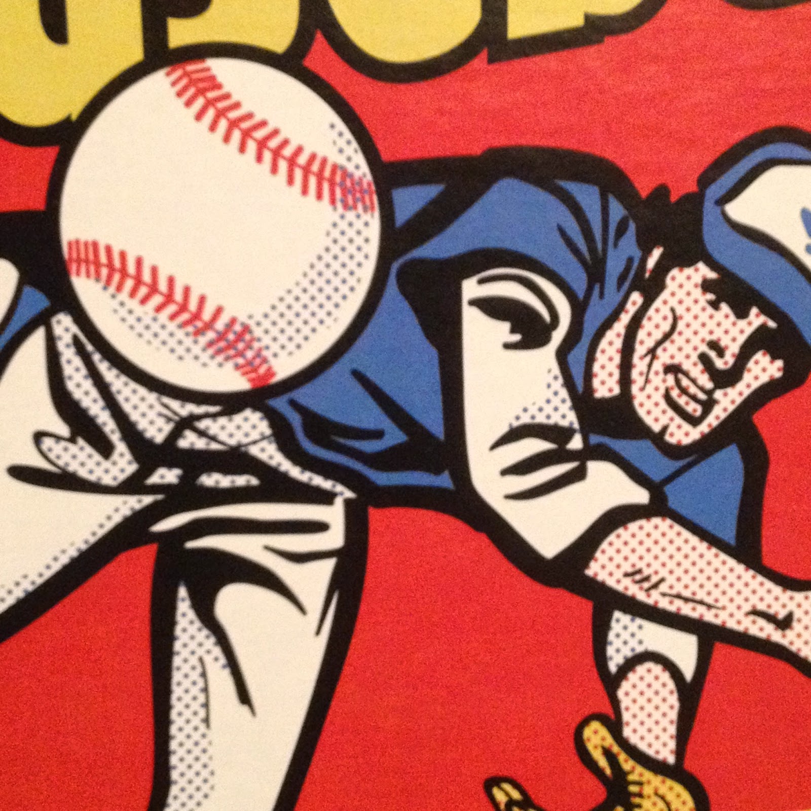
Ahh well, let's return to the Art. This print really surprised me with a new component to one of the primary graphic design images of my life. Dots………….


And here I am 39 years later still learning something from this image. The use of dots like that automatically makes anyone with a little grounding in 20th Century American Art immediately think "Liechtenstein!"

And I guess after all these years I have finally realized his influence on this wrapper. Topps had a long history of being attuned to the Art world, not just the sports world. But upon opening this package, I also noticed the dots are probably part of the image to produce a proper shading effect when the image is shrunk to use as part of a consumer product. Thereby realizing an insight into Roy Liechtenstein's work that I had never considered before.

See, I told you baseball cards were Art, and all before you even open the wrapper! The things I learn from these things… I so wish I could compare my new insights on this to the one 1975 wrapper I have in my collection, which is unfortunately still stuck in a storage unit while I can barely fit a card desk in my current living quarters. Arg.

Although I have made little progress on my ongoing goal of learning good photography composition techniques as that is just way, way down the always too long To-Do list (luckily babbling to you dear readers is much higher up the list), I am pretty sure a diagonal line is a strong element of an image. So is a flowing curve. So are primary colors like Red and Yellow. So is an image with motion, and an image that invites the viewer to wonder what is going to happen next. This image has all that, and a pack of cards inside. Come to think of it, all of those exact same compositional elements are part of my other purchase directly from my Topps master, which hasn't arrived yet, or else I would be short one future blog post right now.

I'm sure there are other things to learn and realize about this classic (All-Time?) Baseball Card image. I'll leave the Art Theory alone now and get on with some other great things I can gab about this. I failed  my only Art History class when I wrote up a 'review' of an assigned painting by trashing the ridiculously overwrought frame of the piece, loaded with ceramic grapes and fig leaves and gold gilt, just hideous, instead of writing about the painting inside the frame. I was told to write what I saw?

Now last year I was delighted to open a pack of Baseball Cards and find a sweet brand new Baseball Card inside:

This is one of my favorite Sea Turtles, for what should now be an obvious reason. Though I love card images that bring to mind classic wrappers (I've posted two cards that recall the '77 Topps wrapper), I've never posted this one because I kept thinking I could find a better example if I just kept looking at enough of those worthless base cards nobody wants any more.

Perhaps I will someday. Meanwhile as I have been composing this post in my head for the last 36 hours, Gallardo has won two games in two days - and he is in the starting rotation! Tonight he pitched 6 2/3 innings and got a W. I've always though a Pitcher should get an extra W (at least) when he gets a GWRBI. Yep, last night Gallardo, a former Silver Slugger winner, came into the game as a pinch hitter in the bottom of the 10th and delivered a walk-off Double. Topps had better keep it's act together and deliver me a classic Baseball Card of that next year. Or more than one.

At some point last summer that card led me to finally use this Internet deal to look into that image from the 1975 wrapper. I was hoping maybe someone had sleuthed out who drew it up for Topps. Instead, I found this:

Mets Card of the Week: 1975 Hank Webb box


which is a nice succinct write up of this image:

This is not something I could remember from 1975. When I saw those boxes of cards, ole Hank was likely already ripped off the top of the box, or tucked out of the way to make room for some other box of candy that generally surrounded Baseball Cards back then.

So the wrapper image starting out as a real photo never clicked for me until I stumbled across that blog post.

Of course in the 21st Century, Hank Webb's life story is just a few clicks away, and as it turned out 1975 was a very good year for Hank Webb as he cracked the Mets rotation for 15 starts and went 7-6 in the process.

And like the superstars on the wrappers and boxes today, Webb also has a card in the set he fronted for every single other card:

I'm pretty sure I have this card, as I can recall most of the cards of the Big Red Machine that rolled over my various Pittsburgh Pirate rookies, and I always seemed to pull cursed Reds cards.

This was actually his second appearance on a multi-player Rookie Card, which happened in the 60s and 70s but compared to young players today, well, whatever. The Mets360 blog has more on Hank here.

Also on that blog I learned that my Baseball-Card-wrapper-introduction-to-a-lifelong-fascination-with Art has a son.

Do I mean this one?


No, that is a topic of a future blog post some wonderful rainy day when I can finish ripping that box and starting in on collating that neat set of real cardboard Baseball Cards. But that wrapper definitely owes a little something to 1975 Topps. And some to 1977. And 1976.

It turns out that actual player on the 1975 wrapper that will eventually hang on my wall has a son that is pitching in the Major Leagues today, currently doing fairly well in the bullpen with Baltimore. And sure enough, I have his baseball card:

Whaddyaknow, it's a post release In Action shot of a right hander complete with leg-kick. Nice! This is a pretty good card, though it suffers from the usual practice of the current Topps Baseball Card set editor, who frequently has no concern for slicing off bits and pieces of the ball player with the card margin - that always looks sloppy to me in an age when any image can be manipulated quite easily.

[And really Topps, out of all the subset / inserts ideas you keep reusing for better or worse, bring back the Father & Son cards already. I think a whole lot of collectors would like that.]

Even so, the 2012 Webb card is another nice piece of Art. Art is more enjoyable with Context, and I have sure discovered a lot of that for 2012 Topps Update #US253. The Art elements I like are the banding of the infield grass and dirt, the sense of paused, just-completed motion, but with imminent activity as the ball reaches the plate, and the blurry empty seats in the background. That latter element is not a standard sign of quality Art, just a photo feature I always like on Baseball Cards.

Because as I mentioned above, that is what matters when it comes to Art and Baseball Cards. They are your Baseball Cards. You decide which ones = Art.

Wednesday, October 23, 2013

World Series Box Break

It's World Series Day. I want to rip some new baseball cards. I keep hitting up the Big Box stores, and they still don't have them. It's like they think it's football season or something. I'll return to that shortly in another post.

I am going to satisfy my itch by participating in a Box Break of an Update Jumbo over at the Andrew's Baseball Cards blog: link. 2 Teams, $10. 18 Teams left to pick. You're sure to get some fun baseball cards. If you still agree that baseball cards are fun, like Andrew does, rather than just worthless hit-delivery systems, like most grouchy baseball card collectors. I am also sure Andrew will get some packs ripped for me while the Series is still in progress, unlike a bunch of slack truck drivers lost somewhere on their way to northern Michigan.

Words words words. No one clicks a blog link for the words. Here's a picture:
I think Miggy is going to lose this battle. Trout and Machado are gonna take him out for blocking them at the All-Star Game and the MVP awards banquet, and Miggy is just standing there admiring another Home Run, oblivious. Harper will try and get in the struggle, but he's not all that great at making contact consistently. Harvey is cocked and loaded, but everybody knows he can't throw right now.

That leaves Darvish. He looks pissed. Not a good look for a card wrapper there Topps, displaying a player showing an unflattering Game Face in the heat of battle. Does Grumpy Cat sell products?

But cards man, we need cards to look at. OK, OK...You sharpies may notice the special little H on the pack there. I did well with this pack; I pulled this card out of it, though I am too lazy to take it back out of the top-loader for you:


Nomar is not impressed. What is this set, the Grumpy Tween Gymnast edition? All those ballplayers looking up in the air rather than at a not even Barely Legal Twitter feed?

Oh, yeah, baseball cards. I'm sure you will enjoy ripping a Jumbo with Andrew. I bought one at my Friendly Local Card Shop, along with a couple packs just for good measure. Yeah, I collect the wrappers too. I'll show those off some day. The sweet slippery feel just won't translate across the wireless internet wires, but I'm sure you will remember it on your own.

I did pretty good on my Jumbo. I pulled one of the /25 Sapphires I am lusting after, a 1/1 printing plate, a Silk Collection, another short-print (McCutchen) and an All-Star Stitches I have already traded for a Camo. And this mammer-jammer:


I'm thinking I'll trade that one to Andrew when he pulls the /62 HTA-only Black Border edition of the best Black&White card I've seen in about forever, the DeWayne Wise card. That will make a sweet 2 card rainbow. I hope he hits the White Sox on the random for his second team. Or, maybe I will, though with my first pick I couldn't pass up a shot at the sweet Scherzer/Cabrera short-print from the team I wish was playing tonight (and it stands to reason that I pull hits from the LCS winners). It's random. I have a little pile going for a White Sox trader....

What are you hoping Andrew will pull from these cards? Try out a Group Break and see what happens. You don't want Yu to throw that ball at you, do you?

Hey, maybe I can get him to launch that one at the front window of the next Big Box store too slack to stock their shelves on time...