Opening packs the last several years, one type of card surprises me most of the time - I always forget minis will be in the pack:

I think the Mets are becoming my favorite team to collect, graphically at least. Their orange-and-blue just says "Baseball" to me, more than any other team.
I had pulled just a few of these previously this year, and hadn't thought to collect them. Until this slice of team-colors-baesball-card perfection. I also have finally figured out a perfect way to "collect" any type of card I care to define - just pick my 9 favorites for a binder page. I am moving towards permanently keeping cards based nearly completely on their visual appeal, and that is nice and easy now for the mini cards with the new mini binder pages - the news of the year in enjoying baseball cards, if you ask me.
I saw the Jose Abreu card from this checklist on a blog today, and that had a cool tree in the image, so that one will join the page, and I'm sure I will be able to find 7 others that work as well as Cone's card with the great Mets leg stripe and crazy flow of lines here, there, and all over the card.
It also really took all the way till the end of the collecting year for me to realize how much the base Topps design this year owes to 1989. Maybe this has been commented on elsewhere, I hope so and would like to hear more thoughts on that idea. Maybe that all happened in August of 2013 when the design was revealed, 5 1/2 months before any of us could hold the cards in our hand. The heavy use of foil this year and the just simply inadequate use of color doesn't lead to the quick comparison, but much like the 1987 & 1962 sets, 2014 should be forever linked to 1989, and that was no accident; I am a little amazed it took this mini card for me to notice all this. Maybe I'll even finally do something with that shoebox full of 89 cards - probably in some sort of project divisible by 9.
Sometimes lately, another team is feeding my orange card jones:

It's such a pity the images have to supply the color on the cards this year, though fortunately most of the teams all have nice colorful alternate uniforms to create colorful baseball cards with. Personally though I would be happy with Topps deciding black is the secondary color for the Marlins, not blue. And this jersey makes me wonder how long it will be until we get to see Marlins Man on a baseball card. Perhaps he is a bit of a polarizing figure for that, but if you had his type of bank account, what would you do with it? Maybe if Topps would drop the zoom zoom zoom on the World Series cards some day, we'll get a cameo. His own card would amuse me too - a run of "Super Fan" short-prints, perhaps? If only I could Tweet @Topps, but if I were to join Twitter, well, you wouldn't get as many blog posts, that I'm sure of. I don't see adding more Social Media to my life in the future, at all.
There was one last '89 mini that caught my eye; not sure if it will make the cut for a favored 9 of the 150 issued, but I kinda like this one:

What, no Eye Black? (Which is what caught my attention here). I'm not sure why road grey makes the team color base here, as compared to the all-orange majesty of that Mets card, though I like how using road grey unis with team names on cards turns out, every so often, and the script of the 89 design works perfectly for that, so this might make the cut. Or maybe I'll just hope there are 9 Mets and Marlins 89 minis to work with; I'll probably just shop the whole checklist on COMC which will likely end up with 50 copies of each of these, on sale for 40¢ each. I hope.
A big part of ripping packs is watching for your favorite players; if a fave is an All-Star you are all set in Update, but other times, you've been waiting all year to see the player again:

Nate McLouth is not one of my "favorite" players, but he is the close as I have to a Hometown player as he lives just 90 miles away. I think about him, and thus baseball, and thus baseball cards, whenever I drive by his exit. Maybe if he had started out in the AL I would have been following his career more closely. This is actually a pretty good Night Card, almost as good as they get any more in the Topps Torsos sets; the stadium lights reflected in his helmet make a crazy pattern that mirrors the wave of the design somewhat - you'll have to see that in-hand with your own baseball card.
I thought this could be the last card for McLouth but he is signed for next year; though as a 4th/5th outfielder these days, I suspect I won't see him on-card again till next October, in the Update set.
If a favorite player is an All-Star though, Update will be giving you a new entry in the PC:

Another set, another great Salvador Perez card. This card almost makes me want to consider how Topps decided who gets black-ink-on-secondary-team-color and who gets white ink for the team name, but since that is such a tiny portion of the card, who cares? Anyhow, Perez always seems to be in a good mood, or a nicely focused, game-mode on his cards, and this one is another keeper for me.
Another player I have started to follow, but mostly only when I pick up his new card, is Justin Turner:

Although it perhaps remains to be seen if he will be starting at the hot corner for LA next year, as in playing every day, or playing a lot of days off the bench all over the infield, I think Topps will always try and put him on a Turning Two card. I'll be watching.
Probably one of my favorite cards this year was in Series Two, of this player:

Although I always like cards with imminent bat contact, I always hate cards with helmet-less players doing something with a bat…especially actually hitting a baseball, not just posing. So though Frazier had a pretty good year and made his first All-Star Game, this card might not make it onto his eventual best-of 9 card Player Collection I am slowly assembling.
That card did have some good news for me though - it is clearly from the Home Run Derby, but it is just his All-Star card - there were none of the goofy Home Run Derby cards this year. The reaction to those was never that great, and now perhaps they are gone.
I had one final non-Tiger to watch for as part of a Player Collection, due to their recent cards, and that was Chris Sale:

Shudder. The hat, the hat. Uhh, no thanks. I think Major League Baseball was going for the triangular graphic design used on several teams' batting helmets back in the 70s with the All-Star Caps this year, I guess, but instead of a nice spare triangle, we got a trapezoid. Or a rhombus. Or who knows what other crazy geometry word I haven't used since grade school; though even grade schoolers could have told MLB officials how ugly those hats are. This Chris Sale card won't make the Hall of 9 on his page either.
Topps, though, likes to purchase photos of players wearing unique caps, let's wash away that All-Star cap right away:

That's not a super unique ball cap, just the special one Cardinal cap the Cards wear on Sundays at home, or about 11-12 games a year, though probably very few in between the trading deadline and the image deadline for the new Update cards. I could probably use that fact to figure out what game that photo was from, if it wasn't such a boring photo. I can't understand why Topps doesn't give just a few more pitchers some of the casual cards in a set - relaxing in the dug-out, at-ease during batting practice, something, anything, once-in-while-at-least, Please?
But Topps also likes capturing the Memorial Day caps:

At least this card works well with the design, we get a cool red glove to admire, and isn't such an overall waste of the usually wonderful horizontal card format.
And Topps likes July 4th at the ballpark:

Now this would have been a nice image to zoom in to a torso from the belt up, like the Lackey card, and really show off that once-a-season cap, but instead we get a featured view of Jurrjens' butt. Is there any method to Topps Torso sets? No, I'm pretty sure there isn't.
I did pull one of the shortly-printed photo variations in this Hobby Box, though I haven't finished checking for sparkles or saber-metric card backs, and it featured a Check Out My Special Cap shot too:

I hope Topps didn't pay a lot extra for that photo, though again it would have been nice to have something as unique as a New York Yankee wearing a hat that's not blue featured a little bit more, as in this shot from July 4, 2014. And I don't even like the Yankees.
The hot RC in this set, the Jacob DeGrom, has a nice photo variation with the Mets camo uniform, though I think they might wear that every Sunday. I want that card, but I'll probably wait a few years unit DeGrom is a solid #3 starter, which card collectors think is just about total failure, and pick up that particular SP for a buck somewhere.
I did get a unique Yankees card in this set though, it was quite noticeable after pulling 1,209 Yankees cards in my baseball card collecting career:

A warm-ups / Batting Practice uniform. The road version no less. I was just babbling the other day how I wanted to see a few new wind-breaker cards, and though I am still waiting for that, we did get fair and balanced journalistic coverage of the Titans of the American League East:

This set just simply needs these uniforms, I'll just say, though I really have no idea why MLB teams have special uniforms just to wear for an hour or two before a game.
Ahh, the mysteries of baseball, our most quirky sport, which surely must serve up our quirkiest sports cards:

Oh, Snap! I really think Julio is about to give us a real Oh, Snap, on that one. And this could be the first baseball card ever featuring earrings. Yep, earrings. There are actually two more cards in this set with that new feature, believe it or not, so it would be hard to say which card broke that barrier; though I have to think this is the first set of cards to include such an unexpected image, you can never count out 1990s baseball cards on any such question. Maybe this is just the first one to feature a pair of earrings, as are the other two you can discover on your own.
I guess when you wish to see baseball players in their warm-up duds, be careful what you wish for. These can supply some nice casual images though:

I like that card, though knowing Cruz is from the Dominican Republic really sets up it to contrast with this one:

I mean, Apple Pie, Chevrolet, and Derek Jeter, am I right? What could be more American than that picture? I remarked on the first card I pulled from a retail fat pack of update, the Francisco Cervelli card, how the Yankees never put their iconic red-white&blue top-hat and bat logo on their uniforms, and here comes MLB All-Star uniforms to prove me wrong, and I finally get a good shot of a New York Yankee in a red hat as I was just wishing.
My last Derek Jeter card? Well, my last active roster Derek Jeter card at least. I expect one final Derek Jeter sunset card in 2015 Series One somehow, and possibly an image variation of that, and some 2015 insert action, and then will come 2016 baseball cards with some more new Jeters, somehow….what's the over/under on the first year Topps doesn't print a new Derek Jeter card? 2021? I'll go with that in the pool.
I like Derek Jeter cards though. I'll miss him. Yes, there really is a Kalamazoo, and his cards always remind me that I used to hang out there while he was in high school there.
Usually, many of the All-Star cards are just not all that remarkable, but this one definitely invites a hearty What's Up With That?

You just very, very rarely see this body language on a baseball card. And you really shouldn't. If you don't know anything about what body language indicates in life, well all I can tell you is that this is very negative. I thought this might be a little bit of Topps Voodoo as they selected this picture during Oakland's post All-Star-Game offensive implosion. Of course, Topps had no way to know that would happen, or that the A's would lose the quintuple coin-flip game that was the truly wild AL Wild Card game this year. And this card came out well before the A's traded Norris to the Padres for prospects, like seemingly every other MLB team did recently (where did the Padres get all those prospects anyway? Maybe it really is a big advantage to play like a AAA team for the last forever, we'll see). I think something dramatic (and dramatically bad) happened in the Oakland clubhouse right after the All-Star game, and this card knows what it was, but won't tell us.
So I just hope St. Louis can keep it steady-as-she-goes next year:

Two of these cards? Not nice, Topps, not nice. Redbirds in a blue uniform…these All-Star cards are just going all weird on me this year:

When the rain comes, baseball players have to just grin and bear it I guess. I'm happy to get another Rain Card, those are pretty darn rare. But it sure looks like a nice sunny day on all the other All-Star cards. And more of these red teams wearing blue uniforms…these cards are really confusing me now:

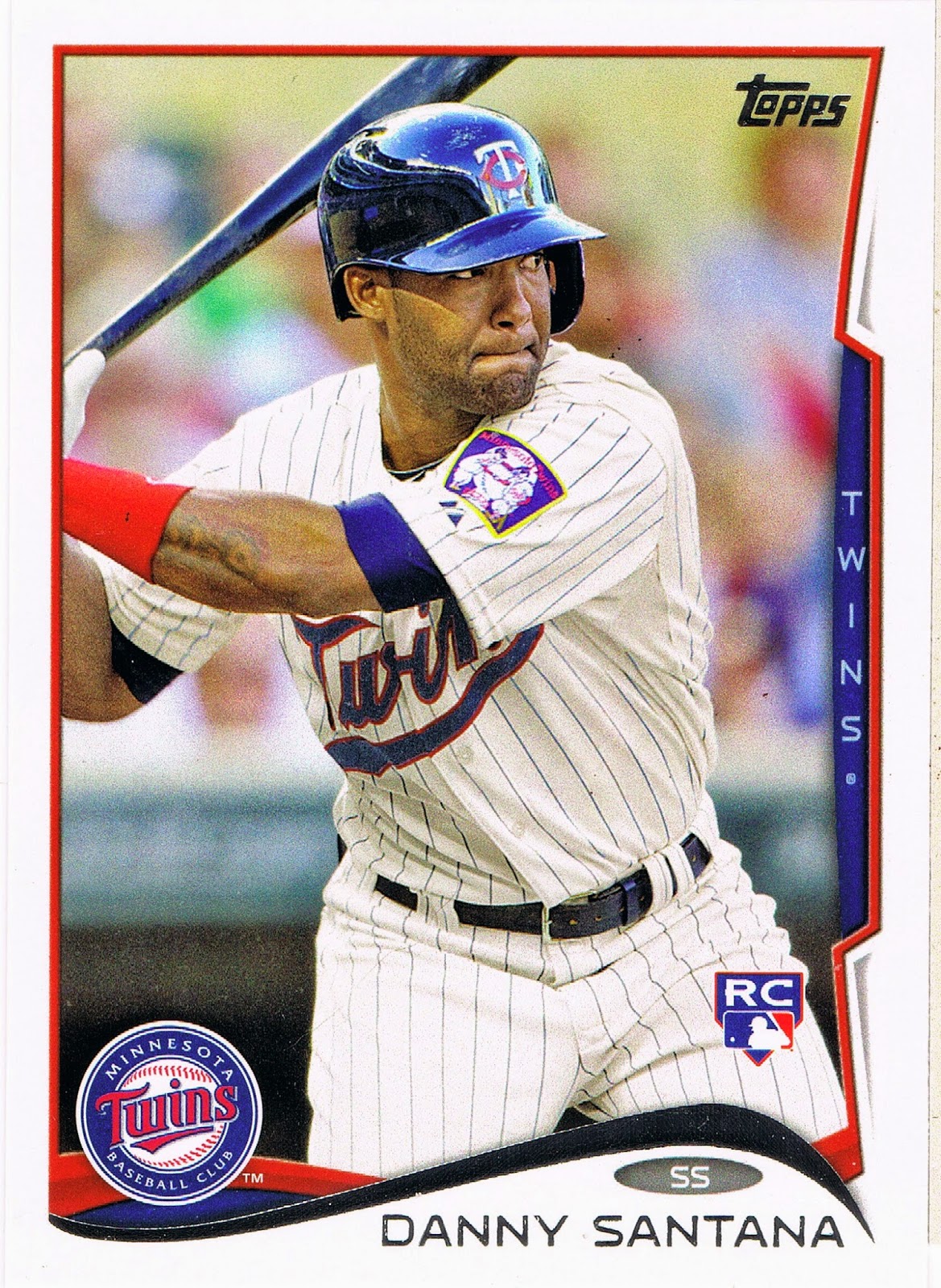
From the Independent Leagues to the All-Star Game, truly a Cinderella Story? Nope, the Minnesota Twins just get to wear an All-Star Game patch on their uniforms, not on their baseball cards, for the most part. It's too bad Glenn Perkins couldn't have been pictured in the Twins alternate uni, as on this card, so you could try and figure out which League Minnesota actually plays in, which would probably stump baseball fans on the coasts.
Colabello was the feel-good story of the young season in April, but then pitchers probably watched the video and their coaches probably analyzed his strike zone and poor Chris was toast. Maybe we'll see him again in next year's Update set if he ever makes the Toronto 25 man roster, as they picked him up off waivers recently.
The All-Star cards delivered another probable first this year:

One player, same set, two cards -

Two teams? Maybe this has happened before, I'm not totally sure. It almost happened twice in this set though:

I can't recall the confusing details about Samardzija being named an All-Star for the NL but then not pitching for the AL after his trade to Oakland, but this card really confuses me. Topps has conditioned me to know that only Closers celebrate an out on their baseball cards. Did Samardzija move to the bullpen out there in the land of Billy Ball? I don't get this card. At least the Torso-only image for Pitchers stays intact, I guess.
We almost need a special set of baseball cards to keep up with the Oakland A's any more. They push all their chips in the pot, get great cards on the turn and the river, but then it turns out they didn't read the flop right in the first place, so they fold. Topps card-back writers will have to be oh so carefully polite covering all those baseball transactions in the next several sets.
Another confusing thing about Topps and which player goes in which Series of cards is their handling of some of the higher caliber Free Agents. During a season, everybody knows who some of the top Free Agents are going to be when the season ends. Except Topps, it seems.
This year's winner of the Shin-Shoo Choo Memorial Most Topps Base Cards award is Brian McCann. Let's review:


And finally, after the season is over, we get an Update card:

Why, Topps, why? Actually, I get why. McCann was a Free Agent that signed with the Yankees after his Series One Braves card was prepared (though a good 9 weeks before it went up for retail sale), so us loyal collectors needed a new card of him with the Yankees. Fair enough.
And I like that the Opening Day set gets a few unique cards because of such transactions of the upper 1/3 of the players in MLB.
So why do the same players then get a new card in Chrome and Update, which is cool … but not all the other players? Particularly in Chrome? Why do so many players get repeat images across multiple products, but then some players get four different cards in these products? I like that, quite a bit actually, even though I don't like the Yankees or Brian McCann. It can't be all that difficult to put different photos on different baseball cards, can it?
It certainly isn't for Shin-Soo Choo cards:


So we have a tie for most Topps cards this year as Choo comes back strong to retain a share of the title again this year. Both of these players have photo variation cards in these sets too, so if you Player Collect McCann or Choo, this was a very good year.
I just can't understand why more of the highly mobile players these days can't get more unique cards like these here. Does Topps think we are all just a bunch of geeks so obsessed with player and/or team idolatry that they don't need to take this approach across all their sets? We'll just dutifully purchase their new cards in multiple copies even though they use the same image? Of course, many collectors will, but then they have to ask themselves - why were less products picked up at Wal-Mart this year? Why does shelf space for Topps Baseball seem to decline slightly all the time at various Big Boxes?
And as usual, mentally pondering fine Topps baseball cards like that fine 2014 Topps Update Shin-Soo Choo card there after a fine Christmas 2014, these baseball cards always leave me with one recurring question - Why?