Showing posts with label 13 Series 1. Show all posts

Thursday, October 9, 2014

Baseball Card Therapy #2

Hello there. Don't be alarmed by the title…the pets here are fine, and life is pretty good. You probably wouldn't believe how good the trout fishing was right there at the end of the season last week, but that's another hobby.

Work though, has been annoying as all get out. My actual jobs are great and I thoroughly enjoy them. The clients though……

Which is of course one reason baseball cards are so great. Just relaxing little picture cards, full of nice calm numbers on the back. Whatever is happening in life, baseball cards won't let you down, well, unless you are desperate to pull a "hit" card by purchasing them retail. But if that is your collecting, err, speculating style, well, I won't be much help.

So when I got home from yet another work excursion (my career is almost as incompatible with baseball card collecting and baseball card blogging as perhaps over-the-road trucking would be), I reached immediately for some baseball cards. 

Aside from working on the ever ongoing Sea Turtle parallel project, I have also been dedicating my available baseball card time to preparing my piles of baseball cards for the long term. Some will hopefully get headed towards sale via COMC (probably still a few weeks out), and some need to be placed in binders….
And yes this means I can finally type….

Minnnnnniiiiiiiiiiiis!

Though I didn't want to use that in the post title and steal just totally everything from the Night Owl. That scan there, definitely owes him something as yes, that is a page of minis in the new binder pages from Ultra•Pro for these cards. And he certainly helped push them into making this obviously needed product in the baseball card world.

I love 1972 style cards. One of my favorite designs after 1975, 1953, and 1956, and, well, maybe I'll rank them all some day, but probably not. But 1972, oh yes. Sadly, at the age of 5 I was not yet buying baseball cards in 1972, and I haven't made any effort to acquire many of my very own original 1972 cards. Until the rise of internet card sales, that was always a scary idea for me. Expensive, not completely simple to do through the mail unless buying a whole set, and there just aren't many card shows (i.e. none) in a county with only 20,000 people living in it.

So when I saw the 1972 style mini in my first pack of 2013 Topps Series One, I knew I would be collecting all of them.

That is a pretty good Mike Trout card there, a nice On-Deck Card it looks like, with plenty of baseball context viewable on-card with the stadium behind him. Quite striking amidst the other 8 seemingly now standard action shots cropped to the torso, which generally blurs the background, on his page.


Now I love the card design, the Psychedelic Tombstone I've read it described as (probably at the Night Owl blog, again), and it turns out these new versions scan really well - probably more vivid in the scans than real life. When the green cards pop this much, I even like the non-harmony of green cards for 'red' teams. Seems fitting for these.

On this page I love the gleam of Adrian Gonzalez's helmet there, and I can still tell Chris Sale was photographed in Detroit, even on a cropped down mini card. Topps prints so many cards shot in Detroit I'm starting to think about looking into who the Detroit based photog for those might be. I also like seeing Rizzo in the Cubs alternate home uniform, complete with National League shoulder patch. Cubs cards next season might be quite varied - they sported 9 different one day alternate / throwback unis this past season.

Page 2 of these cards also shows some downside to the new mini pages. Every time you move the page, the cards go for a ride in the pockets. And doubling them quickly reveals the other card hiding behind the front you are looking at. OCD collectors will struggle with these pages, but for me, they are fine, I just like to look at pretty baseball cards.

This third page makes me wonder if Jose Reyes throws like a girl - professional shortstops in the Women's Fast Pitch Softball league probably do throw better than he does.

That's an interesting dug-out shot of Ryan Braun there, he's sporting a pink armband probably from Stand up to Cancer day in MLB. But his inclusion in this little insert set again makes me wonder why suspended players get baseball cards but we can't have any new Pete Rose cards.

The Dickey card reveals that Topps in no way attempted to use the Heritage approach on these cards, with mimicked poses from the original set. R.A. has two other regular size 13 cards featuring a nearly identically zoomed/cropped photo as this one.
These cards did arrive before A-Rod's eventual suspension of course, and I have to admit I like his card here. Nice shades, and is a nice reminder that the new Yankee stadium tips it's architectural cap to the previous edition.

I like the leg kickin' Cliff Lee card here … it was only with the scanner's help I've noticed it's a card shot in the late afternoon, which I usually like and have a small pile of, waiting for the ever precious free time to be bindered, scanned, and blogged. There are several Night Cards in this set, and though none are all that memorable with this much crop/zoom, they do stand out because there are so few in the base card set these were inserted with.
Here with the sudden change in the checklist from a nearly alphabetic one (by home city name, including 'Anaheim' for those ever mysterious Angels), to a run of Superstars of the past, we reach the end of tonight's blog post.

That is indicated by the Gio Gonzalez card back peeking out at us. The backs of these are authentic to the '72 style, complete with a trivia question on each one. I read some of them; the best one was answered by that card to the right of Gio's back-side - Who was the last ROY to make the HOF? Yes, baseball card prospectors might shudder with the answer - 1982's Rookie-of-the-Year Cal Ripken, Jr.

For the most part though, it is just too hard to squint out from under my glasses (Old Man Need Bi-Focals could easily be inside my next fortune cookie) to read the back of a mini baseball card. Which at least made for an easy decision on whether to keep 9 or 18 cards on each page of these.

But I'm drawing to a close here because this set is not complete, and the Series 2 checklist has even more holes. The missing card there is #44, Nolan Ryan.

My needs list from the Series 2 run of these is:

51 Griffey Jr., 56 Wright, 62 O'Neill, 78 R.A. Dickey (again?), 82 Sheffield, 83 Mattingly, 86 Brett, 89 Middlebrooks, 94 Ortiz, 99 Ozzie Smith

And since I'm typing up lists of cards in hopes you might have one for me, I should note that I am about a similar amount short of the '71 minis from Update. I hadn't thought to collect them at first, and indeed even shipped a few out that I now need. But I bought so much Update chasing the parallels that I had pretty close to a set of those, and they too look pretty good on a binder page. I do need:

2 Ruth, 10 Votto, 12 McCutchen, 15 Kershaw, 21 Kinsler, 26 Rivera, 27 Musial, 28 Bench, 31 Puig, 33 Posey, 36 King Felix, 39 Stanton, 40 Garciaparra, 41 Cespedes, 44 Myers, 47 Mattingly

I do have a nice little stack of these cards to trade, and I look forward to scanning the rest of the pages for you. The blog will likely stay in semi-regular mode as I continue to work on nice permanent binders of cards for the future … but the ever increasing hours of darkness this time of year mean I can only work but so much, hopefully giving me a bit more time to hang out with y'all in the weeks ahead.
Friday, September 19, 2014

Beguiling Binder Pages #9 and #10

I think. The last time I tried to count them I got 7. Now I'm adding two pages but I count ten in the snazzy permanent binder I have for them. You'll have to wait for the end of the project to see it though.

I'm not sure why I can no longer count to ten correctly. I called a re-do on that pesky page I assembled with a Wal•Mart blue version of Kevin Millwood that was just all wrong, but I think I posted it once already. But that one is not part of the ten finished pages.

I'll probably change the #s again next time I finish a page. Sigh. Meanwhile...
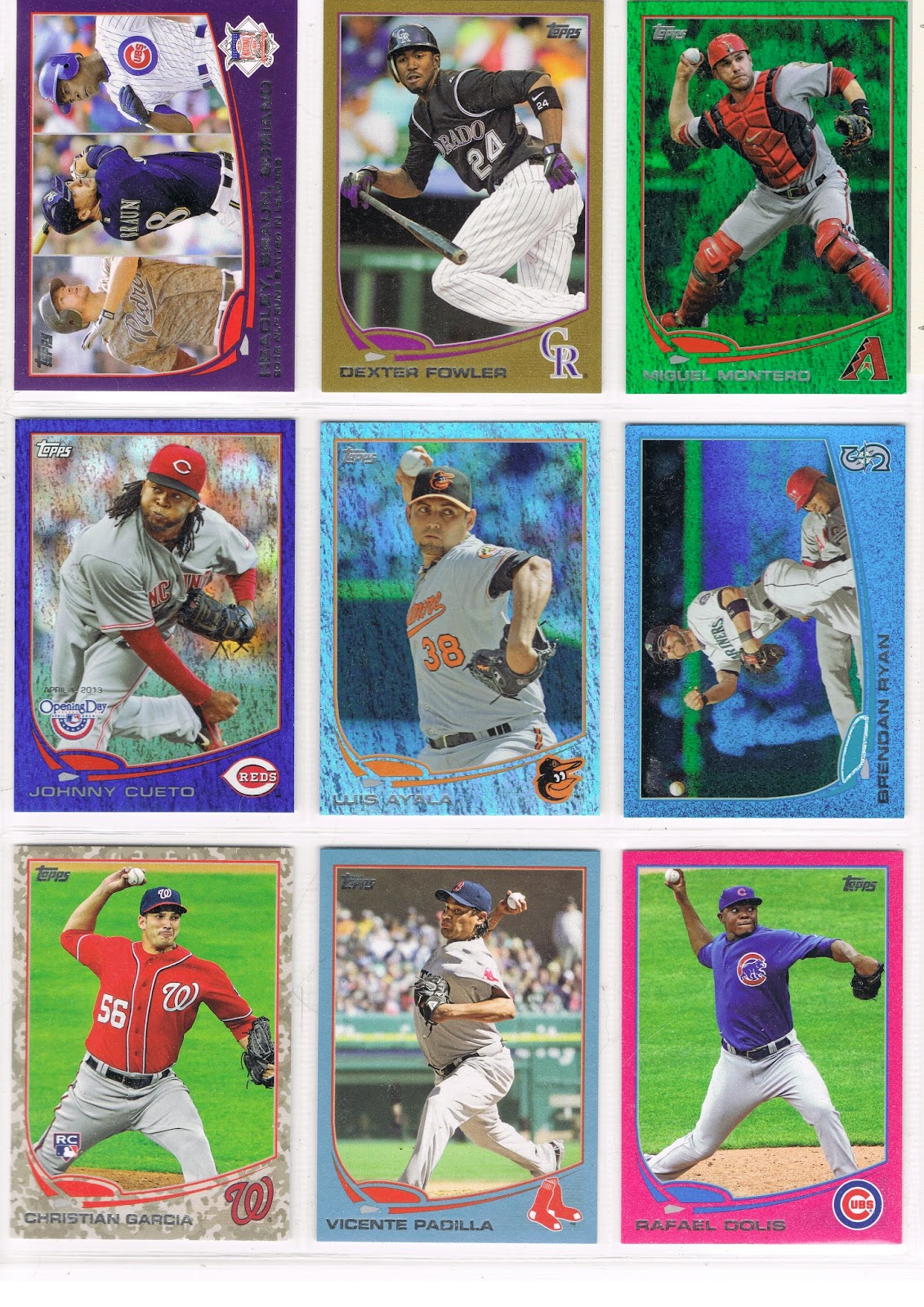
…a couple new items on this page. The center slot is anchored by a Sapphire, that's Luis Ayala there. 

I like the Sapphire Foil cards that were released across all 3 Series when Update came out. I don't much care for the fact that they are in an edition of /25. The popular Hope Diamond parallel in 2011 released similarly, was printed /60.

But of course today, collectors and Topps customers prefer expensive cards and yaddayaddayadda, you've read it all before.

I like the Sapphire Foil, except of course I won't use a blue Sea Turtle for one. I discovered the other day that an Athletic Sapphire Sea Turtle doesn't contrast enough to look that great in the project either.

And I'm glad I pulled that Ayala Sapphire myself. His 2012 Update card is probably my Card of the Year for 2012. What, you missed that post? Yeah, well, I'll get around to that one some day. 2015 perhaps.

What was the other new card here on page 9? Not a new parallel, but the first card I've shown that will be part of an interesting side collection developing out of this project.

The Sea Turtle swims aside to reveal a Starship Enterprise Card:
Some of the horizontal cards on certain teams on the Blue Sparkle wrapper redemption cards, and the Emerald Foil cards, have this certain printing error. How could I resist? In the project they go, even though a Mariner Blue Sparkle is a bit less-than-ideal for the project. I'll be putting together a neato nine of these cards for a separate page, if there are 9 of them, though I'm not sure about that yet.

I might need a third copy of this card for another project for which this card includes an example. I found a great, great such card on ebay the other day for fifty cents and I think you'll see it soon. I'm pretty darn sure I can win that auction.

I also like page #9 because it is only the second from Series One that I have finished. I think the lucky Ayala pack pull occurred after acquiring the Pink Dolis and the Camo Garcia, so I didn't need a third low /# parallel with Johnny Cueto conveniently showing up on the Opening Day Blue Foil. And thus probably my first page without a cheap retail Target Red parallel. Such diversity will certainly help the eye appeal when I am flipping through the completed project in the year 2025.

So on to page #10:
Another dramatic page for me, because it's the one that started it all, somewhat. My first purchase of 2013 Series One was a Hobby Jumbo box from which I pulled the black /62 of Izturis there.

What should I do with it, I wondered? And wondered. And wondered. And read card blogs. And put cards in binders. And worked on the still easily available 2012 Update simultaneously. From which parallels poured out of, since I usually shopped for cards at Wal•Mart and Target. As I was haunting those stores all over eastern North Carolina that winter hoping to find left-over 2011 Update with that confounded Mike Trout RC I still needed and refused to buy as a single.

I'm still pretty sure the chance acquisition of many Emerald Foil editions of St. Louis Cardinals cards like the Furcal on this page somehow made the Christmas-in-February lightbulb come on in my head.
Which somehow led to the Eureka! moment for this project, and a way to use that Izturis card in my collection for all eternity.

I lost track of what was the keystone card here. I think it was the Scott Hairston card there in the center slot…I think I was holding out for a Blue Sparkle version of that one, because the Mets cards look fantastic on that parallel, especially when there is great contrast in the background with infield dirt.

But the Orioles also look fantastic with their eye popping orange home uniforms amidst all those sparkles, and Endy Chavez was patiently waiting. So I think I finally relented and pulled Hairston from the Emerald reserves and declared this page done.

I suspect that when I get my COMC account up and selling with all the extra cards I have laying around (and writing this post is delaying that process yet again…), I will pick up a Sparkly Hariston and an Emerald Chaves and rotate them onto public display once in a while.

Because no good Art Gallery can afford to keep all of it's treasures out on the walls at the same time, can it?

Wednesday, May 14, 2014

A Lot Going On #2 / What IS That? #9

I've been wanting to post this card for a while. Heck, I've been wanting to just post at all for a while. That job in the Town Without Baseball Cards became a 16-days-straight marathon.

But I made it all the way home finally, for the first time in 5 months. To where the bulk of my baseball cards live.

And my scanner, as in an actual sheet of glass with a cover real-deal scanner. So I scanned a card for you to ponder:

I have loved this card since the day I pulled one from a pack. Because of course, it has A Lot Going On.

At this point though, I have to stop and acknowledge a source I borrowed for the format of my blog; awhile back I noticed one of my other main card blog reads just over to your right there doing this. Repeating a post title with a sequential # is of course borrowed from the card blog that got me blogging, which else but the inimitable Night Owl Cards.

I really liked 2012 Update for some reason. I put it together by simply purchasing pack after pack. I can't remember what I was chasing in it, or why, but looking back on the binder pages now, well that is an enjoyable activity. It is definitely binder worthy. I am starting to have my doubts about that on a few other collecting efforts I have ongoing.

That's Brian Bogusevic there on that card, as even my sorta pro scanner can't handle foil-on-black. Bogusevic had been traded to the Cubs not long after '12 Update was released, though of course he still ended up on an Astros card in 2013 Series One. Which begat him a Cubs card in '13 Update. Perhaps that created the mojo that had him shipped to the Miami Marlins last November, in exchange for the ice-card man Justin Ruggiano. Topps seemed to know the future on his career as he was left out of '14 Series One and he reportedly had a tough go of it in Spring Training this year. He is currently "raking", as they call it, back down in AAA, but Miami is loaded with young outfield talent and I'm not quite sure why they felt the need to trade for Bogusevic to start with.

Be that as it may, this will always be one of my favorite surfboard cards. I always like cards showing the railings in the stands - they set up a great sense of the lines of the image.

And what a menagerie this image contains. Quick, name another baseball card that features two different uniforms of the same team on the same card. Or one that features two player uniforms AND a team executive get-up too.

What is that exec up to anyways? Drinking a beer in the stands? How many baseball cards show an actual container of beer? It looks like a tall-boy of Heineken to me, but let's go to the Zoom and find out:

Hmm, could be one of those energy drink things the kids today are all so addicted to that they can't figure out why they don't have any money to spend on sensible things like baseball cards. I'll just always presume this is a can of beer though. Beer and baseball, mmm-mmm.

But that is just ho-hum compared to what else is happening on this card. Over to the left of the would-be drinkin' exec, it appears a now somewhat frightened fan brought her dog to the game. A dog on a baseball card? I know that happened in those wacky 90s, but in the stands? Let's make this laptop in my lap earn it's keep:


Rover's arm looks a little stiff there, must be … stuffed. ? A stuffed animal on a baseball card? Surely even the 90s couldn't have accomplished that?

And what is going on with that stuffed dog anyway, it appears to be wearing something. It has multiple colors and some sort of number or icon, much like a … baseball uniform. Four uniforms?

And that older gentleman calmly checking out this sweet catch by Bogusevic (the baseball appears on this great card too - it is snagged safely in the glove), he is wearing something that sure looks to have an S-T-R-O on it - A-S-T-R-O-S = another uniform. Five different uniforms on one card? That has to be some sort of record. Four from the same team, even an All-Star Game card couldn't achieve that.

Then we have a final mysterious element:

So What IS That? A coat? A purse? And what's in there? If Bogusevic doesn't make this catch, is this person going to bring the pain down upon him somehow?

And Who IS That? Looks nicely "Chinese-Eyed", an expression from my youth which had nothing to do with ethnicity. Is there a bong in that coat-purse thing? Is Lindsay Lohan a let's-go-to-the-stadium baseball fan? Nice hat.

I like cards with lots of mystery elements; I still like the very first one I found, and I must admit one reason I finally got around to blogging up this 2012 card is that I want to simply show-off a recent acquisition of a special edition of the card I wrote up in the first installment of this series. I didn't make it on time for an apropos anniversary posting a few days ago, but I am just tickled, of course, pink:


Thursday, November 28, 2013

Only one sleeve - What's Up With That?

Well I'll try hard to stick to the visuals - baseball cards, duhh - on tonight's post so that 3rd turkey sandwich you just snagged from the kitchen won't lead you to fall asleep reading my blog. I'll let you wander off to consider some checklist somewhere for that. Maybe some Japanese cards...

And I'll be showing you cards from Series 1, which you might not have seen for a good 9 months or so now, so that should keep you intrigued. And these happen to be the cards I am trying to put away, finally, for the season.

So let's see a card already!
Bats: Left     Extra Sleeve: Right

I love how on this card it looks as if Moose is trying to catch the Turtle. If this card weren't so blue, blue, blue everywhere I would probably have it on a year-end list of some sort. But I promised cards, cards, cards...
Bats: Right     Extra Sleeve: Right

Bats: Right     Extra Sleeve: Left

Bats: Right     Extra Sleeve: Right

Baseball Reference lists a Final Game, so you might think this is a Sunset Card. Except he hit .292 in Japan this year, with 28 Home Runs, and his team won the Japan Series...so now he gets Sega Card Gen cards, a terrible discovery to discover. Topps makes cards of American major leaguers in a foreign country and uses all unique images on them! No repeat photos for their discerning Japanese arcade game customers, no sir. Don't blame me for what happens when you finally see 'em. Here, I'll give you an excuse: An MLB themed bar in Japan even has waitresses in go-go boots parade the cards around. I Kid You Not. It's not my fault.

OK, Ok, I'm sure you expect to see some proof of that bold claim. Here yas go:


Well, if you slept though that part, there's just no helping you. Buy a set of these wonderful baseball cards? Sure thing, uhh, maam, I was just thinking that myself. Anything you want... 

Baseball cards just can't get much more exciting than that ... can they? We'll see.

But now that I've beat back the extra turkey sandwich droopy eyelids, let's get back to some boring old baseball cards. I'd rather look at go-go boots, myself:
Bats: Right     Extra Sleeve: Right

Now this is one of my cards-of-the-year. Torso shots aren't all terrible at all, I just burn out on the quantity of them. I really, really want the black border version of this card, though not nearly as much as I want to hang out with go-go boot wearing baseball card fans. I might have to settle for the /100 Chrome black-border though, rather than the /62 Hobby-Only version all these hobbyists have parked in their collections by now. If only Goldschmidt had hit a half-dozen more home runs...I have his Gold card already, and Cutch cards might be a little more obtainable. All those retired fans out in the desert don't want baseball cards any more. But here I am typing again, what's up with that? Here's another card:
Bats: Right     Extra Sleeve: Right

Bats: Left     Extra Sleeve: Left

Bats: Both     Just One Long Sleeve: Left

Does anyone really like switch-hitters? I dated a switch-hitter once. It didn't end well. I wish she would call me though...
Bats: Left     Extra Sleeve: Right

This card is like a memo. To: Wil Myers baseball card investors.

Bats: Left     Extra Sleeve: Left

Bats: Right     Extra Sleeve: Right

Wheee, I can fly! I've been trying to figure out a way to post that card all year long.

Bats: Right     Extra Sleeve: Left

I still don't know what is in his back pocket.

Bats: Left     Extra Sleeve: Left

I don't remember seeing that last guy playing in October. Oh, yeah, that's because he plays for the Cubs now. Played 70 games this year in Chicago actually. Didn't make the cut for a new card in Update when all those Astros collectors demanded an extra copy of the Chris Carter card I suspect.

I watch baseball on my baseball cards far, far more than I watch it on TV. So when I started seeing all these ball players on their cards with one bare arm, I asked myself: What's Up With That?

I figured maybe that extra high-tech, special athletics-fibers sleeve they are probably wearing might make it sting less when they get hit by a pitch. I mean, for hit-by-pitch questions, all I have to do is turn to my trusty baseball card of Shane Victorino and see what's up, right? His Series 2 card (Sorry, my scanner already dell asleep, and since it runs on an ethernet cable for some stupid reason, it is hard to wake up. Something to do with the 'ether', I guess, you'll have to look up his card in your own collection for 'proof'.) ... anyway, on Victorino's card he is batting left, with his one extra-long sleeve on his right arm, though of course he typically just manages to artfully get his uniform brushed, not actually take a hit on his arm, 'kept when he does, he squirms around like it really does hurt. Aww.

But Victorino is a switch hitter, or was, or will be again next year, or who knows? They can't be trusted. So I knew I would have to just do my homework. Thankfully, I could use my baseball cards for the task. Was this extra sleeving of one arm in any relation to going up to the plate?

You've seen the results above. On 4 of the 12 cards (ignoring the switch-hitter card) - a .333 average, thanks baseball for teaching me math, the extra sleeve would be deployed facing the pitcher. On 8 of the 12 cards, bare skin would face the pitcher.

So despite my baseball cards' best efforts, I am no closer to unraveling the mystery of Only One Sleeve. So, What's Up With That? 

Maybe my baseball card waitress might know. Excuse me, miss...


There are Umpires at the baseball game?

Because I just don't see them on my baseball cards much any more.

I received this card recently; not in trade, but as a bit of packaging protection in a shipment from an eBay seller. The fate of early 1990s baseball cards...
A nice, basic, horizontal baseball card. A Turning Two card, most likely selected out into many collections of such cards.

But what immediately jumped to my attention is the Umpire there. You just don't see many cards like these. We still receive brand new Turning Two cards from Topps, but the Ump is so often edited completely out of the picture.

Now I'm not suggesting Umpires should be on baseball cards. They shouldn't, generally. Baseball picture cards are supposed to feature the players, and oh how well they do now. I just prefer baseball cards that depict the game of baseball, rather than make fetish objects out of the players. Baseball card collectors are always saddened by the size of "The Hobby" today, and wonder why more people aren't interested in it. I'm beginning to think the steady banishment of baseball pictures in favor of the ego-gratifying celebrity-worshipping products that baseball cards generally are today, is one, albeit small, part of the reason.

When I started pondering this toppic the other day I knew I should compare my old-fart complaints about those kids today to cards of years past. But I don't really have the collection for that, with my wonderful 70s/80s cards in a secure remote undisclosed location for the time being, and only large portions of 1991 and 2001 Topps sets to check out. 2001 proved to have a whole lot of live action photos, but no Umps; the images were all sensibly cropped down to a single baseball player, as they should be. You do usually get to see their feet however, which allows in more glimpses of that game context I crave. And again, the cards should be about the players, not the Umpires.

I knew 1991 likely held few of the action shots I seek. That led me to the set that brought me back into everyday collecting, the 2011 set. I fondly recall some Umpires on a 2011 insert set, the Kimball Champion minis:
I like those little cards, where it looks like the Major Leaguers are playing on some small town ball diamond with a forest in the background, but am only saving 2 binder pages of 15 each, rather than collecting all 150 of them. I am down to 8 entries on my want list and have about 50 left over, which I would like to find a good home for. They're not worth sending to COMC.

Now the 2011 set has standard cropping very similar to the 2001 set, but far more horizontal cards, and those are usually dramatic entries in the set. It didn't take long to find one:
A complete slice of baseball action there. I always like cards that capture the press pit there in the background for some reason, though they make me wonder who Topps hires to get such shots, as they obviously aren't over there with the rest of the media.

But let's see what happens when we apply the 2013 zoom style to a similar card I know you all probably remember from Series One this year:
Now the Umpire is just a lurker? No, though even lurking umpires are few and far between on the backs of the Sea Turtles. They can be found on the Ben Zobrist I-just-murdered-the-catcher card, and the spectacular Pedro Alvarez card.

There on the Utley card, the Home Plate Umpire is still present, with just his fingers on Buster Posey's back there, which I found quite touching. Ouch. The Utley card is still a pretty good card, but despite all my bitching about the zooming in to the all torsos, all the cards this year, I have never liked cards that don't show a player's face, no matter how spectacular the game action we receive in exchange. It just seems disrespectful, to me.

But that's about it for Umpire Action in Series 1 & 2. A couple blurry lurkers, and one headless umpire that I was very grateful to have on a card, as I used his uniform # to determine the results of the bunt on the wonderful Erick Aybar card.

Now that Aybar card introduced me to an outstanding baseball card vantage point, seemingly from a point just above and behind the pitcher's shoulders. I'm not sure just how new this is, as I don't have enough baseball cards to ponder. Does anyone ever have enough baseball cards? Topps came through with another fine example of this in Update, on what could become a classic Rookie Card:
Now to me, that is already a great baseball card. Arcia is still a promising young Major Leaguer, but if he hits 30 Home Runs next season collectors these days will be scrambling for all his shiny photo-shopped serial #d relic autograph cards....every card but this one.

I'm not sure how Topps gets these photos. Maybe all that digital / optical zoom technology they overuse now has it's advantages I guess; perhaps these are even stills from the video feed of the standard baseball-on-TV vantage point. I have never fully understood that view; I have always wanted to watch a game from the Umpire's vantage point. I sat 7 rows directly behind Home Plate at Comerica Park once, watching each pitch come right at me, and I've had a bit less desire to go back to a baseball game ever since; unless I could return to that simply awesome vista of baseball, which is how the game should be seen. 

However these photos arrive in my packs of baseball cards, Topps certainly deployed it to good effect on the live-action All-Star cards this year:
There are several of these shots used for the All-Star cards, and I have already featured another great one. Whatever the technology at play, it's only a tad better than the TV cameras at handling Max Scherzer's max out the tint orange shoes there. Is this his hint that he hopes to play in Baltimore in 2015?

Topps does get their photo equipment dialed in to deal with more great orange shoes on an actual Oriole player, Adam Jones:
Though here we are back to an obscured Umpire, I added this tonight because I certainly flubbed not including this one last night ... where else are you going to find two memorial patches for two baseball legends, Stan Musial and Earl Weaver, on the same card but on an All-Star card. (The O's Weaver patch is moved to the left breast to accommodate the All-Star Game shoulder patch). I love the lines on this card created by the MLB logo, the umpire's torso, and the space betweem Molina and Jones. They lead you right to those wonderful shoes. Though lines trending down aren't good for baseball cards, they work out just fine here.

A few more of those cards shot from the same point are used for the All-Star cards in Update, and I am just fine with that, as these make for excellent baseball cards. Overall the Arcia card is probably my favorite Umpire Card this year, at least among the base cards.

But my actual favorite baseball picture cards including an Umpire appeared in an insert set in Opening Day this year:
The game is over, for everyone but the Umpire, lurking there to make sure Willingham steps on the plate after his Walk-Off. I'm not the greatest fan of these cards, or seeing this at a regular season game, though I guess some teams need to celebrate when they can.

Another card in those inserts actually is a home run though, for many reasons. A copy of it will probably make my Airborne binder pages, for one, and even though the card features the vast majority of the Washington Nationals - perhaps these are better than staid team checklist cards - I can't seem to find Bryce Harper anywhere on it, amazingly enough, though I have no plans to look too closely:
Now I had hoped to deploy my own digital technology to figure out which Umpire this is and give him some props here, by zooming in on the scanner results, but that didn't work out. Just not enough pixels available, I think.

Whichever Ump it is, I love this shot of the Umpire, an integral part of every Major League Baseball game, all the way to the end. Whether Topps ever notices them or not.

Wednesday, November 20, 2013

Every set needs one of these cards

At least one, please?
A nice On-Deck Circle Card.


This one of course is from Update. I don't think On-Deck images have ever been all that exceptionally numerous in any given set. Baseball cards are generally always posed/portrait cards, or "action" cards which are going to be hitting, pitching, fielding, or base-running. 

And then there are the ones that don't fit in those neat categories, like this new Frandsen card that I really like. The image gives you a feel like you are in the ballpark, in a really good seat. Not in the press pit with an excellent telephoto lens. And we absolutely have to have these "other" card-types somewhere in a set, preferably a lot more than just once.

I have to wonder, though, if Topps picked this image to go with their usual we'll-try-to-make-you-aware-of-the-player's-position-via-which-photo-we-pick approach here. The back of the card talks up Frandsen's role as a pinch-hitter, though in an average card-back, workmanlike way not really worth scanning for you. And indeed when I looked up Frandsen's stats for 2013 (not good) on Baseball Reference, one of his positions played was listed as "Pinch Hitter." So I guess every card does happen for a reason, even if the Phillies might possibly break up with Kevin this winter, though that remains to be seen. 

And where else would you expect to find a Pinch Hitter but in the On-Deck circle, probably signifying an upcoming pitching change in the National League of course...sometimes a pivotal moment in a baseball game, and thus nice to see on baseball card. It's like I'm watching a baseball game or something.

I also like how the Frandsen card shows off a little of the miscellaneous objects that populate the On-Deck Circle. Just the other day I conveniently ran across a much better example of that on this card,
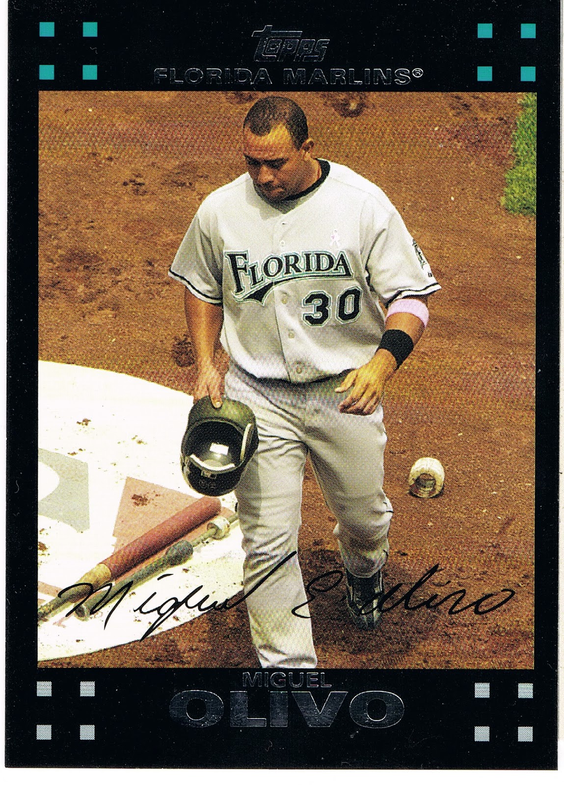
which has some intriguing hardware on display there. I can't recall seeing such items on any other card, though I would imagine such exist.

The rest of the Olivo card is just all wrong though. Every line on the card leads down; even the usually uplifting MLB logo (here nearly monochromatic in chalk, also kinda on-card unique) doesn't seem to help. Hatless cards are not always popular, but a player with his hat in his hands instead of wearing it isn't going to win many popularity contests. Just a downer of a card for a journeyman back-up catcher, with every plus matched by a minus. An interesting glimpse of the game courtesy of Topps however.

The Frandsen card is the only On-Deck card in Update, and Series 2 was not granted one either, although it did have a really nice Batting Cage card, which is every bit as rare as an On-Deck Circle card these days of course.

But I couldn't wander around in the On-Deck circle without posting a certain card from Series 1:
I would imagine this card was the subject of many a post back in the winter, when I hadn't quite fully hatched out of my turtle egg yet and was just discovering all you baseball card bloggers. I seem to partially recall a comment or two disliking the corporate logos on the card, but I am OK with those. I don't think Topps gets money for them or they are conspiring with Fortune 500 companies to make you want a hamburger. You see some logos here and there when you watch baseball, very occasional they then turn up on a baseball card. Big deal. It's not like we're as logo-ed up as NASCAR. Just imagine an unlicensed set of NASCAR cards...that might look weirdly cool, now that I think about it.

But overall just a sweet baseball card, On-Deck. I posted a parallel not to re-pimp my project (again), but just because the White Sox cards all look markedly better on the parallels, except the Camo parallel, my least favorite. There the Sea Turtle is just plain hidden, naturally, which kinda defeats half the purpose of the parallel. The White Sox cards are OK on their base glossy white of course, but much better in full color. I only picked the Target Red because it was the closest copy, on top of the nearest stack. This card looks good in every solid color edition and Gold, but loses everything when it goes off into the parallel Shiny universe.

Now this card does make me wonder if this might be the first appearance of the Golden Arches on a baseball card. I suspect probably not, but at this point of card-gazing tonight I'm a little distracted. Anyone got a hamburger?

Friday, November 15, 2013

These cards make me dizzy

This side-set is starting out slowly. The second entry is really a doozy:

I don't want to go too fast finding these, or, well, you know, I might get...

Monday, November 4, 2013

Phoning it in #2


I could add several more Chapmans like this from the last 3 years. I love the first one a whole lot.

And now ... Le Pièce de Résistance