I could really use some sunshine. The other day there was a notice in my media 'stream' about the large city 90 miles south of me. The news of the day was: some Sunshine! For 5, yes, five minutes. For the whole year so far. Of course with the year 2023 not even being a whole week old, that news was a bit disingenuous. And no one has sent an intrepid Lifestyle reporter to my little town, where everyone could have quickly informed any visitor that 5 minutes of Sunshine was the grand total for — the last 30 days!
So I sure miss that flaming ball of fire in the sky. Fortunately, I have some new baseball cards...


May I present: 2022 Topps Archives
It's tough to beat a purely red, white, & blue baseball card.
I always like Archives in a general sense. Maybe not all of the product, but for me, that's OK, as I don't often collect all of a product. Let's scroll-ponder our way through the first 8 card pack in a blaster.
I have always liked 63 Topps. I would like to see a "Redux" issue of it like I saw with 52 and 65 Topps on those 2021 inserts I liked. By that I mean an issue using all action images as the primary image (i.e. 83 homage style) rather than the purely keep it trad approach. That idea is so obviously good that Topps reserves it for the short printed "variations" in this release that I will never own and thus for me, Topps keeps it authentic and uses a head portrait shot in the large image, and a fuller body, posed image in the inset, which has never made the most perfect sense, to me at least. 83 got this quite a bit better:
Archives is a "3 set" issue this year. What's behind Door #2, Monty?


1978 Topps!
That hasn't fallen out of a pack of Topps baseball cards for me since: 1978! How did that not happen already? Are our cursive reading & writing skills so withered up and dried away that Topps didn't think we could read the cards any more? Doesn't seem to bother us (well, most of us) on those 'auto' cards everyone wants. An Astros card of Scary Altuve though, gee whiz.

If it wasn't for that clear cursive script and Mr. Redlegs running on to the card there, I might have thought this was a Yankees card. At least someone in Major League Baseball thinks it might look nice to have a nice clean shave on Photo Day, unlike that Altuve guy, or this next guy:

Sad Trout?
I am quite certain I have never pulled a sad looking Mike Trout card before. This does not bode well. Though I would have to agree with the expression showing that it just sucks that a great player like this is the prisoner of a bad team, as the back-drop here has got me thinking. I just want to see Mike Trout play a baseball game, say, in October, without paying $179 for an MLB.TV subscription, somehow. Maybe if I go wager $5 on an Angels game I can somehow get my local Casino Sportsbook to put Mike up on the big screen there, but I doubt it. And I just don't care for the idea of pay-per-view Baseball. You're right Mike, it's sad in MLB right now. And that means I still have baseball cards to watch instead:

Topps Big, take 2
Well I think I can predict one of the inserts in 2023 Topps Archives. This year's effort seems to have lightened the foil processing for the action image and the cards look a little better than last year's Archives issues of a way too dark Topps Big, though I still don't see the need for foil here. Just because you can Oooohhh, Shiny, doesn't mean you should Oooohhh, Shiny. Still no cartoon on the back either, bummer.
Ok, Ok, Monty, I give in. I will switch to door #3:


Wait, isn't that 9 cards in the 8 card pack? Yup. But I wouldn't advise being concerned about this. The New Guys Topps sub-contracts production to these days are still dialing things in, but I have yet to see a card count error that didn't work out in my favor. Calmado, esse, todo bien.

I swear I just saw some new 1987 Topps cards, somewhere?
Oh, yeah, that would be in packs of 2022 Topps Baseball. Is there a Dead Horse card in the set?

On the other hand, one reason I am not a yuge fan of 87 Topps is that the original set just largely looks terrible due to basic low quality production by Topps in the late 80s. Something particularly true in the 1987 set, which routinely offers up cards that were blurry to start with, anyway, even before the slapdash printing of them.
So when these retro 87s offer up a crisp image the way a baseball card should, quite often, me likey.

Got Bling? This image is in the right decade's set.
Finally a Rookie Card! I was starting to go through withdrawal. Early on in my year of pulling Rodolfo Castro Rookie Card cards, I was growing concerned that his incredible entry into MLB last year would become nothing more than a one or two card baseball footnote. Amidst the numbing parade of RC issues from Pirates middle infielders for seeming years now, on this one the Topps Card Back Writer gets in some nice illumination on Castro's standing in MLB. And by the time I pulled this card, after the season, it was looking like he might "stick" in the game, something fairly rare for Pirates middle infielder RC issues the last I forget how many years.
Maybe I should at least count the packs in a blaster, considering how much each one costs, and since there just basically isn't any other way to purchase baseball cards now, except by spending $30 at a go. So as there for me is no such thing as bet you can't rip just one, anyway, let's see what else I find. Speaking of interesting new Pirates middle infielders...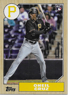

A player I've been quite wanting to "see."
Topps did well here. I didn't need to flip that card over to know that O'Neil Cruz is a tall player, which is an interesting choice at Shortstop. Topps Card Back Writer puts in another solid swing on the back, too. That wood grain paneling is looking good at night, too...

5' 11" reports the back. Huh. I woulda guessed different.
The 87s I pulled are all game action shots, except one, which recently escaped from the blaster box and made it into my one-year-late 2021 review post. So many retro cards, it's hard to keep track...

A classic place to see a baseball player on a baseball card.
Tonight I did take a peek at the rest of the set and, true to 1987, there are some Spring Training images used on this design also, for better, or worse...
There were other Topps designs of the past in the box to check out:

"1992 Topps Major League Debut 1991"
'Rookie Debut' cards didn't just appear in the 2010s to pad out checklists and help give everyone that crucial impression that they pulled a valuable Rookie Card card, denoted by that key logo, even when they had already pulled another Rookie Card card of the very same player, sometimes in the very same pack. The mouthful set called 1992 Topps Major League Debut 1991 was actually the 2nd (and, final) year of a complete stand-alone product of nothing but cards revealing the date and the result of a rookie appearing in MLB play for the first time.
The last few years in Archives the small - subsets? - of just a few cards of some old design now get sequential numbers on the checklist rather than some short numbering sequence more typical of inserts. What I don't know is if the cards then have the same print run as the base cards in the 3 main styles. This checklist oddly ends at #380 so there is probably something weird going on with production totals of some cards when they are coming off 100 card sheets, somehow.
On these, you can get a memento of M.J. Melendez' first game for the Royals, and one of Babe Ruth's first game, in the 'set' of 25 such cards. Good Luck, M.J.
There are some more of these efforts, too
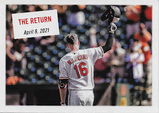

I did not know that the World Series MVP Award is actually called...
The Willie Mays World Series MVP Award. Thanks, Topps.

A "1955 Topps Scoop"
The back of the card might help a little, here

I blew that one up a little to illustrate the solid work put in by Topps Card Back Writer. The fielding award trivia seems worthy of, I don't know, maybe a whole baseball card? And I can't recall them ever mentioning a contract opt-in or opt-out before, a key piece of team construction that Topps usually completely ignores in their always-sunny-in-Brooklyn sets of baseball cards.

I think I would quite like to see the rest of those, given the absence of Highlights cards from the current Topps Baseball set. The next only-one-in-the-pack card was also quite nice -

However that groovy card is a true insert with it's own card # PC-6, which stands for Post Card:

There is one more of these old subset efforts of only 5 cards, a super-gimmee selection of a 2005 Topps Draft Pick / Int'l Signing design that enables Topps to print the 59th or so Wander Rodriguez Rookie Card card this year, and the 39th or so Julio Franco Rookie Card card. I did not pull any of those valuable Rookie Card cards but I did get my first boring old base card from the 2022 AL Rookie Of The Year, so I guess I can retire now?

L-R centering all wrong = trash.
This card mostly makes me think of another big "pull" I made from Archives back in 2018 and my realization that it is probably time to sell that one: the 1981 style Ronald Acuña Jr. RC card. I think he is probably headed to Hall-of-Very-Good territory; his 18 Archives RC is currently selling for around $10, just like that Julio Rodriguez card right there. Ultimately past design Rookie Card cards from this set don't excite very many people.
Elsewhere in this blaster, Topps was up to it's usual shenanigans. Archives now functions as a bit of an Update set given it's late release and I saw one big highlight from that idea, though there may be others:


This card eventually just straight made me mad, because
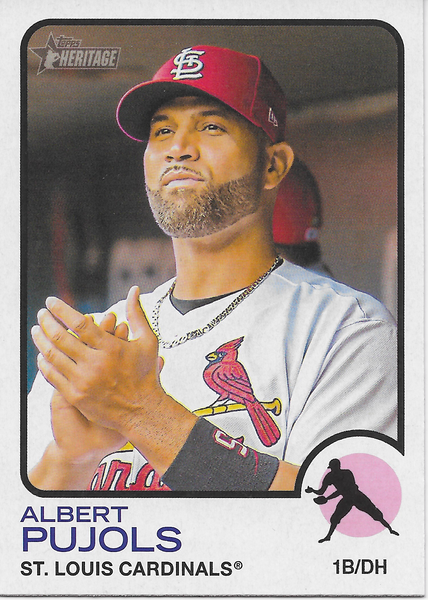
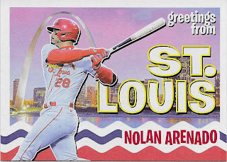
So maybe the Heritage High Numbers card is the offender, as I discovered that one later, I don't know. Baseball cards should not make you unhappy, that's for sure. And they definitely shouldn't hit you over the head with the thought that, hmmm, maybe I really am buying just too many of these goofy things, and there are just too many of these things to begin with, now-a-days. But I am forced to conclude this ever more often of late, I am afraid.
Topps did manage to cheer me up elsewhere in the blaster on another 78 card, with a from-way-downtown nod to baseball card history


If I were a dedicated Randy Johnson collector, this would please me immensely.
I found one other 80s/90s Ace card that would fit well into a Player Collection -

A 'Black Armband' year for the Red Sox
But once I had digested the inserts/subsets or whatever they are, enjoyed the unique things I found here and there, and pined away for any Tigers cards (none), I had to start pondering the true question about my little brand new accumulation of a $30 pile of baseball cards amidst the torrential blizzard of baseball cards we can select from today. If I could buy a $6 hanger pack with next week's groceries, that would be an easy decision; I would check these out a little bit more, sure. But at $30 a go, I had to decide - would it be a year I would assemble one or more of the different styles, Completely?
The 1978 cards seemed the strongest possibility, somewhat naturally. But did I want ALL of these -

That card made me mad, because

Not, technically, a repeat (from 21 Archives), but it might as well be.
Do I have any sense of Josh Bell (am a fan), or Victor Robles from either of these 2 cards? No, not really. I mean did they wear their baseball duds out to the industrial park to help unload cargo for a day or something? The current Official© Washington Nationals Baseball Card Back-Drop™ is just, pitiful.
Now there is an occasional sign of encouragement in these Spring Training Photo Day sets I sometimes like. Since the Yankees put up faux-Yankee Stadium edging on their ST field in Tampa -

Only one Position now, sigh
Yankees Photo Day cards look much less like the players are standing inside a prison, these days, like they were for an entire decade of such cards in the 2010s. So, that's an improvement. There were a few other signs of better cards ahead in this regard in this one blaster purchase, but I am becoming concerned this line of thinking, which I often Bloggle about, is going to become a be-careful-what-you-wish-for.
And I still had to decide - another $30 on this one? I did find a strong theme in the blaster, on 10 or so of the 54 (20-ish %) non-retail-gotchya-exclusive cards (the foil Topps Big I am a lot just lukewarm about) - the set editor on this one seemed to have picked up an image theme, and just ran with it -




This year, I started noticing nice Cloud Cards for the Cubs in particular, as well -
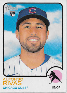


Cloud Cards
And these, I quite like. Recall the first 2 cards I pulled from this, the Benintendi and the Maeda. Classics of the little me-defined genre. I have been setting these aside into a tiny little pile for years, occasionally deploying a Label tag for them on my blog posts, where a few of these have been seen before. I hadn't quite reached 9 really really good ones to keep, yet -


It could be a cloudy day in Florida -


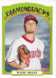
- or one in Arizona, which caught my eye.
Until 2011, it could happen in the Topps Baseball set

A foggy Photo Day?
Get out there and pose, it's Photo Day dammit.
But starting in 2012, these would only be seen in Heritage or Archives
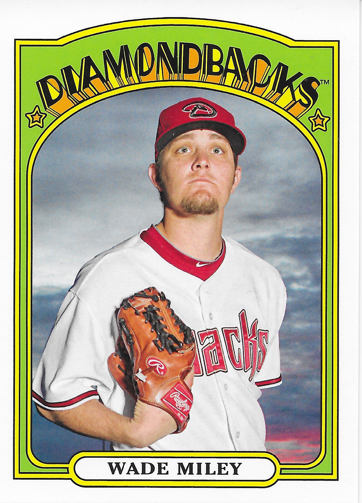
A favorite 'sunset' card
Now in 2021, I started noticing an uptick in these cards, quite easily, because my team suddenly had bunches of them:

Even the Rookies were getting this special pose set-up


I know from my team collection that this type of image could basically be found in any Heritage set one wishes to gaze their way through -


How cool is that? This might be a fun set to dissemble / re-assemble just into some pleasant binder pages of baseball cards.

- even though an all-sky background is not automatically an extra-good baseball card.
I was becoming intrigued by the idea of building out a nice little collection of some just basically purdy baseball cards with this pleasant background, especially when it was used for a player that was, finally, in a new spot to stand for these cards, such as one for the Braves, another team with a decade+ run of same-same cards, until, now:
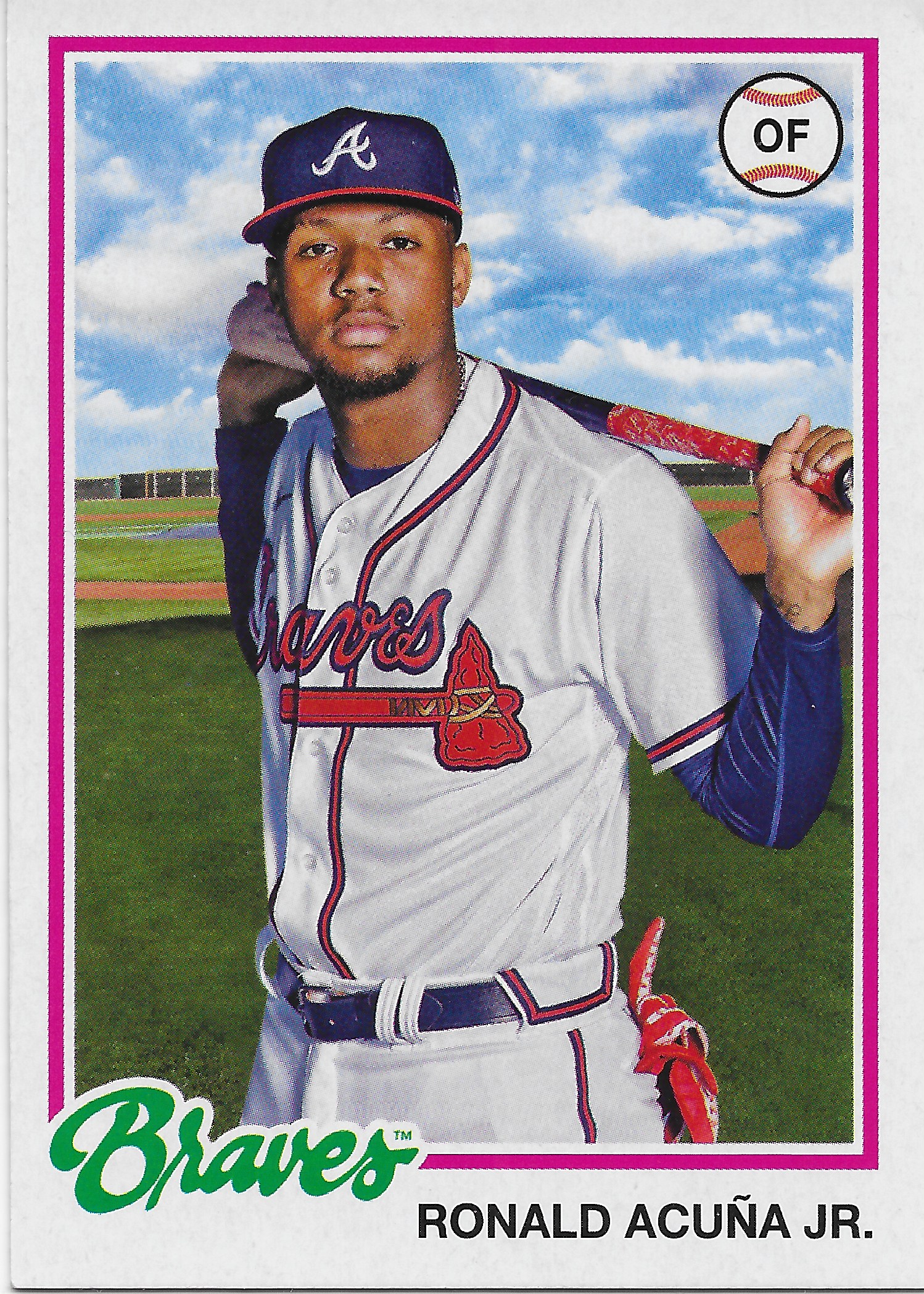
(I still hear a good ole ZZ Top song in my head every time I see this player)
I was, initially and for quite a few days and weeks of occasional post-purchase paws through this small stack of new Archives baseball cards, particularly intrigued that Topps seemed to have dug into their, yupp, archives to find other photos showing off a pleasant sky even 20-ish years ago:

But then, I hit a perplexing conundrum -

- how did they get a 2022 A's Rookie to stand in the exact same spot as Nomar did, 20 years previous?
Oh, yeah, Garciaparra played his final season for Oakland, so, maybe, Topps just photo-shopped him back into a Red Sox uniform, considering how many people would basically prefer to see a Red Sox card for him. (Somewhat) understandable. But, then,

Wait.
Now the Twins have suddenly moved to Arizona for Spring Training, too? I quickly used my favorite information resource (the back of baseball cards, natch) to see if maybe Miranda had been somehow Photo Day'd on Oakland's back-fields and then PhotoShopped into a Twins uni. Nope: "Acquired: Via Draft" - "Drafted: Twins #2-June, 2016" - Miranda had never played in Arizona. Something is going on here.
I re-pondered that Kevin Smith card (is there a more forgettable name for yet another, now you see-em, now you don't A's Rookie?). On his card, why does the outfield / batter's eye type wall not line up on each side of young Kevin?
Finally, sadly, I realized what is happening. My lovely new Cloud Cards - were 100% Fake.
It's not even the practice field back-drop that gets re-used on multiple cards, it's the lovely clouds by themselves, too:

The clouds by each player's right ear - are exactly the same.
The reality of it all had escaped my notice last year. But there it was on that 21 Heritage Tigers RC:

Perhaps, if I stared at more of these cards for a while (I won't be), I could figure out if the pretty clouds are the same from year to year. Which, given the level of fake laziness (or, authentic laziness?) on display here, might be entirely possible.
The more I gazed upon my brand new Archives baseball cards, the more I saw this, at least, in the clouds -

I have long wished to see an end to the basic repetitiveness of these "low end" cards that are seemingly ignored by so many people in "The Hobby" today. If I want a truly unique baseball picture card of any given baseball player I like, I can of course just buy one of their completely unique Topps Now cards with their limited print runs and $5, each, type price tag. Or a Topps Living Set issue, or a Topps Throwback Thursday issue, or any of dozens to scores of other cards to pick from for each player, in a given year.
That level of production of baseball cards is going to create repeats, to be sure. And now, I finally have my wish of not posing the players in the same spot, for ten years, or more, running on. Will I get to see a card shot during batting practice at Citi-Field some day? Who knows. If 2024 Heritage has this not-delightful new "feature" I will be very, very disappointed.
Ultimately, a bottom line is simple: it's my own fault for buying these products that just, repeat themselves.
Farewell, Archives, it was some fun collecting, sometimes. It was good to rip a few packs, often, over the 2010s, but, now .... farewell.


