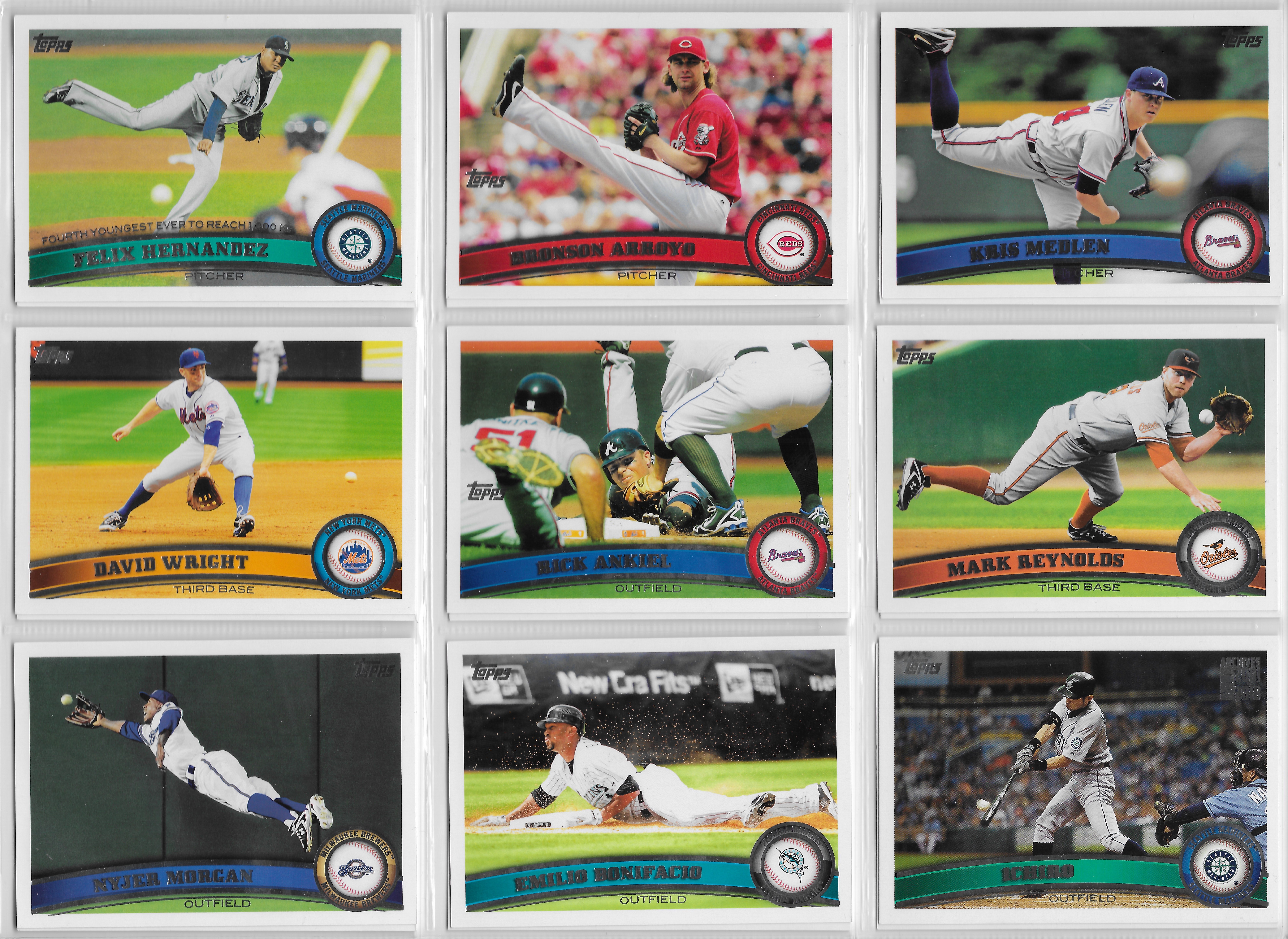
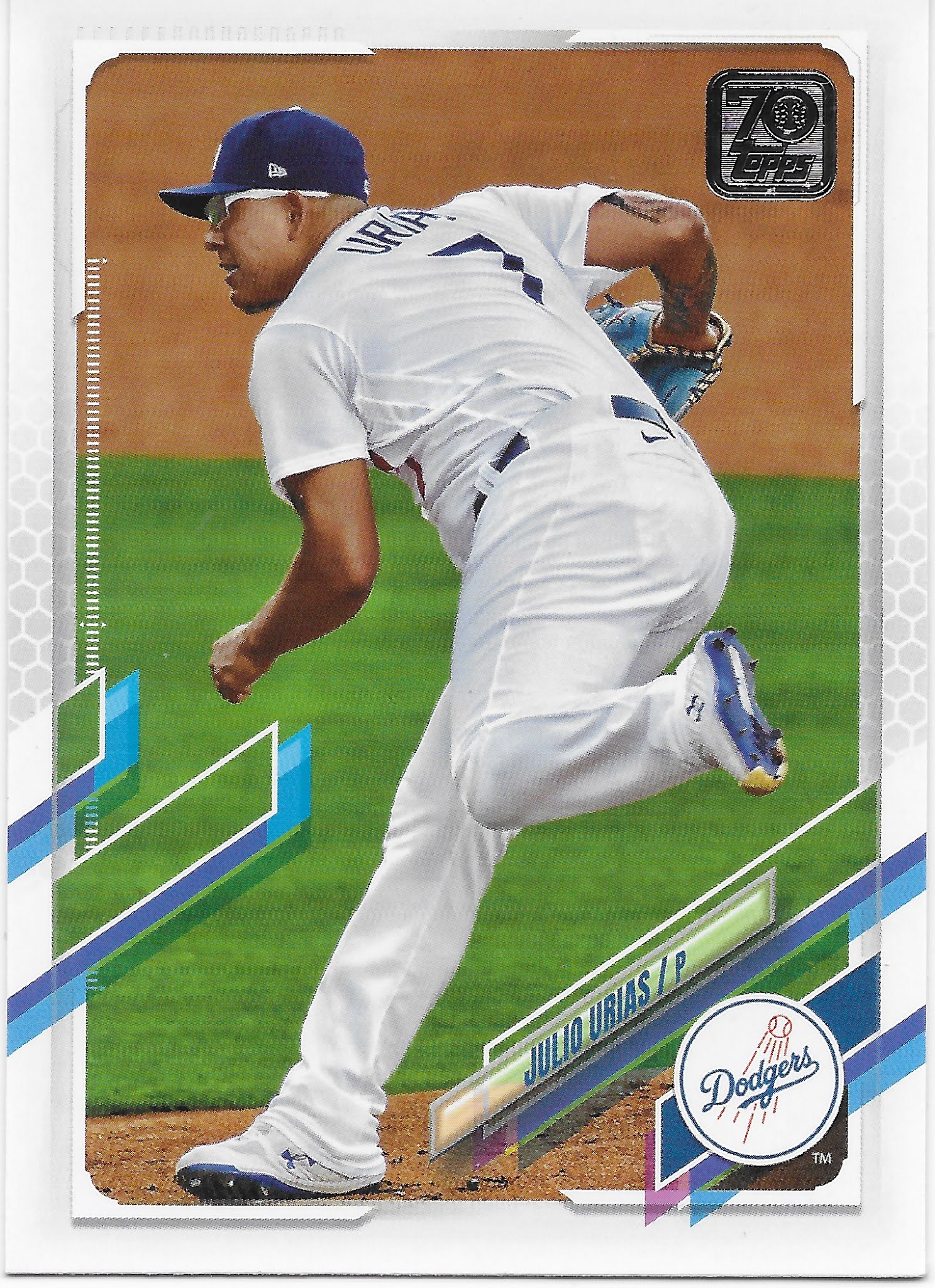
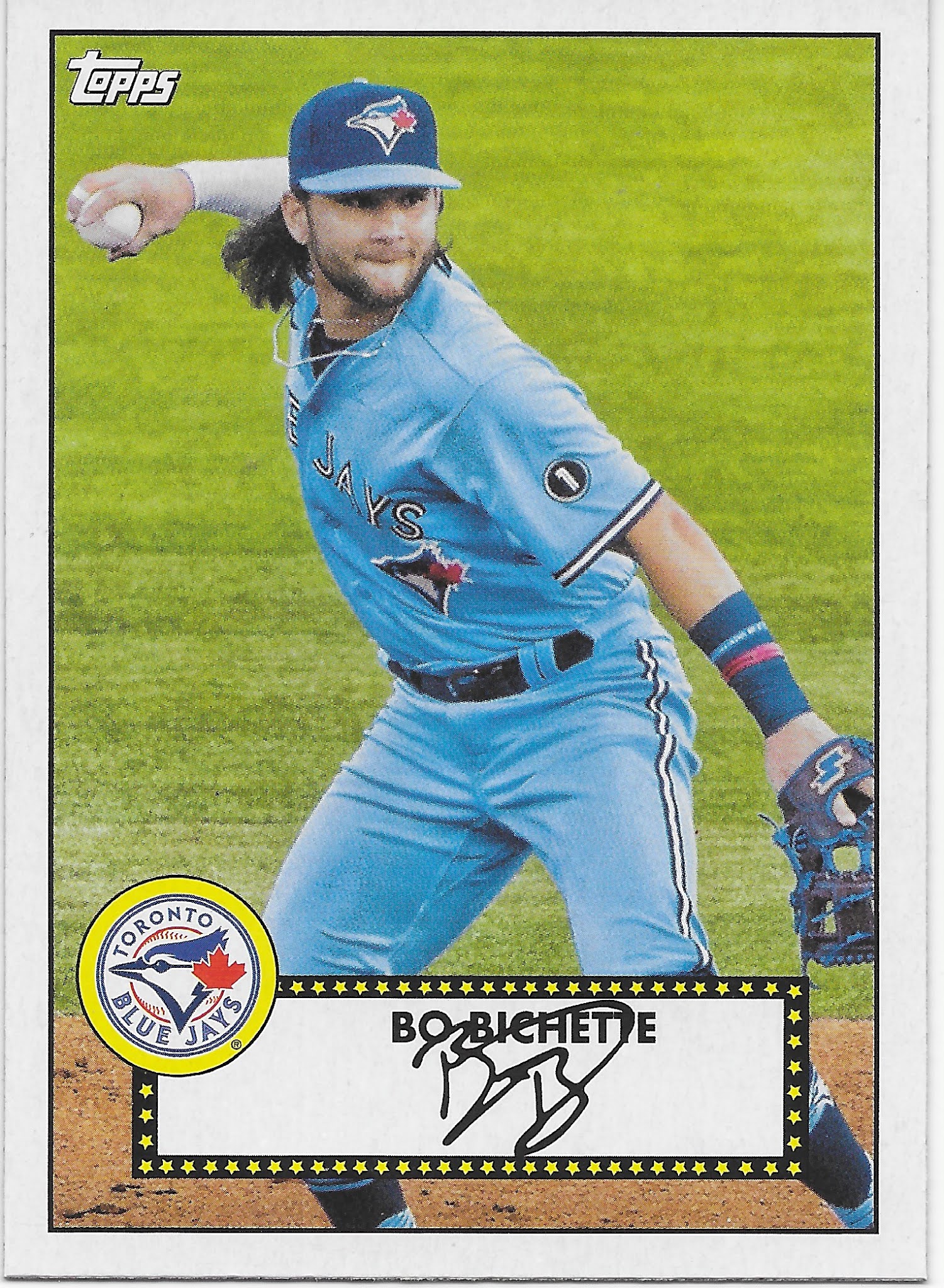
As I was making my final cuts for my 2021 cards recently, I realized a new rule, or, let's say, 'guideline' which I will need to use with my collecting efforts: if a set I am still "working on" is now appearing in Archives, it is probably time I should make some attempt to wrap things up.
Such is the case with the 2011 Topps Baseball set. 2011 was, for me, one of those years familiar to many people who love baseball cards, but did not necessarily collect them diligently each and every baseball season. There are very few years in my life where I did not purchase at least one pack of Topps Baseball cards, some years where I collected lots and lots of Topps Baseball cards, and then those certain years where something about that year's set re-ignited my basic desire to collect lots and lots, after some years of just 1 or 2 packs. This has happened to me three times in years that are Topps Anniversaries - 1991, 2001, and 2011. I don't think it is the Anniversary angle which pulled me back in, but rather the set that particular year. Does Topps try extra hard for an Anniversary set? Could be. I will never know now though; I don't plan to stop building sets routinely, now, as baseball card collecting is just so relaxing in our ever faster world.
The 2011 set just drew me in to it. You all know how that works or you wouldn't be reading a baseball card blog. The clean design, the splash of color, the ever elegant white border keeping things orderly, but most of all, probably the photography drew me back to hanging with Topps on their 60th birthday bash.
So I bought good amounts of the cards. And kept on buying them, in 2012, and 2013, when those delightful "Now 40% Off" stickers appeared on the packages. Remember those? I haven't seen one in about four years now, I think.
This became my collecting strategy in the 2010s - buy some cards, decide how much I liked them, and then buy more of the ones I liked, on the cheap, the next year. There is a small problem with this approach - when does one declare enough cards have been purchased? After all, who knows what might appear on the baseball card shelf the next time you walk up to it. Do I really have enough of that set? Why not add another little package of them - they are 40% off now.
Meanwhile simultaneously other new cards are coming in, some from the current season, some from the discounted season(s). The one priority I do give to baseball cards is absorbing them some (reading the backs) when I buy them; not the same thing as sorting the stack of cards, building the first needs list and getting busy crossing numbers off it. Thus I have a lot of partial sets I am perpetually "working on." Now, finally, I stopped reading my 2022 baseball cards and got around to cracking open a couple 800 count boxes holding my 2011 Topps Baseball cards. Let's take a look:
Card #1
I can't recall if Topps made a Social Media splash with their selection for this lead-off card in the 2011 set, as they do some years. But given the nature of a 60th Anniversary set, I bet they probably did at some point just after the 2010 season.
The most interesting thing to me about this card is a simple wondering if Card #1 has ever gone on to win the MVP Award that same season? This in turn makes me wonder just how much longer it will be before I can simply ask Alexa or Siri that question rather than do a bunch of Googling myself. Of course the whole idea is a bit moot because Braun's 2011 MVP has probably the most serious cloud hanging over it of any major baseball award, once it came out that he was using PEDs that season. This is why I had to draft Pee Wee Reese (from 2021 Archives) to represent the set up there at the top of this post.
A standard feature of many a Topps Baseball set is what happens six cards later -
Card #7
Looking at this card now, it makes me wonder if, ten years or so from now, we will all know who will still be holding down the Card #27 position, even after his final game. In the 2010s however, Card #7 usually has something interesting going on, so this will be a feature of these Finalizing posts whenever I can finally write one.
I will also consider some of the other standard Topps Baseball set features:
League Leaders: The 2011 set does include these, as a 3 image card for the top three players for each stat. Such cards only rarely capture my attention, in a permanent, I must-always-own-this way. 2011's Leaders did not. I find the 3 little pictures just distracting. The Leader is the guy on the left, OK. What do I need to see the other guys for? That's only going to make it harder for me to 'member the Leader, especially since, for me at least, the right side of a card is often more memorable than the left side. My ideal set up for League Leaders is a 2 player card, showing the AL & NL Leader, with a list of the top 5 or more on the back, for each single statistic.
I will say I always wish to find a Stolen Base Leaders card, but such does not exist in 2011 Topps Baseball. There are but 5 categories, for HR, RBI, AVG, ERA, and W. RBI and W are basically dated stats, now. As I think/write about this, I am warming up to maybe keeping a running collection of the Home Run Leader cards. That would make an interesting page of cards. I think I need to head back over to the scanner now...


Ahh, that's better. I always like seeing the NL & AL official logos on my baseball cards. The peak of 19th century graphic design, still going in the 21st century. Now I won't forget that Joey Votto didn't just Walk all the time, and that Adam Dunn played in the National League, too. This is why I write this blog - writing out my thoughts on cards is an enormous aid in clarifying those thoughts and in this case, deciding which ones to keep — I won't say "unfortunately" right there. I am quite pleased with my ever so slowly developing ability to begin a better editing of my collection.
Wait, what? I'm not keeping all the League Leaders cards? I'm not keeping this set? Not, completely. I am in the beginning phases of making my baseball card collection fit my future life style - which will be living in a basically small amount of square feet of space. I already live a fairly mobile life with my work in the tree seed business; I have no plans to maintain a large home mainly to hold physical objects no matter how much I love those objects. With many types of "media" I can enjoy them immensely in their "digital," near-zero-storage-space forms, wherever I go. With baseball cards, not so much. It would be nice to have a big ole screen saver set up showing a slide show of scanned favorites from my collection, something I do look forward to building some day. But for cards that's not really good enough, for me, either. I also have a strong feeling that I will enjoy a permanent collection more, if it is less overwhelming to attempt to look through once in a while.
Thus for most sets I will continue opening new baseball cards to continue following the sport of Baseball in my preferred way. But I will not plan on owning every Complete Set, but rather only a few favorites. Instead, I will focus on just certain elements of them - a Tigers Team Set, and a few others, as we'll see, right now —
Highlights: 2011 Topps does include some Highlights cards although they are easy to miss:
FIRST POSTSEASON NO-HITTER SINCE 1956
...is what the foil printed text says there above the player name / team color arch. Your only real hope of reading that text is with the actual baseball card quite up close; there is zero other content about the season highlight itself - the back of the card functions as a Checklist card. There are 5 of these cards covering each Series, 1 & 2.
I always like Highlights cards, so will be collecting/keeping them. With just checklist boxes on the back, I won't feel too bad about creating binder pages of 18 of them in sequence. Later in the 10s Topps got tired from all this work that is baseball cards, and quit trying to spotlight any season highlights in the Topps Baseball set. The checklist cards are still there, but become simple "duals" in the set. Here's to hoping for a return of some Highlights.
Post-Season: Alas, there are no cards depicting the 2010 Post-Season in the 2011 Topps Baseball set.
Awards: I do not know when Topps began placing a card in the Topps Baseball set for the biggest player achievement awards, such as the MVPs, Cy Young, and Rookie-of-the-Year award winners in the 2011 set. But they seem like a perfect card type to see in a run on a binder page, from set to set.
2010 NL ROOKIE OF THE YEAR
Rookie Cup: Buster Posey does very well in this set; he also appears on a card with the Topps Rookie Cup logo. And in this set, all of the Rookie Cup players receive a separate, unique card - one card with the Rookie Cup, one without. Each with a distinct write up on the back, though not for the threepeats of Posey and AL ROY Neftali Feliz.

Topps aced the basic idea of placing their own signature set element in this set, something that would unfortunately not always be the case in the 2010s. All 11 players have their Rookie Cup card included correctly. Ordering them by position, as Topps always does in announcing the selections after the World Series each year, leaves 2 more cards to show you:
I have been looking forward to assembling a continuing Rookie Cup collection for a long, long time.
The KEY Rookie Cards: There is one, essentially:
If one wishes to sell a copy of this set, the whole idea will be judged on just one thing by any buyer — the condition of card #145, the Freddie Freeman RC.
There used to be a couple other "key" RC in this set, but the standing of the 2 players in "The Hobby" (always sounds like a cult) has diminished considerably amidst the relentless Hall-of-Fame-or-just-trash mentality on the part of sooooooo many "collectors" - i.e. their basic value has probably declined now rather than continued to appreciate. Horrors. One of those is one of my favorite RC cards of the 2010s, featuring Aroldis Chapman:
I love 'twilight' cards like this one.
2011 Topps is quite a 'sunlit' set; it appears to me that the set editor attempted to select a sunny day photo whenever possible. There are relatively few cards from any neutrally lit indoor stadium (mostly Rays), just some Night Cards (nowhere near the blizzard of them in 2018 Update), and it seems even very few cards from a game with clouds overhead, though some, largely from perhaps a single in Miami between the Marlins and Braves. This is just an impression I have had for a long time with this set; I won't be attempting to quantify that set characteristic, though I will be checking into some others.
One result of that is a smattering of cards showing the crowd now sitting in late afternoon shade, which was something commonly seen on cards in the 70s and 80s, but has now become quite rare in a set of baseball cards. A shaded crowd and a sunlit player always seems to up the drama, with the player out in the bright spotlight of the game action moment.
I like that card so much I once splurged a whole $5 on what I thought was a copy of the "Topps Black" edition but was actually a "WalMart All Black" copy that is similar, but different. Oh well.
The other formerly key RC is the #65 Chris Sale RC, seen here the way I will be absorbing a lot of this set in future years:
That's the very first page of a new binder I will be assembling, for a complete run of Topps Rookie Cards, though starting in 2011. Although I won't have a complete set of all 990 cards on the 2011 Topps Baseball design to look through, a set of just the Rookie Cards (and all of the Tigers) will still give me a decent enough view of the set whenever I wish.
And that won't be purely a look at just the RC logo cards. You eagle eye baseball card blog readers probably already noticed one of those cards doesn't have an RC logo. Which is because Topps is naturally far from perfect in application of that logo, which isn't all that surprising given the raw quantity of unique baseball cards they produce every year. Nor all that concerning, to me; on the scale of possible errors on baseball cards, inadvertently omitting an RC logo, well, is quite low in importance overall. So really that particular collection will be more like an older concept in cards, one called "FTC" cards, for First Topps Card of each individual player.
The cards in that page are in sequential checklist order, which is conundrum-ing me. These days, when I place 9 baseball cards in a binder, I have begun ignoring checklist numbering not just for some RC inserts as I was writing the other day, but I have also begun assembling pages of purely horizontal and purely vertical cards. I find those much more enjoyable to view that way. However for this somewhat more official/historical look at RC/FTC cards, I still feel compelled to keep them in official sequential checklist order for some reason I can't quite explain. Baseball cards.
How Many Rookie Cards? I count 65 here in Series 1 & 2 2011 Topps Baseball, or 9.8% of the set.
That is it for separating out the cards — the way Topps designated them into easily, concretely defined subsets. However I enjoy collecting baseball cards via adding some of my own designations.
Memorials: This is an idea I picked up from the
Garvey Cey Russell Lopes blog, more specifically the series there specifically about
Memorial patches on baseball uniforms. Do not be confused by the seeming end date of the original GCRL blog; he is still an active blogger at
"cards as I see them" and if you keep wandering around in his first blog (well worth it), you may even see updated bits from subsequent releases, such as the 2021 Topps Archives 2011 Topps cards like the one I admire way up above there.
I am not going to build an exhaustive collection of these, but I thought it would be nice to assemble a concise collection of sightings of these tributes as I build my 2011- History of Baseball type collection. I will just keep one example of the uniform patch for each baseball personality so honored, rather than some of the ones worn after horrific events in the regular News. As a priority, if possible, I will use the best example from the main Topps Baseball set although sometimes images in other sets can be more clear.
This effort is off to a rough start on it's minty fresh new binder page - the slot for an Ernie Harwell patch is missing. Although it appears in the 2011 Topps set on the Jose Valverde card, that card is not yet in my possession as it is on the short list of cards I still need from this set. Additionally the best view of it is on a 2010 Update card (Brennan Boesch RC) that I also do not yet own. That one is also featured on a box-topper size effort that I also might acquire some day.
To get this rolling I selected the #424 card in 2011 Topps, the Yankees Team card; this actually shows 3 tributes simultaneously, for long-time Yankee Stadium announcer Bob Shepherd, George Steinbrenner, and Ralph Houk, all 3 of whom passed on during the 2010 season.

For now, i.e. through 2011 Topps only, I am adding just one more card, the #460 Cole Hamels, which shows off the "36" patch the Phillies began wearing in 2010 for Robin Roberts.

Throwbacks: A photo choice I quite like on my baseball cards is the use of images from those few certain games featuring a team's older uniforms. In 2011 Topps, I found 4 of them:
There are 2 more of these; the Chase Headley card is quite dramatic.
The Headley card, when it arrives, will likely get a spot in my Shoulder Patch collection.
I like the lurking yellow Outfielder.
What's going on with the baseball there in Trevor's hand? That's a kind of 'Easter Egg' in this set I guess, and I think the first example of the "Diamond Sparkles" - to commemorate Topps' Diamond Anniversary of course. I found this one while finally sorting my 9-11 year old card purchases. There are a lot of them in this set; a fair amount of them are hidden in white parts of the player uniform, too. I could spend way too much time carefully looking for more of them and then probably not find any, anyways; there is
a visual guide available. As we in the Midwest would say, Yeah, No.
That A's uniform becomes a popular choice for Topps in later sets; I might or might not just give it a whole binder page eventually.
Sunglasses: There are a LOT of cards with players wearing sunglasses in this sunny set of baseball cards. So many that my initial idea - setting up binder pages of every card featuring a pair of Sunglasses - would clearly be using up too much space for something that is sometimes rather repetitive. So, instead, I will make this a purely subjective decision. In 2011 Topps, the Royals are the Sharp Dressed Men, that I can tell you:
The best of these, will come along later.
A Classic Card: This next card I picked out as perhaps the most 'baseball card' in the set. Obscure the 'Topps' in the corner and all of the graphics at the bottom and most people would still instantly recognize this image as likely originating from a baseball card. This is Mike/Giancarlo Stanton's non-Rookie Cup card; there are several Marlins cards shot from this same angle, and some Braves cards too. All could easily be from the same game. 1977 Wrapper, anyone? Trout RC? Coming soon...

9 Verticals I Like: The hardest part of NOT collecting an entire set is picking out just a portion of it to keep. This just goes straight across the grain of how collecting things is supposed to work. Making my 'final cuts' from the set was an enjoyable stroll back in time the last several days, and I know it must be done to some day fit my collection into a manageable size. After keeping the various official and subjective subsets shown above, I will also be keeping a single page of the very best cards in the set, not already picked for some other sub-collection. The verticals:
I could not solve the mystery of the young Madison Bumgarner's white SF Giants cap there. That probably would have been more do-able ten years ago, but at this point, the expected World-Wide-Web-Knows-Everything-Ever resources are becoming scarce.
The rest of those cards are just the ones that caught my eye. At one point there were 18 of them, but that included the Sunglasses cards and a variety of other +/- decisions along the way to this post, and no longer wondering just what to do with all these 2011 Topps Baseball cards.
9 Horizontals I like:
This is The Way
Horizontal baseball cards look sooo much better like this. Whenever possible, this is how they will be kept in my binders. It is highly likely pages like this will end up in their very own binder, even, and that one will also highly likely be the one that gets flipped through the most often, in years to come.
I never care for reading comments on the web slagging horizontal cards. Some of them are lazy efforts on the part of Topps, to be sure. But when they work, they can be among the very best baseball cards made.
A key problem with them is when they are just randomly mixed in with horizontal cards through a checklist. This, I do not understand. It is clear from the way they arrive in packs that the horizontal cards are placed all together on the production sheets used to print the cards. Would it be too much trouble to then just place the horizontals all together on the checklist? No, it would not. And...can we have a brand new, all horizontal set, even if it's just an insert effort? Pretty please? A '56 Topps Retro, done up right, warm analog Living Set style, though without the limited print run making them cost too much for me to collect? Pretty, pretty - please. The recent appearance of the '56 Homage called Topps Big, in Archives, was just basically ruined by making them foil cards, both times they appeared.
One final thing I want to spotlight from this set is a rather endearing feature of this set - an occasional photo clearly from Spring Training -
Although that card quickly becomes a Michael Who? if one ponders his very brief MLB career, it has baseball card glory all over it. This is an attractive set, at root level. After 2011, cards like this become extremely rare to completely non-existent, most years, in the Topps Baseball set, and that is a shame. I will return to the concept of baseball card sets and Spring Training photos and even be using the Pittsburgh Pirates as an example of where Topps has been with this type of image lately, on a post here soon.
Most examples of that type of photo source occur with the Rookie Cards, but there are a few examples of non-RC cards with these photos, such as the quite rare appearance of a Spring Training cap in the set:
Now I am wondering if you might have noticed anything about all the cards seen so far here, before those last 2 cards at least. 2011 Topps has a different look to it, compared to even the very next set in the long history of Topps Baseball sets, in 2012. There are far more images of complete baseball players, from their cap to their shoes, than we will see on Topps Baseball sets after this one.
I do like a baseball card that lets me see a day at the ballpark and 2011 Topps definitely comes through with those, as here:

The price we pay as viewers for these grand slices of a moment from a game, is a bit less recognizability of the specific player, sometimes far less. I am not much into 'Player Collecting' and generally just keep (no surprise for you, Dear Reader, by now, I'm sure), yupp, 9 cards of each player. So if I had a Victor Martinez collection going, this one probably wouldn't make the cut because it is hard for me to see V-Mart here, all that well. So I thought something that might best illustrate this is 3 cards from (quite likely) Hall of Fame players in the set -

That's card #42 in the set, by the way. The true seeds of the big departure from checklist tradition that was the 2013 set, using uniform #s for card #s to a huge degree probably came from the #7/Mantle card trick which stretches back to 1996 or so, and then in 2011 the idea began to grow. In another 2011 set, Lineage, Jackie Robinson is card #42. The uni/card # idea has continued on at a low level ever since, though generally only most noticeably for #27 cards.


Plenty of day-at-the-ballpark to absorb on these cards, and that I like. But, also, not the instant recognition that becomes a hallmark of most cards in the Topps Baseball set, even while using live game photos, which is something I have come to think may have taken off -after- this set, in 2012.
Now I do want to clarify that I like ALL types of baseball cards in this regard. The key to a good set of cards, in my opinion, is to keep the images varied as the set moves along. And 2011 Topps does do that as well as any other set. But it still has a distinctly different feel without quite so many zoomed/cropped cards. I have wanted to figure out how different the sets are in this regard for some time.
Now as I have sliced and diced 2011 into my own personal archives I have finally calculated what I am calling the Zoom Index. To do this without going any further out in to the baseball card weeds, I dreamed up a simple 1, 2, or 3 rating system for each card. 1 point (minimum) for each card, 2 points for seeing a player's knees, and 3 points for seeing a player's shoes. If shoes or knees are hidden behind the graphic elements of the cards I just imagine the image without those graphics and proceed.
Now there is some subjectivity required at times, because baseball players largely aren't standing perfectly straight while they play the game of baseball:
So some cards I just skip, or make a quick judgement call. And I have already spent way too much time on this project; I decided well ahead of time to just use the first 100 useable cards in the set to calculate this, while skipping over cards that just don't work, such as the League Leader and Team cards and such.
The 2011 Topps Baseball Zoom Index: 2.67
This means that a large majority of the cards scored a 3 in my little rating system - the whole player is visible. I am quite looking forward to comparing this number in other sets, maybe some day even a vintage set, which I expect will have quite a low number, comparatively. And there is a good chance that 2011 Topps may have one of the highest possible scores. There are a LOT of somewhat distant shots of players busy playing the game of baseball, with their entire bodies visible. Something not nearly as true in the rest of the 2010s.
A final element I will be checking into as I put each Topps Baseball set to bed, as it were, will be the use of images wherein the players are wearing the striking solid color "Alternate" uniforms. Recently I was flipping through my 2014 set, still in it's 'complete' form, and the amount of Alternates in that one seems as high as Topps could possibly make it. We'll find out here, some day.
When I first became acquainted with the idea of making my own "Frankensets" courtesy of all the wonderful baseball card blogs, an initial attempt I made at such was just assembling all the Alternate Uniform cards in a set, sequentially. The first such page I assembled was using 2012 Update:
Now, THAT, is a striking page of cards.
The Zoom Index of those 9 cards, by the way, would be 18 points / 9 cards = 2
I am more than a little tempted to just build a collection of all Alternate Uniform cards. However the use of such a photo does not automatically create a good baseball card. Sometimes, they are just not that remarkable - an inescapable fact about baseball cards. And though this idea CAN make for some great looking cards, other times I think Topps might be blissfully unaware of the possibilities with these.
In 2016 Opening Day, they picked up this idea and ran with it on a 15 card insert set:
Leave it to Topps to theme a checklist around a visual aspect of the game, and then pick almost exclusively images that completely fail to show off that aspect. As with so many things they do, I will frequently not understand their thought process along the way to me ripping open a pack of baseball cards.
So back in 2011 Topps, an Alternate Uniform themed collection would look like this on the first page -
With the much more distant photos, the colorful uniforms are a fair bit less striking than in the live game images the very next year.
2011 Topps Alternate Uniform Use: 23% in first 103 cards, skipping the decision on 3 cards.
That basically concludes my look at 2011 Topps. I have a short list of cards to acquire to fill out some of my declared subsets, and I had some good news while sorting, sorting, sorting this great big ole pile of baseball cards: this set is worth keeping/selling, in a financial sense. A recent completed sale on eBay went for $50, iirc, obviously with the $15-ish Freeman RC included. This was in quite some contrast to the Lineage set that year, a copy of which was recently "allowed to ride" as a 99¢ minimum bid auction - which was the final sale price. A bit, discouraging, that one.
All told I would estimate I had around 1,500 cards from Series 1 & 2, which still left me at about 93% complete. But given a $50 value, I decided to keep the set together / complete, even after putting aside my subset needs from the doubles/dupes wherever possible. This leaves me needing 80 or so cards in total to fill out one Complete Set and my special needs sets. That should be easy enough to obtain via Sportlots some time soon. Though if you are sitting on a pile of a couple thousand 2011 Topps Baseball cards looking for a home, I'm sure I could find something you might want to exchange for those 80 'commons' - & aside from the Freddie Freeman RC, which I don't need, they are all commons, now.
Several cards headed off to inclusion in weird little theme pages did elude my scanning efforts for this post, but that's OK. They should appear here, eventually, some day, maybe, perhaps. They will look better around their compatriots when 9 of them have been assembled together, anyway.
One new collection I look forward to building is a look at the slowly but steadily growing resurgence of the use of classic 1970s Powder Blue uniforms in Major League Baseball. In 2011, only two teams were proudly sporting the 'powder; the Rays, and the Royals. While starting a history of the game on cards in 2011, this is a bit early to ponder the topic, but in this 2011 Topps Baseball set I did find a great looking card that will definitely anchor a spot in this theme:
This fab card, we will see again on this blog.