Showing posts with label There's A Baseball On My Baseball Card. Show all posts

Wednesday, January 29, 2014

It's that One Day

The day of the new Baseball Cards!

Not just any Baseball Cards. The Topps Baseball Cards. Not the Bowman baseball cards. Not some other gimmicky set of baseball cards. Topps Baseball Cards.

Oh…and…Hello there. Yes, I've missed y'all. I'm missing the game of baseball. I miss the baseball card blogs. I miss blogging. And mostly I miss my baseball cards.

I do have some cards with me. But I'll just say that camping and baseball cards don't mix. So though I have had desire to open the road case of cards I have with me, I haven't wanted to do that while out-of-doors. Mostly I have some cards with me that will become the basis of a new COMC account, when I can finally assemble them into a single box for shipping.

Maybe tomorrow finally….thanks to another round of the Polar Vertex vortex, I am safely ensconced in a hotel room for a couple nights….so I can visit with you fine folks. But if you are reading/downloading this post at the speed it is being assembled (with free wi-fi you all too often get what you pay for), well, I hope you brought a book to read.

I did. I picked up a new copy of Janisse Ray's "Ecology of a Cracker Childhood" today (yesterday) finally. I read it when it came out and it is one of my favorite books of the 21st Century so far. It is about the Longleaf Pine ecosystem, and growing up in Baxley, Georgia. Which has worked out well for me to peruse as I upload each picture, as I have just finished planting 53 acres of Longleaf Pine just up the way from Baxley.

This morning (yesterday) I was walking in the doors of the Wal•Mart there in Baxley thinking "man these Big Box stores sure are boring when I know they won't have any new baseball cards I want in them" as I had been thinking the new 2014 Baseball Cards wouldn't be out until the 31st for some reason.

So when I approached the cash register (yes, I picked that one aisle with the cards, of course, just in case), well I was pleasantly surprised to see … Mike Trout? Again? What's up with that? I won't post that image for you, again. I would have wagered on anyone but … Mike Trout. The 3:2 Vegas line would have been on Yasiel Puig I would have thought, with Andrew McCutchen being pretty deserving as well, 'cept of course he plays for a dreaded small market team.

I hope some baseball card blogger will look into something for me. What happens to a baseball card cover player that season? It didn't seem to work out too well for Prince Fielder last year. Or perhaps Roy Halladay in 2012 either. But why would I give up juicy blog topics like this? Well I love blogging about baseball cards of course, but I see my time will be limited for quite a while yet. I do have a few "hotel" jobs on the horizon at least, but I also have lots of other things to blog about, including a fun new collecting project. We'll look into last year's project eventually here a little later on tonight. Or whenever this post actually makes it to the actual Internet, which remains to be seen….

And the cards, can we see some cards now. Yep, here we go, my first Baseball Card of 2014:
No, I didn't get special Test Issues of an extra-large wood-panel inset card. I am back to taking pictures of baseball cards with a cell phone, on a desk. When I walked out of that Wally World though, did I immediately rip that pack of cards? Of course. But then I also immediately pulled up a nocturnal baseball card blog for the first time in two months, just in case, to see if I had lucked into some special secret Topps test of putting Mike Trout on the packaging again - i.e. if y'all had found these cards too….I see I am still just a normal Topps customer.

Well I'd say we're off to a good start. I made the mistake of looking at the 'Sell Sheet' sometime last summer, so I already knew what the cards would look like. That took a lot of fun out of ripping the pack. I won't make that boo-boo ever again I hope. Except of course I do already know what 2015 Heritage will be, visually.

But I like this card, mostly because it shows a complete baseball player. Even one of his shoes. Maybe this will be a good omen for the photo selection and layout this year.

And I always like the special throwback uniform cards. Nice white belt to match the white letter "C" there, well done Cleveland. But for Topps….not so much. Apparently they missed the memo that Chief Wahoo is now only to be found on antique items. Of course baseball card collectors now demand that their cards instantly be antiques and most especially have the same dollar value as antiques, which is mostly a highly dubious proposition to most sane people, so maybe Topps is onto something and Cleveland Indians cards might actually sell this year.

As for me, I won't miss Chief Wahoo. But we are here to discuss baseball cards, specifically The Baseball Cards. Didn't Topps notice the big letter "C" on Lonnie's batting helmet there? Shouldn't the logo in the lower left match the logo the players actually wear?

I like these Baseball Cards well enough. I will eventually own a complete set of them, and many extras as well, though as much because they are The Topps Baseball Cards, and that's what I collect, whatever may come from the pack. I don't like them as much as last year's cards, but they are serviceable enough - i.e., not ugly. I'm not a fan of the faux die-cut border on the one side. It makes them look too much like … the last how many years of Bowman baseball cards? And I just don't like Bowman baseball cards, which have come to epitomize everything that is wrong with baseball cards today.

I mean this year I will be rooting for Byron Buxton to fail as a major leaguer. Which is a darn mean thing to type, though not half as mean as your average Internet sports comment. I just want to see the end of things like people paying $8000 for a baseball card of a player that hasn't even made it to the Major Leagues yet.

Oh dear, I'm wandering away from the Baseball Cards again. Let's see another one
hmmm. Haven't I seen this one somewhere before?
I actually like that card quite a bit. It would have made my Best of 2013 blog post if I had had time to write that one, in the "Best Appearance by the Baseball on a Baseball Card" category. I especially like cards like that, where you can see the seams on the ball, and the batter is going to whiff on the pitch.

Now of course, there are only so many possible poses for a baseball player. But here on my second card of 2014, we are right back to context-less torso shot. Sure, it's a live action shot. But it might as well be a posed Posey there. Let's try card #3
Well, I suspect I already know where this set is heading. I hope at some point this year to have some time to bring you some cards from all the way back in 2011….the differences are striking.

Among the other features of the 2014 Baseball Cards, well the Wave or whatever it is just brings me back to 2012 and the Surfboard. And I have had my share of foil by this point. I wonder if the Opening Day cards will skip over it this year…..I suspect not, with that Foil Wave there, which doesn't photograph well. Bonus points if you can figure out in this post what color the case on my smarthphone is.

I do like that Topps will be more able to randomize the photos of the players they use a little, in that they will be less tempted to have to lead you by the hand to what position each player takes on the field via their photo selection. Though of course, First Baseman are kind of expected to hit Home Runs and trot around the bases.

That's because: The Position Is Back On The Front Of The Card! Yes! Where it belongs. Through many posts last year I mentioned I couldn't really get into the 2012 set for some reason. That was the reason. I want the player's position on the front of my baseball card. Maybe that makes me a "Position Nazi," but so be it. I buy baseball cards to know who the players are, what position they play, and who they play for (insert scary foreshadowing music here…) Is that too much of ask of my Baseball Cards?

That about covers the fronts of the cards. Topps is still up there in the corner, sans umbrella this year, which is OK. Except for one more type of card:
Nice! I like that extra little bit of Topps decision making there. I'll probably put all these Future Stars (which again doesn't photo well, but I'm sure you've seen these) together on a binder page for future reference for my grandkids or something, though I'm not sure pine trees will actually be able to ponder baseball cards. Heck I might even throw together a set of the 1989 Future Stars. I think it was 1989. I think I have, like, piles and piles of those cards sitting around somewhere. But I might need a couple. I've got some extra nickels if you could help me complete that set one of these days.

Now about that photo cropping again:
I just don't get the Topps photo editor's fetish for chopping off the player's hands. I really liked Burnett's card last year - in large part because it showed all of his arms and legs; I just realized I will be adding a copy of that one to my These Cards Make Me Dizzy collection. But his 2014 Baseball Card is just another card to me. The cool look of his eyes each focusing to his right is nice though, but just, nice.

And now in my first pack of cards (a Jumbo Pack! of 36 cards — I would normally buy a more regular pack on this special One Day, but this particular Wally World didn't have those this morning) I have reached the first horizontal card:
I like horizontal cards. I prefer them. I would like to see a Complete Set of such cards even, without borrowing the double image design element from the mid-50s sets of such cards.

But making a horizontal card of a player from the belt up is just kind of….well, pointless. It seems fitting that I would find Jose Bautista on my first horizontal card this year. Anthony Gose, another Blue Jay, had a similarly purpose-less bit of cardboard in Series 2 last year.

And, as last year, I think the horizontal cards are probably all on a single sheet. If I could get a hold of an uncut sheet of modern baseball cards (and I love sheets, with or without perforations or whatever print or plain white is on them, mmmm, sheets) and had to pick only one, I would pick the one with the horizontal cards. Why do I suspect that about the sheets of Baseball Cards? Because the horizontal cards always come together in the packs now, at least in the big packs of the various sorts. The parallels work like that in the blasters too. In a blaster, all the parallels are either all horizontals, or no horizontals, generally.

Now my next horizontal card is starting to improve this pack:
Kick it, Kris! I like Leg Kick cards. I started to pull copies of them aside at one point, but eventually let that mini-collection go, as I couldn't decide on which ones made the grade. Some are magnificent, like last year's Justin Verlander card, and some are just, nice. Medlen might be at Comerica Park on this one, like on the Verlander card last year; perhaps with less of a crop to the photo it would be easier to tell and could have been a nice homage linkage to two incredible Major League pitchers.

This Medlen card has a lot going for it. Throwback uniform, primary baseball colors, Great Sox, and harmonious lines harmonizing everywhere, even the Swoosh. But again the cropping just gets to me. I don't like a card that makes me wonder if I'm about to bump into the ceiling while I'm looking at it, like last year's Juan Francisco card. I guess though, that like the Burnett card, the pay-off of all that zoom/cropping is we get to see Medlen's eyes each focused on the result of that pitch. And at least he doesn't look like a teenager any more. But I just feel like I can't breathe right looking at this Baseball Card.

Fortunately, we have another horizontal card on the way:
Yes! We have a winner! Jonathan Villar could be on his way to being a Legend of Cardboard perhaps, with a second great card from Topps, after his outstanding sliding-into-home entry in Update last fall. (I really hope Greg Dobbs is hanging out on some interesting card in Series One again….)

Now we all know these Base Cards are just pointless filler to be thrown out or burned on our way to scratching off a winning HIT on our lottery tickets - a Parallel:
These will be the most common parallel, this year's Foil, obviously red this year; and a parallel horizontal right after the 3 horizontal cards…

I like the boldness of the tint keeping it towards Primary Red at least, as technically it is the "Red Hot" parallel, Topps tells me. But I have had plenty of enjoyment out of last year's parallels. I am still working on that project. So when you find that poor neglected pack of cards that slipped out of a blaster and in behind a couple binders at some point last year and you open it now to discover a pink bordered copy of Ryan Braun's 2013 card #8, well, hit me up, please. I think I will make large dents in my remaining needs for the project once I get that COMC deal working, finally, I hope. If only I didn't have to work….but if I didn't work, I couldn't buy these new Baseball Cards. Such a conundrum sometimes.

Overall though, I will be fine with collecting Base Cards this year. Like this one:
Now here is a player I've begun to follow because of his baseball card. I can even vainly hope Topps read my thoughts on his almost-good card last year. Now I finally get my wish. Justin Turner turning a Double Play, though it looks like it kinda hurts when Topps cuts your hand off. Yes, Topps, you already told me now that he plays Shortstop there on the front of his card, though I'm sure it was tough for Topps to determine just which Mets infielder will play where on the diamond this year.

I like this card for some other reasons as well…great colors, plenty of dirt, heck I even like finding another entry for my Budweiser binder page.

I'm also always intrigued by the Turning Two cards when I can see about whom the 2nd base Umpire is now saying "Yer Out!" In fact I have a special pile of those cards…
Thank goodness it's David Wright at last or I might have started to get the DWs - David Wright withdrawal symptoms. Topps never misses opportunities to get him on some more baseball cards. After three cards in my last set of the Sea Turtles, the ridiculousness called Update Chrome, it took all of eleven cards in 2014 to see David Wright again, sort of.

And perhaps we have a Turning Two Hot-Pack going on here, hmmm.

At least this year there are plenty of Astros in Series One, as their cards didn't require as much work for Topps as they would have in S1 last year, with all new logos and such. Why here is another 'Stro now:
OK, an outfielder at the plate, nice Eye Black, hmmmmm, another pair of eyeballs intent on a live pitch, perhaps we will have a theme here, or I just missed that all the time last year having fun riding on the back of the Turtles.

Wait, did I type "Back"? Yup, perhaps it's time to check out the backs of these cards:
More Wave action here. And the player's position again, which is nice, but in such tiny type….why?

The two notable new features this year are the Rookie Fact, and a certain new statistic there on the far right.

Now of course I read the backs, and I read all 33 Rookie Facts in this pack (3 inserts), so you don't have to. I kept thinking they were Rookie Fun Facts, but that was just me projecting the idea that the backs of baseball cards should be fun. Instead, all 33 of the Facts I read were things that could only possibly be known by, and not even of interest to - Baseball Card Back Writers, whoever they are. I used to think I would want to be a Baseball Card Back Writer, but reading these Rookie Facts made me realize I am much luckier to crawl over loggging slash and through briers with a 30 pound load of seedlings on my back, getting bit by mosquitoes, rained on and sunburned all at the same time every day instead of trying to discover bizarre baseball statistic factoids to write. Tough stuff to do all day, every day, I am sure now.

Eventually I will discover the one enjoyable Easter Egg fact the Baseball Card Back Writer left for us in this Series of Baseball Cards. But it won't be this day.

Now, what was what over there on the right of the stat lines? WAR? Yes, though, no, I won't make any trite references to it's name here.

Yes, here we are in the 21st Century, fittingly enough after the baseball club that Bill James now works for won another World Series, with Sabremetrics on the back of our baseball cards. At last.

Yawn. Yawn? Isn't this new and exciting? Sure, it's new. It's surprising, even, given that there is still more than one method to compute WAR. And even though all the baseball webpages (sadly, the most used baseball cards here in the 21st century) that report all the statistics add up WAR cumulatively, as Topps does here:
I'm just not that into it. I know that the numbers don't add up correctly because we are only seeing one decimal place. But wouldn't an average of the WAR from each year be a little more illuminating?

Who cares. Who cards? Stats nerds? They don't use baseball cards….today's stats couldn't possibly fit on 2.5" x 3.5" pieces of 'cardboard' any more. So I guess it was due to see WAR on cards. Maybe one of these days it will kick me into figuring out SLG and OPS. Sure, those are important, they tell me. But I can figure out quite a bit from the old time stats lines just fine. And if I could pick a single stat to add to cards, I would probably want to see OBP - on-base percentage. Because yes, I too watched Moneyball, several times. And might even read the book eventually. If I can ever snag the free time away from my baseball cards, like this one:
Hey, how did Brandon Inge sneak onto a baseball card again?

And what I was just mumbling about Nerds?
Nerd Power! It even explains it all for me right on the back of the card. Such perfection, making the Nerd Power card a Bunt Card. Nicely laid down there, Topps.

Now, much like Buster Posey, I predict a popular future for this player:
Because baseball fans just naturally like players with nicknames. I am happy to own my first Scooter Gennett card, as I was always happy to hear about his progress on Brewers broadcasts last year. And here I have his First Topps Baseball Card.

So where is the special little RC logo? That was on his Bowman card last year, it turns out. But not on his Pro Debut card last year. Or any other other dozen or so cards he appeared on before he made it to The Show last year. Such is the world of baseball cards today.

Now I was mentioning I like my baseball cards to help me keep track of which player plays for which team. So why does Topps make cards like this one:
Which is a pretty great card actually. You gotta love the unpopular persona of McCann now seen with a huge smile on his face as the airborne Gregor Blanco couldn't be more OUT! You Be Out! You are soooooo Out. Man this game is fun to play.

Classic card. It also has a classic back, with perhaps a final Chipper Jones quote from the Baseball Card Back Writers, who used them regularly, perhaps regularly enough to make binder page of card backs perhaps….
I guess Topps saw that photo and just knew they had to use it on a card. Which is OK; it reminds me of the Ryan Raburn card last year. So I'll give Topps that one. But then why the very next card in this pack:
A decent enough card though again the torso shot bores me (though I did just get four cards sequentially with the player's knees on them), and the mysterious One Sleeve still ?

But most of us knew Shin-Soo Choo won't be playing for the Reds this year. Just as he wouldn't be playing for the Indians last year when his Series One card came out. Maybe Topps is just setting up Choo to be the leader in unique base cards again this year, as he was last year. I had a blog post to illustrate this all ready to go for you (in my head at least) before I went back to my love of the pine trees. He had a different card in Series 1, Opening Day, Update, and Topps Chrome. Which is a nice thing, for a great baseball player, and something I would like to see for ALL of the Baseball Players. Different pictures on different baseball cards. Wouldn't that be sweet?

I just don't understand why Topps doesn't save the obvious Free Agents for inclusion in Series 2, with some cool brand new photos of a player playing baseball for his new Baseball Club from Spring Training that collectors (and especially those all important Player Collectors these days) would really look forward to — especially when Series 2 could always use a little more star power on the checklist?

At least the Choo card keeps repetition alive, as does Jose Altuve's new card:
Can't miss a chance to use Poster Boy. I do like when the digital age captures the dirt flying though, though digital doesn't work as good over-the-air photographically as it does with scanning lasers. There is good flying dirt on that card though, trust me.

Speaking of missed chances, I was really looking forward to finding a certain card this year, for which I had high hopes that it might me just the second card since this legendary slice of baseball immortality:


But instead, we get just "OF"

Overall I do like the Hamilton card, though I can't help but hear that strange springy sound made whenever Steve Austin, the Six Million Dollar Man, used one of his Bionic parts. Maybe that's the sound created when you hit your head on the top of the baseball card though. That weird side to the card makes it look like the cards would be a little springy.

Perhaps Hamilton will go on to set some Base Stealing records. I guarantee he will at least make for easy copy for the Baseball Card Back Writers for the next few years. If he does get famous, perhaps that card will be worth a quarter some day. If only I could have got his card in a Parallel, like this one:
Finally a HIT in this pack of baseball cards I can throw away now. A "Green Camo" parallel, which seems to be stretching things a little, in a nomenclative sense, which isn't a word, but you knew what I meant in the same way you understand "Camo" here. These aren't numbered this year (horrors!) though I would expect someone to quickly deduce that there are 100 or 99 of them from the all-important "Pack Odds" on the back of the pack, since we know there are 50 Pink copies, and, well, such things bore me. As does this boring green color. Sure, a baseball field is green. But not pastel green. Yuck.

Of course after any HIT in a pack we will find the inserts. I got a Future Is Now, (borderless action shot cropped heavily, OK I guess), an Upper Class card (as in Rookie Class, the only players anyone collectors care about now), and a Topps All Rookie Cup Team card. I'm sure you'll figure out the "theme" of this set once Topps hits you in the head with enough cards. Kill those dumb veterans already, why do they keep clogging up my baseball card collection?

I only shot a bad cell-phone picture of the last insert. I wish I could tote a scanner around the country with me, but so it goes buying baseball cards and traveling and blogging. Anyway, here is a Jim Rice card:
I hate these cards, which is probably why I didn't bother with whether the picture was focused well. All that empty space in the design, obviously sitting there for the Relic/Auto or even the ultra-desirable Relic + Auto versions. I don't get why they even foist the non-Relic, non-Auto versions on us. I like Jim Rice. I like the 1975 Boston Red Sox, which are part of some of my All-Time Baseball memories. But I don't want essentially a floating head card of Jim Rice just taking up space in my pack of baseball cards.

And I was looking forward to this little insert set. I always like the Topps All-Star Rookie Cup cards. Could we at least have gotten one of the versions of the Rookie Cup on the All Rookie Cup Team cards? Go figure. I will say that I have some hopes to score one of the 'Manu-Relics' (eww!) this year. We'll see….and then you might see….

And naturally after the inserts (I look forward to finding just a couple of the 1989 die-cut minis, and I know I will eventually buying one of the Hobby Only "Clear" /10 parallels, probably of some washed-up &/or AA player that signed with the Marlins), we have the Retail parallels, of which this is the Wal•Mart version:
As in previous years I have to wonder why this parallel can't be a nice deep dark primary blue, as used in the MLB logo and even the Wal•Mart logo? Have fun chasing the pastel rainbow I guess. One set of Parallels is enough for me. At least I got a Mullet Card this year. Maybe it's a Wig Card, kinda hard to tell there.

That leaves just a few cards to go here, including a likely Karate Card / memorable Turning Two edition:
I suspect this Series might include a new record for these cards, or maybe I just did hit a Hot Pack of the things.

And finally with just two cards to go I get my first 2014 Detroit Tigers Baseball Card:
Huhhh. Technically, I could add this to my The Pitcher's Not Pitching collection, but it's just too blah for that really. I hope Rondon leads the leagues in Holds, WHIP, K/9, and any other stats you might like for 8th Inning specialists this year, just to prove Topps wrong for releasing such a downer card for one of my Tigers. What did Detroit ever do to New York to deserve this treatment from Topps? Oh, yeah, I guess there were a couple recent playoff series...

And now I can tell by the feel of the stack of cards in my hand that I am at the end of the 'pack' (I left off several for you to rip on your own), and what a perfect last-card-in-the-first-pack-of-the-year, card #331:

The Cup! I guess if you get The Cup you can't also be a Future Star? Or are already? Or only were last year, on the Sell Sheet? Or maybe there is a special exemption if your second Topps Card is really identical (lame) to your First Topps Card, technically, whichever was his First Topps Card amidst all the short-prints. Ahh the mysteries. To solve them, of course I'll probably have to go rip some more packs….

Friday, November 1, 2013

My Favorite Fielding Cards

...aren't necessarily all the awesome In Action cards we get to enjoy here in the 21.1 century - Topps does a very nice job with those, even handing us a nice insert set of them this year, the 'Chase It Down' cards.

I do like those, a lot. But I think my favorite fielding cards are the ones that make you think:
That's actually a very nice card, though I'm pretty sure it is a shot taken during warm-ups; as far as I can tell from the game log Alvarez did not touch a live ball in the field when he came in for David Wright late in this year's All-Star game. I had to cheat and look it up, because I was pleasantly beered up by that point, thoroughly enjoying strange sights like a Prince Fielder triple.

Pedro has one of my hands-down favorite cards this year, and you'll be seeing it again here eventually. He is a heckuva slugger of course, and Topps can't just show sluggers slugging ALL the time, can they?

But what I like about this card only comes from knowing your 2013 National League fielding statistics. I'll be keeping an eye out for Starlin Castro's 2014 base card, (after a great slab of 'cardboard' this year), let's put it that way.

Perhaps seeing a Castro fielding card, or another Alvarez one, will depend on how much Topps likes those 2 players. Perhaps Topps can get a little catty, even:
OMG! OMG! Do I have to catch it? OMG, I HAVE to catch it! OMG! 
I hope I catch it!

Home Run Topps, Home Run.

Monday, October 21, 2013

Update on the Morrow

Well the first card of a set that one should blog about would normally be the first card in the first pack:


A solid, seemingly workman-like effort at first, this card grows on me some as I gaze upon it. 

Plus: nice flow of multiple diagonal lines.

Minus: the now standard cropping of the player above his knees. Letting us have a little more background context might have reinforced the lines, or possibly weakened them from this end result. We'll never know. At least all the floating torsos don't come with a set of storm clouds as the cult-like Inception cards did.

Plus: the lines all lead you to the baseball in Morrow's right hand. I like to see the baseball on my baseball cards.

Half-Minus: the Nike swoosh takes us a little roller-coaster ride and all that flowing has me a little woozy, though strangely still without any desire to own any Nike anything.

So yer average 2013 Sea Turtle. Let's check the back:


I didn't even find anything to mark-up with my digital pen. The Topps writer does an OK job of creating a "first pitcher in Club history" deal out of arbitrary stat limits; I think he could have been a little more generous and pointed out the dramatic improvement in Morrow's numbers in the 2012 season.

A bigger question is why Toronto's #2 starter at the beginning of the season wasn't in either Series 1 or 2 or Opening Day already. ?  Normally in Update we get lots of middle relievers, not seemingly solid starters. All those R.A. Dickey and Josh Johnson cards must have left poor Brandon swept under the rug at the Topps office.

Which is just as well as he unfortunately struggled with injuries in 2013; he didn't pitch at all after late May and thus inadvertently created a perfect situation for an Update card. Except for my aforementioned complaint of why a WHIP of 1.11 doesn't earn a card in the regular Series?

Ahhh, the mysteries of common baseball cards.

The next card has already been seen on 2 good blogs so far, and will probably have a nice future of popularity as bright as the nearly glowing infield grass:


I thought I'd do my own scan of it to help further show off that nice run of shadows there at the bottom. I'm thinking those will really pop on some of the various build-your-own-baseball-card options we have with all the parallels these days. There will be an obvious one I will want, but I think some of the other options might surprise the viewer. The /2013 Gold parallels can be a bit of a sleeper hit. Decisions, decisions.

And on that note I will sign out for the evening, for as much as I like typing up my ramblings on baseball cards with y'all, I like looking at brand new baseball cards even more...

Monday, October 7, 2013

A card of fundamentals

I think most collectors like Bunt Cards. I like them so much I honored them with some capital letters there.

Bunting itself is a more controversial topic. Bill James and then the book Moneyball began the assault on the theology of "small ball'; I think the movie version of Moneyball really brought the topic to more casual fans.

However you may feel about baseball strategy, Bunt Cards will always catch your eye when flipping through a stack of cards. Probably because there are just so darn few of them. I have previously written about one of my favorite cards in Series 1, #284 Angel Pagan, which is a bit of a stealth Bunt Card in that Pagan has already left the classic bunt pose. #273 Dexter Fowler is a similar post-Bunt Card.

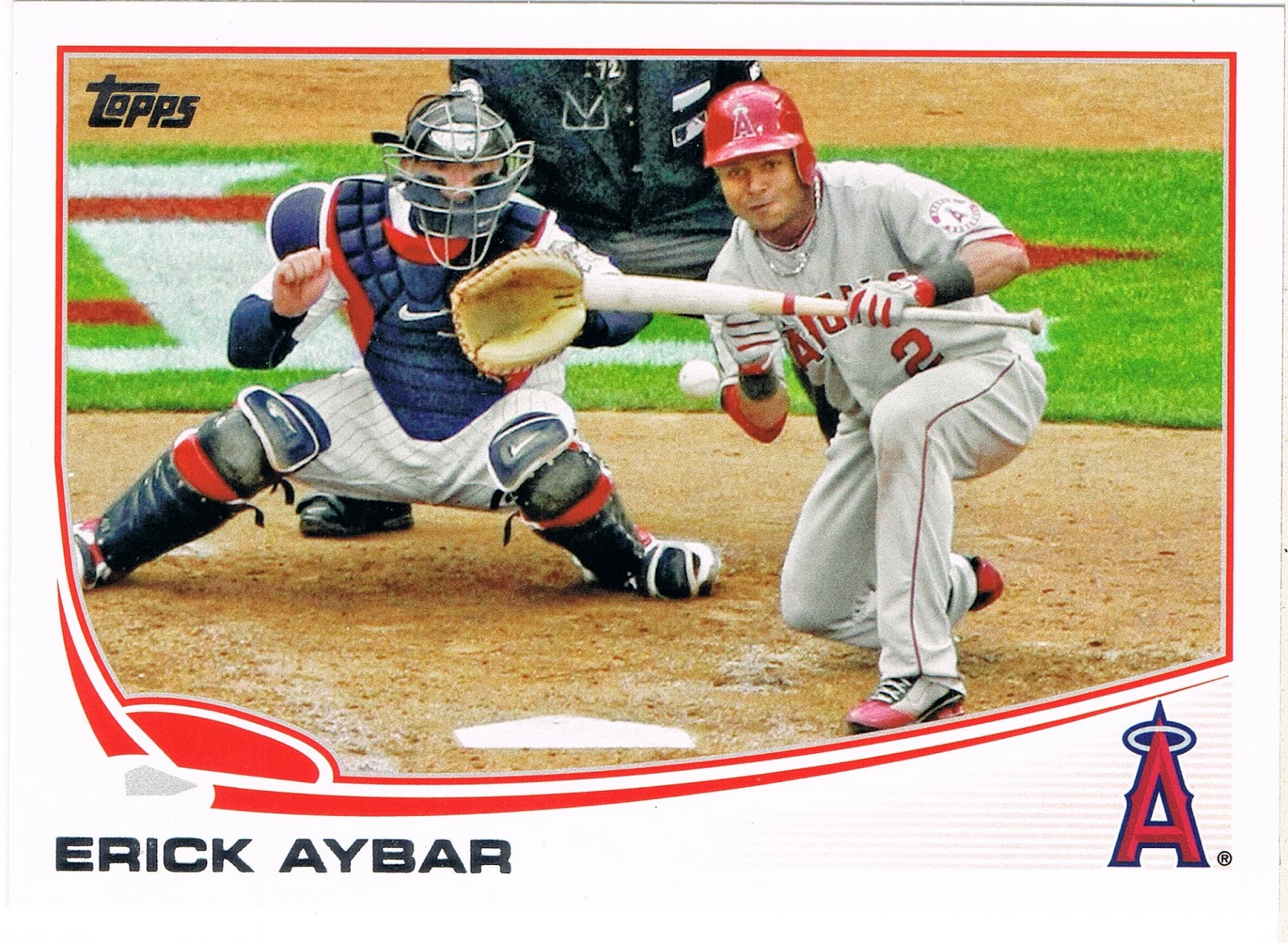
So it was wonderful to discover a quintessentially classic Bunt Card in Series 2, featuring Angels Shortstop Erick Aybar:

The Topps scribe even conveniently syncs up his prose with the imagery, explaining on the back that "Erick is moving up Angels career lists on some of the more subtle categories. He's their all-time leader in bunt hits (78); ..." You'll have to buy your own card to find out Aybar's other statistical subtleties. They are pretty cheap as this is just another useless Base Card.

Aside from being a fantastic Bunt Card, this card is also an outstanding illustration of photo editing, specifically cropping. Aybar's left foot seems to be resting on the frame, while the catcher even seems to be using the frame for a bit of support. Perhaps that left border could have been zoomed out 1% more for a little bit better masterpiece I guess.

Now when I set this card aside to babble out late some evening, I didn't really think it would tie in so much with the Angel Pagan card I like so much, aside from both of them being Bunt Cards. But when I started typing away about Pagan's card, I quickly wandered off into the theory of Photo Composition, something I am slowly learning via admiring my baseball cards. I think I have even managed to find something to take a picture of to put this knowledge to use; I'll share it with you some other evening whenever I find the time to unpack a bunch of 2011 Series 2 cards I bought real cheap even though I hardly needed very many of them. They were cheap.

Anyhow, in that post (relinked again here) I got a little closer to understanding a mark-of-good-photography called the Rule of Thirds, though concluding it can only infrequently be used with baseball cards. At least, until I showed it to my friend Jeff, who I had borrowed an illustrative train picture from. His comment got me much more discombobulated on the subject.

So tonight I buckled down and asked Google to tell it to me again. This time I went with a simpler link to the Wikipedia entry on the subject, rather than a more high-falutin' Art-Of-Photography type site. This one tells me that "The guideline proposes that an image should be imagined as divided into nine equal parts by two equally-spaced horizontal lines and two equally-spaced vertical lines, and that important compositional elements should be placed along these lines or their intersections."

And this is exactly what the Topps photo editor has done. The subject of the photo, Erick Aybar, is not the center of the photo; he commands the right 1/3 of the image. Since the card has gone and scrolled away again, I'll post it again, since digital stuff is sorta free:

Indeed nothing is centered on this card; the center of it might be in the patch of grass below the catcher's (Joe Mauer?) left elbow, with a constellation of the elements of the photo circled around that point.

And with Aybar, the Umpire (I always like an Ump on a baseball card, even if just a portion of one), and the Catcher all making a nice set of vertical elements, we also have an excellent set of horizontal elements courtesy of the infield grass and the dirt. I think I detect the interlocked TC logo in that grass there. Plus we get an appearance by Home Plate, so very rare on baseball cards, even though returning a batter back to Home Plate is the very object of the game of baseball.

Recently I read a criticism of this year's "Sea Turtle" design as it has been dubbed. To wit, "there is too much wasted white space on the cards." But I think I disagree on that idea thanks to what I have learned studying this card. Perhaps the very layout of the cards themselves is part of what has made this set pretty popular with whatever collectors there are that actually care about these things. Perhaps that "wasted" white space actually helps get the image of the player more onto those tension creating, not-centered or squared parts of the card, and this makes them subliminally more attractive to us.

But then that might only truly work on the great horizontal cards. I would say that I am looking forward to finally assembling all the horizontal cards in Series 2....I had better get my butt in gear on that as Update drops next week sometime.

So yeah, yeah, yeah, enough with the Photography lesson already. What about the baseball game being played on this card here? Looking at the catcher's pinstriped white uniform, all classically accented with red white and blue, and my hunch on the logo painted on the grass there, makes me think this game features the Angels at the Twins. Aybar does seem to be wearing road grays, though of course the Angels® refuse to ever come clean with where exactly their hometown is.

But with the California or Los Angeles or Anaheim Angels being in the AL West and the Minnesota Twins being in the AL Central, that leaves probably only one visit by the Angels to Minneapolis in 2012, but actually Baseball-Reference.com informs me that the Angels visited Minnesota twice for a 2 game series each time. I bet the Angels were thrilled with that scheduling.

A bit worse for my curiosity on the impending bunt action by the Angels all-time Bunt Hits leader, Aybar bunted once on each trip to the Twin Cities, on both April 9 and May 9, 2012. So back to the card I went for more clues. Perhaps long sleeves would indicate playing on a chilly April day; this card is definitely shot in the daylight. But both days are weekdays - and the 2nd game of the set, played as "getaway" day games to facilitate traveling on to the next stop on the schedule. Baseball-Reference has everything though, reporting that April 9th was 45º while May 9th was 65º at game time.

At this point I'm leaning towards the May 9th date as Aybar is sporting the short sleeves here. But I keep staring at this wonderful card for more clues...hardly any shadows on the field, must be cloudy out. Baseball Reference is ready again, reporting that weather conditions were "Cloudy" on each day. I bet the Sabremetricians have a line in their spreadsheets for that too.

Me, I'm just a baseball card geek, not a stats geek. So I stare at this card some more and find the final clue...a uniform #. How does Aybar's # 2 tell me what day this photo is shot? It doesn't. The Umpire's #  there at the top of the frame - 72 - does. MLB Umpire #72 is Alfonso Marquez. No baseball cards for them of course; I had to ask The Google that too.

And that clinched it. Marquez called the game as the Home Plate Umpire on April 9th. Temps in the 40s must not bother the Dominican Rebublic born Erick Aybar. Tough. And now I get to see what happens when that pitch hits Aybar's perfectly squared bat there with one out in the top of the 7th, the Angels up 2-1 and a runner on third...

...it's a Suicide Squeeze! Aybar lays down a perfect bunt fielded by fresh Twins reliever Glenn Perkins, who can do little but throw Aybar out as Chris Iannetta races home and scores!

Perfect!

Sunday, October 6, 2013

How Not To Do It #2

I liked this card a lot when I first saw it. It has a baseball on it. Those always catch my eye when I look at baseball cards.

It will be very hard to see when I finally show you the front of the card, but the card features a Special Uniform night. Not a Throwback Uni, but a special Uni some teams wear occasionally for Hispanic Heritage night, or however that team might phrase that certain theme night.

And I like cards where the player has at least a positive expression on their face, even if not actually smiling, though a player's demeanor isn't actually under their control during live ball game action.

I actually also like how Topps tries to show a player's position via what picture they pick out for them, though obviously they can't show only fielding images of the position players. And I really wish they would back off this idea for all the pitchers.

So I'll show you the back of this card first.


Keep this player's circled position in mind (2B for you squinters)...may I present Justin Turner:


What is Justin doing here? At first glance, he is demonstrating his perfect-for-an-infielder last name and I could triumphantly declare Aww Topps, You're So Punny! again. Launch a series of such posts even.

But upon the dreaded further review....

...we have no base runner trying to interfere with Justin's seemingly routine handling of a routine ground ball. Instead we have a blurry, lurking opposing player holding on second base behind Justin, waiting for the fielder to make his choice. No turning of any double play here. Although Justin has his eyes squarely focused on the photographer, err, the first baseman, his throw looks like it will sail off towards the pretty ball girl along the right field fence, unless Justin has a truly wicked curve ball. And this card collapses in a heap like an over-eager rookie swinging for the fences.

It does appear that Turner will stick around in the major leagues, after a decent enough season this year, improving his batting average 31 points in an around-the-infield utility role. Topps did miss the expected move to the outfield, where he only appeared in one game, so the Topps scouts were a little off there, as they were on several elements of a great baseball card. A great Special Uni ("Los Mets") - wasted. Great horizontal fielding shot - of a probable error. Possible visual pun of the entire set - nope.

But I'm sure he'll play second base again. There's always next year, Topps.

Thursday, September 12, 2013

5 Cards challenge

Well hello there, I sure have missed y'all. I'll just say that self-employment and blogging can be very mutually exclusive at times. I love to write, which you may have noticed, but I would write quite a bit more if I had a nice regularly scheduled work week.

I do have quite a number of posts figured out, but I also have a long stretch in nearly-no-baseball-access land coming up too. I am hoping Bob Uecker's broadcasts will come in at least, I think they might, and there is a cheap casino just down the road a piece. But I won't be around all that much until Update comes out, then I should be at home some, I hope.

In other blog news, I wish to note that I love it when I find out I am wrong about a baseball card. A part of the reasons I write about any card is an attempt to find out if I am really seeing what I think I am seeing on that card, or if the goofiness is taking over again. So you might want to check out how my previous blog post over a week ago actually turned out.

For tonight though I have plenty on the to-do list (such as packaging one trade and typing out details on another, hang in there), so I'm going with a trick I will probably try more often going forward. The first time I tried this it eventually led to a very long post on photo composition. Oops.

The idea is to pick the smallest possible pack of cards, and blog about one of the contents. How small do packs of the Topps Base Set get? This small:

Yep, that really says "5" there in the crinkle. Where does a 5 card pack come from? The Dollar Store, it turns out. So the cherished image of little Johnny saving his nickels dimes and quarters for taking old Mrs. Smith's garbage cans out to the curb and back and saving up for a pack of baseball cards is still alive, I guess.

I'm actually somewhat seriously considering buying my set this way next year. I was stupid enough to look at the sell sheet for 2014 Topps, a set I already know I will call the "Half Bowman," and I'm just not that excited about it. The inserts just don't appeal to me that much, and I don't see enough color synergy possibilities in the design to get very excited about the parallels. There is some sort of big Rookie theme across the whole set...as if we don't have enough baseball cards of kids not old enough to legally drink yet. That's not a clown comment, bro, that's an all too sober reality. So it might likely be pretty much a Heritage year for me next year.

But I can't really pass on a Base Set of Topps cards. Heritage will never have enough random baseball photos of random utility players to feed my jones. So the question becomes ... how to get those base cards? I like ripping packs, so perhaps a whole bunch of these 5-cards-for-a-buck packs are in my future. But the actual wholesale price of your Topps base showcase, contestant, is actually just 4¢ a card. That's right. If you go out to purchase base cards on the secondary market they run just about 4 shiny Lincolns each when purchased in bulk. That ripping jones is actually pretty expensive.

But all that's next year. It's just silly to know what next year's baseball cards will look like before the playoffs even start, fer-cryin'-out-loud. I'm going to try much harder to never peek at future sell sheets.

I do hope the 2014 wrapper is at least as good as this year's wrapper. I like that the Sea Turtle appears on most of the packaging this year. And I am a sucker for that classic MLB logo on anything. I do sometimes wonder which came first, MLB or the similar one for the NBA? Dunno.

And I have to wonder what is the deal with the Eye Black on the young stars; they sure seem to lay it on a bit thick. But now I'm wandering off into a future topic, and I've already blown the time budget for tonight. And aren't baseball card blogs supposed to be about looking at baseball cards?

So the winner of tonight's 5 card challenge is....Alexei Ramirez:

Tell Alexei what he wins there, Bob. Well Base Set, Alexei didn't manage to escape his fate at either the the traditional no-waiver Trade Deadline or the clear-waivers Playoff Roster deadline, so he seems doomed to be a solid middle infielder on a rebuilding team with a young manager for however long it takes for his contract to run out with hopes the eventual post-Jeter circus might still be in swing, so he wins absolutely nothing. He can have a big pile of duplicate Topps base cards if he would like I guess.

At least Topps handed him a good card this year. Though he is a very good top-of-the-order batter, Topps shows him fielding, in line with their themes for each position. As if they are saying, nope, we don't need to put the player's position on the front of the card, we'll demonstrate it for you in the picture and show slugger Clint Barmes batting instead.

And a good picture it is. I almost always like a horizontal card. There is one in Series 2 that is just stupid, but I didn't pull it in this pack so you'll have to find that one on your own time.

It seems the 5 card challenge does lead to a card with great lines. I'm already looking forward to ripping my next pack. I think I'll take it on the road with me and do a little mobile blogging. The idea of way over-paying for base cards with these dollar packs might be growing on me....

Here we have several examples of lines going from bottom right to top left, from the pinstripes on Ramirez' uniform to Joe Mauer's fingers. They are nicely complemented by just a small amount of not-quite-opposite, more-vertical lines. But the predominant flow of the lines lead straight to a baseball. On a baseball card. I always like seeing a baseball on my baseball card. Nice pick, Topps.

I also like Alexei's 21st century shades, and that little smirk on his face as if he is sayin' yep, All-American pretty-boy perfect baseball player Joe Mauer, you be Out! Not gloating, just a sly little smirk.  And now I'm gonna throw out that slow Willingham dude too! Ha!

The only downfall to this card is the same problem the White Sox always have, save when they bust out some special colorful uniform on special uniform day: monochrome. The Sox are the one team that just don't fare too well in the base Sea Turtle design. (They do pop very, very well in any parallel you wish however). You probably can't see it in the scan, but this card suffers even more as the Topps printer shorted the turtle of the right amount of ink and the Turtle's racing stripes are kinda washed out. Like how most Chicago fans are probably feeling by now.

What else did I pull? Not much to write out to the blogosphere about. 3 more torso cards (zzzzz), one of them Photoshopped (Torii Hunter - that certain shinyness to the cut/pasted uni from some night dome game they use every time always gives it away). Yet more proof that however much I admire the various set blogs and the 2013 Sea Turtle set, I just don't think I could ever pull off writing about all 990 of them with 600 torso shots along the way. Colorful turtles and logos can only get me so far.

Also another turning-two card, of Brandon Phillips and a camouflaged Padre. A nice enough card with Phillips' hat looking like it is a beer can that needs to be opened. I would be too tempted to crack that head open in a blog post, so I'll leave that one be.

So there you have it, another baseball card for another night in the 2013 baseball season. The teams keep on setting lines like a heartbeat on one of those heart machines at the hospital as they win and lose and race towards playoff eligibility. While they do it, I just hope to find the time to follow the lines on their baseball cards.

Friday, June 28, 2013

The Oldest Active Baseball Card

Could be this one?


I see Giambi got a hit tonight. I've been trying to hold off posting this one till he hit a Home Run, for a bit more splash. 'cept I unexpectedly ended up in the town up the way there with the great Baseball Card Store, so I did a little shopping, and found a neat box of the '91 Traded set. Plus I need a short topic for tonight. Tired.

Topps got a hit here too. Team USA. Red, white and blue. There, was that so hard Topps?

I love the '91 set and collected it in the day, probably pulled in by the anniversary angle or something. But I never picked up the Traded extras. The shop-owner was concerned that it might not be complete, as it was not sealed, and he was right. The Team USA cards were all missing. I do own the one above from way back, not today, which is somehow the only one I have. So I will have to track those down, but I can't say it will be high on the to-get list. I've lived without them for 21 years, I think I'll make it through some more. For a five-spot, the card shop was happy, and I am happy.

I enjoyed thumbing through the 100-some cards I do have, and found some to post and mess around with some other time.

As for oldest active cards, I'm pretty sure I know what the next one is too, someone absolutely positively due to retire this year. But it's not a card I have or want as it is from a set I don't collect and it is also a non-baseball image; indeed it could be one of the first of such cards and that has been a terrible trend. For the '14 season, I won't have a clue, because after '91 my baseball card itch went into semi-hibernation for ten years.

When time and life and baseball move on into the future, it will probably be about impossible to discover the oldest active baseball card amongst all those kid cards today. Instead it is a bit of an interesting question to wonder which is the youngest player ever depicted on a card. That would take more research into birthdays and even set release dates then I would ever look into on such a trend in the hobby I'm just not into — though I also bought some cards today that partially make me a hypocrite on that idea. Something else I'll get around to-it some other night.

Last year 2 players retired that were older than me. The last such players. One didn't even receive a card during his final season after a career chock-a-block full of cards, and left us with this one, a great In Action edition:


The other was Jamie Moyer, who's final game was in May, 2012. I have some thoughts and associated cards to post with his final card some other night.

Omar's final game was on the final day of the season. I made sure to catch the radio call, which was nice - he had one hit. But when he came out of the game in the 8th or so for a final crowd salute, well, I know at some point in the early fall in Cleveland, there will probably be a certain small set of fans who have the same thought I had 9 months ago now.

I guess my shot at showing up for Spring Training and making it to The Show is officially impossible now.

Friday, June 7, 2013

My favorite in Series 2 so far

So do I have some friends down at the Social Club who know a guy who knows a guy who does deliveries to big box store distribution centers, a guy who likes to take his lunch hour down at the Bada Bing club and leave his trailer unlocked?

No, this card was in the Opening Day set:


I am looking forward to new cards of course, but I thought I would share one with you. I'll be looking for a card to knock this one off it's pre-season ranking of #1. But I'm not sure I'll find one.

I love horizontal cards. I'll have some stats on those from Series One for you soon. So many great elements to this card...I don't even need to tease them out for you, they are all right there for everyone to admire in broad daylight. I'll just point out one: not many cards have two examples of the great Pirate shoulder patch on Pittsburgh uniforms, and definitely none have one on their home whites AND home alternate uni, the black one. A lurking patch.

I think a lot of you reading this have probably seen more cards than I have. So perhaps seeing a bat on a live ball is just another baseball card. I'm pretty sure this is the first card like this I have ever seen.

It is fun in the 21st Century to use these computer things to figure out exactly when and where a baseball card picture was taken. Someone, I think Nick @ DimeBoxes, suggested that someone should keep a list of such determinations, which is a great idea but not something I'll ever be able to take time away from sorting baseball cards to accomplish.

But I will contribute the date and situation for this one, actually a super-easy one as we have the Cubs @ Pittsburgh, using their back-up catcher for a day game. Only one game fits: July 25, 2012, a 3-2 Pirates victory.

There is a definite down-side to this ability though. That awesome baseball picture there makes it look like Alvarez is about to crush one to the right field seats. Perhaps it is better to just believe that.

'cuz that is definitely not what happened. Alvarez was up 3 times that day, and this shot could have come from any of his at-bats. Of course, with any long-ball batter photo except a few pics of a definitive home run shot, there is the possibility that the ball went foul. So this shot could have even come from Pedro's first at-bat, when he struck out.

Even worse is his second at-bat, when he grounded-out ..... to the Pitcher, Ryan Dempster.

The best we can pick from is his third at-bat, when he grounded-out again, but at least the ball went all the way to ... the second baseman. Which is where this ball looks to be headed. Especially with the barrel not on the ball that just exactly perfectly. Perhaps a little of that good ole 'late movement' on the pitch from Dempster, or his replacement Scott Maine in the bottom of the 7th, kept this great photo from being the great outcome one instantly wants to imagine for it.

Enjoying baseball cards in the 21st century is certainly a little different than previous decades. The information at our fingertips generally adds to the experience, but sometimes it's a little better to let the baseball card cast it's spell all by itself.

Tuesday, March 19, 2013

Yeah, I read the backs


And the bon mot above is one of the better ones I have ever read on the back.

Melky was suspended on August 15th, 2012, so I'm thinking the Topps Update editor must have finished his (c'mon, don't you daydream that Erin Andrews actually does this?) work and had the cards off to the presses before that date. I'm sure they would have preferred a Do-Over on this card.

Personally, I wish Update would come out a fair amount earlier. I think it would sell better if it arrived with more time left in the regular season. I'm no expert on such matters. A release date of October 1st means many fans who's team isn't in the playoffs are probably buying football cards instead, methinks. I know Update is tied up with the All-Star game now, and the trading deadline of course.

But last year's Update set creates a question on this. The blockbuster Red Sox <> Dodgers trade was announced August 25, 2012. And Topps had time to create a few super-duper-short printed cards of the major stars in that trade. Perhaps those versions were created and printed during production and the special cards then hit the market a bit later in October; I don't know.

Probably an accidentally goofy statement on the back of the Melky Cabrera card wasn't high on the list of details to cover for the release of the set. I'm sure it is much more important to Topps to keep the amounts and distribution of their manufactured rarities just exactly perfect. But with the All-Star game on July 10, and the so-called trading "deadline" (don't ask me) on July 31st, and then a blockbuster trade on August 25th still kinda-sorta being able to make it into the Update set.....is Topps run by Europeans who just take the summer off?

It seems like when I was a kid, those wacky Traded cards came out in late summer, so you still had time to play with them, while baseball was still being played. Then you could take that card where you had crossed out one team's name and written in the player's new team and stick it in your bicycle spokes to give an already mangled card a properly mangled burial. The new Traded card set the record straight, and that was the one to keep. Who needs a card with the wrong team on it?

But there is one other remote possibility about that sentence - Topps has total faith in Melky. And some people do say that about PED's - they don't help you make contact with the ball. Maybe the greenies do though. More upper-body strength should get you more hits though, as your drives rip past the infielders faster than they used to. So perhaps Topps is declaring that Mr. Cabrera will spray the ball all over the Sky-Dome just as he did at the new Candlestick or whatever the heck they call the Giant's ball-field, and like he did at Kauffman Stadium too. But I doubt it. On both counts, if you are following closely here.

I'll be watching to see what they put on his 2013 cards, that's for sure. I'd wager that they avoid the whole thing by adding his minor league stats to his Series Two card, so there is no room for comment.

Whew. Oh where a sentence on the back of a baseball card can take me. To keep from getting too wordy yet again (I thought this would be a short post. That first sentence on the back of the card kinda just says it all, not that that stopped Me), let's look at the front of this card:

I actually love this card as a baseball card. It would make several of my Frankensets I like to look at - it's a Horizontal Card, There's A Baseball On My Baseball Card (with such good stop-motion photog action these days you can see the seams on a live pitch), and it's a Bunt Card. 

I think it might be the first Bunt Card I can recall actually — I will soon post another one to launch a quest for all the Bunt Cards I can find. 

And then Melky has a red bat. I can't recall where else I've seen a red bat. One other Giants card in the last 2 years I think, but I forget which. And since baseball cards are my main visual reference for the game, I really noticed this one. Now of course I discovered this card, like everyone else, with full knowledge of the partially comical Cabrera saga. But looking at the red bat on there, it makes you wonder a little.....is it a sign? Melky with red, trouble ahead? Dunno. And I haven't figured out what goofy name to use for a Frankenset full of colorful baseball gear - Hey, Look: My Bat Is RED won't work for the blue glove and pink bat I have discovered elsewhere in the world of Topps recently. Frankenset meme under construction here.

As for cards in the steroid era, I wonder if today's news on Topps remaining exclusive until 2020 will have any other details in the fine print. Not that we card collectors will ever be able to read those details, at least not until 2040 or so when Topps sells off it's copy of the contract perhaps.

But given the flap over even printing the name "Pete Rose" in tiny type on the back of a baseball card this year, it leads me to an obvious thought. If Topps is MLB and MLB is represented on Topps baseball cards, perhaps part of any PED suspension could include Topps. So a busted player would be dropped from certain sets via some mechanism.

I mean, PED's, and even non-performance enhancing drugs, are banned in part because of the poor & dangerous example they set for kids. Sometimes I think too many things in our country are set up that way in my opinion, but this is one I can agree with easily. What about the children? But I'm here to write about baseball cards, not Society.

So when the hypothetical young baseball card collector is building a set and there is no Melky Cabrera in it, even though the kid remembers him winning the All-Star Game MVP last year and he just saw him go 1-for-5 leading off for Toronto on the Saturday Game of the Week, the no-baseball-card-for-cheaters lesson hits home a little bit. If, in fact, kids still buy baseball cards, rather than just Comic Book Guys who like to hang out down at the Android's Dungeon and bitch bitch bitch about their cardboard master all day.

Just a random tangent my mind was led to by the back of a Topps baseball card. Where will these things lead me next?