Showing posts with label Parallels. Show all posts

Thursday, January 8, 2026

Stumbling around in the Past

 Well it is once again Old Guy season in Baseball Cards, as 2025 Archives is somewhat fresh on the shelves, as is 2025 Heritage High Numbers, kinda sorta. HHN is not on actual shelves any more, just, virtual ones, as Topps has finally listened to all the complaints from shops about keeping those Old Guys away from the Middle-Aged dudes who just want to shop for their Pokemon cards in peace, without stories about walking both ways up a hill in a snowstorm just to buy some Bubble Gum Cards.

I always look forward to Archives, though some years I immediately wonder - why? Will this be one of -those- years? Let's rip a pack.


International Bonus Baby (see how Old Guy I am?) Jasson Domínguez greeted me this year as First Card, representing 2013 Heritage, errr, uhhh, 1964 Topps. I could mainly only summon memories of 2013 Heritage as I am not quite Old Guy enough to have experienced 1964 Topps, ever.

I immediately noticed that this 100 card take on the '64s would be different than 2013's was. Back in '13, a photograph from a live game of Baseball would mostly only be used as a coveted "Action" parallel printed in tiny quantities, so all the Old Guys buying up Heritage could feel more secure in owning a tangible asset rather than just a bunch of worthless Bubble Gum Cards. Me, I was still pissed about the lack of bubble gum, going on almost 5 years at that point.

Everything else feels solid about that particular Bubble Gum Card, complete with the authentic card stock. My main experience of late with a 64 Topps style card has been a reprint of Bob Gibson's 1964 Topps card, which looks OK enough in a binder page, though it has a too-brilliant white gloss shine to it, and is on craptastic modern Baseball Card printing stock that feels more like a piece of plastic. I vowed to replace that card someday if I could.

That Jasson Dominguez card there certainly looks legit with a nice night-time photograph, but it also has some odd faux analog-ness that kind of jumps at me a little, though not as much as a card from another pack we'll see later. Next!
ahh, now there's the cold unfiltered digital photography I remember so well from Heritage. Perfect for a Twins card? 
...and is that the perfect smug-ness for a Yankee? I am still quite pleased that the Yankees finally let their peeps be photographed while we look towards the outfield, rather than the prison that Steinbrenner Stadium's pressbox always appeared to be on so, so many years of Heritage cards.

So, 1964 Topps, give it a blue check-mark. As usual with an Archives release, and just as I carefully do with each year's Series One big Baseball Card day, I managed to get a box of this in my grocery cart without knowing what styles would be included in it. Just this week I had to enter a partial online-Baseball-Carding bubble of avoiding any and all Baseball Card websites with pictures (including your fine blog), as 2026 Topps Baseball images are likely circulating now. Anticipation, anticipayayshun, is making me wait... (Old Guy enough for ya?)
1996 Topps.
Tatis.

I feel, kinda, kinda, about each concept here. Somewhere I might still have the pack of cards I purchased from Topps in 1996, might not. I just know I didn't purchase a 2nd one, that year. Ditto for Fernando Tatis, Jr. I know I have some of his cards, because, but I do know I don't have any extras, deliberately. "I didn't know what 'the clear' was," uhh-huhh, sure. Between this guy and another Manny character, it is kinda, kinda way too easy to root against the Padres lately, even though they have been spending money like the drunken sailors I always figure supply them with a good amount of tickets sold. I do respect the owners that spend.

As for 1996 Topps I'm not sure I will ever warm up to it fully. Has any other "inset" set ever simply repeated the inset image from the main photo? I expect so, but I would be equally, hmmm, non-plussed as I am about 1996 Topps. I mean I can clearly see Fernando Jr.'s face perfectly clearly in the main photo - why does the card need a smaller version of the same thing? Ifffff I recall correctly, an ever less certain concept, for Old Guys, 1963 Topps set the original standard here, and one that didn't need somebody else to mistake it all up.

I will say the near Stadium Club clean-ness to the 1996 design is an overall strength however.

And, foil. Did 1996 Topps introduce this bad idea? I think 1995 did, but those were dark times. Foil sure won't usually illuminate things, unless the sun is shining.
Pitcher Face inset. Uhhh, ok. This card is a little weird in the way the outfield wall went purple just in time to match the 1996 card designer's thoughts back in the fall of 1995. At least the Giants' alternate black uniform always makes for a nice Baseball Card. I thought their lettering was orange though - that fog in S.F. is powerful stuff, sometimes; Webb's 2023 Topps card is a bit red as orange, too.

2005 TOPPS
IN THE HOUSE

I should have seen this set choice coming from 2 aisles away back at the grocery store, but Old Guys aren't known for having the best memory. I think this is now a basic tradition in Archives, to select that year's 20th anniversary set for use, or is it 30 years? And if that is a tradition, why did Topps just blow up next year's 30th anniversary in the previously seen set? Old Guys are easily confused by this stuff. But, then, so is Topps.

One thing I am no longer confused about, is what to do with my shoebox (yes, really) full of several hundred 2005 Topps cards. For a long time, I have been thinking - should I go for it? Complete it? This ices the decision. The big bold beautiful set you can never forget when you see it, is cleared for collecting launch. If you have a similar box of hundreds-plus-ish 2005 Topps commons, I'm your huckleberry.

That decision was helped by a recent serendipitous find of an incredible 2005 Topps style card hidden away in the "online only" Throwback Thursday Baseball Cards, which are always a pain-in-the-gimp for Old Guys to ever discover. I soooo look forward to the day that card can be bragged about right here on this very Baseball Card blog. i.e., when it actually arrives.

Yes, I like 2005 Topps. Looks like I'll be 'clectin it right here in 2025 Topps Archives, too. Those PLAYER LAST NAMES are just so perfect there centered on top of the Baseball Card. Plus, strong team color use, and for once Topps even defeats the color yellow correctly, too. 

What? Those PLAYER NAMES are printed in foil, too, you say? Don't remind me of the perfection that could have been with some simple black ink, like Old Guys prefer. At least it's gold foil, a big improvement over silver foil, always. Plus I couldn't hear whatever it was you were just sayn', and I already forgot, anyways.
Speaking of Old Guys, they sure do seem to get long contracts, don't they? This guy has been playing for 14 years already, is signed for 6 more to go, and is now routinely busy passively aggressively trying to get another 4-5 years added on, maybe cuz he already knows he is lucked out of becoming Baseball's first Billion Dollar Player, coming soon, and he's now jelly, as those young whippersnappers like to say. 

I do have a way extremely casual Bryce Harper collection going; it's got like, four cards in it so far, out of my 5,000+ options. But when the day comes that I have to pick from 20 (or 25?) Topps designs to memorialize this one-helluva-Baseball-player, how could I skip his HARPER card for such a collection? 'specially a sweet red-white-&-blue one.

So, a calm steady-as-she-goes traditional 3 styles in this year's Archives, just like Old Guys expect. But we also know that every pack of Baseball Cards in the 21st Century will also have a big "Hit" in it, of some kind, cuz even Old Guys don't like those super boring "base packs" any more. Let's see what's under the scratch-off box, in this pack -
tight

It's a Hit!
Topps sank my Battleship! 

Sooo many boxes checked, here:

• black Baseball Card

• weird cap possibly never seen on cardboard before, just, wrappers

• 'home' alternate solid color uni

• 'rainbow' foil, sometimes-a-fun-time, not to be confused with foil "ink"
    (hard impossible to see in this scan)

• (in?) famous Baseball Player

• I've seen this guy on TV already, unlike 96% of Rookie Cards

• I know his name even without the useless foil "ink"

• I'll probably see this guy on TV again, unlike 82% of Rookie Cards

• Rookie Card card - & worth actual money

OK, well that last double point isn't quite accurate. Rookie Card cards don't check my boxes, usually. And this one has a touch of white showing on one corner the scanner hid from ya, so it is not worth $2, it's worth $0.00 now. I should probably blow up this defective Baseball Card rip-off on TwitterX repeatedly until Topps is shamed into sending me another one, plus a couple old packs of Big League or something.

So, yeah, I likes those black bordered Baseball Cards. If I'm gonna keep it, like this one, I might just touch the white spot with the tip of a sharpie. Don't tell nobody.

I am always wistful that the black cards are often only produced in /x limited quantities, or special retail only packages in a store I am a long long ways away from, or in one of so many other ways to make them complex obtainments. Like, here in Archives being the "retail parallel," arriving at 4/blaster, probably the only retail format for this, or kinda-sorta $7.89, each, depending on if you actually want any of the other 52 cards in the box, which most people won't, unless one of the other 4 special needs cards have an RC logo on it, for one of the top 5 rooks of 2025.

That was quite a pack. But there's gotta be more Old Guy stuff bubbling up from the dusty past, right? Inserts? Archives will never let you down there:
2007 Topps All-Stars

I think this card might answer a question I hadn't been wondering, until I saw this card: where did Topps get the idea for so many phoned-it-in inserts featuring slapdash design even a child would laugh _at_ (not, _with_, which is perfectly fine), in the Opening Day and then Big League product?

Turns out, 2007 led those phone calls. With yet more foil, no yay. I guess I missed those in 2007. Stars on Baseball Card, generally good. But, sometimes...whatev. Next?
1995 Topps CyberStats

Flags on Baseball Cards always instantly make me suspicious. They say to me "we ran out of ideas, so here comes a repeat." Which is actually understandable, considering how many Baseball Card sets are created every year, each needing a half-dozen or so actual card designs. It ain't easy bein' cheezy. What flags have to do with "cyber" stats I doubt anyone anywhere could explain.

And what is a "cyber" stat, anyway? Let's flip the card over and find out -
That's actually quite enjoyable to me, Mr. Wordy-word. A nice simple paragraph detailing out an impressive statistical achievement by a Baseball player.

I think, however, I am starting to be suspicious of the word "cyber" which doesn't feel at all Baseball-y, and is somewhat as randomly incongruous as the flag on the front of the card. 

Meanwhile, the correct appellation for these cards is not 1995 Topps Cyberstats, but rather 1995 Topps Cyberstats Season in Review.

Let's review: in 1995 Topps, there appear to be a set of parallels of the base checklist which are known as the Cyberstats version. Those have a different back simply highlighting the 1994 stats while obliterating / not including any stats more than a few years old, to what mysterious purpose I can't at all divine, today. 

Also included was another small insert checklist with the text paragraphs as seen above, the Cyberstats Season in Review cards. 

Why? It sometimes seems to me that Topps often struggled out of the gate with the concept of inserts/parallels in the ever growing 1990s Baseball Card market, despite the early Home Run known as "Finest." Those cards in ... 1994 Topps? ... with the "Gold Winner" version, but also the version with a star on it, are similarly just ... confusing. I didn't Baseball Card much in the mid-1990s, and I don't think I ever will.

Though I am still decidedly dubious about cards with flags on the front, I do expect to be collecting more of 2025 Archives, the dumb way - i.e. buying it still in packs, and this will result in me owning more of these flag cards. But since what I really like about them is the backs, I can always put them on a binder page, backwards, just as I can collect just 9 of them, because looking at a page of 9 paragraphs of stat nerd stuff is probably the solid realistic limit for such a goofy concept. It's time for the magic word ... next
1987 Topps Boardwalk & Baseball

Now here is a now somewhat rare thing in the Archives product: a Topps concept I had never heard of, after so many of them have been rolled out in either Heritage or the now 15 year history of Archives (counting 2011 Lineage as year 1). Apparently this is based on a small boxed set produced for a theme park in New Jersey around 1987, or some such story you will have to research on your own time. I can't get past this:
2021 Gallery

That's a design I quite liked, and will be filling out some pages of, one of these days. These new "Boardwalk" cards are not a complete copy by the Gallery set, but I can't look at one without seeing those Gallery cards. 

Meanwhile, on the back...
...these cards introduce some new (to me) Baseball stats.

That would be the and RP and RPA* columns there on the right, which if you are squinting too hard at this card back (like me), stand for Runs Produced, and Runs Produced Average (RP divided by G).

Completely absent from this wondrous (?) development is just how "Runs Produced" is calculated, as Old Guy stat "RBI" is included here too. We are left to our own devices on that one and I have to wonder if Bill James was called about this. I suspect, not. I mean otherwise, wouldn't we all know about it in the age of endless cyber, err, SABR-metric stats all over all Baseball discussions? So confusing.

Meanwhile, the 25 card checklist includes some Rookie Card cards (surprise!), which one would think might struggle to have much MLB relevance in this way outta left field "new" stat, unless MiLB is all about the leader board for "RP," which I also basically doubt. Also on the checklist are some Pitchers, so they will have to have different stats - I suppose, though we all have a keen interest in quantities of Runs, connected to a single Pitcher. I will certainly be kinda bored-ly looking forward to seeing a Pitcher on this effort, but I definitely have zero desire to assemble these and I expect they will also have zero value to anyone except those hungry for card #2,329 in their PC of of some Baseball SuperStar. Howz about we use the magic word again -

1964 Topps Stand-Up

It's another Hit! Home Run! With me, at least. I collect 1964 Topps Stand-Ups, or at least that style of card, not having the courage to look at prices of actual 1964 Topps Stand-Ups. I got into the habit with Archives, volume 1, aka 2011's Lineage, which has a nice set of these also. Sometimes, repeats are just the ticket I like in my old-new Baseball Cards.

A few other manufacturers have dabbled in this card concept and I have a carefully stashed collection of any such cards I can find. The project that results will be epic, I promise you. The reinforcements to the idea I will be pulling from 2025 Topps Archives will be a big ole help to that long-simmering idea.

That Kyle Tucker Stand-Up there appeared in the last pack of my first blaster of this stuff; I have now opened 2 more of those. I found lots of great cards, but stumbling around my scanner can be tiring work sometimes, and I scanned a whole bunch of fun new Baseball Cards from the growing pile of 25 Archives. But to see those, check back here, soon. Us Old Guys can't always babble on about Baseball Cards quite as late as we used to...


Wednesday, February 12, 2020

Nifty Nine #2

...or, "When Nine is Enough"

Quite often, I like a set of cards quite a bit - but I have a lack of time/space/money/desire to actually complete it.


The Topps Chrome retail Pink parallels are one of my more perfect examples of this.

I am not the biggest fan of Topps Chrome. But I like pink baseball cards. I think it is some primal / subliminal urge that connects baseball cards to the color pink, because, Yeah, I Chewed the Gum.

So most years, I like to buy a few retail hanger packs of Chrome; the ones with a 4 card pack of Pinks.

I was reminded of this today when I figgered to pick up a single pack of 2020 Series One to read for awhile this evening to get re-acquainted with 14 Major League baseball players and where their careers are sitting now just as the Pitchers & Catchers are all busy answering questions about the Houston Asterisks.

Alas, was not to be - buying a pack that is. Last Friday, the local retail baseball card god, err, distributor rep, 'serviced' my local Big Box store and set out a full display 2020 Topps S1 via one of those cardboard tray box thingies, completely full of blasters and hanger boxes and with heaping helpin's of extras of those piled on top. Just above it was a full peg of perhaps 2 dozen blister packs holding one pack and 2 purple parallels.

Today, all gone. Rookie Card mania seems to be ramping up again - I have never seen anything like this in my humble little burg of some 8,000 souls. But the something-for-nothing urge hardwired into human brains is probably as strong as ever when it comes to baseball cards.

I was actually fairly content with the discovery; I suspect it will make my local distributor rep tighten up on some things, and be more willing to bring my town more product. And it's not like anyone is ever going to run out of 2020 Series One baseball cards to the point that I can't even buy any more.

But that is precisely what happened to me in 2017, when I wanted to check out some Chrome and pick up some of those tasty looking Pink baseball cards. Aaron Judge mania had hit and Topps was unprepared.

Will baseball cards get scarce this year? I doubt it. Whoever dropped some $400+ on retail baseball cards in my town in the last 6 days is highly unlikely to recoup their investment, and most people who try such a thing via off-the-shelf purchases don't stay with that kind of gambling problem for long. Sure, perhaps individual, true collectors like me slowly wiped out the supply, but I somewhat doubt that. Normally, I can count how many packages of whatever set and pack format have moved since the last time I was at the store, without even really trying.

Last year, my local rep didn't even bother bringing Topps Chrome to my store, or if they did, the local retail ripper investor cleaned it all out as with this first stocking of 2020 S1, and the rep never bothered to re-stock. But in all the other little towns around me where I like to vary my grocery shopping in case the rep decided to drop off some more discounted fat packs of 2009 O-Pee-Chee, well, there is almost the same amount of Topps Chrome on the shelves there as there probably was last August.

So some 6 months from now, I think I will be OK on my own urge to buy a $10 lottery ticket, hoping to scratch off something like this:

or this


So I did OK. Although I did not hit any of the key "Big 4" RCs tacked on to the end of the Chrome checklist this year, because Rookies. I actually think all 4 of those Rookies are headed towards being merely Very Good baseball players, gasp! The whole "he's too old to reach the Hall of Fame" calculus surrounding Rookies really turns me off more and more each passing year. I just like the baseball cards that I like, but I can in no way afford to ignore what other people might like about the cards I end up with.

And thus those are already in toploaders because they will be sold, possibly sooner rather than later as the whisper campaign (shortage of MLB top 10 hitting stats = sucks) has already started up around Ronald Acuña. Although those are some extra tasty 'pulls' from 19 TC, I will be perfectly content with my plain-ole regular Topps Baseball cards of those.

I also like Topps Chrome because it does seem to offer a decent chance at an on-card autograph on a player's Major League Rookie Card, not their Bowman photo-shopped card. In 2018, I pulled an Andrew Stevenson autograph, ho-hum, but I also pulled a Pink copy of an Acuña RC that shows him post-swing with 'bat down' but of course is not the "Bat Down" RC from S2 now worth a couple thousand dollars already. (I think my humble Pink RC could already net me fifty bucks though). 

As with so many MLB Rookies Andrew Stevenson seems, so far, a bit unlikely to truly become an MLB All-Star. But then Christian Yelich hit for a league average OPS his first 3 years in Miami, so you just never know on these things. I have little reason to sell Stevenson's auto for a couple three bucks right now.

This year, I managed to pull another RC auto:
I did get what I wanted from what turned out to be 6 of these lottery tickets in several ways, including having the autograph of a young baseball player who has managed 43 At Bats in his first two MLB campaigns and is as "on the bubble" as any of thousands of other extremely good baseball players are as they gather in Florida and Arizona the next several days. (Ciuffo is a 'non-roster invite' with the Rangers now).

But at the end of the collecting effort, which this post kinda officially represents as I will no longer have a chance to encounter a hanger pack of 2019 Topps Chrome in the store now that 2020 cards are arriving, what I will enjoy the most from the 24 Pinks I was able to consider, in-hand, is this nice simple binder page of pleasingly pink baseball cards:


Friday, February 7, 2020

It was hard, and I largely failed

Baseball carding in the 21st century is sometimes a little challenging for me. One key thing I truly desire from baseball cards is to not know what the new ones look like, -before- I open the pack.

But I can't resist wandering the internet, gobbling up baseball information and baseball card stuff, too.

I have learned how to mostly avoid seeing the new design in the four months or so that it is publicly available as an image, before it is available as a card one can hold in your hand. But you never know where you might stumble across it, accidentally.

This year, the most damage was done while I was trying to read some salacious new details on the Astros cheating scandal, a whole week after the main announcement of the penalties by MLB. More specifically, I was considering the beyond-the-banging charges that Altuve and Bregman had worn buzzers for pitch information. Amidst all that chatter, someone had posted a newly made, digital-only 'custom' of Bregman wearing-a-wire, as it were, in the design of the brand new Topps 2020 Series One baseball cards.

So my first, deepest glance at these cards was - on a fake card!

How will I fail at this simple small dream next? I still can't get over how one recent year, what wrecked this basic baseball card aspiration was the classic baseball card catalog from Fritsch cards of all places.

Ahh well. Finally on Friday of release week, a full week after I almost saw some posted card images from one of the earliest retail 'finds' (I had fingers over my eyes, just in case) - the new baseball cards arrived in my little ole home town:

My first thought on my First Card was: hmmm, maybe I have another MLB look-alike doppelgänger following me around along with Ian Kennedy.

2nd thought: that big-ole frown.

3rd thought: Grey? That much grey?

4th thought: Red socks. I like those.

5th thought: Blue? Those tiny bits of blue are accomplishing what, exactly?

6th thought: OK, so I am pretty sure this guy is a Pitcher. He is Pitching, after all. But, ya never know, the amount of, ummm, 'other' players being called in to pitch here in the Rubber Ball Era of Major League Baseball is said to be trending upward steadily. And I really like those cards of a non-Pitcher now Pitching; I recently finished a small collecting project of those to share with y'all some day. But I do still really really want that Willians Astudillo "Pitching" SP from last year. So I had better check the card carefully to see what this baseball player's true position really is. I'm looking and I'm looking, and finally I notice the tiniest element of the whole design - a diminutive capital letter "P" there just before the all-caps team name in white letters. But the official positional designation is made with yet more of that grey color that makes it fairly well disappear on this 'red team' card.

7th thought: Lines, lines, everywhere lines, overlaying the scenery, tricking my mind. Sometimes, those will be good, I suspect. Other times, they will be busy.

Sum of all thoughts: this card doesn't quite make me want to own 999 others almost just quite like it. I am contemplating moving to one of those "tiny houses" that everyone on the Internet thinks are so cute - an extensive library of a few score thousand baseball cards won't be making the cut if I do that. But, it's a Topps Baseball card. Anything can happen, to me, with these. Particularly since, for most of my life, Yeah, I Read the Backs:


There's all those lines again, and all those rhombusessses? No, not quite. A rhombus is something precise. These are just parallelograms. At first my Topps design memory was whispering "2014 File Folder Set" but that's not really apropos, either. I am sure all those little shapes scattered around the player name bar are parallelograms. The Parallelogram Set. In my mind, at least.

Wouldna noticed, with the vertical player name bar on the front. But on the back, yup, Parallelograms.

Unfortunately of course on this card, there is nothing to read. I do like pulling a League Leader In Italics card, usually. But a Pitcher does absolutely not want to Lead his League in Runs.

The back of the card once again has some blue to the design, for a 'red' team, but is in even tinier, why? type amounts. Then the MLB LogoMan appears to tease you with some nice colors and a oh-what-might-have-been thought.

Meanwhile, the overall Greyness dominates, with a vengeance. Even worse, there is a shading to all that greyness, getting darker and darker towards the bottom of the card, for the stats you most want to read - last year's stats, and the career totals. That, I can do without.

Not just Parallelograms. The Grey Parallelograms. Blah.

So much for the First Card. It's way past time to check out the 2nd card:
Another Pitcher Pitching, but when a Cy Young award winner jumps out of the baseball card frame atchya on a nice sunny day like this, you start to think, ahhh, baseball cards. This card, by the way, is #332, so I guess "Hero" #s will be basically scarce in these cards.

Though it is nice to see the Metropolitans' orange show up - this will definitely be a team colors affair. A proper, two team colors affair:
I can tell now that it is time to fully explore a perpetual Topps Baseball card design element - which team icon/graphics do they actually pick to be the main icon/graphic on the baseball card? A future post.

I always like a good Sunglasses card. For some reason, the main red parallelogram after the name bar seems bigger than the blue one on the first two cards. Tricky little parallelograms, sneaking around these cards.
Allll right, alternate uniform to the rescue! A rarely seen, quadruple team logo card, thanks to Archer's T-shirt there. You won't soon forget which team Chris Archer plays for now. I also like how the blurred out bit of stadium architecture there in the background is starting to interact with the card design.

Sometimes, I think Topps really tries to use as many photos featuring players in their solid color "Alternate" uniforms as they can. It would totally fascinate me to count up how many Alternates vs. normal Home/Road uni pictures they use, across a whole set, and in comparison to other sets. I suspect that the more Alternates are used on cards, the more fond the memories collectors have of a given set.

This Archer card has an impressive card back in that the Topps composers didn't run away from saying something nice about a 2018 trade that was so bad, the Pirates front office was replaced afterwards. This card does have a text, one that starts out "The Pirates are optimistic..." Which is how I always am, whenever I am opening a pack of Topps Baseball cards:
Though baseball players busy playing live baseball rarely look all that optimistic. Maybe Jose is worried that his team is so far behind, again, that he is going to have to take to the mound once again, after this At Bat. Which is something I learned about from reading the back of his card. But I like how Jose is trying to take a little bit of the load off by resting his elbow on that convenient Grey Parallelogram there, and the way the probable Throwback uniform here gives Topps a signal on how to pick a second team color for a team that otherwise only uses white, after the color in their name.

One team that has been going through some icon changes appears on this next card:
Every New Year that I pull a new Cleveland card, the appearance of that block red "C" there re-assures me that the Chief Wahoo icon really is gone from baseball. I live and routinely work near several Native American communities, and I wouldn't be stopping over to the casino for a beer and a burger and maybe a baseball game on the big TV with anyone wearing certain Cleveland gear.

This card seemed very familiar to me...it seemed like I saw it right around this time, last year....I pulled it in my first pack last year, too, as I did for Jacob DeGrom. That worked out pretty well, for both of them.

This particular Grey Parallelogram card though, is the first to feature a road grey uniform, and the dearth of color is telling, even with a pleasingly faded color background that is a touch hard to imagine in an MLB stadium. Oh well, on this card I did learn a new, totally useless fact: Cleveland puts the player's uniform #s on their belts. The more you know...
One thing I didn't know, as I opened this pack this afternoon, is whatever happened to Billy Hamilton lately. I was kind of looking forward to seeing him tear up the playoff basepaths last October, before St. Louis so completely demolished his latest team. 

I think all baseball fans kind of secretly root for Billy Hamilton in this age of the "the data says..." So I wasn't totally surprised to see this brand new Atlanta Braves card for Billy. Except this isn't a brand new card, at all - it is the same card as pretty much the last Topps Baseball card set to be released before this one, the Topps Holiday set, which uses this exact same image. I know image re-use is inevitable amongst the 59 different sets Topps sells every year, but two in a row...

The bigger bummer of that card is the white "A" there for the Atlanta team logo. A terrible choice to use with the Grey Parallelograms, even if it that is technically their main, on-cap logo these days. The problem is when that white logo is removed from the blue field on their caps, as on this design. Blech.

The up-side, good news of this card is a little bit of pack opening mojo for Billy. Your faithful baseball card cranky pants wouldn't leave you hanging, wondering whatever happened to Billy Hamilton, now would I? Turns out, in between me opening this pack and starting to babble about the contents here a few hours later, the Giants announced they signed our favorite next-U.L. Washington (four years to go, Billy, you can make it) to a 'minor league deal' at least. With some thought that with 26 Man rosters this year but new rules on using too many LOOGYs on the mound, this might give an exciting late innings speedster replacement a little better chance to make it onto a few more Topps Baseball cards. See you in Update, Billy.

Now we have another Alternate uni to the rescue. With some green, green grass of the baseball diamond, some blurred out yellow advertising, and that cool red glove you finally notice, all that grey design stuff is totally forgotten. And I am starting to like how these cards run head-to-toe, more often than not, like this one:
Boo-Yah! Now we're cooking with gas! The grey team appears on the grey cards, wearing their road greys even, but still: we have a winner! How many days till Pitchers and Catchers report? I'm ready. 

For a new kind of card in this pack? Yep -
It's time to go horizontal, and start the pondering all over again.

1st thought: less Grey! Even with a road grey uni on the card.

2nd thought: I knew those parallelograms would start complementing the image elements eventually.

3rd thought: check out my nifty shoes - no Swoosh - and an extra touch of that weird, we-miss-water-in-the-desert-vibe I get from that weird, aqueous vibe to the uni # on Arizona road unis these days (well, most days; other days, their road unis have black #s, so weird). 

But yeah, a horizontal card the way they are supposed to be - a complete baseball player, inside a baseball stadium, playing baseball, not just another baseball player torso with no baseball context. Nice.

Horizontal cards always appear together in packs, probably because they appear together on the printing sheets. Can Topps keep this nice-ness together? Let's shuffle the pack along:
Double Boo Yah! Grey? Snoozer design? What? This card leads the eye up to the fly ball in the sky so well it is a little jolting to see the baseball has already arrived. Things happen fast on Topps Baseball cards sometimes.

Plus, Bullpen Prisoners! And - new Milwaukee logo, have been looking forward to seeing that on the cards. But, major-minor demerit for Topps feeling the need to spell M-i-l-w-a-u-k-e-e.... and the team name, like any baseball fan would otherwise not understand the classic m, b, ball-in-glove Brewers logo that no one has ever disliked. I mean, they didn't write B-o-s-t-o-n around those Red socks on that Cashner card now, did they? So close, Topps, so close.

Third time's another charm on the horizontals?
As usual, one can count on the Pirates to supply us with good baseball cards, at least. I do hope Cherington can right that ship, for a fan base that really deserves more. An ironic thought right here, gazing on a card for yet another very good baseball player that had to be traded away in the interests of trying to re-re-build, yet again, all over again.

Be that as it may I mostly like another pretty good Starling Marte baseball card with those great batting gloves and strong image lines every which way. All those flying digital dust pixels are even better in the scan than on the card though, I must admit. The down-side bad news of this card is that in the past, we probably could have had a good time checking out the sartorial choices of major league baseball fans, circa 2019. Sigh.

OK, quick now - it's the year 2025. You are pawing through a box of nickel cards at a baseball card show. Why is the following card in that nickel box?
Is it because Marco Gonzales has matured into being not just the Mariners "Ace" (as declared on the back of this card?) but a League Leading perennial All-Star hurler?

Could be, could be; this blog can cheer for the Mariners fans just as much as it can cheer for the Pirates fans.

Or is it in the nickel box because every card from this long-time Topps special card creation is always worth keeping separate from the regular base cards, as it is a Topps Gold card, #1088/2020 in this case.

As a member of the classic Gold lineage, I am underwhelmed. As a better looking card than all that grey space we have been staring at, oh, yes. Some collectors do annually complete a Topps Gold set. Although these cards might not be as classic as many such efforts, such a set could also quite well look better with this gold half-frame than without. Though I don't see myself truly going for a complete set this year, there are many portions of this set I will be completing. I am starting to think about just doing that with the Gold cards this year, perhaps.

This card had one other down-side unrelated to it's "gold"-ness, or the card in general. I figured to pull one parallel or insert in this pack. So when I reached this card, I figured checking out my first 2020 insert would have to wait. Such was not the case:
Money. Your American League Rookie of the Year on his special new retail-only "Turkey Red" insert, not available to all those fancy case breakers ripping open a million Topps Baseball cards the other day down in Texas. Only to us marks who collect Topps Baseball cards by buying them at the grocery store like a bunch of kids or something. One of _the_ chase players in this set, for the $ obsessed collectors.

I don't have a particular opinion on Turkey Red cards. I already chase way too many sets so though I was around for the last year or two of the Turkey Red stand-alone Topps product, I didn't add it to an already busy menu. I like the fine detail of the shading of the faux recessed frame for the card, being in shadow on one half and lit up on the other.

But this card will soon be on it's way to the great warehouse cemetery of old baseball cards, also known as COMC. I was so moderately pleased to probably almost pay for the cost of this pack of cards that I forgot all about which team Yordan Alvarez plays for, though the Turkey Red design doesn't exactly make a big deal about that, either. I could not forget all that on the next card in the pack:
I have never liked this player and don't really want his cards in my pack, even though I like base-running cards, or a 'candid' card, or whatever the heck is happening on this card. I used to like seeing what the Astros did with their love of 70s color, color, color on their uniforms, too. Now though, all that is an asterisk.

Moving on, we reach the last card in the pack:
No, that's not some hard-to-discern new stealth parallel like Snow Camo or something, that is just how the Grey Parallelogram interacts with a Night Card. And no, that is not some Bowman Draft-esque photoshop of a player in a new team's uniform; Baez is an international signing for the Padres who has stayed in their organization for his complete career so far, and already debuted in MLB in the 2019 season. So that is an authentic live action MLB photograph; it's just that after Topps has used so many road greys to cover their Photoshop sins, sometimes, a road grey uni on a card just looks fishy. 

But this year, with a road grey uni and an overall base grey card design and then a bleached out white team logo, some of these cards just aren't gonna make it, for me, and one of my ever more precious binder page slots. Even an attempt to use the classic Padres mustard&brown for the team colors can't save this one.

So there you have it, my first 16 2020s. Seems like a pack has a different # of cards in it every year now; I think my First Pack last year had 14 cards in it. Over the years it wasn't always easy for me to buy just one pack of cards to absorb the coming year of collecting Topps Baseball; it has only been recently that Wal•Marts where I live have begun putting out loose packs to purchase at all. Before that happened, I would have to detour quite some distance to find a Target to buy one of those.

But now, I have a Meijer's store in my home town, and they picked up the classic Topps retail exclusive product from Toys R Us: the purple parallel. So to buy just one pack, I purchase a blister pack that has 2 purple cards included. Let's take a look:
I quite like these. I look forward to seeing what a Tigers card might look like on this parallel. As always on modern Topps cards, a solid color Alternate uni does more for the card than whatever Topps does for the card. I was also happy to find a card with the parallelograms on the right side of the card. I knew they existed, but I didn't pull any in my first pack. Seeing the design elements move from side to side in a stack of cards will be a nice aid to enjoying this set.
Another happy baseball card result. Right up there with the Garcia card in triumphant baseball carding. I always like a nice bright sunny day card, and I can't recall any hovering Catcher's masks on cards in my collection, though I wouldn't be surprised to find an older one.

I especially like a certain star of this particular card: the live action baseball there at the bottom.

In past years, some of the prettiest purples were created by the nifty combination with the teal that is the Mariners' second team color. This year, ehh, not so much, as there is so little teal to start with.

What I like most about these two parallels is the old standby about baseball, which also applies to baseball cards: "There's always next year." As with the 1/2 border 2019 cards, and now a 1/4 border design, they hold a bit of promise that a nice clean full border design will return to Topps Baseball, some day.


Tuesday, December 2, 2014

New Pack!

So I bought a pack of baseball cards. Yeah, yeah, so did you, and you, and you, but not over there in China, that one is just a web crawler trolling for - ? I wonder what I would have to type to generate a bookmark over there in the People's Republic?

Anyhow, see if you notice anything new about this pack:
Yes, I thought some blogger somewhere should report the demise of the 2 panel "rack" / "fat" / "jumbo" pack. Maybe that will get the attention of the Chinese - ace Japanese pitcher moves to America, triggers savings in plastic wrapping material. That would probably need to happen with basketball cards for anyone in China to notice, actually.

But this does mark a certain end of a long tradition - the long pack of baseball cards hanging on a peg. It has of course been a long time since we could see the cards inside, but those long packs were a certain tiny part of the traditions of baseball cards.

Personally, I'm OK with this, less packaging material is a good thing. I really sometimes wonder why Topps sticks with the "packs" in a blaster box, and I hope that is the next place they look to save a few pennies. And yes, I will still be buying new packs of cards in the future, as I love ripping packs and I will have to get a chance at the random cards I put on my idiosyncratic binder pages somewhere. And it  is still the very best way to keep an eye on what Topps is doing with all those baseball cards.

Though the minimal color cards this year made me so sleepy a very strange thing happened to this pack of baseball cards in my possession - I bought it 3 weeks ago, and never opened it! What the hell? Not to worry, my friends, baseball card collecting has gone on as usual here at the Base Set base, I was just too busy dealing with old base cards to look at the new base cards. What the hell?

So even though I haven't made it as far as blogging about my Series One cards this year (I did get them all bindered up, and I recently picked up the bulk of Series Two to start on those - I'll post some of each soon I hope), let's see what I found in this new-ish pack of baseball cards.

First card:
And, yawn.

Though I must say here I find it odd that with Topps designating blue as the Yankees color, the red of their iconic icon logo really stands out, and though I've never been a fan of the Yankees, I much prefer this logo on my baseball cards rather than the blue NY used last year (Topps seems to agree as this red logo is much more common on their cards than the NY). It also works well because the Yankees never place this logo on any uniform, so when Topps uses logos on the cards, the Yankees never have those overly busy cards that result from multiple logos, a topic I've been working on for an upcoming post.

So here I am with a brand new baseball card, and I'm not yawning. Thanks, Topps. I won't even ding you heavily for lopping off Francisco's elbow, as on this card:
Yes, his elbow is complete — but why just slice the baseball in half with the photo software? It would change little of the live game portrait style the set editor goes for on every card Topps issues these days, to just include his complete hand and the baseball by decreasing the zoom % just a single point or two.

I complain about the zoom choices of new cards fairly often (best fortune cookie ever says: "Human invent language to satisfy need to complain.") That doesn't mean I don't like all live-action close-ups, or that every last body part absolutely must be visible on the card:
This card works very well without Brignac's left elbow being visible, as the photo has captured the intensity of waiting for a Major League pitch, and the lines of the image converge nicely on the intensity of Reid's grip on the bat - your eyes are led to the batting gloves, not off the card, as on this shot:
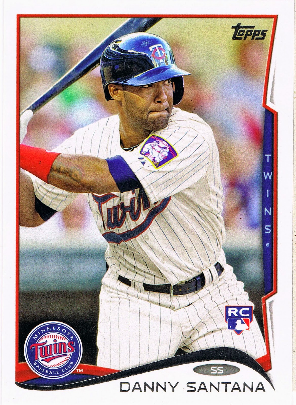
That is another classic still image for a baseball card, but leaving Santana's thumb sticking back into the frame kind of makes for a whole that is less than the sum of the parts. I think the focus is again on the hitter's eyes, which is kind of interesting here as well, probably more so on-card than on-screen. Maybe Santana will go on to multiple fan-ballot All-Star appearances and this card will become an iconic RC on it's own, though that mess on the left edge will certainly detract from that.

The Santana card contrasted nicely with this one:
I did not know that the Twins sport two different left shoulder patches these days. I've always liked that big Minnesota patch on the Burton card; the patch on the Santana card is a new one for me. Maybe if I could watch baseball on TV all the time, I would know these things.

But I always like looking through the Update cards to find all the new-this-season patches, and this pack didn't disappoint:
Though you have to squint a little to see the Mother's Day patch there on Tyler's left breast. I believe this was new this year; here is a nice downloaded-from-web-somewhere view:
With all the zooming going on with the cards these days, that might look nice with a little bit more zoom, actually. Never thought I would see a pink LogoMan.

Update is a quirky set of baseball cards for many reasons, including the way it is now frequently the home of "sunset" cards:
And that seems like a nice one for probably the only card in this set that has a first stat line that starts with "95" in the YR column. I've never been a fan of Giambi, nor a hater, but by the time any player has made it to 20 issues in the base set of Topps cards, I always like their final cards. There are several such in Update this year, also including Daisuke Matsuzaka and Bobby Abreu. All 3 players got photo variations in the set - a nice touch by Topps. 

This could be a sunset card for Chief Wahoo there, unless he pops up on a Fan Favorite type retro card in some future set, but I'm good with that.

So I was reading the back of the Giambi card, and in fact read most of the cards in this pack. That's a main reason I buy them. The unique feature of this year's card back is the "Rookie Fact," like this one:
Usually the Rookie Facts are totally forgettable, but if you squint at them long enough, you find a few kinda interesting ones. Pitchers hitting the ball is probably an easy go-to for the writers as they skim a player bio:
I'm pretty sure I set that one aside to share with you as I read through Series One, when Arroyo had a Reds card. 

And there is always the hope that the baseball card back will connect you to the history of the game:
Here I am in 2014 still discovering things about a favorite player of my youth, Carl Yastrzemski. Again, thanks Topps.

Another neat thing about the card backs in Update is they sometimes discuss the just-completed season:
But not many people buy baseball cards for the backs. Actually, zero people buy them for the backs, unless I go out and break my long-standing aversion to Bowman products and pick up some 2014 Bowman Chrome mostly for the interesting card backs I've seen on the blogs lately.

So let's get back to the fronts of the cards. This one caught my eye:
Check it out - a baseball player's knee! There were only 4 cards of 36 in this pack wherein that body part could be seen, if you don't count a pitcher's leg kick (always a sure bet to see on any of Bronson Arroyo's cards).

That card also certainly made me notice a card later in the pack:
I'm not sure I've ever pulled two cards from the same team in the same pack for the same individual position on the field. Perhaps I have in the several dozen other fat/rack/jumbo packs I've picked up the last several years, or whether you count the 72 card "hanger box" as a "pack." It just seems like for the last four years or so, I am always pulling cards of S.F. Giants infielders named Brandon, and just tons of S.F. Giant infielders in general. It's like they have a special infielder bullpen full of almost-could-be guys out there. At least that's what I glean from Topps anyway, who has yet to issue a Joe Panik card outside of Bowman or Minor League products.

So anyhow, what about those other cards in the pack, that might actually feature a famous baseball player instead of all these Update back-ups? 

Let's take a look:

POW! That one's going on the "None" page - as in "None More Red", a page I dreamed up just tonight when I opened this pack. It will only have one other card so far, though I will probably put other colors on the page so I have some chance to make it to 9 cards some day. I certainly never expected an Oakland A's card would end up a contestant in the reddest card of all time. This card is so red, it takes the viewer quite some time to even notice the All-Star Game logo there in the corner - even though it is mostly red!

Maybe if I can find the Red Foil parallel of this card, Sean and Ted can have some company:
A pity the Cardinals can't really put red birds on a red alternate jersey. Maybe if we ever get a little bit of a "loose" photo selection out of Topps again, with a player wearing their warm-up jacket. I think it's been awhile for one of those cards. Don't even get me started on the fact that all the All-Star cards feature the special warm-up uniforms as on the Doolittle card - I pulled 5 other such boring cards.

I did promise to detour from those base cards, so here ya go:
Is there any more useless card back than the back of an insert? The story of a home run in a Gulf Coast League (high or low A league, I forget, and absolutely don't care)….yawnzzzerz.

The front of this card is quite strange and I will have to compare it to the few other examples I have from Series 1 & 2; I'm not sure if it is an example of Topps checking out what some menu option in their photo software does, or this is just a warm fuzzy analog photo somehow. I'll return to this another time.

I was really surprised to find this card:
I really like it when I get a card of an All-Time Great in a new pack of baseball cards. Especially when they play for my favorite team. Though Kaline (name in foil = Boo) retired when I was 7, I have grown to be a fan through his post-playing work in the broadcast booth and his continuing work in scouting and development for the Tigers. I even saw him give a short speech at Comerica Park on Ernie Harwell day some ten years ago. I will never forget it.

I'll never be a fan of insert designs really intended to be a base for "Relics", but I would say these are unique in that the team logo is all in foil, including the Tiger graphic. Though I don't care for foil, I kind of like it's use here. I've already been on the lookout for the Stargell card on this insert checklist; it should be interesting to see some of the others.

So being not quite old enough to know the details of Kaline's Farewell, I eagerly flipped this card over:
I knew he hit his 3,000th hit in Baltimore, his hometown, and the 399 Home Runs, but did not know that about announcing his retirement. For a second time in a brand new pack of baseball cards I'm picking up information tidbits about long retired Hall of Famers. Another Well Done, Topps.

The inserts and parallels always fall just past the middle of a pack of course, so this means I have a few more cards to check out:
It's always cool to pull the player on the wrapper, though the Rookie Debut cards are a slightly dubious proposition. But when they are a horizontal card this nice, complete with lurking fielder in the set position, they are A-OK with me.

The 2014 design probably works best on the horizontal cards; there is a better supply of color from the design. This set would have been very nice in a radical all horizontal issue not seen since 1956 (it's time, Topps!). I will be assembling these all together for some interesting pages, probably. 

Quite often these days, the zoom fetish just wastes the always big potential of the horizontal format:
Though I am always a sucker for the cards with the colorful gloves. There are plenty of those; I can never decide if I actually want to make a special page of them. Probably not - just not enough going on, usually, on those cards. At least the baseball doesn't get sliced off on these cards; even a careless photo editor can figure that out in the horizontal format.

One feature of the 2014 set that surprised me is a return to documenting the 2013 Highlights:
Though all we get is a number, and one word: "500 Homers", as this is actually a checklist card with no further elucidation, not even the date, of this feat for Albert Pujols. And it would not have surprised me at all to see the Checklist cards somehow be connected to Rookie accomplishments, to go with the Rookie Facts and the Rookie, Rookie, Rookie theme of all the insert sets particularly in Series 1 & 2.

But a nice baseball card for one of the Hall of Fame statistical points. Nice touch by Topps to use a photo featuring a fan wearing a vintage St. Louis uniform for this one.

One probably-not-collected-by-anyone-else meme I like on cards is Empty Seats. And 2014 Update has a doozy of a card for that page:
Empty Seats at Night! Oh yes. So many neat image components here, many working very well with the swoop of the card design. A first mystery is the blurry red-white&blue bunting = Opening Night? No, there wouldn't be empty seats on Opening Night. But the bunting might stay up for the whole Opening Series, and Pomeranz pitched an inning in the third game this year,  a night game of a day-night doubleheader after a rain-out I guess; a 4-6 A's loss to the Indians). The line of the script Athletics on the uniform works tremendously setting up a second main horizontal line image, just as the bill of the cap goes with the other line to the left - really quite a photograph here. The cropping/zoom is perfect again on a horizontal card, and I even like the Nike swoosh this time in an upside-down appearance.

So though the 2014 Topps Baseball Cards didn't grab me as much as their 2013 models did, I know I will probably always find some enjoyable baseball cards in every new pack of baseball cards. I hope.