Showing posts with label Al Kaline. Show all posts

Sunday, December 29, 2024

Player Collecting the Easy Way #3

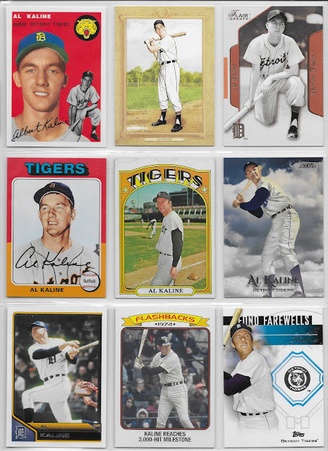
When I headlined a post recently with an Al Kaline RC reprint, I knew it was time to get crackin' on assembling my first display of Al Kaline cards.

The Card That Started It All
2003 Fleer Flair Greats

I pulled that one from some repack product, out of the blue, over 10 years ago now. At that time I hadn't thought of the idea of collecting just a few cards of a player, rather than diving into the deep end of a Player Collection pool concept and starting out with a goal of collecting all of a player's cards.

But I didn't know what to do with that card aside from placing it in my box of Tigers cards. I didn't have any 1950s Tigers cards, where this picture seems to have originated. But I knew I wanted to keep it. When I looked up it's lineage, some definite cheese on the part of Fleer appeared as they had used this same image in a 2002 product called Greats of the Game, on a much cleaner and thus more appealing design. That is only a 100 card checklist that I knew would be enjoyable to collect, but has to be done one card at a time as the original box&packs when it was issued featured one on-card autograph of a Hall-of-Famer per box, placing that firmly in the too-many-Benjamins for me category. If I ever run across a lot of the base cards from that product I could see launching an enjoyable collecting effort from it.

That pleasant daydream would still leave this 2003 Flair Greats re-run quite well orphaned, however. So here on this dreary last Sunday of 2024 I am finally giving the card a proper place in my collection, along with these:
1994 Topps 1954 reprint

One thing I particularly like about that card is that it is slowly but surely increasing my motivation to consider collecting the previous year's reprint of 1953 Topps, though I will have to check out some singles from it first to make sure there isn't a too simple (i.e., blurry) "re" in the "print." Some reprint efforts are better than others, from what I have seen; but I now have several cards from this 1994 version of '54 Topps and they are just exactly perfect for a simple binder page construction project.

2010 Topps Turkey Red "Boxer frame" insert

2019 Topps Archives 1975

Kaline does not quite have a card in 1975 Topps; though he is featured on a Highlights card at the start of the set for reaching the 3,000 Hits milestone at the end of the 1974 season, after which he retired. 

So this was a mostly pleasing inclusion in 2019 Archives; I like how you can see the color of Al's eyes on this one. The '75 style cards in that release had one of Topps seemingly standard go-tos of applying a digital filter to the source images for the cards, which detracted from the enjoyment of the card for most of the 20th century players, and some of the contemporary ones as well. Fortunately that filter seems to not bother this card, at all.

Given that 1974 was Kaline's final year of play one would think that a '75 style card for him would be the perfect place to print his complete career stats, but Topps punted on that idea, even though 1975 cards for a Kaline contemporary such as Hank Aaron didn't cut the stats short.

1972 Topps

Such a pleasant card; Mr. Tiger just chillin' during practice. I like the glove just casually waiting for some activity. 

I do not know which of the 11 other 1971 AL ballparks might be shown here though several can be eliminated from consideration upon first glance. That will be an enjoyable little research project some other dreary winter day in my future.

2019 Topps Stadium Club

Quite a departure from classical Baseball Cards though I don't think this is the first such card Topps had ever made. Kaline remained on friendly terms with Topps in the 2010s and new Kaline cards appeared routinely.

2011 Topps Lineage

2023 Topps Heritage insert

In original Topps, the Highlights appear in the next year's set. In Heritage, they appear with the set of the Topps Baseball style being celebrated.

That card certainly does show Kaline's age, appropriately enough, although that is not a photo from Baltimore on Sept. 24th, 1974 - home uniform in this one. So, close enough I guess, as is this next image -
2014 Topps Update Fond Farewells insert

I normally don't care for inserts clearly designed to show off a "relic" inclusion but then still needing a non-relic version to place in packs. But this one does have a nice enough foil repro of the Tigers logo, and I for some reason like that the card designer drew in the batter's boxes on each side of Home Plate for a touch of authenticity.

That photo might actually be from a post-retirement appearance by Kaline, it appears to me; he remained employed by the Tigers throughout his entire life.

Card Most on the Bubble: Surprisingly enough, that would probably be the excellent 1972 Topps card. But that's because I would rather include that in a nice run of Kaline cards, starting backwards from his 1975 Highlights card, which would be a nice affordable look at the final third of his career.

I also look forward to assembling some pairs of cards featuring Kaline and George Kell, his TV broadcast partner for many years. 

And I also hope to come across a post-retirement card for Kaline that prints all of his stats, from 1953 to 1974, a probably not-overly-difficult project I haven't dived into yet.

The Result


Wednesday, March 17, 2021

Kicking off card season with a Blast(er)

I wouldn't normally make my first baseball card purchase of the year via the Blaster format. I rarely buy the things at all, though I do have a weakness for the "box cards" in the Big League product. It just feels like I am paying a premium for the so-called "Patch" card in each one, that I very rarely ever wish to own at all, for one.

The other problem with blasters is the way collation works in baseball card packaging. The sheet-cutting and partially random assemblage of the cards is designed to do one thing: there will not be a repeat card, inside a given package. 

However, when one buys two such packages, you will "hit" identical sequences of cards - and then you don't get just a duplicate card, you receive multiple duplicates. Many multiples. This is probably magnified even more in the "hanger box" format, although that has usually offered the lowest price per card. So far, I haven't seen any hanger boxes or "rack"/"fat" packs, either, this year and I have to wonder if I ever will.

This year however, anyone wishing to just buy a few brand new baseball cards while grocery shopping can't take any chances on hoping to find some desired pack format. It is a minor miracle to find new baseball cards on a shelf at all, so if any are seen they must be purchased on the spot. Which is how I found my first blaster of the 2021 baseball card season - a single solitary blaster, half hidden behind some Magic The Gathering boxes of some sort.

A little later on I did find just a few examples of my preferred format but that will make for a nice future post, with some interesting, non-blaster cards to look at. Today I want to check out the rest of the blaster as a way to ponder 2021 Series One a little more. Fully absorbing the "first pack" is nice and all, but there are 84 other cards in each blaster - now a $25 blaster, where I shop. What did I find?


This is a perfect example of why I grade this design a "so close" - everything works here, except those almost vertical design elements, and outside of the ridiculous player name size. Many have commented on how they make the cards "line up" in a stack and would even in a binder page, but I don't think that is why they exist like this. Rather, aligned elements like this make it easier to print and most importantly, cut the cards accurately. Something ever more important in the collecting era of "10 Snobs" who insist that every single baseball card Topps makes MUST arrive to their greed focused hands in 100.0% flawless condition, including "centering," or it is off to Social Media they go. Not just some of the time, but instantly.

I still quite like this Alex Verdugo card, with his cool glove, harmoniously color balancing the Green Monster and the team colors, and the way the wall even makes it looks like he has a green wristband on. Perhaps the perfect card to post today - St. Patrick's Day.

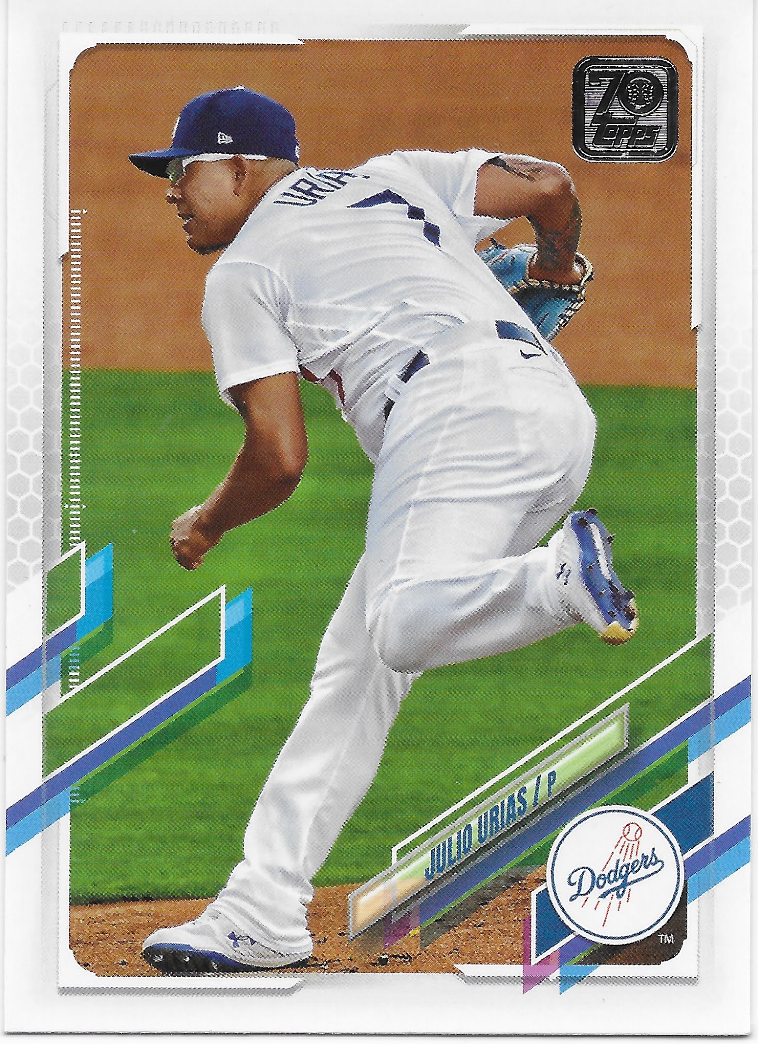
Meanwhile I think this card will kick off another random little side collection for me - cards featuring these - "full wrap?" - sunglasses that I am seeing on more and more cards lately. How long will baseball players favor these? I fully expect my Topps Baseball cards to document this.

But I'm just not sure I will ever quite get used to looking at 2021 Topps Baseball cards in the horizontal format.

An S1 card I always anticipate is some World Series cards from the previous Fall Classic, like this one:
I didn't have much invested in the Series last year, with 2 teams from the coasts featured, and was unable to watch it at all while out on a remote job at the time, and no ability to head into a pleasant little drinking establishment with a television, either. So I was depending on Topps to show me at least a little of what I missed. This card does that wonderfully, with a great image break taking primacy over the design elements. Overall, this is probably my favorite Kershaw card in some time.

Another routine part of Topps Baseball is the Rookie Cup -
Floating player, floating Cup.

And it's always nice to pull card #1 in a new set:
And card #27, too:
Mike Trout is routinely card #27 on many Topps checklists these days, a tiny holdover from the then firm break with tradition in 2013, which I could now write as "way back in...2013" - when I started this blog. Time flies, when brand new baseball cards appear for me to purchase on a relentless, basically year-round schedule these days.

That card makes me think State Farm has certainly got it's money worth from that bit of advertising placement at Angel Stadium of Anaheim. And also makes me wonder if they have ever considered hiring Mike Trout as a promo guy of some sort. Seems like it would be a good fit - the perfect wholesome baseball player, who would surely make a good neighbor, and one with basically perfect statistical production, year in & year out - a sure bet almost like - insurance.

I did find a bit of a surprise in terms of a year in, year out tradition in Topps Baseball for about 25 years now - a special handling of card #7.
That long run of Topps Baseball sets going back to 1996, of either a Mickey Mantle card, no card, or a carefully selected Yankees card at card #7 is over now. The Mantle family moved on to do business with Panini rather than Topps back in about 2017, iirc, but Topps kept some minor tip o' the cap to The Mick in the Topps Baseball set even afterwards.

2021 #7 is such an odd card. The center of the card is basically empty space while a touch more care in overall composition might have nicely accented the basic card design. And I certainly never expected to find the word "dab" on a baseball card of all places, given it's 21st century association with something else altogether.

Meanwhile, I also pulled the Yankees team card from this blaster (why not make it #7?), which is also odd -
On some of the horizontal team cards, the white line around the "design element" (what else can you call those weird parallelogram like 'things') just inexplicably disappears. 2020 strikes again I guess, with more baseball cards being produced than ever before, all done via Zoom meetings, perhaps. Meanwhile on this card at least, the design element has a clear antithesis in a whole 'nother professionally played sport, which at least gives you a mental name for the design elements on these graphic error cards.

Another card I always watch for in particular, this time of year, is one featuring a previous equal to the #27 card, Miggy:
And Miggy is looking good here - this bodes well for the 2021 Tigers.

Speaking of which, for the first time in a long time the Tigers have highly anticipated Rookie Cards in a new Topps Baseball release, and I pulled one in my first purchase -
What I particularly like about Tarik Skubal is that he is not some high-rated first round prospect who already has Bowman cards selling for 4 or even 5 figures. Rather, he is a normal product of baseball scouting, drafting, and development. It's way past time that my team gets some fresh young talent this way, rather than whatever they could get via their timid trades of two month rentals, which is how they picked up another Series One Tigers card I was looking forward to:
Though I am a little less optimistic about Paredes than Skubal, I do quite like the prominent view of the Al Kaline patch the Tigers wore last year, when I had the lowest chances to see them on TV of any year of my life. Those 3 cards pretty much satisfied me completely on the Favorite Team portion of the beginning of my 2021 baseball card season. I guess there are upsides to starting with a blaster after all.

2020 was of course a completely unique year in basically every way, and along that way, we all knew this card was coming -
and this one:
which was my first card to show me a fan cut-out in the stands. I know there will be more, and better, such cards in my future S1 purchases, but this is a card image I was expecting (and oddly looking forward to) from the first rip of the first pack.

A great thing about the Topps Baseball genre is the occasional repeat of a classic -
This new entry in the Wrigley Ivy checklist perfectly shows off the possibilities of this design + image and I can almost forgive that too long left side design element. Almost. I will return to that shortly. This year's Topps Baseball features an even more classic Wrigley Ivy card I quite enjoy:
It's like Topps has brought the Social Media concept of "trolling" into the set with this one, which perfectly cardboard-encapsulates the probable rise of the South Side of this year, while the North Side likely treads water.

As for images that perfectly match this design, I found several -


Now this Spencer Howard RC has me wondering - does this set feature the most Powder Blue uniforms since, oh, maybe 1982 or so?
I would say - Yes, yes it does. Probably later this year I will attempt to tally up how many Powder Blue baseball cards I find this year. I think it will be - a lot.

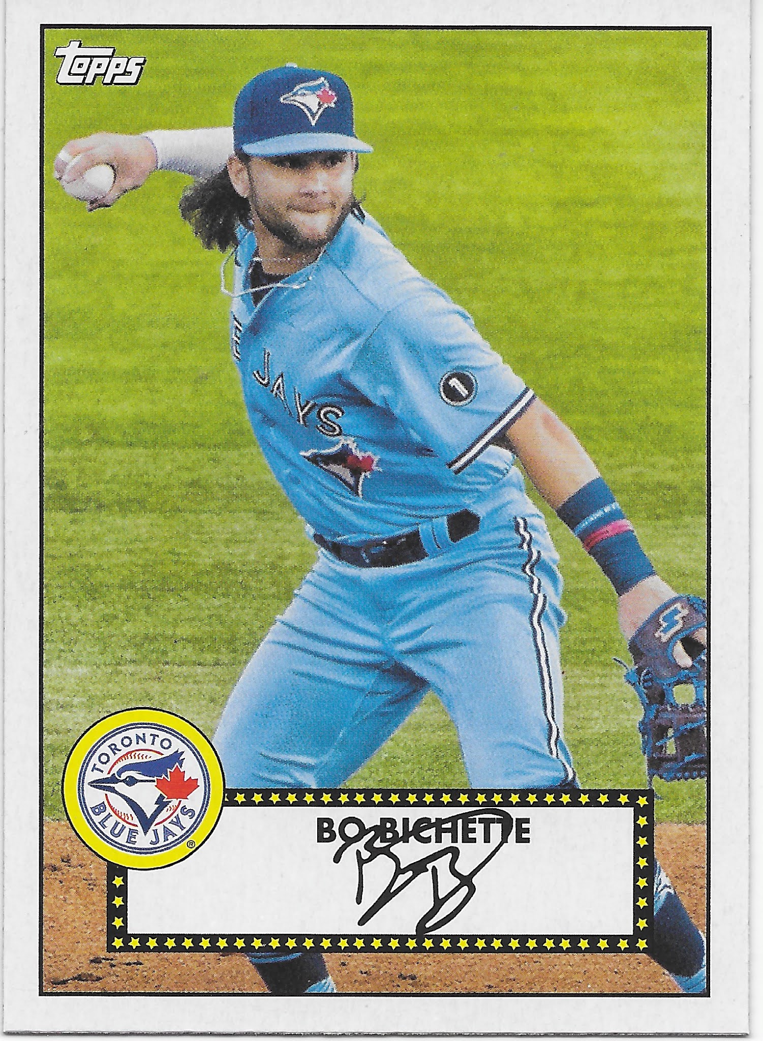
That is another of those 1952 "Redux" cards though I can't for the life of me figure out the need to use the weird psuedo-word "Redux" for these, nor why an insert clearly included to mark the 70th anniversary of Topps Baseball sets doesn't include the special Topps 70 (or is it 70 Topps?) logo - but for once I am glad to see Topps basically miss an obvious chance to thematically tie a few things together, as these "Action 52s" that I quite like are much better without any superfluous graphical notations.

Especially since such sure, why not appellations will likely be found on all the other inserts in the release:
I have always been a fan of 1986 Topps so I quite look forward to obtaining some "new" 1986 cards. But I don't know anyone who celebrates the 35th anniversary of anything and that notation on these reprint inserts is pretty much played out - but you know it will be a huge deal all over the Topps Baseball set, next year. A prediction so easy, it's like falling off a log.

Meanwhile I might need a duplicate of this Ortiz card to help fill out some binder pages of a half-baked Opening Day insert checklist from a few years ago called "Heavy Hitters" which well illustrates the comical challenge of maintaining upper torso muscle mass as you get older.

Inserts have changed over the last several years; I believe Topps dialed down the insertion ratios of most of them to give collectors more of a chase challenge and possibly to up the re-sale value of their products; something I can only partially agree with. When I like an insert, I don't want it to be rare. When I don't like an insert, I am more happy to not find them in my packs. Particularly all those insert checklists that mix certified Hall of Famers with maybe-maybe Rookies which then makes for big holes in the checklist years later after most of the Rookies inevitably fail to reach Cooperstown immediately after their first At Bat.

This year there are a couple ridiculously low input low hanging fruit type inserts given the "Anniversary" theme of the Topps Baseball set, and one upside is that the design of these inserts locks out brand new Rookies completely, as with this one:

These are nifty little reprints I would quite like to assemble - but they are also basically low insertion rate reprints that I am unlikely to find more than a couple three of over my coming S1 purchases. But since they are just reprints without hot Rookie Card cards included, I'm thinking they will be very cheap to acquire in the "aftermarket."

Speaking of which, the point of most box break recaps for most readers is the hits, man, the hits - did I "hit" anything in this blaster? Anything worth more than 0¢, the basic value of all of the cards I have just scanned in for you, (possibly temporarily) outside of the 2 RCs shown? Why yes, yes I did:

This is technically a "super" short print, though it took me quite a while to realize that. Usually the photo variations have some sort of theme to the image selections. Other times, Topps simply phones it in, as with this card. Nonetheless if I can get around to ever selling this it would probably pay for the price of the blaster. Which is both good, and bad. 

'Bad?' Yes, this "hit" card I found is the reason it is so hard to find baseball cards for sale, and I don't care to encounter problems when I just want the simple pleasure of ripping a few packs of brand new baseball cards. Of course I enjoy the faint chance of "hitting" a card worth more than 0¢ in my packs (the 'good'), but if I had to choose between buying packs that might hold a $20 bill and a guaranteed chance to simply buy a few packs of baseball cards, I would take the the guaranteed availability. Meanwhile that intoxicating chance to find a $20 bill in a pack of cards, or $200, or, even - $2,000 - leads people to purchase so many of these baseball cards that this all now makes it difficult for people who just want to buy the cards, a few packs at a time. Like me.

Ultimately, a Topps Baseball set is remembered for the basic design of the basic baseball card and how that works out for any random player your mind selects when thinking about the set. Over the years I have started to notice the way I think a few teams put uniform #s in odd spots, though I can't recall another specific team example right now, when I need one to share. I have noticed the Reds uni style including the uniform # on the player's belt before this card. 

But it took until I found this card to even notice the player name is written in a team color match, normally a basic, and good, part of a baseball card design. In 2021 Topps Baseball, however, the uniforms have to do the talking:


Tuesday, December 2, 2014

New Pack!

So I bought a pack of baseball cards. Yeah, yeah, so did you, and you, and you, but not over there in China, that one is just a web crawler trolling for - ? I wonder what I would have to type to generate a bookmark over there in the People's Republic?

Anyhow, see if you notice anything new about this pack:
Yes, I thought some blogger somewhere should report the demise of the 2 panel "rack" / "fat" / "jumbo" pack. Maybe that will get the attention of the Chinese - ace Japanese pitcher moves to America, triggers savings in plastic wrapping material. That would probably need to happen with basketball cards for anyone in China to notice, actually.

But this does mark a certain end of a long tradition - the long pack of baseball cards hanging on a peg. It has of course been a long time since we could see the cards inside, but those long packs were a certain tiny part of the traditions of baseball cards.

Personally, I'm OK with this, less packaging material is a good thing. I really sometimes wonder why Topps sticks with the "packs" in a blaster box, and I hope that is the next place they look to save a few pennies. And yes, I will still be buying new packs of cards in the future, as I love ripping packs and I will have to get a chance at the random cards I put on my idiosyncratic binder pages somewhere. And it  is still the very best way to keep an eye on what Topps is doing with all those baseball cards.

Though the minimal color cards this year made me so sleepy a very strange thing happened to this pack of baseball cards in my possession - I bought it 3 weeks ago, and never opened it! What the hell? Not to worry, my friends, baseball card collecting has gone on as usual here at the Base Set base, I was just too busy dealing with old base cards to look at the new base cards. What the hell?

So even though I haven't made it as far as blogging about my Series One cards this year (I did get them all bindered up, and I recently picked up the bulk of Series Two to start on those - I'll post some of each soon I hope), let's see what I found in this new-ish pack of baseball cards.

First card:
And, yawn.

Though I must say here I find it odd that with Topps designating blue as the Yankees color, the red of their iconic icon logo really stands out, and though I've never been a fan of the Yankees, I much prefer this logo on my baseball cards rather than the blue NY used last year (Topps seems to agree as this red logo is much more common on their cards than the NY). It also works well because the Yankees never place this logo on any uniform, so when Topps uses logos on the cards, the Yankees never have those overly busy cards that result from multiple logos, a topic I've been working on for an upcoming post.

So here I am with a brand new baseball card, and I'm not yawning. Thanks, Topps. I won't even ding you heavily for lopping off Francisco's elbow, as on this card:
Yes, his elbow is complete — but why just slice the baseball in half with the photo software? It would change little of the live game portrait style the set editor goes for on every card Topps issues these days, to just include his complete hand and the baseball by decreasing the zoom % just a single point or two.

I complain about the zoom choices of new cards fairly often (best fortune cookie ever says: "Human invent language to satisfy need to complain.") That doesn't mean I don't like all live-action close-ups, or that every last body part absolutely must be visible on the card:
This card works very well without Brignac's left elbow being visible, as the photo has captured the intensity of waiting for a Major League pitch, and the lines of the image converge nicely on the intensity of Reid's grip on the bat - your eyes are led to the batting gloves, not off the card, as on this shot:
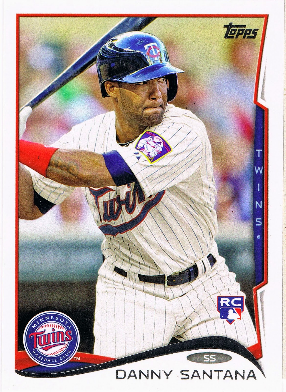
That is another classic still image for a baseball card, but leaving Santana's thumb sticking back into the frame kind of makes for a whole that is less than the sum of the parts. I think the focus is again on the hitter's eyes, which is kind of interesting here as well, probably more so on-card than on-screen. Maybe Santana will go on to multiple fan-ballot All-Star appearances and this card will become an iconic RC on it's own, though that mess on the left edge will certainly detract from that.

The Santana card contrasted nicely with this one:
I did not know that the Twins sport two different left shoulder patches these days. I've always liked that big Minnesota patch on the Burton card; the patch on the Santana card is a new one for me. Maybe if I could watch baseball on TV all the time, I would know these things.

But I always like looking through the Update cards to find all the new-this-season patches, and this pack didn't disappoint:
Though you have to squint a little to see the Mother's Day patch there on Tyler's left breast. I believe this was new this year; here is a nice downloaded-from-web-somewhere view:
With all the zooming going on with the cards these days, that might look nice with a little bit more zoom, actually. Never thought I would see a pink LogoMan.

Update is a quirky set of baseball cards for many reasons, including the way it is now frequently the home of "sunset" cards:
And that seems like a nice one for probably the only card in this set that has a first stat line that starts with "95" in the YR column. I've never been a fan of Giambi, nor a hater, but by the time any player has made it to 20 issues in the base set of Topps cards, I always like their final cards. There are several such in Update this year, also including Daisuke Matsuzaka and Bobby Abreu. All 3 players got photo variations in the set - a nice touch by Topps. 

This could be a sunset card for Chief Wahoo there, unless he pops up on a Fan Favorite type retro card in some future set, but I'm good with that.

So I was reading the back of the Giambi card, and in fact read most of the cards in this pack. That's a main reason I buy them. The unique feature of this year's card back is the "Rookie Fact," like this one:
Usually the Rookie Facts are totally forgettable, but if you squint at them long enough, you find a few kinda interesting ones. Pitchers hitting the ball is probably an easy go-to for the writers as they skim a player bio:
I'm pretty sure I set that one aside to share with you as I read through Series One, when Arroyo had a Reds card. 

And there is always the hope that the baseball card back will connect you to the history of the game:
Here I am in 2014 still discovering things about a favorite player of my youth, Carl Yastrzemski. Again, thanks Topps.

Another neat thing about the card backs in Update is they sometimes discuss the just-completed season:
But not many people buy baseball cards for the backs. Actually, zero people buy them for the backs, unless I go out and break my long-standing aversion to Bowman products and pick up some 2014 Bowman Chrome mostly for the interesting card backs I've seen on the blogs lately.

So let's get back to the fronts of the cards. This one caught my eye:
Check it out - a baseball player's knee! There were only 4 cards of 36 in this pack wherein that body part could be seen, if you don't count a pitcher's leg kick (always a sure bet to see on any of Bronson Arroyo's cards).

That card also certainly made me notice a card later in the pack:
I'm not sure I've ever pulled two cards from the same team in the same pack for the same individual position on the field. Perhaps I have in the several dozen other fat/rack/jumbo packs I've picked up the last several years, or whether you count the 72 card "hanger box" as a "pack." It just seems like for the last four years or so, I am always pulling cards of S.F. Giants infielders named Brandon, and just tons of S.F. Giant infielders in general. It's like they have a special infielder bullpen full of almost-could-be guys out there. At least that's what I glean from Topps anyway, who has yet to issue a Joe Panik card outside of Bowman or Minor League products.

So anyhow, what about those other cards in the pack, that might actually feature a famous baseball player instead of all these Update back-ups? 

Let's take a look:

POW! That one's going on the "None" page - as in "None More Red", a page I dreamed up just tonight when I opened this pack. It will only have one other card so far, though I will probably put other colors on the page so I have some chance to make it to 9 cards some day. I certainly never expected an Oakland A's card would end up a contestant in the reddest card of all time. This card is so red, it takes the viewer quite some time to even notice the All-Star Game logo there in the corner - even though it is mostly red!

Maybe if I can find the Red Foil parallel of this card, Sean and Ted can have some company:
A pity the Cardinals can't really put red birds on a red alternate jersey. Maybe if we ever get a little bit of a "loose" photo selection out of Topps again, with a player wearing their warm-up jacket. I think it's been awhile for one of those cards. Don't even get me started on the fact that all the All-Star cards feature the special warm-up uniforms as on the Doolittle card - I pulled 5 other such boring cards.

I did promise to detour from those base cards, so here ya go:
Is there any more useless card back than the back of an insert? The story of a home run in a Gulf Coast League (high or low A league, I forget, and absolutely don't care)….yawnzzzerz.

The front of this card is quite strange and I will have to compare it to the few other examples I have from Series 1 & 2; I'm not sure if it is an example of Topps checking out what some menu option in their photo software does, or this is just a warm fuzzy analog photo somehow. I'll return to this another time.

I was really surprised to find this card:
I really like it when I get a card of an All-Time Great in a new pack of baseball cards. Especially when they play for my favorite team. Though Kaline (name in foil = Boo) retired when I was 7, I have grown to be a fan through his post-playing work in the broadcast booth and his continuing work in scouting and development for the Tigers. I even saw him give a short speech at Comerica Park on Ernie Harwell day some ten years ago. I will never forget it.

I'll never be a fan of insert designs really intended to be a base for "Relics", but I would say these are unique in that the team logo is all in foil, including the Tiger graphic. Though I don't care for foil, I kind of like it's use here. I've already been on the lookout for the Stargell card on this insert checklist; it should be interesting to see some of the others.

So being not quite old enough to know the details of Kaline's Farewell, I eagerly flipped this card over:
I knew he hit his 3,000th hit in Baltimore, his hometown, and the 399 Home Runs, but did not know that about announcing his retirement. For a second time in a brand new pack of baseball cards I'm picking up information tidbits about long retired Hall of Famers. Another Well Done, Topps.

The inserts and parallels always fall just past the middle of a pack of course, so this means I have a few more cards to check out:
It's always cool to pull the player on the wrapper, though the Rookie Debut cards are a slightly dubious proposition. But when they are a horizontal card this nice, complete with lurking fielder in the set position, they are A-OK with me.

The 2014 design probably works best on the horizontal cards; there is a better supply of color from the design. This set would have been very nice in a radical all horizontal issue not seen since 1956 (it's time, Topps!). I will be assembling these all together for some interesting pages, probably. 

Quite often these days, the zoom fetish just wastes the always big potential of the horizontal format:
Though I am always a sucker for the cards with the colorful gloves. There are plenty of those; I can never decide if I actually want to make a special page of them. Probably not - just not enough going on, usually, on those cards. At least the baseball doesn't get sliced off on these cards; even a careless photo editor can figure that out in the horizontal format.

One feature of the 2014 set that surprised me is a return to documenting the 2013 Highlights:
Though all we get is a number, and one word: "500 Homers", as this is actually a checklist card with no further elucidation, not even the date, of this feat for Albert Pujols. And it would not have surprised me at all to see the Checklist cards somehow be connected to Rookie accomplishments, to go with the Rookie Facts and the Rookie, Rookie, Rookie theme of all the insert sets particularly in Series 1 & 2.

But a nice baseball card for one of the Hall of Fame statistical points. Nice touch by Topps to use a photo featuring a fan wearing a vintage St. Louis uniform for this one.

One probably-not-collected-by-anyone-else meme I like on cards is Empty Seats. And 2014 Update has a doozy of a card for that page:
Empty Seats at Night! Oh yes. So many neat image components here, many working very well with the swoop of the card design. A first mystery is the blurry red-white&blue bunting = Opening Night? No, there wouldn't be empty seats on Opening Night. But the bunting might stay up for the whole Opening Series, and Pomeranz pitched an inning in the third game this year,  a night game of a day-night doubleheader after a rain-out I guess; a 4-6 A's loss to the Indians). The line of the script Athletics on the uniform works tremendously setting up a second main horizontal line image, just as the bill of the cap goes with the other line to the left - really quite a photograph here. The cropping/zoom is perfect again on a horizontal card, and I even like the Nike swoosh this time in an upside-down appearance.

So though the 2014 Topps Baseball Cards didn't grab me as much as their 2013 models did, I know I will probably always find some enjoyable baseball cards in every new pack of baseball cards. I hope.