Tuesday, February 27, 2018

I scored some Baseball Card Heritage today

via my favorite way - in a $1 repack!

I hit the Dollar Tree today, and discovered a new-ish repack product - 30 Baseball Trading Cards for One Dollar. This one is from PressTine, who previously offered a 20 cards / $1 product that I would sample occasionally, though I much preferred the 30 cards / $1 product from CardsOne. I think those guys that were trying to sell a whole 6 cards / $1 are going to lose this war.

But competition for consumers makes the capitalist world go round, and I was jonesing for some Heritage, so as I went one buck window shopping, this top card was an easy choice

This guy is also my team's new manager. I always respected him in Minnesota; his teams were cracker jack on the fundamentals. This should be quite a change for the Tigers after their last, laid-back SoCal we're-all-professionals-playing-the-SABR-odds-here manager - Brad Ausmus - who might be the only baseball personality ever pictured on a baseball card with a laptop on his lap. (I still need that card too, it's in '98 Stadium Club I think, hint, hint.)

So maybe Old School Crusty Manager is the new nerdy type Manager, we shall see. I could never figure out how a team could hope to be successful "playing the odds" without a strong emphasis on the fundamentals. It's the little things, the itty-bitty things, sings one of my favorite songwriters, that make a play successful and give a +1 on a key counting stat that create those sexy compound SABR stats. It definitely remains to be seen if Gardenhire can successfully merge the new use of analytics (including a deep new analytics department in the Detroit Front Office) with his 20th century ways.

Anyhow, I like Manager cards and I was pretty sure I needed this one from what I call the "Salmon Set" for those just peachy card backs. I never did get around to completing it back in 2013, but that is a beauty of collecting Heritage cards - they are fun to collect later on, too. Do you think anyone will fondly get around to finishing the assembly of 2017 Topps in the year 2029?

Before I dive fully into this 100 cents worth of baseball card enjoyment, I have to note that this will probably be the very first repack advertising card what might well end up on a binder page, though I am having trouble thinking about what other cards to put on a page with this crazy cool card


Maybe it would work with some Nolan Ryan cards, surely some of those have some flames on them too, I would imagine. But really, this card has a lot going on.

It is a Stadium Lights card - I collect those, even though I never have gotten around to finishing that cool little insert set in 2011 Opening Day. One of these days.

And you thought only Topps could wield the air brush on to a baseball card these days? Nope, PMI has their own sluggers in this department too; since the pack invites you to "Hit a Homerun with PMI Baseball Packs" it seems only fitting that they supply you a team-mate to play baseball with, in a PMI uniform and everything. PMI = Presstinemarketing, and probably Incorporated, too, I would guess. They even have a website, though sadly, they don't undercut their customer and allow you to buy your own $1 repacks for less than $1 by going direct to the "manufacturer". Truly a pity, as their competition allows you to save money by buying your junk wax by the pound, something I am truly looking forward to doing some day, actually, though I might pass on a full 1,400 pound pallet of junk wax fun.

Bu it is truly a pity sometimes that we live in the land of the Disclaimer. This one really detracts from such a fun baseball card. We are about to hit a Home Run straight into the gathering Night, straight off our awesome baseball bat that is so awesome it is bursting in to flame as we swing!

I just hope this Home Run clears the top of the stadium, because otherwise, as far as I can tell, this probably flaming baseball is about to go zinging straight into the crowd. I sure hope this stadium has plenty of safety netting!

So, each side of the pack has a keeper. How many packs of baseball cards can say that these days?

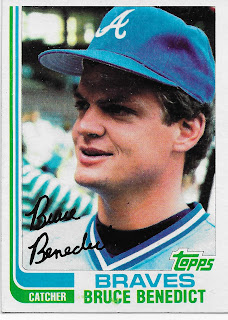
And, yes, tl;dr reader, it had baseball cards. I have always had a soft spot for In The Dug-Out cards


Recently, the Night Owl explored the mysteries of the creation of the 1988 Topps cards and how the image always lays over the team name. I have been wanting to pull a 1988 Topps ever since. This one doesn't disappoint in that regard, but I doubt it will make my All Time Nine of dug-out cards that will forever lead off with the 1975 Bert Blyleven card that scared me so much as a child. But it might just be the funkiest "O" on the Orioles uniform I have ever seen. What's up with that?

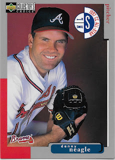
Speaking of scary cards, this one just straight creeps me out
I think it might secretly be an out-take from an un-released Will Ferrel movie, mocking me somehow. Sure, it has acceptable red-&-blue colors, perfect for a baseball card. But grey, ugh. Buh-bye 1998 Upper Deck Collector's Choice, I will be taking a pass.

Which is why I love re-packs. Discovering sets I didn't collect, that I can later discover that I don't want to collect. Sometimes, though, that is a tougher decision

It is a pity the Internet is still stuck in two dimensions, and aside from a lack of depth, it also still has a lack of an ability to impart a tactile sensation. That will make a bunch of people a bunch of money some day, that I can tell you. I mention this because by the year 2001, I am sure baseball card companies were really struggling to come up with anything new, though SkyBox was never shy about giving that a Go. A player stepping out of the design frame? Yeah, so 1988 (and 1964, really). So this card has a portion of it done up with a sand-paper like tactile surface for some reason. Maybe starting pitchers were supposed to hide these in their hats to rough up baseballs with somehow. No, ump, that's not an emery board, that's just my baseball card, I keep it up there to bring me some luck.

But ultimately, the key component of a baseball card is the player on it. If this potential 2001 First Baseman (POS on back) for the Oakland Athletics had such a bright future, how come in the movie Moneyball they were still thinking about the guy who flopped on to first base, and hiring an injured Catcher to convert to First Base? How hard can it be to pick out a Prospect that will make it The Bigs and put him on a baseball card, Washington? Incredibly hard, methinks.

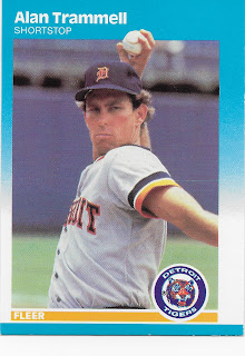
But failed prospects are not why I buy repacks. I am looking for baseball card glory like this one (and cards of my favorite team) -

Another keeper, though I must confess that was automatic based on it being a Tigers card, but how many other cards can make the viewer think - "He throws like a girl" - about a Hall of Famer?

Some cards in a repack will amuse as soon as you see them

Like that card, which says to me "Pitching Coach", instantly. So at least it led me to look up the idea on Baseball Reference, though I had to actually surf on over to Wikipedia to confirm that yes, indeed, Bruce Hurst was eventually hired as a Pitching Instructor, at least, for 2008 Spring Training with the Red Sox. My baseball card radar is rarely wrong.

And even though I have an eye out for all the players that appeared in Moneyball and I oh-so-slowly work on a collection of them

The repack always rides to the rescue, reminding me to bail on those blah grey bordered sets. I am sure a 90s-lovin' repack will eventually deliver me many more David Justice baseball cards with far more eye appeal. For your sake, I hope so too. My scanner doesn't like them either. Sorry 2000 Topps; I'm sure I bought a pack of you, fell asleep, and waited till my usual baseball card re-birth in any year that ends in "1", which is a Topps Anniversary and they try much harder to make a cool looking baseball card.

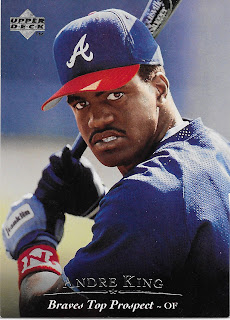
Now, wasn't I just wondering how hard could it be for a baseball card company to pick only prospects that make the Major Leagues? Yes, yes, I was, but sometimes failed prospect cards are kinda cool

I mean, how many posed hitter cards are like a good example of Pitcher Face? A scowl must not have been the best way to make it to The Show, you know. But Upper Deck was so frequently thorough, with those basically double-sided baseball cards, even for a Minor Leaguer, so if you collect Bunt Cards, you might could be on the lookout for that scowl -

Well, the scanner got the important part at least. Reading stats of a guy who sadly never made the bigs.... baseball cards are supposed to be fun.

In the 80s, they frequently reminded you of that. Baseball is Exciting! It was only in the 90s that the companies started working a little too hard on the fun.

And ultimately, the funnest thing about opening a pack of baseball cards is finding a card you need for your collection, like this one

Thanks, PressTine! Home Run! My low-end Miguel Cabrera collection just filled an empty slot.

And after a find like that, it is right back to checking out a never-seen or forgotten set

This card gives me a nice warm fuzzy Goudey feeling, though my scanner is again not quite a fan, what with me being all lazy on using the "Auto Detect" feature. Nice primary colors, goes well with an Alternate Uni, and I am a sucker for an On-Deck Circle card, even without the Stadium in the background. I wonder if they put a Canadian flag on the Blue Jays cards? This card is also made out of real cardboard, always a pleasurable part of a repack after one has been fiddling with too many 21st Century baseball cards. I think I will be on the look-out for more 2002 Fleer Tradition efforts.

No repack would be complete with Moar Junk Wax, from the peak years, and this repack didn't disappoint

Even a blurry off-center version of this card is always fun to pull. 24 years before Toys-R-Us parallels, we could ponder Purple, and Dodgers and why, Topps, why? Are there any other cards with a golf cart ? I suspect so, but can't be sure. And I always love this card because my theory is that it is impossible to be in a bad mood when you have your very own golf cart to drive around. Try it some time.

This card, though, just might show the limits of that highly technical 1988 Topps card construction technique. Perhaps that careful work with the scissors might have made it just a teensy bit harder for the printer to align the color plates. At least in that set, the printer has a good excuse for that. I wonder what the excuse was on so many baseball cards the year before this one was printed, and the year after? I told you I would be working on my baseball card heritage chops today.

Eventually though, the best reason to buy a repack will come pawing along. A baseball card of a type that you didn't even know existed. Behold, The Bat That Was Broken!

BAZINGA! And a Rookie Card! Oooooohhhh, I'm rich cuz surely this card foreshadows the Return of King Meyer, though I'm thinking he looks more like a First Baseman. And I am already thinking if there is an official Rookie Card Logo, we must have already reached the Mid-Aughts, though if you can ever tell Mid-Aught Full Bleed Upper Deck cards apart, then you are far more of a baseball card Wizard than I (which is why I need repacks). But by the Mid-Aughts, the Rangers should have had some rookie named Ian Kinsler coming along, so I am off to Baseball Reference ...... which sure enough reveals that this Rookie Card might have just a little too prophetic with that broken bat there, as Drew Meyer played all of 5 games in the Majors, and, yes, in the same year that saw the debut of one Ian Kinsler.

How hard can it be to print baseball cards of prospects that actually stick in The Show, Wash? Incredibly hard. But then you probably shouldn't get your hopes up over a baseball card #'d One Thousand, Two Hundred, and Two. I'm pretty sure I have never pulled a card numbered higher than 1200 before. The things you find in these repacks. Another keeper.

I like collecting baseball cards because of the surprises you can find on them - like Pitchers At The Plate

I will never have enough batting pitchers cards, not even from 1988 Donruss — another set I am no way, no how, ever going to deliberately collect with even a pack or two. So, bring them on, repacks!

And don't forget that mid-90s weirdness

It wasn't until I had this card scanned and was selecting the next one to share with you that I could even notice that it was for another recently minted Hall of Famer. At least it gave me a pleasant flashback to just the other day when a track from Metallica from long ago suddenly appeared on the shuffle on my iPod. Did James Hetfield get stuck with a pack of these cards before he picked up a guitar? Those eyes are just hard to escape from - I'm pretty sure I absolutely do not want a set of 9 pairs of them looking back at me from a binder page.

Sometimes, these repacks are a little too good at teaching the baseball card heritage. As with this card

I want to like 1990 Topps so much, though I find it hard to believe my scanner can't figure out the edges of this colorful card. It's like a cool mash-up of Mondrian and Lichtenstein, as I've written before. Or maybe that should be MondrianXLichtenstein, as in one of my botanical pursuits.

But maybe the repack is finally illuminating baseball card heritage for me. Red, Blue, Texas Rangers, so far so good. Yellow? Ok, Candy Apple Yellow like this card (the color I want to repaint an old van I have), I guess that works to offset so much baseball classicism, and the tint is great and the red dots fading into yellow dots into the pure yellow, yeah, good. But the reason I just can't warm up to 1991 Topps is there in these two corners. What does light blue and teal do here but create a not-psychedelic mess? Is Gary Pettis about to be traded to the Mariners? To a 1970s powder blue club, of which there were several to pick from? Why, Topps, why? I want to like 1990 Topps so much. But now this repack has revealed it to me - it's the superfluous corners, stupid.

So, palming on forward into this little stack of cards, another repack trope is found

A Double! Right in the same pack! Creepy all over again! Is it more or less creepy that this card didn't fall sequentially with it's doppleganger in the repack, the way Bip Roberts cards are supposed to? Dunno, but this card is still creepy. But no cheating on this blog, I scanned both of them.

Repacks are also good for showing off unique unis of the past sometimes -
I generally like brave black bordered sets. A pity this cool alternate uni supplies more color than the totally phoned-it-in design "Bowman" came up with that year - maybe 2011 was just past the peak of the "Foil Era".

I tried to let this repack card entry lead me to some baseball card/uniform education, but all the right webpages were so loaded down with auto-play video advertising and other skip-the-screen-all-over-the-place-advertisements, I gave up on divining the mystery of a white cap for the Boston Red Sox. Thankfully, I have repacks to bring me some baseball uniform/card history.

Sometimes I think I missed my calling in life. I really should be seated in front of an infinite pile of "worthless" baseball cards, purchased by a repack company for mere fractions of a cent, each. I could endlessly amuse myself, and all those unknown people walking into the $ store for a little break from their day via a - randomly? - assembled pack of worthless baseball cards. I would carefully pick a photogenic card from a somewhat recent set to put 'on the cover', make sure to include a Hall-of-Famer or four, not worry about which way each card faced as I maniacally packed the repacks with care, or without care. And at the end of the pack, I could let my hair down, and slyly assemble a couple cards (and meet my one per quota for "vintage"), with some cards created 33 years apart, but still, somehow, related.


Ahh Baseball, the sport of alliteration. Those repacks.


Sunday, February 4, 2018

Clap Your Hands Say Yeah


OK, I cheated. I could not show you my First Card of 2018. I like these cards. But I just can't lead off a way-too-rare post on this blog with a downer card like this one:
What a bummer. Seems like the right omen for the upcoming baseball season I am expecting, for my team. Though I always feel bad for various baseball card people I know who root for the Orioles, and will never forget working in Maryland one spring right on Opening Day - impressive fans in that state - my thought on the Orioles this year is that it will be a matchup with the Tigers that I will pay extra attention to, because it might be a rare series they could actually win. Sorry, Baltimore.

So, the 2018 Topps Baseball Cards. I like them. I read a key review last night and I agree, the best of the Full Bleed Era so far. Still not as perfect as could be, but we do have some color. Sometimes, an excellent amount of color - 
I have really come to prefer baseball cards showing a teams "alternate" uniforms. I wish we could get a whole set of cards with just the 'alt' unis, home or away, since Topps is so parsimonious with handing out color lately. That Semien card there came along early in the pack and was the perfect flash-back anti-dote to last year's cards - where Semien was my First Card, and his alt-Yellow uniform really helped that one, too. It was a weird pack - 2 Oakland Shortstops in the same pack (Chad Pinder). I can never keep track of the Oakland A's roster, even when listening to their broadcasts  a couple times a month. Baseball cards certainly help, but only some.

So, the ... Water Slide? The thingie there that supplies most of the color on the card, or at least the bright color. Is it 2014 all over again? That swooshy device on the cards that year was nice, but the regrettable 'File Folder' team names and the use of foil for the swoosh made everyone forget it's pleasing roll across the bottom of the card. Well, maybe not so pleasing if you are the type that easily gets car sick riding in the mountains. So the Water Slide seems like a hey-let's-not-let-that-otherwise-solid-idea-go-to-waste revival on the part of Topps here. I like it. But the other main thing that pops into my head whenever I see it is:

I don't know why, but there it is. I'm pretty sure I will be the only person that thinks of this set as The Rolling Stones set, but there you go. Maybe these cards will motivate me to check out their new release of early 60s BBC Broadcasts. I loved that era when they were pretending they were cutting sides for Chess Records just like their heroes.

And now the baseball cards are scrolling away, let's see what else is in my 'pack'...
A perfect baseball card. Very well lit. The image flows right on to the Water Slide, and your eye rolls right back to the slugger's bat. For an instant here on-screen you might think Schwarber swung and missed because his eyes look closed, but that's just an on-screen thing. In-hand, these cards are great and you can see his eyes just fine.

I mostly pulled that card to scan for you because of something else - the back. The card fell just a few cards in to the pack and it was the first one I turned over for an update on the ups and downs as Schwarber's career has been a bit of a water slide ride at times. Let's take a ride down to the bottom:
Ugh. Another year without complete stats. I just don't like that. Perhaps, yeah, it "changes things up" and that has some odd sort of value. But I am already looking forward to the day when things change up right back to complete stats. I use my baseball cards to understand the game, and the players.

Maybe you are reading this on a mobile OS. If so, pinch and zoom in on those underlines up there now. They report "3 Years" of MLB service. At first glance, that matches the 3 lines of stats - but one of those is for his trip back to AAA last year. The Home Run total, which doesn't match the tater numbers listed above it, reminds the card back reader that Schwarber came up in 2015. But for Topps, that is just "whatevs" to the card back writer who managed to dredge up the pointless fastest to 40 Homers stat. I don't begrudge the task of writing the back of a baseball card. But I just want to read the player's stats on the back - even if just the last five years. This card gives me a feeling I will be similarly disappointed in other random cards in the coming months; I just don't see any good reason to randomly delete a year of stats when all the other cards carry 5 lines of them. Sure, I could order Siri to bring up Baseball Reference for me. But that is why I buy baseball cards - to take a break from the screen, the screen.

But here I am on the screen and these pretty baseball cards are slipping away again. Here was a nice one, my First Card from My Team:
And the only Tiger in the pack. This year, I now need pretty much only 2 other Tiger cards - Miggy, and that new third baseman who's name I forget every time - so I need his new baseball card. My gut feeling is he will carry the Tigers effort in Series Two however. But those 3 cards are probably the only 3 cards that will have any relevance to the 2020 Detroit Tigers. Overall, I expect to find the lowest # of Tigers cards in S1/S2 in a long time as it's play-the-Rookies-time in Detroit, and that is hard to get excited about, and most of our promising Rookies will be up late in the year and most likely just a few will show up in Update. 

It is that bad in Motown - the likely starting roster was recently ranked #30 of 30 by some baseball ranker guy somewhere. I don't think the Tigers will finish 30th in MLB this year as they are so widely expected to finish last, and that will take most pressure off the players, for an a), and b) usually some other team will spectacularly implode quite surprisingly. And, c), the Royals are in the same boat with the Tigers, just in our own division, so there's that.

It was a big pack of cards to only have one Tiger - a "hanger box" of 72 cards. Those are my Go-To for collecting these days, although more and more Wal-Marts are offering single loose packs, the one and only Big Box store in my town does not. I would prefer the classic single pack of 10 cards or however Topps deigns to hand out for handing over two bucks these days, but my nearest Target is 65 miles away right now, unfortunately.

Picking up 72 cards at once does always guarantee plenty of baseball card pleasure. Topps can never screw up all 72 of them. This next one is now quite possibly my favorite card ever of this famous player:
However, the screen does not do this card justice, even though my new WiFi-enabled scanner is darn sweet, and will make scanning cards easier than ever. This card, though, has to be enjoyed In Hand, the way baseball cards are meant To Be. I like the use of the classic old-timey National League logo, rarely seen on cards outside of the special not-quite-accurate "All Star" blister pack sets that come out in June or so, for each league. The fairly pointless dab of lightening on the logos take a lot away from the 19th Century graphic design here; they vary in that effect on all of the other 31 logos on these cards. This set would be a lot better without that weird wash-out on the prime icons of the game.

Otherwise, this card is a little unremarkable. Clayton's arm just happens to also make this card look like a Panini effort (boo, hiss). So why is this a new fave of mine? I do like the darkness, darkness background. Is it a Night Card? Probably, but it might just also be an Indoor Card. Or both. Milwaukee, would be my guess for venue here.

When I reached this card in the pack, however, the feature I like about it jumped right out at me - this can only be seen in-hand, and I expect will disappear completely on any cards "slabbed" inside vanity plastic cases. The 2018 world of digital photography and high quality full color printing of bright glossy images is great - and on this card something happened to leave a glow around Mr. Kershaw here. It almost looks a photographic capture of his aura. My guess is it is some sort of reflection from the bright portion of the image, on either the original digital 'film' (memory card) the photographer used, or a similar such effect created by the printing process. But as soon as I had this card in my hand, I saw it, and I liked it.

Or, of course, when I next pull a copy of this card, which is inevitable when you attempt to build a set of Topps Baseball Cards by purchasing one of their packages with one's groceries, it will turn out that only this copy has that cool looking aura and all I have is a very minor printing error card. But then I will finally own a Clayton Kershaw 1/1.

So, yeah, I know, I type talk too much. There were some other cards I really liked in the 'pack' too:
One of those players who just always gets Good Cards. I'm glad he was on a World Series winning team before he had to live through a rebuild, like my team is doing now too. I have a feeling this one will make the cut of my eventual 9 best Salvador Perez cards. It also foreshadows another fave pull -
What a perfect way to show off the very nice "Ace 30" memorial patch for Paul Splittorff that the Royals wore last year (also way better, in-hand). Nice work, Topps. The Water Slide works very well with a Pitcher-in-Motion card, which are often good photos with lines revealing imminent motion.


EDIT, 11 months later: I am kind of glad no one noticed that terrible Error there. I even already have a nice card showing the "SPLITT" patch the Royals wore for Splittorff - some six years prior to this. Doh! That patch is for Yordano Ventura of course. On the other hand I am kinda bummed no one noticed it, either. Too long of a post, probably largely composed too late at night, ahh well, better luck, next time. I hope.


Another Pitcher In Action shot I found will also likely remain a 2018 favorite, and I only have 72 or so of the eventual 1,500 or so cards I will likely end up owning from this year's sets.
Eh, don't mind me, I'll just float here while I wait for the Umpire to call it a ball or strike. An excellent photo purchase. I think this card will likely end up on my Favorite 9 page for this set.

So I found plenty to like, and am all recovered from my anger at the back of the Schwarber card. The hoizontal cards are nice this year -

One thing I like about these two cards is that I think people will complain about them. I can't remember very many other oh-so-desired "RC"® logo cards being horizontal cards. 'They won't look right in my PSA holder' will be the charge. And since only PSA 10 RC qualify as actual desirable baseball cards to own (the other 99% of the set to be simply thrown away), these two cards will have a healthy population report, eventually. I did not pull the Rafael Devers RC that seems to be the most desired card in Series One, so far, but these two should not be far behind, considering how many teams wanted the Nationals and the Dodgers to offer these two players up for trade last year.

I also like that these two cards are not just floating torsos, which frequently wasted the horizontal format the last few years. I have long disliked the all-torso, all-the-time editing/cropping/zooming of recent sets. I really think someone else took over the mouse for this set, and we don't just see the players from the belt up, in a live action shot, but with all other traces of live baseball removed.

There remains the common complaint of what happened to the fans. I'm not sure this is deliberate by Topps. The clarity of the player image, which we like, I presume, might depend on shooting the photo and running it through the necessary software and then result in a loss of resolution in the background.

Or it might be deliberate, to help keep Topps out of compaints in the Social Media age, as with a fan on this card -
I'm certain this is not the first Smartphone Card. I'm also certain that fan is not snapping a picture right then, either. It might be kind of interesting to assemble all of the cards that have this kind of fan shown, but that would be straight depressing. As are pop-ups for the easily distressed Josh Reddick.

It wasn't all that long ago that we could see the In Action baseball players, and the fans, just as clearly:

In the years since 2013, seeing fans has been a moot point as the cards were so often so tight on just the player from the knees or belt up, like this new card:

But what is going on with that card? Did it escape from a Vladimir Putin kompromat operation? No, that is an example of this year's Topps Gold card. I know Topps has been making a set of Gold cards for a long long time now, and many collectors assemble it. So they have to print one, and they always will. And normally I like the Gold cards. But hopefully, this pitiful example of a parallel will help finally lead Topps back out of the Full Bleed Era. I have mostly been avoiding peeking at the other parallels this year, in hopes of wandering past a Toys R Us that is actually still open, and actually pulling one of the Pink, Black, or especially the Independence Day version, one of which did scroll past me on eBay the other day. Mostly though I don't plan on really taking a deliberate look at those until I am probably 3-4 hanger packs into Series Two, round about July. 

Of course it wouldn't be a pack of baseball cards any more without Inserts, for better or worse, mostly worse, in my opinion. I always like a few Insert sets in the Opening Day release, but Flagship inserts rarely fail to disappoint, me, at least:
This first one is like a cross between the various recent "Fire" cards, and some sort of homage to the work of Ralph Stedman. Ralph Stedman and photographically based baseball cards should probably not be mixed. I'll bet he could make some wicked cool Sketch Cards however, even though I don't really care for those anyway. As for re-using Insert ideas -

I swear I've seen more than a few "starry" graphical takes on the word "star" on a superfluously worthless baseball card. This latest retread of the idea seems to be missing a cat riding a Unicorn while shooting laser beams and eating a Taco, for hipsters to wear on Cat Shirt Friday. It's that Cheshire grin Bryce is sporting which tipped me off I guess.

Another standard component of Insert-ness is Topps mining it's past with retro issues. I like those. I like these. I figured they would fall one per hanger box, as per usual, and that was correct. (2 per Blaster, I would wager plenty on that being true). Let that Mullet Flag fly, deGrom - Bronson Arroyo won't be on any more baseball cards, so...

83 was the year where collecting started slowing down for the kid version of Base Set - the first year I did not complete the Base Set after a pretty good run from 78 onwards. So I have some guilt issues with this card and I won't be surprised if I pull the trigger on some random 29 card lots of 83s on eBay at some point this year. If I can ever escape from the boat anchor around my free time that is the reality of not being able to afford doing your own self-employment taxes, I might could hope to get back in to trading to help complete such a set. But that seems unlikely, especially given how much time I still spend working on really remote Forestry jobsites. But I love baseball cards, so that could still happen. Stay tuned.

The final insert, also surely to be found one per box, is from the "Topps Salute" set. The "Salute" part means whatever Topps wants it to mean. I liked most of the pulls I had from it last year, though not enough to get anywhere close to a desire to build the set. The Throwback Uniform cards which failed to show off the cool retro-ness features of the uniform turned me off the most, a common problem with Topps' frequently lazy attempts to make thematic baseball cards. I can do that in my sleep, buying random piles of "repack" cards and collating them in ways no baseball card set designer ever dreamed of. Why can't Topps?

Anyhow, my first Salute did feature one of those nice Alternate Uniforms I like so much on a baseball card - 
If this kid can hit the ball anywhere at Above Replacement levels, he is destined for baseball card greatness. I am still bummed that I pulled an autographed card in 2013 Pro Debut from one "Rock Shoulders", and he never made the Major Leagues.

I gotta say though, it was a little weird pulling two of those send-the-grandkids-to-college-with Rookie Cards of the same player, in the same 'pack'
It's all about that RC logo now, we all know that. There were strings of the things in this pack, 3-4 cards in a row, but I won't bore you with too many Bowman card escapees, like this 'Major Leaguer'
This kid should change the spelling of his first name to Rowdy and crack jokes about being all out of bubble gum. Or might need to wait a few years to pull that off.

One of the new Rooks is the clear front-runner for Best Socks In The Set though:
I was also mostly mollified, after my way-too-long-gone blog post previous to this one, that Topps didn't screw up the Rookie Cup this time. Those 83s are part of their "Continuity Program," whatever that is (the "silver packs"), but their real long-time continuity effort in the #1 set of baseball cards in America is their own Rookie Cup. And here one was in this pack:
And 'Future Stars' are back in the main set, after being relegated to the 87 inserts last year. I'm not excited or upset about the disintegration of the graphic stripes supporting the player and team name, just kind of whatevs about that myself. But on the Future Stars here, it seems like someone missed their Windows 95 Graphic Design software, as with those horrible "Perspectives" inserts a couple years back. We all know what happened to baseball and baseball cards in the 1990s. With those Perspectives cards, this Future Stars card, and the new wound-too-tight Gopher Ball MLB is using these days to make sure the utility infielder guy can hit Home Runs, too, I'm getting a little worried.

At least I got The Cup back. And now I have a new card to look for - a triple header RC Logo, Rookie Cup, and a Future Star. Does one exist? I don't think so, yet. But it could happen. My binder page is ready.


Despite that minor Future Star setback, I persisted with these cards, and with the scanner, all for you, Dear Reader. I pulled an OK pair of these cards - a nod to a long-time tradition of Duals, and another long-time tradition - these are again the Checklist cards. I pulled two of them on this go, am I detecting a theme here?
Are the Checklist cards all shot at First Base? I will be watching for the rest of these. I also enjoyed discovering an actual "Who's On First?" baseball card; perhaps it's been done before as it seems a perfect, and obvious, theme for a baseball card. But to really get this one right, it should have sported a photo of Rizzo, and, say Paul Goldschmidt. So close, Topps, so close.

I did find just one more theme running through this set, for now. In fact, I sort of used it for the title of this post. Early in the "on-line" breaking process we all peek at these days, I saw this image
(but no, I didn't luck pull that Super Short Print card, unfortunately), and I heard that it was indicative of the theme of the Short Print Photo Variations this year - "something going on with the hands". And that description does hold partially true, when I gaze at all the variants posted in yet another  Gallery-of-Cards-I-Will-Never-Own, where I conveniently downloaded that Trout to share with you.

But I think there is something going on in the mind of the Chief Photo Buyer For 2018 Topps Series One, regarding baseball players, and their hands:


I just kept being drawn to what the player is doing with their hand in these photos. These all make for a good baseball card. Did the Topps Curator do this consciously? Who knows. Am I just imagining this, and really most sets of 330-ish cards might have plenty of cards like this? The only way to find out, will be to buy more baseball cards.

Now, elsewhere online from the nice cozy baseball card blog-o-sphere, most of these cards would be total snoozers, except the Robles and Verdugo RCs, and then only if I had surgically placed them in pack fresh toploaders right in the parking lot of the Big Box store for a maximum chance at PSA 10ness. All most people care about in a 'break' is The Hits, man, did you get any Hits? It might be a good baseball card season, despited that dud Trumbo Opening Card, because I did hit something, at least, as the $ collectors might say -
which is a Short Print Photo Variation. Not terribly difficult to hit, 1-in-8 of these hanger boxes, but not as simple as with the deluge of these amongst my last baseball card purchases in 2017 Update, nor as insanely greatly difficult to pull as in 2016 Update, either. I also set aside Chris Sale cards, another one of those Good Card players, but this one won't make that cut. It is not even the first time Topps has shown him on an SP with a warm-up jacket and a towel - is Topps putting the juju on him, since he throws for an-enemy-of-New-York team? Are they trying to foreshadow an injury for this perennial Cy Young candidate? Is Chris' arm getting tired and sore? This card seems to say so. 

But maybe this card does too, and Topps is trying hard to be Fair and Balanced, unlike so many in "Media" these days -
I never like a card where I can see individual parts of a Pitcher's musculo-skeletal system; probably more noticeable, in-hand - you should collect these cards yourself, silly. And what is going on with Dellin's leg there? Does that light swooshy deal on the team logo get resentful of the white NY and commences to start growing on other parts of the card? Or did the intern in charge of blurring out the fans in every photo have a slight mouse accident here? Betances has been a workhorse the last many years running, as has Sale...what will 2018 hold for them? Sometimes, my baseball cards are pretty smart.

Other times, Series One is a nod to the past, not the future. As with probably a sunset card for Joey Bats this go-round, and probably others I have yet to discover. I also try, and frequently fail, to remember what was my Last Card of my first baseball card purchase of the year. This one, I think I will remember. I like this player, and I like baseball cards, and I like blogging, and I like all of y'alls, and I will be back. And this, was just about the perfect Last Card in the mini box of Baseball Cards, for this Baseball Card Season Opener