Sunday, January 26, 2025

The Happy Miggy is a collectible Miggy

Now here is a little project I've been looking forward to for a while. Time is the enemy of such projects of course, and Father Time is always undefeated, as the saying goes in the sports world.

But I have been winning a few battles lately...

The Card That Started It All

2013 Topps Opening Day Ballpark Fun insert

2013 Topps Heritage

If you own a copy of this one, or the corresponding card in 2013 Topps Baseball, I suggest you "set it aside" / put it in some plastic, if it is just floating around loose, still, for some reason. This card likely depicts 3 Hall of Famers simultaneously, so it has more traction than most equally printed base cards in those 2 sets, and ultimately probably more than any of those cards outside of perhaps the Manny Machado Rookies on the same checklist. That's not to say this is even a double-digit card, but it is also a long ways from a 20¢ card like the vast majority of its checklist mates.

I have faith that the 2013 Heritage card miner did their level best to find a 2012 picture of Beltre with an actual smile and it was just a bit of misfortune that one couldn't be found to match the basic happiness of Cabrera and Trout here. Smiling Beltre cards are not unusual. One could -probably- assemble 9 cards of Mike Trout cracking a smile, since there are surely well > 1,000 different images of Mike Trout on a Baseball Card. But I expect that would take more legwork than you might expect, once you start gazing upon Mike Trout Baseball Cards, particularly the newer ones.

2014 Topps Archives


2015 Topps Gallery of Greats insert

This card confused me for a long time as it kicked around, waiting for enough page mates to hang out with. That's because in 2013 Topps, 2 checklists of very similar inserts in Hobby boxes only were called "The Greats" and another was "The Elite" but I kept thinking somehow this card was part of those small sets.

Anyhow this was still a little before the time when Topps would routinely anoint the current favored Rookie as right up there with the All-Timers as it creates a checklist. Overall a classy card, and a classy checklist. Posed Miggy is not usually this happy; that's something that generally comes out on the actual ball field.

2019 Big League

2020 Stadium Club

I always like the Logoman, even upside down.

2022 Topps STARS OF MLB insert


2022 Topps All-Star Game insert

This was the inaugural year of adding two "Honorary" All-Stars; I believe Albert Pujols was the NL selection. The only downside about that is a personal one - I already forgot who the 2 players were in 2023, and 2024. Doh! (Or was this concept already forgotten? Exhibition games are just so forgettable.)

I do like it when the All-Star Game uses never otherwise seen variations of actual team uniforms like this.

2022 Stadium Club Chrome Beam Team insert

I have never, ever, understood what the conceptual is behind the long-running "Beam Team" inserts in Stadium Club. Laser Beams? But at least I finally recently found the perfect card to anchor down this happy page of Baseball Cards. Now I can go back to not understanding these inserts again. Wave goodbye, Miggy.

The Result


Friday, January 24, 2025

More fun times with my friend, fiddy

I can't always tell what makes one Baseball Card land in the Dollar Box, while another lands in the 50¢ Box. Of course I wish they all landed in the cheapie option, oh well. Let's examine another expedition to the land of spare change Baseball Cards:

Why I selected it: I already essentially "collected" the cards from the 2021 Topps Update 1992 Redux insert checklist in that I assembled 9 of them and passed on collecting the rest.

But when I saw this one I knew it could liven up that page of cards a little and I had a card to replace in mind, instantly, when I saw this Judge card. That would be the Nolan Arenado card bringing up the end of the parade in binder slot #9. Arenado is exhibiting strong symptoms of wanting to play on a "Super Team" and get the heck out of St. Louis now. Which is partially understandable, but, for me, only partially acceptable.


Why I selected it: Staying with the negative waves, I guess I wanted a card to dislike. Or, more accurately, one to help me to remember to tread carefully with these Leaders cards. I do prefer a vertical Leaders card. I had presumed they automatically indicate just exactly who Lead the League right there on the top of the card.

But what if - there's a tie? That's what happened here. Bummer.

I confess I would be a lot less displeased if my man Salvy had been on the top of the card. Cynicism can come easily here in presuming hot young Star VG Jr. gets top billing on a Youth-before-Vets basis, but my guess is alphabetical order would have been the tie-breaker.

Still, couldn't the mold be broken by putting Perez and Guerrero Jr. together on the top line?

Some day, in my infinite amounts of spare time, I will examine how Topps handled this on Leader cards of the past. But today is not that day.

Why I selected it:                             Boom!

First, let's review:

That card is from 2021 Topps Opening Day, arriving publicly in the early spring of 2021. This wasn't the first time "Bomb Squad" had been used on a Baseball Card though. As near as I can tell, Donruss was the first to give the term a try in the mid-90s. These 2021 card from Topps are just off in a league of their own. A very, very sleepy one.

These days, Panini owns the rights to the Donruss brand. And so a year later, their first "Bomb Squad" cards appeared; these are from the 2nd iteration, in 2023.


I had to have one of these, as soon as I saw one. And there proved to be more of them in the ever friendly fiddy cent box. The card number is a hoot - this Alex Rodriguez card is # "BS1," I kid you not.


These cards are almost too fun to put in a binder page; that's because this is the "Pink Fireworks" parallel which are "exclusives" in the "Mega" boxes (think $50, "Retail" stores only) of this product. Though I'm not sure anyone can easily keep track of which cards are Panini Donruss and which are Panini Donruss Optic.


Anyhow when you have one of these cards in-hand, the Fireworks pattern essentially explodes whenever you move the card a little bit. This, I like.

I'm not sure how I feel about classier "vintage" players appearing on the crazier Ooooohhhhh, Shiny parallels of the 21st Century though.

And right there is another reason I gravitated to negative sampling these: Panini is as unable to resist randomly mashing Minor Leaguers together with Hall of Famers on checklists as Topps is.

Orelvis Martinez is currently a highly rated prospect in the Toronto system who should see some more time in the Bigs in 2025. This is a card from 2023 though.

This 10 card 2023 checklist also features respectable enough brand new 2024 Los Angeles Dodger Andy Pages though I can't say I have yet particularly associated his name with hitting Bombs. 

Panini has recognized the popular reaction to these cards and they also now produce Bomb Squad cards in their Football and Basketball sets, somewhat like their "Kaboom!" cards which are similarly popular although there that is an odd term to apply as Kaboom!s are printed in strictly limited tiny quantities. So with Kaboom!s lots of people want to find one in a pack but few people can actually afford to buy one, quite unlike these much, much higher print run Bomb Squads.

The initial Baseball Bomb Squad effort in 2022 included a Shohei Ohtani card; fortunately and a little surprisingly Ohtani did not make the 2023 checklist. Instead it does feature Ken Griffey Jr., a fitting "Bomb" subject I guess, but one who is nearly as massively collected as Ohtani is. I like my Miggy cards, but I have no plans to continue obsessively purchasing all the new ones ever made, for the rest of my life.

So, maybe someday I will spring the real money for a KG Jr. card and complete this set, or maybe I will wait and see if O. Martinez or Andy Pages can ever hit many Bombs, in the real deal Major Leagues, rather than just on the screens in Panini offices. Although that waffly conclusion would normally mean these cards will be sentenced to life in a small cardboard casket for a few months or years, these things almost audibly go "Pop" when you handle them, so I will probably let them swim around on my card desk near that Panini "Lubmerjacks" card I bought, which has a textured surface that also refuses to be imprisoned in plastic.

Why I selected it: This is my 2nd-favorite City Connect uniform and I am quite simply going to collect all of the cards it appears on. I don't know why Topps went with a Powder Blue team name for the Rockies though; I think that was a composition error on this card.

Why I selected it: This is my favorite City Connect uniform and I am quite simply going to collect all of the cards it appears on. Overall it is however a rather unfortunate image to pick for a player's Rookie Card logo card but since these are technically inserts in Topps Baseball releases, they don't count as Rookie Card cards to the cognoscenti. Unless of course, the player on such a card has "Cooperstown" whispered anywhere within 162 meters of the card, and then all of a sudden it is an expensive Baseball Card.

Anyhow I expect the Brew Crew collection to be fantastic. And am quite looking forward to seeing the little charcoal grill shoulder patch being recreated by Topps.

Why I selected it: I can't say I have ever understood the point of the title of the "Beam Team" inserts in Stadium Club. I mean I would doubt Miggy is very good on the balance beam in Gymnastics contests. 

But here he is definitely beaming, so this card could make it into some Nifty Nine pages in the future I guess, in a variety of ways.

Bonus Round


Why I Selected these: More of my fascination with Gold facsimile signatures, held on to as a needed Baseball Card motif by Bowman all the way to these 2011 cards.

That Logan kid was lazy with his signature so I doubt that one will be a keeper. I did look up this checklist and the fancy Gold sig is haphazardly applied; there are a mix of famous names and never-heard-ofs on the checklist. So for example the Manny Machado card has this Gold flourish on it but the Christian Yelich card does not.

Of these 3 players, Kevin Keyes never reached MLB; Logan Darnell did manage 24 Innings Pitched with the Twins in 2014 while Cody Stanley received 10 At Bats from the Cardinals in 2015. Neither Darnell nor Stanley were memorialized by Topps for those achievements, amazingly enough.

I do like the kitsch of those Gold sigs, so just another shopping project for every collector's favorite day, "Some," though I expect for me that one will be sometime in the last week of November, 2025. I'm sure by then we will see plenty more odd Baseball Cards, right, here.


Thursday, January 16, 2025

10 Cards from the Dollar Box #13

Sometimes, Baseball Cards are like Tribbles. Things start out innocently enough, but then...you know the rest. Routine access to a big ole box of randomly assembled Baseball Cards....so nice:


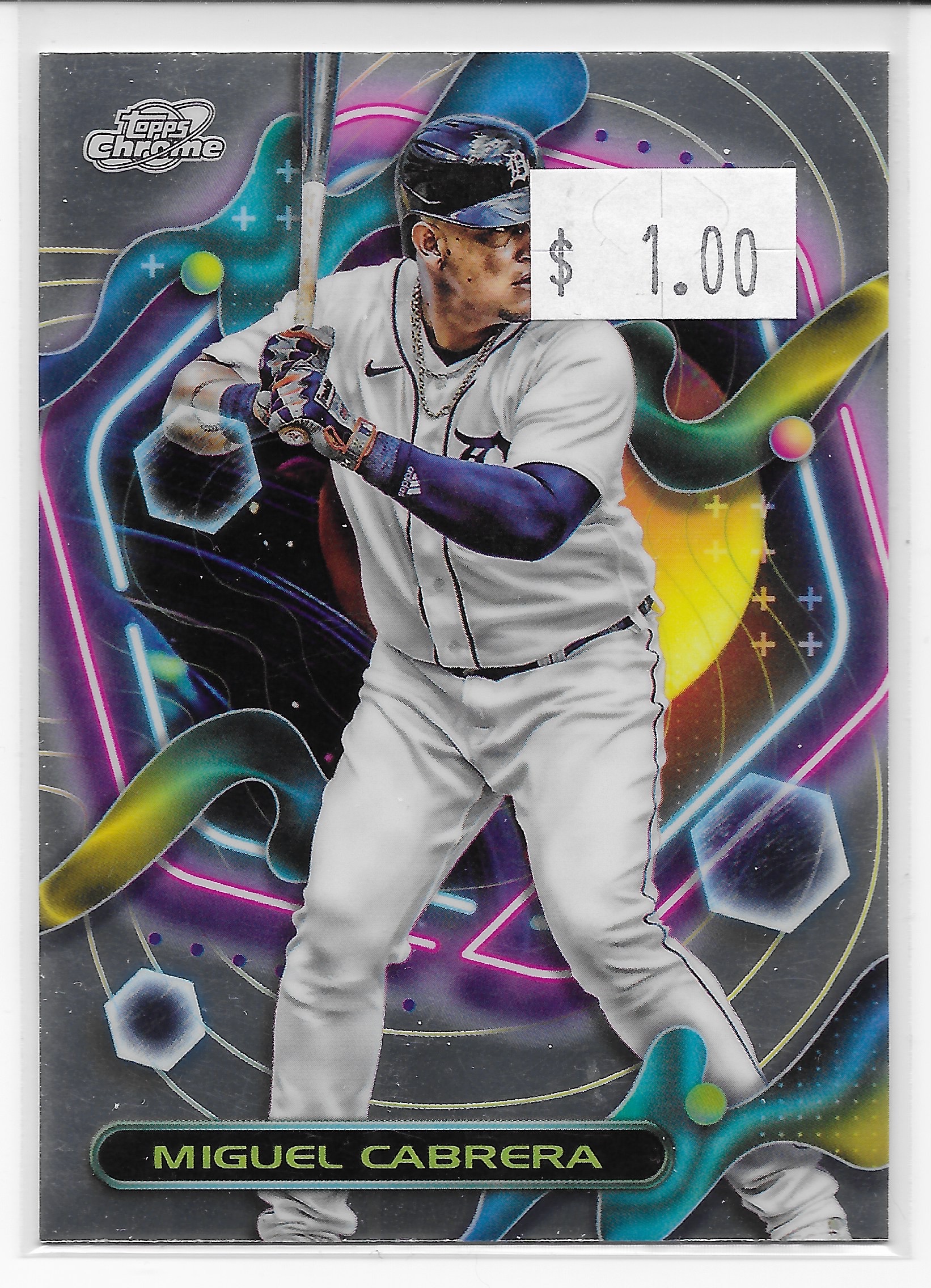
Why I selected it: I have always wanted a Topps Cosmic Chrome card that I could hold in my actual hand, instead of just seeing them on a computer screen. Would all those colorful interstellar takes on Oooohhhh, Shiny make me feel like I am visiting outer space, too? Only one way to find out. And, if I am going to own exactly one Cosmic Chrome Baseball Card, which seems likely, well then I want it to be a Miguel Cabrera card. It's not like I am ever going to spend $5 per card, in-pack, particularly when the whole pack is later going to end up priced as you see above, or, even cheaper.

Biggest surprise found about Cosmic Chrome cards? They have stats on the back. Begs a certain question though: Why?

Why I selected it: I once started a collection of Xfractors. You shouldn't be surprised that that is a 2013 related effort, for the Xfractors in 2013 Topps Chrome. On those cards, the pattern zooms itself in and out, like you are heading towards the Abyss but then can easily skip a visit there by simply tilting the Baseball Card in the opposite direction. 

On these Stadium Club Chrome cards, the whole idea is just, stupid. The pattern just sits there, little different from how that scan looks. The point of Stadium Club is, supposedly, to enjoy the best of Baseball photography. Obliterating that photography in a superfluous parallel pattern like this, or making Chrome cards of epic photographs in the first place — all that obviates the whole supposed point of the whole product. So, another product, Not For Me. This one hasn't survived the Fanatics chopping block, at least for the short time being. Certain products may just become "semi" annual and I would guess Stadium Club Chrome will be one of those.

But I do collect Detroit Stars cards, and the only way I could remember that one could be found on this Casey Mize card, and nowhere else, was to buy this copy so I could later get a more intelligible copy of the boring old "base" card. So, I just picked up this device that can summon any object to me at any time, and summoned that card, or, at least, to my next shipment of wonderful Baseball Cards, whenever that may be.

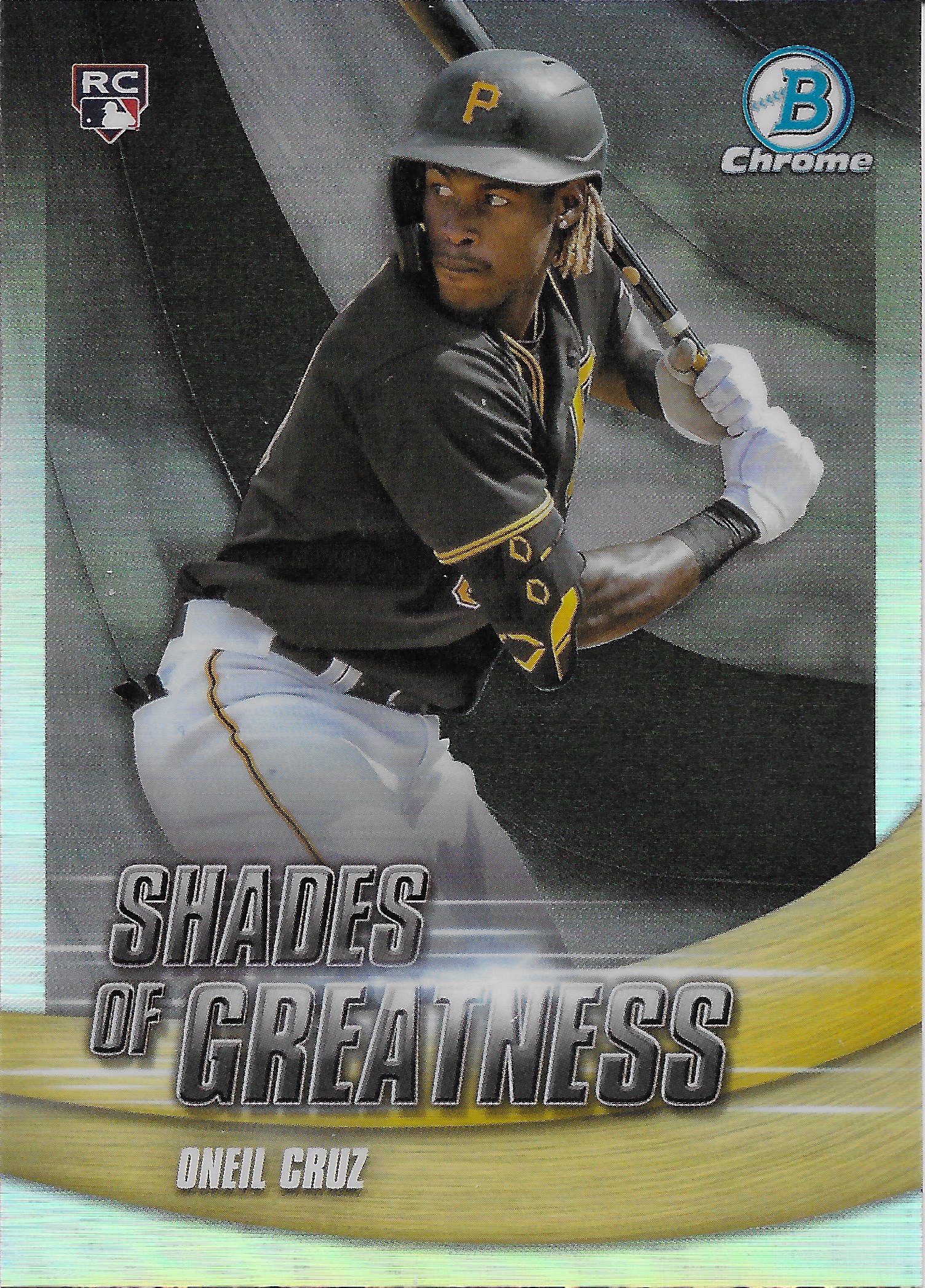
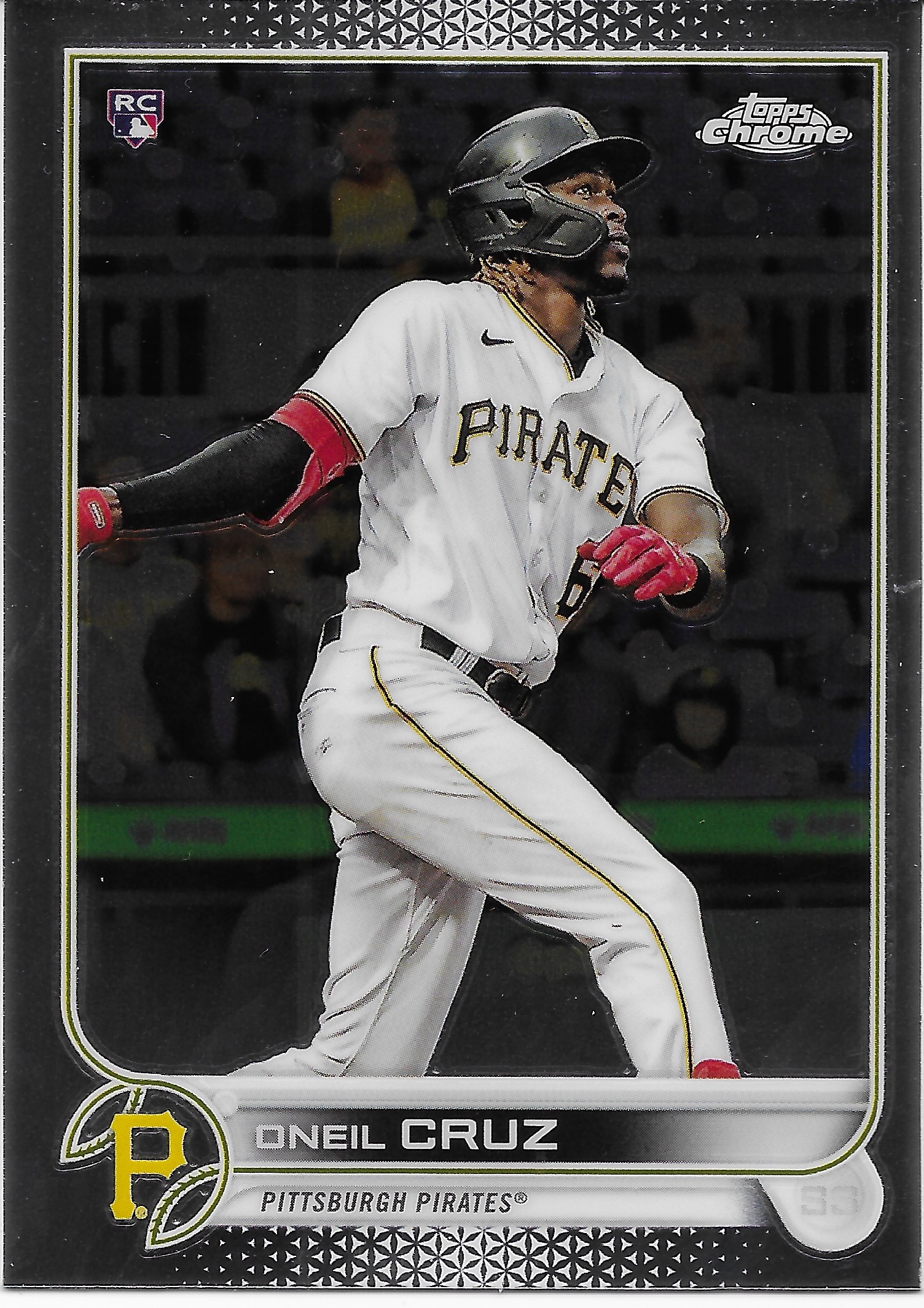
Why I selected it: When I was going through the $ Box, I simply pulled every Oneil Cruz card I came across. Since at the time he was injured after a Rookie Year that revealed he was, gasp, only Very Good, rather than already receiving Hall of Fame votes, there were a lot of them. 

Do I really want what are usually labelled not "Rookie Card" cards, despite the official logo, but rather "Rookie Year" cards? By the endlessly argued "Rules" that no one has ever seen written down, RC-logo inserts don't count as Rookie Card cards because they are just, inserts. Of course if the player on the Rookie Year insert is named "Shohei" you will still have to pay $10 (or more) for it, even though otherwise no one really wants Rookie Year inserts, "they" say. 

On that Oneil Cruz card I do like the elbow pad with some sort of Pirates team motif graphics, so that will be a possibly interesting detail tidbit on other Pirates cards. Otherwise, I don't usually want Rookie Year inserts, either, and probably should have edited my little stack of cards that day. Checklists of such cards routinely look basically pretty dumb, starting just a few years later.

But for everyone else, when the RC Logo appears in a pack, even on an insert, everyone gets to go home a "winner" with that feeling they "got something" from their lottery ticket.

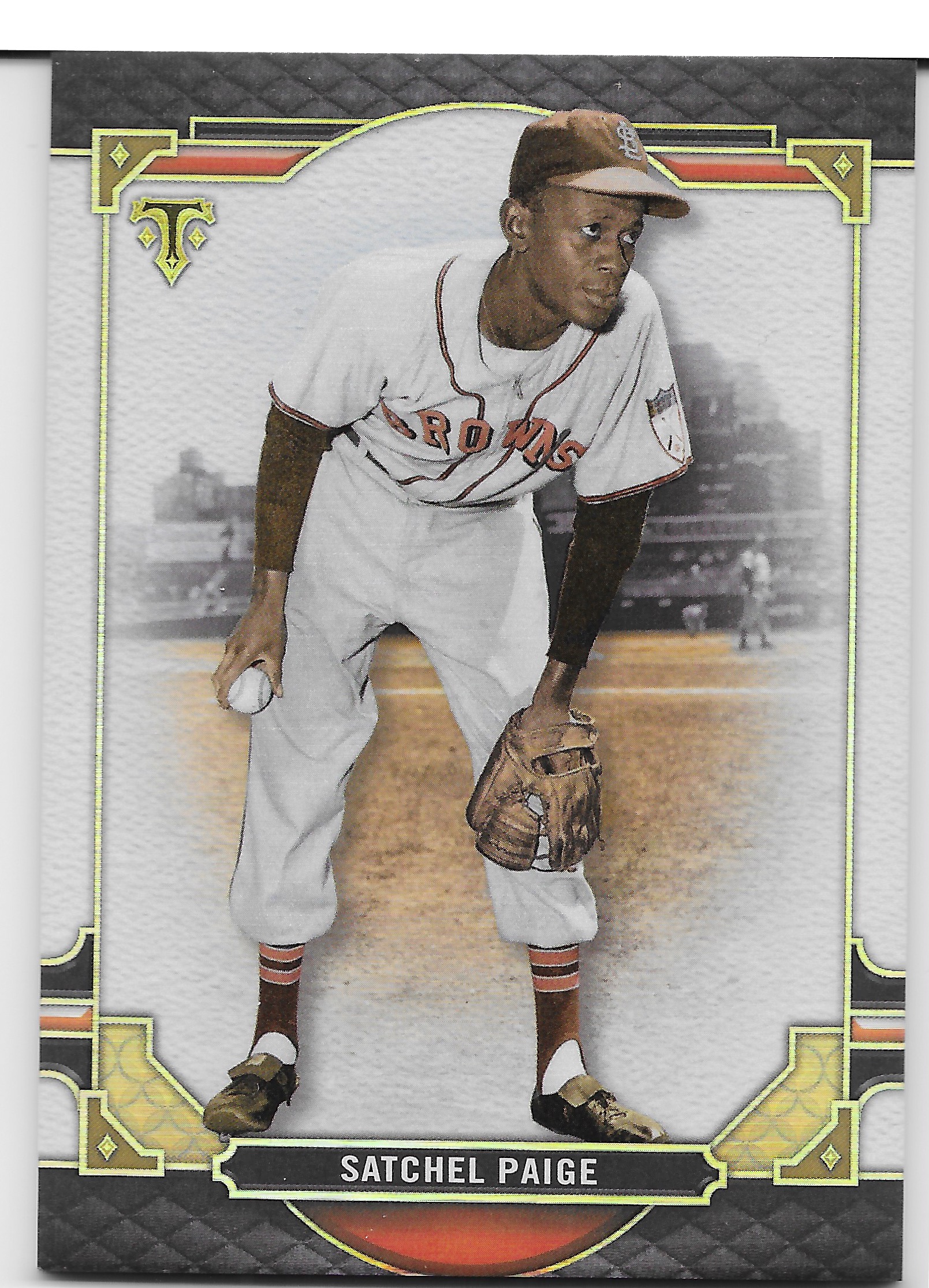
Why I selected it: I collect Satchel Paige cards. I have a feeling he will be a player where I will end up with 9 different cards, all using the same picture, a future post series here, someday.

With this card, I'm not positive what set it comes from. It is an extra-thick card, but there is no indication it is not a base card in the source product. The "T" on the front makes me think it is from Topps "Tribute" but I can't remember for sure if that is a Topps product. I think so?

The card-back text leads with "Triple Take" so I will thus presume this is a card from Triple Threads. A collection of these would look nice enough I guess, but I have to wonder if anyone really cares about a set of Triple Threads cards, rather than all the "hits" in Triple Threads for which base cards have to be assembled, just, because. Eyeroll please, Satchel.

Why I selected it: At the time, I thought I might collect this small checklist of the "Legends of the Game" from 2010 Topps Baseball. But over time I have come to quite dislike this design with all the pointless darkness to it. I will keep this card until I find another one with this picture of Jackie Robinson on it, which probably won't take too long. Quite an unusual backdrop; I again suspect this may be at the Polo Grounds.

Why I selected it: Seems like a nice standard addition to a collection of Oneil Cruz Rookie Card cards. I probably snagged it on the "just-in-case" chance this has a different image than his card in the non-Chrome Topps Baseball set in 2022 (couldn't recall). Also have no clue if this is regular Topps Chrome, or if it might be "Sonic" Chrome. I don't think anyone can hear regular Chrome, but Sonic is supposed to make some sort of noise, somehow. This card is rather quiet.

Otherwise I find "base" Chrome cards to be a fair bit less enticing than their regular cardboard cousins. Despite the Oooohhhh, Shiny, I want more to "Ooohh" over than just, silver.

Why I selected it: I like these inserts. This was their 2nd appearance in Gallery, in 2022, the last year (for now?) it was issued. Year one of "Next Wave" was a fair bit less visually appealing. I could see assembling some pleasing additional copies of year two. If I don't, then this one will look nice on a page of Powder Blue inserts.... 

Why I selected it: ...same as above, except I already have a set of these die-cuts, just recently completed. But if I have a page of Powder Blue inserts then it surely needs a die-cut representative. Particularly now that by scanning it, I can see how much Topps leaned into the Powder Blue on this card, even 11 years ago, when only one team in MLB was regularly wearing the Powder Blues. Topps, couldn't wait for more, it appears.

Why I selected it: I've been waiting to get this one into the scanner, to see how it turns out. This stack of cards probably got a little mixed with 10-months-ago and 1-month-ago purchases as this one was definitely from last winter. These are extra thick cards, the first clue they aren't just useless, regular base cards. They are also Gold bordered, another clue they aren't just useless, regular base cards, though they are not serial #'d like pretty much all other Gold cards are.

The final clue that this isn't just a useless, regular base card is the printing of the "facsimile" signature, which is done in dramatic shiny Gold ink. And that's why I bought it.

I found it very surprising that Topps would still take an interest in producing a card with a facsimile signature on the front; something I can't recall them otherwise doing in the 21st Century outside of just one set, 2007 Topps Baseball, except for when they are faithfully re-issuing an older design that included them. Probably there are more examples in the Bowman product line.

But at this point, the concept of autographed Baseball Cards is so here, there, and everywhere that when you type something like "2005 Topps Baseball" into a Google Images Search, the top results will all be of cards autographed "in person" by a player. And there are uncountable thousands of Baseball Card collectors who ONLY collect autographed cards, one at a time. Every single person who plays Major League Baseball has an actual autographed card, or hundreds of different ones, that can be collected now. The only "real" Baseball Cards are the autographed ones, "The Hobby" routinely seems to want to say.

That all makes the old-timey tradition of a not-real autograph just look rather quaint on a brand new 21st Century Baseball Card. And to include them but also to then blow it up via special gold-ink printing — Topps, err, Bowman, is darn proud of these "signatures."

So, I decided to collect some of these dramatic fake Gold signatures. They look cool on a Baseball Card. Even when they are essentially a useless regular insert card of a by now long since failed Prospect (exception: Pomeranz had a solid MLB career) wearing a fake uniform.

Why I selected it: Ya gotta remember, this was purchased back in the offseason before the 2024 season, when the glimmer of hope around Torkelson was actually glimmering, a little. Even though my LCS had dumped all his Rookie Card cards into their Dollar Box already. So this one went straight into my pile of 91¢ acquisitions as soon as I saw it. 

At least, it will help make progress on the HICKORY collection.

Bonus Round
Why I selected it: This is an unusual card in that it begs a question: What is Tyler Stephenson doing here? Is he racing back to the dugout?

I initially was intrigued by this being a Night Card, on the 1986 Topps design, which looks like Night on the top. A little subset collection of that concept would look purdy neat, I thought. And, it still might. I am a long ways from making final decisions on what to do with 2021 Topps Baseball cards. I think there should be 150 different 1986 design cards issued with it, as well as another 100 or 150 Chrome/Mojo cards, generally with a different image, I believe, though I haven't tested that proposition. So there might be 9 2021-1986 Night Cards to be collected, dunno.

This is also Stephenson's 2nd Rookie Card card to feature him blowing a bubble, while he is playing Baseball. That makes this card a Bubble Gum, In Action card, and those are my favorite kinds of Bubble Gum cards. This one might not count as a Rookie Card card, because remember, insert cards don't "count" as Rookie Card cards, nevermind what the RC logo is doing on the card. There are Rules about this stuff. This is a Rookie Year insert, and don't you forget it.

Stephenson's regular Rookie Card card in 2021 Topps Baseball does at least solve the riddle of what is happening on this odd card, as the image was clearly taken immediately after this one; on that card Stephenson is looking up to begin fielding a pop-up. So, someday, this card could end up in a few different odd corners of my collection. We'll see.

Double Bonus Round
Why I selected it: Because, surprise. I was kinda taken aback to see players who -might- become players for my favorite team, already Photoshopped onto my favorite team. I mean, that's stuff that only happens with the real Major League teams, the ones that play in the East or West divisions. Everybody knows the teams in the Central divisions are just Farm Teams now, and they don't need their prospects Photoshopped into their uniforms because their prospects will all eventually fail. But if they don't, they won't retire from a team in a Central Division, either, so no one wants to see them in fake Photoshopped uniforms like these, later on.

So once a Detroit Tiger(s) was (were) selected to be on a prestigious Bowman Chrome Prospects fake MLB uniform card, I had to hop right aboard this particular bandwagon.

Triple Bonus Round
Why I selected it: Well because I like these Topps Chrome Prisms. Having a yellow outfield wall stripe on one might be kinda neat. Might not. At least the classic "mb" ball-in-glove logo is in full color, unlike some other teams on the always more increasingly boring 2022 Topps Baseball design. Though I appreciate elegance in Baseball Card design, 2022 was just a bit lacking in....something. 

Anyhow I grab Prisms when I see them, even when I'm not sure if I need my requisite one, just one, copy of one of them from a given year. I really need to make a little list of which years I still need Prisms, Pinks, and Sapphires for, from both the vertical and horizontal divisions, before I go delightfully jumping into the $ and 50¢ boxes down at the LCS. So, I guess I'd better get goin, and get some more homework done...


Sunday, January 12, 2025

10 Cards from the Dollar Box #12

It's that time, again

Why I selected it: I'm collecting Johnny Evers cards now. Because I have to eventually Man Up and buy the ultimate Johnny Evers card - the t206. Because I have Tinkers, and Chance. So this will help keep the motivation inching forward.

Plus this card makes me wonder - why doesn't Panini do this, like, all the time? & by "this" I mean just print a portrait card, with the design conveniently covering the logo they aren't allowed to print. Works, perfectly.

Why I selected it: I love Baseball Cards with real live Trees on them. But this won't go with the "Trees" collection, which is still sadly quite small. I also collect oneil cruz Baseball Cards. I think I will easily make it to 9 of his cards with the good ole RC logo; scoring this one in the 91¢ box will help. And, odds I would ever purchase a whole "box" of Topps Archives Snapshots Baseball Cards? Zero.


Why I selected it: This is just a great Ichiro card. Babe Ruth "called his shot" and hit a Home Run. Ichiro, he's more like, y'all hold your beers, Ima hittin' a Single right here, right now. When the continually growing Ichiro collection finally gets committed to binder page (s), soon (ish), this is one is "First Team," all the way.

Why I selected it: How many ways do I love this card? Let me count the ways:

It's a Horizontal card.

It's not a Detroit Tigers card, it's a Detroit Stars card.

It's a Foil card.

Foil cards look great, in-scan. Check out those little glowing stars on a Detroit Stars card. Ace.

That's it. 4 ways.

Why I selected it: I collect Wade Boggs cards, sort of. I only collect Wade Boggs, Sad cards. Wade Sad, lotsa sometimes, on Baseball Cards. The "Mojo" pattern makes this whole card look sad and gloomy. Perfect.

Why I selected it: This card is "Fire." See all those little graphical flames on it? That proves this card is "Fire." Further proof is the serial number stamped on it. That means this card is not only "Fire," but is also "Money." 91¢ is "Money." I could probably also easily fool someone into thinking it includes a battle-tested Game-Worn, actual swatch from Omar's compression sleeve there in that big blue rectangle, which otherwise, well, why is that big blue rectangle there, anyway? 

Fortunately, Omar Narvaez, In Action, makes it (kinda? a little? part-way) easy to forget that big blue rectangle, and since I collect Omar Narvaez cards, I needed one that was "Fire," like this one. Panini brings the heat, particularly when they don't even have to lift the airbrush, for a change.

Omar signed a 2025 Minor League deal the other day, so there might could be yet one more Omar Narvaez Baseball Card, in the future.

Why I selected it: Didja notice this Baseball Card doesn't have a "35th Anniversary" stamp on it? That's because this is an actual 1985 Topps Baseball Card, not a re-enactment. They still sell these, sometimes, down at the LCS, if you look long enough.

This card has it all. The mustard melting sorta triangle, the Swingin' Friar, and most importantly, how could you collect Sunglasses Cards without this one?

Why I selected it: Hey, look, the Dollar Box finally ran out of 2022 and 2023 Baseball Cards for me. This will be fun. Neon Prisms? Oh, yeah.

Why I selected it: Not a Prism, but almost certainly the 2024 Topps Chrome Pink Horizontal Champion, in my house. Arm Cards are still weird, though.

Why I selected it: I'm still waiting for an officially checklist announced "Powder Blue Parallel." Or at least a nice run of inserts with such a title. What's taking so long? The Topps Eye clearly loves the Powder Blue. At least in 2024, there is Neon Powder Blue striping, which is real cool time.

This is a "Royal Blue" parallel, sometimes called a Royal Blue "retail" parallel, because it doesn't appear in the Hobby Boxes for the rich kids. Just the cards sold at the Big Box stores for us regular, every day collectors continually funneling our money into the system.

So this one might become the Blue Jays 2024 Topps Baseball delegate to the Powder Blue Collection. Because I like Powder Blue Catcher gear in particular, and "Royal" blue = classy, particularly on The Neon. Although I am not fat, I like it that Baseball Players are allowed to be.

Bonus Round
Why I selected it: This is a "Bubble Gum, In Action" Baseball Card. And those are cool. I'm going to throw you out - while I'm blowing a Bubble. That's how slow you run, slugger.

It is only kinda-sorta apparent in the scan, but this is the 2024 Topps Chrome card for Trea Turner. So for the Bubble Gum, In Action collection, I might as well Oooohhh, Shiny it, when I can.

Why I selected it: Probably because of a whole other card, one I have already posted:
At the simplest level, I like Horizontal "Sliding" cards quite a bit. But when I came across the 2024 Chrome Verdugo, I was simply perplexed by Topps just randomly using a different image for the Chrome, as compared to the "base." 

Why doesn't Topps do this in all the various Topps Baseball styled sets, routinely?