Friday, February 7, 2020

It was hard, and I largely failed

Baseball carding in the 21st century is sometimes a little challenging for me. One key thing I truly desire from baseball cards is to not know what the new ones look like, -before- I open the pack.

But I can't resist wandering the internet, gobbling up baseball information and baseball card stuff, too.

I have learned how to mostly avoid seeing the new design in the four months or so that it is publicly available as an image, before it is available as a card one can hold in your hand. But you never know where you might stumble across it, accidentally.

This year, the most damage was done while I was trying to read some salacious new details on the Astros cheating scandal, a whole week after the main announcement of the penalties by MLB. More specifically, I was considering the beyond-the-banging charges that Altuve and Bregman had worn buzzers for pitch information. Amidst all that chatter, someone had posted a newly made, digital-only 'custom' of Bregman wearing-a-wire, as it were, in the design of the brand new Topps 2020 Series One baseball cards.

So my first, deepest glance at these cards was - on a fake card!

How will I fail at this simple small dream next? I still can't get over how one recent year, what wrecked this basic baseball card aspiration was the classic baseball card catalog from Fritsch cards of all places.

Ahh well. Finally on Friday of release week, a full week after I almost saw some posted card images from one of the earliest retail 'finds' (I had fingers over my eyes, just in case) - the new baseball cards arrived in my little ole home town:

My first thought on my First Card was: hmmm, maybe I have another MLB look-alike doppelgänger following me around along with Ian Kennedy.

2nd thought: that big-ole frown.

3rd thought: Grey? That much grey?

4th thought: Red socks. I like those.

5th thought: Blue? Those tiny bits of blue are accomplishing what, exactly?

6th thought: OK, so I am pretty sure this guy is a Pitcher. He is Pitching, after all. But, ya never know, the amount of, ummm, 'other' players being called in to pitch here in the Rubber Ball Era of Major League Baseball is said to be trending upward steadily. And I really like those cards of a non-Pitcher now Pitching; I recently finished a small collecting project of those to share with y'all some day. But I do still really really want that Willians Astudillo "Pitching" SP from last year. So I had better check the card carefully to see what this baseball player's true position really is. I'm looking and I'm looking, and finally I notice the tiniest element of the whole design - a diminutive capital letter "P" there just before the all-caps team name in white letters. But the official positional designation is made with yet more of that grey color that makes it fairly well disappear on this 'red team' card.

7th thought: Lines, lines, everywhere lines, overlaying the scenery, tricking my mind. Sometimes, those will be good, I suspect. Other times, they will be busy.

Sum of all thoughts: this card doesn't quite make me want to own 999 others almost just quite like it. I am contemplating moving to one of those "tiny houses" that everyone on the Internet thinks are so cute - an extensive library of a few score thousand baseball cards won't be making the cut if I do that. But, it's a Topps Baseball card. Anything can happen, to me, with these. Particularly since, for most of my life, Yeah, I Read the Backs:


There's all those lines again, and all those rhombusessses? No, not quite. A rhombus is something precise. These are just parallelograms. At first my Topps design memory was whispering "2014 File Folder Set" but that's not really apropos, either. I am sure all those little shapes scattered around the player name bar are parallelograms. The Parallelogram Set. In my mind, at least.

Wouldna noticed, with the vertical player name bar on the front. But on the back, yup, Parallelograms.

Unfortunately of course on this card, there is nothing to read. I do like pulling a League Leader In Italics card, usually. But a Pitcher does absolutely not want to Lead his League in Runs.

The back of the card once again has some blue to the design, for a 'red' team, but is in even tinier, why? type amounts. Then the MLB LogoMan appears to tease you with some nice colors and a oh-what-might-have-been thought.

Meanwhile, the overall Greyness dominates, with a vengeance. Even worse, there is a shading to all that greyness, getting darker and darker towards the bottom of the card, for the stats you most want to read - last year's stats, and the career totals. That, I can do without.

Not just Parallelograms. The Grey Parallelograms. Blah.

So much for the First Card. It's way past time to check out the 2nd card:
Another Pitcher Pitching, but when a Cy Young award winner jumps out of the baseball card frame atchya on a nice sunny day like this, you start to think, ahhh, baseball cards. This card, by the way, is #332, so I guess "Hero" #s will be basically scarce in these cards.

Though it is nice to see the Metropolitans' orange show up - this will definitely be a team colors affair. A proper, two team colors affair:
I can tell now that it is time to fully explore a perpetual Topps Baseball card design element - which team icon/graphics do they actually pick to be the main icon/graphic on the baseball card? A future post.

I always like a good Sunglasses card. For some reason, the main red parallelogram after the name bar seems bigger than the blue one on the first two cards. Tricky little parallelograms, sneaking around these cards.
Allll right, alternate uniform to the rescue! A rarely seen, quadruple team logo card, thanks to Archer's T-shirt there. You won't soon forget which team Chris Archer plays for now. I also like how the blurred out bit of stadium architecture there in the background is starting to interact with the card design.

Sometimes, I think Topps really tries to use as many photos featuring players in their solid color "Alternate" uniforms as they can. It would totally fascinate me to count up how many Alternates vs. normal Home/Road uni pictures they use, across a whole set, and in comparison to other sets. I suspect that the more Alternates are used on cards, the more fond the memories collectors have of a given set.

This Archer card has an impressive card back in that the Topps composers didn't run away from saying something nice about a 2018 trade that was so bad, the Pirates front office was replaced afterwards. This card does have a text, one that starts out "The Pirates are optimistic..." Which is how I always am, whenever I am opening a pack of Topps Baseball cards:
Though baseball players busy playing live baseball rarely look all that optimistic. Maybe Jose is worried that his team is so far behind, again, that he is going to have to take to the mound once again, after this At Bat. Which is something I learned about from reading the back of his card. But I like how Jose is trying to take a little bit of the load off by resting his elbow on that convenient Grey Parallelogram there, and the way the probable Throwback uniform here gives Topps a signal on how to pick a second team color for a team that otherwise only uses white, after the color in their name.

One team that has been going through some icon changes appears on this next card:
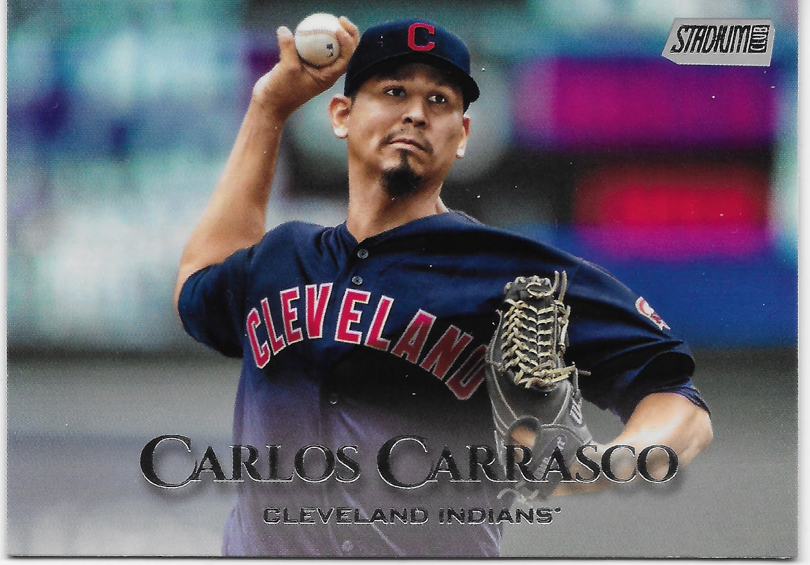
Every New Year that I pull a new Cleveland card, the appearance of that block red "C" there re-assures me that the Chief Wahoo icon really is gone from baseball. I live and routinely work near several Native American communities, and I wouldn't be stopping over to the casino for a beer and a burger and maybe a baseball game on the big TV with anyone wearing certain Cleveland gear.

This card seemed very familiar to me...it seemed like I saw it right around this time, last year....I pulled it in my first pack last year, too, as I did for Jacob DeGrom. That worked out pretty well, for both of them.

This particular Grey Parallelogram card though, is the first to feature a road grey uniform, and the dearth of color is telling, even with a pleasingly faded color background that is a touch hard to imagine in an MLB stadium. Oh well, on this card I did learn a new, totally useless fact: Cleveland puts the player's uniform #s on their belts. The more you know...
One thing I didn't know, as I opened this pack this afternoon, is whatever happened to Billy Hamilton lately. I was kind of looking forward to seeing him tear up the playoff basepaths last October, before St. Louis so completely demolished his latest team. 

I think all baseball fans kind of secretly root for Billy Hamilton in this age of the "the data says..." So I wasn't totally surprised to see this brand new Atlanta Braves card for Billy. Except this isn't a brand new card, at all - it is the same card as pretty much the last Topps Baseball card set to be released before this one, the Topps Holiday set, which uses this exact same image. I know image re-use is inevitable amongst the 59 different sets Topps sells every year, but two in a row...

The bigger bummer of that card is the white "A" there for the Atlanta team logo. A terrible choice to use with the Grey Parallelograms, even if it that is technically their main, on-cap logo these days. The problem is when that white logo is removed from the blue field on their caps, as on this design. Blech.

The up-side, good news of this card is a little bit of pack opening mojo for Billy. Your faithful baseball card cranky pants wouldn't leave you hanging, wondering whatever happened to Billy Hamilton, now would I? Turns out, in between me opening this pack and starting to babble about the contents here a few hours later, the Giants announced they signed our favorite next-U.L. Washington (four years to go, Billy, you can make it) to a 'minor league deal' at least. With some thought that with 26 Man rosters this year but new rules on using too many LOOGYs on the mound, this might give an exciting late innings speedster replacement a little better chance to make it onto a few more Topps Baseball cards. See you in Update, Billy.

Now we have another Alternate uni to the rescue. With some green, green grass of the baseball diamond, some blurred out yellow advertising, and that cool red glove you finally notice, all that grey design stuff is totally forgotten. And I am starting to like how these cards run head-to-toe, more often than not, like this one:
Boo-Yah! Now we're cooking with gas! The grey team appears on the grey cards, wearing their road greys even, but still: we have a winner! How many days till Pitchers and Catchers report? I'm ready. 

For a new kind of card in this pack? Yep -
It's time to go horizontal, and start the pondering all over again.

1st thought: less Grey! Even with a road grey uni on the card.

2nd thought: I knew those parallelograms would start complementing the image elements eventually.

3rd thought: check out my nifty shoes - no Swoosh - and an extra touch of that weird, we-miss-water-in-the-desert-vibe I get from that weird, aqueous vibe to the uni # on Arizona road unis these days (well, most days; other days, their road unis have black #s, so weird). 

But yeah, a horizontal card the way they are supposed to be - a complete baseball player, inside a baseball stadium, playing baseball, not just another baseball player torso with no baseball context. Nice.

Horizontal cards always appear together in packs, probably because they appear together on the printing sheets. Can Topps keep this nice-ness together? Let's shuffle the pack along:
Double Boo Yah! Grey? Snoozer design? What? This card leads the eye up to the fly ball in the sky so well it is a little jolting to see the baseball has already arrived. Things happen fast on Topps Baseball cards sometimes.

Plus, Bullpen Prisoners! And - new Milwaukee logo, have been looking forward to seeing that on the cards. But, major-minor demerit for Topps feeling the need to spell M-i-l-w-a-u-k-e-e.... and the team name, like any baseball fan would otherwise not understand the classic m, b, ball-in-glove Brewers logo that no one has ever disliked. I mean, they didn't write B-o-s-t-o-n around those Red socks on that Cashner card now, did they? So close, Topps, so close.

Third time's another charm on the horizontals?
As usual, one can count on the Pirates to supply us with good baseball cards, at least. I do hope Cherington can right that ship, for a fan base that really deserves more. An ironic thought right here, gazing on a card for yet another very good baseball player that had to be traded away in the interests of trying to re-re-build, yet again, all over again.

Be that as it may I mostly like another pretty good Starling Marte baseball card with those great batting gloves and strong image lines every which way. All those flying digital dust pixels are even better in the scan than on the card though, I must admit. The down-side bad news of this card is that in the past, we probably could have had a good time checking out the sartorial choices of major league baseball fans, circa 2019. Sigh.

OK, quick now - it's the year 2025. You are pawing through a box of nickel cards at a baseball card show. Why is the following card in that nickel box?
Is it because Marco Gonzales has matured into being not just the Mariners "Ace" (as declared on the back of this card?) but a League Leading perennial All-Star hurler?

Could be, could be; this blog can cheer for the Mariners fans just as much as it can cheer for the Pirates fans.

Or is it in the nickel box because every card from this long-time Topps special card creation is always worth keeping separate from the regular base cards, as it is a Topps Gold card, #1088/2020 in this case.

As a member of the classic Gold lineage, I am underwhelmed. As a better looking card than all that grey space we have been staring at, oh, yes. Some collectors do annually complete a Topps Gold set. Although these cards might not be as classic as many such efforts, such a set could also quite well look better with this gold half-frame than without. Though I don't see myself truly going for a complete set this year, there are many portions of this set I will be completing. I am starting to think about just doing that with the Gold cards this year, perhaps.

This card had one other down-side unrelated to it's "gold"-ness, or the card in general. I figured to pull one parallel or insert in this pack. So when I reached this card, I figured checking out my first 2020 insert would have to wait. Such was not the case:
Money. Your American League Rookie of the Year on his special new retail-only "Turkey Red" insert, not available to all those fancy case breakers ripping open a million Topps Baseball cards the other day down in Texas. Only to us marks who collect Topps Baseball cards by buying them at the grocery store like a bunch of kids or something. One of _the_ chase players in this set, for the $ obsessed collectors.

I don't have a particular opinion on Turkey Red cards. I already chase way too many sets so though I was around for the last year or two of the Turkey Red stand-alone Topps product, I didn't add it to an already busy menu. I like the fine detail of the shading of the faux recessed frame for the card, being in shadow on one half and lit up on the other.

But this card will soon be on it's way to the great warehouse cemetery of old baseball cards, also known as COMC. I was so moderately pleased to probably almost pay for the cost of this pack of cards that I forgot all about which team Yordan Alvarez plays for, though the Turkey Red design doesn't exactly make a big deal about that, either. I could not forget all that on the next card in the pack:
I have never liked this player and don't really want his cards in my pack, even though I like base-running cards, or a 'candid' card, or whatever the heck is happening on this card. I used to like seeing what the Astros did with their love of 70s color, color, color on their uniforms, too. Now though, all that is an asterisk.

Moving on, we reach the last card in the pack:
No, that's not some hard-to-discern new stealth parallel like Snow Camo or something, that is just how the Grey Parallelogram interacts with a Night Card. And no, that is not some Bowman Draft-esque photoshop of a player in a new team's uniform; Baez is an international signing for the Padres who has stayed in their organization for his complete career so far, and already debuted in MLB in the 2019 season. So that is an authentic live action MLB photograph; it's just that after Topps has used so many road greys to cover their Photoshop sins, sometimes, a road grey uni on a card just looks fishy. 

But this year, with a road grey uni and an overall base grey card design and then a bleached out white team logo, some of these cards just aren't gonna make it, for me, and one of my ever more precious binder page slots. Even an attempt to use the classic Padres mustard&brown for the team colors can't save this one.

So there you have it, my first 16 2020s. Seems like a pack has a different # of cards in it every year now; I think my First Pack last year had 14 cards in it. Over the years it wasn't always easy for me to buy just one pack of cards to absorb the coming year of collecting Topps Baseball; it has only been recently that Wal•Marts where I live have begun putting out loose packs to purchase at all. Before that happened, I would have to detour quite some distance to find a Target to buy one of those.

But now, I have a Meijer's store in my home town, and they picked up the classic Topps retail exclusive product from Toys R Us: the purple parallel. So to buy just one pack, I purchase a blister pack that has 2 purple cards included. Let's take a look:
I quite like these. I look forward to seeing what a Tigers card might look like on this parallel. As always on modern Topps cards, a solid color Alternate uni does more for the card than whatever Topps does for the card. I was also happy to find a card with the parallelograms on the right side of the card. I knew they existed, but I didn't pull any in my first pack. Seeing the design elements move from side to side in a stack of cards will be a nice aid to enjoying this set.
Another happy baseball card result. Right up there with the Garcia card in triumphant baseball carding. I always like a nice bright sunny day card, and I can't recall any hovering Catcher's masks on cards in my collection, though I wouldn't be surprised to find an older one.

I especially like a certain star of this particular card: the live action baseball there at the bottom.

In past years, some of the prettiest purples were created by the nifty combination with the teal that is the Mariners' second team color. This year, ehh, not so much, as there is so little teal to start with.

What I like most about these two parallels is the old standby about baseball, which also applies to baseball cards: "There's always next year." As with the 1/2 border 2019 cards, and now a 1/4 border design, they hold a bit of promise that a nice clean full border design will return to Topps Baseball, some day.







Tuesday, February 4, 2020

'twas a couple three nights before New Years

When I run into an old friend in the middle of July, I always like to say to them: "Happy New Year!"

Some of them are a little perplexed, but I only say that to a person I haven't seen yet that calendar year. And I don't really bust that phrase out until later in the year, even though we are a month gone from 2020 already.

Well, for most people, anyway. For baseball card collectors, 2020 starts, well, sometime this week. All depends on what day the work schedule and a truck of some sort all synchronize their efforts to put a brand new pack of Topps baseball cards in their eager hands.

But for baseball card bloggers, this all means the clock is ticking to make some final selections of favorite cards from the previous year...tick...tick....tock! Here ya go:

Best Card for This Time of Year


Not a lot of "Snow Cards" ever get made. That is a good thing. I have always liked Aroldis Chapman cards. I think, though, that if I pulled a vertical Aroldis Chapman card, it wouldn't quite register that I had a new Aroldis Chapman card until I got back to pulling a nice sensible horizontal card for him.

Best (only?) Pop-Up Card


Not a lot of these cards get made, either. I'm not sure if that is a good thing, cuz I always like them.

Card that makes me most want to pull his 2020 Card

This card is oddly endearing to me. I mean, Chris Davis has to get a baseball card after all. This card has two things going for it. Topps sensibly makes a Fielding Card for the most famous Not-Slugger in the game these days. Also, he has so many years of stats that they don't have to write up some text on the back. You can almost hear the sigh of relief from deep in the Topps baseball card mines when the copy/paste of Full Stats squeezed off all the empty space on the back of the card during construction of this one. I _think_ Davis is signed for at least another year. The answer, and his 2019 stats that I am kinda curious about, are just a few clicks away, whenever I wish — but I would just rather pull his 2020 Topps baseball card and get the answers that way.

Favorite Fielding Card

In the 21st Century, there are so many good Fielding Cards every year, I should probably find a whole bunch of the best ones and show them all together. About the best I can actually do with such a dream, is to just pay more attention to the horizontals and see what happens (seems to be a theme for me in 2019 so far). I always like a definitive Fielding Card, like this one: that batter is Out.

Best Glove Webbing Card
Wait. What? They make Glove Webbing Cards, too? I guess so. I don't think I have ever had a card where the webbing of the glove jumps out at me like this one does. Now if I could only figure out which Pitchers hold their glove up and which hold their glove down, and Why?, well, Life is full of mysteries, and, well with baseball cards, you like what you like.

2nd Best Glove Webbing Card
This card has a couple things I like. No, I don't really watch for Glove Webbing cards. But I like to see team logos in weird places on All Star Game cards, which otherwise kinda put me to sleep any more. This is the only such 2019 card I can recall featuring one of the Warm-Up jerseys. Too many of those on the Update "ASG" cards, well, that's not good, either. And there might be more than one such 2019 card. But I will probably never know, because completing an Update set any more is so much an exercise in Why, Topps, Why?

Why I like that particular card though? The great big smile on Marcus Stroman's face there. Never enough of those on baseball cards.
Best Historical Card

I have never pulled a Branch Rickey card before. I looked it up and a few do exist. I'm glad to have one.

Best Tribute Card No One Noticed

Cards with photos from this special day in MLB used to be a special issue from Topps some years. I recently completed a collecting effort of those that I will share with you on the just exactly perfect day. The Topps effort on those, well, let's just say their batting average on them wasn't the greatest. Now that I have seen this card, I might start watching Uni #s on new Topps cards a little more closely.
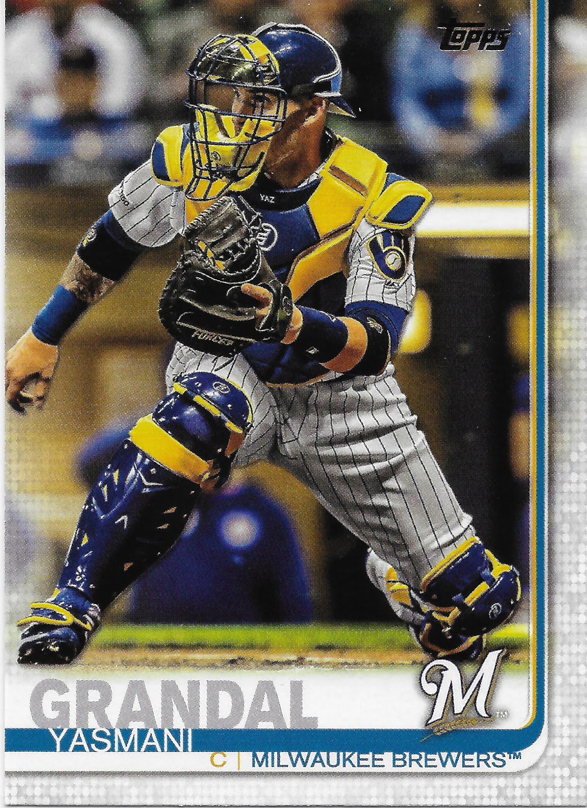
Best Transformers Card
Also makes a good preview for 2020 Topps Milwaukee Brewers cards - these will look better than ever given the demise of the exciting use of a stalk of grain in a baseball team logo. As long as Topps remembers to make colorful baseball cards with a colorful team logo on it, like this one. Shhh, don't tell me how that turns out. Still 2-3 days till New Year's Day. Hopefully not 4 whole days.

Best Card for 8 Year Olds
Who'd ya get? Who'd ya get? I got Johnny Lasagna!

Loaisiga made a few Topps Checklists this year. I hope he makes many more, for the sake of the 8 year olds among us. He didn't make quite as many Checklists as this next card...

Player That Followed Me Around Way Too Much
You never forget your First Card. Chance Adams was the First Card I pulled from a pack of 2019 Topps Baseball cards a few days over a year ago now. I then proceeded to pull his card in pretty much every set Topps created this year, including via a rather choice checklist spot in Gallery. This is kind of a preview scan for me, to see how these would appear while scanned still in a penny sleeve. I bought just one pack of Bowman (my first ever, I think, since maybe, oh, 1991 or so), and there he was; but fortunately there was also a Wander Franco card I got twenty bucks for, so perhaps my First Card was well named this year. 
When Topps likes certain Rookies, they really like certain Rookies. If you are a nascent Chance Adams Player Collector, you already have 443 cards to pick from on COMC as I type tonight. How are things working out for my First Card and one of Topps' anointed ones? Adams only appeared in 13 games for the Yankees before he now has one of the stranger official Transactions listings: "Traded by the New York Yankees to the Kansas City Royals for unknown compensation."

I do always like to see a player who doesn't make it in New York go on to a good career elsewhere, so I am pulling for you still, First Card.

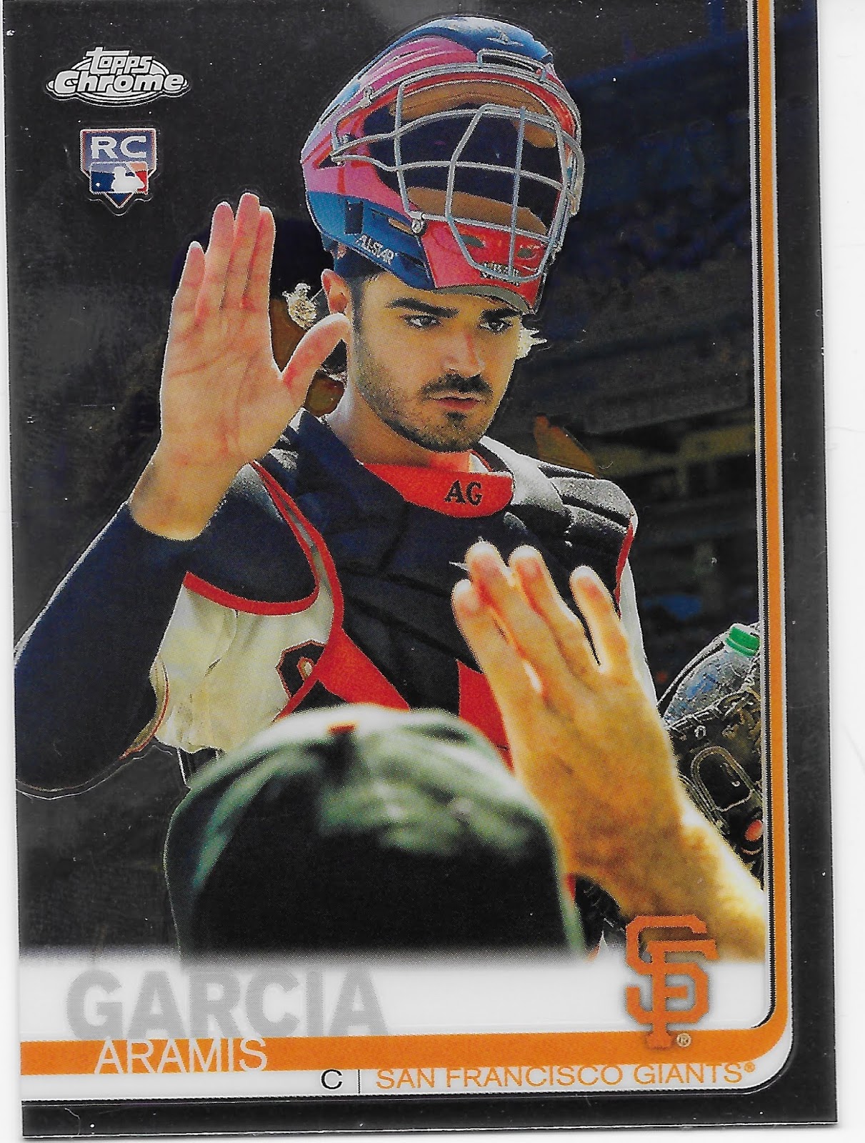
Best Card to Mentally Caption

I can just never decide what Aramis is about to say here. "Live Long, and Prosper" ? No, no, they have the special hand sign all wrong.

"Take Me To Your Leader." Could be, could be.

"Nanoo, nanoo." This pops in my head every time.

Shazbot! I just want to know what he is going to say. I bet you can't wear a Catcher's mask like that.

Best Card Design I Am Not Going To Collect

I think I do understand one big reason this clean, simple design appeals to me: I really miss cards with a white border, for one. And somehow the fake rays of sunshine work for me, too, even though that would clearly be a No Go for an entire set of hundreds of baseball cards. Good ole red, white, & blue on a card always works - so does a star on a card. So I just like this card. I can't quite see how it could be used for a real set of cards (minus that sunshine), but I like this card anyway.

But until the day comes when the Tigers anchor their club with an All-Star Center Fielder or an amazing Dinger Hittin' corner infielder (as not too long ago), and Topps deigns to put that player in a special set of insert cards in every pack of baseball cards sold at some certain store all across America, well, I just don't collect "sets" of cards that feature only one player all the way through. But I still like this card.

Who's On First?


Quick, what is the first name of each player? I am going to kind of miss the White Pages set. And, the Millenials are coming...

I Kind of Hope This Is Not a Sunset Card

It just wouldn't feel like a set of baseball cards without a Fernando Rodney card in it. He did just even win a ring there with Washington a few months back, so hopefully that is worth a nice 2020 Series One checklist spot, since Topps will be printing cards of lots of players who were cut from the team's 2020 card they appear on, the day after the World Series — like Fernando Rodney.

But we are in the 20s now, and Rodney wasn't exactly "lights out" in that World Series, though I am happy he did get to appear in one, and that would be the perfect way to cap such a long career. At press time, Rodney remains unsigned.

It Probably Is a Sunset Card When It Shines On You From 2 Directions

I could have also selected this as my least favorite Tigers card of 2019, though there could be some other contenders; we'll see in a few days I hope. Nice job by the Tigers road laundry crew to get that uniform so nice and extra bright that afternoon. Moore was (probably, there could be some other contenders) the most Hard Luck Tiger in 2019 as he pitched well early in the season, then succumbed to injury. A common tale, for a Pitcher hoping to rebound into a few more MLB years - except Moore didn't injure his arm, he injured a knee while fielding and was out for the rest of the season. Will he return? I dunno. I am not really interested enough to Google around on yet another attempted Tigers reclamation project. Ahh well, everyone wants a perfect sunset card for players on their team, right?

Card With Most Apropos Facial Expression


One would think that for a player with a solid career WAR > 39, Topps could at least pony up for a photo from Spring Training to use in Series 2. Sometimes, 'Sunset' cards are just kind of, sad...

Why, Topps, Why?


Has a player ever had 2 different Sunset Cards before? No one expected Ellsbury to make it back on the field this year. If he did, that would have made for a perfect Update card. Personally, I would have much rather this checklist spot had been used for a true Sunset Card for Ichiro, with his full MLB stats including the farewell At Bats in Tokyo this spring. Alas, no such card was ever made.

This Ellsbury card is making we wonder if Brooklyn has been infiltrated...

Best On-Card Jewelry


Some day, after my team spends November celebrating a triumphant WS winning season, I hope Topps creates a card like this one. The one thing I wonder about this card is that the only card like it that I can remember is a 2014 card for David Ross. Perhaps there are others in the long history of Topps and World Series cards of various kinds. But the only ones I can recall are ones featuring the ring given to the Boston Red Sox.

A Card Type I Saw Too Much Of


I don't know what got into the Topps photo buyer this year. They seemed to just be unable to resist photos with the player's face not lit up. Then there were all the cards where the key word you might think of was "filter?"

As part of prepping for New Year's Day here soon, I was still working on some things 2018 - always interesting to see what you think after pawing through a stack of 50-129 cards of 2 different sets. 2018 now seems more...lit up, on average, across the set - which is something I would not have said last year.

A Design Element I Definitely Disapprove Of


Is the "Rookie Cup" the new "RC Logo?" I hope this is a one-off and goes away. But I doubt that it will. Baseball card customers are insatiable in demanding that their packs and boxes hold "value", and so many people who open cards think all those Rookie Card cards they pull will be valuable. Which is pretty much a same as it ever was calculation in the baseball card hobby. I collect Topps Rookie Cup cards. I expect there will be only one such card per player, per year.

Another Rookie Card Going Where It Shouldn't Go


I know that cool little red, white & blue sorta Logoman RC logo is here to stay, on every 'first year' card Topps makes. It is a cool logo and people like it. I am fine with it appearing on inserts. I am fine with most insert sets.

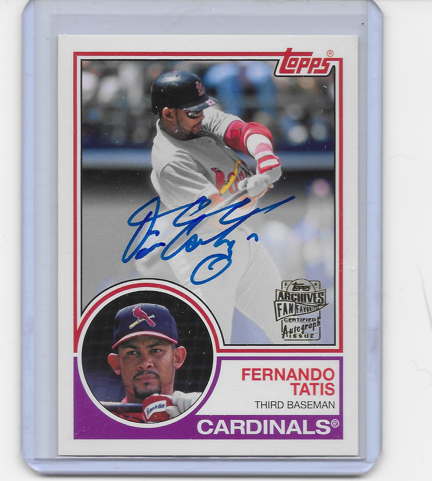
But the card above is perhaps my Least Favorite card of 2019. I don't know a lot about Fernando Tatis Jr., because he plays on the west coast. I know well how popular his cards are. I have heard rumors of possible back issues, and stats results flowing from a high BABIP - i.e., plenty of luck.

What I don't like about the card is the checklist it is on. Once Topps starts mixing Hall of Famers with brand new Rookies, I just don't care for the whole checklist, when there is a 'theme' to that checklist. (I am fine with that on 'base' checklists, such as Archives). My question about the above card is: where's the matching card for Joe Charbonneau? How about Chris Coghlan? Rookies of the Year often go on to have great careers - but not always. 

Ahh well, Rookies and Rookie Cards. There is no escape.

Hey, Wait


Why do I say that?

Hey, Wait


I do still like Rookie Cards. Let's check out some good 'uns

Best New Submariner


I especially liked finding this card since there won't be any more Brad Ziegler cards appearing in my packs. I hope Cimber collects cards, too. And since he plays in the AL Central, I expect some day I will actually get to see him pitch on a Television, something I never did get to see Brad Ziegler do.

Night Rookie Cards Are Cool


But I Think the Pirates Have This Idea on Lock Down


I definitely end up pulling for baseball players based on their Rookie Card. Or, sometimes, other factors...

2nd Best Rookie Card Baseball Name


I know, I know, MLB debuts after the age of 25 = no Cooperstown for you = no love from baseball card 'collectors.' Sorry, Jeff McNeil. Nonetheless I was very happy to pull this card. It did make me regret not being able to catch more games called by John Miller this past season ... I hope Yaz's grand-son 'sticks' on into the 2020 season for that reason. But now it's getting late in the show and the awards speeches have droned on too long. It's time to wake up Vegas and check the betting line on one of the real deal awards here -

Best Rookie Card


Now is that the ultimate name for a Reliever, or what? And there aren't many Powder Blue Rookie Cards, that I can tell you. And how many Rookie Cards have the Rookie's picture also up on the scoreboard? I can't wait to see this guy's Player Weekend cards; I hope they appear in Big League, not Topps Now.

Better Than Rookie Cards: Old Guy Cards


What's Better Than an Old Guy Card?
Two Old Guys on One Card


Best Old Guy Card


Really, this award goes to any card featuring a retired player in the "1993" portion of 2019 Archives. So many good cards. Really, 2019 Archives was my Feel Good Hit of the Summer, and I am really looking forward to bindering it up, sometime this coming summer I expect. My want list for it is in the post previous to this one. 

I like the Roberts card because it looks like the photo might have been shot from the same field & close to the same vantage point as a card I will never own, at least as a real card, rather than a reprint: the 1951 Bowman Mantle. But really, really, there are a lot of good cards in 2019 Archives, and despite my love of 1975, I think I probably liked the 1993 cards a little better. 2019 Archives brought back another touch of authenticity that many people scorn today; the special 'variant' versions of the cards even omit it:

Yes, I Like Facsimile Autographs on my Baseball Cards


Most autographs these days don't appeal to me. These did; this was the first time I had ever seen an Ichiro 'autograph', such as it is. I especially like uni # inscriptions. And how about a Detroit Tiger For The Win, here.

And though I don't Win an autograph card very often, sometimes going a year without pulling one, this year Topps did hook me up, twice.

How Not To Do It


Not even a so close, Topps, so close here - this is just not what I want in an autographed baseball card. In an ideal world, I want them to be on-card, on a cool baseball card design...

Topps, Keeping You Close to the Game


This was a fun pull. I don't really have much memory of Fernando Tatis, Sr., and his career. But since his son was tearing up the League, it was nice to have this little connection to all the excitement. 1983 is such a great set; having an autograph on such a pretty card is what baseball card collecting is all about.

I collect baseball cards for oddball reasons; I never know what little pile of oddball cards I will end up adding to, before I start looking at some new cards. This year I found myself thinking about Leg Kick cards more than usual.

A Classic Leg Kick Card


Sometimes I noticed them for ... fielders?

Best All-Star Card

I have never decided, hey, that is a great All Star Game card. But this one is. What is even more impressive about is that it looks like Muncy is actually _playing_ the game of baseball in the All Star Game. I know, the players in it do actually play a real game - they hit the ball, they run they bases, they score runs, a winner is declared (we hope). 

But put me down as one fan who preferred it when there was at least a little bit riding on the outcome, for that run of 7-8 years or however that went. I still remember Ichiro's dramatic catch in the 9th inning of an ASG to preserve an AL victory. Do you remember _any_ play from a 2010s All Star Game?

I don't know if the play shown on the card was really a difficult fielding play or how much effort Muncy had to expend here, but I might hunt around on YouTube a little to try and find out. And all because of a baseball card.

But let's get back to actual Leg Kick cards, which always have that sudden stop in time moment to them:

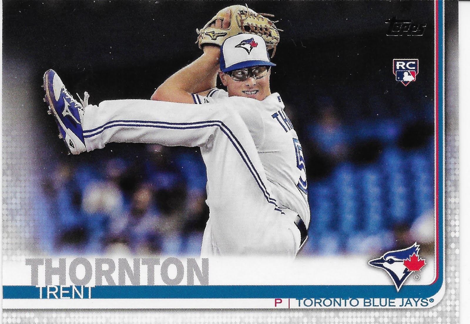
He Goes Into his Delivery


But that's not even the best Toronto Blue Jays RC Leg Kick Card -

Some Cards Almost Hurt to Look At


I have a very athletic job, and I enjoy that part of it. I ran chainsaws on the side of a mountain a fair bit this year. But I am pretty sure I could not copy the pose on this card. Everyone who enjoys baseball has probably thrown a baseball in the back yard. And along the way they have probably tried to imitate various parts of a real Pitcher's delivery/motion. But the leg kick? Unless you played the game and were a real Pitcher, who can get that part figured out? Not me.

Though I do pretty good with physical activity, for an Old Guy, I am still not a pro Athlete, like the guys on my baseball cards. Even the oldest MLB players are still excellent Athletes and you just never know what you might see them do next -

Best Leg Kick Card


Kung-Fu Panda!

It is tempting to make that my Card of the Year. I wouldn't be surprised if anyone else did. What does surprise me, personally, about this card is one of my reactions to it - I absolutely do not want a parallel copy of this card, all snazzed up with extra color.

Even though 2019 Topps was a good year for parallels, I noticed that as I set aside cards to be kept vs. not kept, and cards to include in this post, I wasn't really fired up to assemble some parallels this past year. So many cards, so little time; I just like ordinary baseball cards sometimes.

And it is hard to get more ordinary than my 2019 Baseball Cards of the Year.

Runner Up


I included a couple Catcher cards in this assemblage for the year, but it's not the colorful mask I like here. I like that this card is just a picture of a baseball player, probably from the dug-out steps. No live game action, no stiff Spring Training pose, no crazy post-game moment. Just a straight-ahead "candid," as they are sometimes called, like this one:

2019 Card of the Year


Wait, what? That could be the card someone else picked out as The Most Boring Card of the Year. And I wouldn't totally disagree with that conclusion.

What I like about this card, and the previous card, is that it's just a picture of a baseball player. That's what I want from my cards. The 'action' theme of the Topps Baseball set is well and good, and I have many favorite action cards from this year's set(s). But all action, all the time, well, we've seen it.

And we've seen plenty of brand new 21st Century baseball cards just like this one, generally with photos taken on "Photo Day" early in Spring Training. But those go into other products, like Heritage, and Archives.

But this Jeffrey Springs card (I know exactly zilch about Jeffrey Springs) gives me hope that the Topps Baseball set editor will start mixing things up a little bit more in the 2020s. There is no reason we can't have a few more candids, mixed in with all the Hitters Hitting and the Pitchers Pitching. The more diverse the images in a set are, the more you want to go back to it, over time.

So I hope I find a few more 'boring' cards like that one, in my new 2020 sets of baseball cards. In just a few more days...


Saturday, December 7, 2019

Howz about an old school Let's Trade post

It's been routinely said that we collect baseball cards to re-connect ourselves to our childhoods.

And few things connect me to my childhood like pawing through a stack of brand-new 'vintage' cardboard baseball cards. And no other types of baseball cards do that as much as these:


I hope you've been involved in 2019 Topps® Baseball Cards enough to know that is a stack of this year's Archives cards. And that perhaps you have your own little stack of these things sitting around with nothing to do but maybe be mailed to my house.

After lo these many years, I am pushing some chips into the center of the table and going for a Completion on a set of Archives. I have several more such efforts on the back 'someday' burner, but I am really looking forward to finishing this one and enjoying it in full 9-card binder page glory. For many years to come. Sort of. The big down-side of finishing this one and imprisoning it in full 9-card binder pages for all eternity is that I could then no longer soothingly paw though such a purdy stack of cardboard. And it will then be a long long time until the year 2023.

But that is what it is. So, here is what I need:

10, 16, 23, 28, 38, 41, 75, 90

108, 113, 119, 120, 121, 122, 127, 133, 156, 180

222, 225, 226, 227, 233, 248, 250, 258, 266, 267, 275, 279, 280, 281, 286, 299

Or, basically, about 25% of the set still. I have a stack of mailing supplies ready to go and would prefer small simple trades of 2 cards each (or 3 of the 93s), done "PWE" style.

What can I offer? I am surrounded by stacks of low-end retail Topps baseball cards as I type, so a little bit of everything. When I finish this post I am going to quite pleasurably rip 2 blasters of 2019 Gallery (& will share those with you soon (and will be kick-starting the Sea Turtle cards blog quite soon too)).

But let's stick to specifics for anyone of my half-dozen readers also busily finishing their Archives set before Santa comes down the chimney. Maybe you only bought a pack or two of Archives this year and don't know what to do with the little stack of cards. Well have I got a deal for you:
Yes you too could own a nice classically classy Bo Jackson baseball card, 1958 style. Or, maybe one fresh from that oh so pretty stack of 2-tone full color baseball picture cards up there at the top, a pretty cool 75er
I mean these are some of the prettiest Football player cards I have pulled in a long time. I was particularly surprised how much I liked some retro repro 93s -
Oh, sorry, Hey-Zeus, I thought you were going to pull devastating offensive lineman secretly eligible for a 2 yard touchdown pass across the goal line plays just a little farther up the lakeshore at Lambeau. I wish you could have survived the Curse of First Base there in Milwaukee, but that particular Curse is just wicked potent. So potent the other hot corner will probably be occupied by one of the most reviled players in the game this coming season. 

Ahh well, I'm not done compiling the 93s yet either, so there is still hope Topps slipped a bad-ass two way player from the 30s in there somehow for a perfect re-issue triumvirate here. If only Tebow-mania had worked out for those hard working sages in Brooklyn, oh the oh so easily composed insert sets that would soon flow.

But all of those cards are from the doubles / dups pile and can soon be yours. Or, even this one, one of my very favorites in this set:


It's almost like a 1951 Bowman beautifully tucked away in a photo album just waiting for you to rescue it some 68 or so years later. Don't worry, when I finish this particular base set, I will call you with all the beautiful scans. But to reach that particular post, well, that is where you come in, dear reader.

Here are the 2019 Archives base duplicates I have available:

5, 11, 13, 18, 21, 35, 37, 39, 44, 46, 48, 50, 50, 58, 71, 76, 82, 85, 93, 96

101, 102, 103, 115, 126, 132, 136, 137, 140, 142, 145, 150, 151, 153, 157, 159, 160, 166, 167, 169, 173, 178, 179, 181, 182, 183, 185, 187, 191, 193, 194, 196

202, 203, 205, 207, 209, 210, 212, 217, 220, 223, 238, 241, 243, 245, 246, 247, 270, 284, 287, 290, 294, 297

Now I discount double checked to make sure I wasn't asking for too many of those uber-valuable Joe Charbonneau RC cards from your precious horde and I found that I did need two such cards: Fernando Tatis, Jr. and newly minted New York Home Run King Pete Alonso (sorry Aaron, I did pull your card already). So if you need a little sweetener to trade away cards worth more than just a quarter or so, well, I guess I could offer up a Mike Trout base card if I have to have to.

I am particularly interested in procuring my own copy of #116 Matt Boyd from the '75 set for a proper scan for a proper blog post soon. And I know hiding in my needs list is Reggie and Hank, too, sigh. But hidden there in my duplicates list is a Shohei Ohtani card, so I got that going for me, which is nice.

And I am not chasing any of the inserts aside from the '75 Highlights cards that have a set card #, but don't seem to be printed in the same totals as the other base cards. Short Prints? Dunno, but I'd figger so. But some of the other inserts in this have that ID style too, and I have a half-dozen or so of each to offer up if you want them.

Thank you and staaaay in touch. Your'ebeautifullet'sdolunch.