
Pitchers & Catchers? Nope. New Baseball Cards!
Let's take a look:

Wot?
That's my First Card this year, I think. It is definitely how I saw it, first. The cards in each pack arrived in a stack with the back facing outward - on both sides of the stack.
I am mostly positive this is the card that was on "top" of the pack - i.e. right there underneath Julio Rodriguez' massive forearm.
So, let's ponder the back first, since Topps kind of forced me to. This card back is highly functional. I quite like there being at least some of the text printed white-on-team color rather than black-on-white, so the vitals there are easy to read. Every other box is checked - team logo, player position, clean readable card # there in the corner. And, as far as I can tell, so far - all the card backs align the same way, with none flipped around. Hooray! It's the little things, the itty-bitty things. Let's never find cards with flipped backs ever again, please?
I don't quite understand why Topps continues to print the Twitter and Instagram symbols after they quit printing the players' Social Media names some years ago now. Will anyone forget @Topps if they don't print it on every card? But that's a terribly minor quibble. Let's flip this puppy over:

And we're off into a new season!
And like pretty much every First Card I can remember for quite a while now, my first thought is: Who IS this guy? But that's — OK. This is why I buy baseball cards. Surely this must be Oakland's proposed replacement for their excellent Catcher from last year, who they traded away, naturally, as is the order of things in Major League Baseball. The card back text up there even explains the deal when they traded away their excellent First Baseman last year, as is the order of things in MLB. It also notes he was a First Rounder for the Braves, so hope, and baseball cards, springs eternal, much like my First Card last year. Plus he wears cool socks.
My second thought is: 1983, right on schedule. This pure head-shot is even better than 1983, or 1963, or 2003. I like.
I can read the player name, a solid plus. I shouldn't even have to type that sentence, but after 2021...
....and after 2016 - did Topps learn nothing by obscuring half of the Team Logo? I don't get this. MLB Team Logos are solid pieces of graphic design that work best when presented in their entirety. An odd thing about them is they are often quite good at making other design elements near them look much more, hmmm, not-as-pro. Meanwhile they are so famous that even partially obscuring them still enables them to impart information, so no one needs to figure out the team name, which is good because this year that suffers from an outbreak of teeny-tinyness for, well, who knows why? Maybe Topps just resents being required to print the team name or something, I dunno.
I quite like the stars in 2 corners of the card, though they could easily be bigger, and bolder. Every MLB player is a star, really, to have reached the top level of their profession and appear on a Topps Baseball card. I also quite like the team color border. Though there again, I would go bigger and bolder, if I were in charge. More color = more better. I do like white border cards though. Clean, usually.
Topps also seems to be saying, hey, let's not forget 2020 & 2021 too fast now kids. Everyone likes a good parallelogram, right? I mean there's a word everyone thinks they won't need to ever use again once they graduate from 6th grade. Who remembers parallelograms? Topps remembers. So they just randomly add one to the bottom of the card, because, I guess, they can. Which always seems to explain a lot of graphics elements on Topps cards of the 2020s. And I guess this way the professional graders can just measure that bottom grey parallelogram to get the official T-B centering grade just exactly perfect.
And why don't all those parallelograms align out there on their right ends, like the left ends do? That whole area of the card is leading my eyes around in sort of a circle, but not, that ends in ... a triangle?
What does a triangle have to do with the game of baseball? It sure seems important considering how my gaze so easily ends up resting on it. At least the Positional element features Home Plate to remind me of the game of baseball. And I can read the Position this year. Hooray! It's the little things. That triangle though - I'm trying to think of any sport that uses a triangle, for anything, really, but I'm just not placing it. Baseball does use a diamond, which is kind of like 2 triangles after all, so, there's always next year for that idea, hint, hint. Maybe - Moto-Cross? Is there going to be a collision in the right corner of the card? I'm still going around in angular circles, whatever those are, or whatever is happening down there.
Overall, another not-so-cleanly effort this year. Functionality is good, but distraction is bad. Stars are good though, so I will give this one ☆☆☆✰ out of ☆☆☆☆☆. Conveying thought with graphics is hard - that's a 3.5 on a 5 scale. Last year I used a school grade for this, but I changed my mind on that as the baseball card season went along, but that's another post for another Night.
As they say, these baseball card designs always grow on you, and it's a long, long way till Update uses this design with who knows how many other products this year — baseball cards are a marathon, not a race. Let's get out past the starting block:

Cedric Mullins was my Second Card last year, too. That worked out pretty good for the Birds. I'm quite starting to like Cedric Mullins, and that's just because of baseball cards.
The constricted Team Logo here delivers an interesting tidbit - I somehow forgot the cap the Oriole is wearing features an authentic script O's just like on their black Alternate caps they wear on about every 11th baseball card Topps issues for them. Neat.
Orange & Black are a great color combo for a baseball team and they look good on a baseball card, which is good, cuz -

I can never remember who this guy Pitches for until I get his new baseball card. Which is why I buy them. I just randomly hope he is still pitching for the Giants — a common question in Series One.
This card has well composed lines with the card design and image cropping. Looks like an overcast day at Candlestick, which seems right. And I always like a card which shows off a Pitcher's grip on the ball. Bonus point for first authentic smile.
The Giants Team Logo comes off OK here, plus it features a baseball, always a solid choice. But I have wondered for a long, long time - does Topps really use official Team Logos? Or do they just kind of randomly pick from the team's various graphics they display on their caps (not here) or, just how this works? Do MLB teams have an official Team Logo?
I purchased some Hobby packs today, and these will feature 14 cards this year, so pondering the Team Logos and 2023 Topps and baseball card history will have to wait. Tomorrow, is another Night. And next up, we have -

Another A's Rookie!
Is this 2019 again? That year I pulled A's Rookie Card cards out of pack after pack of baseball cards, and now, none of them play for the A's any more.
This card has a great photo element, seen much more easily, in-hand - the Ray Fosse memorial patch. I miss him on A's broadcasts.
This card also has an odd photo element - Jonah's right hand, perfectly centered. It looks like the camera may have tuned the focus on that hand, rather than the rest of Jonah. Overall, it has a weird 3-D effect that is a bit spooky. Much like the Oakland A's season is looking to be yet again. Topps picked this 23rd round draft pick to play Third Base this year after a 0.1 WAR campaign last year but the A's went out and signed a couple other 3Ber's instead, which I think is the "R" part of the WAR stat, in action. Oops. At least I have another Rookie Card card! Hooray! Let's move on to...

A playoff team!
Another authentic smile. Human beings can discern that in photographs when they try.
This Team Logo fares just OK amidst the constricted design. Also, I don't know if that is an official Team Logo or just their long-time uniform shoulder patch. Some teams get the shoulder patch, some get the cap logo. At least the Mets patch/Logo features a Baseball, and team colors and an apropos bridge, and ... I just wish I could see the whole thing. Let's try again -


Bazinga!
My very own favorite baseball team's very own hot Rookie Card card. Riley Greene could still turn out to be pretty darn good. Last year, he banged a Foul Ball into his foot during Spring Training or he would have been a starter on Opening Day. Ultimately, I think that might have worked out OK for him as it gave opposing teams less time to "write the book" on him - i.e. mine the data to figure out where the hole in his swing might be. This year he will have a new hitting coach, too, so the sky's the limit. I got my best possible Rookie Card in my first pack of baseball cards! We're gonna win 72 games this year! Hooray!
Let's just not ponder the sad fate of the olde English D Team Logo there however, quite a butchery, which is probably an olde English word. Nor look too long at sad Riley, who seems to have just banged a dribbler into the dirt, making a not so good omen for a Rookie Card — his first and only Rookie Card so far, even; should we maybe designate some cards as FRC for First Rookie Card? On this card, the 63/83/03/23 bonus picture comes through just in the nick of time. I like. However, it seems time for another authentic smile, maybe:

Wot?
I just pulled the A's new Catcher as my very First Card. So I thought maybe Topps well knew Murphy would be long gone from the sad city by the other side of the Bay by now. I mean, they wouldn't issue a Rookie Card of a back-up Catcher in the Topps Baseball set, would they?
Oh well, Series One is always Series One in this regard. I like how this card shows off a clear view of the PitchCom device on Murphy's left fore-arm. I look forward to seeing it in even more of a close-up on more 2023 baseball cards. But I can't say I am looking forward to more Oakland A's baseball cards this year, cuz the AAAA teams are a bummer...


...speaking of which.
Last year I got bunches of cards of yet more Pittsburgh Pirate middle-infielder Rookie Card cards, which have been appearing in droves for years. And I thought those 2 guys, Rodolfo Castro and O'Neil Cruz, would likely "stick" at the positions. But maybe, Topps doesn't think so? The one thing this card assures me of, is that I will never know who works out of the Pirate's bullpen, because surely printing Rookie Card cards of AA players is more important. Maybe that actually is best for the AAAA league teams, so when they finally start to Star in The Show and move to a real, "big market" club, everyone can have cheap Rookie Cards of those players to track down.
At least I got another cheerful sunny day baseball card, which was nice as yet another snowstorm rolled on to my baseball card mission today. And some cool shades. Let's just not think about that squashed letter "P" though, and see who's next:

Ooohh, shiny.
This might be a year I keep more of the Foil cards than usual, I'm already thinking. The Foil version of 2023 Topps Baseball has a couple nice quirks - the 2 stars in the corner are filled in by the foil-ing, so they show up much better. Meanwhile, that weird triangle doesn't shine in the foil, making it easier to forget.
On this card, I quite like the grease spot on Benintendi's right leg - authentic. The Yankees Team Logo is a classic, somewhat like the Mets Logo we just saw but is one that does not appear on their uniforms outside of a few rare occasions (some All-Star Games). Also as with the Mets, it would look much better if it could be fully seen. The whole idea worked perfectly fine in 1985 Topps, so I'm failing to comprehend as I fall back, back towards 2016 Topps...

sigh
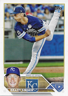
This card does feature fairly good composition of a Pitcher pitching and it shows off an odd trivia: the uniform # on the back of Singer's shoe. I can't recall ever seeing that on a baseball card.
Despite the solid image framing this would also have been a nice photo to crop in heavily on, as Singer is wearing a unique patch that you can only pick up by zooming in on a scan, from MLB's Lou Gehrig Day to support ALS research. Hopefully we will see this patch on some more cards with a more clear view, and I expect that will happen. I also wonder how many more Pitchers with shoes in the air can appear in one set of baseball cards -

That's 3 in one pack, surely a record. I will probably build a little pile of these to show off in the year 2025, when I get caught up on all my baseball card bloggling ideas. Maybe.
Lugo seems to have an authentically not authentic smile here, chez New York. Let's see where else this pack of cards can take me:

Here at least the Marlin gets a solid on-card appearance, a graphic item often hard to discern on Miami baseball cards. It appears Topps isn't sure what the Marlins' secondary team color should be though, which is pretty much the same for the rest of us with this team that just can't quit fiddling with it's iconography anyway. I will like seeing the Fish right there on the front of the card for a change though, and it even looks like it's swimming around in the water giving the whole Team Logo some basic accuracy, somehow.
Mostly though that card just makes me hope that Sanchez' team-mate Sixto makes it back to the Bigs from a long injury rehab, because who doesn't want a baseball card with the name Sixto on it?
And as I ponder that card more, I realize it is my first card with 2 smiles on it. I like base-running cards and this one is in the running for my favorite in this pack, even after my key Tigers RC find. Two contenders to go on that question...

Solid baseball card.
Sunny day, great lines in the photo, nice smile. Even the little blue triangle is starting to feel OK on this one. I hope the photogs in Texas are able to get as many good shots of DeGrom as the ones in New York have over the last ten years of baseball cards. And, finally, a Star. Every pack of baseball cards needs a Star in it -

Even a potentially fading Star is OK. Because that is part of what baseball is all about - can this baseball player make it? Can he hit the next Pitch?
Betcha didn't know the Dodgers secondary team color was a faded pink though; the scan actually cleans that up in this regard as compared to in-hand. The Dodgers have another classic Team Logo never seen on their uniforms (that I can think of at least) that looked fantastic in 1985 when seen in full.
This year, 2016 + 2020 ≠ 1983 in it's clean, colorful simplicity.
Another extra sunny day on that Bellinger card, which makes 4 in this pack of 14 cards. Perhaps 2023 Topps Baseball will be a rather more sunlit set, as some sets are. This pack certainly prepped me for the first Spring Training broadcast, now just 8 days away, despite another extra white, cold day where I live. And ultimately regardless of who appears on a Topps Baseball card or how much the design moves me or repels me, I always enjoy the new baseball information the cards bring me, and the potential they represent. Thus for me, it's always sunny on Topps Baseball Cards.
My first card of the year hasn't been anyone I've known since 2019 and Rick Porcello.
ReplyDelete