I sure have missed y'all. And, Baseball Cards. I recently returned from 7 straight weeks on the road, working. The summer months were little different. I became so disconnected from Baseball Cards that the other day I noticed I had some unopened packs of Series 2 still sitting on my desk, some 3, or maybe even 4 months since I purchased them. Yikes!
And that whole time I sure have been wanting to just sort a few cards and, of course, share them with - You. So today I enjoyed my modest new supply of free time and used it to purchase some Baseball Cards — brand new ones. Yay!
Let's take a look:

This can only mean the new Archives cards reached my little ole home town. I had already stumbled across one of the featured designs on this always wonderful Internet thing, but I was able to get a blaster box into my grocery cart without seeing the sides of it before I opened the first pack.
1956 drew a mixed reaction. I have always greatly admired everything about 1956 Topps - nothing but key essentials in the information presented, bright, simple primary colors, clean design, and the wonderful dual imagery - like two cards in one, sometimes.
However the use of actual photos for the 'backdrop' rather than ... illustrations? artwork? - I'm not sure how to label that part of a 1956 Topps Baseball Card. I just know that I wish Topps would do up some 1956 cards, that way, once again. And that always nags at my enjoyment of these efforts. Although straight 1956 Topps Baseball hasn't been done as much as, say, 1965, Topps Big from the late 80s has been a repeated (iirc) part of Archives recently, and Topps Big is essentially the same thing.
I will say that these cards feel like an improvement over the 2005 Heritage take in that digital photography 20-ish years ago frequently had a noticeably more harsh feel to it, as compared to analog film. That seems to be far less noticeable, today. Also, Heritage releases were always 100% photographed in February, seemingly at around Noon on a bright sunny day in the south — a far different sunlight than one sees during a baseball game, in late afternoon, in the summer, in the north. Early digital takes from that crisp fresh sunlight were quite often a bit too fresh and crisp, for my taste.
As for this Pasquantino card in particular, it is strange to pull an "RC" after the player's 2nd season in the Majors has already ended. Vinnie appeared in 72 games last year - 2022. I now want to know how things turned out for him in 2023, but for that I will have to wait till February, a fair bit more exciting of a month for Baseball Cards.
Last year at this time, I was still remembering October play of the player on the 2nd card in the pack -


The best Baseball Cards, are the smiling Baseball Cards.
One thing I will not be scanning for you is the backs of these cards. With this particular go at '56, it is just too sad to not see the basic cartoon-esque sketches illustrating a player's bio or career. Now, there is just a big rectangle of text from Topps Card Back Writer, who is sounding particularly elementary school Book Report-like, this year. Ho-hum.

Ooops.
Recently, I read a list of one of the Top Ten leaders in some stat for the 2023 season, with the player's name and team. Long-time Baseball Card phenom Wander Franco was on the list, but for his current team a snarky web editor decided he was "Out of Baseball." Ouch.
Archives never stays in one place for long though, inside each pack. Next appeared the design I knew about already, which I was happy about -

Pennants FTW!
I have always quite liked 1965 Topps. I started into a collection of the Heritage set when it came around, but the endless, though historically accurate, head-shots / portraits on every single card eventually disqualified it from being "binder worthy," (i.e. completed) even back the same year it was on the shelves; something even more true today as I have ten-ish more years worth of baseball cards since then.
But I was pleased to get this card. Powder Blue! An entire Redbird! Not a card that will make it into my nascent Powder Blue collection, but I have been wanting a card of this bright future Cards prospect in particular, possibly because 1 or 2 off-seasons ago I was playing armchair GM, like all Baseball fans do, and imagined a trade scenario where Gorman came to my team. I no longer expect that to happen, but I will be turning over Nolan Gorman Baseball Cards for many seasons to come, so I can (maybe) tell my team, see, I told you so.
The next card in the pack cheered me up immensely:

Not because I am particularly a Guardians fan, or had any particular interest in Bo Naylor, but because of that nice authentic distant view of some random mountains in Arizona. For whatever reason, the team for which Topps has most used those horrible repetitive fake backdrops for has been Cleveland. I did see a few more of those in 2023 Heritage, which instantly turned me off from the idea of collecting that set to completion when I saw one in my first pack some six months ago.
So I am really hoping this authentic new brand Baseball Card is a sign that Topps will kick the habit of just-have-the-computer-do-it, and hopefully never ever never do it again. All I can conclude for now is a shruggy, We'll See.
Outside of the old-is-new-again re-use of previous Topps Baseball set designs, Archives also always features oddball designs from Topps history. The enjoyment of these has declined some, for me, along the way into the 2nd decade of this product's existence. Which is probably because of the repeats of a few, and particularly the now never ending streams of these efforts in the Throwback Thursday program, particularly when I discover them a couple years after they are made and discover that only 397 copies of some cool card I want were ever made, so they now cost $19.95, for each single card. I am just not a fan of Limited Edition stuff.
However I do enjoy routine inserts that are printed in generous quantities, and this year features a great where-did-this-come-from effort: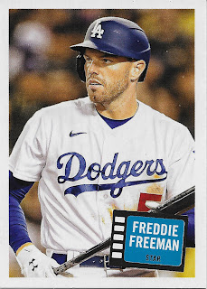

Freddie Freeman, Star - cuts right to the chase, doesn't it?
I can't say I had ever seen a 1957 Topps * Hits * Stars * card, but I sure like the concept applied to Baseball. Somehow these remind me of the simple elegance of 1980s Topps Glossy sets available through the mail only, which were even more minimal than this of course. I haven't read the checklist for these inserts but I am hoping there won't be any RC Logo cards in it as I can already tell I want to enjoy a binder page, or 3, full of these.
The next card filled out the mystery of which Topps Baseball set would be in use -

2003 Topps
Surprise, not-surprise when you think about it, given the 2023 Topps Baseball set design, and that third digit in the year count, this year.
2003 Topps is generally off-putting when you first see, or re-see it. I think it has just one simple problem: the blue border is just too dark. I can't explain why black bordered Baseball Cards are quite pleasing, but dark blue bordered ones are, not so much. I sometimes wonder what this design would look like with an MLB style Powder Blue border. Maybe parallels in this year's Archives will help answer that question? Dunno, haven't looked into those yet. I pulled only one parallel in my 2 blasters as Buy One, Get One 50% Off &/or 25% off 2, only if you buy 2 - that sucked me right into doubling down on this sampling. That one parallel was a /199 '65 Foil parallel of Alex Rodriguez in a Mariners uniform. Foil won't answer this theoretical pondering on improving '03 Topps Baseball.
The solution to like / not-like ennui about a Baseball Card design is simple - just look at more of 'em:

This fun base running card shows off the clean dynamism of the design - the inset portrait has those nifty lines suggesting it is scrolling itself off to the left, doubling the sense of motion on this one. This particular card though, suffers from the authentic design choice made back in late 2002 of using the team's primary color for the position and player name area; back then, the Tampa Bay Devil Rays used dark green. I guess this card does help illustrate why the Rays moved on from that poor choice, just as Topps maybe shouldn't have picked dark blue to bound every card in this set.
Just one bright light in my first pack of 2023 Archives, that fantastic Freddie Freeman, Star card - which is brilliant without even having a (graphic) star on it. 3 intriguing sets to ponder all over again though, so methinks we should just simply check out pack #2, which starts off with a Classic -

A real signature.
A great thing about a fresh supply of 1956 Topps cards is that it will greatly assist one of my current deepest challenges in collecting Baseball Cards, which is increasingly based on assembling 9 cards of a player, or an image theme, or a certain Highlight, or whatever I deem should fit onto a page. Except — I now only put Horizontal cards on a page with other Horizontal cards, in my slowly growing all-Horizontal binder. I expect it will look fantastic on a coffee table, someday, if I ever have a coffee table.
But assembling 9 pleasing Horizontal cards of a single player is a serious Baseball Card collecting challenge. Check it out for yourself amidst any particular Player Collection you might have rolling. I have a casual one for Bob Gibson, almost exclusively of post-career cards, and as I type I'm not sure if any of that little stack of cards is even a Horizontal. But when that decision comes, this card is making the starting 9. And I sure never expected to start wondering if a 1956 Topps style card is a Night Card as this Gibson has that look, especially compared to the next card in the pack:

Ain't no Smile like a '56 Topps Smile?
On this one I think the pure field background is much more reminiscent of '56 than a photo with spectators in the background. I am now taking a short break to scroll through some random '56 Topps cards that I sure wish I owned...
...that was pleasant. Turns out, the Mantle card had fans on it that year, too. How quickly I often forget super expensive cards I will never own. The bulk of '56 did not however seem to have paying customers in the sub-image, unlike those first 2 '56s at the top of this post.
Maybe that wise break time decision generated some Topps Mojo for me -

What year is this?
I have always figured Topps Favorite David Wright would make a triumphant return to my packs of baseball cards, though I didn't expect that would be via a Topps Certified Autograph Issue, hard-signed / on-card, complete with a uni # inscription. Just about as perfect of a David Wright keepsake as one could hope for, if one wanted a David Wright keepsake. Note this isn't part of the long-running Fan Favorite series in Archives, which would be denoted by the classic Archives stamp on the card as debuted over 20 years ago now. This is an autographed version of the 1957 Topps * Hits * Stars inserts I like so much. Archives is fun like this, quite often. It takes a minute, or 5, to get onto the next card after pulling one like that, but I made it:

An even better Powder Blue effort, with 2 complete Redbirds, while Contreras sports double team color compression sleeves. Which Cardinals? The St. Louis Cardinals. I love Baseball Cards that use a road uniform when the card itself doesn't incorporate the city name in the design, like this one. Oooohhhh to have a Powder Blue parallel of a card like this. Are you listening, Topps, it's me, Base.
Such great base cards in this pack -

Cardinals Hot Pack!
I can just see the sly grin on the face of the Topps Sheet Construction Manager who carefully placed this card on the sheet such that it will come off the cutting machine right after the previous card. Well done. My 2nd favorite division is the NL Central - I have friends or family who are fans of every team, so it never matters who is top dog in the division - I get to root for all of the teams, at the same time. Makes for fun packs of Baseball Cards, a little unlike pulling cards from my team's division:

How quickly we forget.
There are a lot of reminders in this Archives release - Roger Clemens in a Blue Jays uniform, Alex Rodriguez back in Texas, probably several more I haven't seen yet. A nice touch here is that, if I recall correctly, David Ortiz was still a Minnesota Twin in 2003 Topps, so it appears the Topps Set Constructor did a little requisite homework this year. I also quite like, and hope, a new trend is developing in this history mining portion of the world of Baseball Cards, to wit: using a live game action image on a set design that never included them. This was the case in the "1965 Redux" inserts from just a single year ago, as well as the "1952 Redux" effort last year as well. Gives the design a fresh look, and that's, a Good Thing.
Another nice road alternate uni image choice up there too. Where do the Twins come from? Just look at the card, silly. I keep on lookin' at em, all my life...

Hall of Fame Triple Header
Archive can have some serious Star Power like this, at times. Only crazy expensive sets of cards, where each "pack" has just 3 cards in it (as I have heard), usually give you much chance to see this many Hall of Famers sequentially in packs. Though even in such products, everyone usually wants the Rookie Cards anyway. This pack, didn't have any - 

- how long has it been since you opened a pack of Baseball Cards, sans RC?
This is a well selected, nicely sunlit image; you can almost hear the crowd hush a bit as King Felix goes into his wind-up. But yet another example of where primary team color, Teal, doesn't quite make a 2 + 2 = 4 effort when paired with the dark blue border. This one actually looks better in-scan, than it does, in-hand.
That was quite a pack. 6 Hall of Famers, a solid contemporary All-Star, and 2 solid Hall of Very Good well regarded retirees as well. As much as I would like to scan every card in every pack I open, you might prefer just checking out the other key ingredients, like more inserts:


Do we even need the player name printed?
Now there is another triumph of design simplicity. This is a retail only, "69 Topps Team History" foil insert, which particularly "pops" in bright daylight. I sometimes wonder what was going on in 1969 at Topps, which seems to be the source year of a whole lot of experimental Baseball Card products.
These cards look very nice, in-hand, and I will surely see who represents the Detroit Tigers on this checklist, but I'm not sure even this classical design victory is going to make it to my coffee table in the Old Folks home. Close.
These, however, definitely will -

Just had to share the only other card of this I have, so far. Now that, is a Baseball Card. This release has lots of those, like this fun card:


The fun, however, really begins on the back of the card -

These are called "89 Double Headers" and I am possibly more intrigued to just discover the original inspiration for these, a semi-routine occurrence opening Topps Archives. I'm guessing the way-back-in-'89 versions didn't partially ruin this swell idea with an overload of legalese copyright icons on the 'back' - which will probably keep these from making the starting rotation on that coffee table.
Those 89DH are fun cards though, seems to be a not-uncommon criteria in this stroll through the Archives. Sometimes, the results of that make me a touch, 'jelly' - in the modern vernacular. This happens when a Topps product that -should- have been revealed to me in my actual Youth, is instead discovered some 44 years later:

A "1979 Topps Comic"
I have never heard of these before. I am always intrigued by hand-drawn cards, but for these, I will have to look at more of 'em, to form an opinion, I think. And that's not even all the inserts in this product, as Hobby Boxes have yet more goodies to stumble across, a wandering I haven't started, yet.
However this blog is supposed to be all about dat bass, so let's see some early Highlight Reel -


These two cards both stood out to me as possibly being the result of a 21st Century image tweaking technique, that being the colorizing of photos originally shot in Black & White. Just a guess, but these cards work, particularly the Speaker, in capturing the '56 gestalt very well.
All Old-Time Baseball Players, for old people? No, Archives does mix it up well with active players; don't forget that first pack way back up there. I did find a true treasure amidst the Young Guns:

2023 Detroit Card of the Year
I am years and years behind on examining a year's worth of Topps Tigers cards. But I doubt you will see more of Detroit on a baseball card this year than on this one.
This late season release is routinely going to include the Rookies of the Year, which have clear betting line leaders by the time this is assembled, and 2023 Archives delivers again -


More Smile FTW

Even if a Rookie of the Year appearance is a year late. So strange that a player can win that award a whole year before his Official Rookie Card© is ever created. Even stranger to pull a ROY RC -after- his 2nd season of play. Such, is Baseball Cards.
And what's up with that teeny-tiny Braves team logo on that card? Per chance a slight design snafu back there in the fall of 2002? I don't remember; those dark blue borders just lull me to sleep, a little. But then, the little things start to poke me back to enjoying these:

How about that new Guardians icon, Baseball Cards?
Me likey. These 'red team' cards finally start to gel as they begin to dispel the 2003 Topps Blues-

Now, we are cooking with gas.
These things just destroy the seriously over-busy 2023 Topps Baseball design. Let the team icon do it's professionally designed job, simply and effectively, give me the position and the name, some team color action, and, I'm Good. I didn't expect to be desiring a few binder pages of these cards when I saw that Taylor Ward card, but 2 blasters in, I would like some more fresh 'head shot' cards, just like these.
These brand new 2023 2003 Topps Baseball Cards are making me want a 2023 Archives, Series 2 release (pretty please?), even though I went into this rip thinking I knew the 65s would rope me in, right away. '56 Topps re-efforts I think will always pale to the originals with those quasi-Art, all Action backgrounds, whenever just regular photos are used instead. A whole bunch of my other Topps Baseball cards have Action photos for me to look at, whenever I wish. But '56 Topps, sigh...
Still, I expect the 100 brand new '56s will manage to make a few delightful curated pages in that Horizontal binder on the coffee table, while the shelves nearby will likely hold a full run of some new sweet '65 and '03 Classics:

Say Good Night, Satchel.
Welcome back! Is it weird I like the Tris Speaker card the best because it looks like he's taking a knee to the groin?
ReplyDeleteMaybe it is even better when you notice that probably each player is taking a knee... totally Topps-like to select such an image but then I doubt there are a lot of photographs of Speaker to pick from, either. So to use 2 of them on just one card kinda surprises me for this particular checklist.
DeleteMan, that Wright auto is GREAT! Enjoy!
ReplyDeleteNice Wright auto! Yeah the backs are a bummer, especially the '56 section. The card fronts are nice and crisp though. And the inserts are interesting.
ReplyDeleteThe only one of the 3 main designs that doesn't look "off" is 2003, probably because it's the most modern and current Topps can do modern. I'm really surprised by how weird '65 looks.
ReplyDelete