Tuesday, November 19, 2013

Let's Trade ... Blue Sparklers?

These are probably the ultimate scanner cards, though I only have a single season of scanning under my belt and I am a long way from making the big $ leagues to scan a "SuperFractor." I'm not sure I would recover from gazing into all those little circles, if I scanned one and checked the results, full-screen, the way I like to look at these cards. One of my next collecting goals is to buy a SuperFractor of some 2000-whenever draft pick who never even made it to AA ball. You can send me yours if you'd like, so you can quit thinking about how much $ you blew on that hot prospecting tip that just couldn't miss.

Fortunately, these cards have a million points of light for the scanner to bounce their laser off, and I just drool over the results like a tourist come morning after being transported to a Colorado ski town over night, i.e. a "gaper."

Here, gape with me now:
This is one of my favorites, though it would be darn near impossible for me to make anything less than a top 50 list of these, all tied for first. I think the aliens are sneaking up on Scott there while he is busy trying to play baseball. Watch out, Scott - The Blob is coming to get ya! You just have to think something bad is going to happen on a Poltergeist card.

I'll tell you right now, the best way to enjoy this post is to click on Mr. Sizemore, and let Blogger take you on a scroll-show of the results of my scanning efforts this evening. If I could find a Complete Set of only the high-quality scans of these cards, I would probably buy one.

Go ahead, mix up a drink, take your tablet over to your extra comfy recliner, and get lost in the stars for a little while. I'll wait.
That's the closest I got to a star card, for now though. Now that you have already scrolled through 'em, lazy side-to-side style, you can scroll along down the screen with me while I babble on about these a little bit. Any card that has both dirt and grass on it turns out fantastic on these. So do all of the New York Mets cards. I like the rosin bag picking up a best supporting prop there on this card, and the Mets' logo on the back of the mound too.
These "Reverse Tatooine" cards that have an all-grass background, of which there are plenty in the zoomed-in 2013 set, turn out very well, making me likely to pick them for use in my parallel project. But this card breaks one of the rules of the project - no blue Sea Turtles on a blue border parallel. So my trade stack of these tends to have a lot of the blue teams in it.
A lot depends on the image though...some grass is better than other grass, and we get to see lots more of those little shiny points of light twinkling at us, and who doesn't like that in their grass? This card was actually set up in a permanent home in my project for a little while, until I picked up a Camo border version of this card in a lot purchase, and this Blue Sparkler got bumped. And there is an even better entry in the weird world of parallels on that page anyhows - a Sparkler Error card that is pretty neat. I think someone at Topps was checking out the grass too much perhaps the night those were printed. There is actually a series of those across several different parallels. Naturally, I'm working on a special binder page of those, for future reference after I cut the grass some evening. Don't worry, I like to share.
Of course as the man sang one time back in the 90s, 'what is from the earth is of the greatest worth.' So the actual Tatooine cards in the set this year make the very best sparkler cards this side of, oh, I don't know, Labrador perhaps. Houston Astro cards always pose an existential question for me though. If you didn't have their players on your baseball cards, would they even exist?
I mean, if I had started this post with a "Quick, name a Houston Astro without looking at your baseball cards!", how long would it take you to do it? 

That card is an example of how the various outfield walls around MLB can appear somewhat randomly on these cards, sometimes knocking the buzz out of these. I always wonder whenever I see this card if that is some sort of mark the Astros put on the outfield wall to help all their AA players trying to hit actual Major League pitching, gently telling them "look out there, aim at the crosshairs."

Other times though, the outfield wall becomes the star of the card:
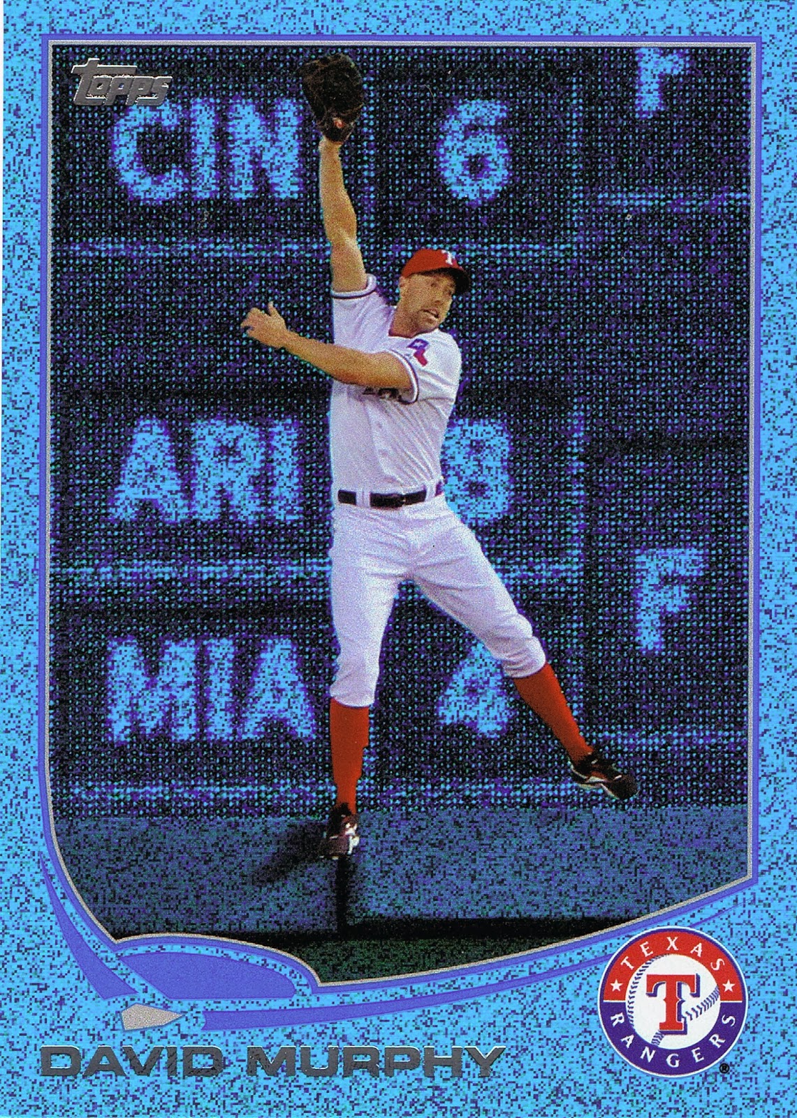
This card was Designated For Permanent Assignment in the Parallel Project, until the Commissioner came along and starting dreaming up Franken-rules, like the second rule I already mentioned - that the back of the Turtle can't match the color of the card it is swimming through. We wouldn't want the players to get confused about which part is their Turtle-shell home and which part is off the edge of their world when things get bumpy. So the Commissioner had to tell this card it was to be Designated For Assignment, back to the trade pile, which happened to the equally cool Jeff Francouer card that didn't show up on time to be scanned for this post, and this one too:
... even though it didn't break the all-important No Matching Colors Rule #2. The Commissioner had to rule out cards that disrespected the other players enjoying their Cameo on someone else's cards (I know from my Base Card of this one that we see Torii Hunter and Albert Pujols here - quite telling how far apart they are in the dug-out on this 2012 shot, pretty sneaky there Topps - can't lose that in the Project). 

It wasn't long before the Commish was summoned from his post-3-martini-lunch siesta, heard to mumble something about not actually wanting to let that cool slice of grass go to waste, to rule on another multi-player mash-up card:
That decision came quickly though: Ope! Which is baseball-ese for "NO." Not enough sparkly action for the high standards of this project, though the scanner revealed another entry in a new, not-yet-revealed-to-the-collecting-public Frankenset - This Card Is Watching Me, since Topps let a TV cameraman sneak onto the card.

No more multi-player cards allowed. "But what about that Todd Helton card you let in, Commish?", asked the Press Corps that is always bothering the Commissioner wherever he goes. The Commissioner again ruled nimbly on his somewhat wobbly martini and sparkly grass feet - Grandfather Clause. Helton is in. He's beaming out of the League this year anyway. "But that one looks like his teammates are beaming up, not Helton," some wag was quick to point out. Err, Reverse Psychology Grandfather Clause. Helton stays in. "But what about that Baltimore Oriole Wild Card Blue Sparkler card you let in? That one isn't very 'wild'." Would these reporters ever leave the poor Commissioner alone to find some more of those sweet organic grass cards? The Commissioner decided to give the Press Corps something to chew on. Baltimore Oriole Sparkler would be replaced. Page entry to the project revoked. Start over....and that was the first one completed from Series One too. This Commissioner is tough; maybe he should be given more time to look for grass cards.
Ahh, now there is a classic of the genre. The wall and that ever sweet shiny grass combine just exactly perfectly. Why, this card should be a #1 draft pick in the Project. And indeed it is. It seems the Commissioner has short-term memory loss at times, and he drafts the same player twice sometimes. No one can convince him to just give up those grass cards. He needs them when conflicts with Rule #1 arise, like when Reimold's set-neighbor, Zack Greinke, had such potentially potent looking grass on his card. But that type of grass is extra-expensive, so the card scouts looking for a Greinke entry for the project were directed down towards Target, which made them happy, because Target has better customer scenery inside than a bunch of baseball cards.

What? You forgot Rule #1 already? It was only 59 posts back now, you should really try and keep up in class better. Don't let that grass up there distract you so much. Rule #1 in the Parallel Project is that only one border color can be found on each page. Rule #1 and Rule #2 don't get along very well as a result, especially when Rule #1 trumps Rule #2 and an extra, more expensive parallel has to be acquired because Topps put 5 or even 6 blue cards on the same page. Maybe Topps lingers too long with the grass cards too. The Commissioner has heard rumors. How else do you explain Topps .998 batting average on the 89,420 different baseball cards they make every year, making a .002 strike-out rate of switched autograph stickers, letters not die-cut correctly, and the various other incessant complaints from their OCD customer base, who obviously aren't into the grass cards enough.

But it was darn nice of Topps to print these just simply beautiful sparkly cards this year. They even gave them away to their loyal customers, in spite of how much they whine about them.
The shadowy cards = nice.


When I first found more than a few of these cards in the same place, I thought they would make an incredible set of cards to own later on down the grassy road. But then my sometimes stupid let's-kick-it-up-a-notch impulse kicked in and I went for the greater glory of the all-Parallel Project. Then these cards could only be 1/9th, or perhaps 10/99ths of the set, as occasionally other from-the-Topps-factory-only parallels take their place, like the basically boring Silver Slate cards, and the outrageous, in a good way, Hunter Safety cards. Or even the also boring but oh-so-wonderfully-ego-stroking Platinum 1/1 cards, of which I scored the one of only one such card the Commissioner would allow in the project (all parallels must be represented by at least one card, even those extra dull printing plates, which is part of Rule 1, subsection b, as in boring), just the other day, finally.
Overall these cards can have a lot going on, and I sure enjoy them. The idea of building a whole set of them has sailed however, as easy pick-up lots on the ole eBay dried up some time ago, and the resellers here and there will only let you have one for a buck or three, plus shipping. So you could still do it if you really wanted, and you could afford the Bryce Trout editions. Luckily, or unluckily, in my case, there wouldn't be a Puig to chase on these. I really wish these had been manufactured for Update, but Topps has bigger customers to worry about than one goofy blogger with an over-fondness for the ultimate twinkly baseball cards.

The good news for you is that every card I scanned here is up for trade. And really, what player or team rainbow is complete without a boat-load of Blue Sparkles at the end of it? That grass is better than gold sometimes. 

The bad news is that I am quickly approaching Last Call on trading season. An actual, no-Super Bowl-eligibility-for-this-card Trading Deadline. So if you are still reading this far down a blog post and you have been thinking you might have some parallels I need, well, it's time. In a few short weeks I will be leaving home and my beloved baseball cards behind for several months. 

In the world of the Blue Sparklers, I need these cards:

(6 R. Howard or 10 A. Jones), 17 (Choo), 24 (Haren), (59 Rauch or 60 Bauer); 79 (Eaton), 89 (J. Santana checklist), (112 Reynolds or 118 Matsuzaka); (120, 122, 125); 157 (C. Capps), (192, 193, 194-197); (211 Parker or 215 Beckham); 235 (Westbrook), 271 (Familia), 277 (B. Ryan), (287 or 288); 312 (S. Hairston), 326 (Andruw Jones)

(368, 371, 372); 412 (E. Cabrera), (476, 478, 481, 483, 484), 490 (C. Ross), (508 Doubront or 510 McLouth or 511 Brantly); 545 (Presley); (548 Lackey or 555 Hanrahan); 597 (M. Scutaro), 646 (Aumont)

And the Commissioner's free agent negotiations resulted in a slight over-supply of these, all up for trade, though you'll have to know your favorite player's card # to see if I have that one you just have to have, somehow. It's November, you should know your favorite player's card # by now, geez:

Series One: 12, 16, 18, 30, 48, 51, 52, 53, 57, 66, 79, 100, 103, 105, 106, 116, 121, 126, 133, 144, 145, 149, 150, 154, 156, 160, 177, 182, 194, 206, 209, 214, 216, 218, 220, 226, 236, 239, 240, 257, 258, 259, 262, 283, 285, 304, 327, 328

Series Two: 341, 347, 348, 354, 363, 364, 367, 377, 381, 384, 400, 404, 408, 429, 432, 436, 438, 444, 450,  451, 471, 479, 482, 485, 492, 496, 497, 516, 518, 520, 524, 525, 534, 539, 542, 550, 557, 558, 560, 567, 574, 590, 601, 619, 623, 630, 632, 659

The other good news on these is that you don't need an actual Blue Sparkle card to pry one of these away from me, before they all get shipped off to COMC when Base Set's base gets way, way smaller come December. Any contribution to my Parallel Project or my other random set needs would probably work.

Now thinking card #s might lead you eagle-eye types to spot a Hero # card in there, and it's been so much boring old alpha-numerics scrolling along your screen for a while now that I figure I should hook you up with one last hit of that sweet shiny grass before the withdrawal symptoms get any worse.

My scanner just loves these cards, so much so that for this one (when it "automagically" detected the borders of the item I was scanning), for the first time ever it reported the dimensions of said item to be exactly 3.5" x 2.5", even though all I ever do with the machine is scan baseball cards that are all exactly that same size.

That's how perfect this card is:
Kinda puts anything in Topps Chrome to shame, if you ask me. Shiny? I call trump on shiny when I get lost looking at these. 

This card already made the Project. And it's duplicate sitting around gathering dust here at Base Set can be yours. Whaddya got?

Sunday, November 17, 2013

...and another thing...

you be Out!

Hey, wait a minute. What happened to my finger? What is that stuff there Topps? Hey, leggo already! That guy is Out! That's the last Out! I'm closing a game here, can't you tell? He's OUT! Now let go of my finger. No, I didn't say Pull My Finger you knucklehead. Let go already! OWww!

Let's Trade ... Short-Prints?

The cards everyone loves to hate....until one appears of their favorite player. Gimmicks. Set-breakers. You have to have them. You didn't even know you pulled one. You could care less. They make you rip packs like that mayor in Blue Jay town seeing what he can find down on the corner after work.

You gaze at them wistfully on eBay. You just can't decide what to think about Short Prints. Or what to do with them when you get one. Sure, you could send them to your favorite trading partner who collects That One Guy you pulled. But what does he send back? What is equal in trading value for a Short Print? We don't even get to know how "Short" the Print is.

So they sit there. They're a Short Print. You can't just put them in the binder with your other cards. They don't fit on the page right. You don't collect that team. You don't know what to think about them, or what to do with them. So they sit there, over in the corner of your card desk in their lonely little stack, on that box of base cards from 3 years ago that you don't know what to do with either, where you hope nothing will bother those weird little Short Prints.

And sit there. You don't want to open an eBay account. You can't throw one out. You're not really up for just adding it to the pile you're shipping off to that one trader. It's a Short Print. That's gotta be worth something, isn't it? I mean, you think you saw one on TV once, or maybe just on a non-baseball-card webpage. How often does that ever happen? People must love and desire these things somewhere.

But where? What do you do with the darn things when you pull one? You don't even understand how they play baseball in That League. And now you have a Short Print from it.

I have the answer you've been looking for. Trade it to ME!

But what can I give you back? What else but a Short Print. Check 'em out:
Cutch! MVP! Lovin' It there all googly-eyed with Pedro! If this card wasn't a short-print, there would be vandalized meme quotes drawn on this one everywhere you look.
Cutch again! A Cell-Phone Card! I bet you don't have one of those yet! And a Bow-Tie Card. Now there's a Two-Fer for ya. Good luck ever finding this combo on a baseball card ever again. And ... an Earring! It's a Trifecta!
These silly dress-up cards just don't do it for me. Does that guy even play baseball? I never see him in the MVP voting everyone is always arguing about. He must be a League Official or something, the fan in the back there is more into his cellphone. Hey, it's a 2nd Cell-Phone card! Trade for these cards and you're on your way to a whole binder page! I can even hook you up with more sartorial baseball wonderment, check it out:
Good Lord. I'm thinking all the smart baseball players told the League they weren't feeling too good before "warm-ups" at the 2000 All-Star game. They'd be OK by game time in their regular uniform, but for now it would be ahh-ite if the the 2nd place vote-getter went out there and represented for them. Yeah, that's the ticket. Nomar forgot this option. He is not impressed.
Now that's impressive. You have to be pretty frickin' cool to wear pink. I bet you don't ever wear pink. Robinson Cano though, he can Man-Up and wear pink whenever he wants. Even on a baseball card. Maybe he put on shades so no one could see him rolling his eyes all the time during the Fan Parade. I'm not sure just what is going on with all these fans who refuse to even watch the thing though. But Shades Cards are certainly cool.
Topps certainly thinks so. They made a bunch of them this year. If you look closely enough, I think you can see my scanner in there, cuz this year's batch sure scans up nice. Go ahead, click on it for a better view. Careful though, you might need your shades first.  His necklace is even glowing a little bit, just extra coolness dripping off there.
You know what else is cool? Signing autographs for kids. That really is cool. Maybe wearing cool Shades explains an autograph that looks like this:
That's not a Short-Print! Nope. Wrong blog for that kind of thing, sorry. Let's get back to the baseball cards:
Now we're talking. Classic lines, classic player, classic socks. The spare, popular 2011 design, classic "topps" up there in the corner. What's not to like? Not sure what happened to the classic "A" logo on the baseball there though. Maybe it got rubbed off in all that great infield dirt on this card. Or maybe it's an uncorrected error card. A UER SP. Boom! Now that would be a card to chase.

Vintage players on current designs. Kinda cooler than current players on vintage designs sometimes. Your Topps Master has to keep you ripping packs somehow. Let's see some more:
Hmmm. That picture sure looks familiar. Where did I see that one before? Was it here?
No, no, that's not quite it. That one is a print too though; it's hanging on walls these days in the Topps Wall Art Set that is to die for. That is one hell of a stretch Seaver had. I just know I've seen that same picture, hmmmmm....
I knew I had seen it somewhere — it was right there in the same box of cards with the _short_ print. Some Short Prints are shorter than others I guess. I don't know what to do with all those Topps 60 cards I have either. Can't see 'em too well in a room with those new light bulbs these days, can't burn 'em. Hmmmmm. Let's see some more Short Prints.
Everywhere I wander on the baseball related Internet, I see quotes from old Vintage pitchers about how they hated the batter when they pitched. Looks like The Hawk can give it right back to 'em. That poor little Cubbie there on his shoulder seems like he wants to keep his distance from that bi-cep. Damn. Keep your distance, I think it might explode.

There's more cutting-edge Vintage classic retro-ness, or something. Hard to get more "baseball" than Pinstripes at the plate.

We all love to pull Short-Prints. They take you back to that first time Topps told you softly "first hit's free, kid" and you believed them, because scrounging up some loose change for a pack of baseball cards is about the same as free isn't it? Just like swiping your debit card these days ... you don't even have to take cash out of your wallet to get you some more baseball cards. That's kinda like free too, isn't it? Cuz when you get that Short Print Hit, yeah,
Smoltz knows.

So how can you get one of these sweet Short Prints for yourself? Well that will cost you a Short Print. But which ones? You can't even read a Checklist without tripping over the Short Prints and the Super Short Prints these days, and why can't I just call them Variations like a professional baseball card critic? People slap "short print" on every other card on eBay these days.

In particular, I want some more of these Short Prints:
They are from a set of 25 I believe. The 2013 Topps Series 1 'Out of Bounds' series. Looks like I have 16 to go....those are the ones I have so far. Some of them, thanks to cool bloggers like you.

There's some others I'm interested in. I have a few more I didn't scan, like last year's Update SPs of the last 2 AL MVP winners, Miguel Cabrera and Justin Verlander. Yep, more MVP SP cards up on the block.

Cuz I love those Short Prints. I need new ones. Like the Cabrera autograph signing one from Series 2, and the Scherzer one where he's posed along with his awesome power slugging third baseman you may have heard of. Oh, and of course, your choicest Parallels can pry one of these away from me too. So as always, hook me up with your Camos, your Blacks, and your Pinks. Those new Sapphires are crazy-cool looking too. Trust me, you don't want them laying around near all your spare Short Prints for too long. You don't want to end up like that Mayor up there in Ontario, eh?

Sooo, Let's Trade! Short Prints.

Friday, November 15, 2013

These cards make me dizzy

This side-set is starting out slowly. The second entry is really a doozy:

I don't want to go too fast finding these, or, well, you know, I might get...

Striking out at Petco

So I've made two posts in a row now where I have mis-underestimated what I was looking at on a baseball card.

And I'm glad to discover what I was really looking at. But I don't want to go for the complete K here, so I want to get this card figured out:
Is this Petco park in the background?

I ask this today because last week, before another short work delay in the blogging, I posted this card:
and was kindly informed by a reader that the Franklin image is from Petco.

And not from a Spring Training facility, which is only part of why I like the Franklin card, but is all of why I pulled the O'Flaherty card aside last winter when I was corralling the 2012 Update Surfboards onto binder pages. I like Spring Training shots on modern cards for that nice tingly Vintage flashback, though these are few and very far between lately, 'cept of course in the Archives sets.

That could become O'Flaherty's sunset card as he was released after the season by the Braves after not receiving any cards from Topps at all in 2013. Atlanta used him a lot less this year and though his WHIP remained decently steady, his ERA crept back up. I didn't bother considering all the ERA+ FIP .BABIP # deals to think about his career. I leave those concerns to the overpaid professionals.

Just another middle reliever who can't even make the Middle Reliever set of baseball cards, so we can all have those Home-Run Derby cards everyone lusts after, but I'm just on repeat here. I would think a 28 year old lefty middle reliever would likely find more MLB employment somewhere however.

Anyhow it appears Petco has a nifty outfield grass seating feature. If I'm ever in San Diego, which is extremely doubtful even though my career involves too much travel, I'd probably try catching a game from those likely cheap seats.

Otherwise, the only place I'll ever see Petco Park is on my baseball cards. The National League West just isn't going to appear on TV screens in Michigan all that very often.

On a related note, I thought I had yesterday's card figured out as well. At least I can be sure it was shot at Petco, since the Padres are wearing their home whites on the card.

But this is what the aftermath of Chris Denorfia's Walk-Off Home Run on July 29, 2013 actually looked like:

Which is what we have come to expect after a Walk Off Game Winning Home Run, particularly if you pick up a lot of recent baseball cards. I'm not sure when this tradition crept into the game, but I can't say it impresses me during a regular season game. There are only 161 other games to play. But then hitting a Walk-Off off Aroldis Chapman does call for a little celebrating I guess.

At least Topps is on top of things, showing me the state of the game of baseball, even if they didn't actually hook me up with the actual post-GWRBI photo I was leaping to conclusions about after reading the back of Denorfia's new Update picture card.

Here is the real photo from Getty Images that Topps used on the card:
And by finding the photo first, I then finally found the actual date of this shot, which turns out to be from June 26, 2013 against the Phillies, when Denorfia hit a 2-run Homer in the bottom of the 5th, also scoring Logan Forsythe (another boo-boo, let's call it a foul-tip, no Strike Out, yet, I hope) who is there behind him. And Chase Headley is correctly placed there in the on-deck circle as he was batting 2 spots after Denorfia that day, unlike the day of the Walk-Off...I should have caught that.

Still a more tasteful card than another mobbed-at-the-plate card, which are actually kind of boring, for me at least. The build-up on the back of the card just lead me down a different hoped for path a bit too quickly.

Also yesterday I was imagining what might have been with an alternative 2013 MLB photo that wasn't used on a card. The after-aftermath of Denorfia's Walk-Off included another image we have seen on a few cards this year (Opening Day inserts mostly and one Series 2 card) — a gatorade shower, including a lovely TV 'journalist' conducting an interview. If only Topps had given me a card of this action, perhaps taken 30 seconds later. I could see some things really standing out on such a card:

Thursday, November 14, 2013

Does the person writing the back...

...look at the picture on the front?

This would seem to be an elementary step in the creation of a baseball card.

Sometimes, Topps aces this idea:

When we flip this card over, we learn that Denorfia hit the
and the game logs confirm this.

Then when we flip the card back over it does appear we are treated to a picture of this Walk-Off Home Run, and ever so tastefully, without one of those pile-up-at-home-plate shots that are becoming a bit overdone, particularly if you picked up the Opening Day insert set "Superstar Celebrations" earlier this year. The Home Run in question was a two run shot which also scored Yonder Alonso, who is returning to the dug-out just behind Denorfia there. Nicely done, Topps.

Topps also frequently likes to show off what a player is known for at times, be it their glove work in the field, or slugging prowess at the plate. Apparently they are somewhat fond of an increasingly rare type of player in the game today, a base-stealing threat:
Flipping this card over visually reinforces the point:
Unfortunately Robinson couldn't get any Topps Voodoo to help him here, as he only managed to steal successfully 4 times in 9 tries, despite 113 SBOs, or Stolen Base Opportunites. Dusty Baker at the helm, makes sense to me. Now if only Topps had chosen to elevate Billy Hamilton to the Update set instead....but then maybe with next year's cards having the position on the front again, we can finally get a second "Pinch Runner" card out of Topps. It's been 38 years now after all.

Another great base running Rookie Card is this one:
This is such a great shot of a head-first slide into Home just as the ball is arriving....he could be Out!....he could be SAFE!

And sure enough, the Topps card-back writer is on the case once again:
Perhaps that is only a marginal connection to the front of the card, though Villar did have one successful steal of Home this year.

More often though, the back of the card fails to connect with the front of the card:
which sounds like something that would make for a great baseball card,
particularly in a set that almost always features a pitcher in the actual motion of pitching and generally ignores the classic baseball image of a pitcher holding his glove in a set position just before starting his wind-up. At least we do get to see that on the great Jon Lester card in Series 2.

Will we get to see Ohlendorf's unique new, old wind-up?
Nope, just a nice post-delivery image; a pretty cool Leg Kick card shot at Comerica Park. Bit of a swing-and-a-miss there Topps.

Just as on this card:
Which is also a perfectly fine baseball card. We get a throwback uniform, and a sweet shot of the HICKORY there too. Pretty nice lines as well, but they lead straight to the problem — the back of the card holds the disappointment with what we could have seen on the front, if it hadn't been cropped in so tight like so many of the Sea Turtle cards:
And apparently Topps isn't too careful with reading those minor league statistics either.

As much as the information on the back of that card disappointed anyone who enjoys unique baseball images, this next card is much more of an oh-what-could-have-been:
This card starts out nicely enough; Pena is a journeyman back-up catcher known to be better standing at the plate than sitting behind the plate. In other words, he is a decent enough hitter but not so good on the defensive side, and likely to remain a journeyman back-up as a result. The Tigers released him a few days after their season ended and he quickly signed a 2 year deal with the Reds, where I'm sure we'll see him on an Update card again, after next season is over.

Or maybe not. Journeyman back-up catcher Gerald Laird was let go by the Tigers after last season and immediately signed a 2 year deal with the Braves. But apparently more useless Home-Run Derby cards were more worthy of printing than a new baseball card of a Major Leaguer on a 25-man roster for the entire season, as Laird did not receive any Topps cards at all this year.

Be that as it all may, it is the back of Pena's 2013 card that holds the real let-down:
Now, reading all that, don't you just want to see it all happen? I heard the call of that play on the radio, and it was one of the few times I used the video highlights feature of the MLB '13 app on my phone, which was well worth the effort.

This is one of those rare times where I wish there was more than one licensed baseball card manufacturer. Though I am content with collecting one main set per year, I think a scrappier card manufacturer could likely have exploited this much better. I'm sure Nick @ Dime Boxes could tell us exactly which former baseball card company would have jumped at a chance to put the following image on a baseball card. Although I am not generally a fan of cards that obscure a player's face, after all that build-up on the back this could have been a simply epic play-at-the-plate baseball card: