So tonight I am starting on putting them in binder pages. Which is it's own idiosyncratic topic in this idiosyncratic hobby. I'll get back to that shortly; let's check out my new baseball cards first.
I really like these cards:
The scanner had no trouble at all figuring out the exact 3.5 x 2.5 dimensions of these cards. (Which reminds me to share a link with you - Keith Olbermann's tribute to Sy Berger is clutch).
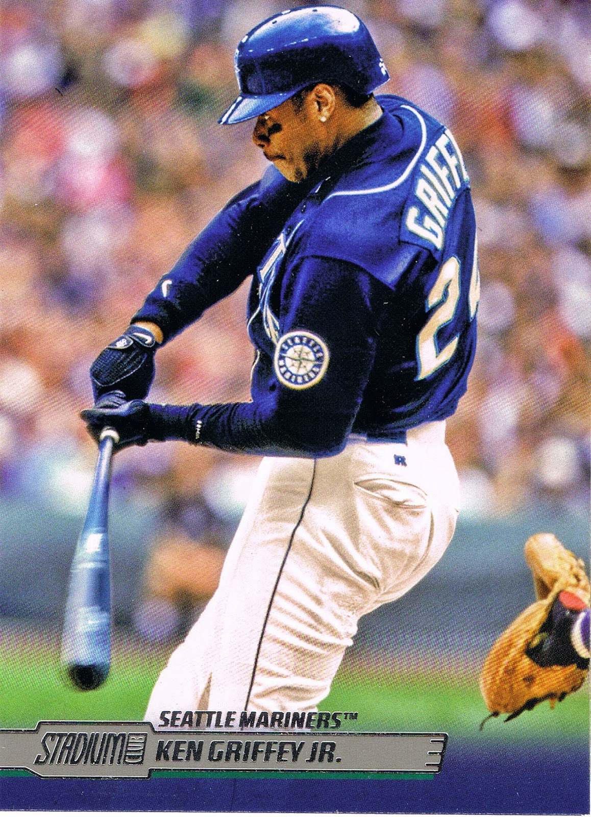
My second recent Blue Bat card - I might need a double of this one. I also like "Bat Speed" cards that can freeze almost everything in the frame.
Has Topps ever made the player on the box card #1?
I've been eagerly anticipating the backs of these cards:

Hey, nice bonus picture!
What I was anticipating, however, was Topps finally making a saber-metric-centric card back. Not a special variant card back as in 2014 Series 2 and Update, but simply a set of baseball cards with a decided saber-metric theme to the stats on the back. Given the history of their efforts to put unique stats on the back of the original Stadium Club releases, I thought we might see it here. Of course, there's always next year.
And I'm sure plenty of people flipped over their first in-hand Stadium Club card this year to see if the player's Rookie Card would be included on the back. Sadly, I somewhat doubt Topps will ever do this again - which card is the Rookie Card these days, anyway? That question has gone way beyond arguing over XRC cards from Traded sets. Hmm, perhaps Topps could print these with different RC editions on the back, with the same fronts, but one card with the Bowman Chrome, one with the Topps RC, etc. Oh dear. Did I just type that out loud? If that were to happen, I'm sure this would drive some collectors bananas. Personally, I would just laugh.
Speaking of bananas though,

I'm sure this card would immediately drive some collectors bananas. First a vertical card in the set, then a horizontal card. HOW CAN THESE BE PLACED ON A BINDER PAGE?!?!?
This doesn't bother me at all. Just used to it I guess. Sometimes I like to put all the horizontal cards together on pages, and dream of 1956 though. I'll eventually get around to this for 2014 Series 1 & 2. Maybe. The results of that might make me too depressed, however.
Anyhow I love this Matt Holliday card. For a photograph likely shot via recording pixel information on a digital memory storage card, it sure looks pretty analog. Almost painted, even.
Also this card shows me that a team color will be part of the design with that stripe under the name bar there.
And of course, let's check out the back some more:

Another sweet portrait shot on the back! I like pictures of baseball players with clouds behind them. So '51 Bowman Mantle-esque. For once, I hope Topps re-uses that image on a full size card.
It looks like the team color will be featured prominently on the back. The teal on the Griffey card was so stealthy in that regard.
Is that a #2 I see up there, as in card #2? This is the second of my brand new baseball cards?
Yes, it's true. I simply bought this set of baseball cards. I've come a long way on that. I've been mentioning the idea on the blog, and put it to the test with these new Stadium Club cards. I picked up the base set for $40, delivered. About ten bucks less than the price of one box, tonight, on that online greatest baseball card retailer of All-Time site, where I bought these.
In one way, these cards were actually free. Because I recently sold a card for $280. Of course, since I just bought a hand-collated set of 2014 Stadium Club, I threw away my chance to pull a similarly valuable card via "ripping a box," such as the /25 on-card auto version of the Griffey card you just saw.
But as I've written a story about on here before, I learned a long time ago that gambling isn't my thing, and now finally with most baseball cards, I've learned to quit while I'm ahead. And one box wouldn't have got me very close to a set of these wonderful cards, either.
I feel so grown-up now. I'd better get back to some baseball cards:
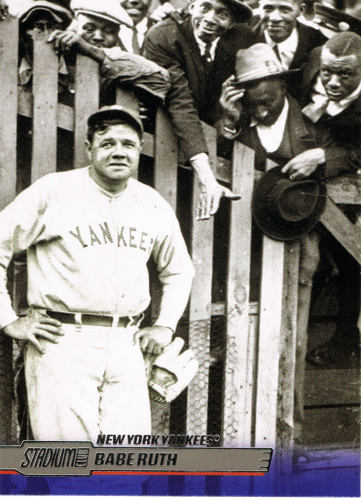
Babe Ruth, photo-bombed! Not too many photo bombs on baseball cards, Topps usually frowns on that idea and those stay on the cutting-room floor down at 1 Whitehall St.
I like Babe Ruth baseball cards. I know I'll never own an original one, such as either of the Goudeys, though I'm not sure there are any other originals, as in contemporary to his playing days, or close to it. It has always struck me as strange how the Roaring 20s seemed to fail at producing any baseball cards.
But, now, I do have an original Babe Ruth card, in that I'm pretty sure this picture of Babe Ruth has never been on a card before. I have never seen this photograph until I held this baseball card in my hand, and that is what I expect from a baseball card. And that is very well done, Topps, after seeing the same baseball player picture repeated on so many other cards. Thank you.
It looks like Topps has gone with Red as the Yankees team color perhaps? Let's check:

Nope, that would be a little odd for the team with the Blue pin-stripes. Red is just used on the front for a little contrast - classy. I'm not sure we really need the old-school NY logo on the back of the card twice though.
And another nice photo on the back - this looks like it could be a colorized photo, but I like that. Such modern creations would make for an interesting look at the game in the early 20th century. Hint, hint.
Even though Topps didn't go with some unique set of stats on the back and pretty much just kept it classy, the text about Ruth does consider stats newer than this All-Time Great:

Digitally cutting that text out for you revealed the diagonal to essentially the second design on each and every baseball card - the design on the back. This one is pretty strong, overall.
The set is really off to a good start though, I would have to say. Imagine pulling those three cards from a pack sequentially - Griffey, Holliday, Ruth - not a bad run. Of course, in a modern pack of baseball cards, a run like that would soon be interrupted, and this set follows Topps standard checklist guidelines:

A Rookie Card…if you thought Topps might finally release a set without these, well, consider Topps Dynasty, their new ultra-high-end "set" that comes in this mind-bending product configuration - 1 pack per box, 1 card per pack - for $300 per box, or pack, or card, however you like to think about three Benjamins leaving your possession just to pull a Nick Castellanos card. Though they are nice enough to leave the RC logo off those cards once you give up that much of your wallet.
And what's up with this Singleton guy? Does Topps thinks he knows how to play this game? First Topps shows him squatting on first base, now he is holding a glove by the laces? Three Topps cards in and he has two things I've never seen on a baseball card before. (I'm sure the Two Outs symbol has to be on a baseball card somewhere, I hope, at least).
A further mystery - the first Brown card - Orange? Let's ask the back what's going on:
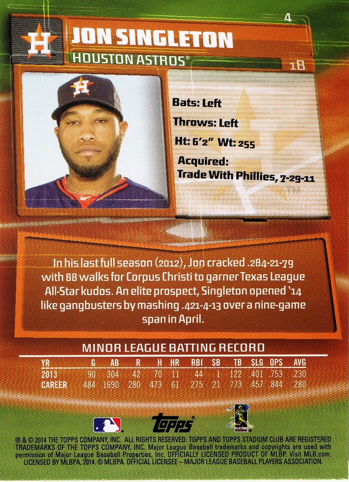
Oh, yeah, man, the Astros, technically an Orange team. A little tough with the dirt around Home Plate being a main design element. But that's OK, this card-back makes me feel nice and relaxed. Yeah, my eyelids are nice and droopy, like Jason Motte cards, that Singleton guy, he's pretty chill, man, yeah. I'd better keep a half-closed eye on his future cards, yeah. There just might even be a touch of red in that photo, man, yeah, you'll just have to look at that one up close on your own card, yeah.
Baseball cards - so relaxing. Even without ripping packs, I'm still chilling out nicely. That's because putting baseball cards in binder pages really connects you to the cards. You have no choice but to handle each one singly, and in the process, you usually slow down and consider each card, one at a time. How much do you consider a card when you rip packs into a stack of cards and then make a pile of #s 1-10 and then get them in sequential order and immediately move on to cards 11-20? And then stick them in a box with a Post-It note for missing card #13, not to be seen again until card #13 finally arrives, giving one last glimpse at #12 and #14… ?
One thing I always watch for on every Topps design in cards from the New York Mets, and here comes one now:

Full-Bleed Action, at last, five cards in. Full bleed designs are great for action shots. I like Curtis Granderson. I hope he finds his power-stroke again next year, somehow.
But Topps let me down just a little here, as quality control on the crucial Mets Orange stripe there slipped and it is the thinnest such stripe so far. I'm sure the back will have plenty of Orange though:

Yes, lots of Mets Orange. But hardly any Mets Blue, which is what always makes the Orange look so nice. My first Mets card on a Topps design I haven't liked in a long time. Like the Astros card, an Orange theme over the dirt of the baseball diamond wasn't just exactly perfect, like using some Mets blue would have been (the Astros would be just straight out of luck, as usual, with no real secondary color these days). Curtis doesn't look all that thrilled with the results either.
Ahh well, you win some, you lose some, but usually on Topps Baseball Cards, you always tend to win:

Hey, who let an Opening Day card in here? Though I do like Koji Uehara cards. And David Ortiz cards. Shane Victorino, not so sure which one that is, so, naturally, let's ask the back:

A Double Dome card! Has a player ever been shown hatless on his baseball card, twice? And re: Red Sox, and beards - I predict there will not be one Boston Red Sox baseball card in 2015 with a player sporting a beard. You heard it here first, or worst, or first, or something.
That's a lot of Red even without a Red ball-cap. Let's go back to a soothing player who plays for Blue:

The sun always shines on Adrian Gonzalez cards. ¡Viva Mexico! There are so many Caribbean players these days, I'm going to have to make more effort to figure out which ones hail from one the land to our south, donde tengo mucho amigos. I also liked the back of this one:

Wherein the Topps photographer coaxed the biggest smile out of Adrian yet. He'll get there, someday. And I can report that while considering Adrian's smile over the years via the cheater technique of typing his name into the search box on COMC, I discovered that his 2014 Bowman card finally shows that he plays in the field too. I'll have to watch for that, though in a repack, some day.
Ahh well, I try to consider binder pages and I end up doing web searches of Adrian Gonzalez baseball cards. I'm pretty sure I will be OK with this complete base set acquisition technique, pretty much because of the process of putting the cards away in binder pages, and because I can now enjoy the mystery of ripping packs of cards via opening cheap repacks. I used the buy-a-set deal for Series One this year and I even saved you, dearest reader, some cards to share as I put that one in it's binder pages. If I don't spend too many days getting lost in these wonderful new Stadium Club cards, you'll see them soon.
The topic I really had on my mind when I wrote the post title a while back now, was the sad fact that a lot of baseball card collectors never see a binder page of 9 baseball cards. Some worry about damaging the cards, which I find, just, sad, considering a base card costs all of, hmmm, twenty cents in this post. But then of course some sad baseball card collectors can only enjoy cards that are worth more money than that. And these few sentences are enough on all that.
So, let's see page #1 of 2014 Topps Stadium Club:

Now that's Baseball Cards.
Except, wait, wait, there is always a crucial decision to make when assembling a page of baseball cards: 9 cards, or 18?
Let's take a look:

With the secondary photo, team color, and the overall mostly careful design work on the back, well, I have to wonder, has anyone ever scanned the back of a 9 card binder page of baseball cards before?
For 2014 Topps Stadium Club, 9 cards it is.
I bought the set, too - no regrets at all. Looking forward to next years set?
ReplyDeleteAre you going to do the whole checklist? That would be awesome!
that's tempting but I'll probably just post my favorites as I put these in pages. this set would make for a nice blog though. I've been thinking about starting a set blog but it wouldn't be this one…
Deleteyeah I do look forward to next year on this, always liked Stadium Club. I hope it comes out during the actual baseball season though.