Thursday, November 7, 2013

The last Sea Turtles

Well it's that time of year. The last baseball cards have arrived. The last ones for me anyway. I'm sure Topps might still have some set of stitched leather $100 / 2-card pack cards that feel like a pack of smokes in your hand still to arrive, but I will never ever understand those kinds of cards.

Normally, Chrome cards aren't for me either. ...All the Way to the Backstop asked recently if anyone truly likes them. Obviously, lots of people do. But lots of people don't. I'm more in the latter camp, even though I love shiny things. I like "foil" cards quite a bit, though perhaps in more limited doses.

This year though I really grew to like the basic design Topps uses in their 'Flagship' set, and then Opening Day and Chrome. I was intrigued by the image variations in Opening Day - I think there were 7 of them, I'll compile them for you sometime soon. That led me to wonder what I would see in the Chrome set; turns out there are a whole lot of Chrome-only Sea Turtles. I'll assemble all of those for you sometime too.

Then around 2 weeks ago a new bale of Sea Turtles made it to shore, though they could only beach themselves in the card aisle of all the usually suspect Big Boxes. What the heck is a "bale," you ask? This high tech device under my fingertips that runs my life tells me that is a correct way to refer to turtles, plural. The things you learn these days.

These last Sea Turtles hail from the "Update Chrome" set. And more specifically, they only hatch from inside the Topps "Mega Box." They even have card #s that reflect this, MB-1 through MB-55. And of course two serial #/d parallels, Gold refractors at /250, and Black refractors at /100, or maybe /99. I forget, though I didn't pull any blacks. Also included in the set is one insert set, "Postseason Heroes."
For me this is another Topps product chock full of pluses & minuses. If I had known it was coming out, I probably would have purchased quite a bit less Update from the red store and the blue store, as to get these Update Chrome cards you also receive 5 packs of Update. I'm not sure why Topps even bothers with all these "packs" inside boxes any more anyway. Put the amount of cards I get for a price in a box and be done with it, like the hanger boxes. I would have purchased all hanger boxes this year, except I liked the white foil Chasing History cards only found in the rack packs, and I bought the stupid blasters because of my addiction to parallels.

The big plus of this last small set is that I pretty much could not do a Parallel set of Update without it. I was stuck at 8 parallels, not enough for one per slot on a binder page, unless I wanted to use 1/1 Platinums, 1/4 Printing Plates, or 1/50 of the "Silk Collection", which are just dumb.

But with these Chrome Updates or whatever you call them - when there is only 55 of them, it's not really a "mega" set - I could assemble 9 colorful, or shiny, cards per page. I could have just done that for my Series 1/Series 2 parallel sets, i.e. used Chrome cards, but I simply prefer glossy cards to Chrome. And really I would rather just have a full set of actual cardboard baseball cards, in a more perfect world.

The biggest minus of the set, aside from the predatory packaging "available only in this box," is that as near as I can tell, there are absolutely Zero new Sea Turtles in the 55 card set. I need just 2 cards now after some careful shopping, the "41 Puig" - i.e. MB-41 Yasiel Puig RD (Rookie Debut), and MB-54 Chris Davis HR (Home Run Derby). I have plenty to trade.

But I'm fairly certain every card is 100% identical to the originating Update card. The Yasiel Puig RC, a regular card, not the Rookie Debut, is cropped differently than his Topps Chrome RC, but then so is the Update RC. The Puig checklist card is not Chromed so he only makes it onto the checklist twice. As does Jose Fernandez and Topps' love-child David Wright. Neither of those 2 rookies have played in the post-season before this set was released of course, but David Wright has, and he appears on the insert set as well.

Some of the cards in the set are true Chrome Rookies, as the players did not appear in the Topps Chrome set, for those of you keeping scorecards at home. I forget the total, so your scorecard from this post won't be too useful. There are also players that were traded in 2013, All-Star cards, Rookie Debut cards, and even some of those exceptionally pointless Home Run derby cards, which is how David Wright makes the checklist twice.

So much for facts and figures, let's get to a card and a bunch of twisted opinion:
For some reason, I like it when the baseball itself gets "Chromed." I like these types of cards, though it takes a bit to realize there is little chance Buster is going to bust that pitch; and indeed he struck out swinging in his only at-bat in the All-Star game. But it always amazes me when modern photography can capture a pitch in flight and still show you the seams, which of course is all seen somewhat better on Posey's regular All-Star card in the Update set.

One of my favorite cards in Update also survived the rounds of Topps voting on Sea Turtle island to make it to the Chrome beach:
I love the herky-jerky action captured here. It's almost like a shot from a cartoon baseball game. A perky, happy, cartoon baseball game. I can even hear a video-game like soundtrack when I look at this card, though it sounds more like Tecmo Bowl than baseball music. And of course, I get to be the play-by-play announcer. 

The other thing I really like about that card in Update is the background, which is actually a shot from a Spring Training game -
-which can be deduced from all the blurry fans behind the chain-link outfield fence. 

I like baseball cards created with Spring Training pictures, the way vintage baseball cards were made. Except when a whole lot of a set is made from staged Spring photos all shot from the same spot. Cough, cough, Archives, cough, cough. That gets to be a little much.

Those fans of course disappear during the "Chrome" processing, whatever it is, and that is my basic complaint with Chrome cards. They obliterate all context from the image, which is something essential to me in a baseball card. Even a profile head-shot should clearly have some baseball something in the background, like a stadium or a dug-out. Chrome cards never have that.

I also like how my scanner revealed the teal accents on Franklin's shoes. Nice west coast style points there, Seattle. Now if only style points somehow scored runs. The scans look similar in revealing that but it is much more clear, in-hand, on the regular base card.

Overall my Update parallel pages will look a lot snazzier with these cards on most of them. About a half-dozen will still need those goofy Silk Collection cards, and I have been wanting just one Platinum for the project, so I might actually soon buy my first (and probably last) 1/1 card. Don't you go and bid on that one, now.

The final indignity of buying these "Mega" boxes for my project is the inserts selected, a straight copy of the PostSeason Heroes cards from Update, which I do enjoy. But I really can't see any purpose to "Chroming" a full-bleed / borderless card, particularly when the bulk of the cards are actually Night Cards. But Base Set HQ doesn't make these decisions, Topps does.

Let's see if you can tell which card is which. When I upload multiple images simultaneously, I can't even predict what order Blogger will do it in, so I don't know either.


Good luck.

Tuesday, November 5, 2013

Patching Around #2

I learned this year that a cool feature of the Update release is that it contains the first on-card examples of all the various patches the teams wear during the season. There are some more new-to-cardboard such patches in 2013 Update, aside from the first Boston Strong patches I posted up recently, and they'll make it over to the scanner eventually.

But I had to gaze around the card desk and look at something else besides my new Update cards, and discovered a small stack of cards patiently waiting in line to enter my halls of baseball card immortality - a card binder. They were starting to get a little worried they might end up in one of those boxes of commons that might not have the dust blown off them for a few years at a time.

Let's see if they escape from that fate:
I know this one will. Topps doesn't seem fond of the Athletics' green uniform, which isn't all that surprising considering how good their yellow uniform looks on baseball cards. So to get a green elephant for a change - from a posed set which frequently yields the best Patch Cards - well, that's a keeper. Plus I'm a sucker for that mountain in Arizona that shows up on it's share of baseball cards. I'd like to discover the name of that little peak. Bonus half-point for a lurking cloud too.

I have no idea why Topps chose the color purple for Athletics cards, but that is a choice they made in 1964. That was 3 years before the creation of the reason I like Purple A's cards.

I did like plenty of cards from Heritage this year. Not enough to build the whole set as that many heads looking back at me from a binder page would freak me out too much. I like the '65 design quite a bit more and I see a new set building exercise on my collecting horizon.

But the '64 / '13 cards will make for good entries on my strange sets of binder pages, like this one:
There is an OK example of the Gary Carter memorial patch in '13 Series 1, but I expect I'll use this one for my patch collection, for the variety. And the possibility that Kirk's far away eyes here have something to do with seeing a famous old veteran catcher there in Port St. Lucie.

Another gazing away card probably won't make the cut:
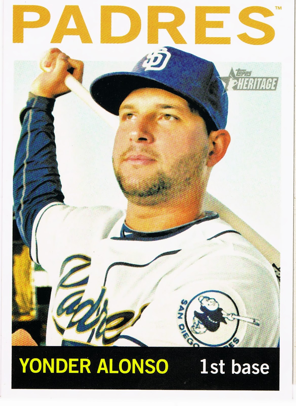
I can't recall seeing this patch on a card before, but then I haven't built sets every year of my baseball life. I get a kick out of the fake swing, no batting helmet pose, but a patch has to be complete to compete with all the other patch cards it will be neighbors with. So Yonder here will probably see just a little binder time, until I find a better example of the Friar Patch.

Which will not be the fate for this card:
I actually just deleted the adjective 'fantastic' before the word card up there. I love this card, but entirely for the Ray sailing on in from the border there. Otherwise putting a white uniform up against a white sky on a white border baseball card just makes the whole result a bit too much floating head for my taste. I like the careful signature though.

So a card of pluses and minuses. But ooooh that Ray patch.....soo smooooooooth......

Monday, November 4, 2013

Phoning it in #2


I could add several more Chapmans like this from the last 3 years. I love the first one a whole lot.

And now ... Le Pièce de Résistance


Sunday, November 3, 2013

Farewell Geoffrey

I think I purchased my last cards at Toys-R-Us. I had a good run, it was fun, we had seasons in the ...

Well, one season anyway. I really liked these purple parallels this year. Some teams looked just outstanding on these, when you see the cards. Sight unseen, hearing the description "It's a Purple-Orange card" doesn't exactly whisper 'sign me up' very well.

The red teams can really pop -
- as can the yellow team, i.e. the Pirates. 

At first I thought to try for a team set of them on purple. The Purple Pirates. ARRRR! But I thought of a much better team set for these. A glance at my want list at the end of this post will probably reveal what that small side project is.

I will kind of miss Geoffrey though. He's the big giraffe that is the Toys-R-Us mascot, in case you forgot. Show me a grown-up who says they totally hate being inside one of their stores and I'll show you someone who needs to loosen up a little and let their inner child crack a smile for a few minutes.

I mean a lot of toys are fairly timeless, and the ones you liked might likely still be in there, grinning at you on your way through the toy maze towards wherever that particular store keeps their baseball cards. And then there is all the candy.....I try and move a little faster before the Swedish Fish can reel me in, again.

All the teams do very well on the purple parallel though, even the blue teams:
I noticed courtesy of Night Owl's thoughts on logos tonight that the Rays got the ho-hum effort from Topps there, with just their "TB" cap logo, rather than their sweet shoulder patch, an actual Ray. I mean several teams got a graphic logo, not lettering, on their cards, like the Red Sox with their red socks on every card. See what that did for them? Now you see what it takes to win a Championship there Tampa Bay? I suggest stopping down to 1 Whitehall Street in NYC with a suitcase full of bubblegum, or something. I don't see a red bird on that Redbirds card up there either, come to think of it.

But I was surprised at how the blue teams fared on the giraffe cards. I tend to use them for the  Rangers in my parallel set:
Because were the rather pedestrian Texas "logo" to sire the card border color, this would be the obvious result. Obvious? Yeah, silly, Red + Blue = Purple. Every actual recipient of products sold at Toys-R-Us knows that. I'm not sure what Red/Blue/Purple/Yellow/Green makes though. A single card rainbow? Where's Roy G. Biv when you need him? Hiding in the factory set perhaps.

I went to see the goofy ole giraffe again a week or so back. I wanted to verify for myself that Geoffrey wouldn't hook me up with more of these purple baseball cards for the Update series. They weren't showing up on my new baseball card master, eBay, and I kept hoping maybe Topps was running late on their deliveries to the toy syndicate.

But it was not to be. Instead I bought my first "Mega-Box" (post coming soon), which of course turned out to cost $5 more than at the Big Box store just two doors down, where I immediately went to seek out more parallels. I was starting to feel a little edgy and nervous. I guess I should have been happy they did do up the purple for Series 2, which was new this year I believe.

Maybe next year they will do all 3 Series in the royal color. I won't know, or care. My parallel project this year will be a one-time deal, I know that. I have an excellent new project dreamed up to start on for next year that is totally different.

Now there is one team that doesn't fare so well taking a stand down in toy-land:
too .. Much ... PURPLE!

So with no more new purple cards to chase and it otherwise being the most expensive retail baseball cards of any possible place to purchase said item, I knew it was my last ride on the Giraffe. I surely won't miss their interrogation session at the cash register. They are way into their reward card deal, and I hate those things. My usual experience in such stores runs something like this:

"Do You Have Our Rewards Card?"

Nope.

"Why not?"

I'd rather not have a pound of plastic cards in my wallet.

"Oh you could use your phone #."

I'm not interested.

"Here, the application is free."

I just want to buy this.

"OK, what's your phone #."

You don't need it for this.

"But if you have to return it, we'll have to have a record of it."

You mean if I don't get any cards I need, I can bring them back?

"I'm not sure what you mean. I'll still need your phone #."

I gave at the office.

"Oh, would you like to donate a dollar to our Toys-for-Tots charity drive?"

Why don't you just donate the extra toys you don't sell?

"Just click Yes on the screen there, and then you can write your name on this shamrock giraffe here."

[hands me pen and little paper dealie to sign. Entire store deathly quiet by this point, all staring at the middle-aged guy buying baseball cards but not getting with the program....]

No, I won't miss that. I will miss these cards though. The White Sox cards can always use a parallel:
And sometimes, their cards really pop:
That really is a purple Hector Santiago card, not another contestant on the What Does It Mean? rainbow contest. I think the printers forgot to change the White Sox into the Grey Sox that day, and they also poured a little extra purple in the hopper that day too. These things happen in the Parallel World I live in. Surprises.

I put Hector in my project on a Target Red edition for obvious reasons, though that still didn't help the White Sox escape from last place this year. Only Topps has that kind of power, not me. I'm not sure we want to see a graphical pair of white socks on a baseball card though. Sorry Chicago, Boston just has so much more mojo in that department no matter how much you try to get it to rub off on you with special red uniforms. Trying to crib mojo from the Yankees never works either - just ask those guys up in Minnesota.

So if Hector Santiago there is already accounted for in my Parallel Project with a Bullseye card, does that mean it is up for trade?

It sure does. All the cards in this post are available, except for the Kyle Farnsworth. He's on my 40-card roster, just in case, as I never know how the cards might fall on a binder page. I need a good amount of these wonderful purple baseball cards. I also have a good amount of them I could trade to ... You. 

It's that time of the year, folks. We can't have half-finished rainbows languishing around our collections now can we? 

I know you meant well when you started that rainbow. It seemed so simple. You got a parallel card of your favorite player/team/league/whole set. You thought that would sure look nice with some more identical-but-different copies of that card sitting right next to it. But no matter how many times you stopped at that Big Box store with all the pretty young things inside, you just couldn't pull another segment of that rainbow.

So now the Hot Stove is warming up. You can go for that rainbow you've always wanted ... but you have to give up on that promising rainbow that just isn't going to make it. You'll have to trade:

I need these purple cards:

29 (Beltre), 48 (Cook), 76 (Inge), 85 (Doolittle), 116 (McCann), (140 Davis or 145 Bass);

(182 Choate or 184 Soto or 189 NL Avg Leaders); 211 (J. Parker); 

(230 Robertson or 231 Mesa); 259 (Colon), (308 Jennings or 314 A.J. Ellis)

334 (D. Norris), 346 (Hicks), 347 (B. Anderson), 368 (C. Young), 370 (A.J. Griffin), 

401 (Dempster), 408 (Crisp), 428 (McPherson), 425 (J. Donaldson), 433 (A. Werner), 

436 (Andrus), (446 Parmele or 448 Hudson checklist); (469 Warren or 470 Franceour); 

(491-493); 501 (T. Milone), (504 or 507 or 508 or 510 or 511); 

(513 McAllister or 520 Bourjos); (576 Teheran or 580 Brett Jackson or 581 Simmons); 

582 (S. Smith), (585 Bailey or 588 Jordan Zimmerman); 598 (F. Martinez), 

608 (Nolasco or 609 Baker); 617 (Rodney), (623 Ogando or 627 Price Cy Young); 

(638 Cashner or 641 Chen or 642 Jackson); (656 Diamond or 661 Ryu)


_from the cards in parenthesis I only need one card in each group_


I have these to trade:

Series One: 4, 22, 31, 38, 49, 51, 53, 55, 63, 64, 65, 66, 81, 86, 89, 112, 117, 127, 133, 143, 144, 150, 171, 173, 185, 194, 203, 210, 213, 215, 216, 221, 223, 224, 226, 240, 248, 254, 258, 265, 269, 277, 281, 285, 287, 289, 307, 311

Series Two: 339, 342, 355, 362, 364, 394, 397, 410, 437, 443, 461, 463, 494, 499, 502, 509, 514, 515, 522, 524, 525, 527, 530, 533, 542, 560, 563, 569, 573, 575, 584, 592, 620, 624, 639, 651

Thank You and......
                               stay in touch.

Saturday, November 2, 2013

A 2 Card Rainbow


Whoa, it's a full rainbow all the way.

Double cards, oh yes.

It's a double card rainbow, all the way.

Header Photo Credit


Whoa that's so intense.

Friday, November 1, 2013

My Favorite Fielding Cards

...aren't necessarily all the awesome In Action cards we get to enjoy here in the 21.1 century - Topps does a very nice job with those, even handing us a nice insert set of them this year, the 'Chase It Down' cards.

I do like those, a lot. But I think my favorite fielding cards are the ones that make you think:
That's actually a very nice card, though I'm pretty sure it is a shot taken during warm-ups; as far as I can tell from the game log Alvarez did not touch a live ball in the field when he came in for David Wright late in this year's All-Star game. I had to cheat and look it up, because I was pleasantly beered up by that point, thoroughly enjoying strange sights like a Prince Fielder triple.

Pedro has one of my hands-down favorite cards this year, and you'll be seeing it again here eventually. He is a heckuva slugger of course, and Topps can't just show sluggers slugging ALL the time, can they?

But what I like about this card only comes from knowing your 2013 National League fielding statistics. I'll be keeping an eye out for Starlin Castro's 2014 base card, (after a great slab of 'cardboard' this year), let's put it that way.

Perhaps seeing a Castro fielding card, or another Alvarez one, will depend on how much Topps likes those 2 players. Perhaps Topps can get a little catty, even:
OMG! OMG! Do I have to catch it? OMG, I HAVE to catch it! OMG! 
I hope I catch it!

Home Run Topps, Home Run.

Did Keith Olbermann write this card?

It all seems innocent enough. A First Topps Card for a young Braves reliever who entered the Major Leagues this year after a sterling college career, and did quite well. He could end up in Atlanta's rotation, or their bullpen next year.

If you have seen him on TV, he is quite remarkable to watch. Topps gave him a nifty card back to match. Definitely my favorite in Update, now that I have read them all: