Thursday, October 10, 2013

Shiny Bait To Catch Things With

I love birthdays. Even though I never get any baseball cards on my birthday.

I love other people's birthdays. The correct thing to do for a friend or family member having a birthday is to buy them a birthday card, yes? And where do we buy birthday cards?

At the Big Box store of course. And we all know oh so well what's inside of those Big Box stores: Baseball Cards!

Let's see what I scored while I was out birthday shopping:

Yep, I picked up some 2013 Topps Chrome. I particularly didn't need these cards, because I have once again broken an old taboo I have about buying baseball cards, which I wrote about here quite awhile back now: I bought a whole Base Set at once.

For the first time in my collecting life I decided I wanted a set of Chrome. Mostly because I like the Sea Turtles so much that I want to see all the variations of them. And also because I wanted to get some fresh Trade Bait to encourage people to read over my kinda complex want list for Series 1 & Series 2 parallels. I think I accomplished that on the very first card I pulled out of the rack pack bonus pack which is shown above. I also pulled #69 Brad Ziegler and #218 B.J. Upton. (Yup, all up for trade). These orange parallels look sharp and indeed, an all-parallel collection of Chrome Turtles such as I am assembling for S1/S2/Update would also be a durn purdy set of baseball cards. But I have my hands full enough already with that project.

The amazing thing about buying a set of Base Cards all at once is the price. The Base Cards coming out of this pack cost about 5 times more than the ones I bought in a whole set of them. 500% more. Boo!

Which kinda makes me upset actually. I like collecting cards by buying packs and trading duplicates. It's a social thing, and a way to enjoy a set over time. But to do that, I have to subsidize all those ego stroking "hit" cards that make up the cost of each pack of baseball cards, whether I manage to "hit" them or not. The Base Cards depreciate instantaneously faster than electronic gadgets, new cars, or New York Yankee ball player contracts.

So I am seriously rethinking how I will collect cards next year. 500% increased costs are too much to be smart about money and collecting, so I might just end up buying another set of cards early next February when Series One pops. That will be boring. Maybe I'll just reach in the box and pull out a random gob of cards to binder up once in a while to simulate ripping packs. Zzzzzz.

Anyhow, I couldn't help myself with just one hanger pack. I had to get a blaster too....the cards are cheaper that way! And I wanted some more trade bait - purple parallels:

He shoots, he scores! Comb through all those stacks for 2013 parallels now... I also pulled #4 Jon Jay (the LaRussa card - you'll be pleased to know that Tony survived being Chromed just fine), #78 Nolan Arenado, and #133 Will Middlebrooks, which is the same as the Series 1 card that really started pulling me back into these sets last early February. Purple Sea Turtles are sharp and that Verlander card is one of the best this year, but those are all up for deals for your trading pleasure.

I was particularly happy to pull Verlander because he is pitching as I type. Pitching very well too. I like to buy cards the day of a big game for my team. This was a good omen I thought. The last time I bought a couple cards was last week when I had to also shop for a birthday card. The first card out of that pack was Bartolo Colon, that night's starter for the A's. That was a bad omen I thought. But come to think of it, the Tigers won that game by jumping on Colon for 3 runs right away in the first inning. Hmmm. Maybe I'm mis-thinking baseball card luck. Hurry and trade me something for that Verlander card before something goes awry!

As I mentioned I was looking for both trade bait, and new Sea Turtles on this fishing expedition at the Big Box store. I landed several:
Oooh, more Dodger Chrome. I heard there was this one outfielder from the Dodgers in this set who would finally be seen on an all new card. I was hoping to pull one of those cards, even though one is on the way to me already.

Instead I got that card. Another apropos base-running shot for Crawford, cool. But I did not expect to see this image in the set, nor understand why it was used. I had the same thought on this one:
tambiƩn este uno:

as well as this card:


and even another Dodger card also:

What unites all these cards? They are all players who changed teams recently. But they have all had new cards issued with their new teams. The thing about their initial 'new team' cards is that they were all Photoshopped into their new uniforms on those cards. Now in Chrome they get brand new picture cards with authentic photos in their authentic new uniforms.

Maybe Topps feels guilty about those Photoshop cards, so they determined to make some new ones for these players; who knows? But I also pulled this card:
Which perplexes me more. I have written about Bourn's Series 2 card because it was so striking - a player who changed teams and then had a new card using an image taken in Spring Training, classical baseball card style. A great card actually, all lit up by the wonderful spring sunshine. Now in Chrome Bourn is on a card that looks like it could have been issued by an unlicensed manufacturer, save for Chief Wahoo there in the corner. A step backwards.

And if these players can get different pictures than their Series 1 or 2 cards, why can't all the players in this set? Oh, yeah, because Topps spends all their production budget on player signing fees these days, not on buying extra photos of ballplayers that they don't need. Collectors no longer care what picture is on a card, as long as it has a squiggled "autograph" on it.

Sigh. I also found what will probably be an image used in Update:
...the more traditional use of new pictures on the picture cards. Player changes teams, Topps makes a new baseball card. That run of Base Cards aren't up for trade but the other 3 dozen or so are on my List List List page  - yes, I do have a non-parallel list. There's lots of famous, collectible players on the list of course ... it's Topps Chrome after all.

I found a different such card in a group break of Chrome, which I participated in to rack up Trade Bait for next week's release of Update. I'll be in serious need of the /25 Sapphire parallels from the Update set itself, though they will issued for Series 1 and 2 as well - so your S1/S2 Rainbows aren't quite done yet and you will have to pay your Topps Rainbow Master one more time. I'm a bit worried Toy R Us won't issue purple parallels for Update, and there won't be Factory Set Orange to help on my project pages either. So I have several of these Blue /199 Refractors available for trade (list up on the Parallel Project page):
Now of course Youk deserves a new card and I expect to see this photo used in Update. Unless we see this one:
Which is cribbed from the 'Sell Sheet' for Update. Once again, I just don't get it. Topps can issue new images for Kevin Youkilis willy-nilly I guess. Everyone else has to do with repeats. And all that work on the front of Youk's new card(s), and we see this on the back:
Which June, Topps? It's October now. New baseball cards are coming out after the season is over (another bitch session for another post). The front of the card tells me he plays for the Yankees. What is a young NL West fan to think about these mysterious doings in the American League? Is this an error card? You changed the card # on the back of this card and conveniently informed me I have a 'Refractor', but no one could be bothered to compose a couple new sentences for a popular player moving to his original team's arch-nemesis?

Speaking of that 'Refractor' designation under the card #, that comes in handy sorting these cards. I only pulled one Refractor, though in 7 packs at 1:3 odds I should have found 2. They are a bit hard to notice without that little designation, though they scan up quite differently than the Base Cards:
That one is up for trade. I like Shiny but I'd say the Base Cards and the Refractors seem more like a Foil card. This is what I think of with the word 'Refractor':
It loses a lot on the scan - an Xfractor. I was really looking forward to scanning it after seeing these on another blog. My scanner puts that line in a different spot than that other blog's scanner. (Sorry, forgot the name). But ooh how these cards hyp-mo-tize me in person. Soooooo trippy. C'mon Topps, isn't it time for some new card love for Doc Ellis? And when that happens, be sure to put him in a set with XFractors. Pretty please?

I'll probably end up chasing a set of those XFractors. Maybe that will give me something to do when the 2014 Base Set I already don't like looks like just another Bowman set...won't be chasing parallels of that, though I will be intrigued to see the clear parallel. I'll probably wait till later next year when Puig's prices cool off to ever complete it, and likely won't even start on trading for it till my crazy Parallel Project is over. If ever.

Webster has an interesting card there. Topps makes cards with different images for the autograph cards (as if the auto collectors even care), though I have no idea if they do this 100% of the time since I don't collect autos nor really plan to start; not even autographed Sea Turtles. But I have seen Webster's auto card in '13 Chrome, which is just a Photoshopped version of his neat card in 2013 Pro Debut.

Now of course we can't have a new set of baseball cards without some inserts. I did better in the blaster & rack pack combo on that front as I pulled two of the 1972 inserts, and none from the other silly insert sets. And no other "hits", though I am happy to get these:
This is where we needed some Ellis, D love but the checklist is current players only. 1972 _and_ Chrome would make a nice set methinks but perhaps I'll have to wait till 2020 Heritage I guess.

A nice thing about these Chrome '72s is they are full-size. 1972 had a nice card back and I liked the ones in '13 Archives much better than the minis in Series 1 & 2. This card -

- has a particularly memorable card back, though you'll have to discover that on your own. I'm not sure I want my blog associated with the mental image that text creates. I'll be chasing this set too some day (Darvish & McCutchen are on the way now), but at a slow pace and am not looking forward to finding the Puig. Probably about the time his prices cool off Will Myers will heat up next year. I'll eventually make progress on those '72 Day-Glo parallels from Archives too. About 1/3 done with that one.

Now I couldn't wander off into the arms of a new Base Set without picking up just a few of my old faithful Base Cards from Series 2. I need those parallels; they appear generally one in every rack pack after all, and I'm over due to pull a Short Print. I didn't get a _needed_ parallel (Gold Pedro Florimon, sharp card), but I did make progress on 2 insert sets even after buying too many packs and pulled 3 Tigers and one Athletic, that had to be good. I got one Chase It Down that I still needed, a darn good insert set for a change ('13 inserts lists finally up on the regular List List List page), and one needed card that fits with the cards just above and is a perfect selection for today:


Mr. October! Surely good luck the day of a big play-off game. Way to go Topps collating machine. And a picture that I haven't seen on a Reggie Jackson card before...nice!

I also looked at those other cards. The ones that aren't picture cards of athletes. On that shelf I made a happy/sad discovery. Always happy to see new packages of Wackys:


But how could that make me sad? I haven't finished collating Series Ten yet! I'd better get ripping on that...I didn't even open all those packs yet. (I save them for particularly gloomy days). That will be fun. Also a nice shout-out to Topps on the visible sticker there on the bottom panel - that's a sticker in the set, not part of the wacky packaging promo material. So you can pack-search these quite simply for that last sticker you will need and it's a nice fuzzy warm memory of cello packs a little. I miss those. Ahhh.

Now of course I finally got within close proximity of these cards being sold retail by buying a Birthday Card. This a card blog I believe...check out this beauty:


I'm looking forward to handing out this one; even though it's not shiny it's the right card to go for the catch with. Her birthday is on Christmas Eve.

Wednesday, October 9, 2013

Yeah, I Chewed The Gum

I miss the gum in the packs. Of course, my teeth probably don't, but it's not like I'm some health saint that manages to avoid all sweets. A couple months back now I actually scored a pack of baseball cards with gum in it, and I wasn't wandering back to the early days of junk wax when I did it:

It came in a re-pack pack of packs, and I was really looking forward to this one. A piece of Bubble Gum from the Topps Chewing Gum Company! And those 1959 style cards inside ... We'll look at those momentarily.

I ran across a post in the blog-o-sphere today that moved this wrapper and it's 8 cards to the top of my blog-about-it pile. One of the best pictures of old baseball card gum ever; perhaps the first picture of 24 year old baseball card gum ever. Don't get too gah-gah over all the awesome vintage cards on the header of the blog (Baseball Card Breakdown) now, scroll down a little to see the gum and the tale that goes with.

I don't think I would try gum that old even though I miss that gum so much. But 5 year old gum, heck yeah. I chewed it on up, and it was all-good, as they say.

I don't understand why we can't have one baseball card product with gum in it still. I know, I know, the "collectors" hate the gum because it messes up the cards, for one. But then the "collectors" who care about such things rarely keep the kinds of cards that get messed up by the gum. Base cards are just filler material for their precious hits.

But really no one wants the gum, even the people who do collect the sets. A great LCS I frequent in the winter used to keep a big jar of all the gum from all the packs on their counter. It was never, ever empty. Anyone who came in could have all the gum they wanted, or they could leave the gum from all the packs they ripped. This was good for me. Err, bad for me. I'm confused. But there was an infinite supply of the stuff, indicating a tiny demand in the brutally supply-and-demand ruled world of baseball cards.

Even so, I wish Topps would put gum in just one of their oh so many products, just for me. For old-timey sake. I know they probably get more sentiment than just mine on the topic. And what are baseball cards if not a sentimental product?

Meanwhile, they hold the patent/copyright/monopoly/trademark something-or-other on the whole concept of packing picture cards of sports stars along with bubble gum....but they don't even use it. Surely there must be some sort of legal precedent on that - if you aren't using your rights to an idea, can you still control those rights?

What I'm saying is, I'd probably buy some of those weird, un-licensed, logo-less baseball cards if they came with gum. Oh yes.

So once I started chewing the gum for the first time in a good five years or so (last time I had picked up some Heritage), I of course started absorbing my 8 new baseball picture cards. I was really looking forward to this pack, because I like '59 Topps a bunch, and have been thinking about chasing this set:

...and the first card is blurry, though the scanner helps it some compared to card-in-hand. What gives, Topps? Is that an attempt at truly authentic authenticity? Were there blurry cards in the 1959 set? I kinda doubt that.

I passed on scanning the 2nd and 3rd cards. The second featured an over-lit face in a stage photo (mark grudzielanek), though I believe that was occasionally seen on vintage cards. The third card (huston street) looked like an obviously digital zoom-in of a photo taken from quite a bit farther away than it appears on the card. It almost looks straight-up pixelated.

I will say that I do like on-card autographs. Yep, printed right on the baseball card by a machine, the "facsimile" autographs that are pointless to the "auto" collectors today. But I have to wonder how much longer Topps could even produce a set with that feature, with the severe decline in basic penmanship in the world of autos. I frequently think there should be a blog featuring all the ridiculous scrawls that pass for signatures, with a 'best-of' 'worst' signature contest every year. It certainly wouldn't lack for content.

The 4th card made me just simply mad:

The beauty of the 1959 cards is the spare simplicity. Though they still convey a lot of information...player's name, signature, city, team name, position, and an extra bit of art via using the team logo. Accomplishes a lot but still looks clean. Then Heritage has to add it's logo. A part of the product, OK I suppose. But the ridiculously large Rookie Card logo in use in 2008 has to come along and push the design past the tipping point. What's the tipping point? I dunno, some line in my mind somewhere.

Maybe I wouldn't have gone over that line if the Topps photo editor had been smart enough to not use a photo with such a dark background on one of the black cards, though I really like those in the '59 design. But with all those other colors to choose from ...

...then I had this guy staring at me. With a something-eating grin on his face, kinda makes you wonder which ridiculous blonde girlfriend he had that year. If I had one of those girlfriends, I'd probably have a Cheshire Cat smile going on all the time too though.

But what is the deal with that blah-orange background? I traded away my only 1959 card this year to a deserving home (Foul Bunt) that is building a set of them. And I've seen others over the years here and there, just haven't owned them myself. But one thing the 1959 set never says to me is "pastel." The colors always seemed brighter to me, even 30 and then 40+ years later. But the Heritage cards (in this pack at least), just seem kind of washed-out to me. Not quite right somehow , like the tint control got stuck on 'low' at the baseball card factory.

Lately I've had some thoughts on A-Rod, he of the many lawsuits now, and yes, I'm going to head way off on a tangent away from baseball cards. I'm sure you're not too surprised. But this is something I posted on somewhere (I'm not allowed to post a blog link there, so why post a link to there?) on the topic maybe a month ago, just after his suspension was appealed and he started playing in the 2013 season finally:

A-Rod's defense is that he is being blackmailed. He is disputing this, he claims, to protect future players.

I look forward to reading a solidly investigated, quality journalism book on the entire Biogenesis affair one day.

But until then ... what if A-Rod is telling the truth? So this Bosch character had a disgruntled business partner that resulted in the beans being spilled on his sales of PEDs to the other dozen+ players. But what if he _was_ simultaneously blackmailing A-Rod for money? Could there be a better blackmail target in all of baseball? He was the most hated player in the league way before these allegations surfaced. Who is going to believe A-Rod? The League?

Why would A-Rod risk his huge contract by going out and recruiting other players to use PEDs? Makes no sense. I could see him using to combat his aging, sure.

Is MLB just using some documents from Bosch, and the tales of Bosch while trying to avoid other legal action, for this? They have "evidence"? What is it? Just that guy's word and some pieces of paper? Are there any other key revelations I haven't heard?

But I think A-Rod does have a certain point. Absent a failed test, players could be vulnerable to extortion/blackmail type threats. A lot of money is on the line ... might be easier just to pay the criminals.

I think it will be a long drawn out case. Maybe a Court TV type case. Rodriguez can certainly afford a few lawyers.

I dunno. I do hope I don't have to pull so many Alex Rodriguez cards all the time, going forward. Though I'm inclined to go backward in collecting of late, so I think there will still be a lot of A-Rod cards in my future.

Finally, Topps came through with a solid line drive right over the center-fielder's head and bouncing off the wall, the left fielder is coming over but he can't get it either, and the batter is into second with a stand-up double:


Griffey to the rescue! Thanks Topps!

Monday, October 7, 2013

A card of fundamentals

I think most collectors like Bunt Cards. I like them so much I honored them with some capital letters there.

Bunting itself is a more controversial topic. Bill James and then the book Moneyball began the assault on the theology of "small ball'; I think the movie version of Moneyball really brought the topic to more casual fans.

However you may feel about baseball strategy, Bunt Cards will always catch your eye when flipping through a stack of cards. Probably because there are just so darn few of them. I have previously written about one of my favorite cards in Series 1, #284 Angel Pagan, which is a bit of a stealth Bunt Card in that Pagan has already left the classic bunt pose. #273 Dexter Fowler is a similar post-Bunt Card.

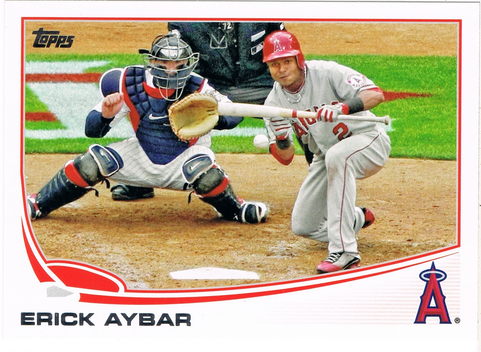
So it was wonderful to discover a quintessentially classic Bunt Card in Series 2, featuring Angels Shortstop Erick Aybar:

The Topps scribe even conveniently syncs up his prose with the imagery, explaining on the back that "Erick is moving up Angels career lists on some of the more subtle categories. He's their all-time leader in bunt hits (78); ..." You'll have to buy your own card to find out Aybar's other statistical subtleties. They are pretty cheap as this is just another useless Base Card.

Aside from being a fantastic Bunt Card, this card is also an outstanding illustration of photo editing, specifically cropping. Aybar's left foot seems to be resting on the frame, while the catcher even seems to be using the frame for a bit of support. Perhaps that left border could have been zoomed out 1% more for a little bit better masterpiece I guess.

Now when I set this card aside to babble out late some evening, I didn't really think it would tie in so much with the Angel Pagan card I like so much, aside from both of them being Bunt Cards. But when I started typing away about Pagan's card, I quickly wandered off into the theory of Photo Composition, something I am slowly learning via admiring my baseball cards. I think I have even managed to find something to take a picture of to put this knowledge to use; I'll share it with you some other evening whenever I find the time to unpack a bunch of 2011 Series 2 cards I bought real cheap even though I hardly needed very many of them. They were cheap.

Anyhow, in that post (relinked again here) I got a little closer to understanding a mark-of-good-photography called the Rule of Thirds, though concluding it can only infrequently be used with baseball cards. At least, until I showed it to my friend Jeff, who I had borrowed an illustrative train picture from. His comment got me much more discombobulated on the subject.

So tonight I buckled down and asked Google to tell it to me again. This time I went with a simpler link to the Wikipedia entry on the subject, rather than a more high-falutin' Art-Of-Photography type site. This one tells me that "The guideline proposes that an image should be imagined as divided into nine equal parts by two equally-spaced horizontal lines and two equally-spaced vertical lines, and that important compositional elements should be placed along these lines or their intersections."

And this is exactly what the Topps photo editor has done. The subject of the photo, Erick Aybar, is not the center of the photo; he commands the right 1/3 of the image. Since the card has gone and scrolled away again, I'll post it again, since digital stuff is sorta free:

Indeed nothing is centered on this card; the center of it might be in the patch of grass below the catcher's (Joe Mauer?) left elbow, with a constellation of the elements of the photo circled around that point.

And with Aybar, the Umpire (I always like an Ump on a baseball card, even if just a portion of one), and the Catcher all making a nice set of vertical elements, we also have an excellent set of horizontal elements courtesy of the infield grass and the dirt. I think I detect the interlocked TC logo in that grass there. Plus we get an appearance by Home Plate, so very rare on baseball cards, even though returning a batter back to Home Plate is the very object of the game of baseball.

Recently I read a criticism of this year's "Sea Turtle" design as it has been dubbed. To wit, "there is too much wasted white space on the cards." But I think I disagree on that idea thanks to what I have learned studying this card. Perhaps the very layout of the cards themselves is part of what has made this set pretty popular with whatever collectors there are that actually care about these things. Perhaps that "wasted" white space actually helps get the image of the player more onto those tension creating, not-centered or squared parts of the card, and this makes them subliminally more attractive to us.

But then that might only truly work on the great horizontal cards. I would say that I am looking forward to finally assembling all the horizontal cards in Series 2....I had better get my butt in gear on that as Update drops next week sometime.

So yeah, yeah, yeah, enough with the Photography lesson already. What about the baseball game being played on this card here? Looking at the catcher's pinstriped white uniform, all classically accented with red white and blue, and my hunch on the logo painted on the grass there, makes me think this game features the Angels at the Twins. Aybar does seem to be wearing road grays, though of course the Angels® refuse to ever come clean with where exactly their hometown is.

But with the California or Los Angeles or Anaheim Angels being in the AL West and the Minnesota Twins being in the AL Central, that leaves probably only one visit by the Angels to Minneapolis in 2012, but actually Baseball-Reference.com informs me that the Angels visited Minnesota twice for a 2 game series each time. I bet the Angels were thrilled with that scheduling.

A bit worse for my curiosity on the impending bunt action by the Angels all-time Bunt Hits leader, Aybar bunted once on each trip to the Twin Cities, on both April 9 and May 9, 2012. So back to the card I went for more clues. Perhaps long sleeves would indicate playing on a chilly April day; this card is definitely shot in the daylight. But both days are weekdays - and the 2nd game of the set, played as "getaway" day games to facilitate traveling on to the next stop on the schedule. Baseball-Reference has everything though, reporting that April 9th was 45Āŗ while May 9th was 65Āŗ at game time.

At this point I'm leaning towards the May 9th date as Aybar is sporting the short sleeves here. But I keep staring at this wonderful card for more clues...hardly any shadows on the field, must be cloudy out. Baseball Reference is ready again, reporting that weather conditions were "Cloudy" on each day. I bet the Sabremetricians have a line in their spreadsheets for that too.

Me, I'm just a baseball card geek, not a stats geek. So I stare at this card some more and find the final clue...a uniform #. How does Aybar's # 2 tell me what day this photo is shot? It doesn't. The Umpire's #  there at the top of the frame - 72 - does. MLB Umpire #72 is Alfonso Marquez. No baseball cards for them of course; I had to ask The Google that too.

And that clinched it. Marquez called the game as the Home Plate Umpire on April 9th. Temps in the 40s must not bother the Dominican Rebublic born Erick Aybar. Tough. And now I get to see what happens when that pitch hits Aybar's perfectly squared bat there with one out in the top of the 7th, the Angels up 2-1 and a runner on third...

...it's a Suicide Squeeze! Aybar lays down a perfect bunt fielded by fresh Twins reliever Glenn Perkins, who can do little but throw Aybar out as Chris Iannetta races home and scores!

Perfect!

Sunday, October 6, 2013

How Not To Do It #2

I liked this card a lot when I first saw it. It has a baseball on it. Those always catch my eye when I look at baseball cards.

It will be very hard to see when I finally show you the front of the card, but the card features a Special Uniform night. Not a Throwback Uni, but a special Uni some teams wear occasionally for Hispanic Heritage night, or however that team might phrase that certain theme night.

And I like cards where the player has at least a positive expression on their face, even if not actually smiling, though a player's demeanor isn't actually under their control during live ball game action.

I actually also like how Topps tries to show a player's position via what picture they pick out for them, though obviously they can't show only fielding images of the position players. And I really wish they would back off this idea for all the pitchers.

So I'll show you the back of this card first.


Keep this player's circled position in mind (2B for you squinters)...may I present Justin Turner:


What is Justin doing here? At first glance, he is demonstrating his perfect-for-an-infielder last name and I could triumphantly declare Aww Topps, You're So Punny! again. Launch a series of such posts even.

But upon the dreaded further review....

...we have no base runner trying to interfere with Justin's seemingly routine handling of a routine ground ball. Instead we have a blurry, lurking opposing player holding on second base behind Justin, waiting for the fielder to make his choice. No turning of any double play here. Although Justin has his eyes squarely focused on the photographer, err, the first baseman, his throw looks like it will sail off towards the pretty ball girl along the right field fence, unless Justin has a truly wicked curve ball. And this card collapses in a heap like an over-eager rookie swinging for the fences.

It does appear that Turner will stick around in the major leagues, after a decent enough season this year, improving his batting average 31 points in an around-the-infield utility role. Topps did miss the expected move to the outfield, where he only appeared in one game, so the Topps scouts were a little off there, as they were on several elements of a great baseball card. A great Special Uni ("Los Mets") - wasted. Great horizontal fielding shot - of a probable error. Possible visual pun of the entire set - nope.

But I'm sure he'll play second base again. There's always next year, Topps.

Friday, October 4, 2013

5 Cards challenge #3

This 5 cards, 1 buck pack seemed like a no-brainer at first. I pulled the outstanding horizontal card from sorta the end of Series 2 - #660 - Miguel Cabrera. Kinda a hero number card I guess, though Hyun-Jin Ryu at #661 is actually the last card in the series, due to the no #7 of course.

It would be fun to write about Cabrera and his heroic card. Easy too. Too easy. But I pulled 3 Pitcher cards as well. I'm supposed to challenge myself with this little blogging exercise, ¿Si? No? Heck, it's my blog and I'll blog how I want to. I decided to pick from only the Pitchers.

I have previously called out Topps for their lazy Pitcher cards in 2013. Enough with the zoomed-in torso shots already! Let us see the ball diamond some. Blogging all the Sea Turtles would be a serious challenge, wading through all of those. Update is probably about to shortly dump scores more on us when the middle relievers all finally get their 2013 baseball cards, now that the season is over for most of them.

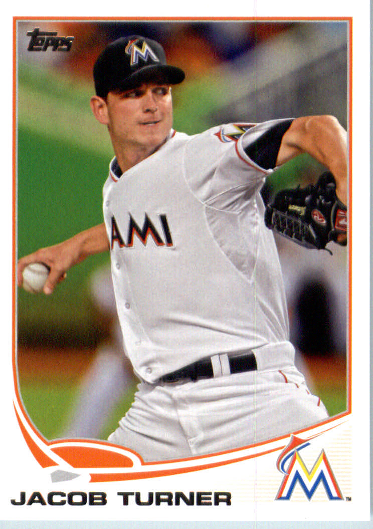
But this card grew on me quickly. It is of course, due to the lines. X! I like X. Draws you in from the edges. Then bangs the subject into the action. This pitch is going to make the hitter look like a fool.

Which it better, with that possibly lurking runner on 2nd base mirroring Turner's silhouette there - a 2nd set of interesting lines. Is the lurker in grey, or white? Base-runner, or fielder? A mystery.

And unlike many an action shot which captures the player's uniform billowing out until they look like a football player, Turner's uni stays cool, as if it doesn't want to interrupt the perfect pitching motion seemingly under way here.

But back to the X. Yumm. At first I thought the Marlins stadium had something going on to create that certain blurry background imagery. It immediately brought to mind one of my favorite cards from 2012 Update, Nate Eovaldi's. I'll show you that card some future day and ooohhh and ahh and bloggle all over that one then. Then I thought, no, just coincidence, as Turner is wearing the road uni, with his team's city on it. Wait. Road whites?

So I had to ask the Google what was going on. Leave it to the Marlins to make a home uniform that looks like a road uniform....not to mention using black uniforms in one of the warmest cities in MLB. At least their players seem to get some good baseball cards.

Anyhow, the stadium lines in the background set it all up. Then the flow of the pitcher's arms keep it going, common enough on all the pitcher torso cards. But the icing on the cake is the eyes. Right on the line. And no Pitcher Face. Calm. Cool. Turner is no fireballing gunslinger, but I wouldn't want him shooting at me in the OK Corral either.

I also like the back of this card, where Topps informs me "In 2012, 21-year-old Jacob was the youngest pitcher ever to win a game in both current Leagues in the same season. (Back in 1887, Cannonball Titcomb did it in the NL and the American Association.)"

You can't beat a card that namedrops 'ole (young?) Cannoball, now can you. Well, if you bother to read the backs at least.

The final item pushing this card onto my really-like-it list is where Turner sits in the Major Leagues. As a former #1 draft pick for the Tigers, he has had plenty of cards already, with a pretty early Rookie Card complete with the official RC logo. At 20 years old on that 2011 card, it makes me wonder if we have had a teen-aged MLB, true Topps Rookie Card yet? (And how long till we have a pre-teen Bowman card? Can't have too many prospect cards can we?)

But that is not my final intriguing pondering over this card. With such a young starting pitcher, it is of course too early to tell what kind of career he might have. But Turner went to the Marlins (along with a catching prospect Rob Brantly, also in Series 2) from Detroit, my team. The Tigers got a brilliant half-season rental on Anibal Sanchez, and a season-and-a-half from veteran 2nd Baseman Omar Infante, who just had the best season of his career and will have a lot of value on the Free Agent market this winter.

There is a lot of history between the Marlins and Tigers of course. Tigers General Manager Dave Dombrowski used to be the GM in Miami. Jim Leyland managed in both cities with Dombrowski in the Front Office. Then there is a previous famous trade where the Tigers landed card #660 this year, in exchange for a couple #1 draft picks. (Cabrera for Cameron Maybin and Andrew Miller, amongst others).  How does he do it? Ownership changes make the Miami<>Detroit connection more coincidental than it appears on the surface. And the Cabrera trade will remain a bigger blockbuster due to the short contract terms left for Sanchez and Infante, for starters.

Perhaps unless Turner really blossoms on an apparently very promising young Marlins rotation. His 2013 Topps baseball card certainly bodes well for that, much more so than so many middling pitchers in all sets of baseball cards. This is just another one of those good baseball cards that never fail to famously remind me that in baseball, there's always next year. Especially for the Marlins.

Thursday, October 3, 2013

5 Cards challenge #2

I can't really drive through civilization without stopping to see which baseball cards might be offered up for sale. I am on my way back to my baseball card collection...just in time for the playoffs.

But way out here at the very end of the consumer product supply chain (Michigan's Upper Peninsula), I didn't bother peeking in the big box stores for some 2013 Topps Chrome, even though I am pretty eager to see some blinged-out Sea Turtles. These places did eventually get those Topps Chipz, somewhat to my surprise, and of course the Qubi stampers too, even more of a surprise. Chrome should hit those shelves in another week or so I expect.

So I went with a sure, cheap thing - the Dollar $tore.

The repacks on offer, the 30 cards / one buck deal of course, didn't entice me with the uni-color Fleer offerings on top of the package. So I grabbed 5 cards of Series Two, just to pick up something to blog about.

And promptly lost the Topps lottery of the day. Two cards that had been the main subject of a post already (Michael Bourn and Juan Francisco), one that I hope to mention in a multi-card post (Phil Coke), and one with a special uni that I had already had fun with via another card.

That left just one card to blog about, and even that one has been mentioned here somewhat obliquely one rough day in July, courtesy of the great blog All The Way To The Backstop.

So let's Get Down! with Greg Dobbs and one of my favorite cards from Series 2:


Sorry I had to crib that image from eBay. Why do I type it with a capital B? I don't know.

If that turns into a red X or a blue ? someday I will replace that image with a quality scan when I get home. This card deserves a good scan.

Thanks to Backstop Cards, I will always think of this card as the Get Down! card. Are we going back to Disco Night at Comiskey? I'm not sure. Something exciting seems to be going on though, even if the fans seem to be watching a different part of the field than Greg is.

Seems that the Braves are visiting Miami for this image, and the poor ole Marlins can't even fill all the seats in the 3rd row. I think if I can ever get within a few hundred miles of Miami during baseball season, I will check out a game there. I like sitting right on top of the action.

And we have a night card, though not much of one to write home about. Just the stadium lights reflecting in the batting helmet tells us this.

The back of the card reveals a decent, mostly National League career, which is why I only know hardly anything about Greg Dobbs aside from the fact that he appears in my sets of baseball cards. Topps gives him a couple nice shout-outs with their text. Respect. A grown-up baseball card.

But after these basics, the mysteries begin. Someday in my not-voluminous free time I will be investigating this Only One Sleeve trend I see on my baseball cards. One elbow sleeved and one bare does start creating some imagery intrigue though.

Then we have the most basic mystery of the card. What is Dobbs doing? Is he covering for the third base coach, off taking a leak in the clubhouse for an at-bat? Ahh the irony of a third baseman seeming to give the STOP! sign to the runner rounding second.

Or is Dobbs at home plate, signaling a runner rounding third?

And what is he signaling anyway? The right hand, palm-out, is saying Stop! But what is his left hand saying? It kind of looks like C'mon down, the buffet is thataway. Very confusing. Maybe Mr. Dobbs is just trying to say Hi, but it's a little hard to do on a baseball card.

Meanwhile, whether he is behind third base, or behind home plate, how did the photographer sneak onto the live field of play to get this shot anyway? Or is Dobbs in the On-Deck circle perhaps. I'm kinda lost now.

Then we see he is yelling something. What? What? What should I do Greg? Ask Lassie? Look down the well for little Timmie first? Follow you to that bitchin' new club in South Beach with the wicked DJ later on?

If only baseball cards could talk.

Wednesday, October 2, 2013

Qubi Me

Or maybe Qubi you. Guess which ball player is connected to a stamping in the photo and I'll send it to you if you want it.


You might want to save out the photo and tell your computer to blow it up a little bit. Go ahead, cheat a little. I'm too lazy to do it for you.

I do want one Qubi - the one of Miguel Cabrera, which stamps a Detroit Tigers olde English "D". I would probably use it to stamp an olde English "D" on things. That would be fun.

That is what I presumed would be on these goofy stamper things. All 30 team logos, for a start.

Oh, I knew there would be some autograph stampers. I thought they would be the rare ones, for people to "chase".

Instead the autograph stampers are the base set essentially. And instead of just the Houston Astros getting the shaft, some 15 teams are left out of the logo set.

And there is an Ichiro stamper. His only appearance on 2013 Topps products.

I just don't get it. Of course, I don't get autograph mania either. I did like autographs on the front of my baseball cards, but that was kind of a back-in-the-day thing I guess. The day when people actually cared what their signature looked like, like that one at the bottom of the picture that will be easy to guess.

But why would anyone want to stamp a 21st century ball-player's illegible scrawl on something? Does Topps think we are really that obsessed with psuedo stalking our favorite baseball players that we would desire such a thing? Probably Topps does think that, because perhaps we are that obsessed.

So why did I buy these anyway? Well, it had something to do with Major League Baseball, and Topps. So just as I have been doing all of my life, I bought some to check it out. Bored I guess. And I want that olde English "D" stamper. So I chased it.

Sure, I could just buy one on eBay. But that is so boring. And also fairly difficult for me when I'm out on a job overrun with bear hunting bikers camped next to me. (Really). Nice folks. Not much into baseball cards though.

So I bought a couple-three or six of the dumb things over the last month. Unlike the ridiculously silly "hits" they keep inserting in all the packs of cards these days, fifty years from now a set of Qubi stampers will have not-yet-born Topps addicts drooling over the warehouse find of several cases of them in a dusty corner of some Chinese freight depot, where the little plastic doo-hickeys are made actually.

Just like the various old Topps test products sold only at that one store in Brooklyn do today.

Perhaps. Or maybe humanity will be melting down poly-acrylic-whatevers to fuel their levitating footware to get to work on time. Who knows. I don't.

I just know that when it says "Topps" on it, I'm probably gonna buy a little bit of whatever it is, just to see what it is. Anyone need a Topps 'Baseball Coin' of Steve Kemp? I thought not. I've got like a dozen of those goofy things too. They're starting to rust. But I can't throw them away. They came from Topps.