Tuesday, November 11, 2014

Beguiling Binder Pages #12 and 13

Finished a page today … I'll change the numbering system again next time. I finally got it figured out. I think. Here 'tis:
Yes, I was glad to see this one. The first page from the Update part of the set.

It was a tough decision to attempt extending this project to the Update cards. Without two key decisions by Topps, it wouldn't really be possible.

What's that Dan Haren card there in the center … what does that logo say? Chrome? Yep. I am using Chrome cards for the all-parallel Update collection.

It really wouldn't be possible without them. Last year, Topps issued a small set of 55 cards from Update done up in the Chrome style, though, surprisingly, without quite the hoopla they put in a regular Chrome set - just two parallels (Gold and Black), and one quite lame insert set. These were the "Mega-Boxes." 

I enjoy my project as it moves along, but for the Update cards, several possible parallels don't exist - Toys R Us purple, Factory Set Orange, Wrapper Redemption Blue Sparkle, and Wrapper Redemption Silver Slate. and Opening Day Blue Foil. Wait. Opening Day is a different set. So is Topps Chrome. That helped me rationalize a little, since I do use Opening Day Blue Foil in the Series 1 and 2 pages where I can. The only thing different are the card #s and a logo on the front; the photo and the Turtle remain the same on the vast majority of cards. Shin-Soo Choo, though, got the most different Sea Turtles last year, with 4 different photos.

But this begs a certain question - why don't I use all sorts of the various Chrome parallels for this project? I considered it. With these Update cards though, the only two parallels, Gold and Black, were the same as two of the base parallels. This is also basically true of the standard 220 card Chrome set, excepting at least the Sepia and Atomic parallels I still hope to obtain an example of one day, perhaps a few others.

And overall, I'm not a big fan of Chrome cards at all. For fun and to complete my full look at the Sea Turtle design, I have a set of the 2013 Topps Chrome base, mostly to look for image variations from Series 1 and 2. And in the long run, I am going for a collection of the Xfractor versions of those cards as you can see there on your right or through this link.

The use of the Update Chrome cards led to a different problem - there are a few pages that don't have a card from Update Chrome. A pickle. I can complete such a page, but it's not easy. I'll show you one day, I hope. I do have a couple that are over the difficult part….

Of course another Topps decision aside from the Update Chrome set also made that page possible - the introduction of a new parallel - the Sapphire. I quite like them, a pretty baseball card. The first thing I have to do completing an Update page is find the Sapphire, before I can worry about the Pink, Black, or Camo (I also need one of each on each Update page - ugggh. Tough project.)

These come in an edition of /25, which is quite unfortunate. In 2011, the Update release also included a new parallel that was extended back to the Series 1 and 2 cards already released - the Hope Diamond, which came in an edition of /60. Much easier to get a hold of.

Incidentally, I have been trading some with a collector who is not only putting together a complete set of this year's Sapphires, but is only 3 cards away from a set of the 2011 Hope Diamonds - 280 Andrew Bailey, 497 Alex Avila, and US207 Frank Robinson. If you might know where any of those three cards are, I can get you in touch with him.

OK, OK, the cards have done scrolled off the screen again. Let's see some more baseball cards….here's page 13:
This was indeed a lucky 13 page. For the first time, I have run into a page of 9 cards with 7 blue teams.

And out the window go my color-choice goals for this project. Where? What? There on the Chris Johnson card. A blue Sea Turtle on a blue parallel. I picked him because at least his team logo has the most red of the possibilities here.

There is no escape. A blue Emerald looks terrible. A blue Sapphire would be the very problem I am describing - blue-on-blue. Yet this page almost holds one example of each possible parallel I can use for the Update cards, save two: printing plates, Silks, and Platinum 1/1.

So now I have finally been pulled all the way into the bizarre world of 21st Century baseball card collecting, which for so many is no longer about completing a simple set of baseball cards, or obtaining a desirable Rookie Card of their favorite baseball player. I've questioned it before, but what, ultimately, is really the point of owning a 1/1 baseball card? Particularly when the 1/1 cards are just a color variation from an otherwise identical edition of that same baseball card? Yes, it makes people happy to own one. I shouldn't criticize that. But I just can't wrap my mind around such a pleasure I find so strange - I own this, and you can't.

And now I want one. It would give me my own strange pleasure to replace that Chris Johnson card with the Platinum 1/1 version. Or any of the other 6 blue cards on this page. I could settle for a Printing Plate I guess, though that is not my first choice. I have one on another page, though at least I pulled that one from a pack myself - my first 1/1. You never forget your first one. And I have purchased one other Printing Plate, for one of those pages with no Update Chrome available.

Silks, ahh, another topic for another night. I should probably wrap this up and click over to eBay. There might be some new 2013 Topps parallels listed...

Friday, November 7, 2014

It's only a buck, what the...

Blah. Baseball season is over. Thankfully, you can still buy cheap as cheap can be baseball cards 364 days of the year. Let's see what fun I can have for only a dollar.

Of course, these re-packs come in clear plastic packages, so you can select your first card from a couple dozen in the box:

Does this make me a pack-searcher? Horrors. I call it Window Shopping, and this post will be indexed back to be probably Window Shopping #2, some day. 

I've always wanted one of those Hall of Fame cards. Not enough to buy a basically over-priced whole pack of them. But when it's only a buck, with the promise of more fun to be had inside, sure thing. And it's a Detroit Tiger Hall-of-Famer - not all that many of those, so I figured I should brush up on my baseball education on another gloomy day underneath the Arctic, errr, the Great Lakes Cloud Machine.

OK, OK, it wouldn't be a pack rip blog post without showing the first card. The free sample doesn't count, it has to be the first card that you couldn't see:

Nice enough full-bleed effort there from Pacific I guess. I like when I can tell it's a home game by what's in the background of the picture. So unlike today's cards.

But that one will go in the special box of 100% completely random cards I have pulled from cheap re-packs. I'm going to sell them. Yep. Junk wax, for sale. How can I achieve this miracle? I found a card in one of my repacks that showed me the way. You simply sell them by the pound. No need to sort them by year and manufacturer, just stack them up. 

My dream is to sell these repack cards back to the repacker. I might even just put them all in a box and send them there on my own, and ask for a $1 pack of cards back in the mail. Just for the entertainment of thinking about how many times one piece of worthless cardboard can circulate the USA until it finally finds an appreciative home. I hope the corners don't get dinged along the way and ruin the card so much that it becomes worthless.

But let's keep flipping through the pack:


Whoa. The card is in the pack backwards. This never, ever happens when Topps Chewing Gum Company is in charge. I think if it did, I could still remember what the school bus smelled like that day, because that would straight up be an Earth-stopping event. Topps does lots of endearingly odd things, but the baseball cards never appear in the pack like this.

This card might be some sort of indicator of the baseball card tsunami approaching the shore there in 1990. The pitching coach of a minor league baseball team. But, then, by reading the back, I learned about one of the baseball immortals that has pitched a No-Hitter, even if I have never heard of him before. Which is kinda why I buy baseball cards in the first place. Mickey Cochrane there on the top of the pack knew what was up.

I think I like this idea of finding my new cards aseball-ackwards. Let's see where it takes me:

Cha-Ching!

1999 Topps Finest! This card has got to be worth, like, way, way more than the 5 pennies I paid for it. It might even be a /100 Gold Refractor and my winning Lottery ticket for today!

Alas, it was not to be. I'll save you from seeing the front of the card, so you can enjoy it more when you pull one of these from a repack. Actually a pretty nice baseball card all the way around. I learned that Curt Schilling was born in Alaska. Over the course of his career, this must have delighted the card-back writers toiling away on antique word processors all over America in the 1990s - "The only major leaguer born outside the lower 48 to pitch a Shut-Out in Florida…" And it uses the word "iced" - baseball history foreshadowing?

Topps Finest, of course, is a set with the Protective Coating you are supposed to Peel And Remove. I took a scroll through COMC listings to see how much money I made on this particular investment - at current market rates of 65¢, I made a 1,300% profit on this one, where else but baseball cards can you get rich quick like this? But on every single one of the COMC scans, not one single baseball card collector had ever Peeled And Removed the Protective Coating to fully enjoy the imprisoned baseball card beneath. What will I do with this finest of baseball cards? What do you think?

Ahh well, I'll wield the scalpel on my own time. Your time is more valuable than that, I hope. Let's keep reading card backs:
Another Fleer set, another set of useful baseball player statistics. In the year 1990, when no one had yet heard of Bill James. Although to be honest, K/9 and BB/9 aren't actually "Saber" stats. But they are a darn useful way to think about a pitcher (check out Koji Uehara's #s in this category sometime). This is the second Fleer set I've found lately with such usefulness on the back. I always liked Donruss card-backs with their contract status information. Someone, somewhere, needs to write a card-back that assembles all this stuff. Instead, on this year's Topps we get ever-so-useless "Rookie Facts," though of course they did finally dip their toes in the Saber pool with including WAR on the cards, and printed saber-metric short-print card-backs, so they'll catch up to 1990 Fleer eventually.

But I know you don't really buy even a one dollar pack of baseball cards for the backs. The action is on the front:
Yes! A night card. A World Series card. A nickname card. I didn't recall from my childhood > teen years that Dwight Evans was nicknamed Dewey. Probably because Topps never put that on a Dwight Evans card that I can recall, they seem a little shy about using nicknames sometimes, and that is where I got most of my baseball information aside from listening to Ernie Harwell. He was probably too busy telling us about 1930s nicknames to use a 1980s nickname.

That 1987 Fleer card there is a heckuva card. # 9 of 12 - any Red Sox fan should own this insert set. Mets fans, ehh, probably not so much. But 12 World Series cards? Brilliant. 4 sharp paragraphs of baseball and player history on the back. I also did not recall that Evans was the only Red Sock to play in the all-time famous '75 Series, _and_ the also all-time famous '86 Series. Once again, the reason I buy these things with my hard-earned dollar.

This card has one slight defect though. I could remember enough of my baseball devouring youth to recognize that Red Sock #24 in the 1986 World Series was Dwight Evans. But with just a nickname and a uni #, I'm sure some west coast fans might see this card and wonder what random rookie was crossing the plate for Dwight to congratulate there. The defect is that I generally never like cards that don't show a player's face. 

But sometimes...
Magnifico! 

Except for a small nagging defect I'll return to shortly. Overall a really good card though. 

That's not a full bleed card, the scanner just makes a '93 U P P E R  D E C K look that way.

I always like cards that clearly show the fans. Again fairly rare today. But I have to wonder about this one fan - 
Could it be the saber-wielding wizard of stats himself, immortalized forever on baseball cardboard?
I dunno. Here at Base Set Calling, I report, you decide.

But as I was typing, I like that Hal Morris card; I can forgive the very best of the best action shots obscuring a player's face. I just wish  U P P E R  D E C K would have stuck with their traditional small logo off in the corner somewhere, as on this 2009 edition:
This card intrigues me because now it looks like the statistics have left the back of the card and migrated to Jose Molina's left shoulder patch:
I have no idea what that patch is. I'll have to start my research via finding more 2009 baseball cards. Darn.

Of course, with a pile of 90s and otherwise junk wax cards (with the thorough un-appreciation of base cards in general in the hobby today, have we ever truly left the "junk" era?), the fun is in finding the weird cards:
Yep, Chad, it is darn hard to see the baseball through all that foil gimmickry Upper Deck was already putting on prospect inserts already in 1992, particularly that just plain odd halo there in the design. 

1992. Who would have thought it all started so soon? Who?
Urkel! That's who. I never knew Urkel played baseball when he grew up. 

It seems that maybe Topps and Upper Deck got together during Hot Stove time 1991 and colluded on what goofy things they could do with the next year's baseball cards. They both went with pointless gold foil (more baseball card history in the making …. who put this repack together anyway?). 

Meanwhile this card seems to be an example of another new concept we all needed so, so much - parallels. Unfortunately, my newly beloved Urkel baseball card is not a Gold Winner edition. How cool would that be - an Urkel baseball card that clearly told me I was a "Winner" right there under his left hand. You'll have to pick up your own repacks to be a Gold Winner. I'm still playing the Lottery on that one, but with a little luck, someday, I hope...
Aww heck, there's a winning baseball card right there. I'm not sure if Pat Kelly there is pantomiming breaking a bat over his knee like a real baseball bad-ass, or, since repacks are almost always exclusively 1990s affairs, he is just about to declare this $1 pack of baseball cards to be worth Two Thumbs Up AND a Snap!

Wednesday, October 29, 2014

A card for tonight.

I like repacks more each time I find some.


But I've certainly never wanted one of the above. No matter how much I can enjoy unwanted junk baseball cards, I'm not going to pay 16¢ each for them. 

Until today:


Not seeing the connection?


I've been enjoying the new crew on Fox this World Series, and have started to want a Harold Reynolds card. And Dollar Tree came through for me, although I can't for the life of me figure out why anyone buys those 6 card packs when they sit right next to 20 and 30 card packs for the same price.

And yes that means I have some other cheap goodies to play with soon too.

In the meantime check out the back of this 87 Fleer:


A bit short of two decades before The Shift changed the game of baseball (and a few years before Stadium Club went with wonky data card backs), someone was laying the groundwork - collecting the data. 

And Fleer probably purchased it, as it is copyrighted from "Mountain Lion", something I'll have to explore from the comforts of home some time, rather than the cab of my truck, where this post is coming from. 

My other question of the day is - who will make the first Tom Verducci card?

Tuesday, October 21, 2014

Beam Me Up, Scotty

I've been half-heartedly looking for this card for a long time. I knew I would find it, but I had no way to know which card it would actually be:
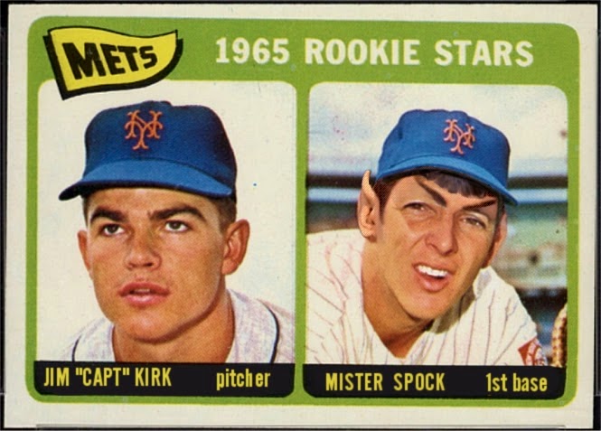
I think you can probably connect this card to the title of this post. Unless, perhaps, you are also too young to not understand the reference when a bald guy says "Make it so."

That's Strike-Out King Mark Reynolds starring on this card as he is about to be whisked aboard the USS Enterprise, from back in the days when he played for the Diamondbacks. Reynolds surfaced on First Base in Milwaukee this year, another marcher in the long parade of nothing at the position for them, outside of the years it was manned by someone named Cecil, or the son of someone named Cecil. Lately the ennui of that carousel is even affecting the guy just across the chalk line attempting to guide the players from the Coaches Box, as they told their 1B Coach to hit the road recently. Though when you think about it, how you can screw up relaying signs from the home dug-out to right-handed hitters bad enough to get fired? What else does a First Base Coach even do?

But I digress. I'm sure you're not surprised. Of course, this is actually a David Eckstein card, and the last thing I ever want to collect, or one of the oh so many such things these days, is David Eckstein cards. The man who seemingly single-handedly destroyed my beloved Tigers during the only World Series this century where they managed to win a single game. It's not easy watching your team being beaten by a guy who is only 5' 7" tall. When Jose Altuve finally achieves his Free Agent freedom from Houston and does this to your team in some future World Series somewhere, you'll know what I mean.

So I like how the 60th Anniversary Diamond Parallel is soooooo sparkly and shiny with lots of shiny colors, too, and you are starting to wonder just what Reynolds will say to Captain Kirk when he meets him, that you forget all about David Eckstein on this card. Well done, Topps. Or, perhaps, Scotty picked the wrong guy, though by 2010 it was too late for Scotty to fix things for me. Unless he activated some sort of time-space flux distortion field….the Enterprise was always good for messing around with Time. Maybe there's hope for the 2006 Tigers yet.

I hope to find more of these cards. Normally the baseball players that get sent to some bizarre tale in outer cheese-fi movies all in the mind of some demented baseball card collector, well they are much more anonymous, as on another recent acquisition:
Though I must admit that lurking Pirate center fielder is pretty much completely amorphous on the regular issue base card as well.

Other times, Scotty can't seem to lock onto just one baseball player amongst all the oh, the humanity on a baseball card, and their baseball kidnapping victim has to stay in another mundane baseball game watched by the Topps photographer:

And then still other times, no matter how much Spock re-modulates the tri-corder or Jeordi re-configures the deflector array (writing a Star Trek episode must be the easiest thing ever - when the characters get painted into a plot corner, you can just make up new technology to solve their problems), they absolutely can not seem to even detect an Umpire, who I guess have pretty much always seemed to be fairly impervious to modern technology:
Maybe after this season and the success of instant re-play, they should try again.

Now I must confess I have been a bad blogger and I haven't even perused my ever increasing stacks of these cards for the best examples of these. Which has many reasons - my collection of recent cards that I actually have access to as I type, is in an extreme state of disarray as I prepare it for hibernation again in the coming off-season, and I select cards to finally beam-up to COMC and make all that ripping the last several years be a little more worthwhile. And thus I will soon have some more trade list pages for you to peruse over there to your right. So I did happen to have all my Lineage inserts and parallels sitting around when the wonderful Mark Reynolds Beam-Up card showed up recently. Err, the David Eck .. no, screw it. Hands down, the best Mark Reynolds card evah.

And I have had all this fun tonight with just a baker's dozen of these diamonds at hand, while declining to share a totally faaaaahbulous example of a Diamond Tatooine Card, because that would be the wrong parallel universe for this post, and I'm saving that up for a possible homage to a Legend of Cardboard. 

Imagine what I could do with hundreds of these things sitting around. Oh yes, I can imagine that….

Sometimes, these cards don't make me wander off into my relatively minor affair with sci-fi make believe. I've never actually watched all the episodes of Star Trek (I heard that gasp from the hardcore Trekkies that wandered in here at random). I did that on purpose as I watched friends obsess over the whole deal, so I could always enjoy the idea of catching an episode I've never seen before, knowing this TV show would be "on" the entire rest of my life. And now more than ever I suppose, when I could summon the complete checklist of episodes with just a few clicks on the track-pad and check off all the missing boxes whenever I wish.

So please don't think I will be wandering off into the many worlds of cards with aliens on them (though I do pull the very best ones from some of the stacks I do have), nor will I be getting into ordering up printed Customs like this one:
With that one, I am content to enjoy a cribbed digital version from this neat-O blog: http://metsfantasycards.blogspot.com

These Diamond Anniversay cards don't always whisper "sci-fi" to me because sometimes, they are  straight-up magnificent baseball cards:
And this from a collector who's just not that into Chrome, or Rainbows (despite building a Rainbow Set, go figure) or especially anything Bowman, where this kind of stuff is all the rave,  though I know I probably I like these because I like actual Rave accessories quite a bit. Sometimes Ooohhh, Shiny + Hall of Fame just simply works.

As I sort my acquisitions of the last several years I have reached one conclusion about these chimerical diamonds of relaxation, and that is: I'm keeping all the ones I have. I had thought I could make a wicked cool looking binder page of the very best ones. Then I thought what the hey, I could make a couple three of those pages. I mean, with 2011 Series 1, Series 2, Update, and Lineage, I would have 1,190 of these to pick from. But soon I realized what would be coming….something to do with that COMC credit left over the glorious day I finish the Rainbow Sea Turtle project. A way to help all my fellow bloggers who have their own little stacks of these, quietly curling their way towards making the stack fall over, who could instead send them to me for safe-keeping, and proper straightness training bound up properly, in an Ultra-Pro Platinum binder page.

Yes, there have been a few things I have found useful in life I learned watching Star Trek. Such as this one:


Collect Long, and Complete

Friday, October 17, 2014

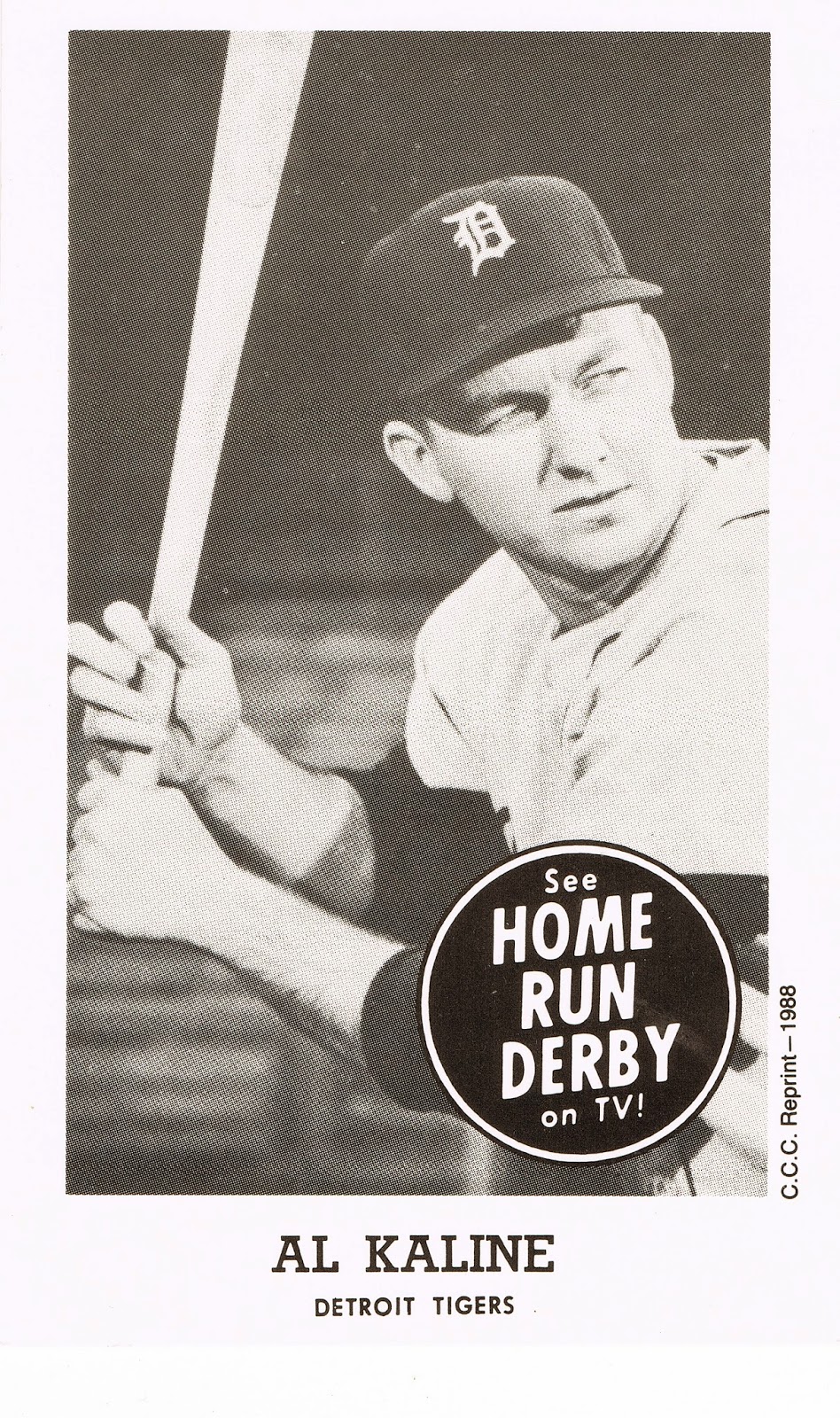
See HOME RUN DERBY on TV!

So is a reprint of an oddball still an oddball?

I'd say Yes.

This is another fun little piece I picked up at the LCS a few days ago. It was even a freebie, as I had already committed to relieving the owner of some other items by giving him real money for stuff no one else hardly wants - junk wax. It might be awhile before you see that junk, because I have a fun construction project to complete before showing it off.

The other reason it was free was the fine print there along the lower left corner of the image, which reads "C.C.C. Reprint - 1988", which was certainly nice enough of the reprint company to include, back in the 80s.

Of course, perhaps this isn't a true oddball, as eBay searches for these items work better if you use the word "Postcard." But this is is still a baseball picture card then, methinks, even if not issued by T.C.G. Co.

Originals will set you back hundreds of dollars, but these reprints are just a buck or so, before shipping. Or free at your Friendly Local Card Shop, perhaps.

This item came with one other helpful item I had thought to work into a post along with it, but when I learned tonight that the first game of the World Series won't be played until next Tuesday - over 100 hours away! - I figured I'd better get on the wire and drum up some baseball entertainment to tide you (and me) over. So the bonus item will have to wait.

OK, OK, now let's get to the subject at hand here on this promotional type postcard: HOME RUN DERBY.

It's the 21st century now, and any product of all of human creativity, ever, can be summoned in seconds:


This was a delightful find for me. I don't live with a super-deluxe Cable TV package. In fact I hardly watch TV at all, which is especially true now that baseball has completely disappeared from broadcast TV, as it has moved to Fox Sport1 rather than regular over-the-air Fox stations. No more Game of the Week. Boo!

Thus even at home baseball is mostly an audio experience for me. Tonight I listened to the final NLCS game on the San Francisco station, courtesy of my phone rather than atmospheric bounce of the powerful AM stations I would use when I was a kid. And thus I got to hear the great broadcaster John Miller call the top of the 9th, 2 outs, bases loaded. Taveras hits it back to the mound and "Affeldt races to the bag. Touchdown!"

So I still thoroughly enjoy baseball on the radio. But I do also like to see what baseball looks like, which is where baseball cards come in.

But I could not resist the call of this baseball postcard, and I was rewarded with the 24 minutes of baseball sort of history embedded just above there. That video is of the Hank Aaron vs Al Kaline episode of the Home Run Derby TV Show, and it was an enjoyable 24 minutes. Aaron and Kaline were particularly pithy analyzing each other's swing  - I could instantly see what they meant. This is something I do lose just listening to games on the radio. It was just so cool to listen to these Hall of Fame players talk at all, back in 1959, still in their 20s. My baseball cards sure don't talk, well at least not out loud.

All the rest of the details on this show can be similarly summoned in just seconds; heck if you look through the settings on your computer long enough you'll discover that the last operating system upgrade you did probably added Siri-style voice recognition even to most PCs now. So you can just say Home Run Derby TV Show Wikipedia entry out loud and get all the answers to your questions quite quickly.

Episode 1 features Willie Mays vs Mickey Mantle:

I mean how cool is that?

Actually, I think watching too much of these would wear you down pretty quickly, they have been broadcast a fair bit already on ESPN Classic over the years, so some of you might have already fallen asleep now. This is just black & white baseball shot live with just a couple cameras, no instant replay, and isn't actually a baseball game of course.

I also learned that there was a Wrigley Field in Los Angeles, and if you've ever seen a classic baseball movie shot in black & white, it was probably filmed there.

The things you learn from these baseball picture cards...

Wednesday, October 15, 2014

Stuck

There is of course a wide variety of baseball player picture memorabilia products out there. One of my favorites is probably the most overlooked in this oh-so-grown-up now "hobby" -

Stickers

Yes, Dave, stickers make me pretty happy too.

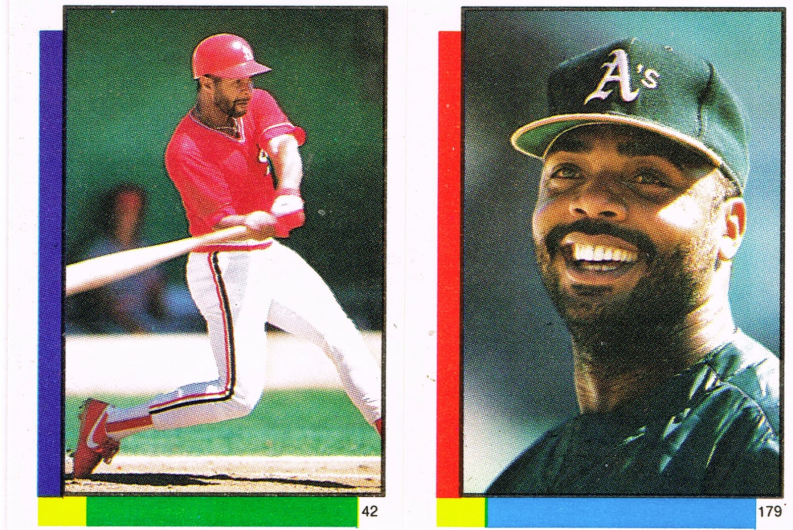
These stickers I picked up the other day do that especially well. These are the 1990 edition from Topps, perhaps their most unique sticker set.

I haven't assembled a collection with representatives of every year that Topps made these, though I can see my baseball player picture collecting tastes will lead me to that point.

So I'm not positive that these are the only dual image stickers issued (they are perforated in the middle and that is two stickers there, on a single backing piece we'll get too shortly). 

I have a stronger suspicion that this might be the only set of stickers that recall the design of the Topps baseball cards that year. Normally with Topps stickers, you get either a white border for all of them, or a combo of Red for the AL players and Blue for the NL players. With special exceptions for the All-Stars, most years. 

But in this case, I find this design much superior to the usual choices from 1 Whitehall Street. And by that I mean also superior to the base card design that year. One day last season I buried my thoughts on 1990 Topps in a long wordy word post about 2013 Archives, and then added to those thoughts in the comments after a smart comment from the Night Owl. He thought 1990 = Lichtenstein, I think 1990 = Mondrian. These stickers definitely support the latter, though you can't argue against connecting the dots to Lichtenstein (no, not the country, click around and learn something), either. I prefer these stickers to the baseball cards because Topps exercises restraint on how many colors they add to the frame, rather than just seemingly randomly rainbow-ing up the entire frame the way they did on so many 1990 cards. And they are still color-coded by League, even with this touch of Art on a 5¢ sticker.

I have always liked the variety of baseball picture card tropes in most Topps products, and this sticker set is no exception. Up there on the first one on to the scanner, we've got a sweet shot of Ozzie Smith, In Action, probably about to smack a pitch left up too high in the zone, it looks like. And I always like a Smiling Card. Or sticker.

Let's see what other baseball card archetypes I can find on these tiny (2" x 1.5") baseball player picture products:
Here we get a nice Batting Cage shot of Andres Thomas, while Melido Perez gets a nice Leg Kick pic as he pitches in some extra-empty weekday game somewhere. Who? Yeah, me neither, though when I cheated via today's online checklists, I did discover that Thomas was a former Topps All-Star Rookie (on those terrible wood-grain cards in 1987, which is why I probably forgot him), and I think Topps always kept those players on their checklists ever after. 

You may wonder why there would be a Topps baseball memorabilia product that doesn't identify the player in the picture (not even on the back of the sticker), which is pretty rare in the world of Topps, though I have always liked their occasional such efforts. Keep in mind that these are designed to be put in the official Topps album each year, where the player's name would probably be printed clearly underneath the empty frame where we are supposed to stick the sticker.

And there are plenty of other classic baseball photo styles:
That's Ivan Calderon hanging out in the dug-out showing off his snazzy red batting gloves. A young John Smoltz is not impressed. Dug-Out cards catch everyone's eye, but I have an eye for certain other things on my baseball picture deals:
Light-towers! Clouds! Storm clouds, at that. Nice stuff. What's up with Kent Hrbek growing a beard and Denny Martinez shaving off his mustache though? No silly, that is Jeff Reardon there on the left, and Craig Worthington on the right, the last sticker # in this set, as it turns out.

Did I finally pull an All-Star sticker there with the special blue star (for an AL guy? actually, all the little stars are blue, even for the AL), while Topps has fun using every part of the color wheel their printing machine had that year.

No, the All-Star players are on their usual special Foil stickers:
Though I appreciate the rare fielding shot for an All-Star baseball player picture thingie, I find the 1990 All-Star sticker effort a little …. meh …. even with all those stars, in part because the foil washes out the wonderful color present in the rest of the set. (Shades of the mmm, shiny baseball card products to come in the rest of the decade, and decades ever after, I guess.) The AL All-Stars get the same exact colors and stars, except theirs are on the left of the frame. Though the All-Stars do get their own complete 3" x 2" sticker.

So what is going on back there with Craig Worthington's special blue star? The answer is another possibly unique feature of this set - the presence of the Topps All-Star Rookies, though without the Rookie Cup, or the statue. Worthington made the team at Third Base, after belting 15 Home Runs in 1989, easily his peak year in the majors. Perhaps the sticker album noted his Topps AS Rookie selection, I don't know.

I like how the All-Star Rookie all-the-colors border somehow leads to his neighbor's frame getting an extra boost as well, as on this likely example of the ultimate Star Power sticker in this set:

Boom!

Imagine pulling that combo the year after Griffey Jr. rookie-card mania. I'm sure the set constructor back in Brooklyn grinned with delight pasting up that one. And no one had to cheat with their album or some computer checklist to figure out those two guys, even though as I mentioned, they aren't named on the back.

So what was on the back? Let's take a look:
More Boom! Check it out kids, you get two stickers on the front, and a baseball card on the back!

And I get to type this again: Miiiinnnnnnnnnniiiiiiiii!

Maybe one of the most unknown mini sets Topps has ever made. The 1990 Superstar Checklist included 66 players, evenly split between the AL and NL, and of course with a special entry for the Checklist sticker card, #67.

I probably won't chase and binder this esoteric mini set with my snazzy new mini card binder pages, as I've never liked baseball picture cards that strip out just the baseball player from the original image; again this foreshadows what was to come in the world of baseball cards the rest of the decade and beyond. Though now that I think about it, perhaps I'll just binder up all the pitchers in this set...

I picked the Langston card to show you due to that cool stat there. Amidst space for only 5 stats, Topps included SHO (shutout), a neat illustration of how the game has changed even in just 24 years. I thought it was amazing this year when Tigers pitcher Rick Porcello pitched sequential shutouts, surely one of the more remarkable pitching performances of the season. 2014 baseball cards no longer even list CG for complete games, and I have to wonder how long it will be before Complete Game shut-outs might get their own special highlight card, they are so rare these days.

Even in 1990 though, a Closer makes this short checklist. I pulled Baltimore Oriole Gregg Olson, who instead of SHO, gets his 1989 SV (saves) stat listed = 27. Another illustration of the game changing over time; though Topps used to issue "Leading Firemen" cards even in the 1970s, I wouldn't expect to see a reliever on any of their special short checklists before this.

Some things never change though, when it comes to special checklist construction:
Yes, in 1990 any modestly successful stat line as a starter for the Chicago Cubs made the player beloved nationwide, though I should note that Dunston did make the NL All-Star team in 1990 for his second and final time.

But did the card back match the front? Nope, that wouldn't be possible with 67 card backs and 164 card fronts (I would expect some double-printed backs). Here is the front, i.e. the sticker, affixed to SuperStar Fred McGriff's entry in that mini checklist:
So, no, that is not the front of SuperStar Mark Langston' card, but it is a nice regulation baseball player image of Langston pitching at Wrigley, I think, nearing the end of the Powder Blue era by this point. I can not determine why some non-All-Stars got full size stickers all by themselves….what Topps set would be complete without some mysteries?

I do like all the ones I pulled, including this one:
That's Ellis Burks, batting as the shadows creep down from the Upper Deck. Apropos today, a day of two shadowed games in Kansas City and San Francisco. I again like how the scanner highlights the shaded portions of the image better than the actual card, err, sticker does.

Unfortunately I only pulled four of those full size / mini stickers (so far…), and only have one more baseball pose to share with you, though I don't have a cheeky name for it:
Yes, Jay Howell, you are correct to have some obvious disbelief here: Fred Lynn is not a Pitcher! I hope the runner was out at Home, at least. One of the more unique fielding shots I have ever discovered.

One of the best things about this little baseball memory acquisition at the LCS the other day is revealed on the wrapper:
What that might be? This was one heckuva deal for only a quarter, still today. Having an appreciation for the Junk Wax era (with real wax, still), can make for some cheap entertainment these days; I spent a whole buck on four packs. I picked up some other cool cheap stuff along with these that I will be sharing with you some other night.

This wrapper also delights me, because, Yeah I Save the Wrappers too. And this is one of the best wrappers I have ever found from the world of Topps Chewing Gum. I poked around the web and even tried the usual best possible reference for questions about all the miscellany on Topps packaging, the excellent Topps Archives blog. I didn't find anything about what feels like the first time I have ever seen this:
Ever the punsters at Topps. Perhaps these things really are designed for children.

Tuesday, October 14, 2014

I can't collect modern archive styles...

…without collecting the original:

Had a very nice visit to my not-that-local card shop (65 mile drive) yesterday. It was the best possible day to visit the LCS.

The day the new cards come in?

Nope. The day the owner of the shop had just purchased a new random collection that no one had looked through yet!

I pulled the above treasure immediately. Two bucks, out the door - though I found some other wonderful treasures to share with you soon, though not the ones I walked in for, as the new Stadium Club was all sold out and the new Update wasn't in yet (in the LCS round of the playoffs….Topps slips more and more on this each passing year). And now as you are reading this, I will be scanning some of the wonderful replacement treasures I found….

As I mentioned the other day, 1972 is one of my favorite designs. Unfortunately, I haven't really collected the originals very seriously and own just a handful of them. I could change that with just a few clicks of a mouse of course, and I might some day. But until that day I'll just pick up 72s when I run across them. I could have just asked my friendly local card shop owner right there on the spot and I'm sure he could have got me started with 100 commons for a carefully calculated price of "ahh, those would book at twenty, so how about eight bucks?" Maybe next time.

The shop I picked this up at hasn't been in my FLCS review series, but it will soon. There is actually a shop ahead of it on my list.

Such a pick-up this card was. When I was young, my first baseball memories are from 1975. Living in the mountains of West Virginia, I pulled for the Pirates in the National League due to their minor league team being the only baseball team in the double-U-V, and the Red Sox because my mom's best-neighbor-lady-friend was from Massachusetts. And she was the only grown-up I knew who had enough of an interest in baseball to comment on the sport, which was good enough for me.

Of course, 1975 is an epic year in Red Sox history, even though it was a bit of an off year for Yaz. I'm sure I'll return to 1975 on this blog plenty. I didn't know or care that Carl didn't produce as normally that year. He was YAZ. Last winner of the Triple Crown, all that.

Right now would be the time to pull out my first Carl Yastrzemski card, but my vintage collection is still locked in it's storage unit prison. (Stupid work).

So I could only show this one. I would have purchased it regardless, and it is definitely now the A #1 1972 baseball card that I own, but it also fits in with another collection I've been occasionally building a little pile of, that I will now add to my blog index: A Tree On My Baseball Card?

This card has a glorious lurking Tree there in the background amidst other miscellaneously dark, threatening shrubbery; a pity that 1971 camera technology didn't dial it into focus the way modern equipment would have. (We are so spoiled these days). I'm thinking a solid specimen of Southern Yellow Pine somewhere there in Winter Haven, though even with a very intimate knowledge of the three Pines that get lumped in to the generic Southern Yellow Pine name, I can't be 100% sure it is actually a Pine.

The one thing I struggle with while making some mini collections is whether a card should go in the set it came from, or only in the mini-collection, or whether I should just set aside an extra copy of it in that little pile.

Hmmmm, looks like I will have to be keeping an eye out for another one of these tell-tale psychedelic green-orange-yellow Sox…...